Have a nice dinner and celebrate, because it will never happen again. In ten years at SAP only one of my ideas ever made it into a product.
- SAP system architect, re: LAVA's Points being accepted for formal development.
LAVA represented a compellingly different way to directly enable the Gather and Consumption stages of the Decision Cycle, while indirectly enabling the Ask and Synthesize stages through its support of user reflection, comparison, social dynamic, and storytelling abilities. When I showed the concept initially, most people interpreted it as a proposal for a net-new product. Others saw it as an attempt at establishing layout and interaction guidelines for the current products. What LAVA presented to users was not quite a dashboard and not quite a report. It had components, like the Lattice metachart, that were more complex than a simple chart, but not a complete product on their own. Was LAVA just a set of demos for customers to use as examples, or for download and emulation with code re-use? Was it a default product configuration that would open automatically? Was it an app targeted specifically for desktop, browser, tablet, or phone deployment? Was it an exploration tool, or a monitoring tool? Would it be sold as a stand-alone product, or be embedded within SAP’s large suite of enterprise software applications? Parts of it seemed like an authoring tool, other parts like a collaboration tool.
For many within the organization that might be responsible for building and shipping LAVA, they saw it either as 1) Promising but something to be done by another sub-group or 2) Because it did not fit into any current categories, an amusing study to be discounted altogether. Like Pirsig’s motorcycle example, the organization was trained to break down concepts according to existing fault lines, with an eye towards execution in the status quo system, and also towards who might “own” the solution and thus reap any benefits for their team and development center. Seeing a solution divided up in such a different way clouded people’s judgment of its merit.
On top of all this fragmentation was the geographic dispersal of the major development centers involved with visual analytics at SAP. BOBJ had already been a shotgun wedding of former rival Crystal Decisions with the original BOBJ brand and product line, resulting in two major development centers in Vancouver and Paris, along with smaller centers in Bangalore, Shanghai, San Jose, Wisconsin, and Boston. Each development center was assigned ownership of complementary parts of the entire product portfolio. The suite of products and architecture layers needed to work well together, so although the dev centers had some autonomy over their specialty products or components, their work required tight coordination. Needless to say, each center was also a power structure vying for interesting and sustained work that would garner attention, and the way that parts of the product suite were divided among centers changed frequently. When trying to explain and build interest in LAVA, we needed to align with a number of groups: The ERP Business Suite’s embedded analytics team, corporate UX standards, internal analytics teams in Germany, the desktop analytic dev teams and product managers in Paris, UX leadership in Palo Alto, chart library and corporate demo teams in Shanghai, and the mobile dev team in Bangalore. Each of these groups had a key role in making LAVA happen, and each had their own strengths, weaknesses, legacies, and agendas.
On the other hand, anyone seeing LAVA who was close to customers and their needs did not care what it was. They immediately saw the benefit and wanted it. Here is a collection of comments from an online survey completed by SAP colleagues, in roles ranging from marketing to product management to UX designer to development manager:
“I consider the Lava principal (its constraints, containers and template approach) as a key enabler for providing a self-service dashboarding client for business users.”
“Lava currently has an easy to use UX. It seems easier to create and better to visualize analytical content for an executive and management audience.”
“LAVA solves the basic use-scenarios we have and it looks beautiful and friendly.”
“Clearly LAVA represents a major shift in thinking, from almost cartoonish and incomprehensible dashboards to designs that catch the eye but highlight what matters most - the numbers!”
“If we manage to nail down the design time experience of LAVA content, then I will consider Lava as being the most modern and powerful wizard paradigm ever designed.”
“Consolidated in-page drill down is a big plus. Reducing the design of multiple reports into a set of most necessary few will force designers and Solutions Managers to provide just the right level of information. A great concept to see the sky and ground with the concept of points-digests-lattice controls.”
“I’ve worked with a number of alternatives, consistency wins over cutesy graphic fads. I’ve worked and developed similar graphic standards (20 yrs. ago) and I view Lava as what I would have hoped I would have developed it, had I done it today.”
“I believe in standardized graphics like Lava. I believe once customers start using it, it will become second nature to them. I’ve worked with similar concepts and graphic standards to LAVA at other companies and it was always well received.”
“I think LAVA represents some of the best visualization componentry to date (industry-wide). We should include it in our consolidated design efforts as a significant part of the “cream” of SAP UX. Would advocate adoption in our BI tools.”
I knew we had a hit when in early 2013 I gave a 40-minute LAVA demo to a room full of large customers, and several mid-level SAP stakeholders, in Palo Alto. SAP’s presentation portion of the meeting featured three phases. First we gave a demo of the product we had currently under development, called Lumira. We then showed designs for features planned to be added to the next upgrade. My part came last, billed as a “concept car” presentation of advanced ideas, that we would like the customers to see and comment on. Their feedback would influence whether the ideas were worth putting into the product.
Feedback on Lumira was lukewarm. At that point the product was early in development and still immature. While the upcoming planned enhancements seemed promising to customers, after they were shown LAVA, “there was a noticeable increase in energy and enthusiasm in the room” according to a subsequent report to management. Here are the responses from BI leaders at IBM, Intel, 3M, Southwest Airlines, and Akzo Nobel to the question “What do you think of LAVA as a self-service BI solution?”
“I think it’s mean to show it to us but have it so far out there (in the release cycle).”
“We’ve got dozens of requests internally for BI applications but we are keeping them at arms’ length. All of them are very common in their themes, and the deck I saw this morning was the first time where, like, ‘that’s the synthesis that I’m looking for’ in all of those requests. I would love to evangelize (LAVA). I’ll see what we can do. And that might help us move away from other (SAP) competitors.”
“Its what we want…For the rest of the dev team (tell them to) get to that demo.”
“I’m very intrigued by what you presented. It’s very inspiring.”“LAVA would make it a factor of ten easier to build and deploy dashboards”
We also conducted usability tests with a working mockup. Led by Interaction Designer Clare Xie from the Shanghai office, a team there developed a proof of concept for China Telecom. I met Clare and her team during an extended placement at their office. My expenses were funded by an SAP fellowship program for top-performing employees, which I applied for late in the year after no such employees were named. The prototype was in response to customer requirements asking for 22 unique WebIntelligence reports of metrics related to customer mobile phone usage. Clare’s team provided the content for all these reports from within one LAVA Lattice. In twenty usability tests conducted in Florida and the Netherlands in 2013, we received overwhelmingly positive feedback from our test subjects regarding the ease-of-use and power of the Lattice component.
The task we presented to conclude the Lattice test sessions was for individual users to find the number of male student customers in the data set, residing in a particular Chinese province with an iPhone, active during a particular month in the previous calendar year. None of the test subjects had telecom industry domain experience, but ranged from casual to experienced data analysis professionals. You can watch a video demo of the prototype from the link in Chapter 9. This chapter provides links to redacted videos of two LAVA usability tests.
The tests used a buggy and obsolete prototype with known errors (we lost our development team after the first round of tests), for which we provided facilitator help and guidance to compensate. Here are selected test participant summary comments following the 45-minute sessions:
“We are trying to create standard interaction methods across our internal BI apps & tools. It would be great if SAP could do that for us.”
“This (LAVA) is what management information is about. Very powerful, useful, visual, especially for management and above, as long as it is not too expensive.”
“I like the concept, it can work as long as it’s more clear where the user is (re: navigation, orientation). You need a moped driver’s license to use it. Not because it’s difficult, but because it’s different.”
“Points are like sticky notes”“It’s tempting to click and find out things.”
“Kids would understand it instantly. My manager would need a 10-minute video.”“It’s very flexible and performance is great (HANA). I’m enthusiastic about this tool.”
The single negative response came from a participant in a role of expert data analysis using powerful OLAP tools. The test subjects were evenly split between male and female, and interestingly the women in general completed the tasks markedly faster, and gave more enthusiastic and positive assessments, than the men.
It was the Palo Alto meeting that jump-started the effort to bring LAVA into SAP’s Lumira visual analytics product. Parts of LAVA were fairly easy to introduce, in particular the Point minichart format. However, due to the organizational challenges already mentioned, it was much harder to assemble all the pieces and achieve the full synergy of the concept. Other teams in SAP, facing fewer obstacles to implementing LAVA, have moved faster. While the Lumira-led BI organization at SAP was tasked with developing and selling its free-standing products to SAP’s customer base, SAP’s enterprise application suite also had a need for analytics to be embedded within workplace applications for HR, marketing, CRM, and finance. Teams working on this challenge were independent from the BI organization, but adopted elements of LAVA for their self-service analytics offering called Smart Business.
Author/Copyright holder: SAP AG. Copyright terms and licence: All rights reserved.
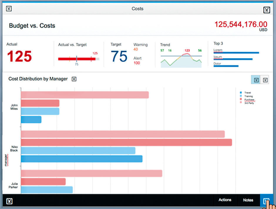
Figure 10.1: Example from Fiori’s Smart Business Design.
 Author/Copyright holder: SAP AG. Copyright terms and licence: All rights reserved.
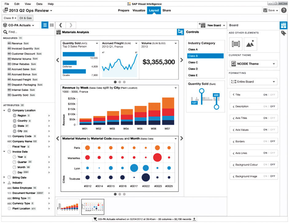
Figure 10.2: Screen shot from SAP Visual Intelligence – now Lumira – showing the authoring of a LAVA Board. From Julian Gosper.
 Author/Copyright holder: Lars Schubert, Graphomate GmbH. www.graphomate.com. Copyright terms and licence: All rights reserved.
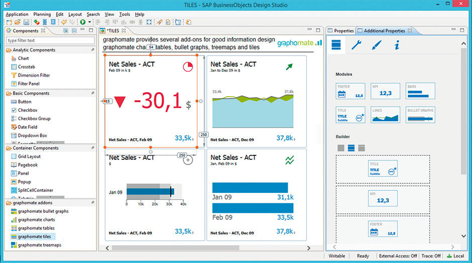
Figure 10.3: View from Graphomate’s Tile authoring feature, a 3rd party plug-in for SAP Design Studio.
L10.2: Authoring LAVA Tiles
As with the overall economic forces calling for simpler and more standardized visual analytic solutions, the Fiori team needed to embed analytics across hundreds of applications, and have them appear and behave consistently for purposes of branding and improved user learning and adoption. Fiori’s challenge was to deploy visual analytics on an industrial scale, where artisanal sensibilities are not sustainable, and LAVA was an ideal solution. By definition, workers engaged with a workplace application need visual analytic content not as a destination unto itself, but rather to supplement a specific application task workflow. LAVA’s simplicity and componentized architecture make it ideal for this, either as complete Boards or as isolated Points, Channels, or Lattices embedded within the working context. For example, with LAVA embedded within a Fiori budgeting application, a manager doing annual planning need not find and reference a separate dashboard or report when researching and recording their outcomes. The relevant analytic content is available then and there.
While LAVA was being adopted as the baseline consumption model within SAP, questions began to shift to LAVA’s authoring use cases. It was easy to see how LAVA’s components and composite templates would make authoring easier than the artisanal efforts of previous tools. But could the authoring of a board be made even easier through automation? For compliant data sets, could LAVA be seen as sort of a universal visual data “player”, as is the case with word processing apps and video players? This is essentially what OLAP systems did, but they were still too complex to be accessible to casual users. Success in this challenge would result in the ultimate self-service solution. It would be able to read and present data sets in an accessible format automatically, without manual expert provisioning effort, and deliver them to the casual user work force for personalized playback within LAVA boards.
Of course achieving this is massively more difficult for multi-dimensional data than for text, video, and other narrative media . The reason is that, unlike these examples, data sets are non-linear. Multi-dimensional data sets have no beginning or end – only an endlessly re-configurable matrix – which is of course precisely what makes them so versatile and powerful. The problem is how to entice beginner analysts to take interest in the data, by anticipating and revealing the most relevant content contained within, in the most relevant way, with the least time and effort from the consumer.
The technology needed for such a step has been evolving for a while, and the key aspect in making it work is the challenge of content relevance. The major role of BI professionals has been to understand what is most relevant to their business user customers, and deliver content accordingly. This has been a cumbersome manual process of editing and publishing that is subject to the same disruptive forces of automation, crowdsourcing, and social media now being endured by the general publishing industry. Google’s Page Rank algorithm out-performed manually-curated content catalogues from Yahoo and AOL for Web content. Could a similar approach predict and refine what quantitative data, and in what form, workers in an enterprise would find most useful?
The challenge for BI is in ways quite different than Google’s, primarily because of the fragmentation of its customer base. Google has the luxury of using the entire Web as a data set, with regulated standards and enormous usage. Taking the same approach for hundreds of thousands of proprietary and unique enterprise data sets, each tuned to the specific needs of its creators, is impractical. It would be different if we all accessed a single giant quantitative data set from our browsers. But, as is the case with enterprise software systems in general, BI solutions have always been highly customized to suit the needs of each enterprise or workgroup, with far fewer common standards to rely upon in seeking the ever-increasing product quality standards of mass-market software products. As consumers, we are at the mercy of what products are provided to us, with little power as individuals to impact what we get. Our influence operates at the collective market level, where mass preference enables new features, products, and brands to address our evolving needs. Competition is fierce and evolution rapid. Large enterprises, in contrast, are markets unto themselves, with the resources to build their own custom solutions, using industry vendors for the various pieces and processes.
With cloud computing, however, this is starting to change. Because of the dramatically lower costs of cloud-based software-as-a-service, or SAAS, organizations are now accepting less control and customization in return for the necessarily simpler and more generic products and processes offered en masse from centralized servers and product code lines. The result is that organizations are getting out of the business of competing with each other over who can build the best internal, proprietary accounting or HR system, in favor of outsourcing this task to cloud software providers like Salesforce or Workday. They trade fewer product options for lower costs. This allows them to focus more on the unique core competencies needed to serve their customers, while accepting and coalescing upon certain simpler, standard ways of working that can be refined by their providers through broader collective use. The same thing is now happening with BI. LAVA is the type of simple consumption system needed to make it work.
Getting back to the question of BI relevance and the inefficiency of its current manual methods, once organizations move their BI consumers to homogenous systems that track usage, the crowd-source feedback loop can run faster. System administrators, content authors, and consumers themselves will see what content is most popular and, presumably, the most relevant and useful, and react accordingly. SAP has given its vision for such a connected system a name: “ The Network of Truth”. None of this will happen, however, if consumers continue to poke around aimlessly within fragmented, hardwired warrens of Rube Goldberg ego statements.
But relevance can never be entirely automated; it involves personal choice, exploration, and curation, along with a provisioned kick start from an author/editor and advice from one’s circle of friends, colleagues, and experts. Let’s look at the four available paths to relevance for an analytic solution; traditional automated, artisanal authored, LAVA authored, and LAVA automated. We’ll use the China Telecom case for an example data set.
In the first case, a traditional automated scenario, the user base of marketing managers download, or are pushed via email, a spreadsheet containing subscriber usage data. The spreadsheet is organized according to how the data is stored in the database. One in ten managers is adept enough with spreadsheet manipulation to gather some relevant data for analysis and share it with colleagues in their team, and perhaps with trusted peers. Every time a sheet is available with new data, the managers must re-configure the spreadsheet to suit their favorite analysis scenarios.
In the second case, a professional artisanal dashboard author discovers the working information needs of internal telecom marketing managers, and builds a custom visual analytic dashboard. She does research and makes assumptions about what her users need to understand cell phone subscriber usage data for use in planning campaigns and understanding demographic trends. Because such dashboards have a relatively fixed layout and content architecture, the author feels pressure to get it right and takes a lot of time to do so. Her breakdown of customer cell phone owner demographic data for analysis allows her users to filter first by time (year, month), then by geographic region (by Province), then by device Type (iPhone, Android, etc.), then by Gender, then by Occupation. Based on interviews with her users, this is how most of them wanted to see the data most of the time. As they are not data analysts, they need the data presented visually and in an easy-to-consume format that is forgiving and prevents them from “getting lost in the data”.
Three months later, the dashboard is delivered to positive reviews by the users. However, within a month, users begin to request changes or the ability to work with the dashboard differently. A number of users independently realize that they need to do an analysis where they can first identify all the student users, and then subdivide that result set by the other variables. But, as the dashboard is not set up do to that, they cannot. They independently ask the author to change the original dashboard to this alternate drill path, or to make a special dashboard for them and others wanting to do analysis this way. Unfortunately, the dashboard author has moved on to other projects and cannot address the requests for six months. The dashboard remains in its default state and is of limited use.
In the third case, the same IT professional becomes a LAVA author and deploys a Board to the same set of users. She spends half the time learning her user’s needs and provisions a Base Board within one week. She is not too concerned about the Board content structure, because she knows that the users can alter it to suit their needs. After a 30-minute online orientation session, the users are given their Board and begin to use it as is. Those attending the online orientation begin to play with the multiple ways of dividing the user data by different Dimensions, and quickly develop a feel for how the data set entities are distributed and clustered. Those not attending the orientation learn from others how to manipulate things, or discover themselves by trial and error that they have control over how they see their data. Eventually they see colleagues sharing unusual facts from the data set, in the form of posted Points or comments linked to data set entities, entered and visible within the visual display itself. After six months of live usage, the author views the Board log and sees that most of her users tend to view their data sets divided first by Subscriber Profession, versus by Province as in the original Base Board default. She changes this and several other settings to the Base Board without disrupting individual settings in the MyBoards and Shared Board of her user base.
The fourth case is a LAVA automated scenario, and follows in time the previous LAVA authored case. The capability to choose the most appropriate chart type for a given metric, having been refined by the vendors for years, is finally in place and working reliably. When a user sees a metric she wants to save as a Point, the Point renders the content automatically in the most favorable chart type. After a LAVA system upgrade the following year, the Base Boards used by the marketing group update themselves to reflect the most common usage patterns of its user base, so that new Board users begin use of the product with the most useful settings based on the previous behavior of their peers. These relevance settings are saved as metadata enhancements to the subscriber demographic data set, so that when the data set is re-applied in new Boards, for users in the sales organization, these boards inherit the relevance data gleaned from the use in the marketing group.
As the sales users have different goals and preferences, these settings are not perfect but are more relevant than random ones, or what an uninformed Board author would be able to discern through manual research. At some point, a new user can open the phone subscriber data set for the first time, and it will automatically open into a LAVA Board and render charts, Points, and a Lattice according to what most previous users have preferred most of the time. The relevance assumptions of this initial rendering, along with the easy exploration and personalization discoveries enabled by the LAVA interaction system, will be enough to keep the new user engaged until they find their bearings in the data, discover what is relevant to them, and then set it and forget it for ongoing reference and occasional research.
These four scenarios track the overall evolution of BI consumption. In 2015 the state of the art is moving from scenario 2 to scenario 3. Although all scenarios will always be usefully present in some form, automated relevance feedback loops, fed by usage logs and social channels, are the answer to providing mass relevance scores. Simple, standardized, self-service consumption vehicles like LAVA are the answer to building the mass usage needed to determine relevance to begin with. Both capabilities need to be in place to start the synergistic cycle, and once begun they will each enhance the other. LAVA begins to resolve the consumption side, but the provisioning side needs to evolve as well. The promise of a data player requires data in a consistent, standard format that can be “played.” Anyone who has struggled to get videos into the right file format for their player will sympathize here. We can also imagine data file formats of predictably varying fidelity and power, some compliant with all players, and others only for premium or professional players. Finally, the data and system platform are where the most relevant data will need to reside. Data providers would then compete on the relevance of their data, which is in turn enhanced by the richness of its metadata.
This outcome is nothing other than the familiar paradigms of letting computers do the tasks that are hard for people to do, and letting the digital product/service provider remove a customer burden or middleman/agent cost through automation. In our case of visual analytics, this is yet to happen because it has taken so long for the industry to get the underlying software to work to begin with, to gather enough data to make it worthwhile, and to get reluctant people to pay attention. While all three forces will stoke the growth of the others, the human factor of consumption has only just begun to be seriously considered.
The LAVA design language provides the most useful visual analytic consumption experiences, and enables them to be fed into relevance collectives for accelerated individual and organizational learning. As an example of the power of the simplicity needed to do this, let’s look at Facebook. For many people, their Facebook page is essentially their default homepage — their personal signboard to the world. Being a product driven by network dynamics of adoption and retention, Facebook needed to grow quickly to establish a critical mass of users and become the dominant social network. They provided a fixed format for users – all people needed to do was sign up and fill the page with some basic data, and then let themselves and their network do the rest. The format was simple. It’s the content – the text, images, and links from you and your network – that is important. The layout, although critical to product success, fades in importance.
Imagine how slowly Facebook would have grown if, instead of providing a fixed format, they provided a service of seemingly greater value by allowing every user to design their own page format. This in fact was the dynamic in place earlier in the Web’s history when the most ambitious of us built and maintained personal “vanity Websites”. While seemingly more valuable and appealing, it would have been more work and stress for new users, more effort for page visitors to get accustomed to each user’s page idiosyncrasies, and harder for Facebook to maintain and upgrade. The current BI landscape is a disconnected constellation of vanity sites, and LAVA is designed to be the Facebook for the mass consumption of quantitative data within and beyond the workgroup and enterprise.
The next few chapters pull LAVA apart in the way described by Pirsig: Into a set of interdependent systems with their own logic, structure, and rationale. Doing so serves to distill identifiable concepts into free-standing units. This helps them to be understood, and better enables their potential independent adoption over time in componentized form.
Readers coming from the BI industry will notice me taking the liberty to convert some hard-core BI technology into less clinical terms. For example, the BI terms like Dimension (e.g. gender or age), Dimension Members (e.g. Male, Female, Unknown), and Member Value (e.g. Male) are not intuitive to casual users. Users better understand terms like Attribute, Entities, and Selection. I simplify the explanation of BI structures, especially in the Metric System, in part because this is not intended to be a comprehensive BI book – nor am I technically qualified to write such a book – and in part because the book’s point is to focus on only the most relevant and useful features. I’ve cherry-picked the material needed to support my proposals, but included enough so that it all makes sense. Think of it as my personal interpretation of what is relevant about BI in order to understand how LAVA uses it to simplify the consumption experience.
While I’m aware of the risks of confusion and over-simplification associated with doing this, given the scale and depth of the challenge, I think it’s warranted. I’ve vetted this stuff with experts to the point were I’m comfortable with it. And remember, removing edge cases and exceptions is central to LAVA’s overall effect and value. To live up to the task of designing the Facebook for quantitative data, all variables must be in play.
10.0.1 Media Assets
L10.1 | LAVA Lattice: Usability Tests (video) |
https://www.interaction-design.org/literature/book/bringing-numbers-to-life/assets
This is video footage of a LAVA Lattice usability test, with participant identity of course hidden. Most participants were professional BI analysts. All or most were able to complete the complex task offered at the end of the session.
The first session, L10.1a, is from our first round of tests, with our initial prototype. This participant almost instantly understood how the Lattice worked, and helped us to define problems in the design, some of which we changed for the second round six months later. Session 1 was conducted in the US, the second in Europe.
The second session, L10.1b, is from our second round of tests. As we had lost the resources to update the app, the moderator guides the participants around known bugs, and deemphasizes certain features. This test is truly us designers exposing our nakedness, as the user struggled to understand the horizontal sorting feature, which we already knew was a power feature, and a cause of unnecessary confusion, but could not be removed due to lack of resources. Plus, keep in mind that the participants were unfamiliar with the fairly obtuse and confusing data, and that they and the moderator were conducting the session in their non-native languages. Still, such tests are humbling but useful, as we wanted to find product aspects that caused confusion. Despite the struggles, the participant had an overall favorable review at the end, which was encouraging. In this case, as with most others, the criticism targeted the completely novel presentation and interaction, but that once this initial hurdle was overcome, people liked it.
Interestingly, female participants in general more easily discovered functionality, and became comfortable using the prototype, than their male counterparts. They seemed more inclined to explore, to try things, and select them, while the men spent more time looking and analyzing.
L10.2 | Authoring LAVA Points/Tiles (video) |
https://www.interaction-design.org/literature/book/bringing-numbers-to-life/assets
This is a screen recording from Lars Schubert at SAP development partner Graphomate. It shows the use of their Design Studio plug-in, enabling the authoring of LAVA Points –called “Tiles” in the product.
