Begin with the end in mind
- Stephen Covey, Habit number 2
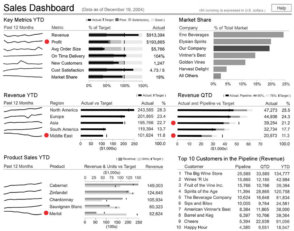
The roots of LAVA began with my early dashboard consulting projects, where my work was heavily influenced by the archetype Sales Dashboard design from Few’s book Information Dashboard Design, as well as by BOBJ’s Explorer product. For reference, I show Few’s design again here:
 Author/Copyright holder: Stephen Few. Copyright terms and licence: All rights reserved.
Figure 9.1: Sales Dashboard example, Stephen Few.
Few’s dashboard, and dashboards in general, are intended strictly for the monitoring and, to a lesser degree, the assimilation acquisition modes. Workers use them to check the status of particular things, and to keep an eye on other related things. What one immediately notices about this design is its reliance upon horizontal bar charts, which feature bullet graph bar overlays – the grey shading and marks behind the bar itself with thresholds and goals – invented by Few himself. Few’s content groupings that combine bullet graphs, sparklines, columnar figures, and alert dots into synthesized expressions are good examples of metacharts. Metacharts combine of multiple charts and behaviors to serve a more specific or powerful purpose than is possible with traditional chart types. The horizontal bar chart is a strong foundation format and easy to build upon, it being essentially the most useful chart form for the most purposes. If there is one chart you want on a desert island, this is the one, and I’ll explain why.
First of all, horizontal bar charts use one-dimensional plots – the bars – to display simple measurements of each entity in the chart in comparison to a scale, and more importantly, to each other. There is simply no more direct way to compare a set of numbers to each other. The bullet graph essentially overlays multiple measures onto a bar chart, with the main measure shown by a bar and associated measures shown with thicker bars or markers. This is an efficient way to show how the the main measure compares to benchmarks like goals and performance quality ranges. In this example, the chart compares actual versus performance benchmarks of Poor, Satisfactory, and Good. As you will see later, LAVA’s Lattice metachart relies heavily on the horizontal bar form in order to convey as much content as possible within limited spaces.
The bullet graph in Figure 9.2 compares Actual Sales, yearly Goal, and a calculated Pace value depicting where sales should be at the current point in time, based upon historical averages or other metrics, in order to be on pace to meet the yearly goal. Olympic swimming broadcasts use this technique in their augmented-reality depiction of the world-record pace progress bar, which they superimpose live onto the racers. The Pace bar is good for scanning and cross-indexing of relative progress across many variables, in particular for performance monitoring.
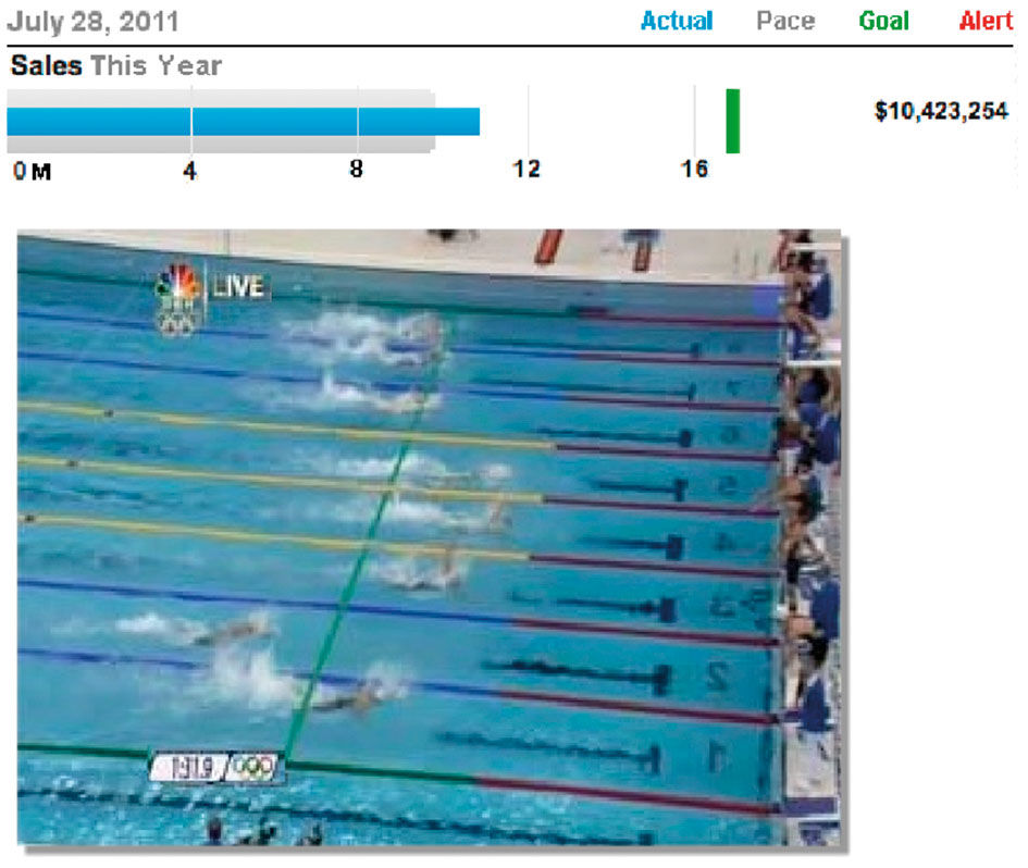
Figure 9.2: Augmented reality world-record pace indicator. The green line overlaid onto the swimmers is comparable in meaning to the gray pace bar in the bullet graph above.
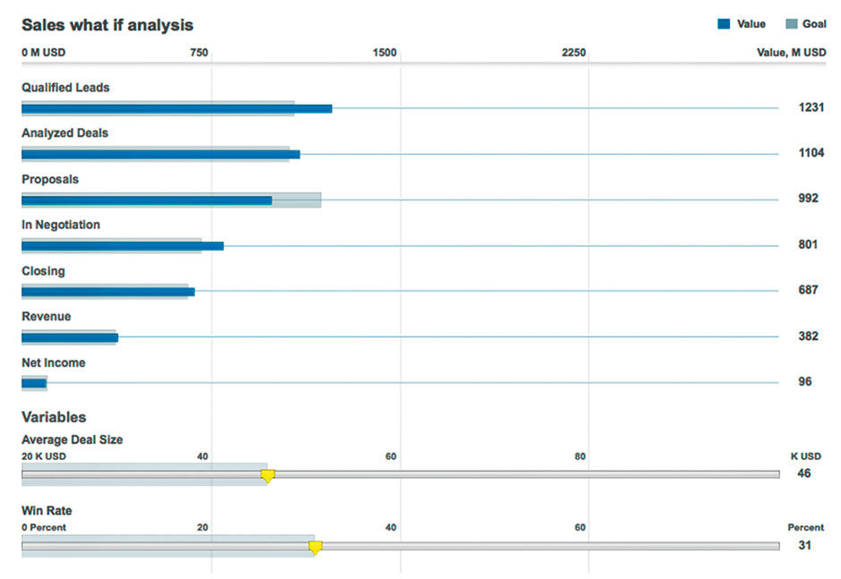
This also simplifies the use of bar charts to double as input devices, as with Figure 9.3, from a revenue modeler I designed as an Xcelsius demo. Input variables of Average Deal Size and Win Rate at the bottom directly impact the display of the number of deals, and their dollar value, through each phase of the sales pipeline shown above. Not only do the sliders provide more space for precise input, versus what would be possible using, for example, round dials, but the mouse or touch input gesture used to change the values is uni-directional , and thus simpler to operate. The input sliders also act as bar displays, enabling the model to undergo future upgrades where each bar is an input device, allowing the user to specify what Deal Size and Win Rate are needed to achieve a certain value input at a certain stage.
Author/Copyright holder: SAP AG. Copyright terms and licence: All rights reserved.
Figure 9.3: Revenue modeler. Moving the bottom sliders impacts the outcomes at top.
Second, because they are essentially a graphical table with the bar plots occupying a particularly wide column, they inherit all the good things we can do with tables, such as adding of columns, sorting by column values, and readily employing text labels and additional values within the forgiving row-based format. Horizontal bar charts cannot do everything, but they can do many of the most useful things. Few says, and I agree, that all pie charts could and should be bar charts. More demonstrations of this come later.
Finally, and most importantly, horizontal bar charts offer the best form for the integration of both continuous and categorical data. Generally, continuous data is equivalent to Measures and categorical data is equivalent to Dimensions. Although time is typically represented as a Dimension, it is done so in a categorical format by being subdivided into categories of duration, like this Tuesday, all Tuesdays, or January 2014, as a way of organizing other Metrics. However because its measurement units can be counted as quantities in terms of time duration, time can be treated like a Measure as well. For example, the amount of time to drive from A to B, B to C, and C to D can be added into a sum of the time required to drive from A to D. We can also determine the average time to drive between the four points, etc. The difference is that Time uses a different numerical system with multiple bases: That of seconds, 60-second minutes, 60-minute hours, 24-hour days, etc. versus the base-10 counting system of 1, 10, 100. Anyway, in general, the difference is that categorical data cannot be manipulated algebraically, only symbolically (by alphabet), ordinally (rankings based on an assigned metric), or by the binary logic of set membership (parent/child relationships).
A Bar chart is really a collection of one-dimensional charts assembled into a two-dimensional chart. The first dimension, marked by the scale, is the measure, and the second, marked by the Attribute labels, I call the Categoric Dimension. The Categoric Dimension can be ordered from large to small according to its metric, alphabetically, by custom editorial or conventional order – as with time-ordered months – or randomly. In Few’s Sales Dashboard example, the Categoric Dimensions include 1) a list of Key Metrics organized manually and presumably by importance, 2) a list of competitors ranked by size, 3) the set of Regions ranked by size, 4) the set of Products ranked by size, and 5) the Top 10 customers ranked by size. Because size does matter in analytics, it’s appropriate to sort large to small – or vice versa for reverse-polarity metrics like customer returns – because the largest (smallest) values tend to be the most impactful and thus the most relevant. Putting them first makes sure they are seen, and ranking the categories this way shows their relative order of importance, the relative amount of difference in importance, and the overall rate and pattern of decreasing importance.
Author/Copyright holder: Evisions, Inc. www.evisions.com. Copyright terms and licence: All rights reserved.
Figure 9.4: The flaw with vertical bar charts: Awkward label orientation and truncation.
Any attempt to simplify how we apply numbers to thinking will involve fitting continuous data into the existing framework of the existing world, which is:
- Highly categorized
- Language-driven
- Hierarchical
- Multi-faceted
- Multi-task
- Multi-scale
Being half chart and half list, the horizontal bar chart addresses the first two. As you will see later, by migrating the Categoric Dimension into hierarchies and facets, LAVA‘s Lattice component addresses the third and fourth, and its Board component and context-based Organization System address the fifth and sixth.
Few’s example represents the collective wisdom of the BtF lineage. It’s exquisite in its ability to display the most relevant sales information clearly and in actionable form within a limited, fixed space. It seems that if I were running a sales organization, this is what I would want to use for monitoring its status and progress. I emulated Few’s approach in my consulting efforts, but despite positive reactions from my customers on the quality of the designs, we ran into two roadblocks, and they were not built as specified.
First and foremost, these internal SAP customers were required to use SAP dashboarding tools, which were not flexible or powerful enough to practically replicate the desired designs. This is nothing new in the BI world, the overall business software world, and much of the rest of the world as well. Designers often push beyond the status quo execution capability. In fact one of the nuances of design practice is to exceed this limit by a calculated amount, to provide inspiration and vision, but that can be responsibly scaled back according to the customer’s ambition and risk tolerance. In the case of SAP’s tools, however, the gap between proven state-of-the-art design, and what could practically be done with the available tools, was huge. Few has been pointing this out for years, making a career of sorts in exposing the more obvious shortcomings in BI authoring tools from SAP and other vendors. Our internal customers had no choice but to proceed with crude approximations of the designs using the means available. While annoying, the situation is slowly improving as the vendors finally respond to the overwhelming evidence, and the customer realization, that the BtF lineage represents visual analytic best practice.
The other roadblock is more severe and interesting. There are two typical user and customer reactions to Few’s spartan designs. One is “can you add more color?”, and the second is “can you make it interactive?”. I already discussed our exercise about adding color. It was the interactive part, however, that drove my curiosity, as it seemed to hold the most promise for improvement. For some reason, customers and users wanted the ability to change what was shown on dashboards by filtering or drilling into entities, to learn more about them and what categories they contain. They wanted to select a part of one chart as a filter, and have the other charts on the page be filtered by this selection.
On the surface level, who wouldn’t prefer to have greater access to more, or more precise, content on a website, versus having it be static? Few’s response to this desire is that once a dashboard is interactive, it is no longer a dashboard but rather an analysis or exploration tool, and that this is a different animal than a dashboard that is to be used for monitoring. His definition of a dashboard is to place the most important content needing to be monitored onto a single, static, non-scrolling screen. Any content not important enough to fit into the dashboard should to be provided somewhere else, in another dashboard or from within a more powerful reporting, exploration, or visualization tool. As with a traditional car dashboard, dashboards cannot be made bigger to fit more things. Rather, their designers need to make the tough decisions about what is relevant, and show it in the most efficient way possible. Few’s dashboards do this very well. According to his definition, having a dashboard that scrolls off the page is a form of cheating, in that if you need to do so you have either too much content or too small a screen. And if you want to have the charts interact with each other on selection, you are entering a slippery slope by diluting the immediate impact and simplicity of a dashboard and turning it into a compromised exploration tool.
I respect the discipline of this approach, but began to believe that while a fixed-size and static dashboard was impressive and pure, it was hard to ignore the customer requests for some flexibility, let alone to try to reconcile the porting of a browser-based dashboard to smaller mobile device screens (interestingly, newer car dashboards, like those from Tesla, are growing less dashboard-like and more interactive and navigable). Customers were asking for solutions to enable more than monitoring, extending the capability to the active modes of Search and Explore, and more opportunities for the Assimilation mode, within the same destination.
These customer requests also posed another problem, which is the lack of talent to design and build for interactive, and even more elaborate, displays. Design talent is limited, and one way to limit design errors is to impose strict rules that prevent them. It’s likely better to have a drier, monotone dashboard than one with ill-informed psychedelic colors, regardless of how much the latter may stand out in a lineup. The same goes for building interactive capabilities. It’s hard enough to gather, deliver, and display relevant business data in a simple fixed dashboard that may or may not be BtF-compliant. Having to orchestrate a clear, reliable, and useful interactive environment on top of that is even harder, and most examples of such attempts are hopelessly confusing. In most cases, making custom, interactive dashboards that meet the consumer-grade experience expectations of today’s users is too difficult and expensive to be worth the benefits. What we instead get are cramped, contorted displays built with tools hardwired to encourage styles and adhere to constraints that are no longer relevant. This is a real problem and a lingering barrier to wider adoption of visual analytics in general.
However, the initial customer desire is reasonable, and actually holds the key to making better visual analytics affordable. Visual analytic consumers want their tools to be interactive because they are not seeing what they need in the current static displays, and the effort to go beyond these displays into other dashboards or professional tools is too difficult. Why can’t they find what they really want by exploring the world behind and around what is shown to them in an initial display, and then bookmark or save the view of what they want so that they can find it later for ongoing updates? Why can’t they apply a few simple filters, or make some detailed comparisons, to learn more about the dynamics and relationships between a few Measures and Dimensions, without having to submit a request to the IT department to build a report or model to do so?
What became apparent to me was that, if in fact the design requirements for the visual analytic monitoring experience and those of a corresponding exploration or authoring experience are so mutually exclusive to be irreconcilable in one product, then perhaps there is a third product category that combines only the best attributes of both products. Or, is a better solution to maintain a model of two products, but to bring relevant features from one into the other in a reasonable way? Doing so would require a bold application of Ockam’s razor, to divide in a different way not only the existing product categories, but to question the BtF terra firma that we were concurrently evangelizing.
I chose to follow the instinct of our customers. They simply could not accept the idea of a static dashboard. But what is the answer to the dilemma presented above? Most current users of visual analytics are relatively large-cap decision makers, predominantly Problem-Solvers, and by definition already find the systems useful, relevant, and worth the cost and effort to use. While the systems currently supporting these users can surely be made more powerful, reliable, easier, or for lower cost, it’s clear that a large un-served market lay at the opposite end of the spectrum – the small-cap Doers for whom quantitative data is only a minor part of their work. But if it is too expensive to spoon-feed these users with solutions custom-designed and simple enough to willingly learn and adopt, how is it possible to bring numbers to these workers?
It was to solve this problem that LAVA was created, and Andrew Murray, my product management colleague at SAP in Paris, was the person who got me started down the path to the eventual solution. Andrew was responsible for the success of SAP’s mobile dashboarding solution, called SAP Business Objects Mobile (nicknamed “Mobi”). Before each new release, Andrew would ask me to help his development team create several example designs to ship with the product, to serve as best-practice guides for customers in their own design efforts. Mobi offered a simple platform to compose dashboards for consumption on iOS and Android tablets and phones. Included in the solution were a number of basic chart types that could be connected to data sources and arranged on a page for display, with a simple navigation framework to locate, and navigate among, multiple dashboards.
With complex data sets it was difficult to get the typical set of charts to render on such a small screen without having the labels be hopelessly truncated or mashed together, or to have a chart be the correct rectangular shape so as to best show its data. If an elegant layout was achieved, it was mangled as soon as the user switched the tablet viewing orientation to or from landscape view (wide) to portrait (tall). The more I tried to demonstrate all the possible chart types and layouts that Mobi made possible, the more I realized that such efforts were folly and the results almost random in their added value.
In frustration, Andrew asked “can’t we just design one dashboard layout, or even one chart type, that can be used for all of these?” Of course I had a good laugh, told him he was crazy, and returned to California. But I could not find a good solution for his challenge without some sort of drastic simplification of his product’s layout system and chart types. Eventually, after a series of design choices and innovations driven by simplification and flexibility, I realized that Andrew’s crazy requirement was what I was actually designing for. The only way I found to ensure a graphically and semantically sound display, synchronized and coherent across devices, workable with quantitative content of any subject, and either supremely easy or fully automated to author, was to fix the consumption format in a way that any data set of readable format could be opened or manually applied. I was on a quest to design one format and one chart type that could do anything for anyone. While this goal is of course impossible, it served well as a vision for the simplification necessary to create a basic vernacular form for the broad consumption of visual analytic content. And, according to Christensen’s lessons that disruptive innovations tend to happen at the low-end of industry, where prices and margins are lower and the product simpler, the approach made sense from a business perspective.
From working on three pilot consulting projects, I formed the foundations of what would become LAVA . In these efforts, I took existing dashboards and redesigned them as mockups to convey the same and/or more information – sometimes a LOT more – in a more effective and repeatable way. Without going into the detail of each case, the examples show the general direction of the minimalist styling and the emerging layout patterns. You will immediately see that we broke out of the fixed, non-scrolling landscape orientation dictated by precedent and the Xcelsius authoring tool in favor of a more Web-like scrolling page paradigm, with key summary data visible at the top of the page, above the virtual “fold”.
You will also see an evolution in the design of these examples, and all are imperfect. Image quality and design/content represent the original artifacts, and have not been redacted or cleaned up for publishing. Iterative design on a pressured schedule is not a rendering contest, but rather a communication and persuasion effort. It’s more important to convey an accurate message imprecisely than a precise message inaccurately – or delayed.
This is a process consideration, to propose solutions early and often for feedback versus waiting to have everything perfect before sharing. You risk losing credibility through public criticism, or having others – inside or outside your company – either steal your work and take credit for it, or have a jumpstart on trying to discredit it in favor of competing proposals. But the benefits of a broader awareness of your work-in-progress, including the gathering of legitimate ideas and challenges from colleagues and customers, and the related engagement and eventual buy-in, is worth it. In fact this process is the essence of agile design and development practice. The challenge is to make the prototypes and builds convincing and engaging enough for an impatient and distracted audience to take notice. This is where the making of non-functional but otherwise rich and convincing mockups is so important. You cannot sell abstract specs. You need convincing representations of the product, how it is used, and its benefit.
Author/Copyright holder: SAP AG. Copyright terms and licence: All rights reserved.
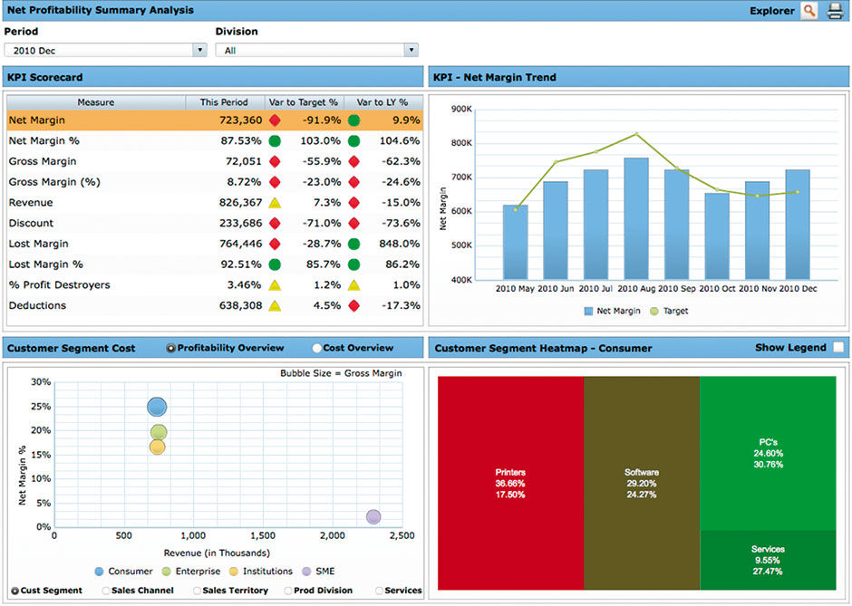
Figure 9.5: Net margin analysis dashboard, original. Selecting KPIs in the upper left quadrant filtered the remaining displays. Other filters and settings appear throughout.
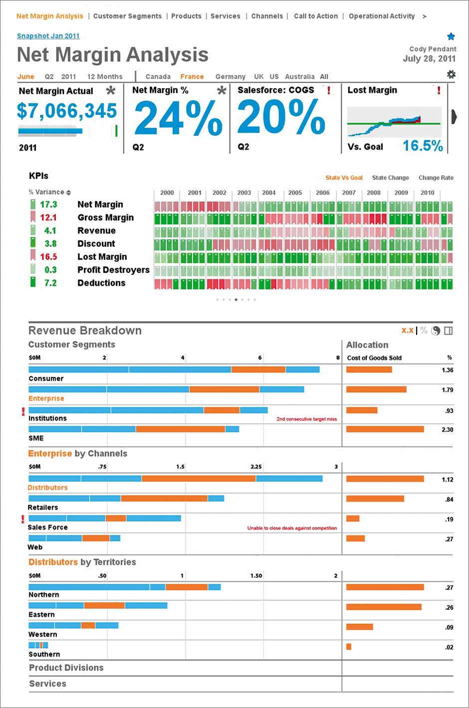
Figure 9.6: Net margin analysis dashboard, redesign. Note the bank of minicharts at the top. The list of KPIs shows current state at the left with a history in the red/green matrix to the right, which became LAVA’s Keyline pattern.
Author/Copyright holder: SAP AG. Copyright terms and licence: All rights reserved.
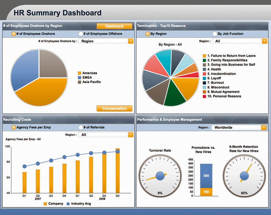
Figure 9.7: HR dashboard, original. Again, selecting pie slices in the upper left filtered the other displays.
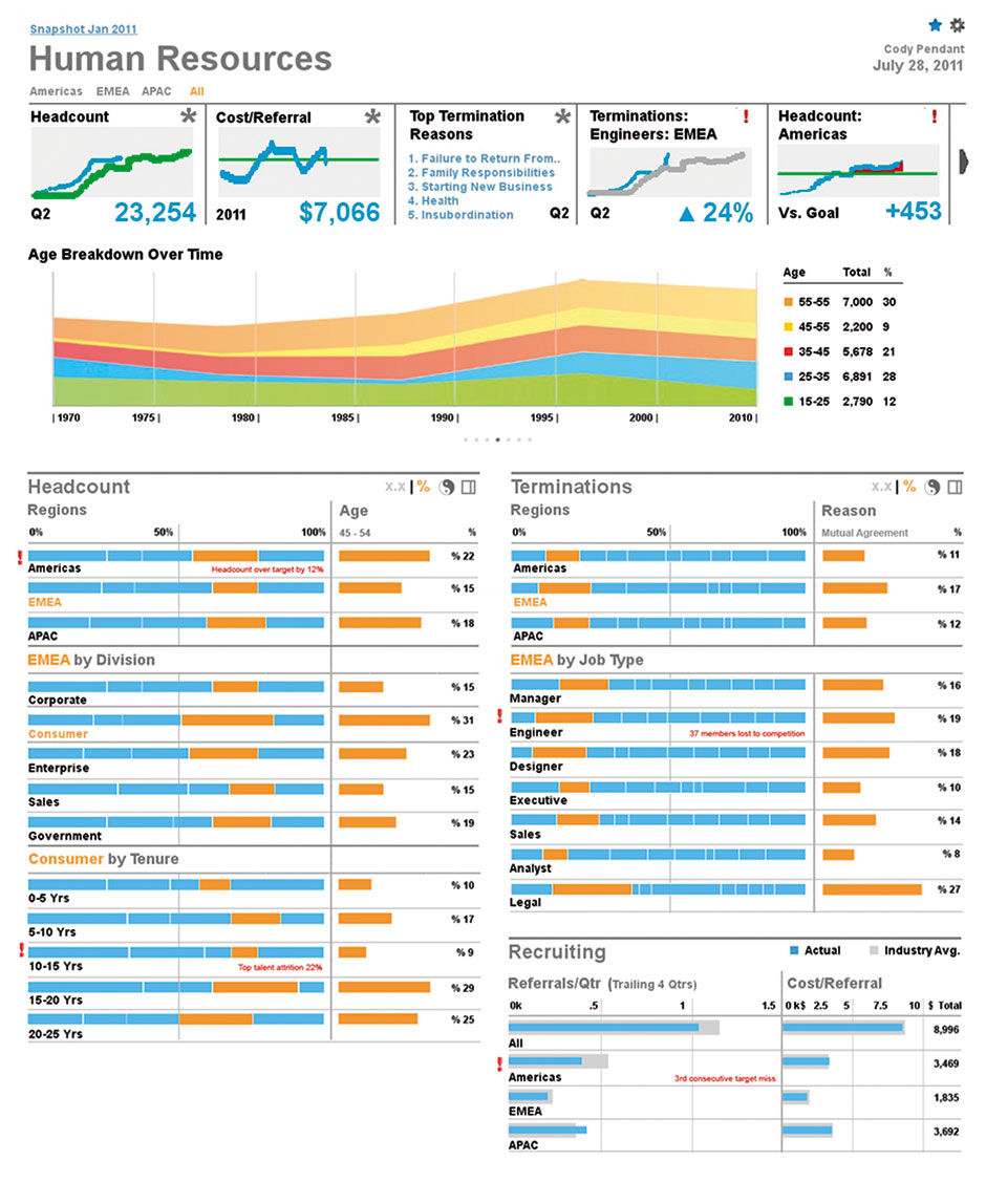
Figure 9.8: HR dashboard, redesign. This features three interactive Lattices in the lower area.
Author/Copyright holder: SAP AG. Copyright terms and licence: All rights reserved.
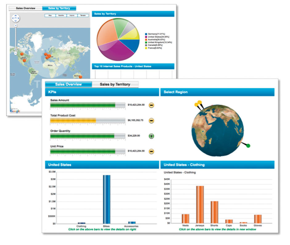
Figure 9.9: Sales Dashboard, original. The user needed to spin the globe with their cursor to access cities around the world and filter the display.
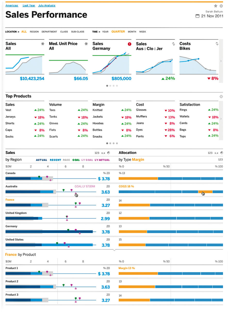
Figure 9.10: Sales Dashboard, redesign. This became the design of LAVA’s default Board layout and dual Lattice design, in the “Day” setting –with a white background.
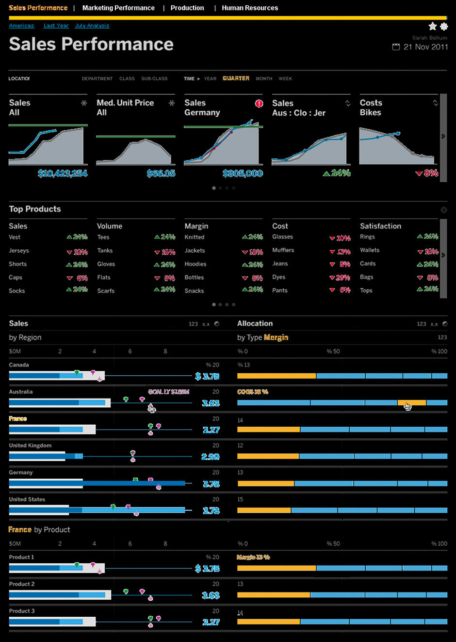
Figure 9.11: The same sales dashboard in the “Night” setting with a black background.
An interesting issue of our visual styling effort was the use of a white (Day) or black (Night) background. Visual analytics on a black background are more dramatic. Their colors appear more vivid, as if hovering against deep space, or reminiscent of graphics on a sports scoreboard. Things on black backgrounds look more mysterious, and evoke the storytelling experience of being in a movie theater or other entertainment events in dark venues. The Night setting contributes to the sense of being entertained, which is often exploited with visual analytics in other ways to seduce consumers into paying attention.
I’ve had a number of debates on the relative effectiveness of the Night/Day approach to visual analytics, without concrete answers, although I’m sure that with more effort I could turn up more research. The tradition of mark-making – writing, drawing, and printing – has for obvious reasons of efficiency and effect been black-on-white. With light-based displays, are we are now free to reconsider this convention? Interestingly, early CRT terminal displays showed glowing green characters on a dark background, due to practical constraints of production/display efficiency in a similar vein to those of printing, only with the opposite result. Bloomberg financial terminals, the dominant information and trading platform used on Wall Street and worldwide, retain their Night view from this era, even though they could easily be switched at this point. You’ve likely seen photos of equity traders sitting in front of multiple black or blue screens filled with glowing text and numbers. Some feel that this “look” is such a part of the Bloomberg identity that they retain it for branding reasons, but regardless it seems to be adequate from an ergonomic perspective.
However, reading columns of text in small font size is harder and more tiring against a black background, and so the printed-page model of dark on a light background remains dominant for most content. Because dashboards are free-standing entities with limited text, rendering them with black backgrounds makes them appear more distinctive than other screen-based content, but without suffering from the eye-tiring ergonomic drawbacks. But this starts to break down when visual analytics are embedded within other content as illustrations. When individual charts retain their black backgrounds among other content on a larger white background, they look heavy and out of place, and lose any of the drama inherent with a comprehensive Night display.
Regardless, when executives want to show visual analytic demos live to large audiences, they prefer the Night view for its dramatic effect, and some users still prefer to see their visual analytics this way. For these reasons, we provided LAVA with a simple Night/Day setting, with no effect on layout and minimal effect on color usage in the analytics themselves.
Getting back to Few’s dashboard, while the design itself is impressive, we can imagine the amount of management and organizational discipline necessary not only to provision such a display, but to decide and agree upon what should be included and how it should be shown. Without going into the complexities of enterprise accounting, let alone the related politics, rolling up such numbers on regular schedules and keeping goals and alert thresholds updated, if they even exist or are agreed upon to begin with, is difficult. What is the size of the audience for such a display? Obviously much of this data is confidential to the subject enterprise, at least for periods of time. Depending upon the enterprise operational culture and business rules, some workers would not be authorized to see this data. Some would prefer to see data limited to the particular product lines, regions, or measures related to their personal performance.
I knew that three things would be a part of any solution we recommended. First, it would involve simplification, of both the author/consumer experience and of the system’s development and maintenance. The only way to simplify something is to remove things – parts, features, layers, steps, clicks, etc. In contrast, each of the other potential strategies already mentioned involved not removing things but rather adding things: Special effects, extra dimensions, metaphors, images, chart types, presentation modes, extra incentives, and algorithms.
Second, the solution would need to focus on the consumption experience versus the provisioning experience. The only time net value is created in the entire visual analytic industry is when workers improve decision quality through the consumption of quantitative content. Consumption had to be optimized as this is the most fickle link in the whole chain, the most ripe for a major upgrade, and would serve to influence the provisioning chain all the way back to the data. Visual analytics is already a complex field, mysterious to many potential consumers, and prone to obfuscation and misuse. Any move towards removing variables in the system through a more consistent, slimmed down, even commodified consumption experience would free resources to focus on shoring up the provisioning process to better ensure data quality and relevance.
Third, it would need to be driven by the design and crafting of realistic prototypes of the imagined solution in use. As the funding for a development team was not yet in place, the process would proceed through the creation of convincing, detailed depictions of how consumers would use the solution. A major principle of agile development is to devote more effort to the code line and less effort to abstract models of the code line. I follow a similar rule with design development, but at a step further removed from the code: Define the product with prototypes that depict the usage experience, in a form that users, customers, colleagues, and the designers themselves will most readily recognize and understand. This means more mid-fidelity screen designs and animation sequences, and fewer spreadsheets, diagrams, and detailed build specifications. Stakeholders typically define their needs according to current industry product conventions, using both small feature-size definitions and vague sweeping demands, and executed in written form or through pointing to existing examples. For them to understand a breakthrough solution, they need to see it convincingly rendered as if it already exists, and carefully presented with a clear link back to a consolidated goal statement.
While the prototyping of critical consumption experiences is a familiar UX process, albeit made a bit more challenging due to the dynamic and interactive nature of the content, the simplification aspect would involve some pioneering. While it would seem that removing things from a software product is easier than adding them, in fact the opposite is true, and for a variety of reasons. Like a house of cards, many mature enterprise productivity products are a creaky patchwork of evolutionary development, having been led by the nose through the years by elite customers and their self-serving requests. Rarely do product teams have the chance for a major re-write, and when they do the sacred cow requirement is always “no regressions” – meaning that the new product must do everything the old one did so as not to annoy what may be a small minority of existing customers, and/or disrupt their product upgrade process. Few people know where these sacred cows lie, and they often don’t appear until it’s too late, after a customer upgrades to a new version and realizes that their pet feature is missing. Because no product manager wants to be responsible for these debacles, the default path is to never remove anything.
There is also technical risk of removing things from a product. The patch of code that allows sorting a list by, say, title length, may seem harmless to remove, but in fact it may have some bizarre dependencies hacked together late before a release that, if taken out, could bring the whole system down. From a political aspect, in that the person or team who put the feature in question into the product is probably still on the product team – and because their reputation and emotions are attached to the work they did – they will likely lobby against its removal. Finally, sales and marketing groups don’t like to remove features either. While the appearance of simplicity and usability is fine enough for them, these groups love specific feature lists that they can compare to a competitor’s and declare that “mine’s bigger”. Often, it works. Laundry lists of checkbox features are how many enterprise customers set requirements for complex systems, and making the cut for a sale requires running a gauntlet of demands that may or may not include line items for “usability” or “simplicity”, let alone knowing how those attributes could or would be measured. These vague values are hard to demonstrate, so sales teams apply their persuasive talents and brand backing to assure prospects that their users will be happy with the product. They might be able to create a simple demo to check these boxes, but if the “sort by title length” feature is missing they might be in trouble, whether the customer ever uses it or not.
Finally, there is an emotional attachment to existing value that can be hard to give up. Pirsig mentions the South Indian monkey trap as an example of our tendency to over-value what we have in comparison to the opportunity of having something better. The monkey trap works by placing a ball of rice within a hole or cage into which the monkey can reach and grasp the rice, but from which it cannot withdraw its hand without dropping the rice. As soon as the monkey grabs the rice, the villager runs out of hiding to capture the monkey, who knows he is in danger but cannot give up the rice, even to save himself.
In terms used by cybernetics – the science of complex systems – such simplification is called the reduction of system variety. To paraphrase various academic descriptions of the topic, cybernetic variety is the total number of states a system can have – essentially a catalog of all it can do, be, and react to. Ross Ashby’s principle of requisite variety states, somewhat obviously, that the more variety in the form and ability of a system, the more it can do to react to its circumstances and survive, but the more complex and prone to error and breakdown. In a sense, more variety is like having more answers or tools to deal with issues presented by outside forces. Outside forces can be understood as anything that might go wrong. Having greater variety entails having more answers for what could go wrong, but also increases the odds that the system variety itself causes things to go wrong through mismatches and malfunctions within the system itself. The art of system design, as with the bridge builder, is to keep variety just high enough to maintain service level agreements in the face of external forces, but no higher. Hugh Dubberly and Paul Pangaro summarize the relevance of requisite variety:
Ross Ashby’s definition of requisite variety provides a framework for describing the limits of a system—the conditions under which it survives and those under which it fails. For example, humans have variety sufficient to regulate their body temperature within a fairly narrow range; if we get too cold or too hot, we will die quickly.
This framework is useful because it forces designers to be specific when describing systems. It suggests crisp definition of range, resolution, and frequency for measures related to goals, actuators, and sensors. The framework also enables discussion of the validity of goals. What is the range of disturbances we should design the system to withstand? Is the cost of additional variety in the system warranted by the probability of additional variety in disturbances?
- Why Horst W.J. Rittel Matters, Chanpory Rith and Hugh Dubberly, Design Issues: Volume 22, Number 4 Autumn 2006
Providing many chart types and layouts in Mobi increased its variety of expression, but reduced its ability to respond to external disturbances such as limited skill and budget for composition, or ability to adjust to changes in device display size and orientation. LAVA sought to limit variety in areas demanding product complexity, in favor of simpler forms with lower expressive variety but greater survivability. The goal is a system that does less but enables more. To produce a successful, broad-based visual analytic consumption experience demands a reduction of variety in the current systems, but also a reduction of what is asked of the system in relation to the validity of its goals – often called the Service Level Agreement — or SLA. The major shortcoming of current BI systems is underperformance in the areas of content relevance and practicality. The best way to increase relevance is to spend more time with content consumers, to see directly what they find useful, and follow them around to see how they work. Our effort to imagine how to engage these users through a necessarily lower-variety system, within a reasonable market timeframe, resulted in four possible strategies.
The first strategy would be to re-design current high-variety systems using their current code lines and overall models, but with improvements so as to be more forgiving to users. The appeal of this strategy is the convenience of keeping a single product/code line while undertaking the risky, disruptive re-design and re-engineering needed to buffer casual users from unneeded variety. This is what MS Office tried with their sweeping UX overhaul in the 2000s, which featured the “Ribbon” toolbar. The second approach would be to market a derivative product with a subset of features aimed at casual users. Adobe did this with Photoshop Elements, which had less variety than full Photoshop but at a lower price point. The downside of this option is the cost of having to manage two products instead of one. The third approach would be to use the “freemium” model, where tiered user membership, based on pay scales, would unlock power features within a single product. A fourth approach would include elements of the first three, where the use of low-variety, constrained, pre-configured templates would be provided within an otherwise high-variety system, creating a sort of “safe zone” where casual users would not be overwhelmed. These templates might appear as defaults or options within the system, or as some sort of after-market plugin.
Regardless of what the final product architecture would be, the actual simplified, improved experience needed to be designed first. All design seeks to provide the most value with the least variety, as increasing variety adds cost and complexity. The key is to invest in variety where it does the most good. If a product does a few things very well and provides instant value, non-discriminating customers will happily adopt it in part just to begin generating value and to reduce the Cost of Transaction – or COT1. As psychologist Barry Schwartz argues in his book The Paradox of Choice, having too many choices can cause stress and impede action:
Autonomy and Freedom of choice are critical to our well being, and choice is critical to freedom and autonomy. Nonetheless, though modern Americans have more choice than any group of people ever has before, and thus, presumably, more freedom and autonomy, we don’t seem to be benefiting from it psychologically.
- Ch.5, The Paradox of Choice, 2004
This is counter-intuitive. Who would not want more choice? But in fact, shopping experiences offering less choice, such as at Trader Joes, have been shown to result in more satisfied customers. With visual analytics, Few claims that almost all basic visual analytic needs can be satisfied through the use of bar chars, line charts, and scatter plots. Limiting a solution to these basic forms help speed up authoring, and channel consumers into using best practices. It also avoids the headaches of maintaining the long tail of exotic chart types, a burden that stifles basic transversal innovation within a chart library. If a generic chart upgrade is called for that can benefit every chart in the library, for consistency reasons the upgrade will only be pursued if it is applied across the board to dozens or hundreds of chart types. This expense can discourage investment in systematic and disruptive innovation. The first major move Steve Jobs made when returning to Apple was to cut down the number of products offered. This enabled the focus necessary to pursue his goal of “insanely great” quality – by doing fewer things better.
 Author/Copyright holder: Sora. Copyright terms and licence: CC BY-ND 2.0
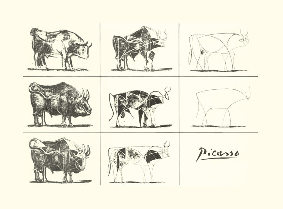
Figure 9.12: Picasso’s bull series.
Apple in fact instills this value as part of its suite of internal training courses, using Pablo Picasso’s example of how to reveal the essence of a drawn composition. In an interesting parallel to my previous example of the letter A, Picasso’s example shows how a conventional rendering of a bull can be sequentially simplified to a set of simple lines, retaining and amplifying the underlying form and energy of the source image. Apple applies the lesson not only to the design of their products but to processes and communication in general.
 Author/Copyright holder: Wmpearl. Copyright terms and licence: Fair Use.
Figure 9.13: Another example from Matisse.
The examples are not to argue that the simpler versions are somehow better than the more realistic ones, but rather that they differ in their intent, which is to convey only the most iconic structural aspects of a subject, or only those aspects that the artist wishes to accentuate. This technique allows the artist to convey the most intended meaning in the most efficient and direct way. In the best cases, the resulting abstract forms convey the subject’s structural or emotional essence beyond what is possible with a more literal representation. In Matisse’s example, if he was trying to convey how the subject is particularly simple and sturdy, what better way than to render it in rustic bronze, embedded in a wall for concreteness, and remove every detail not in direct support of this intent? This approach is in fact the process for eliminating excess chartjunk, decoration, and skeuo.
The infamous Terror-Alert Status is the US Government’s similar attempt to simplify something as large and complex as national security into five discrete levels, indicated by color, word, and interpretation (Yellow: Elevated: Significant Risk of Terrorist Attacks). What it lacks is the relative change of attack odds between the semantic descriptors Significant, High, and Severe for example . The terms and descriptions are not clearly scalar, as is the system of S, M, L, XL. In the spirit of transparency, however, we cannot blame them for trying.
In my visual analytic design project, the key task would be to choose the most useful pieces of the visual analytic landscape, and then find a way to allow these to provide enough value for a basic, practical, and sustainable consumption experience. As in all design, the effort would involve defining constraints and then working within them. Any solution simple enough to approach the goal would require synchronized effort across multiple product architecture tiers, the products themselves, release cycles, organizations, and development centers worldwide.

Figure 9.14: Terror-Alert chart.
Understandably, there was simply no single pressure point, no person or group able to pull off what was needed, as such entities are only created once the organization recognizes the need and opportunity of a certain product or solution. Creating such entities is hard. It involves taking resources from other teams, away from previously-approved and perennially unfinished projects, led by people who are in their roles often because they proposed their projects in the first place. The agenda of these people is to resist changing the current plan because the plan, whether it was their idea or not, is likely benefitting their career. With the exception of the rare few who recognize and acknowledge that the best idea might come from elsewhere, and who pursue the incubation of long-term product-based quality and success as their career strategy, people tend to make decisions according to their self-interested and short-term agenda.
While we might imagine that validated long-term business success is what drives these motivations, business accountability and cause/effect relationships become obscured in large and complex organizations like SAP. Products in such environments can succeed or fail due to a number of uncontrollable and sometimes unknown factors. Frequent management re-organizations sever ties to long-term goals and colleague relationships, reducing the incentive to pursue sustainable management practices. In contrast to this fog of business, an individual’s title, budget, group size, and management visibility are relatively distinct sources of prestige. Anyone possessing them does so because they succeeded in the circumstances of some previous system state, and thus have a vested interest in maintaining the status quo.
It’s almost a Zen koan: Companies seeking change promote people that are subconsciously motivated to keep things the same. Military historians say that armies in conflict are always re-fighting the previous war. Using the intervening down times to refine failed tactics and weapons from the previous conflict, they enter new conflicts only to be surprised that the rules for war have changed. Britain disastrously attacked machine guns with cavalry in WWI, France built a long static defensive line that was merely outflanked in WWII, and the US believed that overwhelming yet restrained firepower would counter a determined guerilla insurgency in Vietnam.
A major aspect of this phenomena is the famous “not invented here” mentality, and we definitely encountered it. At large companies like SAP, with complex and diffuse products, sales channels, release cycles, customer installations, and implementation teams, it’s hard to trace individual decisions directly to identifiable company benefits. What drives many people in these companies is the acquisition of power and resources in the form of budgets and people to manage. The major game is to convince executives that you have the answer to what ails the company, and that if given adequate resources, you can fix it. To do so, one needs to appear to have a plan, the more specific the better, and to have ultimate confidence that it will succeed. What the plan’s owner needs is the time and resources to prove they are right. Although goals typically involve acquiring more and happier customers, the connection to customers in such companies is long, muddled, and tenuous. It is difficult to prove that individual initiative, a controversial decision, or a risky political position was the cause for anything good (or bad) happening to the outcomes that matter most. Large companies can often find themselves locked into partisan political positions, much like today’s congress in Washington.
If you are in a position of power, it’s often safer to do what you are told, maintain the status quo, and blame outside forces when things go wrong. When promising ideas from elsewhere deviate from this plan, whether from within the company or not, they are often seen as a political and reputational threat, and thus resisted. The first reaction is often “why are you working on that? It’s my team’s responsibility” or “thanks, but our product already does this”. This pressure is exacerbated by the often fuzzy boundaries between roles and disciplines in any big company, and made worse still by the constant management re-organizations at SAP. The UX discipline was a hot potato of sorts throughout my tenure at BOBJ and SAP. During my ten-year stint I had ten different managers. All but the last two have left the company, or been laid off or fired. Despite my efforts at self-determination, I and my teams were tossed among a variety of functional organizations ranging from engineering, operations, product management, quality assurance, centralized UX, office of the CTO, decentralized UX, and customer engagement.
These observations may sound like either naïve, pop office politics that are blatantly obvious to any ambitious person having spent time in organizations, or the cynical ramblings of a designer recalling events from waters way over his head. While there is probably some truth to both of these assessments, I think it’s relevant to the discussion of innovation and change. What may sound like a great liberating idea to its creator can be perceived as a terrible threat to others. It’s important for designers to consider the likely winners and losers created if their designs are realized, and tune their strategy and messaging accordingly. And, of course, designers ourselves are all subject to the same forces of backward-facing complacency. While the design profession has an ethos for free-thinking innovation that takes nothing for granted, the effort to maintain this perspective is difficult. This is a big reason why innovative design roles are often not permanently attached to their client businesses, but rather employed in a temporary consulting role. The fear of having to carry out ambitious recommendations can prevent their being made in the first place.
Unless a neutral higher manager sees a good idea and pulls rank on her threatened underlings, many ideas die in this way. Having read The Innovator’s Dilemma, I came to realize that we were living through our own version of the famous theory, and had not yet even encountered its lynchpin. Even if an innovative product is developed and marketed, it needs to be incubated and supported through the gauntlet of lower operational profit margins and higher risk. Doing so, according to Christensen, almost always requires forming a distinct business and political organization separate from the parent company, with its own goals, culture, and even location. I had several people tell me “I love your work, but I have no idea how SAP ever would, or could, do it”. We tried anyway.
I did find an ally in, of all places, SAP’s Analytics Product Marketing group. Marketing can be the bane of any product development effort that is focused on making things simpler, subtler, systematic, consistent, or aimed at long-term product improvement. Historically, these groups tend to favor ideas that are sensorially dramatic, specific, involve discreet figures and feature lists, and those that can be captured in sound-bite phrases. Product Marketing Manager Anita Gibbings, however, became a passionate supporter of LAVA and its potential. Despite the difficulty of talking about LAVA coherently within the attention span of the marketing world – by comparison it’s taken me an entire book to explain it – she quickly attracted interest from the media and spread the word internally, resulting in press stories and a suite of public-facing LAVA demonstration dashboard examples. All of this eventually led to customer workshops led by SAP consultants to teach the new method. In a ridiculous case of “messenger” – the game where one person whispers a phrase to another and the phrase is passed silently from person to person, and then back to the original speaker to see how it was distorted along the way – a Swiss news website, through translations and confusion, reported that LAVA had been invented by SAP founder and chairman Hasso Plattner himself.
While the subtleties of a design language may or may not be possible to accurately convey to the popular press, it was exactly the sort of non-product-specific, but yet specific and actionable, direction that was needed throughout the company. Regardless of this wide appeal and support, functional progress was difficult. You may have heard the notion that most innovation happens in the empty spaces between existing entities, whether they be fields of study, products, work roles, etc. What we were trying to do straddled almost every imaginable company and product entity across multiple dimensions, targeting in effect a “no-man’s land” between the traditional functional, product line, and organizational divisions of the industry.
First of all, for LAVA to work, it needed a coordinated effort across several layers of system architecture. Many BI systems work by taking data from a database layer (1), extracting it and structuring it for consumption – the provisioning – in another layer (2), working with it in an authoring or composition application (3), which uses a library of pre-configured chart templates (4), that is then deployed to consumers in a dashboard, report, or application via a device-based client such as an enterprise portal or runtime viewer (5). Although LAVA did not necessarily call for any special database or provisioning treatment, it directly impacted everything else in the technology stack.
This chapter’s links to videos and PDF files convey LAVA’s essence as it was popularized within SAP and to its customers. If you cannot access these, LAVA’s static text/image descriptions appear in chapters 10-15.
9.0.1 Media Assets
L9.1 | LAVA Concept: Budget Overrun (video) |
https://www.interaction-design.org/literature/book/bringing-numbers-to-life/assets
This video demonstrates is a budget management application concept using basic LAVA principles. Led by Jerome Monteu Nana, it was the first interactive LAVA prototype, and won the award for the most usable app at SAP’s Sapphire user conference.
L9.2 | LAVA Board: Sustainability (video) |
https://www.interaction-design.org/literature/book/bringing-numbers-to-life/assets
This was the first comprehensive mockup of the LAVA experience. Sponsored by Steve Kopp and based on a use case provided by BOBJ’s internal reporting group – although with hypothetical numbers – this demo drove the dissemination of LAVA’s potential throughout the company and its customers. It exhibits an interim design state for Points and the Lattice, and uses the tablet form factor as a midway scale between larger and smaller screen sizes. Kopp’s research team, with Christophe Favart, later built a working version called Panorama.
L9.3 | LAVA Board: Sustainability (pdf) |
https://www.interaction-design.org/literature/book/bringing-numbers-to-life/assets
This is the content in L9.1, presented in paginated pdf form.
L9.4 | LAVA Board: CFO (video) |
https://www.interaction-design.org/literature/book/bringing-numbers-to-life/assets
This is a mockup done for SAP’s internal financial reporting group of Helen Poitevin, Benjamin Kayser, Felix Schoettle, Jurgen Habermeier, and Nadin Eberlein. Again with hypothetical data, it shows SAP’s financial rollup structure and how its data can be navigated via a LAVA Board.
L9.5 | LAVA Board: CFO (pdf) |
https://www.interaction-design.org/literature/book/bringing-numbers-to-life/assets
This is the content of L9.4 presented in paginated pdf form.
L9.6 | LAVA Lattice: China Telecom (video) |
https://www.interaction-design.org/literature/book/bringing-numbers-to-life/assets
This was the first interactive prototype of the Lattice, built by a team in Shanghai as a concept for China Telecom, with realistic but hypothetical data. Led by designer Clare Xie, we used this for our 20 usability tests in the US and Europe. We only had the development team for a short time, so we were never able to evolve the design based on test feedback. For example, we put a lot of effort into horizontal Strip sorting – although a powerful feature, not one of the basic use cases.
L9.7 | LAVA Lattice: China Telecom (interactive prototype) |
https://www.interaction-design.org/literature/book/bringing-numbers-to-life/assets
This is the app shown in L9.6, in interactive form for you to play with. Beware, it is buggy, browser-sensitive (Google Chrome is best), and prefers a certain browser width. Only the Lattice, at the bottom, is fully functional. The Gallery and Points at the top are not.
L9.8 | LAVA Dashboard Demo: VP of Sales (interactive prototype) |
https://www.interaction-design.org/literature/book/bringing-numbers-to-life/assets
This is a sample design provided to showcase how LAVA could be used in SAP’s Dashboards product (formerly Xcelsius). This was a forced marriage, as Dashboards is not well suited to the LAVA model. There are no Lattices here, but you can get a sense of Board navigation, and the nifty interactive sales pipeline modeler. Project was led by Anita Gibbings.
9.0.2 References
9.1 | The Paradox of Choice: Why More Is Less (book) | | Harper Perennial
9.2 | Visuelle BI-Designer von SAP und Oracle (web) | |
http://www.computerworld.ch/news/software/artikel/...
9.3 | Why Horst W.J. Rittel Matters (article) | | Design Issues: Volume 22, Number 4 Autumn 2006
