Our business, technical, and cultural landscapes are a sea of drifting icebergs, driven by unseen forces into temporary arrangements of threats and opportunities. Icebergs can temporarily align to form a path to success, but then quickly drift apart.
- Andrew Toal, business strategist
A big reason why I’ve pursued the visual analytics topic so aggressively in the past few years is the scale and pace of technological change affecting the industry. When such disruption is occurring, interesting things happen. Barriers are removed, new problems appear, investment is made, and opportunities appear for those able to use their imagination to see patterns and projections, and ways to combine these into value. Let’s take a quick look at the current technical, business, and societal trends impacting visual analytics, as they are the enablers of the next generation of visual analytic innovations.
4.0.1 Market Forces Disrupting Visual Analytics
- Quantity & Access. The overall trend of increased access to and use of information of all types via the Web and cellular networks, and the increasing quantity of data and number of data and metadata sources, including individuals and automated reporting sensors embedded in our environment. The Big Data meme.
- Performance. The accelerated performance of analytic processing using in-memory columnar data stores like SAP’s Hana, and distributed databases.
- Literacy. Growing interest, awareness, and literacy in the basics of quantitative visualization, especially from the work and writings of Edward Tufte and Stephen Few.
- Rendering. The fluid graphic and animation capabilities of the HTML5 and D.3 rendering technologies.
- Mobile. The influence of mobile, small-format devices upon people’s reliance on data and the data’s coherent presentation across device sizes.
- Closed Loop. The potential for visual analytics to be used as an input device for so-called “closed loop” transactional data editing.
- Cloud Computing. BI feature bloat and complexity open up the market’s low-end for simpler solutions.
- Relevance. Self-service, personalized, and social means of increasing content relevance.
4.0.2 Quantity & Access
More and more quantitative information from more sources is available and more easily accessible to organizations and individuals. If made convenient, affordable, and understandable, why wouldn’t people want to use this content? Representing the most obvious use case for popular analytics, personal finance management provider Mint.com and similar services from major banks provide automated aggregation of account data from almost any personal wealth source. Soon we will have similar access to our health metrics, food contents, behavior and location tracking, and all sorts of other content that is less overtly quantitative but still measureable and relevant. Once people know that they can know this stuff, they will seek to do so if convenient.
The mixing of data from multiple sources and providers into one application – a key part of the “mash-up” phenomenon – makes diverse data access even easier. Regardless of source or format, data are now seen as creative raw material available on the open market, and able to be combined within applications to create new perspectives and discover new patterns and relationships.
The who, what, where & when information – I call this “objective” information – plus a profusion of opinion and sentiment as to the how, why, & meaning of everyday life – the “subjective” information – continues to be written into now-digital storage in ever-increasing detail. While the creation rate of both is increasing, objective data creation is far exceeding subjective data because it is, literally, increasingly automated. Interestingly, even the most personal and nuanced subjective expressions are being objectified into quantifiable terms such as “sentiment” scores. To the dismay of Jaron Lanier in his book You are not a Gadget, due to the use of our inherently binary/quantitative digital tools to mediate human expression, even much of our subjective information is now silently collected and expressed in quantitative terms. Lanier’s examples range from the categorical declarations of sexual preference on Facebook to the fine-grained but nonetheless inherently binary digitization of musical sound. Basically, if information is passing through a computer system, it means that somebody cares enough about the content to do so, and that this information can eventually be quantitatively analyzed and synthesized into something worth the effort.
Historically, the overwhelming majority of quantitative data being recorded and analyzed has been in support of business or science. Because the ability to collect and store data has outrun the ability to use it effectively in decision-making, organizations have been stockpiling unanalyzed data, with the expectation that in the future it might end up being useful. Due to the dropping cost and improved capability of quantitative data analysis, older data can be made useful as historical reference to similar, fresh data being gathered today. As new ways of structuring, organizing, and displaying this data are available at lower cost, what once seemed useless trivia can be referenced on a mass scale to see valuable activity patterns. The air temperature in Berkeley is relevant to all it’s residents. The temperature of my oven is not.
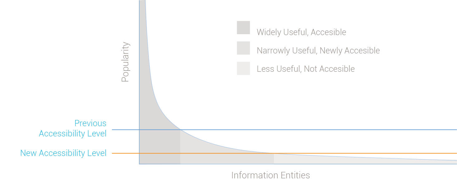
Figure 4.1: Enterprise information’s long tail of relevance
Upon examination, enterprise information begins to exhibit the properties of a long tail. Based on Chris Anderson’s book of the same title, the long tail concept was recently popularized as a way to explain how the Internet’s low distribution costs have made obscure products, in particular media products but also items made available through websites such as Ebay, more accessible (accessible in the general sense versus the “handicapped accessible” sense) and affordable to their niche consumer audiences, while still being profitable for their producers. The increasing variety of products thus made available has been compared to how a receding tide gradually reveals more and more land.
The general business insight of the long tail concept is that although producers can sell only small volumes of individual niche products in the tail, the aggregate sales volume of these products forms a sizable percentage of overall sales. Because the Internet has lowered the costs to sell products in the “tail” to near the costs of those in the “head,” they can now be sold at similar price points and margins.
The long tail effect first appeared in markets with products of homogenous form and that are easily sold online, such as books and music. Similar changes are occurring in the enterprise information world, but more gradually due to its more complex and fragmented landscape. Although enterprises don’t literally “sell” data to their users, their situation is similar in that delivering enterprise data has costs, different data have different demands, and the enterprise has an interest in increasing consumption as long as it boosts productivity.
BI has made popular, widely applicable business information generally accessible and easily consumable. It continues to lower the acquisition cost of more obscure information, previously unattainable due to lack of interest, format / technical compatibility, organization, “findability”, or lack of computing power. Popular information entities, such as employee contact info, sales reports, or analyst reports, reside in the head of the graph, or the area under the curve to the left. They have been made relatively accessible because the costs of doing so can be spread across the large audience that finds them relevant. Less popular entities exist in the long tail to the right of the graph. Much of this is private enterprise transactional data, but it also contains obscure public or commercial information, social chatter, and other content. This content can be of value to someone somewhere, but the costs have always been too high to unlock its value. This “business exhaust” has been easy to stockpile, but simply too hard to expose, find, organize, and apply. One goal of today’s big data movement is to mine this data in search of relevant information.
Beyond the fact that enterprise data, technologies, and ownership are highly fragmented and diverse, for enterprise data to be useful it must be made relevant in decision-making contexts. If this is realized, the inevitable outcome could be that all relevant information – facts, advice, and opinions – will become equally accessible technically to any information worker that needs it. And as is the case with e-commerce, information in the tail could end up providing value to workers. For example, my phone could show my oven’s pre-heating status. For this to be realized, the challenge of information providers will shift from providing reliable, accurate, comprehensive, and timely information to that of better enabling workers themselves to find and use what is relevant, thus freeing them to focus on the predominant value of information workers – their ability to create information of higher competitive value – in the form of decisions, content, specifications, state changes, etc. I use “information” in the broadest sense here, including information that is “locked” within physical forms. For example, the DNA and configuration of our bodies and minds are information, as are the properties of an actual commercial product, as well as its specifications and process of manufacture. Designer Jay Doblin referred to products of all types as “frozen information”.
An obvious opportunity is to provide information that is in high demand, but only to small audiences at key points in time. As an example, a sales rep evaluating an enterprise prospect is of course curious about the prospect’s size, locations, market position, and other fundamentals, and can easily find this information. But so can his competitors. The rep could gain advantage by knowing if he can leverage any history his company may have with the prospect. Has my company sold to this prospect before? Who worked on the deal? What was the result? Who was the contact? To help close a deal, such information could be very valuable, but only to the sales rep, his team, and his competitors. If such information exists, it is likely recorded in a database or report, and perhaps in the memory of current or former employees.
In industry, machinery and devices with sensors and monitors produce ever-more detailed status accounts of their activity and health. The book and film Moneyball tell the true story of how an underdog baseball manager – in nearby Oakland, CA – built a successful team of lower-cost players by analyzing their performance/salary ratios. Individuals can now track and analyze their finances, utility usage, and health/behavior metrics in great detail with relatively little effort. Management and lifestyle decisions – at one time informed merely by collective personal memory, anecdotal evidence, or gut feel – now benefit from increasing levels of statistically relevant awareness. But of course simply collecting quantitative information is of little use unless it is accessible when and where we need it, understandable, relevant to what is important to us, actionable, and affordable.
I often tell people that designing displays for big data is just like designing for small data, only with bigger numbers. I don’t think the amount of data behind an analysis, whether it’s measured in the number of database rows, variety of data sources or types, or the degree of structure or lack thereof in the data, has much effect on the visualization design. After all, regardless of how much data is behind a visual display, people still have a limited bandwidth of visual field, visual acuity, and ability to cognitively process visual content.
On the other hand, I’m beginning to respect Josef Stalin’s quantity/quality quote, given in reference to his massive WWII Soviet army. The reference is not to “quantity” in the sense of quantitative in nature but rather in the sense of sheer volume, as in the “quantity of quantitative data”. The ability to combine and analyze big data can bring greater validity and the potential to see patterns and relationships previously not possible, particularly regarding predictions and cause / effect relationships. Showing the relationships among a set of entities – in other words, their context – is what the spatial metaphors made possible by visualization are particularly good at. I’m not convinced that these big data factors call for new graphical visualization forms, versus slight variations on existing ones or the ones I propose in LAVA, but having such a broad and rich source of raw material for analysis will have an effect on the overall experience and usage potential.
One example is the connection between big data and so-called predictive analytics. As the name suggests, predictive efforts seek to anticipate outcomes and suggest causes for things, and are thus inherently imprecise or “fuzzy”. To accurately convey these messages in graphic displays, I foresee a more sophisticated depiction of probabilities and contingencies to contrast the analytic convention of highly precise, discreet, confident values. In Malcolm Gladwell’s book Outliers, he proposes that the fundamentally simpler and more logical wording of number systems in Asian languages, especially Chinese, contributes to accelerated learning and overall proclivity of math skills in these cultures. With the associated higher volume of visual analytic data consumption, even small improvements in efficiency and comprehension will have a noticeable impact, and become practical to implement, due to greater economies of scale.
Improvements to visual analytic practice at a similarly basic level can, with broad use, similarly improve general literacy for quantitative data. While we all endure the standard QWERTY keyboard layout – despite its intentionally non-ergonomic design intended to prevent jams in early mechanical keyboards – we have the opportunity to avoid the irreversible ensconcement of obsolete visual analytic practices within the emerging digital arena.
4.0.3 Performance
The negative effects on a user’s attention of even slight delays in computer response time are well documented, and those resulting from analytic queries and calculations are unpredictable and can be quite long. I’ve found that for a while, the wishes of end users and the visions of designers have far outrun the ability of information systems to keep up. This is now changing, and quickly. The marketing tag being used for this trend is “computation at the speed of thought”.
My first and most dramatic lesson of how system performance impacts product design occurred in the late 1990s working for the SABRE Travel Information Network while employed at the information design boutique Aaron Marcus & Associates. SABRE at the time was the world’s largest private transactional network, used by over 40% of travel agents globally. Still providing the information infrastructure behind much of the world travel, SABRE records the takeoff and landing of every commercial flight in the world in real time via a transmitter in the aircraft’s landing gear, supported by one of the world’s largest relational databases. When you see or hear a travel agent or airport ticket vendor furiously typing obscure commands into a display terminal, odds are good that they are using SABRE.
The company introduced its Planet SABRE product in 1997. With a fully graphical user interface designed to run on the Windows 95 platform, it was an ambitious project representing a major usability upgrade from the command-line products used by travel agents at the time. Difficult to appreciate by today’s standards, Planet SABRE brought data from two different databases into a single view, and was innovative for its ability to display fare prices alongside flight schedules. The challenge to wean travel agents away from their beloved command-line interface, however, would be hard. Previous usability tests where SABRE users had first confronted WIMP (Windows, Icons, Menus, Pointer) UIs often featured confusion, including test subjects rolling the mouse directly on the video monitor screen, or thinking it belonged on the floor, to operate like the foot pedals on sewing machines.
The user interface of Planet SABRE achieved the company’s highest usability test ratings ever. But as Planet SABRE’s lead designer, I learned that great product design ideas could be ruined by poor system performance and derailed by market disruptions. Despite the usability benefits of a combined fare/schedule display, Planet SABRE’s multi-source query performance was still slower than agents doing two queries by hand on separate databases, and the product never caught on. Planet SABRE’s visionaries left the company to build the consumer brand Orbitz around a higher-speed query solution, helping to massively disrupt the travel agency business model.
When designing for BusinessObjects’ product WebIntelligence – or WebI – in the 2000s, we encountered similar performance-based barriers to wider user adoption of our product. An important way to attract new users to your product is to encourage potential new users to try it themselves and experiment. However, WebI beginners could bring the product to its knees by entering large, difficult, and iterative queries that consumed its limited calculation, retrieval, and bandwidth capabilities. To limit such slowdowns, customers resorted to limiting WebI access to their highly trained analysts. Increasing WebI usage through a more forgiving user interface would have simply degraded the collective user experience of the customer’s entire system. With the incentive to expand the user base removed, WebI’s attention remained focused on evolutionary feature upgrades.
Finally, the concept of batch processing has changed to one of live, real-time computing and feedback, occurring more and more at great scale. Originally demonstrated visually by Ben Shneiderman in prototypes like Spotfire, dynamic querying allows more rapid and immediate queries and screen/data refreshes, thus moving away from “batch query definition” where a UI places a bunch of query controls in one place on the screen with a big [Search] button below. Although preferred by system architects as a more elegant use of bandwidth and computing power, such interfaces make it harder for users to see the direct impact on results from any one of the manipulated controls. The more iterative, back-and-forth protocol with the data that is now possible permits filters and controls to be manipulated independently and with immediately visible results, and thus able to be placed close to where their immediate impact is shown in the UI. This will be demonstrated later by LAVA’s Lattice component.
4.0.4 Literacy
Being now awash in numbers, it’s hard not to begin paying more attention and to try to make sense out of them. I need only point to Nate Silver’s visualization and predictive analytics work, particularly his popular Fivethirtyeight feature with the New York Times and now with ESPN, as proof that the demand for sophisticated, graphical, and exquisitely crafted statistical content is growing. I refer to the movement at Statpop.
Several authors and practitioners have continued in Playfair’s role of evangelist for visual analytics, the first being Jacques Bertin and his book Semiology of Graphics from 1967, followed by Richard Saul Wurman, Edward Tufte, professor Ben Shneiderman, and more recently the work of Stephen Few. I refer to their work as the BtF, for Bertin to Few, lineage, and as a group they have elaborated upon and improved the state-of-the-art practice of visual analytics, and honed ever-more-refined arguments for its relevance. Shneiderman’s HCIL research lab at the University of Maryland has been a leading academic contributor to the area of computer-mediated, interactive data analysis.
The BtF lineage has collected, cataloged, packaged, explained, and popularized the best practices of visual analytics through its books, lectures, and research. I refer to this body of work collectively as a baseline of sorts. The common thread leading back to Playfair is the emphasis on integrity, accuracy, clarity, practicality, simplicity, relevance, function, and general pursuit of the unbiased, honest truth. Intentional distortion of data for commercial or political ends, attention-getting efforts to embellish charts with pictures or meaningless graphical effects, and honestly ignorant miscommunication of facts through poor craftsmanship or sloppy thinking, are the evils this lineage has sought to stamp out. It’s a convincing train of thought and is having a strong positive effect.
Jacques Bertin, based on his experience as a cartographer, emphasized the importance of the two-dimensional grid plane as a vehicle for presenting graphical measures in a variety of forms. His work represents the first and widest effort to provide a theoretical foundation to visual analytics.
Richard Saul Wurman coined the notions of “information design” and “information architect” in the 1980s to represent a design role for those engaged in what he called “The Understanding Business” – a combination of graphic design, statistics, ergonomics, wayfinding, and overall rational sense-making with printed media. He carried out this vision through his consulting company and via Access Press, publisher of a line of innovative travel guidebooks and other graphic explanatory manuals. The body of original work produced through his efforts was quite innovative and influential. For me, Wurman’s gift that keeps on giving is his claim that there are only five ways to organize anything:
- By Size (large to small & vice versa)
- By Time (sooner or later)
- By Location (here versus there)
- By Type (according to attribute categories, like male or female)
- Alphabetically (virtually arbitrary)
OK, category 4 is sort of a wildcard that represents a huge variety of ways to organize things, and 5 is somewhat trivial. But the other three represent structurally unique and universal ways to make sense of things. These are the five pillars of information analysis. Wurman is perhaps most famous for founding the well-known TED conferences and talks.
Edward Tufte has achieved legendary status as the popular figurehead of the movement. The Visual Display of Quantitative Information was the first book I bought in graduate school at RISD, and it remains for me the most influential. In this and his three subsequent books, Tufte demonstrates how quantitative graphics can be used to mislead, and the positive effects of minimizing the printed areas of the page – the “data ink” – to the minimum amount needed to communicate the raw data. The latter is achieved by removing “chartjunk” – unnecessary lines, words, borders, images, and effects like shading, 3D simulations, and textures. Thanks in large part to his persuasive workshops and books of exquisite design and production, we now enjoy a vastly improved general standard of visual analytic craft in print and online.
Ben Shneiderman and the HCIL have produced a steady stream of innovative visual analytics innovation now in wide use today, such as the treemap chart type, dynamic display filtering with graphical sliders, and the overall approach of direct manipulation of digital analytic content. Direct manipulation interfaces let you manipulate UI content and controls by, for example, clicking and then dragging or resizing them, versus by typing your instructions or selecting them from options in a remote menu. As a computer scientist, he and his lab go beyond the teaching and using of known best practices by imagining and engineering working proofs-of-concept. Spotfire, a highly innovative visual analytics product, came from his lab. His namesake catchphrase “Shneiderman’s Mantra” conveniently summarizes the essence of top-down, quantitative visual analysis with the workflow prescription of “overview, zoom & filter, and details on demand”.
Stephen Few has taken Tufte’s inspirational work to further levels of detail and completeness. He begins to address interactive visual analysis and ideas for summary displays of organization performance data via digital dashboards. Few is credited with inventing the highly useful bullet graph, and outlines the practical business benefits of quantitative awareness and analysis.
These industry leaders are of course not the only ones actively working to advance the field, but are I believe are the most influential, at least to me in my career. For me, while working as a graphic and product design practitioner for the past 25 years, the BtF lineage has been enormously helpful. Their efforts, in Tufte’s case initially self-funded at considerable financial risk, have served to collect, interpret, advance, and provide a face to an important but otherwise obscure and nameless body of knowledge. It has applied the best aspects of modern minimalist design discipline to a subject for which it is a perfect fit. Tufte and Few make great sport in calling out the silliness of distracting, misleading, and poor quality examples in their publications and lectures.
The BtF lineage has served as both driver and beneficiary of the overall visual analytic trend. Tufte in particular has managed to will into existence an enthusiastic audience that is interested in and sensitive to logic and clarity in graphic information presentations. The success of these visionaries is evidence of a desire in people to better understand the world of logic and numbers, and do so with a style and elegance bred of function and efficiency.
Having this work already completed has allowed visual analytic designers to focus on its application to real-world projects. Having its values so broadly and deeply disseminated into the technology and business communities has served to pre-establish credibility for the work of like-minded designers when presented to clients and collaborators. Thanks to BtF, I now rarely need to spend time defending the use of known best practices. In general, the publishing and software industries have internalized the values of clean, minimalist, honest presentation of data, and are free to proceed with the hard work of applying them to specific products and services. This is a real achievement given the amount of ridiculous chartjunk surrounding us even ten years ago. Despite this progress, there still exists the temptation to pursue seemingly quick fixes or fads to make numbers seem more compelling. And for all that the BtF legacy has taught us, it has not really made the jump to the digital medium and its associated business opportunities and constraints.
Also, in the success of authors like Malcolm Gladwell, the Freakonomics brand, and my personal favorite, sociobiologist Stephen Pinker, we see quantitatively-driven examinations of common topics making it into the mainstream consciousness. Their data-driven approach, while not devoid of criticism or potential error, would not be possible without the underlying data collection and analysis used to reach its conclusions. Legendary entomologist E.O. Wilson’s book Consilience forecasts a gradual quantification and unification of the humanities under more measurable scientific terms. Despite what might sound like a threatening power grab, the book was in fact recommended my father, a retired – and notoriously open-minded – humanities professor and university administrator. Such work is not new, but perhaps now has greater popular credibility because of its increasing basis in quantitative facts.
For those of you starved for any sign of optimism in the world, Pinker’s latest book The Better Angels of our Nature: Why Violence has Declined uses a rigorous quantitative approach to argue that, despite today’s gruesomely recorded bombings and beheadings, global literacy and communication has in fact been the main driver in the steady reduction of the statistical occurrence of violence of all kinds throughout recorded history. Assuming that his research and numbers are valid, it’s a brilliant example of statistical journalism at the most thorough and ambitious scale.
4.0.5 Rendering
The expressiveness, responsiveness, and fluidity of today’s visualization rendering technologies allow the design of much more elegant, functional, and intuitive graphical stories and models. What started in the 1990s with Adobe’s Flash authoring tool evolved into a number of open-source tools for creating richly interactive visuals. While Flash was used initially to create annoyingly animated banner ads, it evolved into a custom environment for the authoring of engaging, interactive two-dimensional screen spaces for applications, Websites, games, and narrative stories. However, being proprietary and developed for a less-mature generation of the Web, it has lost favor, accelerated by Steve Job’s fiat forbidding its use on Apple mobile devices.
It begins with the brute force technical rendering abilities of the newer Graphics Processing Units, or GPUs. First made widely made available in Apple’s OSX in 2001, their high fidelity, fast refresh rate, and representational shadowing and reflective effects were very dramatic. These are more pronounced when seen on the newer device screens and their steadily-increasing fidelity. When Microsoft released their me-too response to OSX in the form of Windows Vista in 2006, several colleagues declared that this created a huge user experience opportunity for visual analytics. When pressed for why, they pointed to the high-fidelity rendering capabilities that enabled visual elements to have 3D effects and animation, but with no thought for how these capabilities could affect usability and comprehension.
These high-fidelity rendering techniques are like special effects in movies. They can make a good movie better and more convincing, but they cannot save a movie that is badly written, acted, or directed. While it’s hard to imagine how it could exist without advanced CGI technology, The Lord of the Rings movie adaptations succeed due to the combination of special effects with a great story, screenplay and acting. By comparison, the later Star Wars movies, in particular Attack of the Clones, have been panned as shallow and stiff, sublimating good movie-making for special effect demonstrations and the styling of revenue-generating characters, costumes, and fantasy products. Good content can survive without elaborate special effects. The wildly popular game Minecraft succeeds despite its relatively crude 3D graphic rendering, due to the compelling nature of its content, behaviors, and game dynamics. Once we understand the true potential of our more powerful presentation capabilities, we will begin to see equivalent achievements with visual analytics.
However, lacking any clear paths to improvements for equivalent attributes in business intelligence, the desire to shift attention to cosmetic issues as evidence of product improvement is understandable, but of course short-sighted. Xcelsius applied surface-level special effects to visual analytics, a major reason for its acquisition by BOBJ in 2007.
Scalable Vector Graphics, or SVG, is a software standard for computer display rendering, in development since 1999. Graphics rendered with vectors, versus the alternative bitmap method, are smoother, occupy less data storage space and transfer bandwidth, and are of course scalable, meaning that they can be enlarged and reduced in display size without degradation of quality. Visual analytics rendered with SVG are much more responsive to various screen sizes, devices, and manipulation by end users as a part of their exploratory analysis.
Cascading Style Sheets v.3, or CSS3, enable much greater visual control of how web content renders within a browser. Effects like rounded corners, shadows, animations and transitions are easier to produce and replicate across different browsers, and can be downloaded faster.
D.3 is a javascript software library for the easier creation of more powerful and dynamic graphic visualizations within browsers. D.3 occupies a critical process middle ground between data and the visualization type, and leverages SVG, JavaScript, HTML5, and CSS3 standards.
HTML5 ties much of this technology soup together. HTML5 allows device-level versus server-level rendering and interaction, enabling a much more flexible and responsive user experience for any product front-end. Again, much of the benefit is based on reduced upload/download time associated with communicating with a server, and the reduced need for specialized plug-ins and device-specific development for product front-ends.
Finally, I refer to the overall concept of the “mashup”. Enabled by new open standards, the content and services from multiple sources, technologies, and owners are now more easily combined into a unified experience. Interactive and refreshable visual analytics can now be embedded within more digital experiences. Animated and manipulable content are changing the underlying metaphor of visual analytics from that of an isolated, static, fixed-size chart into that of a dynamic model or a broader interactive environment.
GPUs, SVG, CSS, and HTML5 are broad standards, and the basis for the improved visual and interactive richness of all broadly distributed digital content. For visual analytics, due to its highly visual content, the need for precise spatial rendering of graphic imagery, and the strong desire for end-user manipulation, the results can be particularly dramatic, especially when combined with the specialized D.3 toolset. The results are improving and are moving beyond the phase of featuring merely distracting special effects. The New York Times produces engaging and informative custom interactive information graphics on a variety of topics. Crowd-sourced showcases like visual.ly and IBM’s ManyEyes serve as an outlet for quantitative expressions and innovative design and storytelling with information graphics. These and other impressive examples, however, are relatively isolated artisanal artifacts. They don’t represent systematic advances to the state of the art.
4.0.6 Mobile
Mobile devices have transformed the conventions of digital product design, much like Web browsers did in the late 1990s. In both cases, product design constraints introduced by new distribution channels forced the simplification of content and its manipulation. In the case of the web browser, slow load times and a page-based architecture forced otherwise fluid and dense desktop-software conventions into independent, bite-sized pieces able to fit on a web page and load within a reasonable time. The benefits were enormous new audiences and dramatically lower distribution and maintenance costs. Some design responses to these new constraints, such as the “back” button, found their way into desktop software in a positive way.
Mobile computing further extends the audience reach of digital products, at the cost of design constraints that include small screen sizes, crude input conventions, and limited local data storage and computing power. The use of similar simplification techniques to that of the browser revolution, plus the touchscreen and gesture as an input paradigm, have resulted in functional mobile applications. The remaining challenge – one continued from that of products offered in both desktop and Web versions – is to coordinate the product experience across devices so as to be coherent to users. This includes outright product feature degradation for smaller devices, but also the transformation of how content is presented and manipulated so that, as with the browser’s back button, innovations forced by the constraints of mobile devices end up disrupting, transforming, and improving the design of Web and even desktop products.
Visual analytic design is constantly dealing with issues of presentation scale and the legibility of content where text and images are closely interrelated in the display. With the additional constraints imposed by large data volumes, calculation times, and latency, mobile devices pose a difficult challenge for visual analytic products. While they provide a deployment capability for widespread visual analytic consumption, the demands of cross-device coherence are driving the simplification of both the mobile user experience and the large-screen experience as well. As with the Web and general mobile design examples, this will surely result in some improved design conventions across all devices.
4.0.7 Closed-loop
This topic has been somewhat of a holy grail in the BI industry for quite a while. If to take action in life and business is to execute on decisions, then the closed loop or “writeback” scenario is about either bringing the action to the analytics, or bringing the analytics to the action. Writeback is the capability for end users to recognize something actionable in a report or dashboard, in isolation or in the context of a workflow application, and be able to edit the data and/or record a business transaction – like shift a budget or approve a supplier contract – directly from the visualized content presentation. This is a frustratingly elusive capability for several reasons.
First, the transactional relational databases that serve as the nervous systems of large enterprises are somewhat sacred and well protected, and for good reason. They serve as the official operational record-keeping device for the enterprise, and organizations do not want them filled with spurious content that is in error or edited by users without the proper authority. In fact one selling point of traditional BI systems was that they were safely insulated from the transactional system by virtue of having their data stored in a separate “data warehouse,” where users could look at data but not edit it. When users looking at BI content displays see something that requires them to take action via the software, they experience what is called “hitting the wall” – instead of being able to initiate the action from their current screen, they instead need to find the correlating workflow screen in a separate transactional system, featuring a typically dense and obtuse design full of tables and data fields. Imagine if, when using online travel booking websites, you had a trip itinerary specified but were not permitted to buy it, having instead to find the same reservations at one or more other sites for booking. In fact, this was precisely how a product called EAAsySABRE worked in the mid-1990s. Consumers would build their trip itinerary online and then mail the results to their travel agent for booking and billing.
Obviously, this “media break” between different systems is frustrating for users and discourages them from taking actions that they otherwise would. Transactional databases are not well suited for dynamic data access and discovery of the type needed for visual analysis. Data warehouses transform the transactional data into different forms, such as multi-dimensional “data cubes”, that enable the quick retrieval and display needed for productive user analysis. However, by having data stored in two places, one live and official and the other a copy with varying degrees of “staleness”, users can never be sure they are looking at the latest figures when working off of a data warehouse. Today’s in-memory and column-stored databases are beginning to eliminate this discrepancy.
Because intuitive visual analytic displays are not yet well-suited for user interaction, especially for input actions, it’s hard to design visual systems with affordances that enable users to know how to directly manipulate content, and to know whether it was changed and recorded as such in the database of record. The most intuitive visual analytic displays feature charts versus rows, fields, and buttons — and use specialized rendering technologies, such as Adobe Flash or vector-based chart rendering environments, versus Java or other general-purpose application frameworks. It has thus been technically and cognitively hard to juxtapose charts alongside editing controls in layouts, at least to a degree sufficient to sustain the user’s train of thought and workflow. This issue is starting to be resolved with newer enterprise solutions from vendors like Workday and SAP’s Fiori.
4.0.8 Cloud Computing
The visual analytics industry, as with the original ERP industry, has thrived on providing general-purpose tools for customers and consultants to use in assembling custom solutions. Cloud computing and the inevitable growth of industry-specific solutions is pointing to a greater prescriptive approach to build best practices into more usage-ready products. Visual Analytics is at a point where ERP was in the early 1990s. At that point, companies like SAP, Oracle, and Peoplesoft provided development platforms and toolsets for enterprises to use for constructing their own proprietary business applications. These systems are owned and hosted internally with the customers’ own computing hardware, and represent the “on-premise” model of enterprise resource software. Eventually, the software providers assembled their tools into general purpose, best-practice applications, prepared in advance to suit the most common enterprise functions like HR, accounting, and customer relationship management, and sold these as the basis or “starting point” for the inevitably customized final working versions used by customers.
Cloud computing takes this approach to an extreme, where the software provider offers a relatively singular product version that is used by all its customers over the Internet. Customers can turn features on and off to suit their needs, but all experience the same basic product. In exchange for not getting a solution tailored to their needs, customers pay a lower price spread out over time in a licensing model, and eliminate the risk and expense of owning their own computing infrastructure. The cloud model enables providers to add value to their products by becoming “experts” at choosing what business processes, and associated designs, work best for the most customers, albeit with the increased burden and risk of getting it wrong. Because such solutions involve only one vendor versus the aggregate team of software vendor, hardware vendor, system integrator, internal information technology – or IT – department, and army of consultants to build and keep an on-premise system up and running, customers like the cloud model of having “one throat to choke” if something goes wrong.
I describe the similar phenomenon of preconfigured analytic consumption artifacts as Prepared Analytics, in the sense of the concept of prepared foods. As noted BI expert Wayne Eckerson wrote in the late 2000s:
“commercial software vendors will begin to produce more robust dashboard and scorecard solutions that will alleviate the need for companies to build their own... “
TDWI Best Practices Report, Visual Reporting and Analysis, Seeing is Knowing, Eckerson and Hammond
The increasingly popular American grocery chain Trader Joe’s – and similar French frozen food retailer Picard – take this approach. In a different strategy from traditional grocery stores that try to carry as many brands of product as possible to increase selection, TJ’s offers primarily its own house brand versions of the most popular products, enabling much smaller stores and a shopping experience made less stressful by the convenient store layouts and ease of item location and selection. They also specialize in prepared foods of such quality and variety that some people eat little else. IKEA is another example. In contrast to the big-box do-it-yourself stores such as Home Depot and Lowe’s in the US, IKEA offers preconfigured and integrated furnishing systems — efficiently distributed for simple assembly versus being built from scratch, assembled by professionals, or purchased piecemeal from the traditional marketplace of pre-assembled but stylistically fragmented housewares.
While there is always a time and place for the artisanal buying of basic food ingredients and meal preparation from scratch, as well as for the weekend warrior home improvement trips to the hardware store, there is an undeniable role for the outsourcing of food preparation. While eating at a restaurant outsources the whole experience – equivalent to hiring a consultant to build your visual analytic solution – using a templatized design language like LAVA is like making meals at home from frozen or otherwise stabilized prepared foods, and the results today are a far cry from the dry, crusty “TV Dinners” of old. What is lost in uniqueness and local flavor is made up in quality control and price. In Atul Gawande’s New Yorker article entitled Big Med: Restaurant chains have managed to combine quality control, cost control, and innovation. Can health care?, he points out that mid-priced restaurant chains like the US’s Cheesecake Factory, despite their un-cool fast-food stigma that runs against the virtue of hosted food preparation as a local artisanal craft, in fact deliver great value and customer satisfaction reliably and consistently across time and locations. Menus and processes are refined and optimized at scale in the field ecosystem, but managed centrally, freeing local restaurant management to focus on execution and customer service. Distribution and warehousing logistics, pioneered for the lower-quality food and simple service of the fast food industry, have advanced to a point that allows this high quality product and service experience. Similarly, while not necessarily causing the current adoption of prepared analytics, cloud computing will accelerate it.
Although only partly related to cloud computing, and perhaps belonging equally to all the trends, is what Don Norman described in his 1999 book The Invisible Computer as “information appliances”: Multitudes of small, task-focused products taking the form of very specific software or hardware / software combinations. Norman’s book predated smartphones and even the iPod, but his vision has come true in the form of the App Store and, to a lesser extent, in devices like the FitBit. Before, the cost of deploying applications to individuals was so high that the only way to make it affordable was to bundle enough features together to make the profit margin acceptable for the vendor (and the effort seem worthwhile for the user) even if in the end only a fraction of the purchased product’s potential is ever used. With distribution costs almost nil, apps can now be treated like individual features on a device.
By definition, light users of visual analytics will have merely a few metrics to track and maintain, and across a broad user base many of these metrics will be similar. We track our bank accounts due to the mission-critical nature of wealth management, but as more quantifiable things begin to reveal themselves to us, we will gradually commit to tracking them as well, but without necessarily becoming full-bore number junkies. The dominant model will be to be made aware of a new service or capability that will operate by the “set it and forget it” principle. We will track only a few things and not be willing to spend great effort learning to manipulate them. In enterprise software this phenomena is called employee self-service, and the overall trend is to have individuals complete their own expense reports and other HR and role-specific work transactions without IT or assistant support. The payoff in employee productivity and satisfaction outweighs the cost of deploying and maintaining lightweight versions of the traditional feature-heavy, but obtuse, power applications used for essentially the same tasks.
Another trend in the enterprise is “bring your own device,” or BYOD. While knowledge workers typically have their computing hardware and software provided by their employer, many choose to use their own versions if they have either special needs, or just a strong preference for one product over another. Before Apple’s Macintosh was widely accepted as an employee computing platform, I always used my personal Mac laptop instead of the PCs provided for free, as I could not tolerate using a Windows machine for anything other than bare minimum administrative tasks. To retain talent, employers have had to offer more selection for their provisioned products, and open up their infrastructure to user-owned devices. This is now expanding beyond devices to BYOS, or “bring your own software,” which at SAP I witnessed mostly with personal online storage and collaboration products. When done at the departmental “line of business” or “LOB” level, this is a disruptive force for large on-premise software providers, whose products are increasingly rejected when possible in favor of more appropriate, convenient, and often cloud-based alternatives.
Industry-changing innovations can begin within either the consumer market or the enterprise market, but eventually make inroads into the other. PCs were first adopted by business and were then consumerized, primarily by Apple. Social media began in the consumer market and is now influencing business practice. BI, as its name indicates, was developed to serve businesses operating at a scale where they could afford expensive software, and where even rudimentary number crunching could provide valuable business insights.
Early BI systems were complex, slow to implement, unreliable, and hard to use. The major vendors evolved their products in direct response to the demands of their largest customers, because that’s where the biggest profits lay. While this strategy is great for steadily sustaining growth and profitability in line with shareholder demands, eventually products become filled with disparate features requested by a few large customers to suit their specialized needs. To maintain stability and continuity, features continue to be added without the chance for a collective product re-factoring design effort that could harmonize a product being pulled in multiple directions. Providers using such a business model can become large, very profitable, resistant to change, and thus vulnerable to lower-cost and faster-moving competitors willing to accept greater risk. A textbook case of Christenson’s Innovator’s Dilemma — which he documents with historical case studies ranging from the disk drive market to excavating equipment — the BI market, and in fact the entire enterprise software market, is the latest example of the theory unfolding before our eyes.
Products and companies become bloated with features and bureaucracies and, without extreme difficulty, find it difficult to accept the lower profit margins, smaller customers and deal sizes, and reduced prestige of low-end business operations. Although not originally cloud companies, the simplicity and usability of products from Tableau Software and Qliktek epitomize the first round of this disruption through their success in competing with offerings from the larger and more established SAP, Oracle, and IBM. More is to come.
4.0.9 Relevance
A long-standing barrier to greater adoption of business analytics has been the high cost of provisioning relevant data to workers who might need it, and in a form they understand and can make practical use of. Thanks to the emerging conventions of our general digital communication environment, we have better means to tune our individual fire hoses of incoming information, and there is no reason not to think that these means can apply to quantitative information. Social media networks, collaboration protocols, crowdsourcing, automated preference tracking, and personalization techniques can all be better applied to locating and making sense of relevant quantitative information in our work and lives.
4.0.10 Summary
When combined, the factors of quantity, performance, literacy, rendering, mobile, closed-loop, cloud, and relevance are disrupting the industry by lowering the cost in expense and effort for people and enterprises to find decision guidance from numbers. A stereotype exists of the individual genius, or the enlightened company, willing breakthrough new ideas into existence out of thin air. In fact, as Scott Berkun argues in his book The Myths of Innovation, the process of innovation is a numbingly complex soup of hard work, brains, chance, context, errors, and luck. To use Andrew Toal’s analogy, visual analytics is at a point where a number of icebergs are lining up to enable big advances. To understand how and why, let’s look at where the industry began and how it arrived at its current state.
4.0.11 References
4.1 | You are Not a Gadget: A Manifesto (book) | Jaron Lanier | Vintage Books
4.2 | The Long Tail: Why the Future of Business is Selling Less of More (book) | Chris Anderson | Hyperion
4.3 | Moneyball: The Art of Winning an Unfair Game (book) | Michael Lewis | W.W. Norton & Company | Moneyball (film) | Sony Pictures
4.4 | Outliers: The Story of Success (book) | Malcolm Gladwell | Little, Brown, & Company
4.5 | Usability Engineering (book) | Jacob Nielsen | Morgan Kaufmann
4.6 | Fivethirtyeight (web) | Nate Silver | http://fivethirtyeight.com
4.7 | Richard Saul Wurman (web) | http://www.wurman.com
4.8 | Edward Tufte (web) | http://www.edwardtufte.com
4.9 | The Visual Display of Quantitative Information (book) | Edward Tufte | Graphics Press
4.10 | Envisioning Information (book) | Edward Tufte | Graphics Press
4.11 | Visual Explanations (book) | Edward Tufte | Graphics Press
4.12 | Ben Shneiderman (web) | https://www.cs.umd.edu/users/ben/
4.13 | Stephen Few | http://www.perceptualedge.com
4.14 | Show Me the Numbers: Designing Tables and Graphs to Enlighten (book) | Stephen Few | Analytics Press
4.15 | Information Dashboard Design: Displaying Data for At-a-Glance Monitoring (book)| Stephen Few | Analytics Press
4.16 | Now You See It: Simple Visualization Techniques for Quantitative Analysis (book) | Stephen Few | Analytics Press
4.17 | Wayne Eckerson (web) | http://eckerson.com
4.18 | Big Med: Restaurant chains have managed to combine quality control, cost control, and innovation. Can health care? (web) | Atul Gawande | The New Yorker | http://www.newyorker.com/magazine/2012/08/13/big-m...
4.19 | The Myths of Innovation (book) | Scott Berkun | O’Reilly Media
