UX, Usability, Interaction Design, Human-Computer Interaction (HCI), and other design professionals know that in order for their work to be worthwhile – they need to be able to validate it. Ideally, they need to be able to evaluate the effectiveness of their work before it is released to a large number of users. There are many tools within these disciplines to conduct effective evaluation.
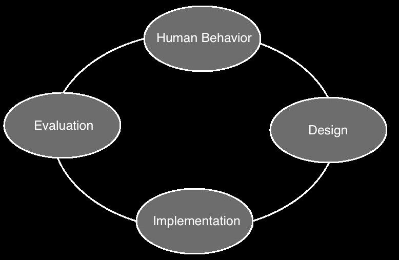
Author/Copyright holder: Sanilshah. Copyright terms and licence: CC BY-SA 3.0
As you can see in the image above (of the standard HCI process) evaluation is a key component of HCI design.
The same is true for information visualization designers; they too want to be able determine whether a design is effective before release. Unfortunately, the discipline of information visualization is yet to yield a concrete toolset for this. Instead, there are tools which can be adapted from other disciplines to give some insight into effectiveness of information visualization design but which, nonetheless, are not guaranteed to deliver the whole picture to the designer.
These toolsets can be found covering two main areas of research according to Riccardo Mazza, the respected information visualization expert, in his book, Introduction to Information Visualization: which are analytic and empirical methodologies.
“If we want this popularity to be more than a temporary trend, data visualization has to mature and develop a critical eye on its own performance, functionality, and influence.” Manuel Lima, Visual Complexity, 3rd April, 2013
Analytic Methodologies
There are two main analytic methodologies employed to evaluate information visualizations:
Cognitive walkthroughs
Heuristic Evaluation
A heuristic evaluation of an information visualization requires a pre-defined list of criteria which make such a visualization “usable”. While these criteria have been very well-defined in the field of Human Computer Interaction (HCI) – they have not been well-defined for information visualizations.
This means that that to conduct such an evaluation – the researcher will need to create their own criteria based on discussion with users of the information.
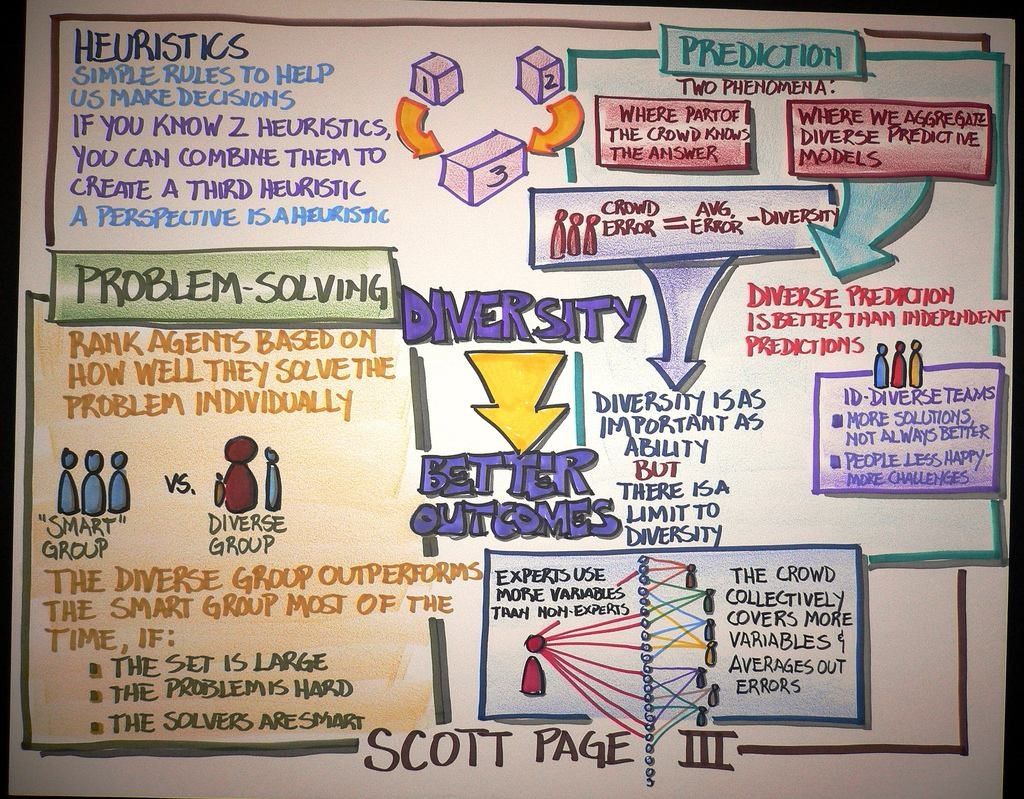
Author/Copyright holder: Steve Jurvetson. Copyright terms and licence: CC BY 2.0
Heuristic techniques come from the behavioral sciences, as above, and have been adapted for use in HCI evaluations.
Cognitive Walkthrough
A cognitive walkthrough is where a researcher acts as an evaluator on behalf of a user. They work through a series of preplanned scenarios and attempt to emulate the behavior of a user. They then try to identify any possible problems that the user faces.
Overall
Neither cognitive walkthroughs nor heuristic evaluations are common in assessing information visualization. Until a well-designed set of heuristics emerges for information visualizations – it’s often too difficult to make these exercises meaningful in the work place.
Empirical Methods
These methodologies involve the user in the research and generally fall into two categories – quantitative and qualitative research. Collecting quantitative data regarding information visualization means testing a hypothesis in a controlled experiment. For qualitative research there is a bigger choice of tools, which UX researchers will already be familiar with: focus groups, observations and interviews.
Controlled Experiments
A controlled experiment requires you to define a hypothesis or series of hypotheses that can then be evaluated through an experiment. This is done by manipulating a condition or conditions to study the outcome when a condition is met or not met. Controlled experiments are usually conducted under lab conditions with a representative sample of the user base.
So for example you might have an infographic that you have developed to show the responsiveness of cancer patients to certain drugs depending on their cancer.
Your hypothesis might be: Users of this infographic will be better able to make clinical decisions about which treatment to use when compared to those users who have either only seen the raw data or who have not seen either set of data.
You would then split your user group into three parts. You would share no data with one group, the raw data with another and the infographic with the third. You’d then offer some patient case studies and see if the professionals made the “correct” decisions.
Of course, this is a very simple example and in many cases designing a controlled experiment will be much more complex. It’s a good idea to read up on experimental design prior to conducting a controlled experiment.
Observation
Observation is a simple exercise where you observe users interacting with the information visualization and see if it can be used for the purpose for which it was intended. This is usually done by setting the user a number of tasks and then observing how they are carried out.
One drawback of observation is that it can be an expensive thing to do when large numbers of users must be involved in order to draw a representative sample size.
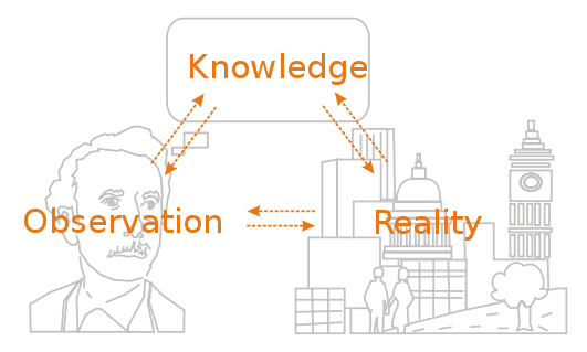
Author/Copyright holder: Marcel Douwe Dekker. Copyright terms and licence: CC BY-SA 3.0
Observations, as can be seen above, enable us to compare our knowledge of something to the actual reality of how that something is put into practice.
Interviewing
Interviewing is often (though not always) combined with observation. It allows the researcher to asks questions of the individual as they interact with the information visualization to determine how the user feels about the product and any tasks that they may do.
Focus Groups
A focus group is a number of users brought together in the same place to review an information visualization. The researcher will facilitate the focus group and may either record the session (using audio and/or visual recorders) or collect notes from the session trying to draw out common observations.
Focus groups can be time consuming to conduct. They need careful planning and recruitment as well as considered execution to be effective.
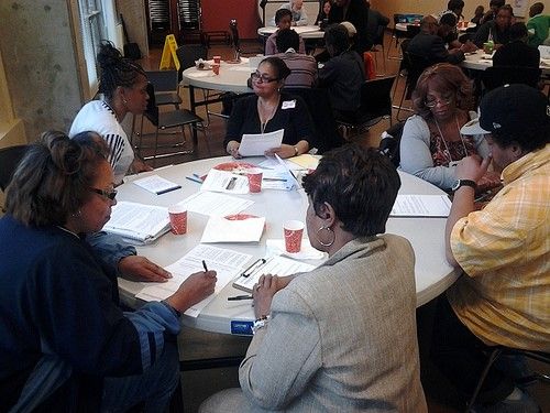
Author/Copyright holder: City of Seattle Community Tech. Copyright terms and licence: CC BY 2.0
Focus groups are commonly used in marketing and other research efforts as well as for examining usability.
Overall
The controlled experiment will often provide the best insights into the usefulness of an information visualization but it can be complex to set up and expensive to conduct. Observations, interviews and focus groups may, when properly designed and executed, reveal useful information but qualitative results may fail to deliver actionable trends too.
The Take Away
The fact that is challenging to conduct analysis of information visualizations should not prevent the information visualization designer from trying to conduct analysis. Some information, in most cases, will be better than no information.
UX designers will already be familiar with many of the techniques commonly employed to try and analyze information visualization effectiveness; this can help cut down the learning curve to conducting research in this area.
We would expect, as the field develops, for a heuristic model to be presented and then become accepted in the future – this in turn will drive the ability to deliver more effective cognitive walkthroughs of information visualizations.
References & Where to Learn More:
Riccardo Mazza, Introduction to Information Visualization, Springer, ISBN 878-1-84800-219-7
Hero Image: Author/Copyright holder: Dave Gray. Copyright terms and licence: CC BY-ND 2.0