User interface (UI) design can make or break any digital product. A user often won’t even notice when they interact with a great UI. They feel the visual appeal and simply trust it. On the contrary, a bad UI design can prevent the user from interacting with a product intuitively or at all and lead to a lack of trust.
As a designer, you must master certain principles to create enticing and user-friendly UI designs. This piece gives you an overview of the fundamentals you need to learn to take the quality and success of your UI designs to the next level.
Why is UI Design Important?
Research estimates that 80-85% of our perception, learning, and cognition are mediated through vision. Therefore, it’s no wonder that aesthetics and visual design play such an important role in our lives. Imagine you were going to the dentist. You enter the dental clinic and see papers everywhere, disorganized instruments, clashing furniture, and your dentist wearing gym clothes. This scenario would probably affect your trust, especially if it’s your first time at that dentist. We all know that this visual scenario has nothing to do with the abilities of the dentist, but we’re thrown off by it on a subconscious level. What if, instead, when you enter the clinic, you see everything immaculate, organized and taken care of? This environment would probably make you feel comfortable and that you’re in the right hands. At least until the dentist tells you that you need braces!
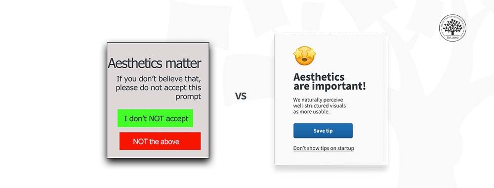
The same phenomenon applies to the digital world. When you first interact with a software product and it’s visually appealing and intuitive, you’re much more likely to give it a chance. In fact, studies show that users are more tolerant of minor usability issues when they find an interface visually appealing. This is known as the Aesthetic Usability Effect.
In this video, Alan Dix, Author of the bestselling book Human-Computer Interaction and Director of the Computational Foundry at Swansea University, explains the difference between sensation and perception, showing how our brains interpret raw sensory input to create meaning—and how this process shapes what we see, including visual design.
Show
Hide
video transcript
- Transcript loading…
UI design has the power to generate emotional responses in your users, both good and bad. By harnessing the power of the different elements that are part of interfaces, such as buttons, typography, color and layout, you can design products that meet your users’ needs and generate positive emotions.
1. Design Effective Buttons
Buttons are one of the most important elements of UI design. Buttons are where the action happens. Imagine you design a beautiful interface for an ecommerce website. Users love the interface; the engagement is through the roof. They browse through the app looking for new clothes and spend hours on it. However, when they want to purchase a specific item, the action to “buy”—the button—is not clear, and after spending some time trying to make the purchase, they leave the website feeling frustrated. Eventually, this online clothing shop will fail because sales are down—not because of the items, but because of a badly designed button.
2. Limit Your Typography Choices
Typography is one of the cornerstones of visual design. There are a vast number of different typefaces to choose from, and thus, choosing a typeface for your designs can be overwhelming. However, for UI design, you can limit your choices to fonts that you know work best in most displays.
In this video, Mia Cinelli, Associate Professor of Art Studio and Digital Design, University of Kentucky, explains how Gestalt principles apply to typography, showing how alignment and flow affect readability.
Show
Hide
video transcript
- Transcript loading…
3. Simplify Your Color Palette
Color is a powerful tool in visual design because it generates emotional responses. The psychology of color is a deeply studied phenomenon and can be difficult to master. Therefore, if you are starting your career as a UI designer, you must choose your color palette thoughtfully. In addition, color—especially color contrast—is a crucial element to ensure the accessibility of your design. One common mistake of junior designers is to add too many colors in a user interface.
In this video, Joann and Arielle Eckstut, leading color consultants and authors, give six tips to help designers choose colors.
Show
Hide
video transcript
- Transcript loading…
4. Design a Consistent Layout
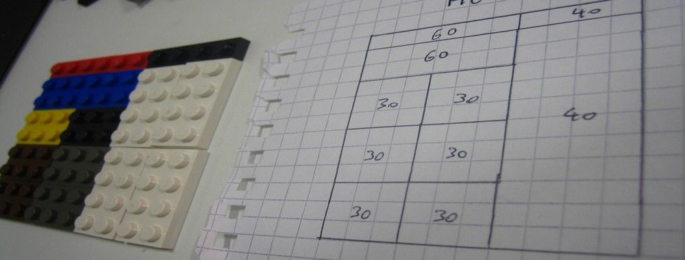
To a certain extent, design is about moving shapes around and arranging them in a way that makes sense visually. Most elements can be thought of as simple geometric shapes, in most cases either a rectangle or a circle. How well you position these elements in space will be one of the main differences between a good and a bad design. To help you build a good and consistent layout, you have to master the use of grids. Grids are essential for good design, but many designers underestimate their value.
In this video, explore how the golden ratio can help you create balanced, visually harmonious layouts, showing how this timeless principle guides proportions and spacing to make designs feel natural and consistent.
Show
Hide
video transcript
- Transcript loading…
The Take Away
UI design is essential to build a good UX. Any good user experience needs a visual interface that generates trust and positive emotions in the users. As a UI designer, you can build enticing and user-friendly interfaces by mastering the use of typography, color and grids, and following best practices to design buttons.
Knowing the fundamentals of UI design can help you level-up the quality of your designs, contribute to improving the overall user experience and build successful digital products.
Where To Learn More
Learn more about the relationship between aesthetics and usability in the Aesthetic Usability Effect article by the Nielsen Norman Group.
Learn more about UI design and its trends by reading the Top 10 UI Trends Every Designer Should Know piece.
Learn more about visual design in the IxDF Visual Design: The Ultimate Guide course.
Image
© Interaction Design Foundation, CC BY-SA 3.0


