I open my eyes. Lush light floods the room, birds chatter. It is only 6:30 o'clock in the morning, but I feel well-rested and alive; time to get up, to brew some coffee. Are you jealous of my morning routine? Were you startled out of your sleep by a merciless alarm clock? Was it dark outside, no birds around, and did you feel groggy and bleary-eyed?
This chapter is about experiences created and shaped through technology (aka User Experience) and how to deliberately design those. The wake-up experience created by an alarm clock substantially differs from the experience created by sunrise and happy birds. The question is whether we can create technology which understands the crucial features of sunrise and birds and which succeeds in delivering a similar experience, even when the sun refuses to shine and the birds have already left for Africa.
In fact, the experience I described in the beginning was not created by sun and birds, but by Philips' Wake-Up Light. This is a crossing of an alarm clock and a bedside lamp. Half an hour before the set alarm, the lamp starts to brighten gradually, simulating sunrise. It reaches its maximum at the set wake-up time and then the electronic birds kick in to make sure that you really get up. Admittedly, it is a surrogate experience, but so are love stories and travel novels. It is artificial, but not vulgar. And more importantly, it substantially changes the way one wakes up. It changes the experience. The object itself, its form, is rather unremarkable (see Figure 1).

Author/Copyright holder: Koninklijke Philips Electronics N.V. Copyright terms and licence: All Rights Reserved. Reproduced with permission. See section "Exceptions" in the copyright terms below.
Figure 3.1: Philips' Wake-Up Light
The Philips Wake-Up Light has nevertheless the power to "transcend its encasing" because its contribution is not one to the aesthetics of things, but to the aesthetics of experiences. This is the challenge designers and vendors of interactive products face: Experience or User Experience is not about good industrial design, multi-touch, or fancy interfaces. It is about transcending the material. It is about creating an experience through a device.
Author/Copyright holder: Courtesy of Rikke Friis Dam and Mads Soegaard. Copyright terms and licence: CC-Att-ND (Creative Commons Attribution-NoDerivs 3.0 Unported)
Marc's introduction to User Experience and Experience Design
Author/Copyright holder: Courtesy of Rikke Friis Dam and Mads Soegaard. Copyright terms and licence: CC-Att-ND (Creative Commons Attribution-NoDerivs 3.0 Unported)
Marc's advice on designing with experience in mind
Author/Copyright holder: Courtesy of Rikke Friis Dam and Mads Soegaard. Copyright terms and licence: CC-Att-ND (Creative Commons Attribution-NoDerivs 3.0 Unported)
Marc's main guidelines and ethical considerations
Show
Hide
video transcript
- Transcript loading…
Author/Copyright holder: Courtesy of Rikke Friis Dam and Mads Soegaard. Copyright terms and licence: CC-Att-ND (Creative Commons Attribution-NoDerivs 3.0 Unported)
Future directions
I will start this chapter with a discussion of our Western societies' shift from the material to the experiential and the potential problems technology-oriented businesses have in accommodating this shift. User Experience and Experience Design can be a remedy to this by bringing experience to the fore. I then discuss Experience and User Experience to flesh out a view which has the potential to advance the way we will design future technologies. I end with some examples of Experience Design and finally offer a simple model of Why, What and How as a starting point for the enthusiastic Experience Designer.
3.1 From the material to the experiential
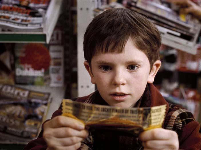
In Roald Dahl's Charlie and the Chocolate Factory, young Charlie faces a tough choice. He just found the last Golden Ticket in a bar of Whipple-Scrumptious Fudgemallow Delight. (Figure 2). It is one of only five invitations to visit Willy Wonka's legendary chocolate factory. Charlie is promised a day full of "mystic and marvellous surprises that will entrance, delight, intrigue, astonish, and perplex beyond measure. In your wildest dreams you could not imagine that such things happen to you!"
Author/Copyright holder: Warner Bros. Copyright terms and licence: All Rights Reserved. Reproduced with permission. See section "Exceptions" in the copyright terms below.
Figure 3.2: Charlie Bucket discovers his Golden Ticket
But Charlie is poor. It is a freezing winter and the whole family of seven is living on not more than cabbagy meals and the occasional boiled potato. People already offered as much as $500 for the ticket. Wouldn't it be more sensible to forfeit Wonka's frivolous offer and to secure the money? In the end, Charlie took the ticket and was awarded with the most extraordinary experience of his life.
Charlie chose the experience over the material. He could have had a winter coat or fire wood instead of the experience, but he already knew that only the visit to the chocolate factory has the power to add some meaning to his life. In fact, studies show that experiential purchases (i.e., the acquisition of an event to live through, such as a concert, a dinner, a journey) make people more happy than material purchases (i.e., the acquisition of tangible objects, such as clothing, jewellery, stereo equipment) of the same value (Boven and Gilovich 2003; Carter and Gilovich 2010).
In a series of studies, Leaf van Boven and colleagues (2010) further uncovered stigmatizing stereotypes: Participants characterized people with a material orientation as self-centred, insecure, or judgmental, but people with an experiential orientation as humorous, friendly, open-minded, intelligent, caring, or outgoing. The seemingly negative stance towards the materialistic is an indication of a post-materialistic culture. Ronald Inglehart (1997) argued that societies in sustained periods of material wealth become increasingly interested in values such as personal improvement. They transform into highly individual Experience Societies (Schulze 1992; Schulze 2005) whose members equate happiness with the acquisition of positive life events. Decried as superficial and consumerist in the 80ties and 90ties of the last century, we now witness a version of the Experience Society which favours meaningful engagement to earning money and begins to dissociate experience and expenditure. Experiences are no longer supposed to be available at exotic places only. They can be close by: a day out in the sun, working the garden, a barbecue with friends, or a trip to the local flea market. In the foreword to the 2005 edition of his book, Gerhard Schulze (2005, p IX) mentions some signifiers of the new millennium's Experience Society: deceleration instead of acceleration, less instead of more, uniqueness instead of standardisation, concentration instead of diversion, and making instead of consuming. All these are not necessarily associated with material wealth. Admittedly, to develop a post-materialistic (i.e., experiential) orientation may require sufficient food, clothing, and shelter (Inglehart 1997; Maslow 1954). This is the gist of Charlie Bucket's dilemma: choosing a frivolous one-day experience in a chocolate factory over supporting his family with food and clothing seems almost immoral. However, while I agree that an experiential orientation in life requires some food, clothes and shelter as a necessary precondition (Inglehart 1997), I do not believe that it needs caviar, Gucci, and a chateau in the hills of the Cote d'Azur. Most of us in the developed countries have the basis for leading a post-materialistic life.
3.2 Experience and business
Though the transformation to a post-materialistic experience society has been recognized by business, as indicated by books such as The Experience Economy (Pine & Gilmore, 1999) or Experiential Marketing (Schmitt 1999), it still struggles with making sense of it. A good example is the music industry. While the number of concerts is still rising, record sales dropped considerably from 2000 and onwards. For example, Madonna's Confessions on a Dancefloor sold only 1.6 million copies, but her world tour generated about 200 million dollars. According to Pollstar (Bongiovann 2010), in 2009 the average ticket price for a top 100 act in the US was about $64, a CD made only $13.99. Typically, illegal digital downloads are made responsible for this effect. But the missing willingness to pay for music in the form of a tangible product may also be a consequence of shifting from a materialistic to an experiential orientation. Today the music itself matters, not ownership, argues Arthur Schock (2010), a booker for independent electronic artists, in a recent interview for Spiegel-Online. He reported on record release parties with 800 raving guests but only ten records sold afterwards. "Liking bears no relation to buying the CD," he concluded. On Creative Deconstruction Rich Huxley (2010) mused: "If we can all now make, distribute and sell music, to succeed we've got to differentiate ourselves from the crowd and give people something they can't get elsewhere. If we can give people something that isn't repeatable and isn't copyable then all the better. So, what's unique and not copyable? A feeling, or an experience." Instead of complaining about declining CD sales, the music industry must develop new, more experiential formats.
Why aren't they? One of the main reasons why the music industry dislikes the shift away from the material is the limited scalability of experience. Once produced, a CD can be copied and sold in theoretically infinite quantities, while an artist can only play a limited number of concerts a year, with a limited number of paying attendants. As long as most industries and their strategies are still geared towards earning money by mass-producing and selling tangible objects, their take on the experiential is often not more than a feeble marketing strategy. For example, the German Telekom recently made "experiencing" its marketing claim ("Erleben, was verbindet"). The companion website promises to be a place for sharing memorable and unique experiences. But a close look reveals hardly more than the occasional sponsored live event interspersed with badly disguised attempts to sell standard products and services. Experience is considered a vehicle for marketing, but not understood as the very product that is sold. The transition from an economy of products and services to one of experience and transformation certainly requires more (Pine and Gilmore 1999). This is the challenge we face: Experience or User Experience is not about technology, industrial design, or interfaces. It is about creating a meaningful experience through a device.
3.3 The evasive beast called User Experience
Experience is an almost overwhelmingly rich concept, with a long history of debate and many attempts to "define" it (Jay 2005). I primarily focus on experiences as meaningful, personally encountered events (in German: "Erlebnis") and not so much on the knowledge gained through these events (in German: "Erfahrung"). These experiences are memorized stories of use and consumption and distinct from the immediate moment-by-moment experience (e.g., Forlizzi and Battarbee 2004; Kahneman 1999). While the immediate moment-by-moment experience is certainly interesting, memorized experience is of more practical relevance. This is simply because most of our waking time, we are feasting on vivid memories of the past (or anticipations) rather than on immediate pleasures.
The construction of experiences as stories from moment-by-moment experience is not straightforward. For example, experiences tend to improve over time. As van Boven (2005, p. 137) puts it: "As one forgets the incidental annoyances and distractions that detract from the online, momentary enjoyment of an experience, one's memory of an experience can be sharpened, levelled, and 'spun' so that the experience seems better in retrospect than it actually was." Who doesn't fall victim to a "rosy view" now and then. We are spinning - not necessarily consciously - our own experiences.
But what is in an experience? Psychologically, an experience emerges from the integration of perception, action, motivation, and cognition into an inseparable, meaningful whole. The intimate relation between those single concepts is reflected by, for example, Russell's (2003) model of emotions, which stresses the importance of cognitive processes, such as self-observation, attribution, and categorization, for the experience of emotions. And most action theories (e.g., Kaptelinin & Nardi, 2006; Carver & Scheier, 1989) assume close links between actions, thoughts and emotions. In sum, I argue for understanding experience as "an episode, a chunk of time that one went through [...] sights and sounds, feelings and thoughts, motives and actions [...] closely knitted together, stored in memory, labelled, relived and communicated to others. An experience is a story, emerging from the dialogue of a person with her or his world through action" (Hassenzahl 2010, pp. 8). An experience is subjective, holistic, situated, dynamic, and worthwhile.
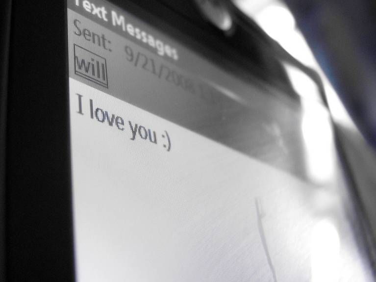
While an experience is a complex fabric of feelings, thoughts, and actions, I believe emotions and fulfilment of universal psychological needs to have an accentuated role. Although emotions are certainly complex, they all share an inherent evaluation, pleasure and pain, which provide "the yardstick on which qualitatively different possibilities can be compared" (Russell 2003, p. 153). This evaluation is important in shaping future behaviour and - if positive - one source of happiness. But where does the pleasure come from? Sheldon and others (2001) demonstrated the intimate link between the pleasantness of an experience and the fulfilment of universal psychological needs in that experience, such as the need for autonomy or stimulation. A specific look at technology-mediated positive experiences revealed stimulation, relatedness, competence, and popularity as the salient sources of pleasure (Hassenzahl et al. 2010). Being asked for a recent positive experience with technology, a young woman provided the following example: "I was on a short trip to Dublin. In the early hours, my mobile phone woke me up. My boyfriend, who stayed at home, had just texted a sweet 'I love you'(Figure 3). This is an example of a relatedness experience, which gets its positive meaning through fulfilling a need for social relationship and intimacy.
Author/Copyright holder: Mallory Bwman. Copyright terms and licence: All Rights Reserved. Reproduced with permission. See section "Exceptions" in the copyright terms below.
Figure 3.3: A sweet 'I love you'
The mobile phone is instrumental to creating this experience, but the positive emotions and the meaning are evoked through the fulfilment of a universal psychological need. Need-fulfilment is what makes an experience pleasurable.
Usage and consumption always translate into an experience, a story of use, a story of consumption: just like a rollercoaster becomes embedded into a (hopefully) meaningful, emotion-laden story of a rollercoaster ride, full-blown with stimulation, excitement and enjoyment. Seemingly different products and situations are represented in a similar format - that of experience. Thus, as long as we focus on the experiences created and shaped by interactive products, we may not distinguish User Experience from Experience in general. User Experience is just a sub-category of experience, focusing on a particular mediator - namely interactive products. If it comes to actual Experience Design, that is the question of how to deliberately create and shape experiences, a distinction between interactive products and other mediators of experiences may be helpful, but does not seem crucial.
The perspective on Experience and User Experience developed here should not be understood as definite. It is a starting point for debate, an attempt to advance a concept of Experience and User Experience that will change the way interactive products are - hopefully to the better.
3.4 Experience Design: Designing the post-materialistic
With the sharp distinction between the experiential and the material suggested by many authors (e.g., Boven and Gilovich 2003), an "experiential interactive product" appears like a contradiction in terms. While experience is intangible, volatile, an interactive product is tangible, a mass-produced piece of technology. The "electronic gadget" is the very prototype of a material purchase. The seasoned post-materialist, though, ceases to strive for yet another novel communication device. She will rather enjoy writing a letter (Figure 4).

Author/Copyright holder: Penelope Fewster. Copyright terms and licence: All Rights Reserved. Reproduced with permission. See section "Exceptions" in the copyright terms below.
Figure 3.4: Letters to an English schoolgirl
But even the post-materialist's experience is most of the time mediated. Writing a letter requires a pen, paper, and a messenger, who in turn needs a carriage, a zeppelin, or a plane. This holds for all the typical examples of experiential purchases provided by van Boven (2003): travel requires transportation, dining requires a good kitchen, and a concert requires instruments and amplification. Things are not the opposite of experiences, but create and substantially shape them. The combination of a pen and a piece of paper, and the resulting activity of writing with one's own hand, has certain features which in turn shape the resulting experience. It is, for example, relatively slow and, thus, offers time for reflection, not provided by more efficient technologies (Lindley et al 2009). Thus, the post-materialist is not necessarily a "green luddite" (Kozinets 2007) who shuns technology in general. But she is more interested in the experience created than taking pride in the ownership of the product or technology that created it. Once created, the experience is what is owned - an immaterial, personal story. The product is only of interest as it is identified as being crucial in creating the experience (Hassenzahl et al 2010).
The challenge of designing interactive products for the post-materialist is to bring the resulting experience to the fore - to design the experience before the product. Or as Buxton (2007, p. 127) puts it: "Despite the technocratic and materialistic bias of our [US-American] culture, it is ultimately experiences we are designing, not things." But what does that mean, to design an experience? For Buxton it seems a matter of how it feels to act through a product, in the moment it is used - the moment-by-moment experience. He used different orange squeezers to highlight how different usage can "feel" even if the function remains the same. This addresses the How of product use, the Aesthetics of Interaction. This notion of Experience - as focusing on how something is done - was notably sparked by the success of Apple's iPhone, featuring a so far unique aesthetic of interaction, but basically fulfilling the same tasks as any other mobile phone.
While certainly important, reducing experience to the mere "pleasure due to the feel of the action" (Buxton 2007, p. 129) is not doing justice to its multifaceted nature. Conceptually, the broad view of Experience as meaningful stories has much more to offer than a narrow view as pleasurable, moment-by-moment feeling. Take the story of the young woman on a trip to Dublin from the preceding section. The experience gets its positive feel and meaning through the fulfilment of a need for relatedness, a need for feeling close to relevant others. The story speaks of intimacy, expressed, for example, by the liberty to send the message very early in the morning. The man was confident that his girlfriend would not be annoyed by the message. And while receiving love messages is always a wonderful thing, being in a foreign place, far away from home, certainly intensified this experience. In this example, the mobile phone was used as a tool for creating a relatedness experience. But the mobile phone is neither especially adapted to this, nor does it in any way imply the creation of this experience. It is nothing more than an awkward piece of infrastructure: even with the most elegant shell or navigational structure, it does not reflect the love put into the message. To give another example: While a telephone is certainly able to connect distant lovers, it embodies a strictly conversational model. However, feeling close is not about good conversations only, it is a about a feeling of presence and emotional expression. The telephone is not exceptionally good at this - as Peter Robinson observed in All the Colours of Darkness after a late night telephone conversation between Inspector Banks and his Sophia:
'Goodnight' said Banks. And the last thing he heard was her laughter as she puts down the phone. Banks felt more alone and further away for having just talked to Sophia than he had before the call. But it was always like that - the telephone might bring you together for a few moments, but there's nothing like it for emphasising distance.
We have all experienced the awkward silence when we have run out of stories to tell while not wanting to hang up on our loved one. This is the result of a misfit between the conversational model embodied by a telephone and the psychological requirements of a relatedness experience.
This must not necessarily be so, as the prevalent research on technology-mediated intimacy demonstrates (e.g., Vetere et al 2005). An unpublished review (Heidecker et al 2010) counted 144 published concepts of alternative communication devices, most of them much better adapted to the requirements of "feeling close" than any commercially available mobile phone. In many cases, the technological innovation embedded in those novel devices is negligible - they neither feature elaborated new algorithms nor future materials or fancy interface concepts. Their superiority is due to the intimate understanding of certain experiences, feelings, situations, boundary conditions, and how those experiences can be created and shaped through a thing.
The post-materialistic interactive product is, thus, not so much a tangible object, but a story transported or told through an object - a "material tale" or "psychosocial narrative". Dunne (2006, p. 69) explains: "[... B]ehavior is a narrative experience arising from the interaction between our desire to act through products and the social and behavioural limitations imposed [...] through [their] conceptual models." We will inevitably act through products, a story will be told, but the product itself creates and shapes it. The designer becomes an "author" creating rather than representing experiences.
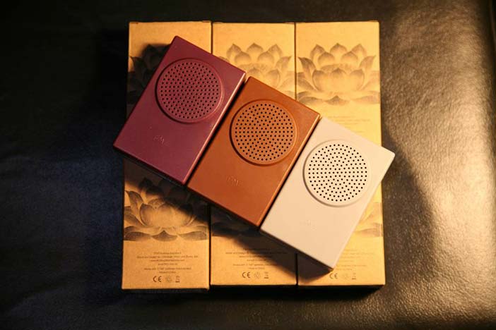
So far, there are not many commercially available products, which reflect the notion of Experience Design as the creation of meaningful stories through a product. An exception is FM3's Buddha Machine, dubbed the Anti-iPod by the Wall Street Journal in 2007 (Wagstaff 2007) - see Figure 5.
Author/Copyright holder: Zhang Jian. Copyright terms and licence: All Rights Reserved. Reproduced with permission. See section "Exceptions" in the copyright terms below.
Figure 3.5: The Buddha Machine II
The Buddha Machine is an electronic device loaded with nine ambient loops (Version 2.0) produced by FM3, an experimental music duo from China. It plays back one of those loops in 8-bit quality through an inbuilt speaker, has a button to skip through the loops, a knob to change the pitch of the playback and its volume. That's it. The Buddha Machine is a meditative experience. It tells a story of contemplation rather than restless consumption and suggests a way of doing so.
In 2007, the Buddha Machine was an unexpected commercial success with over 50.000 units sold. Joshua wrote on Resident Advisor: "With the Buddha Machine, FM3 have unwittingly unleashed a real phenomenon: [...] a personal stereo, a musical toy, a Buddhist souvenir, and a conceptual commodity offering valuable lessons for our consumption-obsessed times." He quotes Christiaan Virant, one of the creators of the Buddha Machine: "That's the beauty of the Buddha Machine, it's really ... serendipity." And Rob Walker (2007) noted for the New York Times Magazine:
And of course there's the anti-iPod factor: the relief of not having to make a choice in a world awash with entertainment and self-expression options. Moreover, at a moment when the unused abilities of feature-loaded computers, cellphones and even microwave ovens pile up faster than we can keep track of them, it's satisfying to know that once you've turned the Buddha Machine on, you are using it to its full capacity.
The Buddha Machine is an example of a device, which "manages to transcend the cheap plastic frame in which it's encased" (Heater 2008). It is a technology that offers a meaningful, valuable, and aesthetic experience and not just a bunch of functions, leaving it to the users to figure out how to incorporate them into their daily lives.
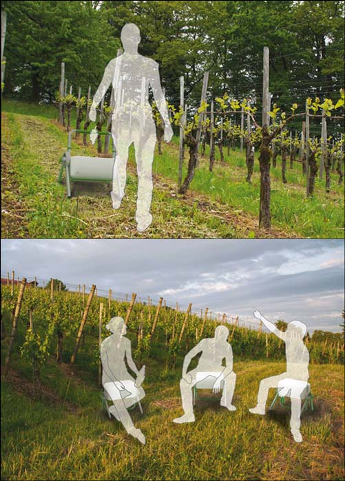
The Buddha Machine is an excellent example of a full-blown post-materialistic device. However, one may easily view it a representative of a novel product genre, which coexists with more "practical" genres, but does not affect the design of those more practical products. I disagree. A post-materialistic, experiential orientation can potentially be loaded into every product. An example is Swantje Krauß' diploma design project, which I supervised together with Olaf Barski. Krauß set out to design a new type of improved "bucket" for the grape harvest. Typically, grapes are picked by hand, gathered in a bucket, which is then emptied into a larger container. This bucket is clearly a tool; its design a tough exercise in practicality and classical ergonomics. However, Krauß added an interesting feature beyond the obvious: The bucket can be transformed into a seat (see Figure 6) which allows the vintager to take a rest from her physically demanding work.
Author/Copyright holder: Swantje Krauss. Copyright terms and licence: All Rights Reserved. Reproduced with permission. See section "Exceptions" in the copyright terms below.
Figure 3.6: From a tool to a place to rest
This seemingly small detail is interesting for at least three reasons. First, the bucket embeds both activities - gathering grapes and taking a rest - on an equal level, making clear that a rest is accepted as an integral part of the overall activity. Second, the bucket has to be empty to be transformed into a seat. This reflects upon the admittedly puritan ideal of "business before pleasure" and functions as a clear signal for the "appropriate" moment for taking a rest. Krauß' design makes sure that its users either pick grapes or rest, but resting and still doing a little bit of cleaning or sorting the grapes is impossible. This implies a clear separation between work and rest - an important psychological requirement for having a truly re-creative break. Third, the bucket suggests a particular way of taking that rest, namely in the vineyard, contemplating and enjoying the views or having a chat with colleagues.
Admittedly, a bucket is not a typical exemplar of an interactive product. Nevertheless, Krauß' example shows that understanding grape picking as more than a mere task, as an experience packed with psychological needs, emotions and meaning enables the designer to become an author of stories conveyed through the product.
3.5 Why, What and How
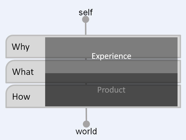
Let me summarize my thoughts on Experience in a simple conceptual model. I distinguish three different levels, when designing an experience through the interaction with an object: The Why, What and How level.
The What addresses the things people can do through an interactive product, such as "making a telephone call," "buying a book," or "listening to a song." Reflected by a products' functionality, the What is often intimately tied to the technology itself or a certain product genre. The How in turn addresses acting through an object on an operational, sensory-motor level: Buttons pressed, knobs turned, menus navigated, touch screens stroked, or remotes waggled. The How is even more tied to the actual object to be designed and its context of use.
The How is the typical realm of the interaction designer: to make given functionality accessible in an aesthetically pleasing way. To give an example: "Making a telephone call" (a What) requires an action to select a conversional partner, as well as to initiate and to end the call. How this is done with - let's say - a mobile phone is specified by the interaction designer. The example of the different orange squeezers, Bill Buxton (2007) provided, addresses possible differences in the quality of the interaction design, the How. Even given the same functionality (i.e., squeezing oranges), performing the action "feels" better with some products. Nowadays, the bundle of What and How is typically considered the product, and an especially sensual, aesthetic, novel, or stimulating arrangement of interaction makes this product "experiential."
This view ignores peoples' actual motivation to use a product. For the couple being separated, the SMS was not primarily an SMS, it was a love message, a way to fulfil their need for relatedness. This is the Why of product use. Telephone calls are not only - technologically speaking - telephone calls. In reality, they are the glorious beginning or the sad end of a close relationship, a surrogate good-night kiss, an act of support, a way to kill time, or a pizza order. People engage in these activities out of a need to be related, to help, to be stimulated, or to ease their appetites. The telephone just happens to be instrumental, but it does not necessarily reflect upon the underlying needs, emotions, and associated practices.
Experience Design is a remedy to this. It starts from the Why, tries to clarify the needs and emotions involved in an activity, the meaning, the experience. Only then, it determines functionality that is able to provide the experience (the What) and an appropriate way of putting the functionality to action (the How). Experience Design wants the Why, What and How to chime together, but with the Why, the needs and emotions, setting the tone (see Figure 7). This leads to products which are sensitive to the particularities of human experience. It leads to products able to tell enjoyable stories through their use or consumption.
Author/Copyright holder: Unknown (pending investigation). Copyright terms and licence: Unknown (pending investigation). See section "Exceptions" in the copyright terms below.
Figure 3.7: From the Why to the What and the How: Three levels to consider when designing technology-mediated experiences
3.6 Conclusion and future directions
The notion of (User) Experience as stories told through products has a potential to change the way we think and design. At the moment, the majority of commercially available interactive devices is either too practical or too open-ended. The practical view results in very obvious and uninspiring stories: how exciting is keeping a calendar on a mobile phone? The open-ended view on the other hand just provides functionality, such as texting, and leaves it to the user to come up with meaningful and inspiring usage scenarios, such as sending "love messages." In this case, the creation of meaningful experiences through appropriating a technology remains the responsibility of the "user". In contrast, Experience Design stands for technology, which suggests meaningful, engaging, valuable, and aesthetically pleasing experiences in itself. Thinking "communication experiences" rather than "mobile devices" opens up a huge design space for possible devices - even slippers (Chen et al 2006) or pillows (Laschke et al 2010).
Don't get me wrong, we still need all the wonderful technologies, dreamt up by engineers and computer scientists all over the world. But they are only materials - canvas, colours, and brushes - for the Experience Designer. From a business perspective, shifting attention from technological to experiential advancement makes sense, as long as the invention of new technologies and their marketing becomes increasingly difficult. Just take 3D television as an example: It is an innovation born out of a frantic need for re-inventing television to ensure future sales. The result is an expensive, hard to sell technology, without much power to impact our lives "The new movie by Darren Aronofsky now in 3D! So what?" Indeed, other technology-mediated innovations, such as improving the social experience of watching television as a family or over a distance, require less effort in terms of resources (both on the vendor and the consumer end), but at the same time offer a profound improvement of current practices and according experiences. We should definitely shift attention (and resources) from the development of new technologies to the conscious design of resulting experiences, from technology-driven innovations to human-driven innovations.
3.7 References
Bongiovann, Gary (2010). PollStar 2010 Midyear Business Analysis. Retrieved 9 November 2010 from PollStar Pro: http://www.pollstarpro.com/specialfeatures2010/201...
Boven, Leaf Van (2005): Experientialism, Materialism, and the Pursuit of Happiness. In Review of General Psychology, 9 (2) pp. 132-142
Boven, Leaf Van and Gilovich, Thomas (2003): To Do or to Have? That Is the Question. In Journal of Personality and Social Psychology, 85 (6) p. 1193–1202
Boven, Leaf Van, Campbell, Margaret C. and Gilovich, Thomas (2010): Stigmatizing Materialism: On Stereotypes and Impressions of Materialistic and Experiential Pursuits. In Personality and Social Psychology Bulletin, 30 (4) pp. 551-563
Buxton, Bill (2007): Sketching User Experiences: Getting the Design Right and the Right Design. Morgan Kaufmann
Carter, Travis J. and Gilovich, Thomas D. (2010): The Relative Relativity of Material and Experiential Purchases. In Journal of Personality and Social Psychology, 98 pp. 146-159
Carver, Charles S. and Scheier, Michael F. (2001): On the Self-Regulation of Behavior. Cambridge University Press
Chen, Chun Y., Forlizzi, Jodi and Jennings, Pamela (2006): ComSlipper: An expressive design to support awareness and availability. In: Proceedings of the CHI 06 Conference on Human Factors in Computing Systems - extended abstracts on Human factors in computing systems 2006. pp. 369-374
Dunne, Anthony (2006): Hertzian Tales: Electronic Products, Aesthetic Experience, and Critical Design. MIT Press
Forlizzi, Jodi and Battarbee, Katja (2004): Understanding experience in interactive systems. In: Proceedings of DIS04: Designing Interactive Systems: Processes, Practices, Methods, & Techniques 2004. pp. 261-268
Hassenzahl, Marc (2010): Experience Design: Technology for All the Right Reasons. Morgan and Claypool Publishers
Hassenzahl, Marc, Diefenbach, Sarah and Göritz, Anja (2010): Needs, affect, and interactive products - Facets of user experience. In Interacting with Computers, 22 (5) pp. 353-362
Heater, Brian (2008). Hands On: Buddha Machine 2. Retrieved 9 November 2010 from Gearlog: http://www.gearlog.com/2008/11/hands_on_buddha_mac...
Heidecker, S., Hassenzahl, M., Eckoldt, K., & Hillmann, U. (2010). Designing for relatedness experiences: A Review of technologies mediating intimate relationships. in preparation
Huxley, Rich (2010). Music is Not Our Currency. Retrieved 9 November 2010 from Creative Deconstruction: http://www.creativedeconstruction.com/2010/05/musi...
Inglehart, Ronald (1997): Modernization and Postmodernization: Cultural, Economic, and Political Change in 43 Societies. Princeton University Press
Jay, Martin (2005): Songs of Experience: Modern American and European Variations on a Universal Theme.University of California Press
Kahnemann, Daniel (2003): Objective happiness. In: Kahneman, Daniel, Diener, Ed and Schwarz, Norbert (eds.). "Well-Being: The Foundations of Hedonic Psychology". Russell Sage Foundation Publicationspp. 3-25
Kaptelinin, Victor and Nardi, Bonnie A. (2007): Acting with technology: Activity theory and interaction design. InFirst Monday, 12 (4)
Kozinets, Robert V. (2008): Technology/Ideology: How Ideological Fields Influence Consumers' Technology Narratives. In Journal of Consumer Research, 34 (6) pp. 864-881
Laschke, Matthias, Hassenzahl, Marc and Mehnert, Kurt (2010): linked.: a relatedness experience for boys. In:Proceedings of the Sixth Nordic Conference on Human-Computer Interaction 2010. pp. 839-844
Linderman, Matthew and Fried, Jason (2004): Defensive Design for the Web: How to improve error messages, help, forms, and other crisis points. New Riders
Lindley, Sian E., Harper, Richard and Sellen, Abigail (2009): Desiring to be in touch in a changing communications landscape: attitudes of older adults. In: Proceedings of ACM CHI 2009 Conference on Human Factors in Computing Systems 2009. pp. 1693-1702
Maslow, Abraham H. (1954): Motivation and Personality. HarperCollins Publishers
Meggitt, Joshua (2007). FM3: Made in Beijing. Retrieved 9 November 2010 from Residentadvisor.net: http://www.residentadvisor.net/feature.aspx?836
Pine, B. Joseph (1999): The Experience Economy: Work Is Theater & Every Business a Stage. Harvard Business Press
Russell, James A. (2003): Core Affect and the Psychological Construction of Emotion. In Psychological Review, 110 (1) p. 145–172
Schmitt, Bernd H. (1999): Experiential Marketing: How to Get Customers to Sense, Feel, Think, Act, Relate. Free Press
Schock, Artur (2010). Gut finden und kaufen steht in keinem Verhältnis. Retrieved 9 November 2010 from Spiegel Online: http://www.spiegel.de/netzwelt/web/0,1518,710269,0...
Schulze, Gerhard (2005): Die Erlebnisgesellschaft: Kultursoziologie der Gegenwart.
Schulze, Gerhard (1992): Die Erlebnisgesellschaft: Kultursoziologie der Gegenwart. Campus Verlag
Sheldon, Kennon M., Elliot, Andrew J., Kim, Youngmee and Kasser, Tim (2001): What Is Satisfying About Satisfying Events? Testing 10 Candidate Psychological Needs. In Journal of Personality and Social Psychology, 80 (2) pp. 325-339
Vetere, Frank, Gibbs, Martin R., Kjeldskov, Jesper, Howard, Steve, Mueller, Florian, Pedell, Sonja, Mecoles, Karen and Bunyan, Marcus (2005): Mediating intimacy: designing technologies to support strong-tie relationships. In:Proceedings of ACM CHI 2005 Conference on Human Factors in Computing Systems 2005. pp. 471-480
Wagstaff, Jeremy (2007). The Anti-iPod: The Buddha Machine Shows That Bells and Whistles Aren't Always Better. Retrieved 9 November 2010 from Creative Deconstruction: http://online.wsj.com/article/SB117712103492177617...
Walker, Rob (2007). Boxed Set. Retrieved 9 November 2010 from The New York Times: http://www.nytimes.com/2007/07/29/magazine/29wwln-...
