A helicopter was lost in a thick fog near Seattle, WA, when out of the fog loomed a glass building with people working inside. Hovering outside, the pilot calls out to a worker, and asks “We are lost, where are we?”. The worker replies “In a helicopter outside my window”. Still lost and now frustrated, the pilot lands immediately. When the fog clears he sees that he is sitting in the center of Microsoft’s corporate campus.
- Oft-repeated joke in Silicon Valley
Over the course of LAVA’s design and development, we created a system of values to help explain and define its principles and vision. As I already mentioned, LAVA took an agile, empirical course as it developed. Periodically, we would look back and try to summarize what was new or different about LAVA, for use as guidance by others at SAP for their individual interpretations and implementations. While many of these values are fairly common to most UX practices, and familiar to UX designers, they have yet to be thoroughly applied to visual analytics. They are useful when pointing to particular aspects of the language, and articulating why the aspects were done that way. Some are timeless, and some are particularly relevant to this point in time. While values overlap significantly, I’ve tried to tease them apart into distinct categorical themes. If any of LAVA’s detailed components are not necessarily applicable to things you may be doing, the more general values can guide you to extend LAVA along the same principles, or to create your own solutions according to their guidance.
The general theme for LAVA is the value I call Robust Design, which refers to the discipline of designing systems that are simple, clear, reliable, viable, and scalable. I mentioned that this involves simplification — the removal of forms, components, moving pieces, and variables – anything not absolutely necessary and that could cause problems. For any broad, systematic design solution, you should always think through the usage lifecycle – how content will be accessed, authored, delivered, consumed, edited, shared, and upgraded. In LAVA’s case, this lifecycle is targeted to users for whom visual analytics is not their main workplace focus. Single-instance, artisanal infoporn sets an artificially high standard of seductive engagement, based on the Look of Meaning, that doesn’t scale to our expanding volume of visual analytic consumption.
Robust Design is made accessible through these guidelines:
- Focus first on the consumption requirements. Provide user-enabled personalization, manipulation, and curation, and enable these via the provisioning process.
- Minimize non-data ink – per Tufte – by avoiding redundant titling and styling effects. Use one-dimensional data plots when possible.
- Show data in context with actual/percent, limits/goals, and clearly-depicted drill paths.
- Use conventional and componentized cross-platform forms and behaviors to enable adoption and embedding. Limit innovation to areas unique to analytics.
- Optimize simple features to gain loyalty, and enable gradual and voluntary evolution of features for Consumers and Provisioners.
I’ll finish this chapter by describing each of these values in greater detail.
17.0.1 Consumption Focus
The main message here is to think of numbers as any other type of content, versus as a special case with its own rules and constraints. Of course it does have its own rules and constraints, but some of these need to be challenged to enable visual analytics to complete with other content forms for users’ attention. Despite having so many moving parts, use cases, edge cases, competing demands and interests, and things to go wrong, too many vendors continue to use this complexity as a crutch, enabling them to pass on these issues for their customers to solve. The breakthrough opportunity is to think of their offerings more as information services. Digital product designer Brett Victor, in his influential essay Magic Ink, states accurately that the most difficult digital products to design, use, and maintain are authoring tools, what he calls “manipulation software”, versus software oriented to learning – or answering of questions – which he calls “information software”:
Furthermore, the industrial and graphic designs in manipulation software must be in intimate synergy, since it is the graphic design which describes how the object can be manipulated—the mechanical affordances are graphical constructs. Even more graphically challenging is manipulation of abstract objects, such as music or financial data, where the graphical representation must show not only what can be done with it, but what it is in the first place.
Because of these intertwined design challenges, the design of excellent manipulation software is unbelievably difficult, and mustn’t be underestimated. Fortunately, for an enormous class of software, manipulation is not only largely unnecessary, but best avoided.
He goes on, with his original emphasis treatment:
Most of the time, a person sits down at her personal computer not to create, but to read, observe, study, explore, make cognitive connections, and ultimately come to an understanding. This person is not seeking to make her mark upon the world, but to rearrange her own neurons. The computer becomes a medium for asking questions, making comparisons, and drawing conclusions – that is, for learning.
People turn to software to learn the meaning of words, learn which countries were bombed today, and learn to cook a paella. They decide which music to play, which photos to print, and what to do tonight, tomorrow, and Tuesday at 2:00. They keep track of a dozen simultaneous conversations in private correspondence, and maybe hundreds in public arenas. They browse for a book for Mom, a coat for Dad, and a car for Junior. They look for an apartment to live in, and a bed for that apartment, and perhaps a companion for the bed. They ask when the movie is playing, and how to drive to the theater, and where to eat before the movie, and where to get cash before they eat. They ask for numbers, from simple sums to financial projections. They ask about money, from stock quote histories to bank account balances. They ask why their car isn’t working and how to fix it, why their child is sick and how to fix her. They no longer sit on the porch speculating about the weather—they ask software.
Much current software fulfilling these needs presents mechanical metaphors and objects to manipulate, but this is deceiving. People using this software do not care about these artificial objects; they care about seeing information and understanding choices—manipulating a model in their heads.
- Brett Victor, Magic Ink
Victor’s Information Software does not eliminate the interaction and navigation tasks asked of users, it rather severely reduces their number. While I’ve touted LAVA for how it enables content to be manipulated by its users in a self-service manner, versus having it served to them in a static or awkward form, this is manipulation in a consumption mode within prescribed boundaries, versus in an authoring and provisioning mode.
17.0.2 Lean Appearance
The major aspect of Lean Appearance is the flat design approach, as opposed to skeuo and irrelevant decoration or styling effects. Limit such effects to relevant branding treatments restricted to the title area and, if necessary, to limited theme colors in the content visuals. Use sharp, high-contrast typography and visual data plots. Reserve the highest display contrast for key purposes, like supporting plot precision or differentiating overlapping or nearby items. For non-content items such as borders and dividers, use the minimum contrast needed for the purpose, thus avoiding the “zebra effect” of having high contrast all over the screen, and thus dazzling and diluting the user’s focus. Minimize use of spectral, non-neutral color for semantic differentiation of peer plots as is needed for pie charts, in favor of using it systematically to draw attention to items such as alerts, selected items, and for coordinating key relationships within the view such as Measure titles and their correlating data plots and values. In general, minimize non-content pixels, per Tufte’s maxim of reducing “non-data ink”, for elements like borders, backgrounds, etc.
The second aspect of Lean, in line with the value of the consumption model, is to eliminate the distinction, separation, and redundancy between manipulation/navigation controls and content. Instead of using navigation menus and toolbars as remote agents to execute commands elsewhere in the display, embed controls contextually within the content itself. This allows the precious space occupied by titles and other elements to serve the double-duty of command access. The current level of user expectations and literacy, and responsive UI capabilities, now enable this. Users will probe anything to see what it can do.
Third, minimize any content redundancy. The problem with BOBJ Explorer was the inefficiency of presenting redundant depictions of the content in both written and visual forms. Inherit semantics where possible. As with Smart Titles for LAVA Points, don’t repeat words in titles if they already exist in a parent title. This is more reliable when the user has manually reached a high-context point within the content, via navigation or filtering selections. Maintaining a simple mental model context, such as the one-dimension top-down Categoric Dimension, simplifies user awareness of inherited active context that may be shown off-screen.
Fourth, let beauty come from the clarity of the data itself, versus from stylistic treatment of the data. As a designer, play the role of neutral facilitator versus that of biased entertainer. Resist the urge to fill the screen with content pixels – white space is not a waste, bur rather the Yang to the content pixel’s Ying. White space creates the contrast necessary to enable focus and cognition. It amplifies the importance of the relevant content pixels, and equally applies to the scale of overall page layout as well as to that of charts and text.
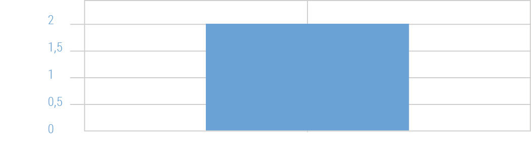 Figure 17.1: Wide bar.
One charting technique that is still used, but that makes no sense, is sizing the width of individual vertical bar chart bars according to the horizontal space available for the chart. When charts using this technique are used to render a small number of vertical bars in a large format, the bars expand to fill the space, sometimes to the point where they are unrecognizable as vertical bars, and are read instead as some sort of area plot. Bar widths should be either be fixed and constant, or at least have a maximum width limit. If the bars do not fill the entire space allotted to their chart in a layout, the chart should merely be drawn at a smaller size. Imagine if all digital text changed size to fill whatever space it was rendered within. It’s even worse when done intentionally to fit really long labels underneath the bars. Nonsense.
17.0.3 Relevant Content
The most important aspect of the relevance value is showing content in context without overwhelming the user. Conveying an isolated metric is fine, but it is much better to convey it in comparison to relevant benchmarks, be they averages, peer values, goals, or associated contributions to a greater whole. One simple way to do this is by showing, where possible, both actual state and change values alongside equivalent percent values. Another is the basic BtF rule of default sorting chart values by size, large to small, to show the distribution and focus on the extreme values first. Percent values typically give a better indication of the contextual impact of the metric.
The original inspiration for the Lattice was the ability to not only compare peer Attributes within a layer, but to place them in context to parent and children layers in both hierarchy dimensions and ad hoc drill paths. The ability to select and sort Strip Slices horizontally in the Lattice, particularly in the Percent Scale view, enables percent contributions to be accurately compared at all levels of the drill path simultaneously. For example, having 60% sales of a product occur in Q4 might seem odd, but if shown that a similar ratio is common for the product’s parent group, category, and store, then a perhaps counter-intuitive but pervasive pattern has been revealed.
Often, the requisite data needed to show context, for example historical, competitive, or goal data, is not available. In these cases, no amount of tweaking or showmanship of isolated content will enhance value. Instead, invest time to provision this context data. If a metric is worth tracking, it is probably worth knowing whether its state is good or bad, to what degree, and whether it is improving or regressing.
The most, um, graphic example of missing context is the infoporn practice of presenting a series of bold, out-sized numbers followed by a text description of what they represent. Another is when journalists quote statistics to an audience that is unaware of what the statistics mean. For example, during American football game broadcasts, commentators often state statistics like “when this coach has a lead at the beginning of the final quarter of the game, they win 70% of the time”. While this may be true, and is meant to suggest that this coach is particularly skilled at maintaining a lead, it may be the case that the average historical winning percentage of all coaches with leads entering the final quarter is in fact 85%, making the coach in question actually an underperformer for this particular metric. While it may be fair to say that this viewing audience would not understand or have the curiosity for such complexities, a simpler way to say the same thing is to say “this coach is in the bottom 20% of holding leads in the fourth quarter, meaning that although he is likely to win this game, he is actually more likely than most coaches to lose this game, so keep watching, things could get more exciting!”
When I’m given my blood pressure readings during a physical examination, the doctor tells me the number and says “that’s very good”, but I can never remember exactly what my numbers are or were, or how they relate to the best/worst/average for someone of my demographic. When told my kids’ height and weight readings, in contrast, we’re given their percentile standing – my daughter has consistently been taller than 96% of all girls her age – and their projected grown height – in her case 5’ 10” or above. The only times when the offering of numerical readouts or statistics without context is acceptable is when the context is so well understood that no context is needed. Gasoline prices, air temperatures, body weights, etc. are so well calibrated in popular awareness that their raw values are easily judged and placed in context.
Related to the concept of context is the undeniable but hard-to-quantify phenomenon of ambient awareness and learning, which corresponds to the Assimilation mode of information acquisition. Ambience is where we see and learn things that we did not necessarily seek out, but which we cannot help but notice, and which end up proving valuable. Well-designed information systems are organized in ways where ambient effects are relevant instead of being detrimental distractions – signal, versus noise. For example, I might want to merely look up sales for a product. However if the answer is shown with some context, I might also learn that it is a top-five seller, has exceeded its goal by 13%, and is growing faster than any other product. The trick, as with targeted advertising, is to place the most relevant related content alongside the explicitly desired content, so as not to obscure the explicitly desired content, and so that the user is not annoyed with what might be deemed irrelevant clutter. Extensive and consistent use of the Categoric Dimension in details like sorting and listing, and the broader Context Dimension for organizing spaces and environments, enhances ambient awareness of content and interaction within a navigable space. I remember an anecdote from BOBJ where a new executive questioned why the product with the greatest percent increase in sales was being discontinued. The answer was that this product contributed a tiny fraction of total sales, and was too expensive to maintain.
Personalization and Social capabilities are obvious ways to increase relevance. Enable users to set preferences and filters on their analytic content, to see what others find relevant about the data, and to express their point of view in context. Visual analytics has some unique properties, and thus requires special solutions, but to the extent that quantitative content can be expressed in forms similar to other media, social dynamics are more readily achievable.
Moving visual analytic displays closer to the action, whether by embedding within workflow applications or by building workflow input controls into the visual analytic displays themselves, is another way to increase relevance. In this case the relevance is related to the conveniences of reduced navigation, fewer media breaks, and the promise that a single form can both convey status, and be used to change it. Consider future scenarios where the display formats can double as input formats, to write back data to the system of record.
Accuracy is more important than precision, so don’t enhance the latter at the expense of the former. I often use a target shooting analogy to explain this. In Figure 17.2, the top right is of course the best case, as both precision (distance of hits from each other) and accuracy (centered on the target) are high, resulting in all bulls-eyes. This suggests a skilled shooter and a well-calibrated gun and sight. The lower left is obviously the worst case, where not only are the shots widely dispersed, they are grouped off-center, in a way that suggests a mechanical or optical misalignment. The upper left also suggests a misalignment, but with the concentrated results of a skilled shooter. The lower right suggests a well-calibrated gun being used by a lower-skilled shooter.
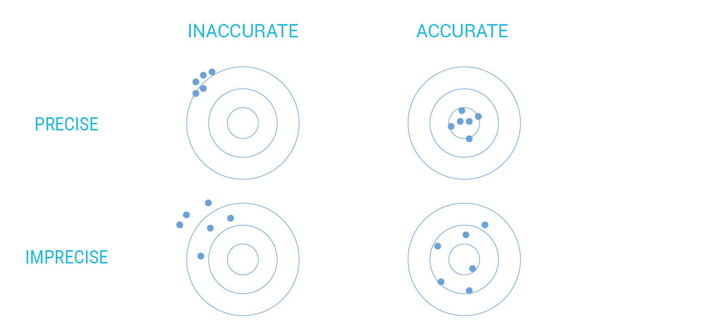
Figure 17.2: Precision/accuracy matrix.
The point of the diagram is to say that the accurate but imprecise, or lower right, outcome is superior to the outcome that is precise but inaccurate, or misguided, at the upper left. An answer that accommodates multiple variables, and is expressed in ten characters to the right of the decimal point, is precise. However, if it is based on false assumptions, an error-prone process, delivered without meaningful context, or is actually answering the wrong question, it is inaccurate. An answer that is vague or based on limited data, but regardless useful and inevitably correct, is accurate but not precise.
Computers are great at precision but not so great at accuracy.
Precision comes with costs involving both production and cognition, so the overall goal is to achieve accurate answers at the least acceptable level of precision. The same principles apply to the design development process, where early concept sketches should focus on fundamental structural product attributes such as layout, flow, content, scale, etc., versus upon styling detail or on the thorough examination of obscure use cases. This is more efficient for design producers and for reviewers, the latter at risk of being distracted by detail to the point where they miss the major points delivered by the presented artifact.
People are often biased to favor precision over accuracy because they can become enamored with impressive processes and formats, that exhibit the Look of Meaning by conveying false signals of confidence, authority, and competence. An example is numerical answers shown in an unnecessarily high-decimal definition. Answers reached by expensive means tend to be favored as justification for the expense and expertise required to reach them. However, if the expense, delay, error risk, or obtuse formats associated with precise answers impedes the consumption of the accurate answer, the process is flawed. This principle is captured well by the parable at the front of this chapter, referring to Microsoft’s near-autistic historical inability to see the forest for the trees at the tactical product level (not to mention their opposite problem at the strategic level), and demonstrates the trap that holds those in the analytics field trying to share their hidden wonders. Rounded numbers, minicharts, text-friendliness, detail-on-demand disclosures, scrolling content, worker curation, and limited chart types can help to open the trap by preventing us from being too literal when conveying analytic content.
17.0.4 Accessible Forms & Behaviors
Again I refer to accessible here in the general sense, not in the sense of accessibility for example to vision-impaired users — although due to its text-friendliness and simple, modular layouts, LAVA is surely much more accessible to these people, via screen readers for example, than are most visual analytic forms. The first aspect of presenting accessible visual analytics is adequate integration of visual and text. This is a fundamental challenge of graphic design, and the current technical landscape is making this easier to accomplish. Techniques like stacking bar chart titles, avoiding radial plot forms, and using on-demand label/legends via HTP are examples. To help ensure good typography, don’t choose a two-dimensional plot over a one-dimensional plot with a Categoric Dimension, or a three-dimensional plot over a two-dimensional plot unless the subject is actually a 3D object. Doing so ensures a simple, readable display with minimal title truncation, and minimizes occlusion.
Another relevant aspect of basic graphic design is the difference between legibility and readability. As already discussed in regards to color, legibility, typically applied to text but also applicable to images and charts, refers to the physical ability of a person to consume the content. Text is illegible if too small, too distant, too distorted, lacking sufficient contrast, or presented in an exotic and undecipherable language or layout. Readability is a larger concept that demands legibility, but also includes viewer’s motivation and inclination to commit to reading something, and is where the poetic and persuasive aspects of graphic design come into play. It involves the crafting of layouts, images, and text to convince a viewer that something is relevant and worth consuming, and then delivering on that promise through good organization, pacing, and other higher-level design concerns. Legibility is of course table stakes for success, although there are periods of mannerist distortion, like when David Carson’s “distressed” typography was in fashion. Although chart libraries are getting better at preventing obvious legibility flaws, like overlapping titles and numbers, the results are still limited, and often represent a hopeless optimization of flawed forms. Much of LAVA is about the softer and more elusive properties that determine readability. For example, vertical text in charts is technically legible, but awkward and not very readable.
Reduce the distinction between the authoring and consumption experiences, and do so by making authoring more like consumption. Provide immediate value to first-time authoring and consumption users by making it easy to create and publish a simple artifact that has immediate value, and then sequentially introduce complexity and power over time, or via user-initiated feedback, via a tiered pricing model if necessary.
Present content to consumers at a pedestrian scale – the term used to describe how large urban buildings exist at two scales, one being the gross appearance as seen on the city skyline or from other buildings, and the other from the perspective of pedestrians and cars, who can only really perceive the lowest levels facing the street. Architects need to consider both when designing an urban structure. A building with good pedestrian scale is approachable by having clear entrances, memorable by having detailed styling treatments, relevant to all by accommodating appropriate retail tenants, and appropriate by being perceived as a harmonious continuation of the surrounding streetscape. Displaying data presents a similar problem, where the data as a whole can perhaps be visualized in a distinct way, perhaps through a table, hairball, or snot smear, but also needs to have an approachable “face” in the form of something immediately understandable and useful. Points and the Lattice are designed to support this pedestrian-scale face.
Music provides another analogy for thinking about the scale issue. Classical music is intended for delivery in focused concerts, often of 2-3 hours in duration, and its pieces are written to suit. Pop music is intended for recorded distribution, radio play, and sequential but fast-changing dance sessions at parties and concerts. Songs are smaller and simpler, easier to fit into the time slots, reproduction fidelity, volume level, and multiple attention demands of modern life. Producer Phil Specter, famous for his “wall of sound” genre during the Motown years, called his songs “little symphonies for kids”. 1980s pop star Billy Joel’s music was criticized for its limited harmonic range, which was produced this way intentionally so as to play well over tinny AM radios. LAVA’s Points, Channels, Rows, Lattices, and Boards are the pop songs to the symphonies of heavy-duty spreadsheets, OLAP systems, and authoring tools. They are sized to fit well into the sometimes small and awkward spaces of modern life.
“Shneiderman’s Mantra” – Overview > Zoom & Filter > Details on Demand – is fundamental to accessible content, as is its inverse, which I call “Shneiderman’s Inverse” – Detail > Pan and Expand > Context on Demand. The latter process represents the pedestrian scale approach of delivering relevant, bite-sized content, then allowing users to see peer and parent content, and finally zooming out to see where the detail fits into the big picture. The hard part, of course, is knowing which details to present. The Mantra is about seeing what is relevant from looking at the whole, and then narrowing down to detail based on your particular interests. The Inverse is based on having details pushed to you, or having you identify them as relevant ahead of time, and then having the ability to see how they fit into the big picture.
A metaphor used to describe the Inverse effect is that of an information space as a blanket. If we use our finger and thumb to grab and lift any point on the blanket, it becomes an undulating, conical form where the blanket hangs from the point being held. The blanket has re-oriented its form according to the perspective of the point being held. From the point, it’s impossible to see the blanket’s form as a whole. It appears as a set of draping folds in perspective, spreading out and receding into space. In a similar way, the depiction of an information space surrounding a selected point within – such as a Web page on the Internet, or a Metric within a data set – can be configured to appear (not literally of course, but figuratively) as from the perspective of the chosen point, versus as from a high level abstract overview. In the case of the Web page, the Internet takes the form of links running out of the page to other parts of its parent site, and to related content elsewhere on the Web. In the case of the Metric, it “sees” its parent data set through its immediate parent categories, child subdivisions, peer Attributes, historical performance and projections, etc. These are the portals into the Metric’s context.
Using the stock market as an example, the Mantra enables you to see the whole market at once – with index values and changes, industry performance, and top gainers and losers – and then drill in on what is interesting or to find the performance of the stocks that you own. The Inverse enables you to see the status of your portfolio stocks or interesting outliers, and then to zoom out and see how they performed in relation to their competitors, their industry, and the market as a whole. Both are relevant and necessary.
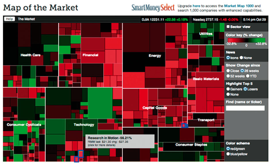 Author/Copyright holder: MarketWatch, Inc, www.marketwatch.com. Copyright terms and licence: All rights reserved
Figure 17.3: Treemap showing a comprehensive overview of stock market performance by sector and sub-sector.
 Author/Copyright holder: SAP AG. Copyright terms and licence: All rights reserved.
Figure 17.4: BOBJ Explorer, with columnar facets at top, and redesign sketch showing improved aspect ratio for visuals.
Figure 17.5: Left panel faceted navigation sketch.
Use conventional concepts when possible, and invent novel or differentiating features – that your users will need to learn how to use – only as a last resort. This is easier, less risky and asks less of your users. A very specific example is the quite powerful faceted data manipulation system. BOBJ Explorer’s horizontal columnar version was unfamiliar and confusing when introduced. It’s visually overwhelming, too complex for most people to figure out, inefficient in its use of space, and requires deft eye-tracking of states and changes across a wide area to know what is going on. While hard-core analysts might be able to figure it out, Explorer was intended for self-service casual use.
The re-design, in Figure 17.4 and 17.5, uses the same mechanism in a more conventional left-hand navigation panel as we see in consumer applications and e-commerce sites, using the expanding/collapsing “accordion” design pattern. This allows more space for titles and longer selection display lists. Hierarchical dimensions are nested in a tree structure, differentiating them from orthogonal dimensions. Given the landscape screen orientation of most browser-based work, the left navigation panel enables a results viewing space to the right that approaches squared proportions, which is more appropriate for chart viewing than the awkward horizontal strip underlying the BOBJ Facet Panel. This design, in fact, is a precursor to the Lattice.
These two hierarchical browsing models are in fact reflected in the MacOSX Finder, where you can view your file structure presented as icons, list (tree), columnar, or cover flow (carousel). ITunes now also offers columnar Attribute browsing for music collections in the fixed order of Genre > Artist > Album, with the filtered list of songs below. For such simple applications the columns can work well. In fact columnar is my default Finder browsing pattern. The Lattice is essentially the OSX columnar browser, only with each newly-opened layer appearing below the previous instead of to the right, with a default sort by size. A Lattice used for file browsing could rank files by several measures, including size, time of event dates like creation / last opened / last edited, etc. Again, the advantages of stacking the layers versus making them columns include the common horizontal measurement axis, the user inclination to drill and scroll down, consistent space for text labels, etc.
Lists, readable text, social media protocols, and Web navigation conventions can be applied to visual analytics without reinvention. In some cases, doing so requires some basic changes to visual analytic conventions, as with flipping plot scales / sums from the bottom to the top of the view so as to be more visible.
Borrowing can also occur at higher levels, where general models of analysis and judgment can be relevant. My favorite example of this is the mining of equity and financial markets – the dominant industry for quantitative content reporting and analysis – for patterns to use in products for other subjects. Having a working knowledge of financial concepts, and having re-designed a major consumer wealth-management and equity trading product, I’ve often fantasized about forcing unrelated performance management data into an equity format, with stock price, price-to-earnings ratios, analyst estimates for KPIs, etc. What would your brand or product annual performance review look like in this format? Or your personal performance review? Instead of the idea of corporations as people, how about people as corporations, with performance metrics in the same format?
Although this corporation example might sound creepy, “context swapping” is a useful technique for finding innovative ideas. Capital markets are not perfect, but they present a proven and efficient model for measuring the most immediately relevant commodity: Monetary value. If a company’s publicly traded stock price and market capitalization is the simplest measure of its worth and the pivot point of a global betting market, what is the equivalent measure for other things in life? Employees get ranked as, e.g., Outstanding, Exceeding Expectations, Meeting Expectations, Not Meeting Expectations, or Developing. Sports teams, and athletes like golfers and tennis players, are ranked. For the more subtle and complex task of ranking athletes in team sports, players are scored on a scale. American Football quarterbacks have a standard performance rating system, with individual scores that are more or less relevant historically, enabling us to fairly compare the performance of today’s Tom Brady to the 1960s’ Johnny Unitas.
The annual NFL draft is a high-stakes hiring process, with multi-million dollar salaries at stake for America’s professional football teams. Every candidate is timed, tested, examined, interviewed, and probed to judge their health, fitness, and game skills. American college-level football teams perform a similar but much less intense analysis of teenage athletes for potential scholarship offers. Multiple recruiting services rate and score these players on a 100-point scale according to the skills and physical properties needed to succeed. Players are ranked nationally by their position, state, region, and overall. Multiple ranking services are merged into averaged composite scores. This is made easier by the naturally quantitative nature of sports statistics. Performance and scoring data abound, especially for baseball, due to its highly regimented and discretely fragmented event structure. Baseball even has a formal metric called the Earned Run Average , which measures whether runs allowed by a pitcher were in fact his fault, or rather due to what was judged – by judges present at the game – to be an error by one of his teammates.
Also tracked are key physical measures of athletes like height, weight, strength, footspeed, and pitch velocity. Even intangibles like leadership, character, and toughness are scored, according to expert evaluation in interviews and off-the-field behavior.
Figures 17.7 and 17.8 show a design for how such a common-scale evaluation might occur, rendered with real names, but hypothetical score data. This is for players in the 2012 NFL draft, with a limited set of hypothetical test categories and scores, and pretending to be used by the Cleveland Browns team. There are 357 players in the draft. All are scored on a 100-point scale, and grouped by position. Position aggregations show the average score of all players in that grouping. For example, this year seems to be a good one for quarterbacks, but a weaker one for offensive guards. Other positions are scrolled out of view. Fuchsia-colored markers show the historical average score for the position, and the yellow marker shows the best individual score on record.
We can unfold the top-ranked quarterback and see how their overall score breaks down into individual test scores. These are divided into physical scores in dark blue, and non-physical in light blue. Each score has a different weight according to its importance to the particular position, with Speed as the most important attribute in this model, and Subjective as the least. Subjective is a variable to measure “gut feel” of a talent scout. The book and movie Moneyball was about supplanting this particular variable with more concrete and objective performance data.
We can filter to show only speed tests, and see a time series display of how a player’s times have changed through the years. You can see here that certain positions are known for the speed of their players. We can also see that Kendall Wright was getting faster but has not been timed recently, while Michael Floyd is getting slower. Because lower times are better in this case, they are given a negative polarity – meaning lower time values equal higher speed score values.
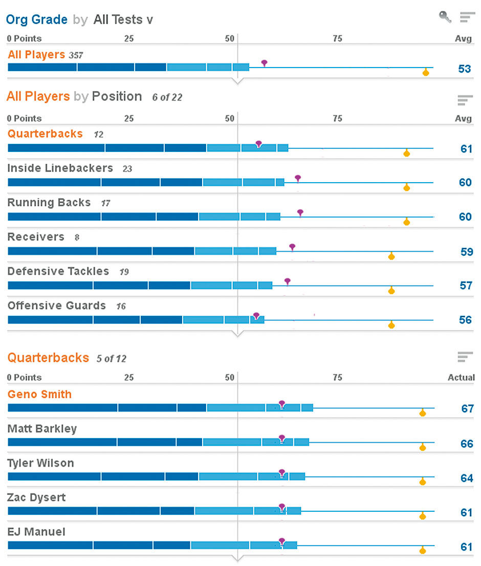
Figure 17.6: Lattice view of NFL draft candidates
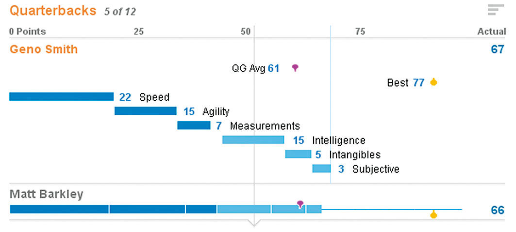
Figure 17.7: Unfolded quarterback score.
Similar systems could be used to rank and analyze anything. The key is to use Normalized Measures. By normalizing – meaning converting or mapping – the scores into a base-ten scale, of 1-10, 1-100, 1-1000, you can create a standard context – a commonly understood framework for comparison. This helps consumers to place otherwise meaningless scales and numbers into a familiar scale. If I tell you that my score was 820, it’s meaningless. If I tell you that my score was 820 out of a possible 1000, that brings with it certain cultural assumptions, which still may need further clarification – e.g. is the grade absolute or on a curve, is the curve sampling small or large, etc. – but that are surely beneficial to understanding.
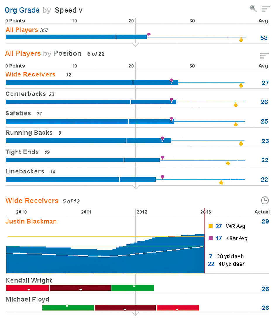
Figure 17.8: Scores filtered for speed tests, with unfolded history of times.
The art of carrying out such a system lies in the creation of its evaluation models and weightings, which in the case of sports could be customized by each individual team, or even each talent scout on each team, to suit their unique needs, values, or perspectives. The same could be done with products, employees, or anything with value measurement criteria. Of course such a system can never be 100% definitive, as there will always be immeasurable factors. Jack Welch, former CEO of General Electric, was infamous for his draconian employee ranking system, which required the annual removal of the bottom 10% of ranked performers. With such drastic consequences at stake, it’s key to ensure that the many intangible aspects of work are being accounted for. The current debate of education in the US revolves around formalized test scores, and their role in judging success. Can something as formless as an education be measured accurately enough through testing to be used as evidence for declaring winners and losers? Is the alternative subjective judgment provided by local teachers and administrators to be trusted, and of sufficient precision? What the use of a weighted measurement system can do is to make visible the criteria and results that are already in place and modeled.
Default settings that offer the best solution for the most cases is an example of product design prescription. In the crucial process I call thresholding , the factors of focus, scope, and commitment are deliberately limited so as to provide only the most useful product features and content. Thresholding helps a product to be simpler to use, and to be produced and sold at lower cost. While feature prioritization is a common activity in any product development practice, in today’s enterprise software product design, this is perhaps the defining challenge. Companies like SAP have spent decades creating special software tools to help automate every imaginable use case in business operations. When faced with disruptive forces like cloud computing, they need to strip features of known value to achieve the necessary simplicity, price point, time-to-market, and agility to compete.
Choosing a horizontal bar chart as the basis of the Lattice is an example. Limiting Points to a single fixed size and constrained content display, at least initially, serves to limit variety so as to get the concept to market sooner, and the most relevant form that is guaranteed to work well. Apple has always been highly prescriptive in contrast to Microsoft, even though it almost killed them. Their model from the start was to control the usage experience with a high guarantee of quality, while Microsoft opened its ecosystem to more applications, particularly for the business market, but with less consistency and quality control. While Microsoft was more successful in the initial PC revolution, Apple’s control strategy allowed tighter integration across hardware and software. Apple’s strategy has ultimately proved more successful, and now translates much better to a world where computing is now a major part of consumer lifestyles. Apple is perceived as a luxury brand, while Microsoft products are perceived as commodity.
Thresholding is a key part of any freemium usage model. Freemium is where a product is offered free up to a certain level of usage. By upgrading to a paid version, users can unlock more features, usage time, amount of content accessed, an advertising-free experience, etc. The original vision for LAVA was to have it available in the cloud on a freemium basis. Users could upload a compliant data set and see it rendered for free in a default Board. The Board would have limitations of data set size, number of users, performance, functionality, or other attributes that would be removed with a tiered paid account structure. LAVA is particularly viable for such a model. It offers a fundamentally simple and homogenous base version, and is designed to be expanded, and layered with added content and features, without breaking.
Such a model is particularly effective for enticing a user base that demands only light usage, or is unfamiliar or skeptical of a product’s value proposition. This description reflects well the looming audience for widespread visual analytics consumption, whose expectation will be consumption-oriented, lightweight monitoring experiences that are “good enough”. The presence of this audience will drive the industry toward a broader base of “set and forget” forms featuring LAVA-like simplicity, which will eventually come to influence more sophisticated practices in the workplace. For example, tactics like embedding manipulation controls within titles, leading with one- versus two-dimensional plots, and having rows expand by unfolding in place encourages consumption behavior that over time, via feature discovery, gradually reveals more precise or powerful means of product manipulation. In general, when complexity is introduced gradually through such discoverable means, features can be tried by the user at their own pace, without intimidation, loss of context, or awkward media breaks.
A major UX technique that is still being optimized for teaching and usability purposes in Web applications – in contrast to its traditional use for purposes of showmanship – is the use of animated transitions to maintain user engagement thanks to a concept called Flow. Flow is a formal theory of cognitive engagement, from Hungarian psychologist Mihaly Csíkszentmihályi. Besides having the most unpronounceable name many of us will ever encounter – mee-hy cheek-sent-me-hy-ee – his concept of flow outlines the basic, intangible connection that interaction designers seek to create between their creations and the people that use them:
In his seminal work, Flow: The Psychology of Optimal Experience, Csíkszentmihályi outlines his theory that people are happiest when they are in a state of flow— a state of concentration or complete absorption with the activity at hand and the situation. It is a state in which people are so involved in an activity that nothing else seems to matter. The idea of flow is identical to the feeling of being in the zone or in the groove. The flow state is an optimal state of intrinsic motivation, where the person is fully immersed in what he is doing. This is a feeling everyone has at times, characterized by a feeling of great absorption, engagement, fulfillment, and skill—and during which temporal concerns (time, food, ego-self, etc.) are typically ignored.
- [Wikipedia]
While flow is so basic as to appear fairly obvious once described, Csíkszentmihályi’s research identifies specific environmental factors that contribute to its achievement. Central to many is the lack of interruptions, media breaks, or “hitting the wall” in frustration while trying to get something done. LAVA’s Lattice, and to a lesser extent its Channels and Board Sets, induces flow in the analysis and exploration experience, and does so by providing simple, clear, logical, unbreakable layouts and state transitions while maintaining focus on a single form in a single space. Continuity of the LAVA experience between devices attempts to maintain flow as much as possible across time and space, by favoring continuity at the expense of more features, or more unique versions, optimized for individual devices.
When flow must be broken to access more powerful analysis or authoring tools, it’s key to link the consumption experience to the power tool by maintaining the user’s data set consumption state and context, and then passing them over to the new app as a starting point. Flow also relies upon maintaining user confidence and trust in the visual analytic content, as well as not having to call IT for help with enhancements or training. Instead of asking workers to endure poorly provisioned data, invest IT effort in the creation and maintenance of consumption-compliant data sets, versus the current model of having them manually create reports and dashboards with work-arounds.
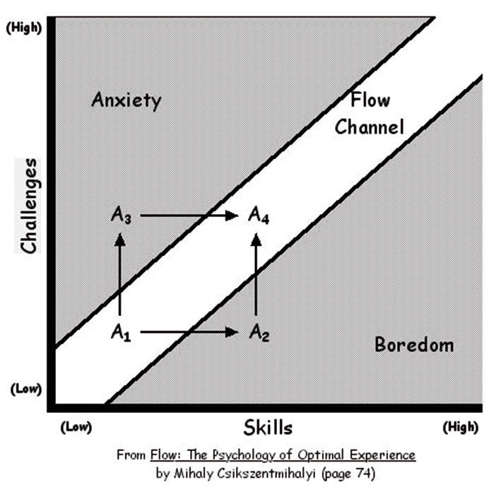
Figure 17.9: From Flow: The Psychology of Optimal Experience , Mihaly Csikszentmihalyi.
Initially made possible through the use of the Flash and Silverlight authoring tools and browser plugins, and now through the HTML5 coding standard, animation has brought us a long way from the Web’s initial page refresh model where, after each click, pages went blank and were then re-loaded and rendered in their new state. This simple example of a media break severs the continuity of the user’s visual field, requiring cognitive effort by the user to re-acquire any layout or state changes on the screen. The benefit of animation is to use movement within an otherwise static screen to focus attention on the items that are changing position or state. This is particularly important in the highly interactive, ever-changing, and often unfamiliar environments of visual analytic exploration and manipulation. It is in fact a core ability for the iterative, trial-and-error protocol of modeling environments, where the point is to change independent variable values and see, in real, time the effects upon the dependent variables.
In the 1996 book The Media Equation: How People Treat Computers, Television, and New Media Like Real People and Places, Byron Reeves and Clifford Nass outlined how people personify computers and other non-human things — essentially thinking about and interacting with them as if they were human or real-world phenomena. While this may sound like a prescription for more skeuo literalism along the lines of Clippy, in fact their research’s most relevant findings are applicable in more subtle ways. For example, people prefer lower-resolution but fluid video playback versus higher-resolution but jerky or interrupted playback. The theory is that while in nature we have a long history of seeing in low-light or obscured environments, such as through fog or with impaired eyesight, the world never just stops moving outright, and so when video does this we find it disconcerting.
We expect moving objects to behave according to the laws of physics, even when, as with digital media, they don’t have to. The problem with skeuo is that it addresses this too literally by making digital elements look like physical elements, or behave like them in trivial or restrictive ways. The art of applying the research of the Media Equation is to treat numbers and charts as viable, if only symbolic, entities in their own right, and use the well-worn cognitive paths of physical cause-and-effect to convey relevant activity within the digital space.
While static skeuo is a crude way to use real-world metaphors in making software accessible, dynamic skeuo – using metaphors of movement and behavior – can be quite relevant to current challenges, as long as they are not so literal as to become restrictive. The Mac OS uses animation effectively to show the origin and destination of items in transition. In Apple’s IOS, the jiggling of app icons in conveyance of their being in an editable state is impossible to ignore, and suggests the mild anxiety felt by a collection of apps in limbo and at risk of being displaced or deleted. It will be interesting to see that if, in the future, such likable effects become as stale and kitsch as static skeuo is today. I think however they will be with us for awhile, especially those that reduce the rough edges of transitions by filling them in with relevant, instructional animated depictions of what is happening. Doing so is an important way of inducing flow and making products likable.
Again, many of these are basic principles applicable to the design of any time-based experience – they merely have yet to be applied thoroughly to the visual analytic space. I believe that due to its precise, brittle, and definitive mathematical underpinnings, visual analytics has been hindered by a habitual,stodgy adherence to perfection, completeness, and precision at the expense of relevance, accessibility, and accuracy.
17.0.5 Sustainable Management
LAVA is an economic proposal instantiated in a design language. No matter how cool or powerful a solution, if its use costs more than the value of its benefits, it won’t be adopted. Widespread visual analytic usage demands a systematic lowering of TCO to the point where the systems we implement are economically viable, or sustainable,versus becoming unused “shelfware”.
To be sustainable today, most solutions need to be designed from the start to be consumed on multiple devices. This does not mean that cross-device experiences need be identical, but rather that they need to share a similar cognitive model and theme, working in similar ways while using device-specific behaviors where it makes sense to do so. Examples of how LAVA does this include its x/y/z semantic dimension layout convention, the use of stacked row titles for more label space and easier touch selection, and its robust Point format that can easily fit onto small screens and be compiled elegantly and accessibly. Also important is the inherent elasticity – the ability to re-size without semantic distortion or degradation – of LAVA components. In the short term it may be easier to design specialized app versions for the individual device platforms of desktop, browser, tablet, handset, and wearables. In the long term, it’s wise to invest in distinct components and behaviors that tie the experiences of these devices back to a single brand, and to a familiar way of seeing and working with data. The results of greater loyalty, broader and deeper usage, and the efficiencies of re-using and refining fewer and more robust components will pay off.
Sustainability also requires scalable, effortless system growth without requiring a redesign every time usage, data volume, or content variety increase. The elegant overflow and expansion of content within Boards, the use of categories to expand navigation within Boards and to multiple Boards, and the expansive layering of extra data and features in the Z dimension, allow organic growth without disrupting the underlying visual forms and layouts, even if such growth is unanticipated at the start. Given the current visual analytic environment of many new customers, data sources, and use cases, being able to start simply and grow without disruption will be especially important.
A simple example of this is in the default design of Markers in the Lattice Row display. In initial designs, to convey the position of a small marker as a benchmark value for comparison to the actual value bar plot, we used a simple tickmark image. However, if multiple Markers were to ever occupy the same point on the scale, they would overlap and be inaccessible. Acknowledging the need for multiple markers and to reduce cases of overlap, we adopted alternating top/bottom marker placement. This minimized the occlusion but did not eliminate it. To enable Marker identification beyond the use of color, we enlarged them to display mnemonic symbols. We changed their shape to allow up to four Markers per row with no occlusion. In the worst case where all Markers occupy the same point, they are all still visible.
This approach illustrates the discipline of Systematic Design, where unseen but anticipated use cases and future scaling needs are designed into products before they are actually encountered. As long as such tactics do not compromise initial success or cause undue delays, they pay for themselves in the long run, and the associated constraints often guide the product form to new forms, based on rigorous requirements versus on whimsy. This is of course a basic skill of any technical system developer, keen to avoid bugs and crashes in systems ill-prepared for certain situations.
Figure 17.10: Initial Row plot Marker design.

Figure 17.11: Revised Row plot Marker design.
Figure 17.12: Current Row plot Marker design.
LAVA’s self-service, personalized, social-enabled Boards enable broader appeal and usage by more users because of the need for fewer provisioned destinations, chart types, and interlocking components. With cleaner, more robust data sets and constrained, unbreakable user-driven interaction, fewer things can go wrong in the ecosystem, which lowers maintenance and support costs. The general-purpose and free-standing components and containers are readily embeddable, allowing a continuous and familiar visual analytic experience across dedicated Boards and workflow applications. Rows, for example, even lend themselves to hassle-free, in-line analytic displays to be embedded within running text:
Earnings at XYZ corporation are above expectations so far this year, but a troubling forecast predicts underperforming on year-end targets:
At competitor Acme, the picture looks different as they expect to take market share from XYZ and benefit from favorable currency exchange rates:
Here is an example of this effect starting to be used in popular media:
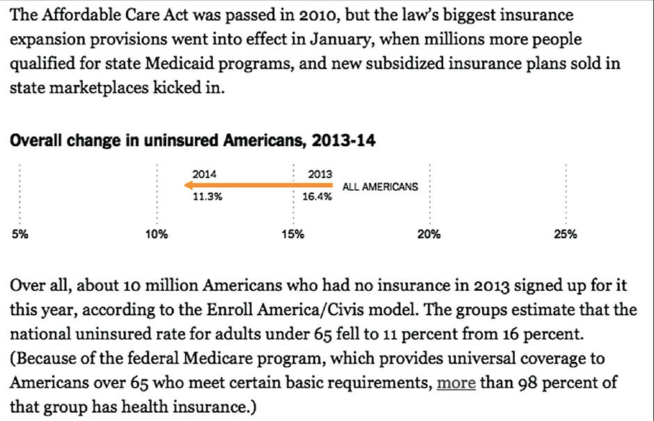 Author/Copyright holder: The New York Times Company. Copyright terms and licence: All rights reserved.
Figure 17.13: Inline 1-dimensional chart from nytimes.com
This competes the summary of LAVA’s Metric System, Visual System, Organization System, Interaction System, and Value System. With this scalable framework in place, we can start to dream of efficiencies on a large scale, with entire Board Sets generated automatically from adequately-provisioned data warehouses. Filters, Panels, and Lattices can be determined with a rules engine automatically from combinations of Measures and Dimensions. Galleries can be populated by algorithm-generated charts derived from the most relevant Lattice Layers. Points can be created from data set indexing and data mining, and populated with major category representations and outliers. Multiple data sets can be organized into groups and presented as Board Sets, or one giant data set can be subdivided into Boards according to individual or sets of Measures or Dimensions, with these Boards further subdivided into Categories and Lattice stacks according to the depth and complexity of the data. These efficiencies will allow more people to use data to make decisions, and require fewer people to support them.
Each of these LAVA systems and components has individual value. The Board is a nice, neat way to show analytic content across devices. Points are a good mini-chart format that can be made available in a library and used anywhere, on their own or in sets. Lattices are quite suitable for embedding within other applications. When seen together as a catalog, they begin to represent trends and patterns of how to improve. When some or all of the elements are combined, they create synergy resulting in value exceeding that of the sum of their value as parts. They are designed to work together and complement each other. It was, in fact, part of the strategy for LAVA’s design and adoption to not require an all-or-nothing adoption decision by teams within SAP, but rather to offer bite-sized components independently for a more agile, gradual, or partial implementation.
A LAVA system implemented as envisioned at full scale, however, would bring a dramatic upgrade in the simultaneous delivery of casual user access to masses of data, along with a self-directed way to filter it to individual needs. The full system would enable:
- Selecting a Board from a Board Set using a large-format menu button
- Setting of up to three Board Filters using picklists
- Selecting a Category from a row of tabs
- Drilling into a still potentially very-deep Lattice within the Board Well
This enables the selection of five order-of-magnitude-level filters of Sets, Measures or Dimensions in a warehouse before the Lattice is even reached within a Board. The idea would be that a data warehouse could be provisioned into Boards according to the need for data to be analyzed together, as this is the only exclusive filtering step. Within a Board, the user has access to the whole data set in the Lattice – with all Filters open and the All Category selected. Or, consumers can use the familiar picklist filters and tabbed Categories to trim down the Lattice to a smaller, more focused size. In a way reminiscent of Charles and Ray Eames’ famous film The Powers of Ten, the system enables zooming from massive scale to minute details in a structured, familiar ,and manageable way. While the extreme example above might sound daunting, it is not unlike the workings and experience of sites like Amazon, Ebay, and IKEA.
While the odds of spawning a satisfactory visual analytic environment automatically from a data warehouse on the first try are slim, the results would serve as a sketch of sorts, a starting point for subsequent manual provisioning and usage-based evolution. Finally, we can imagine how, once such a system is validated, it could start to influence the form of data sets themselves. No longer would consumption tools be burdened with satisfying endless, wonky edge cases resulting from sloppy data provisioning and disconnected, overworked content authors.
A good user experience is no longer a product luxury but a mandatory driver of success. More and more we will see the IT landscape start to pivot around romancing the fickle relationship between casual users and their content, and less around legacy machine-friendly practices. Poor performance, accessibility, or data quality will no longer be acceptable excuses for a poor visual analytic consumption experience. Just as BOBJ took the first major step towards coherence with its Semantic Layer, it is now up to the entire industry to orient data provisioning towards the needs of practical mass consumption.
17.0.6 References
17.1 | Magic Ink: Information Software and the Graphical Interface (web) | Brett Victor | http://worrydream.com/MagicInk/
17.2 | Flow: The Psychology of Optimal Experience (book) | Mihalyi Csíkszentmihályi | Harper Perennial Modern Classics
17.3 | The Media Equation: How People Treat Computers, Television, and New Media Like Real People and Places (book) | Byron Reeves, Clifford Nass | Center for the Study of Language and Information
17.4 | The Powers of Ten (video) | The Office of Charles & Ray Eames
