Everything should be made as simple as possible, but not simpler.
- Albert Einstein
A major benefit of LAVA is how it is broken down into a system of manageable, interlocking parts, which better fit both people’s attention spans and the spaces available in today’s media landscape. We’ve looked at how Dimensions and Measures are combined into Metrics, Metrics combined into Rows, Rows into Layers, and Layers into Lattices. Points are a different type of component, in that they are free-standing and not intended for combinatorial computation. The Point is the name given to SAP’s proprietary format of minicharts, which I define as a special chart format designed for small rectangular display areas, and thus having unique, strict rules and constraints for the display of titles, values, and visuals. Such rules are necessary not only as guidelines, but to enable fully automated minichart generation, with guaranteed coherence and legibility. Points can be thought of in the same light as the well-formatted individual results from a Web search engine – a form intended to summarize and convey the most relevant content about something in a consistent, compact, and easily comparable format.
This involves trade-offs, where all content relevant to a Point may not fit readily into its default format, so Points rely upon a design system of constraints, priorities, abbreviations, and inspection affordances. This allows the most important content to appear clearly, while hidden details are available on demand through simple interactions. Points achieve their consistency through the dedication of distinct display areas to show the most commonly used multi-dimensional data types. Most data expressions involve a combination of Dimensions (data categories), Measures (ways of measuring these categories) and time indicator (a special type of Dimension). Visual analytics provide multiple ways to visually plot combinations of these variables to efficiently convey information. Figure 16.1 is the initial layout spec for the Point elements. It is presented in a refined wireframe format, not the final visual design.
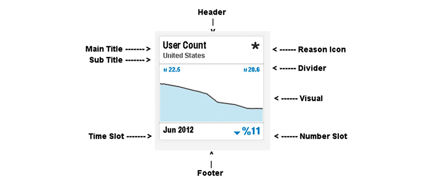
Figure 16.1: Point elements.
Digests can expand in size take the form of a matrix of Points. The Point layout needs to work for both free-standing Points, Points in a single-row Digest, and Points in a matrix. The hairline dividers provide horizontal continuity for row and matrix displays. While being a viable form for authored or curated content rendered in Point form, we can also imagine this view being used to show search results for one or more data sets.
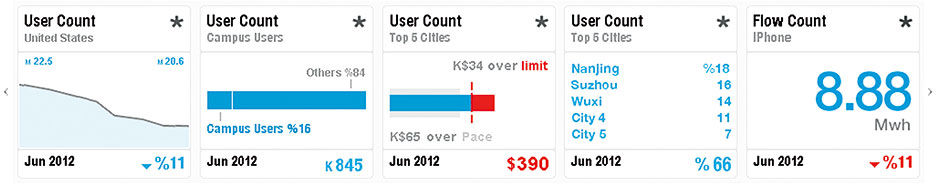
Figure 16.2: Points in the Digest container
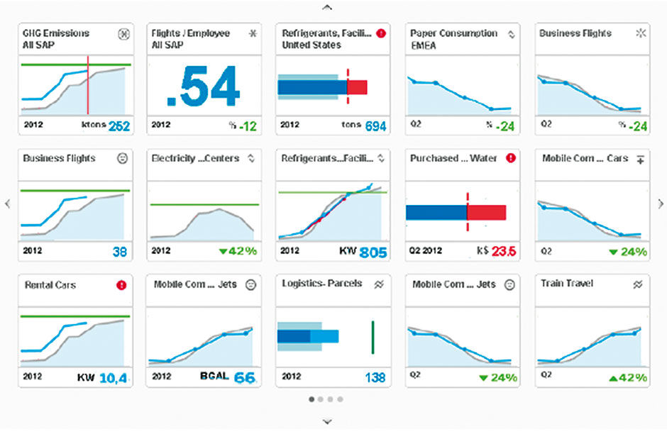
Figure 16.3: An Expanded Digest.
Points can stand alone, or be assembled into groups within the Digest container. They can also degrade into smaller sizes by dropping the Visual and truncating the titles. At this size they are limited to conveying a single Metric, and begin to transition into the category of microcharts, in the case of Figure 16.4, with numerical displays, but we could imagine sparklines, anaji, etc. used here as well.
Titling is actually the trickiest part of creating a coherent Point. Simple cases as on the left of Figure 16.5 are easy, but as we can see on the right, sometimes the amount of context required for an accurate, precise Point is extreme. For this reason, the Header can be manually expanded with a windowshade affordance to show sufficient identification of the Measures shown.

Figure 16.4: Point content in reduced and row-based form.
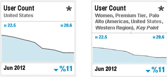
Figure 16.5: Default and manually expanded Headers.
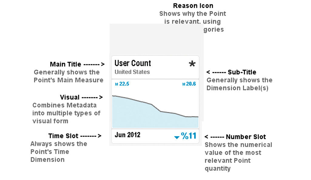
Figure 16.6: Main element descriptions
Points have multiple visualization types to suit different purposes. Each visualization type is assigned to convey a certain quantitative situation. Although some Visuals enable combinations of these categories, such as where multiple trend lines in a line chart allow Dimensions to be compared, each category has archetype forms that Points provide. The six Chart types of trend, contribution, comparison, deviation, table, and numeric support the vast majority of quantitative expressions.
Trends show one or more Metrics tracked over time, typically in a line chart with time on the X-Axis and the Measure on the Y-axis. Points allow up to three trend Measures.
Contribution displays show how a quantitative whole is divided into sub-categories, and the relative size of those sub-categories according to a Measure. Although pie charts are the most common form, Points use Strip charts due to their advantages of accuracy and ease of titling.
Comparisons isolate several Metrics and compare them. Bar charts are the main vehicle for strict comparisons between Metrics. Points can compare up to three at a time.
Deviation displays show precisely how a Metric differs from one or more related Measures. Examples of related Measures include actual values versus that Metric‘s goals, limits, averages, or benchmark peers.
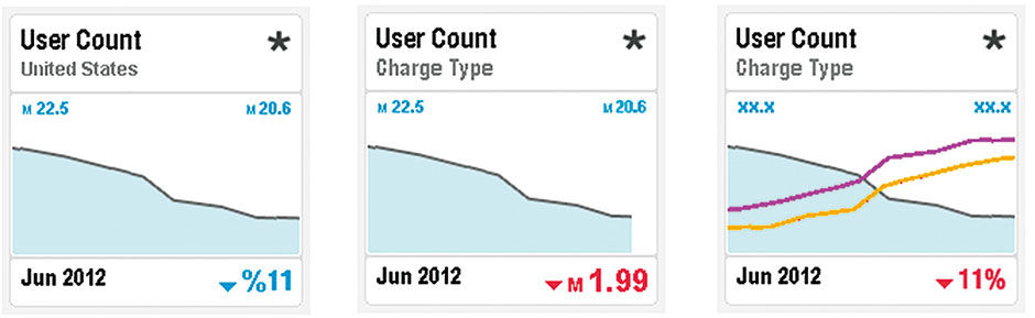
Figure 16.7: Trend Points.
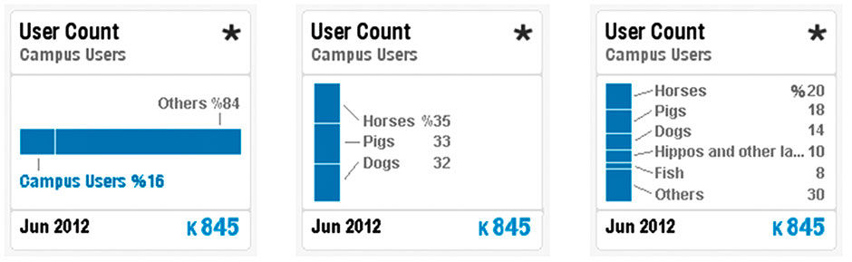
Figure 16.8: Contribution Points.
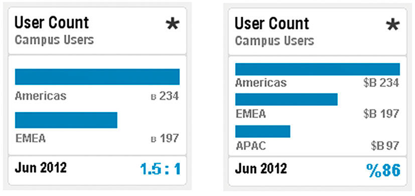
Figure 16.9: Comparison Points.
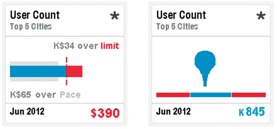
Figure 16.10: Deviation Points.
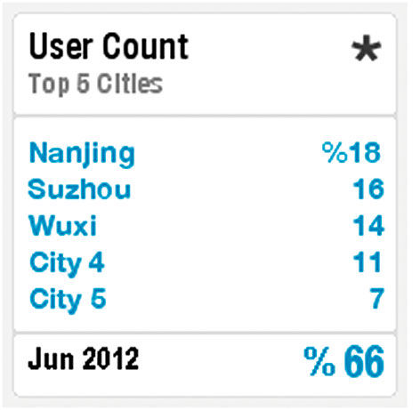
Figure 16.11: Table Point.
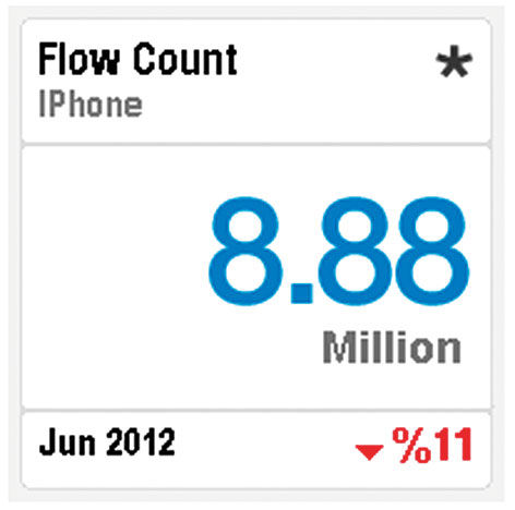
Figure 16.12: Numeric Point.
Tables are good for listing Entities and indexing them to a common Measure. They generally are poor at providing the instant comprehension of the geometric chart types, but still have value as a way to rank small sets of Metrics and show their Measure Values.
Numeric displays can be appropriate for Metrics deemed highly familiar to a given context and its users. Simply showing the Metric’s Value for a fixed point in time, or change in a period of time, can be sufficient. Familiar Measures might include stock prices, outdoor temperatures, or body weights. Familiarity of the number’s context allow it to have meaning without explicit comparisons.
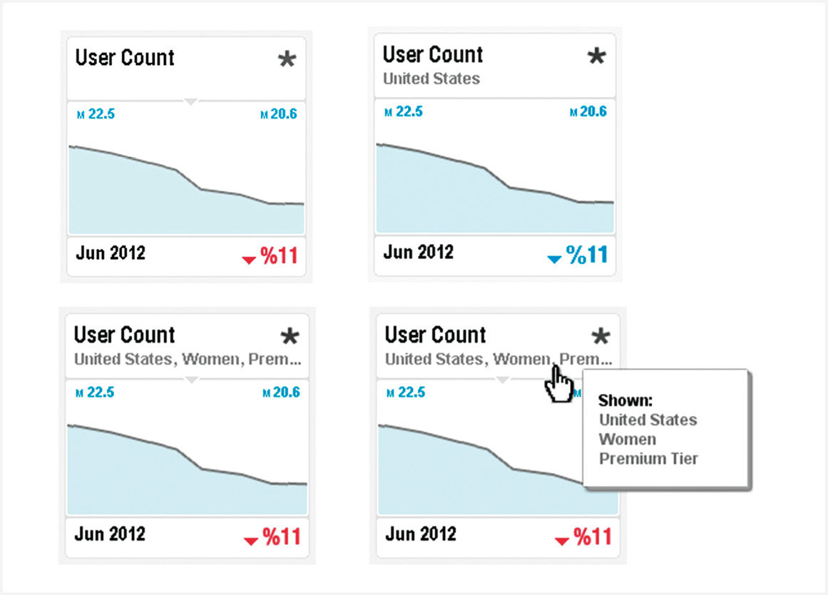
Figure 16.13: Simple Point, Filtered Point, Overflow Point.
In a Simple Point, no Dimension Attributes have been selected, so the Main Title shows the Measure. When no Dimension titles appear, the assumption is that the qualifier is All. This could be shown but to reduce clutter it is left out. With a Filtered Point, one Dimensional value is selected, in this case United States. This appears as a Sub-Title. For Multi-Filtered Overflow Points, if titles don’t fit in the Subtitle space, they get truncated with [...] and are available via HTP (Figure 16.13).
While Charts authored manually can be custom-titled to suit their context, to be auto-generated, Points rely upon titles scripted automatically from their Metric labels. To respect the limited space of Point Headers and Footers, long and/or detailed titles need to be truncated or partly hidden, showing only what is likely to be most relevant for the context. We call the system for controlling this Smart Titles. Smart Title rules try to ensure that the most meaningful metadata-based titles are on display. This involves making assumptions about what is most relevant to a user to understand a Point. The general priority is:
- Main Measure (1 of 3 possible Measures is always designated as Main).
- Non-Hierarchical Dimensional Attributes (applied filters) in reverse order of user/author choice.
- Hierarchical Dimensional Attributes, lower-level to top level.
- Secondary Measures.
- Point Reason spelled out in words.
The key challenge here is to convey the sometimes long strings of applied filters of selected Attributes, as well as up to three Measures. Based on context and user preference, all titles need not be displayed at all times, but all need to be somehow accessible. Because the time Dimension is ubiquitous, it has a dedicated Time Slot title, so Header Titles involve only Dimension Attribute and Measure labels. Points allow two title rows by default, but some Points may have more selected Attribute labels than can fit in this space. Points manage this in several ways to cover browser and touch interfaces:
- [...] to indicate truncation.
- Tooltips to show full titles.
- Points enlarged into charts show full titles.
- Header resizing with the Split Bar.
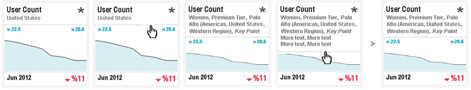 Figure 16.14: Windowshade behavior
Users can drag down the Split Bar to see three or four rows of Header Titles. The Bar handle appears on cursor-hover, and the user can drag it down to snap into a three- or four-row title display. The Chart proportionally reduces in size. Touch input will skip the hover state but enable resizing. The Header can be resized to remain showing four title rows. If this cannot show the entire title, it can be dragged further down. At this point the windowshade starts to obscure the chart, and will stay down only as long at the user holds the Split Bar. If user lets go, the Bar snaps back to its previous spot showing four rows.
In the Simple Point of Figure 16.14, no Dimension Attributes have been selected, so the Main Title shows the Measure. When no Dimension titles appear, the assumption is that the qualifier is All. This could be shown but to reduce clutter it is left out.
As Points will primarily exist within a compliant context, namely a LAVA Board, this context can provide titling for its Points in the form of a Board’s filters, Categories, and Board Title itself. With the feature of Contextual Titling, if any Point Measures or Dimensional Attribute titles are present at the Point’s Board level, those titles are automatically removed from all Point titles as when shown here they are effectively redundant. However, if Points are removed from their Board’s context, such as when embedded into an application or sent via message, any missing titles will re-appear in their normal prioritized position in the title hierarchy.
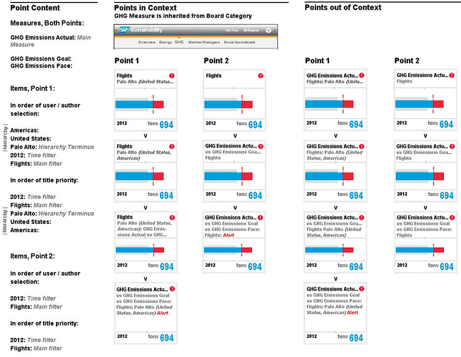
Figure 16.15: Contextual Titling examples.
While with these latter cases the user cannot see all the titling needed for full comprehension, they have the affordances to remedy this through HTP or zooming actions.
For Board content – i.e. Points, Posters, and Lattice – to inherit Contextual Titles from parent entities – i.e. Board Categories & Filters, Board Titles, and Board Sets – these entities must correlate to a particular Metadata Element – such as a Measure, e.g. Greenhouse Gas Emissions or GHG, a Time Dimension period , e.g. This Year, or another Dimension Attribute, i.e. Americas. In theory the Board Title Itself can fill this role, in cases where a single data set might be used to populate multiple Boards. For example, there might be one Board for each Region, with each region having Categories made up of Measures (GHG, Energy, etc.). Here, Board Elements such as Points, Lattice, and Posters need not include their redundant Region or Measure in their titling. This needs to happen in the authoring process, where the author can edit Measure text used in Parent Contexts (e.g. shortening “Greenhouse Gas Emissions Actual” to “GHG”).
Main Measure is the first Measure selected in order, or is designated by the Author/Consumer.
Points can inherit Metadata selections from their Context Parents (Board Categories, Board Filters, Board Titles). Inherited selections are removed from their position in the Title Order. Their position is replaced by the next lowest in line. Use […] for text overflow, always at the end of the text row. Text never changes size to fit more characters.
Author/User title overrides (changing them to suit) should be possible. This might be done as a Title Annotation that can override any of the default titles. The Author might want to do this directly to the Metadata in the authoring phase.
Footer Titles include the Time Slot and Number Slot. The Time Slot always shows the Time Dimension Attribute. It renders dimensional time data in the order of smaller units to larger units according to its assigned time scale – day, week, month, year.....quarter, year....week number, year. It displays on one line in bold font if showing a standard time period, and on two lines if a time span from two discreet points in time, e.g. Jan 24 2011 - Jan 1 2012, or second / minute / hour periods. If a time period ends at the most current point in time, the second time period reads “Current”. The 2-line mode uses a smaller font. For data representing a single point in time, a time stamp is shown. Natural language displays are possible if enabled, for example “This Week, This Month, This Quarter, Last 3 Months”.
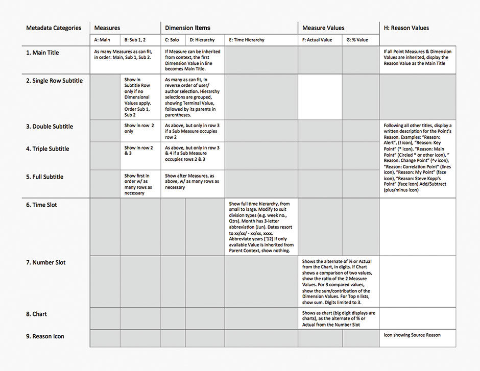
Figure 16.16: Smart Titling rules.
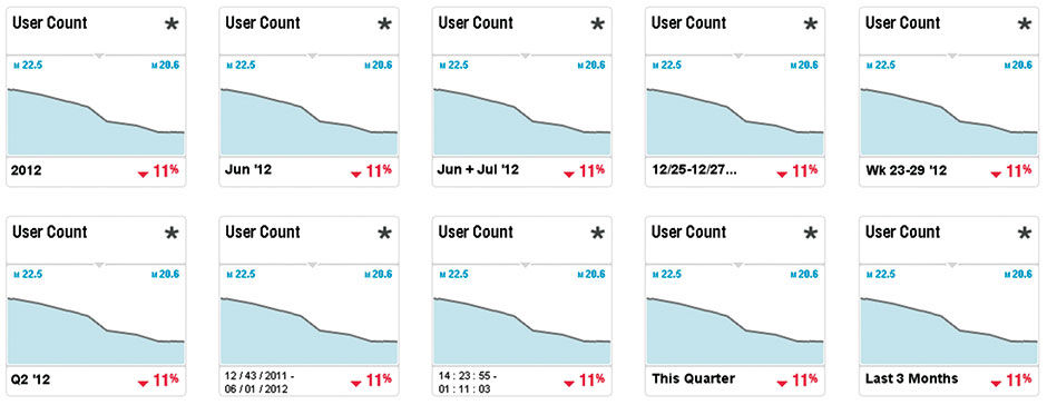
Figure 16.17: Time Slot formats.
The Number Slot shows the alternate of % or Actual from the Chart, in up to three digits with a decimal point if needed. If the Chart shows a comparison of two Values, it shows the ratio of the two Measure Values. For three compared Values, it shows the sum/contribution of the Dimension Values. For Top n lists, it shows the sum. Digits are limited to three.

Figure 16.18: Chinese equity market performance display.
Data sets themselves don’t necessarily know whether Measure Values going up or down are good or bad for a business situation. Performance management systems provide ways of assigning semantic value to Measure states and movements, for example sales going up is usually good news, and down is bad news. Conversely, customer complaints going up is bad news while going down is good news. Where possible, Visuals of these facts should interpret these as good or bad for users. The colors green and red are near-universal conventions for doing so, although in China, where red has positive associations, the equity trading systems have these values reversed.
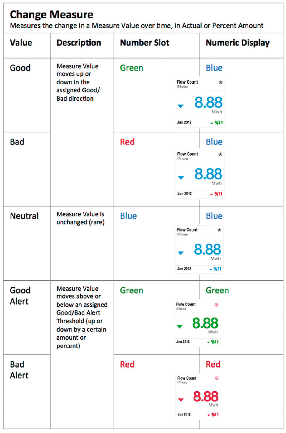
Figure 16.19: Alerting rules for Change Measures
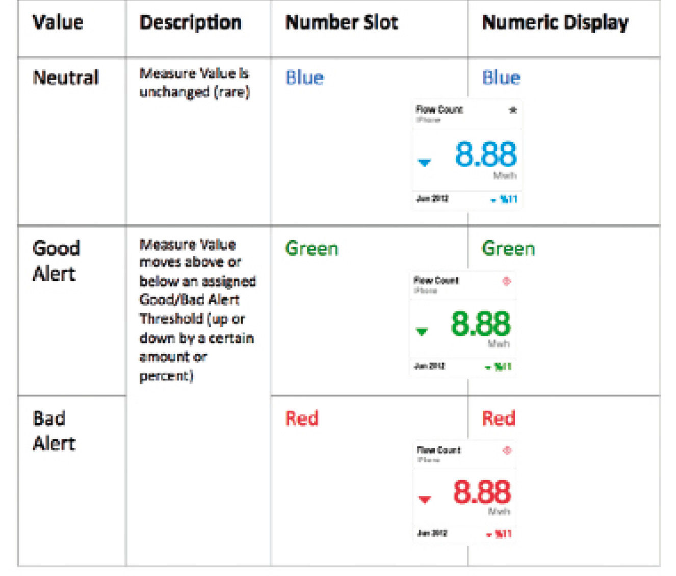
Figure 16.19b: Alerting rules for Change Measures.
A final case involves Measure Values needing an Alert state if they go over a Limit or under another Limit. Heart rate is a good example. In this case, a State Measure would have only Bad Alerts if the Value is over or under the respective upper/lower limits.
Points offer two levels of Semantic Value. The Change Semantic Value assigns a Value to Measure Value movement over time, with two value settings to choose from: No Value or Good/Bad Value. No Value – the default – assigns no Value to any number fluctuation displays – all numbers rendered in blue. Good/Bad assigns a Good or Bad Value to any Measure. Good or Bad can be assigned to the Measure increasing or decreasing, which automatically sets the opposite movement direction to the opposite Value – if a Measure Value increasing is set to Good, then it’s decreasing is set to Bad. If a Good/Bad Measure is unchanged, it is shown in neutral blue.
The Alert Semantic Value sets Limits for Measure Values. Measure Values going above or below Limits can be assigned to trigger Good Alert or a Bad Alert states. If the Limits are exceeded, the Point becomes an Alert. Alert Points show the Alert Reason icon and show numeric displays and Number Slot values in Red or Green.
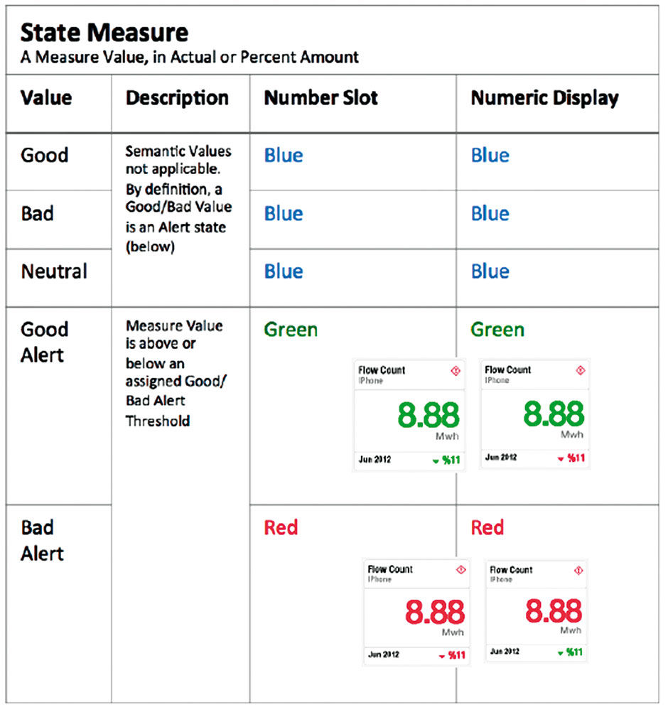
Figure 16.20: Alerting rules for State Measures.
An Alert Semantic Value can be applied to a Change Measure, triggering Alert Status if a Value goes up or down over a certain amount in a certain time.
A Point can also be in a Good/Bad Alert state, even though its Measure Value is moving in a direction of the opposite Semantic Value. E.g. Sales is below a Bad Alert Threshold – Numeric Display in red – but is trending in the Good direction – Number Slot showing upward movement and showing in green.
The Point’s Reason Icons, in the upper right corner, serve two purposes. First, they are a button providing access to the Point’s contextual command menu. Second, the form of the button’s icon indicates the Reason for the Point’s creation. Points can be created by Board Authors, Members, or by the LAVA system itself according to predetermined rules.
When creating a LAVA Board, the author can create Points to appear on the Board, and the Points refresh with new data according to the Point’s parameters. By definition, these points are deemed important by the author, and are thus called Key Points. Key Points may be made persistent on the Board, meaning that they are not able to be deleted or suppressed by the Board’s Members.
Boards always have one Main Point, assigned by the author or assigned by default by the system. The Main Point is used to represent its Parent Board in displays from where the parent Board is accessed, such as from a menu screen containing access to other Boards. The Main Point is intended to represent a particularly important or representative aspect of the Parent Board, and can be personalized by individual Members without changing the Main Point designation for other Members.
Members can author their own Points for display in a Board, called Personal Points. These can be shared among Members of a Board, where they become Shared Points.
LAVA can generate its own Points according to several algorithms:
Alert Points are created when a Metric Value extends over or under a predetermined Limit associated with a good or bad Author-determined judgment, thus triggering the Alert. Authors and Members can set Limits for Measure values in a Data Set. When a limit is exceeded, the system creates an Alert Point and displays it in the Board’s Digest.
Change Points, similarly to Alert Points, are automatically created by the detection of extreme changes in Measure Values across the whole Data Set, and automatically create Points to depict these outliers. Authors and Members can personalize these change Limits globally or locally using general percent change values.
Any Row or Layer can be converted, or “Snapped”, into a Point or a Poster from embedded contextual menus, which then automatically appear in the Board’s Digest or Gallery. Similarly, Points and Posters can be rearranged and deleted without interfering with the Board Layout. Figure 16.25 shows an early view of the Point catalog, with some cursory and still-inconsistently styled examples. Via HTP, full depictions of hidden semantics are available, as well as are Point management commands. In the future, even rudimentary manipulation and exploration capabilities could be added, such as the changing of percent/actual settings, measures, and even Dimension Attributes.
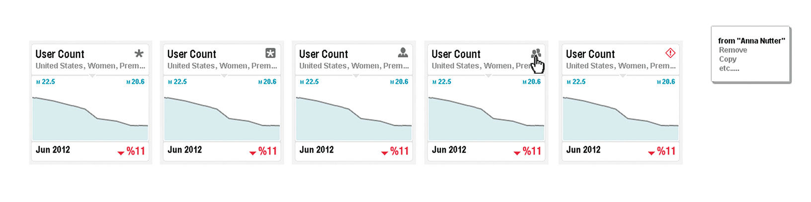
Figure 16.21: Via HTP, full depictions of hidden semantics are available, as well as are Point management commands. In the future, even rudimentary manipulation and exploration capabilities could be added, such as the changing of percent/actual settings, measures, and even Dimension Attributes
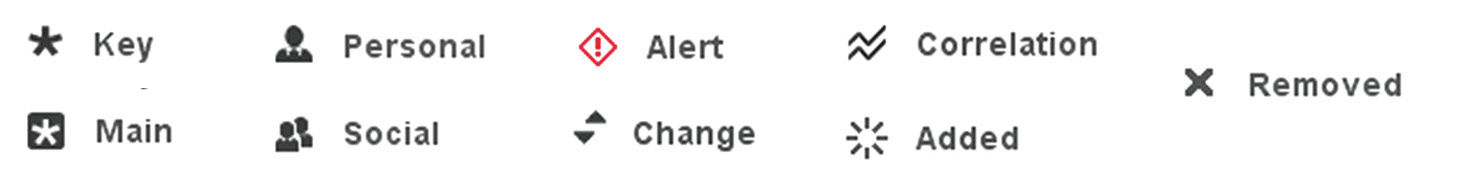
Figure 16.22: Point Reasons and their icons.
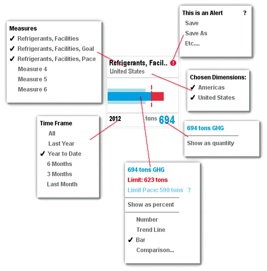
Figure 16.23: Point flyout menus for supplemental semantic display, management, and manipulation.
The Point and the Digest are robust ways to display and consume visual analytic content, and their ease of creation opens up simple analytic authoring an personalization to a much wider audience. While some of the Point format design constraints and behaviors for edge cases may seem restrictive or extreme, keep in mind that the intention is for Points to have the capability to be mass-produced and automated, and yet retain a basic form also applicable to manual authoring. Fulfilling this requirement demands a rigorous accounting of many edge cases, some of which we likely have not yet discovered. All of this is enabled by LAVA’s commitment to a few constrained, powerful, and interoperable components that are essentially unbreakable.
Point designs continue to evolve as they are used more. Wider Points, like this set, sacrifice the space of more Points in a Digest row to allow more space within the Points for titling and for extended single-dimension plots or 2D time-series, and provide the flexibility to use the Time Slot for written status interpretations as shown (Normal / Lower than Normal / Higher than Normal). Wider Points like these make it more difficult to ensure that Points are not cut off at the right edge of any display screen. Mixing of Point widths within a channel exacerbates this problem, and can result in an asymmetric horizontal layout. While not so bad in wider browser windows, on smaller devices the resulting truncations and lopsided displays create discord when viewed in these simpler and highly symmetrical device contexts.
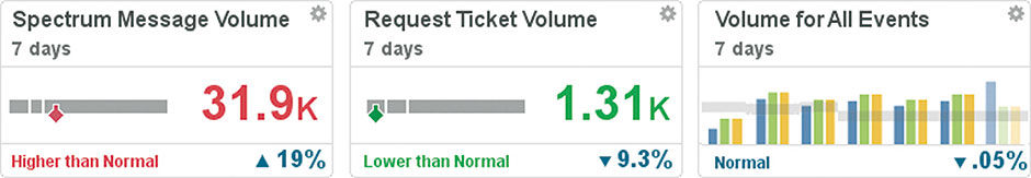
 Figure 16.24: Landscape Points.
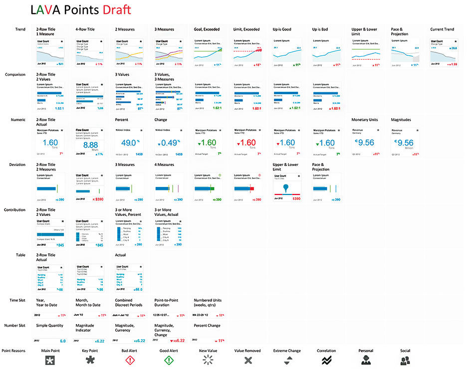
Figure 16.25: Early Point catalog.
