Be Fearless
- Email signature of John Schwartz, BOBJ CEO
18.0.1 Immersive Exploration: Pele
For a three-month period in parallel to working on the main LAVA project, I had the privilege to work with PHD candidate and intern Christophe Viau and his advisor Michael McGuffin from L’École de Technologie Supérieure in Montreal, along with SAP design intern Kayhan Atesci, on a data exploration research project. While LAVA was a browser-first monitoring experience with lightweight exploration capabilities, this was to be a tablet-first exploration experience with lightweight monitoring capabilities. The overall goal was very open-ended, but the fundamental ideals were similar to LAVA: A fluid integration of text and data plots, simple and broad appeal, and a very dynamic user experience. The difference was that while LAVA was oriented more to the Monitor acquisition mode, Pele was to be oriented to the Explore mode: A fully visual data browser for multi-dimensional data sources.
Below is a video of the final mockup, and a link to Christophe’s Web page showing the results of his three SAP internships. Pele is Internship 3, titled Mobile BI.
Demo:
Christophe Viau’s Report (Internship 2): http://christopheviau.com/sap/final_report/
Our starting point was to represent the capabilities of BOBJ Explorer and the related mobile product called Exploration Views, deployed on a mobile tablet device and with a much stronger reliance upon visual content representation, particularly in regards to contextual quantitative relationships. As already shown, BOBJ Explorer divided the screen between a bank of text-based dimensional facets at the top, and a corresponding chart below. In a similar but in many ways bolder attempt than our effort with LAVA’s Lattice, we sought to remove this redundancy and make every area of the screen into some sort of quantitative display, fully removing the idea of an application container. I’ll walk through the experience here, but Pele is an example of an experience that is almost impossible to convey without seeing it in motion.
The experience starts with access to a set of Sources. Sources are essentially data sets viewable through one or more Views. View relevance is conveyed visually alongside their menu titling, in this case measuring their popularity/relevance according to numerous scores (recently accessed, ratings, number of times accessed, etc.). Alerts can appear as with the red dot. Sources here are not sources in the technical BI use of the term, but rather a more intuitive name for a data set from the perspective of a casual consumer. Each Source has a number of Views created by the user and/or their workgroup. Think of Views as bookmarks for display states within the data set, with a display of Attributes authored manually, or by default, with the latter case showing the View’s applied filters and display settings. The Ying/Yang symbol is the universal control button.
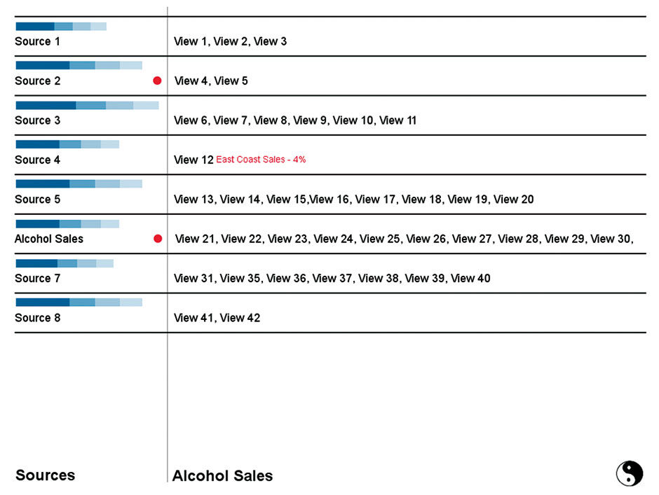
Figure 18.1: Sources in Pele. Blue Strip Charts indicate Source popularity, via usage, ratings, etc.
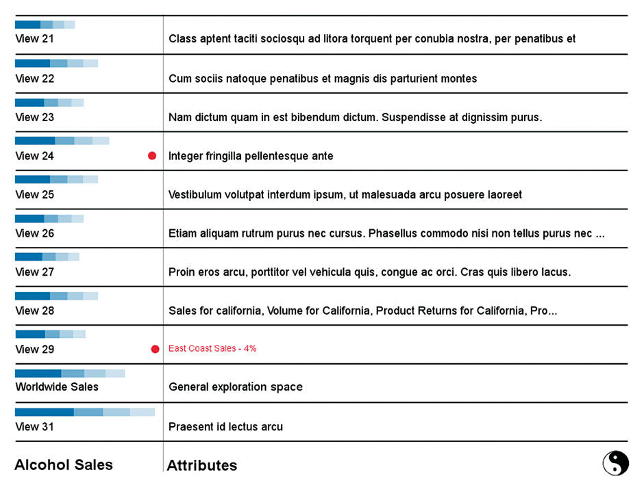
Figure 18.2: Views for the Source titled Alcohol Sales.
When a view is opened initially it presents a default view of the entire underlying Source data. The design enables the user to filter and manipulate the view to their liking, and then “bookmark” it into a formal View that can then be named. The demo uses a hypothetical Source containing global sales data for alcoholic beverages . The chosen source is named Alcohol Sales.
Looking at Figure 18.3, Worldwide Sales is this Source’s Prime Measure, as shown in the row at the bottom, followed by the default display setting type. More Measures can be added via a fly-out menu coming from the title. The screen is divided into two main spaces: the Strip to the left and the Plain to the right. The Strip is for filtering and the Plain is for formatting (and possibly for filtering in custom adaptations). The Strip as a whole is essentially a bank of visual multi-dimensional hierarchical facets, serving as both selection menu and data plot. Within the Strip, Dimensions are grouped into larger universal categories called Aspects, that are the result of the parsing and recognition of Dimension types in the data set and mapping them to Wurman’s Types, Times, and Places organization framework. Each Aspect’s Strip Chart shows the distribution of it’s primary Dimension. The Scales Aspect portrays the set’s Measures mapped into categorical tiered units for filtering. The Relations Aspect remains undefined but would be the place where filtering could happen based on semantic or quantitative relationships or connections among entities in the data set, as might be shown via a graph-type data format.
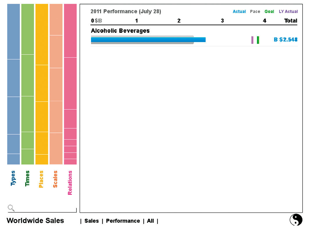
Figure 18.3: Default View of a Source.
Available Dimensions are listed underneath the Plain, but are for formatting the display of what has been filtered rather than for filtering (in this view the Plain is unfiltered, set to All). Settings state titles double as editing controls. I call this interaction system Really Simple Formatting.
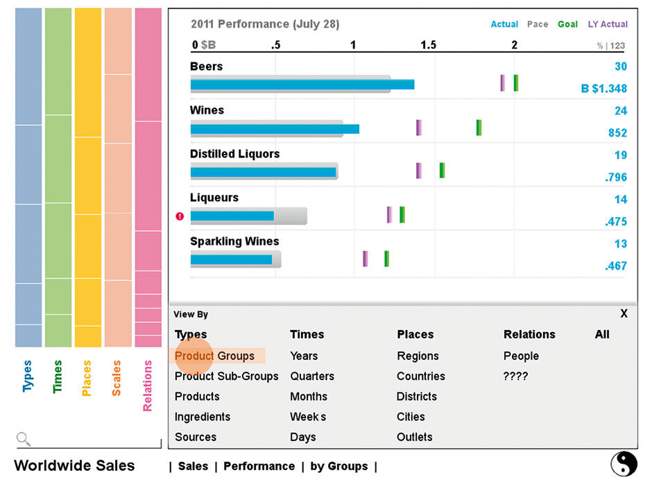
Figure 18.4: Changing the display granularity in the Plain
The Visualization Type is changed via tapping its state title. The example shown is a visualization category called Performance. The Keyline Pattern is an example of a small multiple display. In this case it depicts time series fluctuations in a measure. Instead of rendering each in a sparkline, which at this density would be a mess, the display shows to a heatmap where green depicts rising values and red dropping ones. Color intensity can depict either the rate or the amount of performance rise or decline.
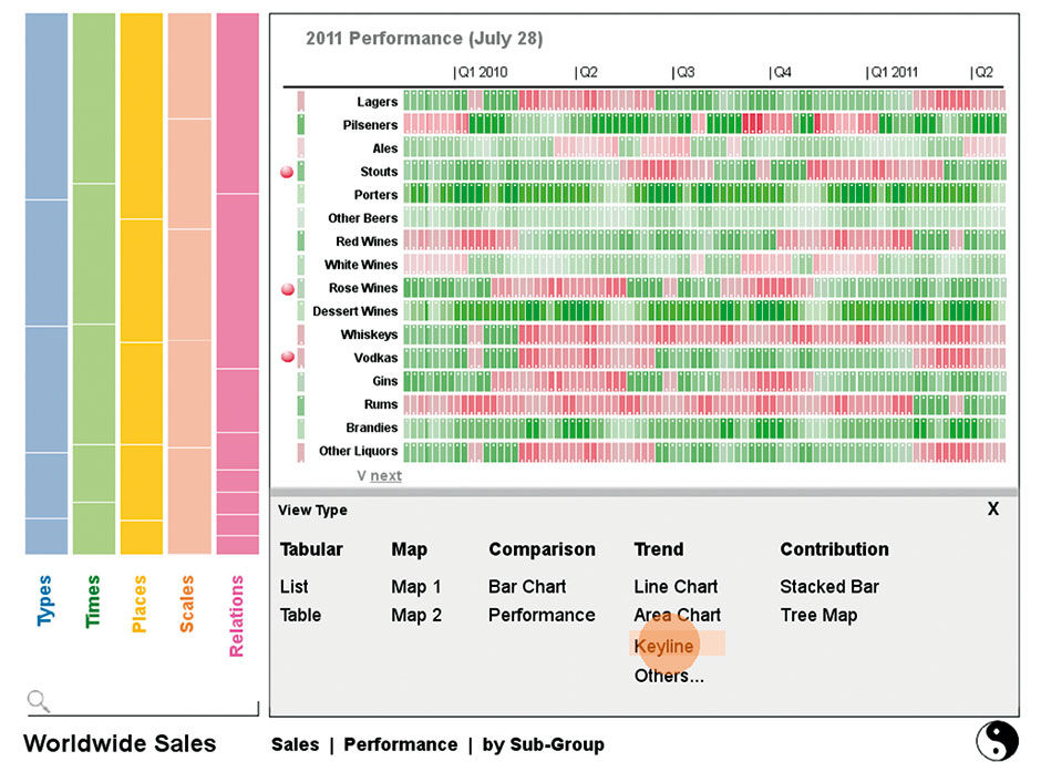
Figure 18.5: Changing chart type in the Plane.
The Plain uses BOBJ Explorer’s auto-charting solution, which chooses the best visualization based on the chosen measures and dimensions. A maximum of three Measures are allowed. There is also an option to display compilations of small multiples instead of a densely-layered single chart, thus extending the limit of measures above three, as shown below, via the Compare versus Combine setting.
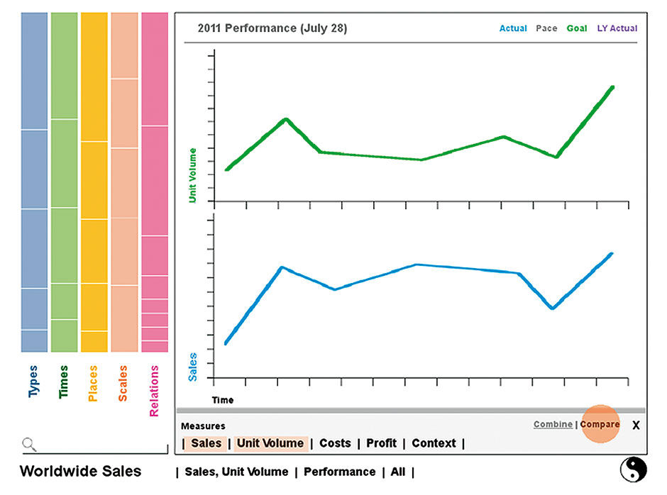
Figure 18.6: Changing Measures and comparison mode in the Plane.
The Strip at the left is for filtering, and uses the Hierarchical Strip Chart pattern for its navigation and display. Each category is displayed in the menu according to its quantitative contribution to its parent category. In Figure 18.7 we have expanded the Category Types to show the types of alcohol products sold. Other Aspects collapse to a vertical orientation. The Dimension in focus is rendered as a stacked bar chart, or Strip chart, at a width to enable the rendering of most titles and values.
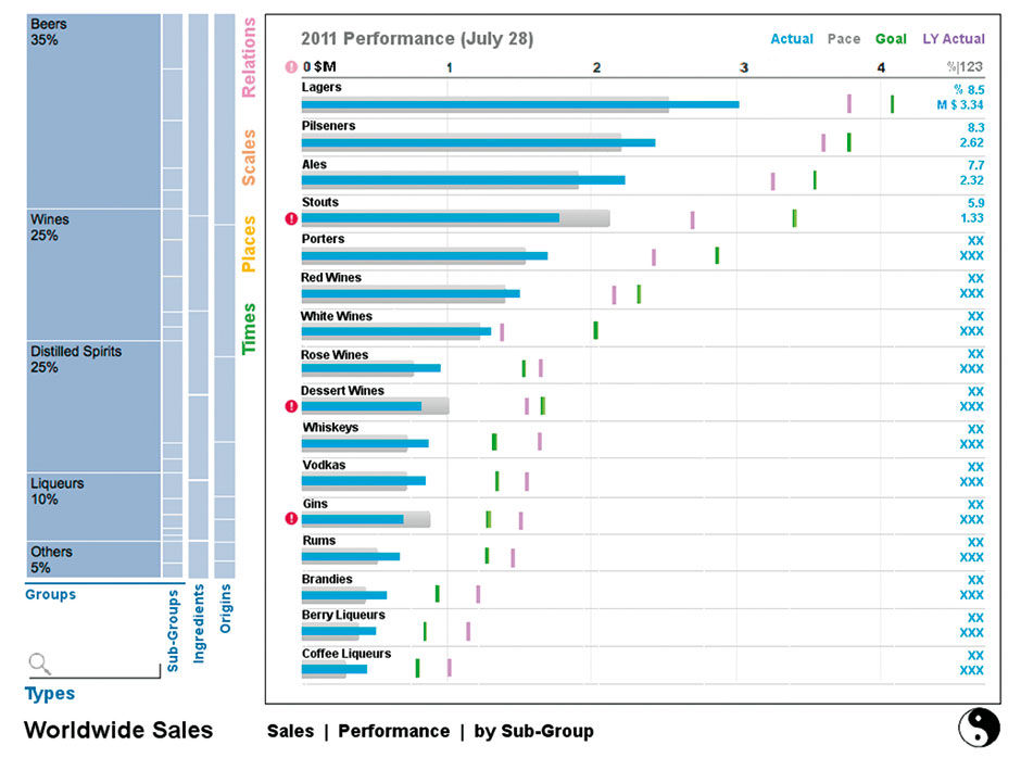
Figure 18.7: Types Aspect drilled down one level.
Here the User begins to filter the Source data. The Type Aspect is opened to reveal its four Dimensions. Opening an Aspect defaults to show first Dimension in the open state, displaying the members in a Strip Chart according to the Prime Measure (Sales in this case). As filters are applied, you will see how the fragmentation of the other Dimension Strips consolidates to represent the smaller number of values resulting from constraining the groups. E.g. the list of Ingredient attributes is reduced from many to one (Grapes). Notice also how the result data shown in the Plain is constricted as the filtering occurs (numerical values are not yet inserted into this mockup). The simple header bar indicates groups of inter-dependent hierarchical dimensions. Multi-selection is assumed necessary but is not depicted yet in the design.
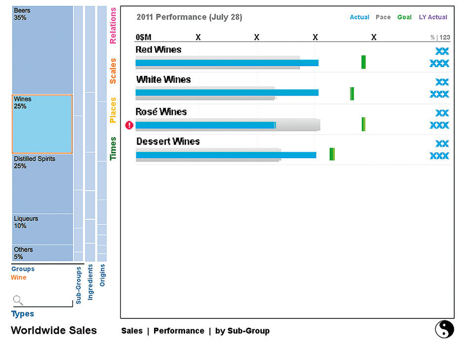
Figure 18.8: Wines selected with resulting results filtered
Hierarchical Parent Dimensions collapse to the left as Child Dimensions are opened into Strips of their own to the right. Of course, animation is key to these transitions being coherent. Within Aspects, the Search box applies only to the selected Dimension.
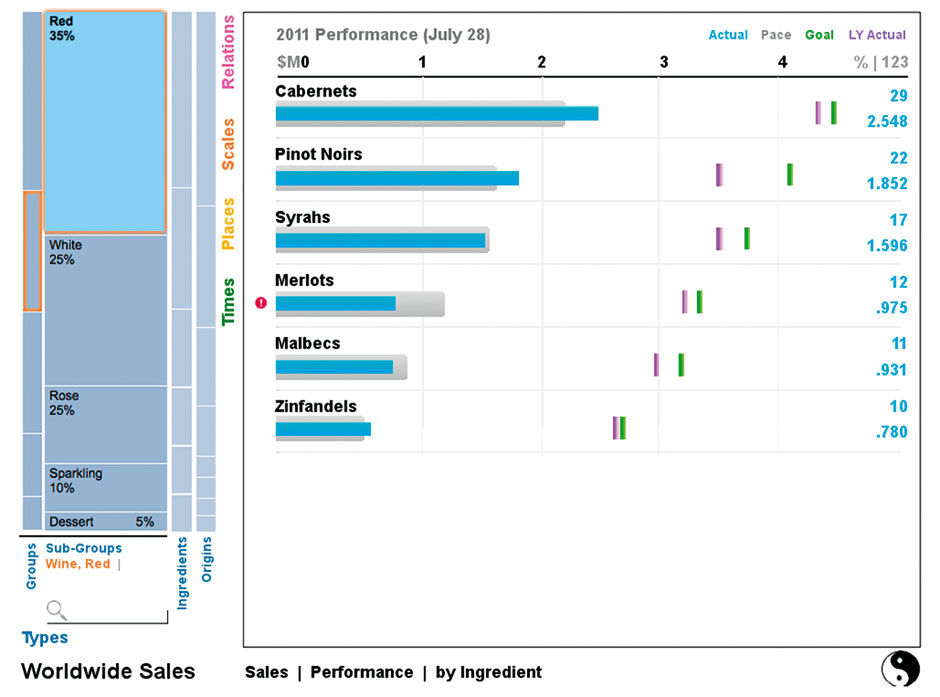
Figure 18.9: Red Wines selected from a lower level Dimension.
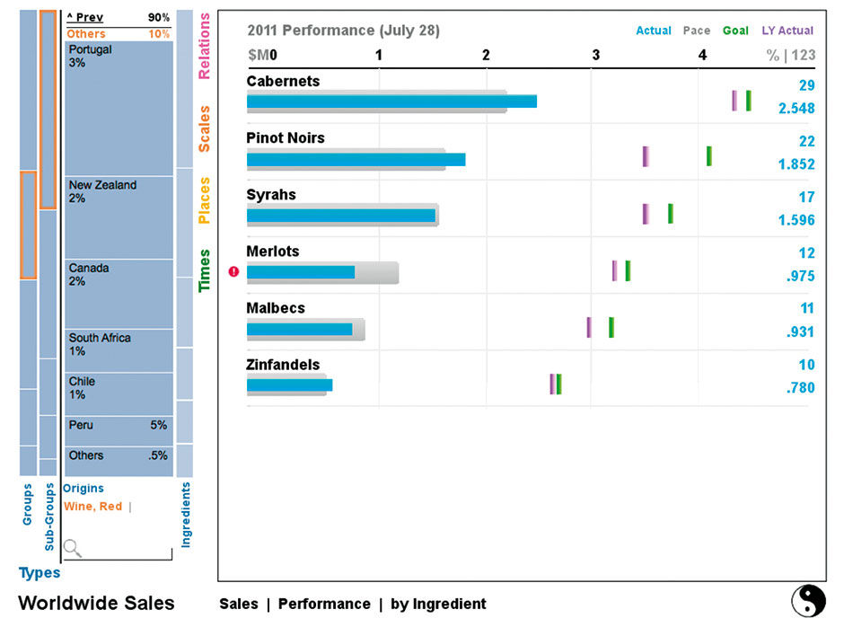
Figure 18.10: Wine Origins Dimension.
Choosing another Aspect collapses the previously opened Aspect. If selections exist in that Aspect, it collapses to a vertical slice at the left with its selections displayed as text. If no selections are made the Aspect returns to the right of the Strip. The chosen Aspect, Place, happens to be fully hierarchical. Its Strip Charts show the growing fragmentation of Sales numbers as the categories become more granular. This provides a pattern overview of the data structure to provide ambient awareness and context, much like a treemap does.
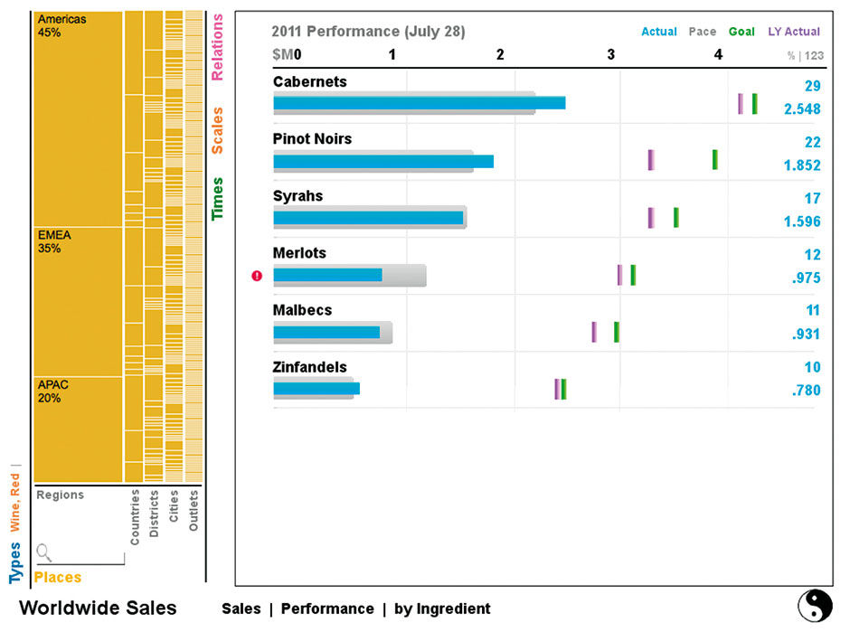
Figure 18.11: Place Aspect showing location of sales.
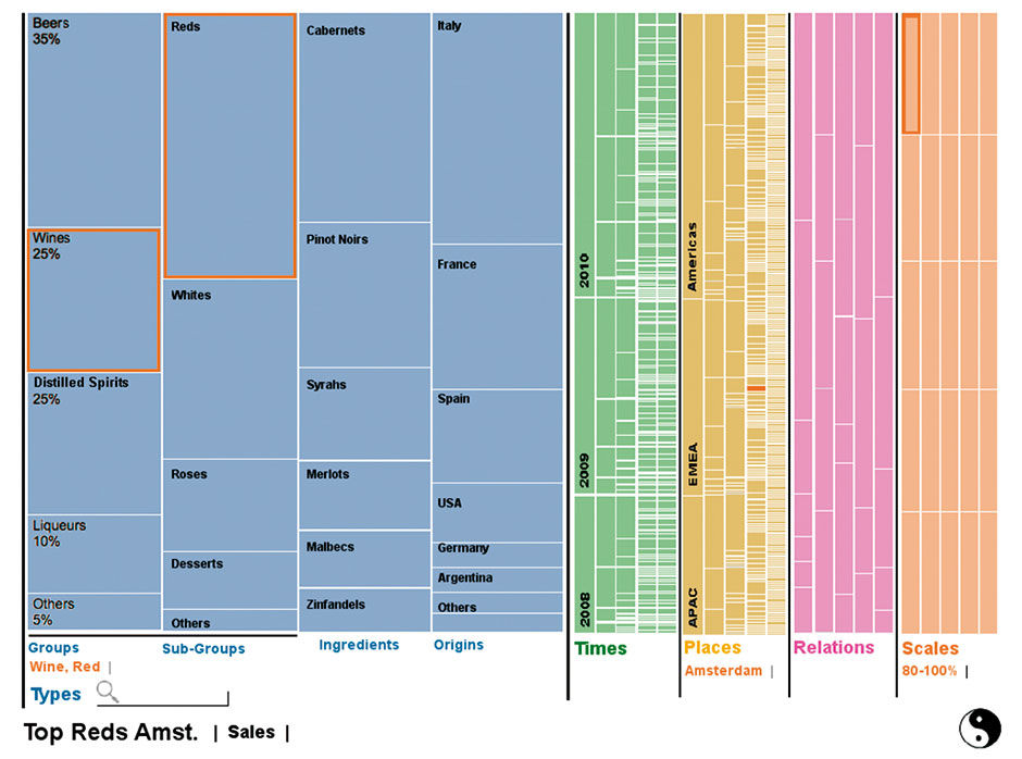
Figure 18.12: Expanded Strip View
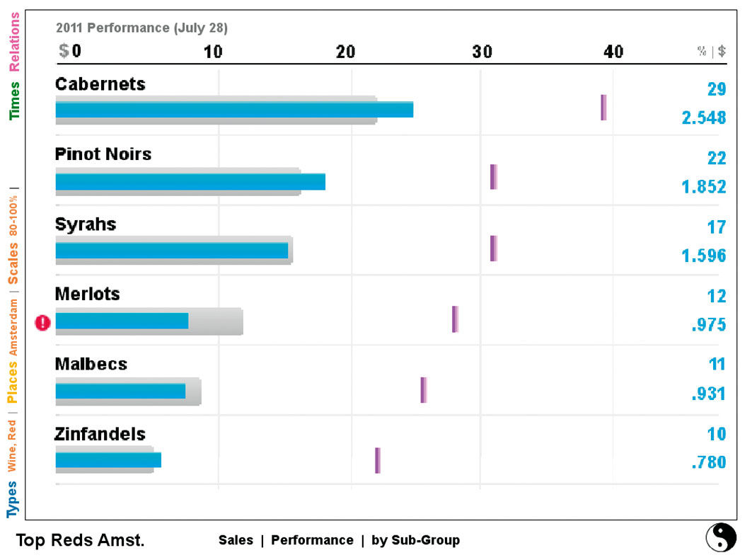
Figure 18.13: Plain expanded to optimized results display area.
The Strip can be expanded to fill the whole screen, as in figure 18.12, enabling an overview of all filter selections, and the overall distribution of the chosen Measure, across all Aspects and Dimensions. This provides an overview of the patterns and density of hierarchical divisions across the data set.
Times is a strictly hierarchical Aspect, which here uses the Icicle Chart pattern to show the sales breakdown by time. In 18.12, you can see that Q4 has the largest sales volume. While not precise enough at this scale to support the more convergent acquisition modes, such views provide valuable ambient contextual awareness of data structure and value distribution, which support the Assimilation acquisition mode.
Although the Pele data browser is dependent on the reading of compliant Data Sets, and the ability to sort Dimensions into one of the five Aspects, there is nothing terribly exotic about the technology needed to enable such an experience, other than some really sophisticated front-end display execution. There are a number of secondary cases and behaviors to consider with the proposed new forms, particularly regarding how the Strip display scales to show long and irregularly-distributed member lists. Many of these are demonstrated in the video.
All of Pele’s visual display innovations result directly from simplifying unnecessary variety in display, formatting, and data structure. Again the argument is that the lost variety and power are more than overshadowed by the ease of use, reliability, and overall appeal. Pele, although a bit of a tangent from LAVA, could provide a valuable supplement for the Explore and Assimilate acquisition modes, and perhaps other modes as well. It is, however, a much more ambitious piece of user interface development than a LAVA Board, and is not as well suited to the Monitor acquisition mode, storytelling, or for micro-level social content exchange.
18.0.2 Consumer: Spendwell
In 2013, I led the SAP product design effort for a mobile finance management application, similar to the offering from Mint.com and the online wealth management services of most major banks. The product, named Spendwell, is available in the Indian market – as of early 2015, with a subset of features shown here – for the Android platform. The product design uses the LAVA visual analytic language, and brings the power of multi-dimensional analysis to consumer finance.

Figure 18.14: Spendwell logo.
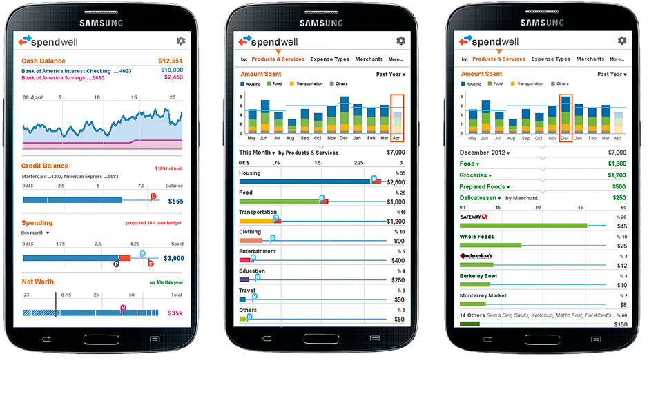 Figure 18.15: Spendwell overview, spending history vs. budget, and historical drill-down by product/service type.
The app features a simple overview of personal finance status, including bank and card balances, cash balance history, and net worth calculation, aggregated from a variety of links to assets and debts at multiple institutions. Users can also set budget limits overall, or by account or spending category. LAVA’s Strip chart is used to show these overviews, and the Lattice for categorical drill-downs. Here is a video walk-through:
Users can categorize their spending, or have it done automatically by the app, enabling analysis of relative spending amounts in categories like housing, food, insurance, entertainment, etc. While these features are common in finance apps and most e-banking solutions, Spendwell enables multiple categorical breakdowns, such as by merchant, time, and fixed (basic) or variable (discretionary) spending. The Lattice provides an effective way to compare expense categories and map them to budgets, and is made more usable on small screens by the Bar Chart Scroll Preview innovation, invented for this product.
Looking ahead to the results of using new services like Apple Pay, when most or every transaction will be present for us to analyze, Spendwell’s design allows navigation to receipt-level detail of everything we purchase, with links to detailed product information based on product UPC codes. In keeping with the space-efficient design approach needed for mobile apps, and to enable intuitive feature discovery, the budget controller is editable by manipulating its marker within the chart itself via tap/drag input. To edit the budget, touch the bar chart and move its limit up or down (left or right) to the new setting.
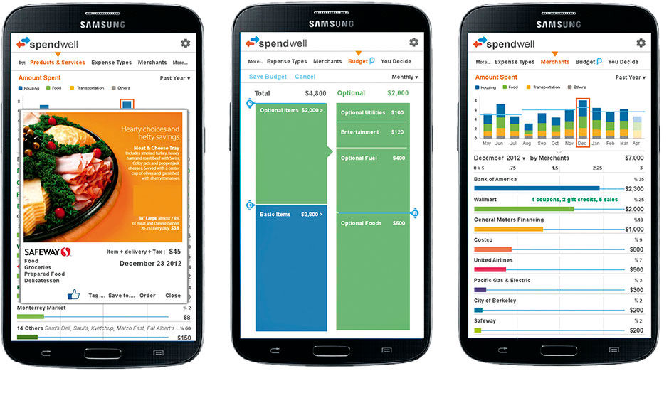 Figure 18.16: Item inspection, budgeting using the Hierarchical Strip Chart from Pele, spending by merchant.
Current Consumer Finance applications are useful, but still only a relatively tactical-level toy for tracking our spending. The concepts included in Spendwell go beyond simple accounting to point the way to comprehensive vendor management and supply chain analysis for consumers. With the eventual consolidation of relevant data sources and interconnectivity with dwellings, vehicles, appliances, and our bodies via the IoT, such applications can extend beyond quantitative analysis into broader, comprehensive channels linking consumers to their assets and, by extension, their favorite brands, vendors, government and utility providers, and professional service providers. This starts to look like a complete Household Resource Management solution, an extension of the casual but still work-centered user base currently targeted by LAVA, but in need of even more dramatic experience innovations to enable numbers and digital household management to become a key part of everyday life.
18.0.3 Media Assets
L18.1 | Pele Data Exploration Concept (video) |
https://www.interaction-design.org/literature/book/bringing-numbers-to-life/assets
This was done as a research project with Christophe Viau, intern and phd. student, and SAP design intern Kayhan Atesci. The charter was to create fully immersive data exploration experience, combining word/image and navigation/consumption, in a mobile-first approach.
L18.2 | Pele Data Exploration Concept (pdf) |
https://www.interaction-design.org/literature/book/bringing-numbers-to-life/assets
This is the content from L18.2, presented in paginated pdf form.
L18.3 | Spendwell Demo (video) |
https://www.interaction-design.org/literature/book/bringing-numbers-to-life/assets
Spendwell was a personal finance application for smartphones, initially released in India in 2013, to be driven by that nation’s system of SMS messages for digital financial transactions. The intent was to provide simple, insightful, and automated access and analysis of personal finance data, leading to creation of a personal purchase database with product-level metadata, such as receipt breakdowns and UPC/SKU data.
L18.4 | Spendwell Demo (pdf) |
https://www.interaction-design.org/literature/book/bringing-numbers-to-life/assets
This is the content from L18.4, presented in paginated pdf form.
18.0.4 References
18.1 | Christophe Viau Internship Report (Web) | http://christopheviau.com/sap/final_report/
