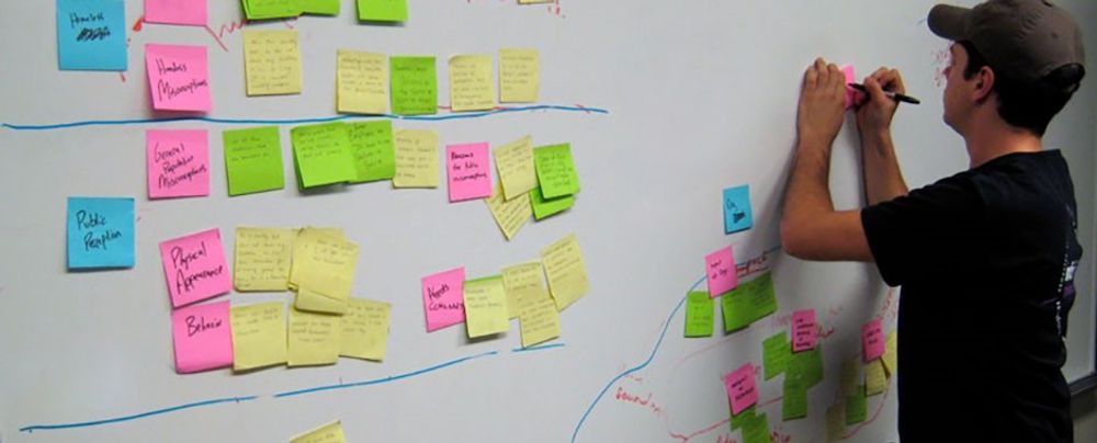
The term “case study” sounds a little boring, doesn’t it? What if, instead, it were called a “design story”? Well, that’s exactly how you should think of it! Approach your UX/UI design case studies like stories, not just a list of tasks you completed. You will not only make your portfolio easier and more enjoyable to create, but you will engage the reader and leave them wanting more. Give hiring managers structure, intrigue, and emotion as you tell your design successes. You’ll find yourself preparing to interview for your dream job in no time.
UX (user experience) design projects can be messy. Deadlines change, project goals shift, and new findings can fundamentally alter design specifications. Stories will give your past experiences form and organize your case studies. In this video, Stephen Gay, UX Design Lead for Google One, explains why you should include narrative in your UX/UI design portfolio:
Show
Hide
video transcript
- Transcript loading…
When you arrange your experience into a meaningful sequence of events, recruiters will understand the path you took to the final product. The path is the juicy part of your case study—it shows how you make decisions, problem-solve, and work with others. Combine structure with storytelling elements like emotion and conflict, and your design stories will come to life.
The UX/UI Design Story Blueprint: How to Structure Your Case Studies
Before you begin weaving tales, it’s important to create a structure for your case studies that keeps you on track as you write.
Your case study structure has three main goals:
To showcase your design process and your solutions.
To keep the reader engaged as you guide them through your design projects.
To make it as easy as possible for busy hiring managers to navigate your case study.
Therefore, your goal is a logical, well-organized, and easy-to-navigate structure. The best way to achieve this is to follow the design process or methodology you used, such as design thinking, plus a hook and conclusion. Morgane Peng, Managing Director and Head of Design at Societe Generale CIB, explains what to include in your case study in this video:
Show
Hide
video transcript
- Transcript loading…
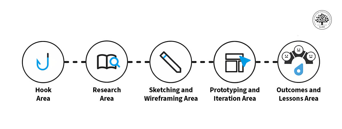
A typical structure for a case study might be:
The hook
Research
Sketches and wireframing
Prototyping and iteration
Outcomes and lessons learned
Each section should include a combination of text and media (images, video, interactive elements, etc.). A good benchmark is 60%-80% text and 20%-40% media.
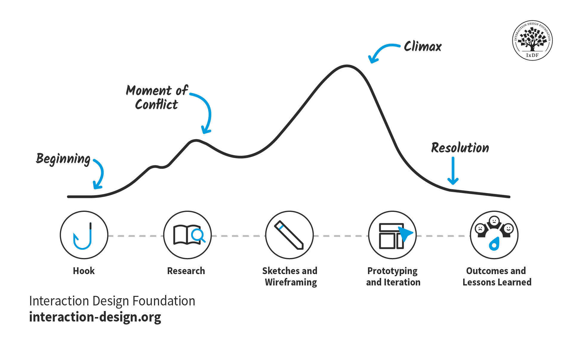
The stages of your design process serve as an ideal structure for your case study. They’re universal and relatable, so busy hiring managers can immediately understand what they’re reading. Your narrative can then flow through this structure as you set up your story with exposition, introduce and resolve conflicts, and reach the climax.
© Interaction Design Foundation, CC BY-SA 4.0
Depending on the message you want to convey in your case study, you might focus on one area in particular. For example, if you want to show off your UI (user interface) design skills, you might only include the prototyping and iteration section. For another project where you’re proud of the research you did, you could make this the primary section.
However, regardless of your project, you should always include two sections: the hook and the outcomes and lessons learned.
The Hook Area
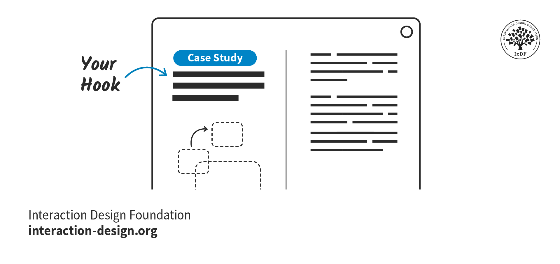
The purpose of the hook is to immediately grab attention and entice the reader to read on. Your hook should convince hiring managers they’ve made the right choice by opening your case study.
© Interaction Design Foundation, CC BY-SA 4.0
To craft a hook that potential employers can’t say no to, make sure you include these elements:
The key characteristics of your project:
The type of project, e.g., a school project, client project, hypothetical project.
Your role, g., UX Designer, Product Designer, User Researcher, UX Writer
Your contribution, e.g., checkout flow, search optimization, information architecture
Whether you worked solo or in a group, and how you collaborated with others.
The design approach and methodologies you used to solve challenges and why they were effective. For example, design thinking, agile, lean UX, etc.
A preview of the work, such as screens, videos, or prototypes, to capture attention early on.
An introduction, or “exposition,” that sets the scene for the rest of the case study (more on this later on).
Where your case study differs from a typical story is that you should include the results of the project before the full case study begins. Why? Hiring managers are busy people and may only have allocated five minutes to review your whole portfolio. If you show them the results first, they will be more inclined to run over their time limit and find out how you got there. Even if the project did not reach its goals, include the positive outcomes, for example, the lessons you learned or the skills you gained.
“This might sound a bit counterintuitive … but as a hiring manager, I'd rather see the results first before diving into the case study and committing 7 to 10 minutes of my life reading it. If the preview is not available, I usually just scroll down to see it and back up to start reading.”
- Morgane Peng, Managing Director and Head of Design at Societe Generale CIB
Research Area
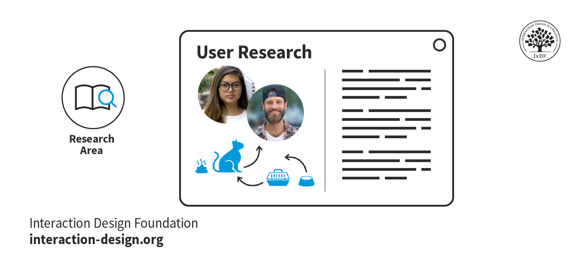
If your case study project followed a typical design process like design thinking, then the next part of your story will likely be user research.
© Interaction Design Foundation, CC BY-SA 4.0
When you present your research and outcomes in your case study, you show that you care about research-driven, user-centered solutions. Follow these top tips when you write about your research:
Provide context, constraints, and clear research goals.
Insights are more valuable than screenshots of interview scripts or the tools you used. However, you should still include deliverables such as empathy maps, personas, and affinity diagrams to show your processes.
Organically link your research findings and explain how they informed your problem statement and design process.
Explain the reasoning behind your research methodologies and what you learned from them. Otherwise, it may seem you just ticked off research as part of a checklist.
Sketching and Wireframing Area
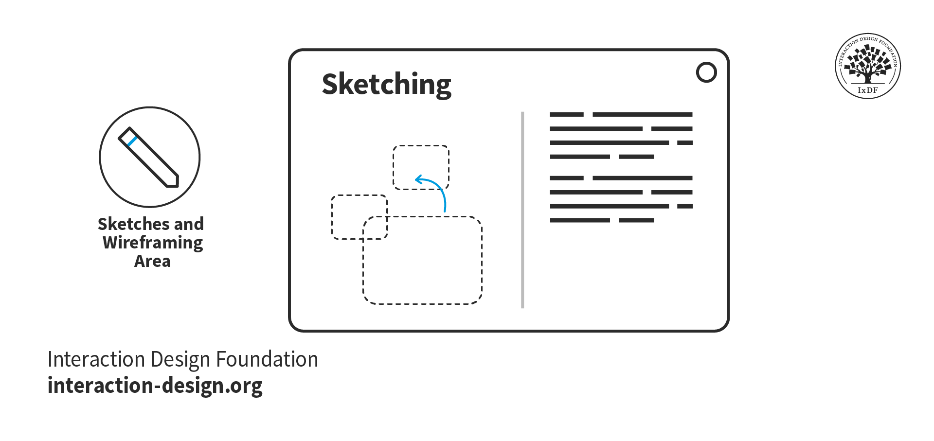
Sketches and wireframes demonstrate your understanding of layout concepts, UI elements, and information hierarchy. They also show your thought processes and the journey from ideas and research insights to final prototypes.
© Interaction Design Foundation, CC BY-SA 4.0
This section is your opportunity to demonstrate the core of your design process:
Armed with research insights, how do you approach solutions for your users’ problems?
How do you collaborate in a team to generate and develop ideas?
When you face a roadblock, how do you get past it?
As for the sketches themselves, you may have created them rapidly while brainstorming, and unless you’re an excellent illustrator, they could be a little messy! Given this, it’s good practice to redraw your sketches for your portfolio. You want to make sure hiring managers can easily understand them and that your handwriting is clear.
Similarly, your hand-drawn wireframes should be well-presented. Even if you understand them, unaligned UI elements may appear as bad design. Redrawn sketches and wireframes also give you the opportunity to annotate and explain your design decisions. In this video, Mike Rohde, Illustrator, Teacher, and Designer, explains how to use sketches in your portfolio.
Prototyping and Iteration Area
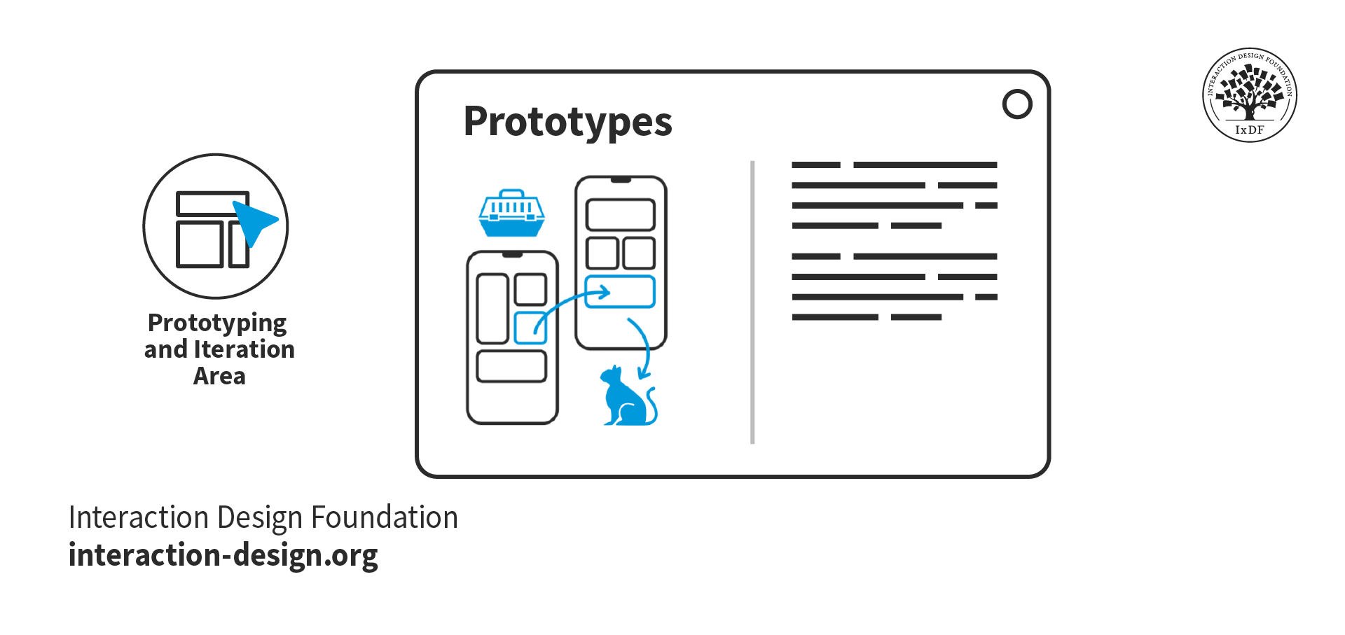
The prototype and iterations section is the penultimate section of your case study, where you showcase your final design. You’ll also tell hiring managers about the road your designs took, from sketches to high-fidelity prototypes.
© Interaction Design Foundation, CC BY-SA 4.0
The time has come to show off your final designs! Use this opportunity to showcase how your design process paid off. These are some tips to get the most out of this section:
Include both mobile and desktop prototypes in context if your design is multi-device. For example, show the mobile version to scale within a phone mockup.
Link to your prototype files to allow hiring managers to explore the design in detail.
Highlight any usability testing and the design changes you implemented based on the insights you found. This approach shows how you improve designs through iteration.
Outcomes and Lessons Learned
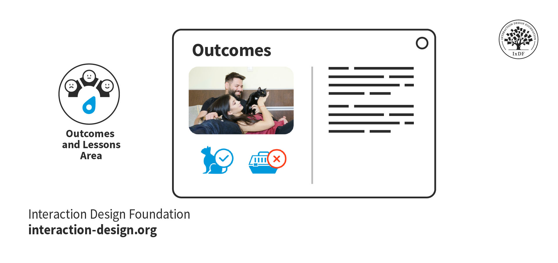
The outcomes and lessons from your project are arguably the most important part of your case study. Hiring managers want to see how you reflect on and grow from your experiences.
© Interaction Design Foundation, CC BY-SA 4.0
Finish your case studies with a conclusion. Did the project achieve its goals? If not, why? If yes, how? While the result is important, how you reflect on the project tells recruiters the most about you as a designer. Make sure you include the following as you write:
Include self-reflection and what you have learned to show growth and adaptability. Hiring managers want to see what you learned and how you’ve grown from a project, even if the project was not a business success.
Acknowledge your mistakes and the lessons learned from them, such as adapting complex interfaces for advanced users. Employers will trust you more when you admit your mistakes and show your ability to evolve and self-improve.
Take the Fast Lane with Our Case Study Template
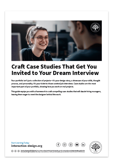
You can get started on the structure of your case study right now with our free downloadable template. For each section, the template shows you what to include and presents a simple example:

The Narrative: Your Design Story
“Tell me the facts, and I’ll learn. Tell me the truth, and I’ll believe. But tell me a story, and it will live in my heart forever.”
—Native American proverb
Now that you have your structure, you can begin to thread your narrative through it. Consider the following as you write your case study stories.
Exposition
Exposition is where you set the scene of your story—it should be short, sweet, and fit into your hook. In your exposition, you should include:
The project background: Provide only as much background as necessary to understand the project's context. Introduce the client or company, the product, and anything else relevant. If it doesn’t add to the story, remove it!
The “inciting incident”: The earliest event in the story that sets it in motion. Instead of “My company tasked me with the project,” aim for “My company wanted to increase conversions to improve year-on-year sales figures, and identified our product pages as an opportunity for this.”
Your motivation: This is the most important part of the exposition. What motivated you to take on the project tells hiring managers a lot about you. For example, “I was eager to develop my user rapport skills, and this project required a lot of qualitative research.” This example shows you’re committed to growth and up for challenges.
The project goal(s): Where possible, use measurable goals so it is clear in your conclusion whether you met them or not. For example, “The project goal was to increase conversions by 1.5% and monthly revenue by 3%.”
If you are transitioning to UX/UI design from a different industry, you may need to provide a little more exposition. This additional information will help recruiters understand how your experiences relate to design. Find out more from Morgane Peng, Managing Director and Head of Design at Societe Generale CIB, on how to use your non-design experience in your design portfolio:
Show
Hide
video transcript
- Transcript loading…
Emotion
Emotion helps readers relate to the story and imagine themselves in your shoes. An emotional account will always provide a better reading experience than a dry, factual account ever could.
However, emotion doesn’t mean melodramatic. Keep your writing professional, and don’t exaggerate the emotion. You want to engage recruiters—not perform a soap opera.
Look at the following two examples; which one is more engaging?
Factual:
The main finding was that the assumption that users shopped based on their weekly nutritional needs was invalid.
Emotional:
Our finding threw a giant wrench in the works. We realized our assumption—that users shopped based on their weekly nutritional needs—was completely wrong.
Emotion is a tremendous factor in decision making, as Susan Weinschenk, Chief Behavioral Scientist and CEO, The Team W, Inc., explains in this video:
Show
Hide
video transcript
- Transcript loading…
Moments of Conflict
Conflict introduces problems that require a resolution. Conflict drives the story forward, creates emotional engagement, and shows character development.
Think about the challenges you faced in your project. How did you resolve them? Some examples of conflict could be:
A lack of accessibility that resulted in user complaints.
Conflicting stakeholder expectations that slowed a project down.
Differing opinions within the design team on how to move forward with a design.
Technical limitations of the product or platform that required design compromises.
The Climax
The climax can happen anywhere from about two-thirds of the way through a story and should be the most pivotal event. It could happen in any section of your case study; however, make sure to allow sufficient time to build up to it. If the climax happens too soon, everything after it will feel flat.
In a UX/UI design case study, you have a lot of freedom in what the climax can be. It can be a turning point, a victory, or, in some cases, a failure. However, it is important that the climax makes sense in the context of the rest of the narrative. It is followed by the “falling action,” which is where the story winds down and all conflicts are resolved.
Some examples of the climax of a UX design case study are:
The positive results of a usability test for a risky, unconventional design.
The agreement of stakeholders to implement a design after much discussion and convincing.
The discovery of a user research insight that explains a previously misunderstood low user completion rate.
The creation of an ingenious design element that solves a complex problem.
The Take Away
The best way to write a case study is to tell a story. Design stories are vessels through which recruiters can imagine a future working with you.
Structure creates familiarity and facilitates navigation. Use your design process as chapter headings and include a good balance of text and media. Include the sections that are most relevant to you or that you wish to focus on.
Storytelling helps hiring managers experience and understand exactly how you solve a design problem. Use exposition, emotion, conflict, and the climax to engage readers and make your case studies memorable.
If you enjoy the process of writing your design stories, recruiters will enjoy reading them, too. Inject color and passion into a framework that is easy to understand, and you’ll soon be getting invited to interviews!
References and Where to Learn More
Want to create a portfolio that gets you hired? Take our course, Build a Standout UX/UI Portfolio: Land Your Dream Job, and learn how to showcase your skills, tell compelling project stories, and impress employers.
Learn more on how to Turn Your Non-Design Experience into Design Portfolio Gold.
Find out how to Keep Your Case Studies Confidential and Showcase Your NDA-Protected Design Work.
Incorporate Freytag’s Pyramid and Craft Compelling UX/UI Design Case Studies the Easy Way.
Discover How Aristotle’s 6 Elements of Drama Will Transform Your UX/UI Design Case Studies into Page-Turners.
Justinmind reveals case study tips from the industry in their article, How to Impress in a UX Job Interview: Recruiters & UX Managers Reveal Their Top Tips.
Images
Hero image: © Interaction Design Foundation, CC BY-SA 4.0
