
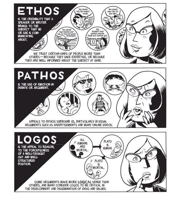
The Greek philosopher Aristotle (384-322 b.c.e.) classified properties of items and concepts in the known universe. One of his most fundamental discoveries was the composition of persuasive speaking. Although Aristotle identified the “three appeals” that make it up 23 centuries ago, when the known universe was smaller, they are timeless. Persuaders of all types have been relying on them since, including we who appeal to users through UX design.
The Trinity of Persuasion
Looking at any act where a speaker tries convincing another person or group, we might first see someone arguing a point. From debating in school to selling merchandise on TV, persuaders state a case to win over an audience in order for the latter to do something. The persuader needs a) an objective, b) an audience, and c) to reach that audience with a message. Specifically, he/she has to persuade them, as opposed to an authority figure ordering them to do something. Aristotle identified that the art of persuasion consisted of three parts:
1) Logos — Appealing to Logic
2) Pathos — Appealing to Emotions
3) Ethos — Appealing to Ethics, Morals and Character
In the case of logos, a persuader uses facts, statistics, quotations from reputable sources/experts, as well as existing knowledge. This is the side of the argument that can prove how solid it is based on facts alone.
Author/Copyright holder: Unknown. Copyright terms and licence: Unknown.
Pathos involves delivering the argument in a way that appeals to the audience’s emotions. Logos alone has facts that are cold, flat and ‘dead’. For example, a scientist speaking at a world convention can talk about global warming and bring up facts and figures about how many tons of ice melt into the sea every year. There, she would be using logos. However, by arguing about the impact of global warming on living things, for instance, how many polar bears will die if the current trend continues, she’ll tap the emotions of the audience. Pathos is the emotional vehicle that carries the logos to the audience.
Ethos has to do with who the persuader is. His/her identity will have a great impact on how the audience takes the message. If our scientist had been running late, and a politician stumbled onto the stage and tried speaking for her, no one would take him seriously. He isn’t a specialist in the field. Not only that, his general knowledge (and political agendas: he may want to distort facts about the topic for his own gain!) about global warming would fail to convince them of his “expertise”. Fortunately, our expert on thermodynamics and environmental science shows up to give the talk. The audience listens to her because:
She is a specialist in her field and has practical intelligence.
She knows what she’s talking about, having been working in the discipline for thirty-five years.
She’s got a virtuous nature.
She is an honest, hardworking professional who has proven her dedication by writing articles, working at the South Pole, and is not in her vocation just to make money.
She has good intentions.
Her commitment to environmental conservation is evident in the articles she has written and, now, in the speech she is delivering. Keeping global warming at bay is her sole intention, and her life’s work reflects that.
Ethos comes first
So, we can take the heuristics, or rules of thumb, embodied in Aristotle’s three appeals to deliver persuasive designs. First, work on establishing trust, which is what Aristotle determined was the most important part of the honest process of persuasion. Winning users’ trust (in that split second on landing on your design, where they judge you as being, hopefully, credible) and reinforcing it (by establishing familiarity or at least reducing uncertainty in a good-looking, user-friendly design) are essential for them to start recognizing your organization’s ethos. You can reinforce your ethos with a strong social media presence. A well-Liked Facebook page will show that you’re likeable, fashionable, are just like your users and, therefore, know what they want.
Author/Copyright holder: Social Media Examiner. Copyright terms and licence: All rights reserved Img source
How do we organize our three appeals around a plot? Let’s imagine that we’re designing for a water purification company. There, our plot is:
“The Smiths, Joneses and Johnsons are concerned about the purity of their water supply; they want to fix that problem but don’t know where to start.”
As the designer, you could mention that your models catch 99% of pollutants, and that logos will look good. Or, how about a good emotional hook to get users a little desperate to find the facts? If you build towards mentioning the statistical efficacy of your water purifier, you might first point out to users that what they don’t know sure can hurt them, and then show how many thousands of households’ dirty water problems your company has solved. Also, you might want to include some humor… “In many cities, a glass of water will have been through six or seven people before it gets to you; let’s flush those other folks right now!” There are many emotions out there for you to tap (I’ll stop it with the water puns now) as pathos. Then, are you going to back up these facts and passionate delivery by showing your audience why you are wise and a specialist (more of your ethos)?
Let’s stop right there, step back, and think about our users again. Who are they?
All About Them — Directing your Persuasive Design
Oddly, even if you’re the best advocate in the world and have an airtight case with the argument you’re presenting (because it’s so scientifically grounded) and you’re making the best speech in your career, you can still lose!
How? It’s easy—your audience was the wrong one to attempt persuading. If you’ve ever heard about stand-up comedians “dying” behind the microphone because the crowd was hostile and didn’t get their jokes, that’s a similar concept.
Author/Copyright holder: Unknown. Copyright terms and licence: Unknown.
Fortunately, as UX designers, we know that we must at least try to figure out exactly who our users are well in advance of presenting our work to them. Say you had to present a design to show 7-year-olds why drinking filtered water was good for them, and then had to present to the heads of a school. You’d focus on a simplified version with an image-heavy, text-light entertaining design for the kids (who just have to drink the water). For the other group (50-something-year-olds who have to worry about costs and benefits), you’d have to concentrate on more text to show the stats, keep the images relevant as functioning representations (like diagrams), and make the whole affair far more serious.
The audience determines the composition of your design. You’ll need to identify your audience. Of course, you want to build beyond that trust and familiarity that you’ll establish with them. You want to win them over so much that they’ll follow through with a call to action. Winning their approval is key; you want to take them from landing on your design with a sense of “What’s this?” and warming that neutral (or even skeptical) feel they have into a feeling of agreement and, if you’re selling something, need. If your design is for water purifiers, you’ll appeal to a large section of the public.
However, what if your industry doesn’t have that potential draw? What if you’re designing for a funeral director’s business? There, you’ll be addressing a totally different usership—bereaved people and professionals from associated fields.
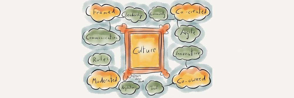
The power of culture
It’s easy to forget another important variable when we’re considering the characters in our targeted audience: culture. The Internet has shrunk the world; however, as internationalized as our sensibilities may have become, and as much as we can find out more about other cultures in our “global village”, one powerful feature remains: our culture largely determines our values. In some cultures, for instance, black is a funerary color, in others white is. The world is awash with a variety of cultures that see the world in very different ways. What appeals to one might offend another.
Therefore, it’s impossible to design to try and reach everyone. So, you might think that the best option is to at least try and appeal to everyone without offending anyone. The answer is a neutral approach? Hmm…well, the problem there is that you’ll be backing away from reaching anyone in a powerful way. This is like painting the walls of a rental property magnolia and putting in beige carpeting. You don’t know who the tenants will be; you can’t afford to gamble with taste: red might offend; yellow might make people sick. Most people will tacitly agree with neutral color choices, but they won’t be thanking you for wowing them. Congratulations on taking a safe, marginal approach that will be sure to keep casual renters from ever really being able to feel totally at home.
So, how do you aim high and keep your users from finding you as tasty as boiled lettuce? You need to elicit strong, positive feelings from them before they click away to find your competitor who does it for them. The art of aiming your persuasive design is the other side of the coin.
The Take Away
Aristotle determined that persuasion comprises a combination of three appeals: logos, pathos, and ethos. Anyone seeking to persuade an audience should craft his/her message with facts (logos), tapping an argument’s emotional aspect (pathos), and presenting his/her apparent moral standing (ethos). Ethos consists of three sub-qualities: the persuader’s professional intelligence, virtuous nature, and goodwill.
Creating persuasive designs is only one side of the coin. Unless we’re casting them to the right audience, taking on board cultural/lifestyle considerations, we will fail. Knowing who the users are is vital. Moreover, in UX design, we can only start persuading our users once we have their trust by presenting our ethos. From there, we can bring out the solid facts and get users interested with well-placed emotional hooks.
Where to Learn More
Toxboe, A. (2015). “Beyond Usability: Designing with Persuasive Patterns”. Smashing Magazine.
Gremillion, B. (2015). “Why UX Design Patterns Work and How to Use Them.” Creative Bloq.


