
In your work as a designer, you will find yourself working closely with different stakeholders, and none more common than software engineers or developers, who are responsible for implementing your designs. Designers and developers share a common goal — to do what’s best for the user and for the business. But the day-to-day realities of their collaboration aren’t so clear-cut and idyllic. The main reason: miscommunication. Here are some tips to help you maintain smooth relations with “the other side.”
Communication is the most important skill a designer must have. In fact, every deliverable a designer creates is a form of communication: personas, journey maps, storyboards, sitemaps, user flows wireframes, prototypes, usability reports all communicate insights and ideas to different stakeholders.
While designers envision an experience, developers execute it and bring it to life. A poorly implemented design leads to a broken experience. Designers and developers must thus work closely and are collectively responsible for delivering a good user experience. Working together smoothly is not automatic. Developers must develop their ability to interpret a design accurately, and designers must ensure they understand the development complexity of their design decisions.
What Is a Design Handoff?
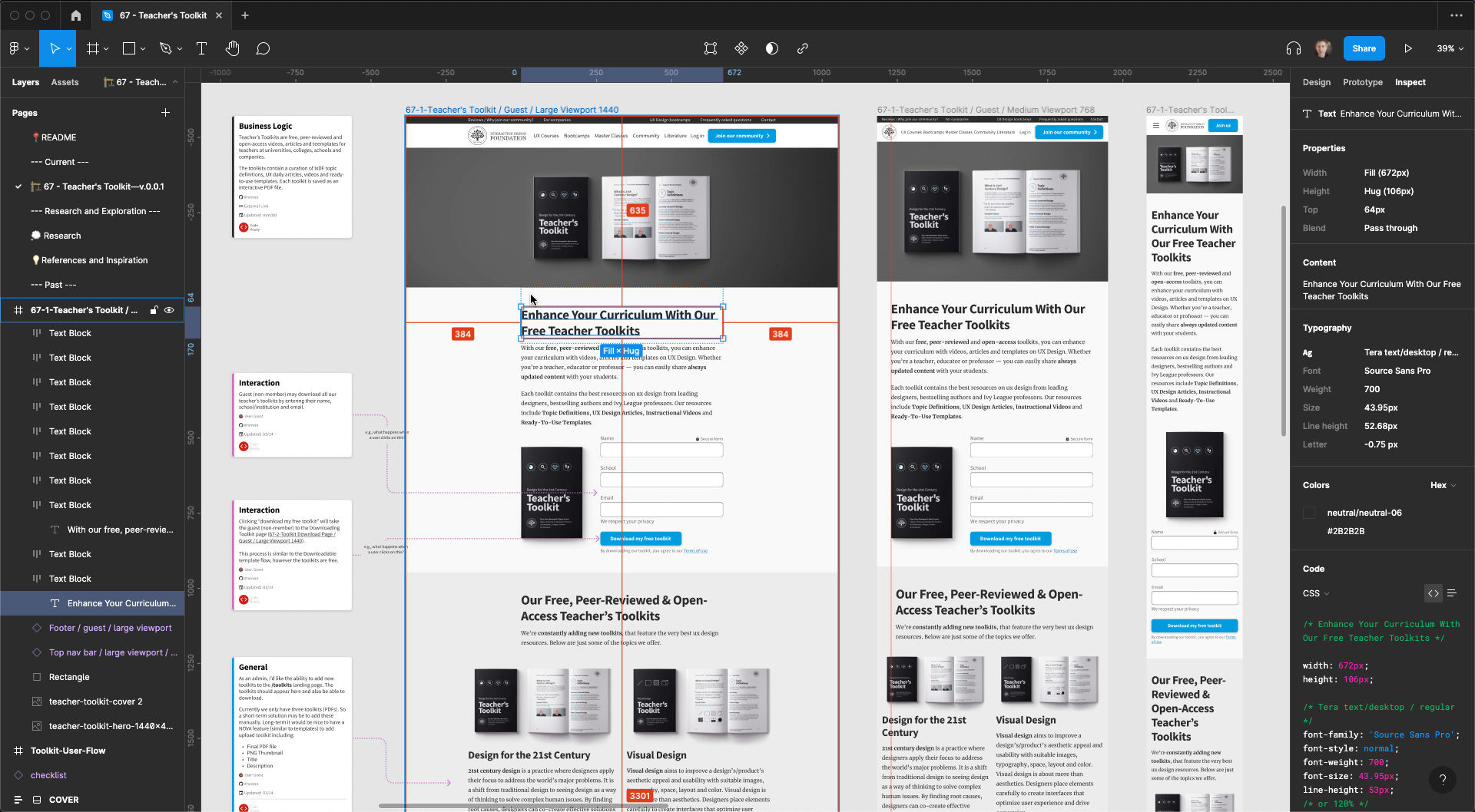
An example of Figma’s Inspect feature. The above screenshot depicts the final design handoff for the IxDF Teacher Toolkit.
Design handoff is the process of handing over a finished design for implementation. It typically involves transferring knowledge about a design as specifications, including, among other things, layouts, flows, colors, typography, icons and images, interaction, animation, copy and instructions on responsive breakpoints, accessibility and data validations.
Design handoffs originate from the Waterfall methodology, when designers worked independently on a project, and handed off the finished designs in one go to engineers to implement. The design handoff was a one-time, clearly-defined deliverable. In an agile work environment, however, design handoffs are neither one-time, nor fixed.
How to Avoid Friction in Design Handoffs?
Ask any designer or developer, and they’ll tell you of bad experiences they had working with “the other side.” So, let’s face it: when designers and developers work together, conflicts, friction and mutual struggles occur. But why does this happen, and how can you mitigate them?
The main cause of friction in design handoffs is miscommunication and a lack of knowledge of each other’s work.
In this video, Szymon Adamiak, co-founder of Hype4 Mobile, and a front-end developer shares his insights on how you can communicate better:
Show
Hide
video transcript
- Transcript loading…
You can further improve your communication by involving developers early:
Seek their inputs on solutions and find out what’s possible and what’s not. Knowing that a solution is feasible will save headaches and revisions down the line.
Explain the rationale behind design decisions. If the solution is not feasible (the symptom), this explanation (the root problem) will give engineers context to propose alternate solutions that solve the actual problems.
Common Gaps in Design Handoffs
One of the most common mistakes designers make is in designing for the ideal scenario. In practice, users will likely begin with not-so-ideal use cases. Here are the different scenarios that are most likely to occur as well as most likely to be skipped during design and handoff:
1. Validation Errors
When users interact with your product, especially while filling out forms, it is likely that they will make mistakes. Ideally, your interface should set up users to succeed. However, errors are not always preventable, and there will always be edge cases that you cannot foresee. How do you communicate these errors with users?
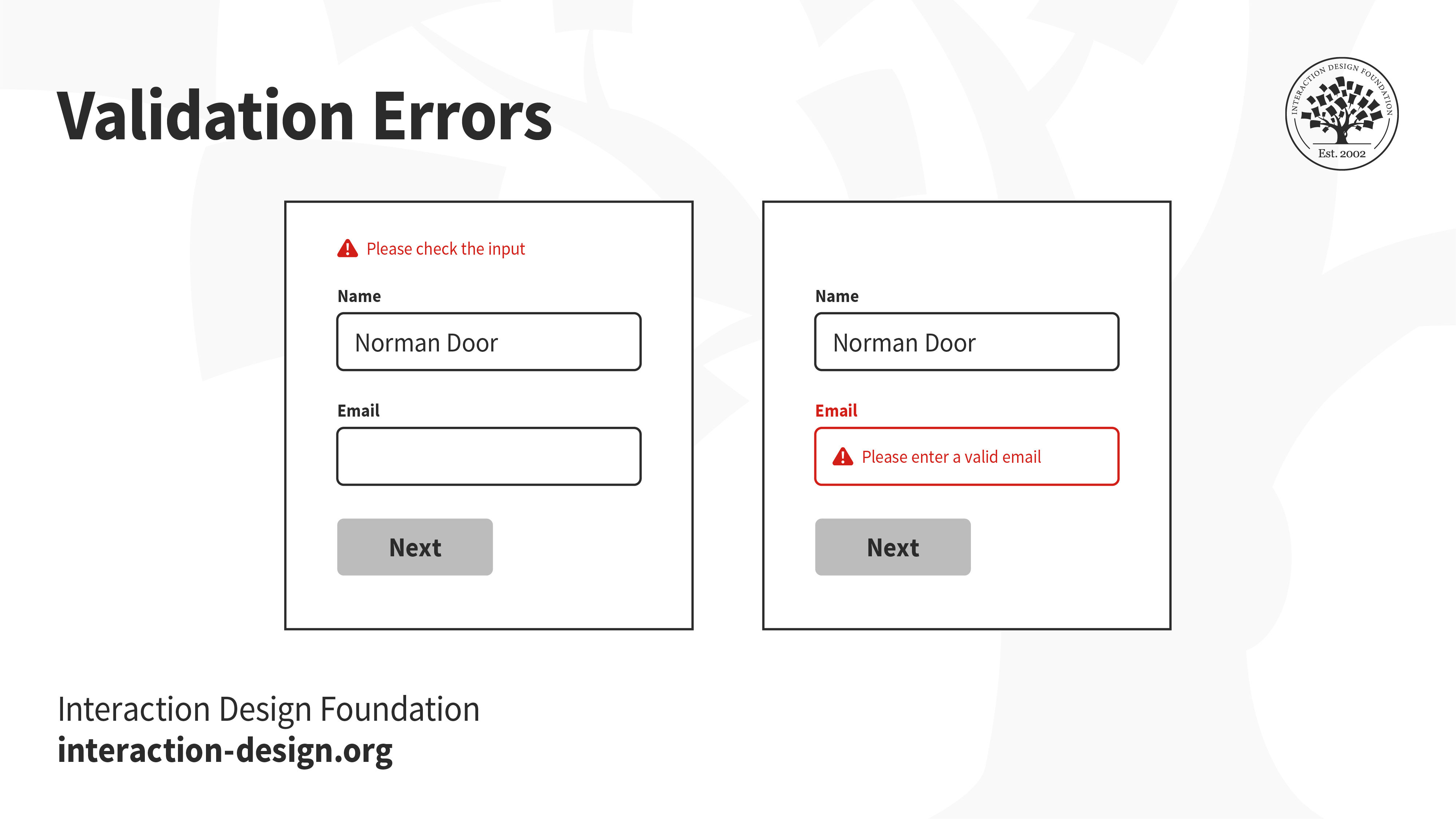
A vague error message at the top that says “please check the input” does little to help users recover from errors. In fact, it might even stress them out. On the other hand, highlighting which form fields have errors, even scrolling to the exact location and showing clear instructions on how to rectify the errors will set them up for success.
2. Error Pages
The internet is full of broken links. You might have seen the ubiquitous 404 error pages — when users are looking for something and end up in the wrong place. Hitting a broken link can be a frustrating experience. Make sure you utilize the real estate to help users find their way back.
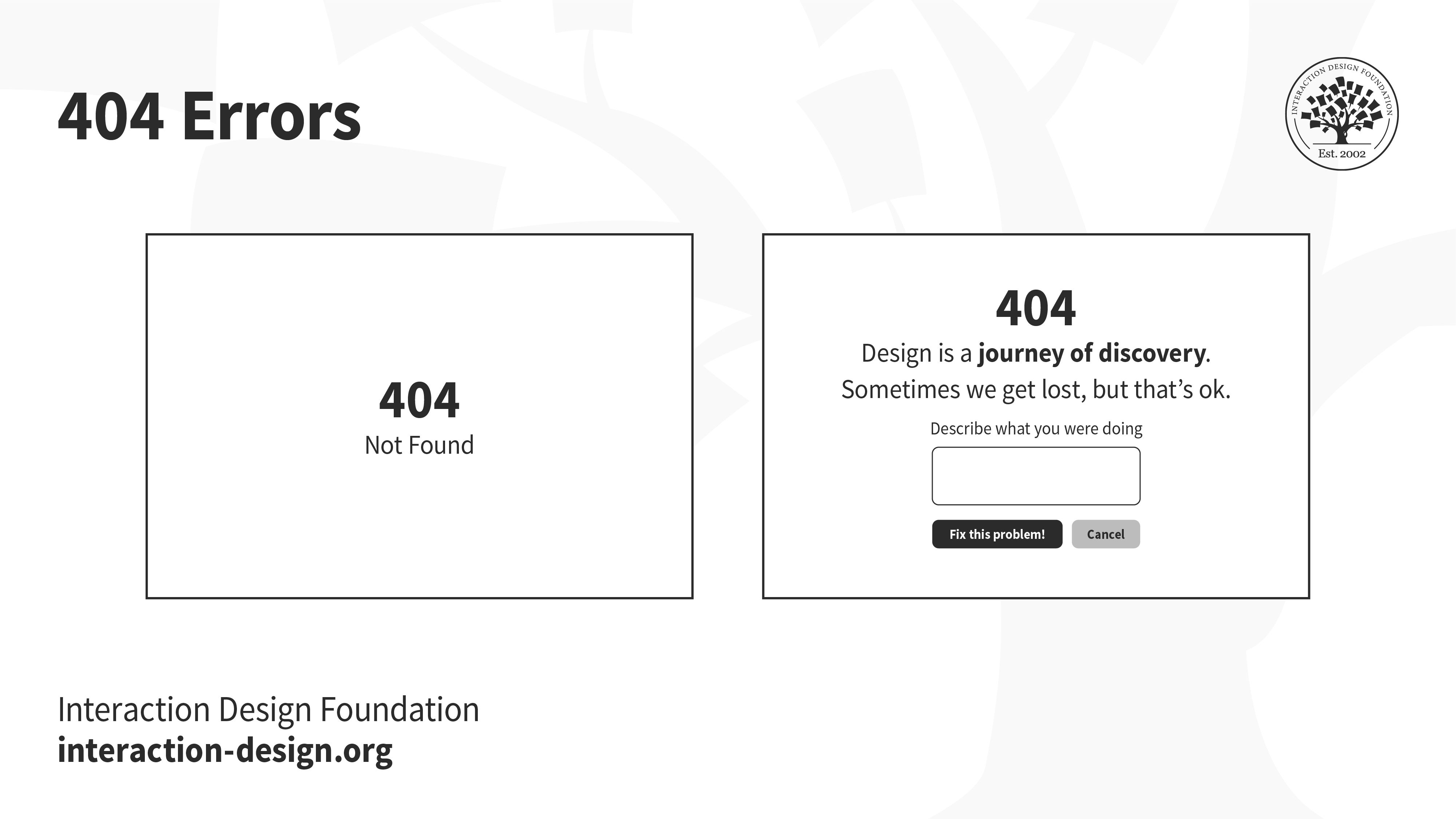
Error codes like 404 and 503 mean very little to most people, and failing to design elegant error pages is not only unempathetic, but also a wasted opportunity to reassure, or even delight users.
3. Alerts
Have you ever accidentally deleted something, or hit the back button without saving your work? When designed right, a timely alert can avert such disasters.
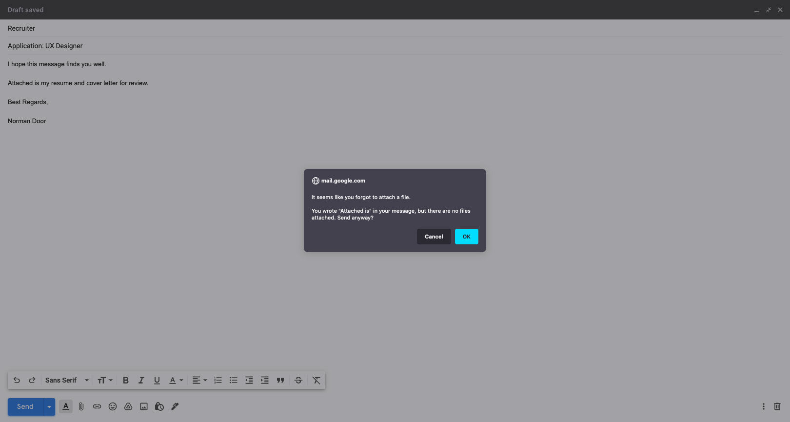
Gmail knows its users well! If you’ve ever forgotten to attach a file to your email, this alert, prompting you to check your message before sending, is one that will certainly not annoy you.
4. Loading States
Whether at the boarding gate of an aircraft, or at an apartment elevator, people hate waiting for something to happen — especially if they have nothing to do while waiting. A loading state can be an opportunity to engage with users, and at the very least, let the user know that something is happening.
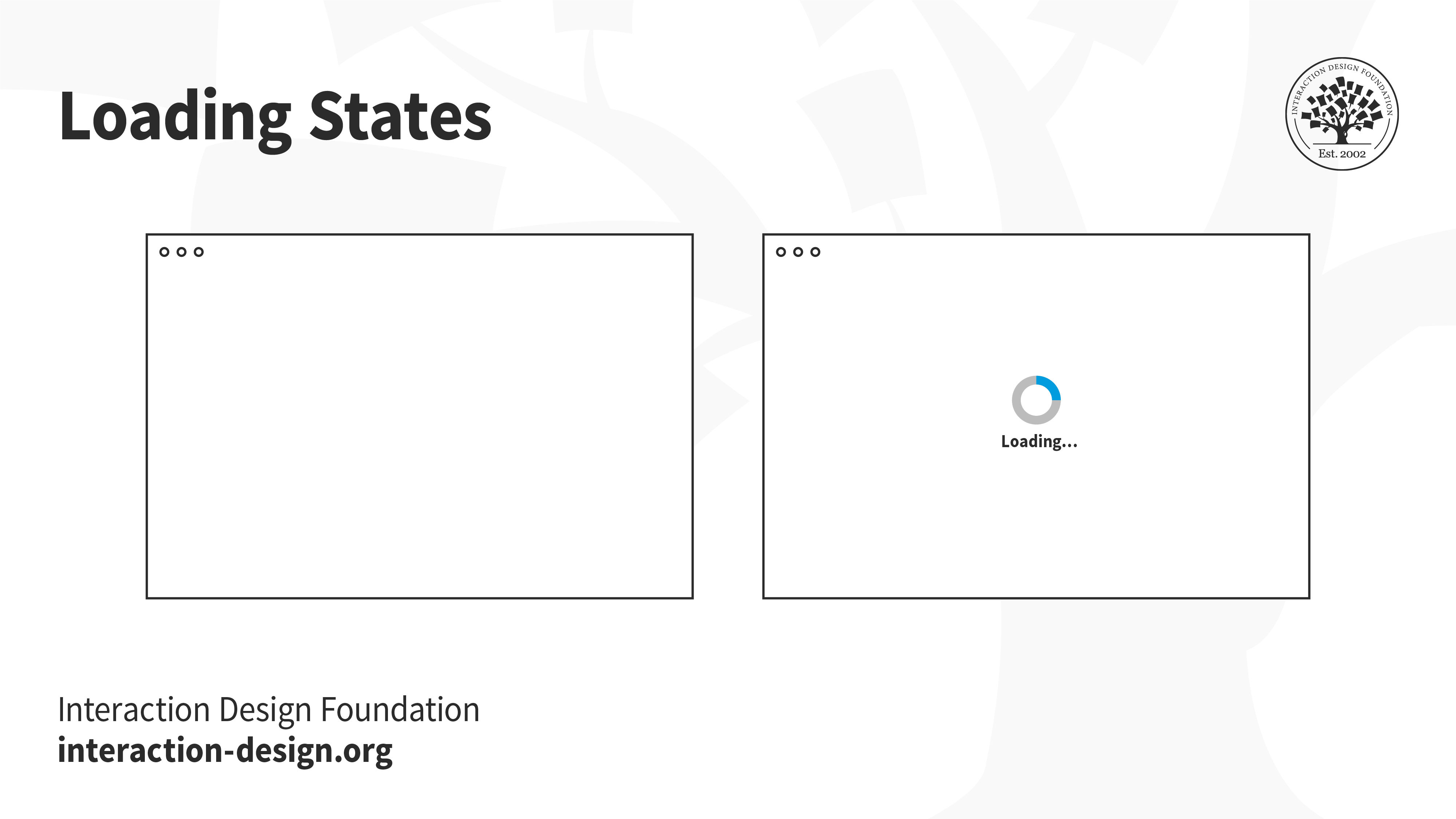
Letting users know that something is on the way is much better than showing a blank page. If users are engaged, they will be more likely to stick around and wait, instead of leaving. The loading state alone is not enough, of course. If the page loads slowly, then users will leave — loading state or not.
5. Empty states
Not every application will begin with lots of data. Think back to the first time you opened an email account, or when you first set up your social media account. You likely had no emails, no drafts, no posts. An empty screen can be extremely intimidating for users, especially in applications that have several functionalities — where does the user begin?
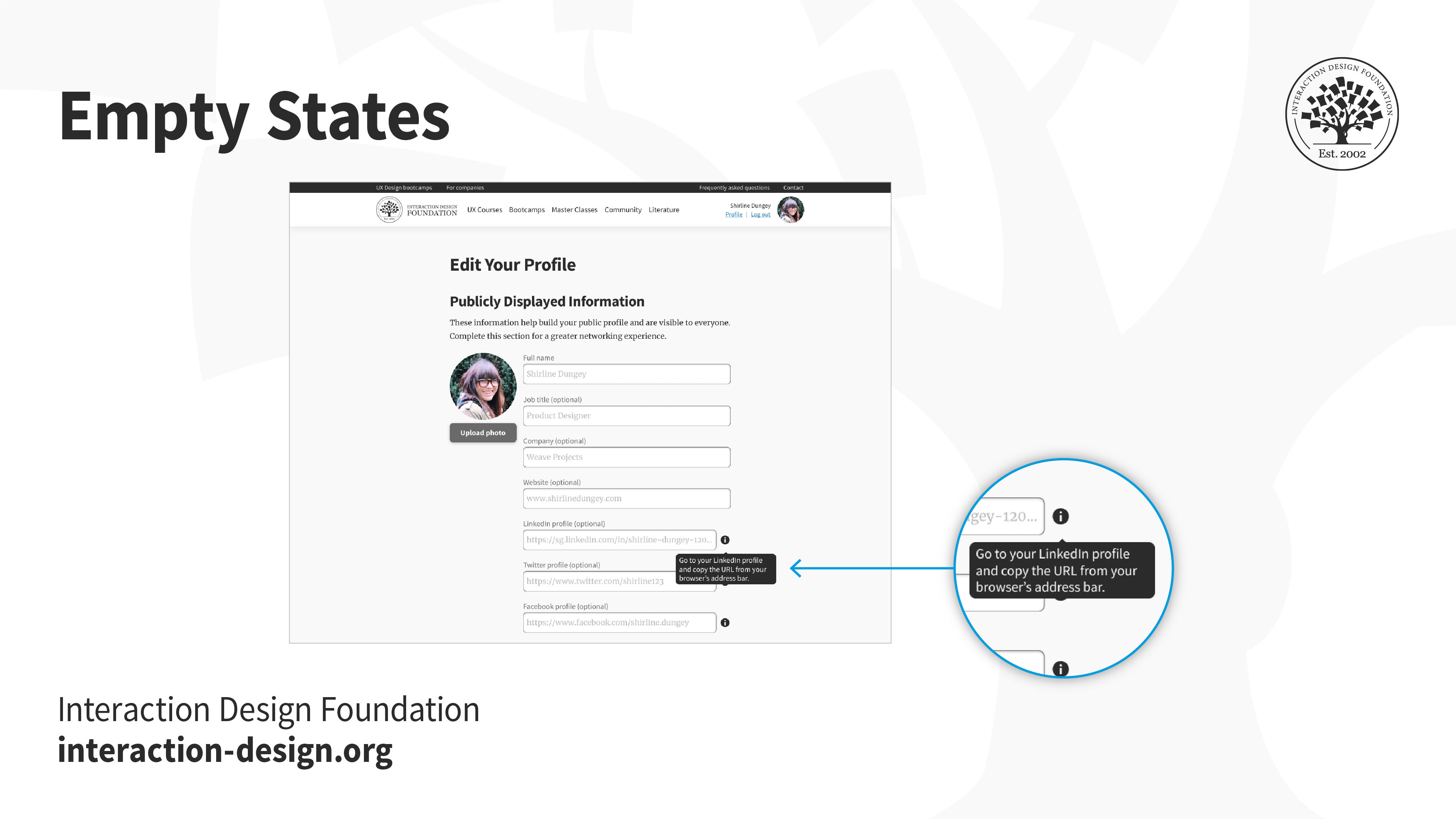
Onboarding screens, product walkthroughs and hints are some ways to nudge users into taking action towards filling up and using the empty space.
6. Input/Button/Icon States
Hover over a button, or tap on a link. How do you know whether something will happen if you click or tap on it? And what after — how do you know if the system has realized you’ve interacted with it? Make sure you create the different states of interactive elements to keep users informed about what’s going on.
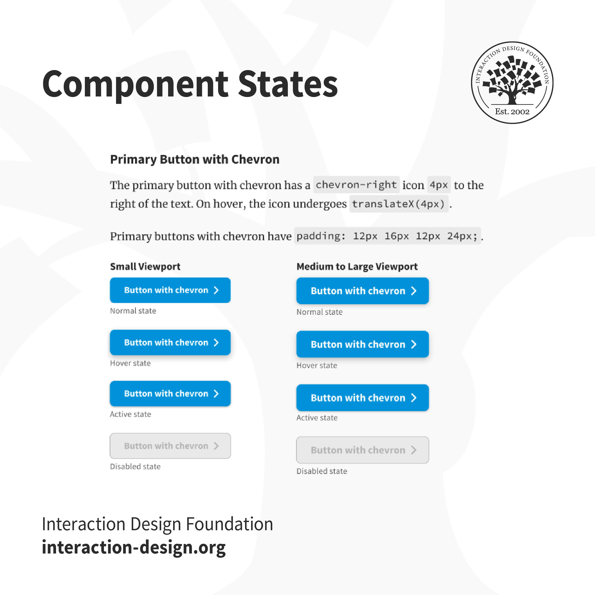
Users won’t know if an element is interactive, or that they have successfully interacted with it unless the interface informs them. For example, in the IxDF design system, buttons that are disabled are grayed out, to indicate that users can’t interact with them. The “Hover” state has a subtle shadow to inform users that they can interact with it.
7. Reset Password Screens
One of the most frequently used functionalities, the reset password screen and flow is one of the most crucial, and mundane aspects of the user’s logging in process. Failure to design this well can be extremely frustrating, especially since users are likely already frustrated at not being able to recall their passwords.
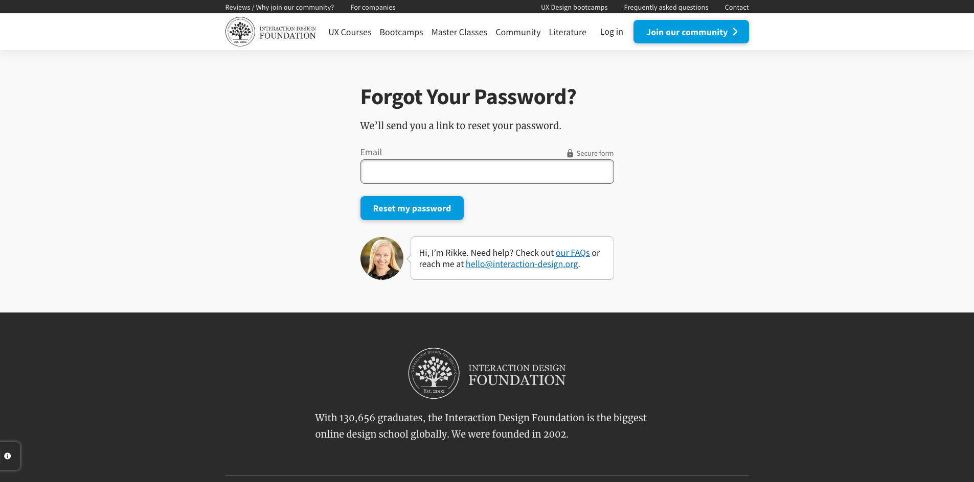
You can help your users reset their passwords in a number of ways such as verification codes, back-up emails, etc. No matter what you decide, ensure you let users feel secure in the process.
8. Responsive States (e.g., Mobile, Tablet, Desktop)
Users access applications through multiple devices. Creating a mockup for a single device is not sufficient. Define how the applications and content responds to different devices and screen sizes so that users can easily use the product.
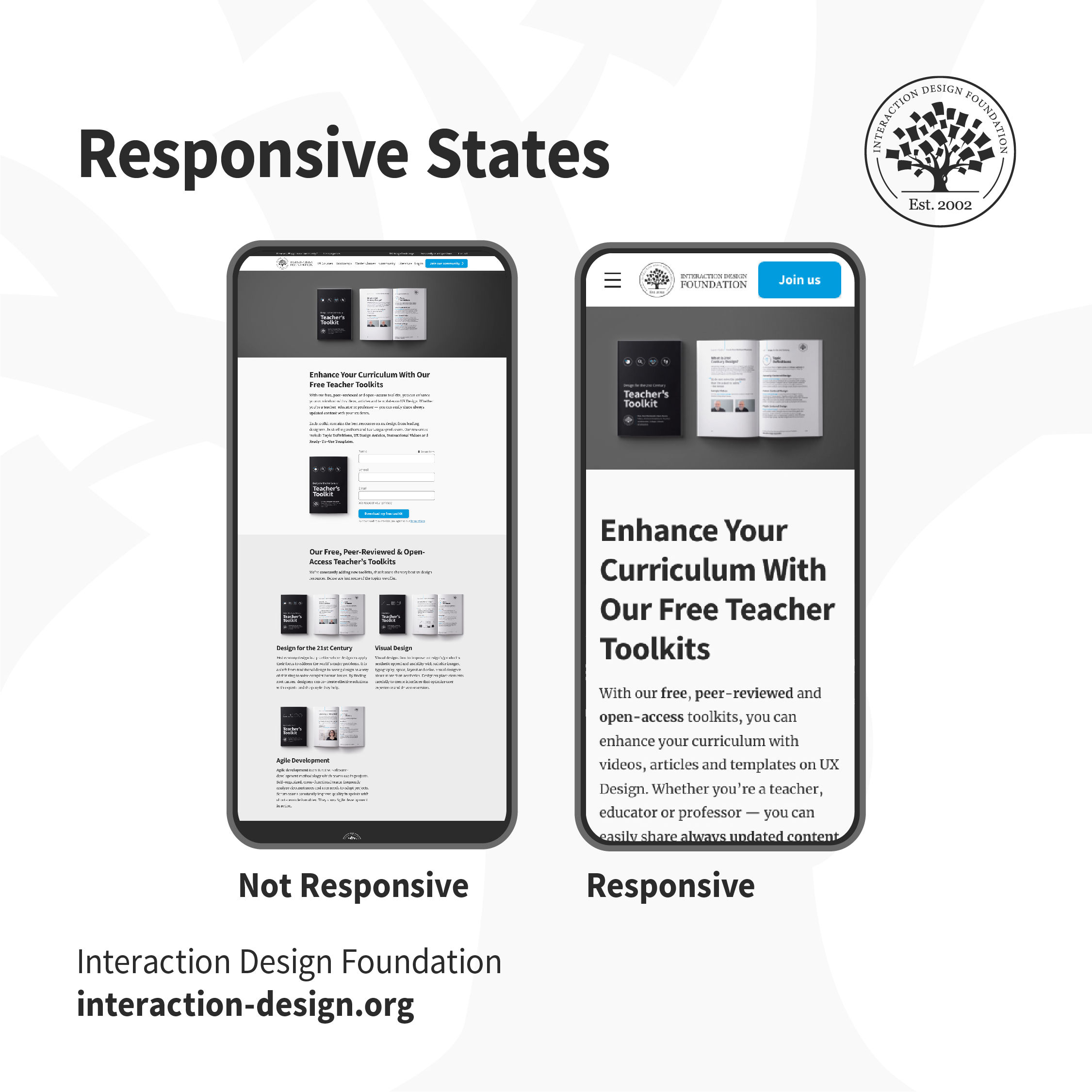
Which one of these would you find easier to use? When the content adapts to the form factor of your device, buttons are tappable, text is legible and the product is usable.
The Take Away
A good designer-developer collaboration goes a long way in delivering a smooth user experience. On many teams, designers and developers often do not understand the challenges faced by each other, which ends up causing friction. One of the best ways to minimize conflict is through efficient communication — understanding what challenges developers face, which assets they require and explaining the rationale behind design decisions. Involve developers early in the design process to understand technological constraints in advance. This has the side effect of saving you any rework, later on, to work around implementation issues.
References and Where to Learn More
For more, see the topic definition on Design Handoffs.
Images
© Interaction Design Foundation, CC BY-SA 4.0


