
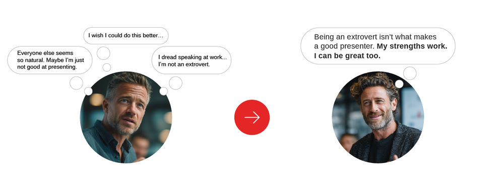
Persuasion occurs internally. You can persuade someone who trusts you by appealing with a convincing argument, backed up with solid facts, accessing emotions. However, nobody can hope to persuade anybody with 100% guaranteed success: you can only design for persuasion. Ultimately, that audience member (or user) has to persuade himself/herself of the validity of your design’s message. This is where the Elaboration Likelihood Model (ELM) comes in.
The Way Persuasion is Hard-wired: Understanding ELM
Developed in the mid-1970s by the cofounder of the field of social neuroscience, John Cacioppo, and Richard Petty, a distinguished psychology professor at Chicago University, the Elaboration Likelihood Model (ELM) seeks to explain how humans process stimuli differently and the outcomes of these processes on changing attitudes, and, consequently, behavior.
Author/Copyright holder: Joe1992w. Copyright terms and licence: CC BY-SA 3.0
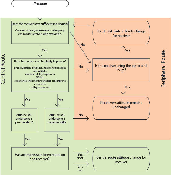
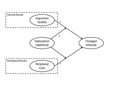
The ELM posits that when a persuader presents information to an audience, a level of “elaboration” results. Elaboration refers to the amount of effort an audience member has to use in order to process and evaluate a message, remember it, and then accept or reject it. Specifically, the ELM has determined that when facing a message, people react by using either of two channels (but sometimes a combination of both, too), reflecting the level of effort they need. As such, they either experience high or low elaboration, and whichever of these will determine whether they use central or peripheral route processing.
Central route processing
Central route processing involves a high level of elaboration. Here, the audience (or user) scrutinizes the message’s contents (rather than reads casually) because of a high motivation level. Users know what’s important to them; consequently, they will invest in examining a credible design’s message. So, if users are persuaded via central route processing, they will have focused on the message’s strengths. Because they’ll be reckoning so much on what the message is telling them, a decision to agree with it will be because of the users’ “work” (i.e., thought). They’ll also be more likely to focus and ignore distractions (such as pop-ups) as they seek their goals.
Peripheral route processing
Peripheral route processing involves a low level of elaboration. The user isn’t scrutinizing the message for its effectiveness. As such, other factors can influence him/her, including distractions. These include such users as those who know that they want an item, but do not know much about the detail of that item. For example, someone wanting “a new laptop that’s good but cheap” is more likely to process by the peripheral route than one who is knowledgeable about the specific features of laptops.
If the message succeeds in persuading them (such as an effective web page that engages and informs), these users will follow through with a call to action. Their behavior will be more enduring and less likely to be changed. However, they may change again if they process another convincing argument.
This group of users looks more to the appealing secondary factors of a design. Because they’re not looking for the message’s details, their eyes drift about, taking in other factors. If you have “bells and whistles”, such as enticing, pleasing imagery, you’ll appeal to them. For instance, as powerful as the message might be, if you’ve included an image of a celebrity giving an endorsement, the latter is what will catch this user’s eye more. Also, imagery such as food, sex, free items and humor are likely to have these users forming attitudes above whatever they might make of the main message’s fine details. However, these are weaker than those positive notions that central route processing forms. That is, they are less enduring, because the design has only caught their eyes, as opposed to captivating the users on a more intellectual level. So, you will need to keep persuading them. Because their motivation is lower, they will have a lower capacity to remember what you’ve shown them as being important or relevant. Also, they will be more likely to stop engaging with a design if they are distracted by, e.g., pop-ups.
Incorporating ELM in your design: accessing user’s abilities
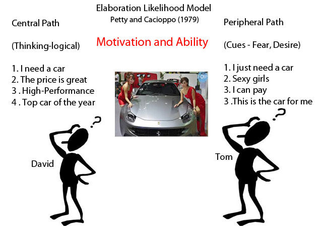
So, now that we know how users “digest” a message, let’s see about making a design that serves the best purpose: appealing to users via both central and peripheral processing routes. That way, we can appeal to both and not risk alienating either one. Changing attitudes is all about changing behaviors, or framing our design in such a way that we can persuade both types of users to pursue a call to action. Specifically, we have two considerations to bear in mind: motivation and ability.
Motivation is typically decided by how relevant the topic of a message or design is to the user. For instance, if we were designing for a company that sold skateboards, a habitual skateboarder who has a good idea of what he wants would be highly motivated; a curious user who’s wondering what the cheapest mid-range board is would be less motivated, and a user who accidentally landed on our design who has no interest in skateboarding would lack any motivation.
Having targeted our audience (i.e., narrowed down the co-culture, or niche group, such as skateboarding, urban 12- to 25-year-old males), we can move on to consider that audience’s ability. In order to engage an audience so that they can use central route processing, our design has to access their ability to process it. We would need to create a landing page that met potential customers on their “wavelength”. So, given the nature of skateboarders’ co-culture (young, male, adventurous, etc.), we could afford to inject some action, or perhaps shock. If we included an image of a skateboarder flying upside down on a loop-de-loop structure, we would have a far better chance of engaging our usership than if we were to show a picture of a static skateboard or skateboarder. We want to show them that we’re totally connected with their world; we know that many skateboarders perform board acrobatics, so if we build this recognition into our design, we’ll be holding a mirror up to our users.
Author/Copyright holder: Davidvfu1. Copyright terms and licence: CC BY-SA 3.0
This is where we need to stand back and evaluate what we want to build according to a strong user-centered design process. Specifically, we want to focus on content and functionalities first. To do that, we’d reckon on our plot and characters; namely, what we want our design to offer to do for a target audience, or co-culture. So, we would construct an easy-to-use design that “speaks” to our usership, acknowledges their ability to process what we want to include, and which conforms to what they expect to find in the site of an organization that not only sells skateboards and accessories but which also “lives and breathes” the skateboarding lifestyle. Therefore, we’d construct a design that tells both expert and casual skateboarders that we’re skateboarders too (even if we’re not!), fine-tuning the image as we move on to focus on the visuals. Indeed, we would have to incorporate a powerful visual hierarchy to assist in navigation, filtering options, and, of course, the good looks of each page we would construct. What about text? We need to show them why our skateboards are best. Short, to-the-point text (quoting specifications of boards and being sure not to flood our users’ cognitive loads) and links to the pages where we show new models would be required here. Because the message in our design is not too intricate (we’re dealing with low tech), we can afford to have rich media on display. Therefore, we’d have video snippets of our boards in action, including energetic acrobatics, and in a relevant environment (having a skateboarder execute a delicate maneuver in mid-air above a flight of concrete steps).
Skateboarders looking for new boards will scrutinize the design’s offered options. Therefore, we should arrange our offerings so that a skateboarder, say, it’s Jack, aged 19, can filter through what’s on offer that appeals to him. This is where our strong visual hierarchy starts helping the user on his journey. When Jack clicks to the page showing what we sell, we’d show our strongest selling skateboard, allowing Jack to click on it to see it magnified and from multiple angles. From there, he can click on dropdown menus to fine-tune his search. He wants to focus on style and value, in that order.
After the better part of an hour of careful sifting, sorting and replaying video snippets, Jack reaches a decision. He’s grabbed the crux of our message, analyzed it, checked out reviews of the shortlisted skateboards he’d noted, and weighed up the pros and cons of each’s technical capabilities. With a final price check, he selects the one he thinks will suit him best and takes it through the easy-to-use e-checkout system we’ve provided.
Now, for the Peripheral Route Processors
What if we had a less-motivated user access our site? Let’s say that Ben, 14, has just moved to a new city and started a new school. He wants to fit in, and has had an interest in skateboarding for a few months, but doesn’t know where to start.
Ben arrives on our site. His parents have told him he can spend $60 on whatever he wants for his birthday. Ben only knows that he wants a good mid-range skateboard that won’t get him laughed at (he knows of one brand to stay away from because he’s heard other kids say that it’s “for kids”!). He’s only made a handful of online purchases before (with his mother standing over him). Ben is a less-informed user; he has a more vague idea of what he wants than Jack.
Fortunately, we’ve designed our site in such a way that it can appeal to Ben, too. He finds the large picture on our landing page and is instantly excited. The danger element appeals to him. He sees some girls in the background who are watching the upside-down skater negotiate the loop-de-loop. Intrigued and enticed, he’s liking our simple, easy-to-use design. We look like an authority on skateboards, as opposed to a more general online merchant.
He navigates to the page where we showcase our latest models. Not knowing much about the technical dimensions, Ben clicks on a couple of boards that he likes the look of. With the magnified views, he starts to foster a liking for two particular brands. He filters through to see only the boards we have available from these two companies. Then, using our very-easy-to-see “sort by price” filter on the dropdown menu, he filters the results so that the cheapest ones head the list.
Ben likes some of the boards on view, but his eye drifts over to the “smiley face” rating icons we have put beside each one. With only 11 models from that company, we have made it easy for Ben to find boards with feedback of four smileys or more out of five. Now, he wants as many shortcuts as he can to achieve his goal: get a skateboard that he can learn with but which doesn’t look like a learner’s skateboard. Within three minutes, he’s homed in on the one he wants; it’s $59.95. He’s just noticed that we offer free shipping on that model. On a budget, how can he say “no” to that?
What happened?
Ben approached our design with a low level of elaboration. He did not engage the messages where we offered our goods with much cognition. Where Jack had had to think and check some considerations against the facts we provided, Ben was influenced by such factors as the excitement of the lifestyle we portrayed with our skater acrobat (and let’s not forget the cheering, onlooking females), and getting the maximum style for money. These changed his attitude from “I want to get a skateboard” to “Wow! That’s the life for me. I need to get a good board like that one, now!”
Ben’s board arrives; despite his parents’ concerns about him having an accident on it, he tries it out and likes it. At school, he’s accepted (at least, he’s not teased, even if no one tells him what a cool skateboard he’s got!). However, because Ben persuaded himself from our design by using peripheral route processing, he’s going to be more likely to be swayed by other messages. If one of his friends tells him a few months later that he knows a place where Ben can get better wheels, Ben will be more likely to believe that and not come back to do business with us.
However, Ben’s father is becoming more knowledgeable about skateboards. Ben may not realize it, but his dad is already looking at our site (in addition to other sites) and educating himself about skateboards and what skaters do with their boards. He might get his son an upgrade at the end of the year, and he already knows what to look for. The axle strength and board grip are important components; he’ll certainly ignore the elements of our design that enticed Ben.
Ben’s dad spends about thirty minutes one evening narrowing down the possibilities to upgrade Ben’s board. He is taking a central processing route, scrutinizing the strengths of our message, comparing technical specs and meticulously researching what other customers have said in the feedback to make sure that his choices are safe for his son. Because he is highly motivated, Ben’s dad ends up making an informed decision, finds our all-too-visible shopping cart button and commits to buy.
Is it possible to use both processing routes? Indeed it is! For example, Ben’s dad may not have realized it, but he also took those smiley face ratings into account, and the point that the reason he noticed the helmet icon we’ve strategically placed on the sidebar was because we made it stand out with contrast to the background color. Yes, he wants to get some safety gear for Ben, just the basics. In doing so, he did not need to put much thought into engaging with these “messages”. His decision-making was more passive, or rather, more peripheral.
The Take Away
Cacioppo and Petty’s Elaboration Likelihood Model Theory (ELM) seeks to explain how people process stimuli and how attitudes they develop from this influence their behavior. Faced with a persuasive message, an audience will process it using either a high or low level of elaboration. The former is called central route processing and takes a greater effort of cognition. Low elaboration, or peripheral route processing, means the opposite. Typically, how motivated the user is to achieve a goal on a design will decide which route of processing he/she takes, although both are often used in some combination.
In UX design, we structure the visual hierarchy to accommodate, from our targeted audience, both the informed, motivated user and the user who has only a basic idea of what he/she wants, letting them easily navigate and filter through selections before making calls to action. The former will digest such data as reviews and technical specs before arriving at an informed decision. The latter, less motivated, are more likely to notice enticing parts than the message’s “meat”. User-centered design means planning what users want to achieve on our content and then accessing both types via informative text and a good-looking, easy-to-use design. As the influential American literary theorist K. B. Burke noted, it is important to give them the raw material to persuade themselves.
Where to Learn More
Course: “The Brain and Technology: Brain Science in Interface Design”
Yocco, V. (2014). “Applying the Elaboration Likelihood Model to Design”. A List Apart.
Brantley, B. (2015). “The Data Briefing: How Neuroscience and Communication Theory Inform Good User Experience Design”.
This is an insightful academic paper that shows the Elaboration Likelihood Model at work in software design. “Practical Findings from Applying the PSD Model for Evaluating Software Design Specifications”.
References
Hero Image: Author/Copyright holder: Alistapart. Copyright terms and licence: All rights reserved. Img


