Congratulations! You have finished the longest chapter in the book, which describes the full hierarchy of design pattern layers from simple components up to the master diagrams of UX Architecture alternatives.
As noted in the book, the multi-level pattern framework is best taught from the bottom up but on a new design project typically is practiced from the top down. We’ll take the top-down approach in our outline for how to proceed.
Project Brief
Review the full project brief for MatchDog again—always keep it in focus.
You will have to draw your own conclusions from the examples in the visualization chapter with regard to your MatchDog design pattern selection. The book scaffolds the project slightly in this regard with the content provided in tables 14, 15 and 16 to help you avoid picking a pattern optimized to display actions being mapped to a primary object. Beyond that, it is up to you to make the design pattern selections at every framework level. No screen designs for MatchDog are provided in the book. As previously noted, there will be a number of valid visualization solutions for expressing your conceptual model. Now you will start the journey to find your own expression of it that will delight users.
Goal of This Exercise
With the completion of your first iteration conceptual model and semantic grid in the prior exercises, it is now time to select the optimal design patterns for visualizing the content of the MatchDog service. You will achieve this goal most efficiently by working through the design pattern levels to map the GUI archetypes and widgets to the primary objects. Then you can fill in all the details which are contained in the attribute list for those objects that you enumerated in the initial exercise.
Equipment You’ll Need in This Exercise
- Pen and paper or a whiteboard
Sketch the Full Visualization of Your Concept
If you wish to continue with the hierarchical UX architecture pattern from the preceding grids and grammar exercise step, that is OK. If you wish to push harder and explore some alternative UX architectures to see if they might be more suitable, you can repeat the grids and grammar step above for any (or all) of the 5 UX architecture variations described in table 19. Typically, in the hub & spoke or network architecture, you will have a high-level aggregate summary view of multiple objects in the home page, and bespoke pages will focus on the details of a specific object.
From a practical perspective, the hub & spoke or network architectures would be most suitable to the administrative back-office experience. The employee persona will spend a significant part of their workday in this UX and is familiar with the task details at a much deeper level than the consumer user would be. They will appreciate a UX optimized for productivity that might utilize screen archetypes such as the dashboard, swim lane or portal, that might be too information-heavy for an infrequent consumer persona.
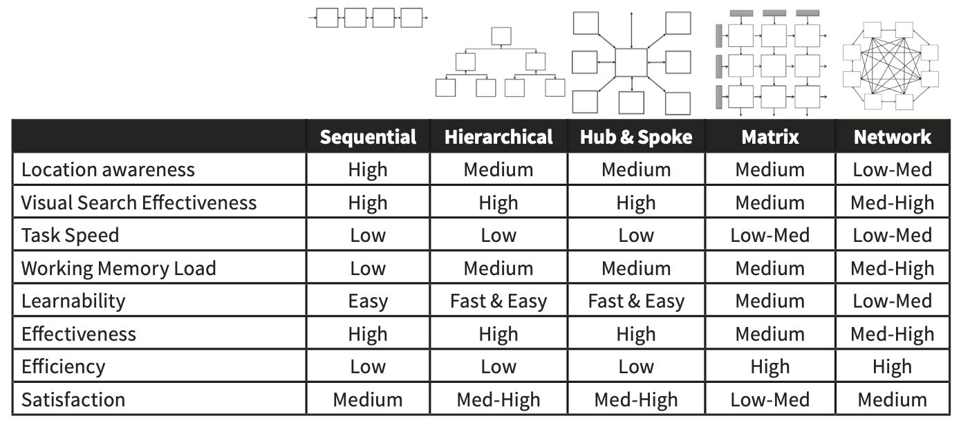
Table 19 from UX Magic: The shape and characteristics of the common UX architectures.
We recommend that you sketch on paper or a whiteboard at this point. Prototyping tools are best for building. They are poor (and slow) for thinking. It is important to feel comfortable with quickly creating many alternatives so that you can evaluate their merits and select the optimal one for visualizing your conceptual model while taking into account device screen size, user tasks and the target persona.
- Choose one or more UX architectures and allocate the objects to them.
- It is common in UX practice to use different architectures in the same overall system for the administrative experience than for the consumer. Keeping the conceptual model consistent across the different UX architecture/persona combinations is critical to the success of the entire solution.
- Create a sitemap for MatchDog per each architecture/persona combination.
- Refine the semantic grids for each page type and try to make them as consistent as possible.
- Make sure you know what your screen header will look like and which global actions need to be permanently placed in it.
- Remember—the administrative UX contains more functionality.
- Choose the most appropriate archetype for each main page.
- Try to use the fewest number of archetypes possible.
- Defer minor pages and dialog boxes until later.
- You need to be sure the core is solid before spending time on supplemental elements.
- Fill in the details of important widgets in each archetype next.
- Usually, this brings the majority of controls with it into each screen.
- Are there filters and sorting options needed in lists and tables?
- Where and how will Search be presented?
- Will favorites and ratings be available for dogs and posts?
- Add any individual controls needed for saving content or backwards navigation (e.g., cancel and undo) into consistent locations across all pages and widgets where appropriate.
When you think your 3 designs can handle all the tasks (object-action pairs) from your MVP functional scope and their position in the UX architecture reflects your prioritization matrix for the consumer and administrative persona, you should stop and return to reading the next chapter.
The time-consuming process of prototyping should not begin until the flow chapter is consumed. Having the primary screens thought out is great, but we need to be sure we can connect them together and navigate efficiently as we support the plurality of use cases defined in the requirements. Otherwise, there is a risk of creating an explosion of screens for each scenario instead of cleverly reusing a minimum number of screens to support the plurality of tasks required.
Iterate Your Visualization to Refine Your CM Grammar
Go back and revisit the CM grammar. Does it fit your visualization decisions perfectly or would it benefit from some pivoting of objects and attributes?
Can you make changes at the CM level that reduce the number of pages or reduce the number of unique archetypes and widgets required? Remember Paul Saffo’s quote, “strong opinions weakly held”. Your design is good so far, but can you reduce cognitive load any further by tightening up the conceptual model?
Wrap up This Exercise
By using the UX Magic visualization levels to choose how to present the primary objects in this exercise step, you have witnessed and practiced the modularity of the semantic IxD methods deconstruction of design pattern levels. You have been able to quickly determine which archetypes were best suited for each of the 3 UX design variations (consumer web and mobile, plus administrative) that will comprise the end-to-end solution in your portfolio. You also have been able to quickly choose the design patterns for widgets and controls necessary to display all the object attributes. Finally, you can use your attribute table and actions as a checklist to ensure that you have covered the functional scope required in the design brief. Not only do you have your design proposal, but you also have verification that you did not leave anything important out.
At this point, you should have a UX design that you have a high degree of confidence in. You used the assembly of Lego-like parts (patterns level) to arrive at a first set of UX screens that support your conceptual model grammar effectively. Your design is standing on a scientific basis that will result in low cognitive load, and you can easily explain and defend it on this basis in stakeholder meetings. Even though semantic IxD is new to you, you should have arrived at this point of initial screens faster than previous approaches you have used. If not, don’t worry – you will only get faster with time and practice as your skill level with semantic IxD increases.

Author / Copyright holder: Teo Yu Siang and the Interaction Design Foundation. Copyright terms and license: CC BY-NC-SA 3.0