
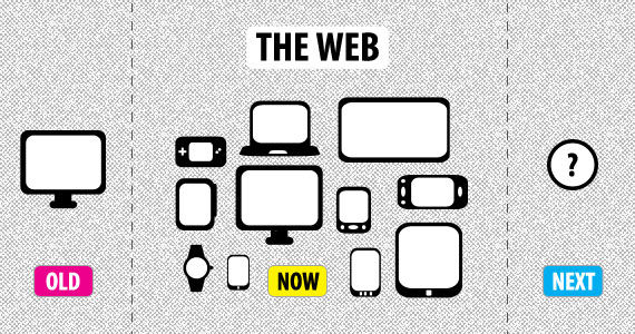
With each new technology (or at least variations on a theme), there are new challenges for designers. As of early 2014, the use of mobile exceeded PC internet usage for the first time in history. This shift from PC to mobile was somewhat inevitable once the technology enabled people to connect to the internet just about anywhere they pleased. Now the landscape has changed, designers are dealing with a new set of restrictions, intangibles, and challenges.
The defining challenge is how we develop sites that are able to cross the divide and straddle both mobile and PC, to provide a seamless transition from one device to another. This is the over-arching challenge, but there are thousands of other sub-challenges, such as how we enable the best conditions for reading, navigating, scrolling, resizing, panning, and so on in smaller devices.
Author/Copyright holder: Flash Mint. Copyright terms and licence: All rights reserved Img source
The Origins of the Term
In 2010,web designer, developer, speaker and author Ethan Marcotte wrote a prescient blog, in which he coined the term Responsive Web Design, declaring,
"rather than tailoring disconnected designs to each of an ever-increasing number of web devices, we can treat them as facets of the same experience. We can design for an optimal viewing experience, but embed standards-based technologies into our designs to make them not only more flexible, but more adaptive to the media that renders them. In short, we need to practice responsive web design".
The technique of adaptive web design predates Marcotte's first use of the term responsive web design. Cameron Adams wrote of this technique in 2004, in the article Resolution Dependent Layout and if you were to trawl the internet you will probably find some earlier mention of adaptive web design.
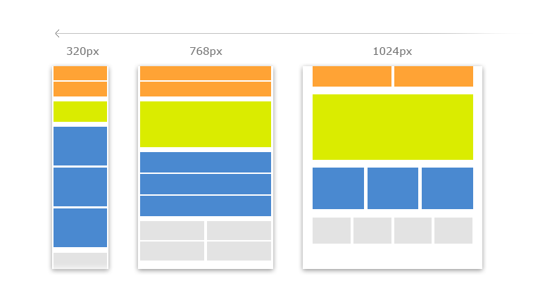
Author/Copyright holder: Quinta Group. Copyright terms and licence: All rights reserved Img source
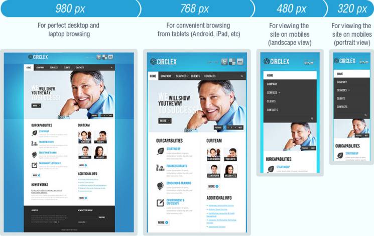
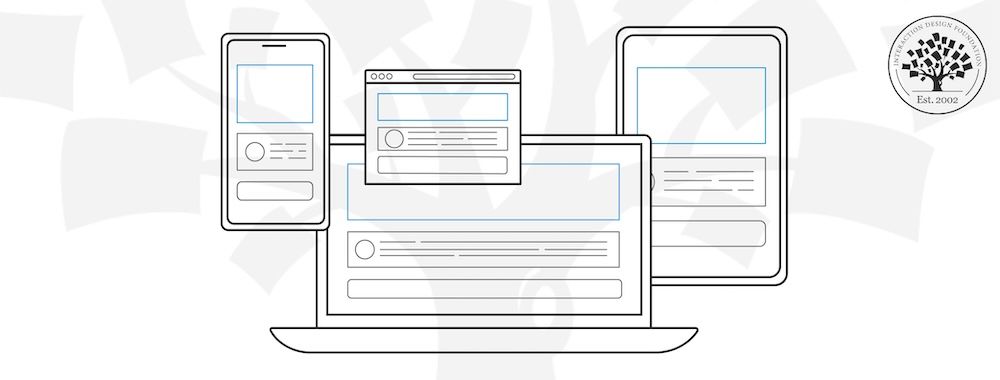
Responsive Web Design Application
Author/Copyright holder: Unknown. Copyright terms and licence: Unknown Img source
Responsive web designers employ images, fluid grids and media queries to adapt layout according to the screen size of a device, and they are able to exploit feature detection, primarily through the web client, to establish constraints and facilities. These constraints and facilities dictate responsive web design. Luke Wroblewski, current Product Director at Google, states that Responsive Web Design is for designers that
"...want layout adjustments across devices...[that] can live without complete optimisation for specific devices...[that] don't have access to server-side solutions...and [that] really don't trust device detection".
In Summary
"...based on the idea of flexibility, whereby the structure, imagery or media truly adapts, by either repositioning, changing size, adjusting view state or eliminating content based on the user's needs" (Pannafino, J. 2012).
The movement from PC to mobile is growing; therefore, the need for flexible websites that adapt according to the user's device is of increasing importance.
A List Apart: Responsive Web Design by Ethan Marcotte
(Book) Responsive Web Design by Ethan Marcotte [Please note: This book is in FRENCH]
Responsive Web Design Basics by Pete LePage
Mobilism: jQuery Mobile, An Event Apart: Rolling up Our Responsive Sleeves, and Which One: Responsive Design, Device Experiences, or RESS by Luke Wroblewski
Header Image: Author/Copyright holder: Intel Free Press. Copyright terms and licence: CC BY-SA 2.0


