
There’s no denying that mobile internet access is here to stay. While the predictions of the demise of desktops and laptops appear to have been overly optimistic/pessimistic (depending on your point of view) it’s clear that roughly half of the world is going to do its shopping, gaming, etc. on smartphones.
User experience is going to make or break companies in the mobile space. The rush to deliver content on smartphones has led a lot of sites and apps that aren’t quite as functional or useful as they could be. Let’s take a look at 8 issues that could be easily fixed that would improve a lot of mobile user experiences:
Link Text Needs to Be Proportionate
With limited screen real estate, link text can often be rendered illegible. The solution to this is almost certainly not short links – we see a noticeable drop off on click through when we use short links compared to when we use full text links or buttons.
People want to know where they’re going when they click on a link. A new strategy of large buttons clearly marked with the place to go – may well fend off users who are getting frustrated with trying to enlarge text only to click on it by accident on their smaller screens.
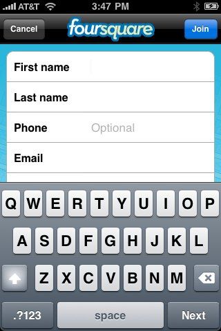
Time to Redesign Forms
It’s often said that the shorter a form is the better. This hasn’t stopped marketing departments from tacking on an endless list of additional questions to try and better understand their audiences. This has to stop.
It’s a minor annoyance to be confronted by a 12 page form on your desktop. It’s a complete PITA to find the same on your smartphone where you’re trying to complete everything with a tiny keyboard. As for voice typing? It doesn’t work well enough to make the process pleasurable and it’s going to be impractical in many of the situations people use mobile devices in. Your fellow commuters would think you’d lost your marbles if they heard you complete a survey on the train…
Marketers will have to learn to keep forms minimal and ideally based on touch selection of options rather than input of responses.
Author/Copyright holder: brennanMKE. Copyright terms and licence: CC BY-SA 2.0
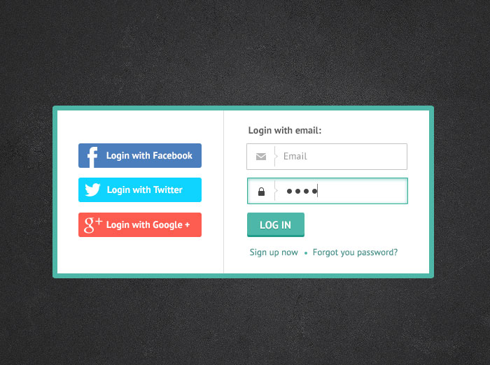
Don’t Tie Your Sign In Process to Other Sign In Processes
This isn’t completely a mobile issue. I can’t tell you of the number of sites and apps that I’ve walked away from because they insist I link my Facebook account to their sign in process. It’s not going to happen – you don’t need that data.
However, there is a tendency on Android handsets to require a Google+ log in as part of the log in process. That’s incredibly daft, particularly because Google+ is slowly dying. It didn’t take off as a social network and tying your login process to an unpopular network just isn’t common sense.
People are happy to use e-mail addresses so try and accommodate them.

Author/Copyright holder: Irina Barsukova. Copyright terms and licence: All rights reserved Img source
Ditch the Sliders
Slider navigation is awkward on a smartphone. It’s even more awkward when the slider doesn’t function properly when translated to the small screen. Then there’s the question of what that slider does to the text around it when it’s all been crunched into the same tiny piece of real estate. Images end up being separated from explanatory text. Medium length paragraphs become a wall of text and so on…
You might actually want to consider replacing slideshows as part of this process. Give people a choice, scrolling slideshow or simple list. And truthfully, this would often be welcomed by desktop users too. Why should I need to click 20 times to see 20 photos with a line of text under each?
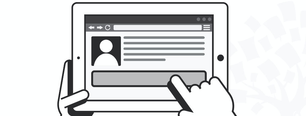
Consider Information Walled Content Carefully
Requiring people to fill in a form just to see your content is annoying. It’s doubly annoying on a screen where the keyboard is not that easy to use. If you must continue walling off content – think about where to use that wall. People need to see something of value before they are going to waste their time filling in forms on a smartphone for you.
Ideally, to keep your marketing department happy, that means creating additional value content that increases the value of the stuff that you give away. An e-book giveaway, for example, if done right can help you get that valuable data without driving a ton of people away at first glance.
People Need Assistance
You can help people come to grips with the pain of using that tiny keyboard pretty easily. Sit down and think about the way that Google and many of the most popular sites work. They all offer auto-complete or auto-suggestion support. That’s a big plus on the desktop but it’s truly invaluable on mobile devices.
You should be able to draw on data from an existing product to work out what users want most often and then map that to an auto-complete function. The less pain that your products cause, the more likely they are to become user favourites.
Author/Copyright holder: Diana Martinez. Copyright terms and licence: All rights reserved Img source
Design Conventions Matter
There’s a reason that we still use a floppy disk for a save button even though floppy disks have long since stopped being in common usage. It’s because users recognize that convention. They know it means “save”. While there is room for improving the mobile experience, abandoning past conventions and replacing them with brand new ones is just going to force a higher learning curve than necessary. Where possible – stick to the tried and tested design conventions. If you do have to abandon them, explain them to your users, don’t rely on intuition.
Tutorials are Good But Need to Be Thought Through
A tutorial to explain an app or a new website feature can be really useful but if you find that it’s 10 minutes long… you’ve probably got a product or feature that’s too complicated for anyone to use. If you’re explaining every button and every field… it’s because you’ve strayed too far from the world people know. You might also want to spend a little time focusing on what people can achieve in the tutorial, rather than making it a dry walkthrough of functionality.
Summary
These 8 problems are endemic to the mobile experience but the good news is that not only can they be fixed – most of them can be fixed easily and cheaply.
Header Image: Author/Copyright holder: Unknown. Copyright terms and licence: Unknown Img Source


