Stage 2 in the Design Thinking Process: Define the Problem and Interpret the Results
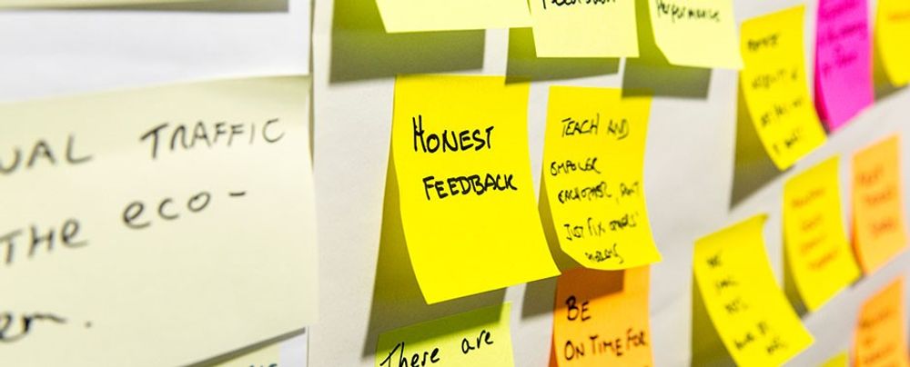
- 1.4k shares
- 5 mths ago
An affinity diagram or map, is a tool that helps designers, researchers and project managers organize ideas, information, and observations to identify patterns and, ultimately, insights.
Also known as the KJ method, after Professor Jiro Kawakita, affinity diagrams are most useful for sorting large amounts of unstructured, qualitative data. Stakeholders cluster data based on natural relationships or similarities into more manageable groups to determine related patterns and draw informed conclusions.
“With masses of data spread about on my desk, I had been racking my brains to find some way to integrate them when I suddenly realised that depending on the spatial arrangement of the cards, you can see new meaning in them and find ways to systemise the data. That was the first realisation that led to the creation of the KJ Method.” - Professor Jiro Kawakita, Anthropologist.
The Oxford English Dictionary defines “affinity” as “a similarity of characteristics suggesting a relationship, especially a resemblance in structure between animals, plants, or languages.” In an affinity diagramming session, participants group similar ideas, items, statements, or data with a “liking” or “similarity” to each other together. You can do this physically with cards or post-it notes or with diagramming and brainstorming software.
Anyone can create an affinity map—whether on a team or individually. Through an affinity diagram you can identify patterns and turn those patterns into valuable insights to apply in your work. Due to its simplicity and effectiveness, UX researchers often use affinity diagrams in their work.
In UX design and user research, we use affinity diagrams to organize and make sense of qualitative data from research activities such as user interviews, observations, and questionnaires.
Affinity diagrams can help you go from a state of complete chaos with no overview of your information to a serene state of organized groups of information, which you have named and sorted into hierarchies that make sense and provide insight.
© Interaction Design Foundation, CC BY-SA 4.0
Affinity diagrams help UX designers in the following ways:
Organize User Insights: After conducting user interviews, usability testing, or other research methods, UX researchers often amass a wealth of qualitative data, including user quotes, pain points, and suggestions. Affinity diagrams help teams make sense of the data and get a broad idea of the types of user insights in a single view.
Identify Patterns and Themes: UX designers and researchers use affinity diagrams to identify patterns, themes, and trends within research data. By grouping similar user comments or issues together, designers can easily identify the most common or critical issues to work on.
Promote Cross-Functional Collaboration: Affinity mapping provides a visual and collaborative platform for different team members to contribute their perspectives and insights, fostering a shared understanding of user needs.
Persona Development: Affinity diagrams can help teams create and refine user personas. When you group user characteristics, behaviors, and preferences, you can create more comprehensive and representative personas, ensuring user-centered design decisions.
Prioritize Features: Designers and product teams use affinity diagrams to prioritize features based on user needs and pain points. This helps the team focus on the most crucial aspects which contribute to a positive user experience.
Idea Generation and Brainstorming: Affinity diagrams help organize existing data and generate new ideas. During brainstorming sessions, teams can use the affinity diagram process to group and categorize emerging ideas, which leads to more structured and focused discussions.
In the context of UX design and user research, affinity diagrams are a powerful tool to synthesize and visualize qualitative data, foster collaboration, and inform design decisions based on a deeper understanding of user needs and behaviors.
Affinity diagrams are useful when a team works with a large amount of qualitative data, whether for research or during ideation. The following affinity diagram example focuses on organizing user research findings, but a team can easily apply the same process for a brainstorming session.
Imagine your UX design team creates an affinity diagram after a round of user interviews for a mobile application for a popular gym in your city.
Start the session where participants write down user quotes, observations, or issues from their user research on notecards or sticky-notes. Write only one idea on each card. Include direct quotes, for example:
“I didn’t understand how I could book a recurring class.”
“I struggled to find the ‘Contact Us’ page.”
“It was difficult to book the class I wanted to attend.”
“I was stuck and I couldn't figure out where to ask for help.”
“This is practically impossible to use offline.”
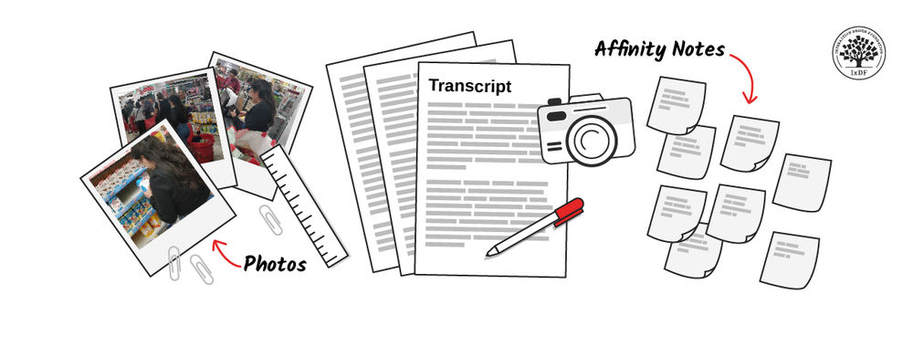
In this video, William Hudson, User Experience Strategist and Founder of Syntagm Ltd, explains how to turn user research into affinity notes.
Whether for a brainstorming session or for organizing user data as above, make sure you add only one piece of data or one quote per sticky note or card.
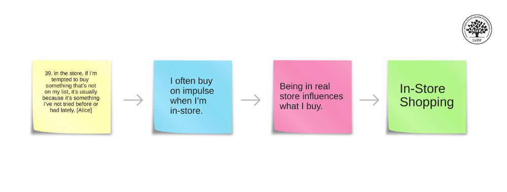
In this example, the designer represents each participant with color-coded sticky notes. The designer includes only one quote on each post-it note. You can gather these observations directly from your user research notes, spreadsheets, recordings, etc.
© Interaction Design Foundation, CC BY-SA 4.0
Once you have all data in front of you, discuss, sort, and group them based on their similarities or relationships.
Following the example above, you might group the following ideas together:
Group 1:
“I didn’t understand how I could book a recurring class.”
“It was difficult to book the class I wanted to attend.”
Group 2:
“I struggled to find the ‘Contact Us’ page.”
“I was stuck and I couldn't figure out where to ask for help.”
Some oddballs might not or do not group well with anything else or even some post-it notes could belong to multiple groups. It’s okay! You can add them to an “Other” group or keep them as individual observations to be dealt with separately.
As you group similar items or those with an affinity for each other, don’t worry about the ones that don’t group well with anything else. You can attend to them individually later in the design thinking process.
© Interaction Design Foundation, CC BY-SA 4.0
Assign a label or category to each group of related ideas. This label should capture the common theme or connection among the ideas in the specific group.
For example, “Booking Issues,” “Class Booking,” or “Class Booking Flow Problems” are category names you could apply to your newly formed Group 1. You might name the second group “Accessibility.”
You can still label the single observations with a theme, too. “Improve offline mode,” for instance.
When you determine the common themes, it’s essential to label them clearly so everyone on the team can quickly understand what each note pertains to. Be sure to accommodate anyone on the team who might encounter accessibility issues, i.e., take visual or hearing impairments into consideration during the session for a truly inclusive environment.
© Interaction Design Foundation, CC BY-SA 4.0
Depending on your data's complexity, you may create a hierarchy by organizing groups into further categories or themes or even merging more narrow categories together.
In the example group, “Class Booking Flow Problems,” you could create a hierarchy where the idea, “It was difficult to book the class I wanted to attend.”, breaks further down into a sub-theme called “Single Booking Difficulty” and the other user comment, “I didn’t understand how I could book a recurring class.”, nests under “Recurring Booking Difficulty.”
Additionally, you could add the quote, “This is practically impossible to use offline.” to the theme, “Flexibility,” under the sub-group, “Improved Offline Mode.”
It would look something like this:
In this optional step, you can create hierarchy within the groups themselves. For example, you can nest the sub-groups, “Icons/Font Size” and “General A11Y Issues,” in the main group labeled “Accessibility”. Hierarchy formation helps when you start to identify insights in the next step.
© Interaction Design Foundation, CC BY-SA 4.0
Now you can review the overall structure of the affinity diagram. Make sure the groups make sense and accurately represent the relationships among the ideas. Refine and adjust the diagram as needed. As with everything in UX design, affinity mapping is also an iterative process.
The affinity diagram process requires iteration. Take a step back, review the results of your efforts, and don’t be afraid to make edits, additions, and appropriate changes based on your user research and data. Create the affinity map as a team to take advantage of different perspectives.
© Interaction Design Foundation, CC BY-SA 4.0
You’ve now identified the patterns, you can create insights to share with your team and relevant stakeholders.
For example, you might notice that a majority of your users faced one particular problem… You could present them as follows:
“Participants struggled to book a class using the gym app; this means the booking flow needs improvement for singular and recurring booking. To accomplish this we could add a recurring booking feature to the app and dedicate resources to improve the current design for the single-class booking experience.”
“Participants couldn’t easily find the ‘Contact Us’ page while others had trouble with the icons and related copy; this means the ‘Contact Us’ button and other icons are perhaps not obvious enough on each screen. The team can improve this by testing alternate layouts.
The affinity diagram helps teams make sense of complex information and facilitates a more organized and structured approach to problem-solving or idea generation. You can use it in different fields, including business, design, and project management, to clarify large amounts of data and encourage collaboration among your team members.
Affinity diagrams bring incredible value to the design table, but they are not without potential downsides. As a UX designer, it’s always a good idea to remember:
Affinity diagrams require time-intensive collaboration. Similar to a design sprint, they necessitate time-intensive collaboration among team members. The process of sorting, grouping, and categorizing information demands active participation and discussion, whether physically or via a design tool. This is a potential drawback in fast-paced projects or when team members have limited availability. However, many virtual whiteboard tools use artificial intelligence (AI) and can automatically identify themes from raw data which saves time by pre-populating the board for the team to then validate and iterate.
Affinity diagrams may introduce subjectivity and bias. Individuals or teams interpret and categorize information based on their perspectives, potentially leading to bias in the final diagram.
Affinity diagramming may present challenges in accessibility. The visual nature of affinity diagrams, which often relies on physical cards or visual representations, may pose difficulties for individuals with visual impairments or other accessibility needs. You should ensure the information is accessible to all team members and keep in mind those who require additional considerations or alternative approaches in the representation of data.
Affinity diagramming involves multiple stakeholders. The more team members participating in the session can mean more insights but also more time needed for discussion and consensus-building. It's important to involve only those absolutely necessary to the process.
Since its inception in the 1950s-60s, people have completed affinity diagramming with paper notecards or post-it notes. They are “tried and true” supplies, always on hand or readily available in offices and homes around the world. However, writing down each input on a physical post-it note is a time-consuming task that teams may not want to invest in.
With the rise of design software tools, many include affinity map templates and built-in artificial intelligence (AI) which give teams a head start on their ideation journey. These digital programs have revolutionized how long-distance or remote teams implement affinity diagrams within their research, as multiple users can log in and participate simultaneously from even thousands of miles away.
The virtual canvas’ use goes beyond affinity diagramming and teams can continue to use the same tools for journey mapping, project planning, design collaboration, and more.
Learn how to use affinity diagrams to distill research insights into powerful personas in our course, Personas and User Research: Design Products and Services People Need and Want.
Read more from the IxDF: Affinity Diagrams: How to Cluster Your Ideas and Reveal Insights and How to Visualize Your Qualitative User Research Results for Maximum Impact
Learn more about user research techniques in our courses, User Research – Methods and Best Practices and Design Thinking: The Ultimate Guide.
Learn about affinity diagrams in the insightful article, Affinity Diagramming for Collaboratively Sorting UX Findings and Design Ideas, from Nielsen Norman Group.
Read about the pitfalls of affinity diagrams from this article, Affinity Diagramming for Collaboratively Sorting UX Findings and Design Ideas.
Learn more about the KJ method from Lucid Meetings’ glossary.
Read about the beginnings of affinity diagramming and the history of Jiro Kawakita from Christopher Roosen’s article, What Came Before the Affinity Map - Reconsidering Professor Jiro Kawakita and The KJ Method.
Read Raymond Scupin’s scholarly article, The KJ Method: A Technique for Analyzing Data Derived from Japanese Ethnology, for an in-depth discussion on the KJ method, now known as affinity mapping.
Affinity diagrams are a valuable tool for agile teams for several reasons. They help organize and prioritize ideas, enhance collaboration, support iterative processes, aid in prioritization, and facilitate a user-centric approach, particularly in UX design.
Affinity diagrams help teams move forward by distilling many ideas into the best solution or path forward which makes them extremely useful when there is a large amount of data to sort and when the team needs to filter all of the data into specific solutions. They are beneficial during brainstorming sessions, and to analyze qualitative data from usability testing and user interviews and are commonly applied in user experience design, UX research and design thinking. To learn more about agile methodologies, explore our course, Agile Methods for UX Design with Laura Klein, author of Build Better Products.
Affinity diagrams are helpful in customer journey mapping as they help teams organize and analyze data related to customer experiences. They also help structure customer feedback, identify pain points and opportunities, enhance team collaboration, facilitate user-centered design, and visualize complex data.
A. A. Milne, author of the famous Winnie-the-Pooh stories once said, “Organizing is what you do before you do something, so when you do it, it is not all mixed up.”
To help organize your own design process, IxDF has a convenient customer journey map template available for download.

Affinity diagrams benefit non-design projects. They are valuable tools for any project which involves large amounts of data or ideas, as they help you categorize and organize information into coherent groups, spot recurring patterns, and break down complex problems into manageable parts regardless of the problem, situation, or industry at hand. Additionally, they promote collaboration and make it easier to communicate results and strategies. To learn more about design and design thinking processes, enroll in our course, Design Thinking: The Ultimate Guide.
The duration of an affinity diagramming session typically depends on several factors, including the complexity of the topic, the amount of data to be organized, and the number of participants. However, as a general guideline, these sessions often last between 1 to 3 hours. Consider these key points:
Scope of Data: The more data or ideas you have to categorize, the longer the session will likely take. You can prepare and organize the data beforehand to help streamline the process.
Number of Participants: More participants can mean more ideas but also more time needed for discussion and consensus-building. It's crucial to manage the group dynamics efficiently to keep the session on track.
Complexity of the Topic: Complex topics with many interrelated aspects might require longer sessions for thorough exploration.
Goal of the Session: Define clear objectives for the session. The session might be shorter if the goal is to generate a broad range of ideas. If it's to develop a detailed strategy or solve a complex problem, it may take longer.
Breaks and Iterations: Include short breaks to maintain energy and focus. If needed, you could also break the session into multiple shorter sessions, especially for complex or large-scale projects.
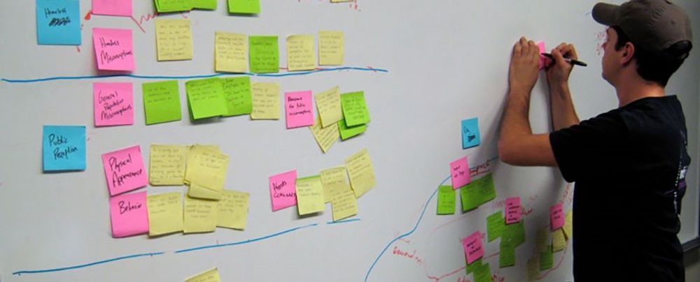
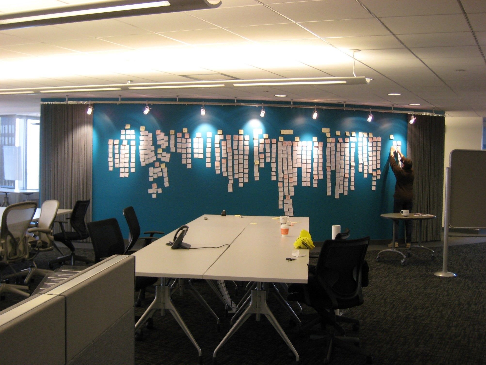 The affinity diagram process is great when you want to make sense of insights gathered during research, as well as when you want to organize ideas generated during ideation sessions.
© Josh Evnin, CC BY-SA 2.0.
Here are some tips to get the maximum benefit of affinity mapping:
Don’t overlook key data: consider all relevant data.
Don’t rush the process: thoroughly analyze and discuss the data and take the time you need.
Don’t be too rigid: allow the diagram to evolve organically and don’t force it.
Don’t ignore group dynamics: ensure everyone involved participates and consider accessibility.
Do create clear objectives: stick to your goal!
Do review and revise: iteration is key.
Do document the session: properly document the process and outcomes.
While there is a plethora of literature on design and user experience methodologies, some books stand out for their comprehensive coverage of tools like affinity diagrams. A few recommended books include:
Read about The Universal Methods of Design, Expanded and Revised by Bella Martin and Bruce Hanington from Rockport Universal, 2019.
This book is an excellent resource for a wide range of design methods, including affinity diagrams. It provides clear explanations and real-world examples, making it suitable for both beginners and experienced practitioners.
Read Practical Empathy: For Collaboration and Creativity in Your Work by Indi Young via Rosenfeld Media, 2015.
The book focuses on the importance of empathy in design, and offers insights into how tools like affinity diagrams can help you understand user perspectives and foster a user-centered design approach.
Read Susan Weinschenk’s 2015 book, 100 MORE Things Every Designer Needs to Know About People, from Voices That Matter.
Susan’s book provides a psychological perspective on design and covers tools and techniques, including affinity diagramming, to understand user behavior and needs. You can also learn more in the Master Class, How to Build Your UX Toolbox by the very same!
Some highly cited research on affinity diagrams and the KJ Method include:
Gunnar Harboe, Elaine M. Huang, Real-World Affinity Diagramming Practices: Bridging the Paper-Digital Gap. Proceedings of the 2015 CHI Conference on Human Factors in Computing Systems (2015): 95-104.
Andrés Lucero, Using Affinity Diagrams to Evaluate Interactive Prototypes. Part of the Lecture Notes in Computer Science book series (LNISA,volume 9297.)
Scupin, R. (1997). The KJ Method: A Technique for Analyzing Data Derived from Japanese Ethnology, 56(1), 233-237.
You can learn how to visualize your qualitative data via, How to Visualize Your Qualitative User Research Results for Maximum Impact.
For additional information on affinity diagrams, read Affinity Diagrams: How to Cluster Your Ideas and Reveal Insights by Rikke Friis Dam and Teo Yu Siang.
We can use both tree diagrams and affinity diagrams to organize and analyze information, but they serve different purposes and have different structures:
Affinity Diagrams:
Purpose: Organize ideas, data, or information into natural and meaningful groups or themes during brainstorming sessions or to analyze qualitative data.
Structure: Begins with a large number of ideas or pieces of information. Participants then group them based on their natural relationships. The process is organic, and categories emerge throughout the diagram creation.
Usage: Ideal to synthesize and categorize ideas or data, especially when the relationships among them are not initially clear. They help identify patterns or themes in a large set of unstructured data.
Process: Write down each idea or piece of data on a separate note (like a sticky note), and then participants group these notes into categories based on their affinity or similarity.
Tree Diagrams:
Purpose: Depicts hierarchical relationships between elements. They show a branching structure where each branch represents a subdivision of the previous one—like a tree.
Structure: Starts with a single root item or goal, which branches into several sub-items or steps. This branch continues, and often becomes more detailed at each level.
Usage: Breaks down broad concepts into more specific elements. Ideal to show breakdown of tasks in project management, or to show the structure of an organization or system.
Process: Create a top-level node (the root), and then systematically add branches and sub-branches to represent different levels of information or tasks.
In summary, while affinity diagrams group and organize related ideas or data to identify patterns or themes, tree diagrams represent hierarchical relationships and break down broad concepts into more detailed parts.
Card sorting and affinity mapping are both user experience research methods, but they differ in their approach, purpose, and typical usage scenarios:
Designers use card sorting to understand how users perceive and categorize information, often to inform information architecture, particularly for website navigation and content organization. In a card sorting session, participants organize cards which represent content or concepts into groups which make sense to them. The users' categorization choices provide insights into their mental models.
Designers use affinity mapping, also known as affinity diagramming, to organize ideas, data, and insights into logical groups, typically after brainstorming sessions, user interviews, or observations. It's useful to synthesize large amounts of qualitative data and identify patterns or themes. The team or researchers who collected the data organize and analyze it, unlike card sorting where the organization is participant-led. The resulting visual representation of grouped data helps us understand complex issues, identify underlying problems, and generate new ideas or solutions.
You can learn more from behavioral science expert and CEO of the Team W, Inc, Susan Weinschenk, in our Master Class on UX tools involved in user research, prototyping, and design thinking process.
Mind mapping explores and expands a central idea through a hierarchical, radial structure, which makes it great for individual brainstorming and idea development. Affinity diagrams, on the other hand, group and organize diverse ideas or data to identify patterns, often in a cooperative environment to analyze and solve complex problems.
Mind Mapping:
Purpose: Brainstorm, organize thoughts, problem-solve, and visualize concepts.
Structure: Hierarchical and radial, with a central idea or concept and branches representing related sub-ideas.
Usage: Ideal for individual brainstorming, note-taking, or planning.
Visual Style: Radial structure, show relationships with lines connecting the central idea to its various sub-ideas, which may also be connected to each other.
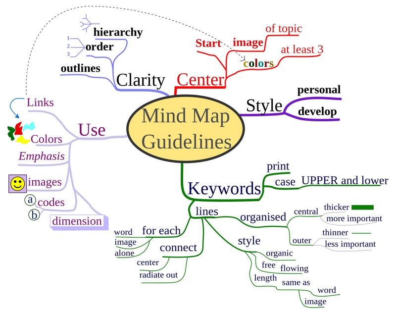 A mind map depicts mind map guidelines. You're able to break abstract ideas down into their sub-ideas and show connections between them. You can easily use this brainstorming technique on your own.
© Nicoguaro. Copyright terms and licence: CC BY-SA 3.0
Affinity Diagrams:
Purpose: Organize ideas, data, or information into groups based on their natural relationships.
Structure: Fluid and determined by emerging patterns in the data, with related items clustered together.
Usage: Collaborative settings, such as team meetings or workshops, to analyze complex issues, identify patterns, and solve problems.
Visual Style: Less structured, with items clustered based on their affinity or similarity, usually on a flat plane without a predefined hierarchy or central node.
Remember, the more you learn about design, the more you make yourself valuable.
Improve your UX / UI Design skills and grow your career! Join IxDF now!
You earned your gift with a perfect score! Let us send it to you.
We've emailed your gift to name@email.com.
Improve your UX / UI Design skills and grow your career! Join IxDF now!
Here's the entire UX literature on Affinity Diagrams by the Interaction Design Foundation, collated in one place:
Take a deep dive into Affinity Diagrams with our course Personas and User Research: Design Products and Services People Need and Want .
In this course, you'll learn from one of the world's leading experts:
William Hudson: User Experience Strategist and Founder of Syntagm Ltd.

We believe in Open Access and the democratization of knowledge. Unfortunately, world-class educational materials such as this page are normally hidden behind paywalls or in expensive textbooks.
If you want this to change, , link to us, or join us to help us democratize design knowledge!
