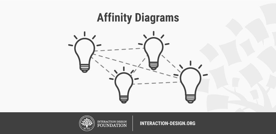
Affinity diagrams are a great method to use when you want to make sense of a large volume of mixed information and data—facts, ethnographic research, ideas from brainstorms, user opinions, user needs, insights and design issues, just to name a few! Affinity diagrams require you to cluster information in an organized manner, and this can therefore be one of the most valuable methods to employ during your design process. In other words, affinity diagrams help you synthesize information and insights and, for this reason, they are used in many phases of design thinking, including the Define and Ideate phases. Let’s jump into affinity diagrams in detail to discover more about what they are, why they’re useful and how you can apply them to your own design process.
“Organizing is what you do before you do something, so that when you do it, it is not all mixed up.”
— A. A. Milne
 © Teo Yu Siang and the Interaction Design Foundation, CC BY-NC-SA 3.0.
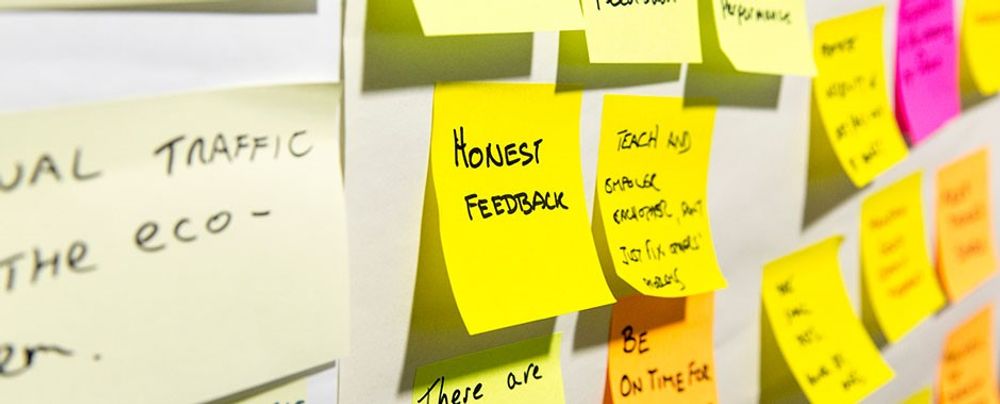
It’s hard to know where to start when your mind, table, hard drive and maybe even the front of your fridge are full of insights from research, or ideas from ideation sessions. How on earth are you meant to transition from that point of colored Post-it note chaos to a stage where you’ve got a good grip of the main points of interest and patterns in your data? Have no fear—affinity diagrams are here to save you from getting overwhelmed by the sheer volume of data you’ve gathered. They’ll help you navigate through and organize your data in an incredibly effective way, and it’s great that you’re here to learn more about them!
What is an Affinity Diagram?
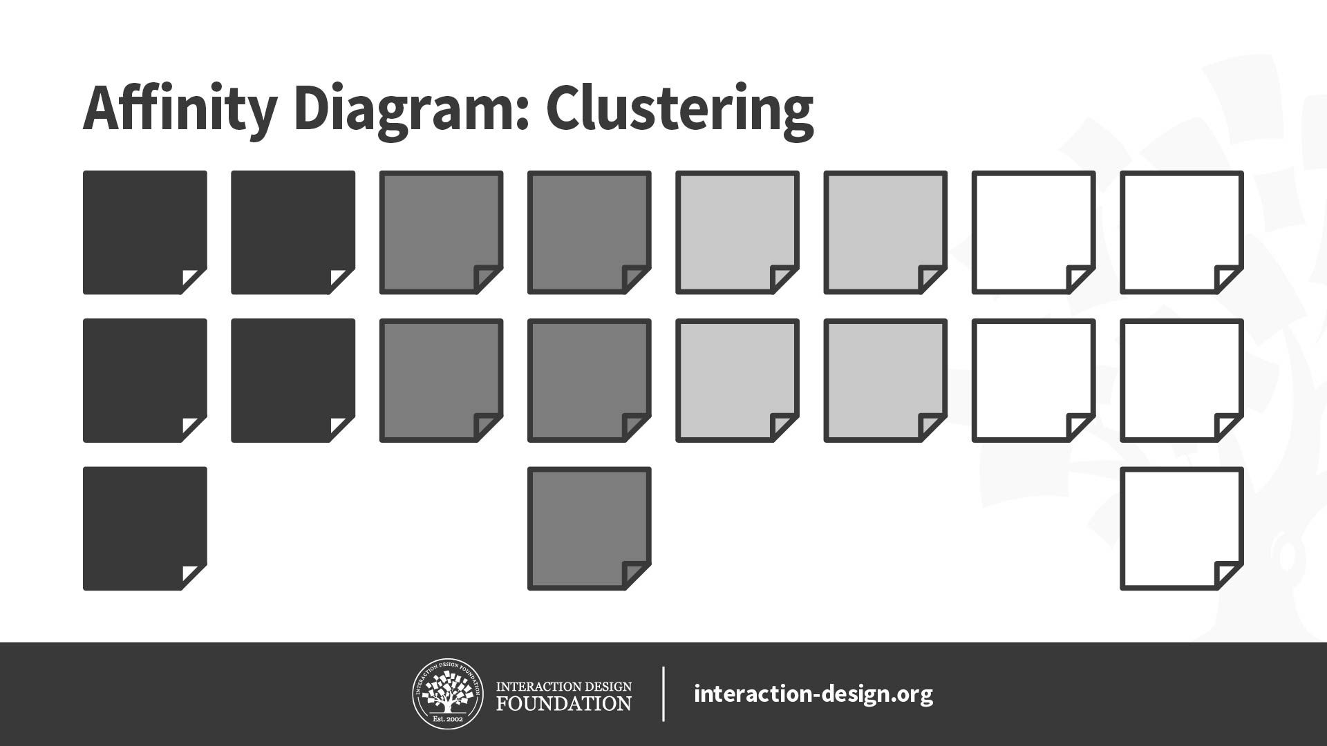
An affinity diagram is a collection of large amounts of data that is organized into groups or themes based on their relationships. The affinity diagram process is great when you want to make sense of insights gathered during research, as well as when you want to organize ideas generated during ideation sessions.
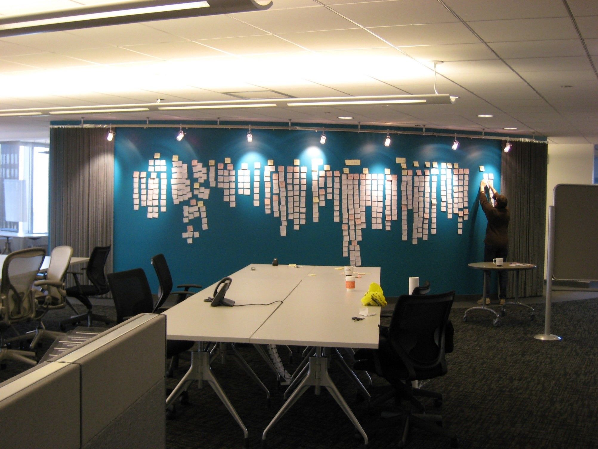
© Josh Evnin, CC BY-SA 2.0.
How to Create an Affinity Diagram
The best way to create an affinity diagram is with your design team, or the people who were involved in the previous stage of the process (research or ideation in most cases). You can also create an affinity diagram on your own, but you will likely find the process more valuable if you have other design-minded individuals around to discuss aspects of it with.
Whether you’re in a group or on your own, you can use the steps below as a guide through the affinity diagram process.
Part 1: Group Similar Pieces of Data
Write pieces of data such as small documented facts, drawings, ideas, quotes, and observations down on separate Post-it notes, cards or pieces of paper—one piece of data per Post-it or piece of paper.
Put them up on a wall or whiteboard or lay them across a table. Post-it notes are preferable at this stage as they allow the design team to easily stick up and move pieces of data around to cluster similar pieces of information together.
Choose a Post-it at random and make it the first Post-it of a first group.
Take another Post-it and ask, “Is this similar to the first one or is it different?” Place it in the first group if it’s similar or in its own group if it’s not. It can be similar in any way that makes sense to you. However, this is best where you have a team and can ask others if they agree or disagree.
Continue Post-it by Post-it as you place similar ideas together and create new groups. Note: it’s OK to have lone Post-its at this stage—pieces of data that don’t fit into any clusters can sit on their own in other words. Feel free to change your groupings at any point in this exercise. That’s why you’re using Post-its!
You will see the data come to life as you create your affinity diagram and move data around on the wall. Your whole design team will find themselves immersed not only in their own research findings but also that from others. You’ll all come away with a better understanding of the scope of the problem space, and will be able to share and communicate findings and ideas more effectively.
Part 2: Discuss and Clarify Your Clusters
You should now have some groups of related data, and so it’s time to talk about each one of the clusters in more detail. Discuss the rest of the steps in the process with your team and complete them together one by one.
Discuss any controversial pieces of clusters and pieces of data in each cluster and reorganize them into different clusters if appropriate.
When all team members are satisfied with the groupings, give the group a name that captures the meaning of the group of Post-its it represents.
Optional: Use lines to connect related groups, and combine clusters to create super groups if necessary.

The last stage of the affinity diagram process requires you to connect related groups of data so that related insights and/or ideas remain linked throughout the rest of the design process.
© Wavebreakmedia, Standard License. Source.
By the time you’ve finished your affinity diagram, your data will be in a much more organized state and you’ll find yourself in a much better position to synthesize it further, define a problem statement and/or move on to the next phase of the design process.
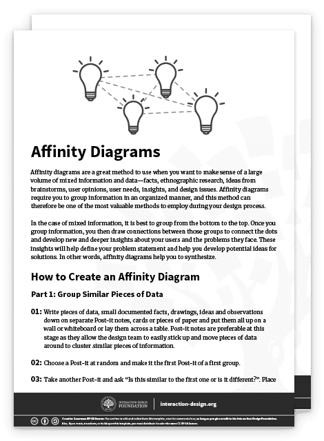
You can download and print our affinity diagram template to utilize the process in offline mode and share it with your team:
Affinity diagrams can help you go from a state of complete chaos with no overview of your information, to a serene state of organized groups of information, which you have named and sorted into hierarchies that make sense and provide insight.
© Daniel Skrok and the Interaction Design Foundation, CC BY-NC-SA 3.0.
How to Use Your Affinity Diagram
As with every method and technique we use, there would be no point in affinity diagrams if we didn’t put them to good use afterwards! You can use the outcome of your affinity diagram (your highly organized set of data) to:
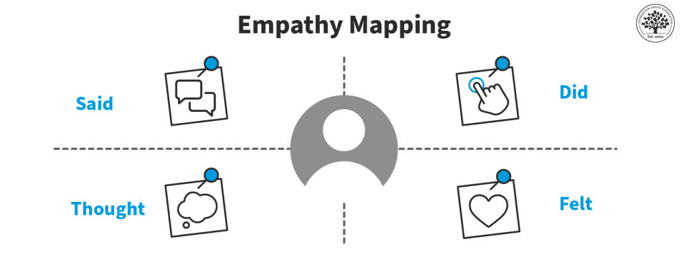
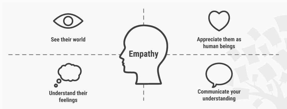
Inform the creation of empathy maps.
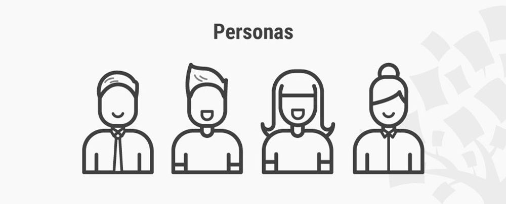
Build personas that represent your target audience in the best possible way.
Synthesize insights further and create a problem statement for your design process.
Provide a better foundation for ideation.
The Take Away
Affinity diagrams are a method you can use to cluster large volumes of information, be it facts, ethnographic research, ideas from brainstorms, user opinions, user needs, insights, design issues, etc. During the process, you will name and rank your data into organized groups and gain an understanding of how different groups of information are connected.
Affinity diagrams are a great method that can create an overview and synthesize your findings in a surprisingly straightforward way—especially if you follow the step-by-step process we’ve provided you with. You’ll come out the other side with a greater focus on the major insights, user needs, pain points and gaps in your data—and once you’ve done that, you can begin to translate what you’ve organized into empathy maps, personas and problem statements to help you progress in your design process.
References & Where to Learn More
Kara Pernice, Affinity Diagramming for Collaboratively Sorting UX Findings and Design Ideas, 2018.
Chris Gielow, Affinity Mapping Timelapse, 2012.
Matthew Weprin, Design Thinking Methods: Affinity Diagrams, 2016.
Center for Care Innovations, Catalyst Method: Affinity Clustering, 2017.
Images
Hero Image: © star5112, CC BY-SA 2.0.