Can you change the chart colors? These are burning my eyes.
- Hasso Plattner, SAP founder and Chairman
12.0.1 Chart Sizing Tiers
The smallest unit of visual metric is the microchart. I define microcharts as a visualization plot – a Visual – that can fit into a text-height row or cell. Examples are sparklines, star ratings, signal-strength bars, etc. The smallest examples, the size of only one or two text characters, I call anaji, after the emotional facial expression system of emoji. Traffic light indicators are one example. Emoji are primarily Chernoff, faces populating our everyday communication with emotional signals. Anaji will do the same for quantitative expressions. Thumbs up/down are perhaps the simplest binary example, but texting now exhibits an icon language of growing sophistication. Even simple character-limited numeric displays can qualify: When corporations are mentioned in financial websites, often their name is followed by a numerical ticker symbol and stock price microchart colored red or green depending on its daily trend of up or down.
Microcharts are extremely limited in the fidelity they can communicate, and have no space for labels or scales. They rely on convention and their surrounding context for correct interpretation. They can exist in tables, lists, or embedded directly into text paragraphs, and typically link to correlating content in a larger more detailed form.
The next size for a visual metric is the row. Rows can horizontally arrange one or more microcharts related to a single entity, and/or one or more one- or non-dimensional visuals such as bars, bullet graphs, or heatmaps.
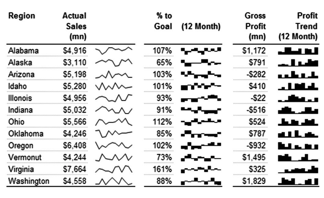 Author/Copyright holder: Macs Stuff, www.macsstuff.net. Copyright terms and licence: All rights reserved.
Figure 12.1: Microcharts embedded in rows.
Figure 12.2: “Points”: LAVA’s minichart format.
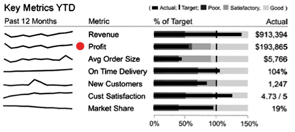
The next size tier for a visual is the minichart. Originally proposed for inclusion in LAVA by Fred Samson as a result of his demo work, minicharts are basically anything larger than a microchart and smaller than a chart, but with specific display properties suited to show the most relevant content with a one- or two-dimension visual in a small, fixed space. Minicharts are not merely charts shrunken down to a small size and rendered as an identifiable, but otherwise illegible, thumbnail image. Minicharts have enough space for titles and more precise visuals than with microcharts, but not enough space for scales, legends, or other precision-oriented chart elements. They are intended to serve as free-standing expressions, precisely designed to convey the most relevant quantitative content within a limited, fixed display size – typically about 4 centimeters in height and 4-8 centimeters in width.
Rather than simply shrinking a full-sized chart down to near-thumbnail size and rendering its plots and labels unreadable, minicharts offer an orchestrated “degradation tier” that converts a larger chart into a fully readable, if simplified, set of one or more metrics according to the associated display size constraints. This involves a set of rules that removes scales, truncates titles, and picks out the most relevant content for the limited viewing size. For example, to show a line chart within a minichart, it is only practical to display at most 3 lines, or metrics, traversing the x and y dimensions. If derived from a larger chart with more metrics, the minichart needs to remove some according to predefined rules, and/or provide hints to their existence. Only three bars can be shown and labeled in a horizontal bar chart, and vertical bar charts at this size are rarely practical at all. Lists and tables allow about four rows. Minicharts provide a reliable, robust format for any quantitative content to automatically “snap” into while remaining a coherent, if not comprehensive, representation of its referent content.
LAVA provides a minichart format called “Points”, referring to the idea of a “data point” or “reference point”. Points are designed and engineered to render any metric according to a set of display rules.
The next level of fidelity and scale is the traditional chart. Charts can be sized from just larger than a minichart to anything larger. Perhaps, the definition is that charts are large enough to provide scales for their data plots. Chart libraries have built-in mechanisms to adjust elements like bar size and scale fidelity to suit the desired chart size. Although most chart rendering libraries on the market are improving by becoming more BtF-compliant, some are better than others.
 Author/Copyright holder: Karl-Heinz Hochhaus. Copyright terms and licence: All rights reserved.
Figure 12.3: Bad chart, from excelcharts.com
Although LAVA prescribes no specific limitation for chart types, it excludes pie charts and calls for horizontal bar charts, line charts, and lists as defaults. By limiting irrelevant variety in the foundation chart library, BtF compliance can be maintained and help solutions like Figure 12.3 to be avoided.
 Author/Copyright holder: Stephen Few. Copyright terms and licence: All rights reserved.
Figure 12.4: Marketing KPIs in the form of a metachart, from Stephen Few.
Metacharts can be defined as multiple charts, or chart elements combined into a more sophisticated, interrelated, and often interactive expression. Although often built to suit a specialized visualization challenge for a particular use case, they can also support general-purpose analytic needs. Metacharts can be defined as anything more complex than a chart, but not as complete as an application, occupying the grey area between a the two. Many custom interactive dashboards are in fact elaborate metacharts when they interactively tie together multiple charts – such as where clicking one or more pie slices filters an adjacent list or bar chart. Of course, these custom behaviors need to be learned from scratch by users. While often artisanal, metacharts can be made into generalizable patterns, built once and re-used versus manually created for specific cases. Metacharts have a bright future as visual analytics becomes more focused upon the special needs and use cases of vertical industries, and horizontal LOBs.
The Gameboard view in the Banzai Pipeline concept is a metachart, as is the Gantt chart flight display in the SABRE air booking screen, and LAVA’s lattice. The spreadsheet view is also a metachart in a way, although it is hard to distinguish this visualization form from its parent application. Figure 12.4 is an example from Few, albeit a non-interactive one.
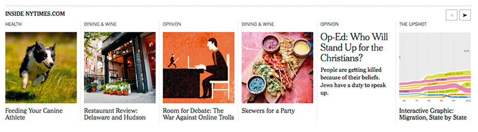
Channels are the name I’ve given to a simple and often-used technique for organizing and navigating among multiple images. Channels display a horizontal strip of images with scroll arrows to the right and left. Tapping the arrows scrolls the set of images right or left to show the next or previous members. Channels show each member in its entirety, as in Figure 12.5 from nytimes.com.
 Author/Copyright holder: The New York Times Company, www.nytimes.com. Copyright terms and licence: All rights reserved.
Figure 12.5: A Channel control with Point-like story images from Nytimes.com
To maximize the number of members visible at one time, channels don’t use the related “carousel” pattern that often fully displays only one member and shrinks/skews those to the left and right as if they were cards in perspective.
Channels are a particularly useful component for mobile devices. Because the content is broken into small pieces, the same component can readily adapt to a narrower screen while showing fewer members. Channels also provide a natural vertical division between tiers of content organized vertically on the screen.
12.0.2 Palette
Color is the most subjective aspect of design. While it’s common for people to declare their favorite color, few have a favorite shape, word, letter, typeface, size, line weight, or rendering style. Color is also the most mis-used design element in visual analytics, and this has gotten worse as the added cost of reproducing color in graphic communication was eliminated with the advent of digital color displays. It’s used as the poor man’s skeuo in attracting cosmetic attention in pursuit of the Look of Meaning.
In a sign that many consider the use of color in charts to be a random, personal expressive preference, at BusinessObjects I once became aware — a bit too late — that a designer on my team was asked to create twelve multi-hue color palette options for our charts. Seeing no rationale for having so many, I succeeded in getting it reduced to five. However, I felt that given the cognitive impact of color in charts, a better plan would be to invest in just one or two palettes of proven effectiveness.
Color does serve an important role, primarily for emphasis and when used subtly for simple quantitative and semantic distinctions. Few’s designs can take this to an extreme at times by limiting color to placing small red dots to indicate metrics under duress. As my informal study suggested, and has been backed up by stakeholder feedback from my design work, adding subtle color to a display increases its readability even where it is not needed, in a strictly ergonomic sense, for legibility. Legibility and readability are basic graphic design factors. The former relates to whether the viewer can physically see and read the image and text content of a design, and is a strictly ergonomic measure. The latter relates to how the design affects the viewer’s inclination to invest in the effort to consume the content, and is a more subtle measure involving viewer engagement and aesthetic appeal. Readability is a subtle application of the Look of Meaning, with the art being to apply enough seduction to get people interested, but not so much as to distort the facts. Using lots of bright colors to do this in visual analytic displays is heavy-handed, like typing in all caps. It’s quantitative screaming.
Beyond its ergonomic and aesthetic purposes, including those for indicating good and bad, color has strong symbolic value depending on the audience. Rival beverage giants Coke and Pepsi are both SAP customers, and each refuses to include the other’s iconic brand color in any internal quantitative displays. At practices of The Ohio State University’s football team, any visitor wearing yellow or blue, the colors of hated rival Michigan, is not-so-politely asked to leave. For cases like these, customers of course are able to apply any color scheme they want to their charts and display surroundings, and if done with skill this can succeed. For our purposes of baseline best practice and simplicity in LAVA, the default is to limit any custom branding treatment to a Board’s title bar area and default monochrome chart hue.
In parallel to LAVA’s design development, we worked with design consultants Edward Guttman and Keith Mascheroni of Codestreet LLC to create a default visual analytic palette for SAP’s library of charts. The goal of the project was well aligned with LAVA: To create a robust default solution representing state-of-the-art best practice, so as to simplify and optimize customer design efforts. It was an ironic challenge, because as stated above, best practice actually calls for as little use of color as possible. However, when functional color use was called for, we wanted to provide a bullet-proof solution that worked in most or all situations.
Designing a chart palette is a classic system design challenge. Its fundamental issue is to resolve the paradox of creating a closed system with as much relevant expressive variety as possible, and as little irrelevant noisy variety as possible. I like to use type fonts as an example – not just the nuances of particular typefaces, but rather the form of the letters themselves. The English alphabet has 26 letters, and each one needs to appear as different as possible from its peers so as to optimize comparative recognition and discrimination. At the same time, each letter needs to resemble its peers, so as to create a harmonious family appearance when combined into limitless combinations of words, sentences, and paragraphs. This is particularly the case with the lower-case letters, which supports their purpose of optimizing legibility in long passages of text.
The process of system design is to create guidelines where some design aspects are fixed and some are variable, making sure that within the variable aspect there is enough expressive variety to convey the uniqueness of each element. In the case of the roman alphabet, the fixed aspects begin with the four horizontal guidelines that define a letter’s baseline and meanline – for example the top and bottom of the lower case “o” – the cap height that defines for example the top of the lower case “b” and the capital letters – and finally the descender height – that defines for example the bottom of the “g”. All letters within each case are roughly the same size, and in the lower case letters, the strokes align horizontally along the four guidelines. In addition, each letter’s stroke width – the thickness of its drawn lines – is either uniform or transitions predictably between a consistent maximum and minimum thickness. The sole perceived variable aspect is a unique set of vertical, horizontal, diagonal, and rounded strokes – along with various dashes and filigree – that define each unique letter. Similar character size, stroke alignment, and stroke weight are the attributes that cause each letter to resemble the others as a family, while their stoke configurations make them unique.
Within these constraints, different typefaces for an alphabet push the limits of how to optimize the leeway available within these constraints to suit specialized purposes for text, headlines, and other expressive purposes. The world of fonts is a market-driven meta-system, where as with letters, each font is vying to look distinct from the others while still adhering to the basic design system that keeps them legible. All visual systems, from book design to signage to websites to icon sets to comprehensive design languages, result from this basic dynamic. The goal is to enable the most meaningful variety from the fewest variables.
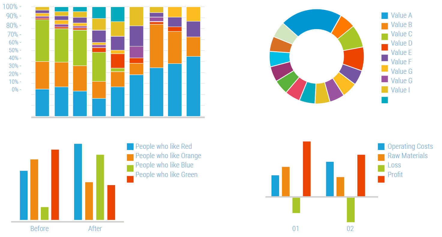
This is the challenge of designing a chart palette, albeit at a much simpler level. Like letters in an alphabet, each color needs to be as different as possible from the others, and at the same time be harmonious with them when viewed together. The responsible use of multiple colors in charts is to code visual elements like bars and lines, for cross-indexing to their corresponding text labels grouped separately in a legend. This is needed because of the difficulty in placing legible labels on or adjacent to the elements themselves, often due to unwise design choices like the use of pie charts and vertical bar charts. The awkward spaces created by these types hamper the use of adjacent labels, and thus necessitate a color-coded reference system. Not only is this cross-referencing cumbersome, but it is effectively limited to about 7 colors – depending on the size of the color areas and legend swatches – beyond which most people lose the ability to tell the colors apart. LAVA’s more text-friendly chart forms are intended to eliminate this problem, and the general ability for dynamic displays to show popup labels through user selection helps as well. In these cases, adequate delineation between plot subdivisions can be achieved with white dividing lines and, if necessary, a monochrome sequence, such as segments colored dark blue, blue, and light blue. Regardless, there is always some level of need for a multi-hued palette to distinguish between values in charts, and we proceeded to provide it.
SAP’s chart library uses a sequence of 32 colors for use in its catalog charts, which includes pie, bar, stacked bar, line, and most other chart types. This number is somewhat arbitrary, but represents a reasonable quantity for accommodating extreme cases of color coding in about any chart. The colors appeared within charts in a fixed sequence – for example the first color in a pie chart was always blue, the second orange, the third green, etc. – proceeding through the basic spectrum colors and then through variant hues of these colors. Although this sequence provided visual separation of chart areas, the overall effect was not necessarily aesthetically pleasing. The colors were distinguishable but not harmonious. Moreover, some of its colors – red and green – are infused with symbolic meaning that can conflict with the meaning of the value they portray. While the symbolic meaning of color varies dramatically within different cultures, there is some level of international semantic convention, such as the red/yellow/green of traffic lights, which we needed to consider as a constraint.
A visualization palette has four basic requirements. First and foremost, it must maximize cognitive performance for users reading charts, i.e. helping people to understand their data. The palette colors can only assure visual separation and a more “pleasing” look to the data elements they portray. The precise assignment of certain colors to certain values in a display – like making Coke always red and Pepsi always blue – is possible, but relies on the editorial discretion and manual effort of an artisanal visual analytic designer. We were designing an automated color assignment system aligned with the legacy technology of the chart authoring tools. The ability to customize would still in the end depend on user-based editorial stewardship to avoid any obfuscation or misrepresentation.
Second, it must be visually appealing to users. Previous SAP palettes had favored strong color distinction by alternating colors from opposite sides of the color wheel – called “complementary” colors despite their being effectively opposites – and this was inhibiting visual appeal.
Third, it must perform well and consistently on large and small screens of multiple devices. Our design work was done using the most common PC Monitor Gamma setting, which tends to read bright and strong. Tests on iPads showed colors to be slightly less bright, or “saturated”, but not necessarily in a bad way.
Finally, it should reflect the spirit of SAP’s brand, although not at the expense of the previous requirements. Although our main goal was to enable customers to brand their creations as they wished, the palette would also be used for embedding within SAP products and thus should not conflict with any basic branding conventions.
We did research on what was known about color perception, and arrived at some unique design considerations. In addition to the emotional factor already stated, physical color perception is difficult to measure. Color is part of the user’s mental response to the light entering the eyes from the display and its surroundings. The mental imagery stimulated by the display is private to the user, which poses challenges to scientific study. How do I know that the green I see is the green you see? Maybe my green is actually your blue, and there is no way to tell for sure. While we tried not to dwell on such near-philosophical conundrums, they reminded us to avoid perfectionism.
Color discrimination also varies based on the forms with which it’s presented. Under some conditions, the number of usable colors may run into the thousands. In others the number may be on the order of six, with several having restricted meanings. If some of the intended users have anomalous color discrimination – or “color blindness” – the choices may be even more limited.
 Author/Copyright holder: Edward Guttman and Keith Mascheroni. Copyright terms and licence: All rights reserved.
Figure 12.6: The “before” palette from SAP.
 Author/Copyright holder: Edward Guttman and Keith Mascheroni. Copyright terms and licence: All rights reserved.
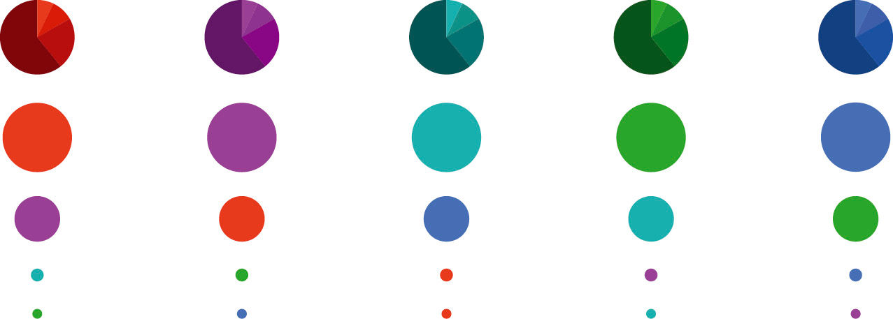
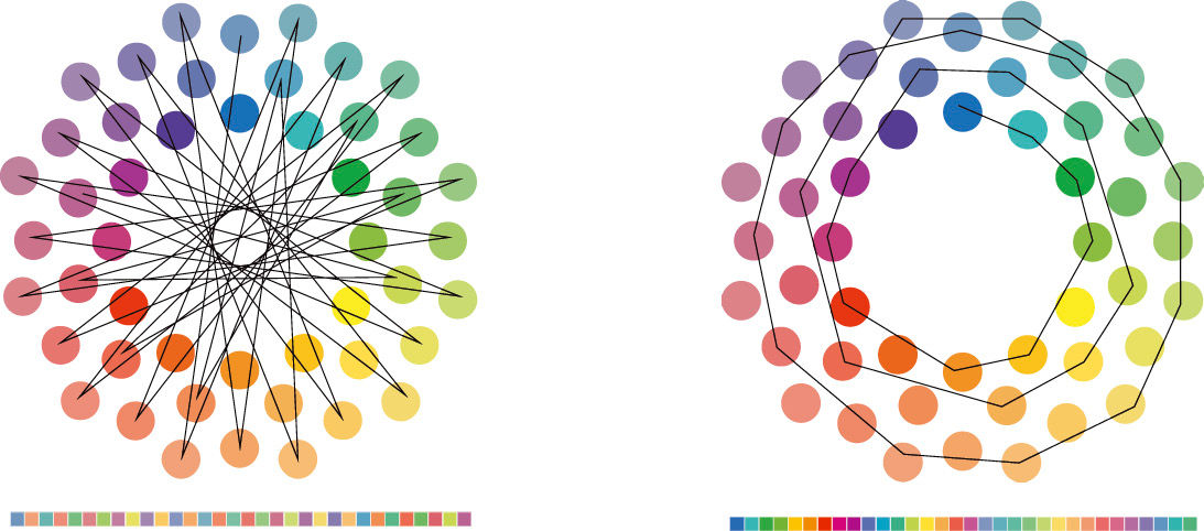
Figure 12.7: Color differentiation.
 Author/Copyright holder: NASA Ames Research Center Color Usage Research Lab. Copyright terms and licence: All rights reserved.
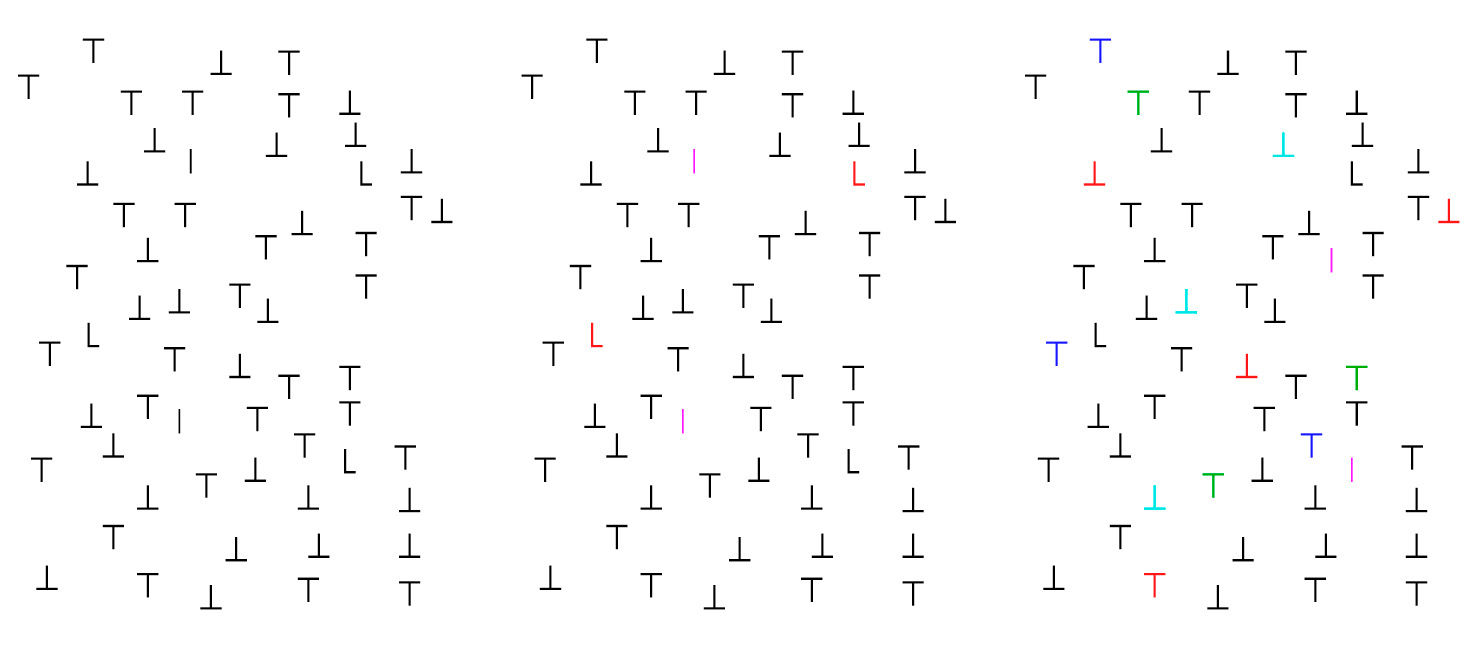
Color Pop-out: 1 & 2: There are two ‘L’s and two ‘I’s in these figures. The red and magenta codings in #2 make them stand out instantly, without having to inspect each symbol. 3: The ‘L’s and ‘I’s are slightly harder to locate due to the addition of three more hue coded subsets.
Figure 12.8: NASA Ames Research Center Color Usage Research Lab.
Small color differences can be distinguished when the areas to be discriminated are large, immediately adjacent to each other (share an edge near the viewed point) and are displayed at the same time. As the area of the patches is reduced further, even large color differences can become hard to detect. At the smallest scale, some hues remain detectable, while others can barely be discerned, as in the bottom row of the Figure 12.7.
Overuse of color detracts from the strength of its benefits. If color is used to visually group too many overlapping sets of symbols, all of the visual grouping can be weakened. Drawing attention to symbols with color takes advantage of the “novelty” effect in human vision, because changes and departures from the norm draw attention. This effect, too, is reduced by repeated use. The biggest problem with overuse of vivid, saturated colors is that the overall neutralizing effect of overuse is worst for saturated colors.
We identified two approaches for deciding on a color sequence. The first, using alternating contrasting hues, was used for the previous palette and favored color distinction. The second was chosen by, well, nature, as it follows the sequence of the color spectrum. Because of people’s familiarity with this sequence, and the fact that there is likely some basic harmony associated with it, we felt that this approach would lead to a more visually pleasing palette. In our research of competing offerings, we found a fairly even distribution between these types, as well as among brignt-to-muted saturation.
 Author/Copyright holder: Edward Guttman and Keith Mascheroni. Copyright terms and licence: All rights reserved.
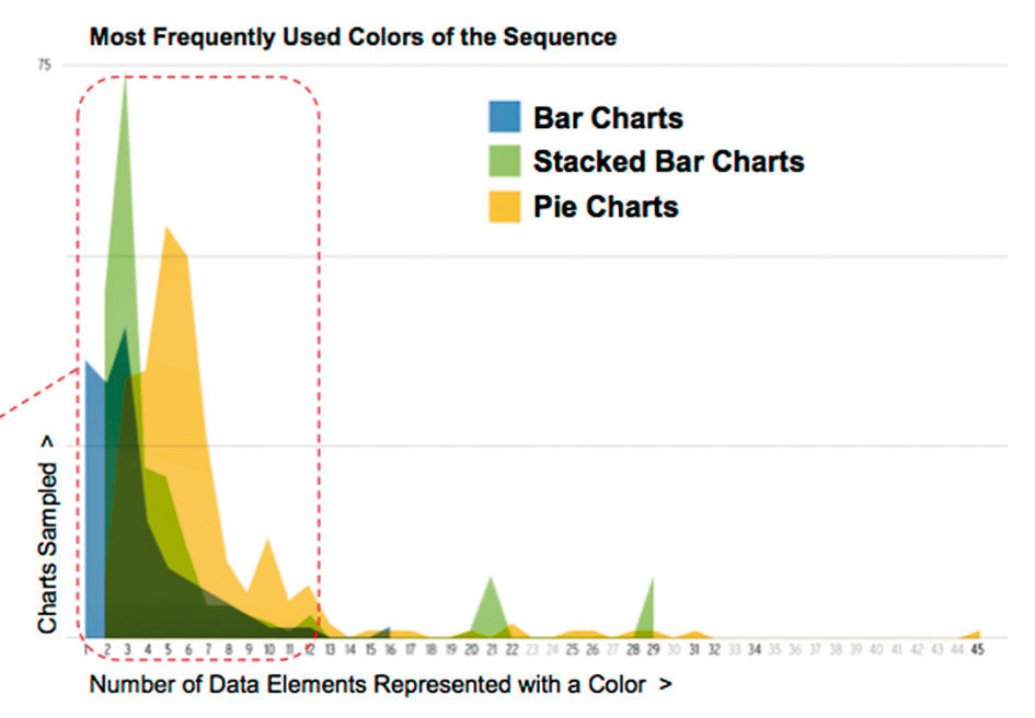
Figure 12.9: Distribution of unique color values in charts.
While our system requirement called for 32 unique hues, the first 8-12 colors are the most frequently used, with the first four of those used even more frequently. Figure 12.9 shows the results of an informal sampling from the Web to discover the number of color-coded values in typical charts.
The first step in designing a palette is to choose the constants and variables of the system – essentially those aspects of the colors used to maintain harmony, and those used to differentiate. Without going too deeply into color theory, the variables include
- Hue, the “colors” in the spectrum or color wheel: Red, Orange, Yellow, etc. Black, white, and gray are excluded for functional and semantic convention reasons.
- Value, the relative lightness or darkness of the hue. Light blue, dark blue.
- Saturation, the amount of pure hue in a color. This is the amount of neutral gray added to a hue. Vividness.
All color is a mix of these three variables. We chose to emphasize hue as the main variable, so that each hue was as different from its neighbor as possible. Our constant was saturation, striving for the effect of having each color be as pure and “bright” as its neighbor colors, but at the same time being subdued as much as possible to avoid detracting from any alert colors appearing elsewhere in a display. In order to make an inherently “dark” color like blue appear as a similar value as the inherently lighter yellow, we chose a relatively dark yellow and lighter blue. We then chose value as our secondary variable, as after the first pass of twelve scripted colors are used, more differentiation is needed. However, as we have seen, not only are this many colors not often needed in a display, but doing so is not a good idea ergonomically. By essentially automating the choice of the final 24 colors, we were allowed to focus more on tuning the first twelve that would, in practice, be the ones used perhaps 99% of the time.
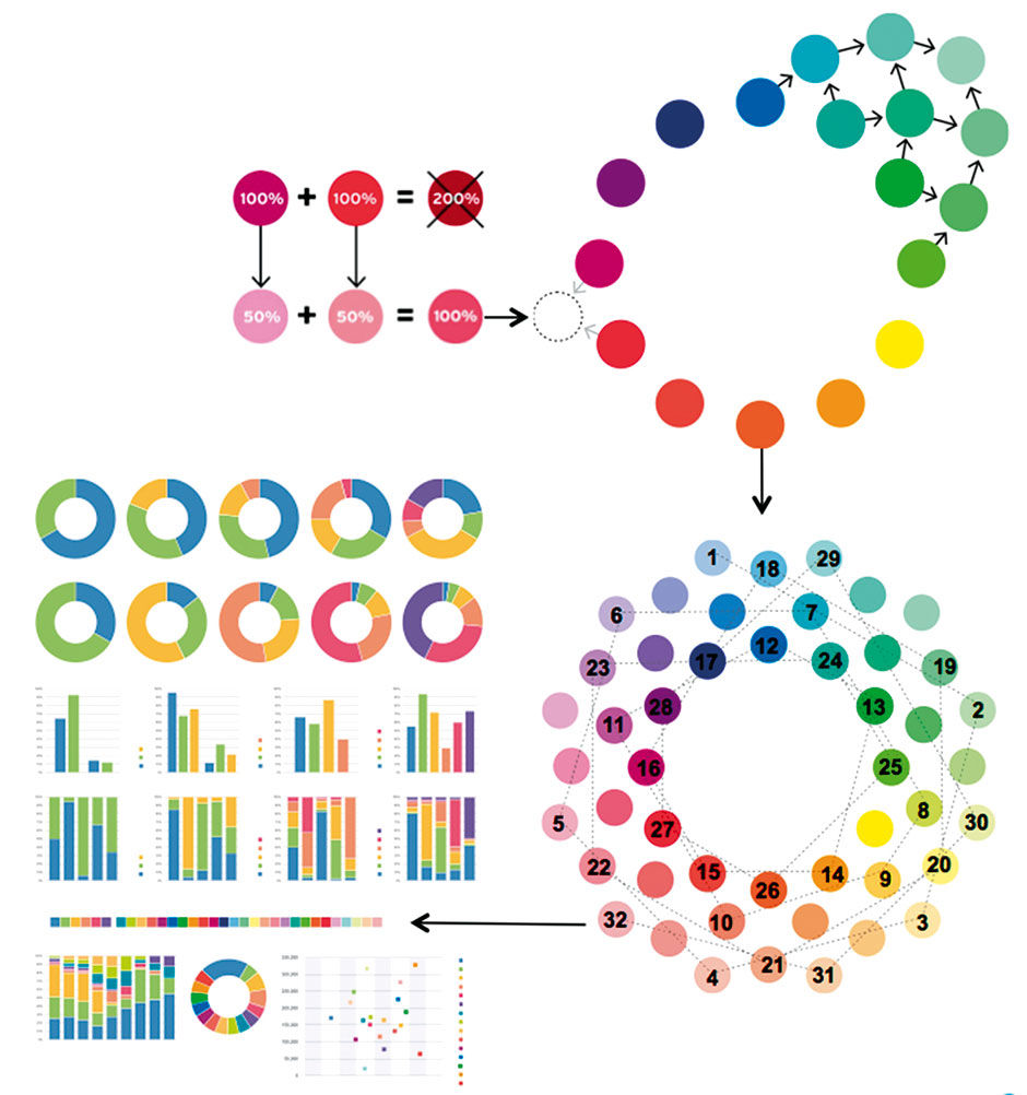
In creating our palettes, we extended a 12-hue color wheel out for four ‘generations’, mixing half-strength values of two neighboring colors to make a third. Then we made adjustments to the mix strengths by eye to improve color separation. Next, we experimented with different sequential jumps – either ‘across’ or ‘around’ the color wheel – to create sequences of discernable colors that are more pleasing to the eye than what exists. We then ‘test drove’ the palettes through a suite of charts composed of differing quantities and sizes of chart elements. This allowed certain colors to dominate or recede from neighboring colors. Finally, we circled back and made small adjustments to colors to reinforce separation and legibility.
In our tests, subjects were shown visualizations rendered with the new color palettes, alongside versions using the existing palette to serve as a baseline. We asked questions to evaluate their ability to discern color assignment and differentiations, as well as to determine any aesthetic preferences. We deliberately used complex and dense charts to make them more difficult to read. This allowed us to ‘stress test’ the legibility and sequential ordering in harsh conditions.
 Author/Copyright holder: Edward Guttman and Keith Mascheroni. Copyright terms and licence: CC BY-NC-SA 3.0
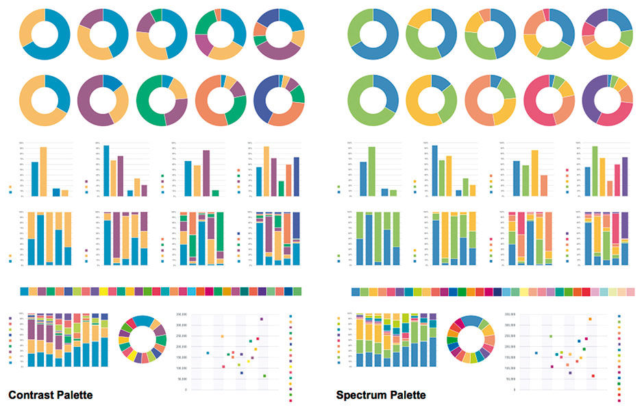
Figure 12.10: Example of a “Contrast Palette” and a “Spectrum Palette”.
 Author/Copyright holder: Edward Guttman and Keith Mascheroni. Copyright terms and licence: All rights reserved.
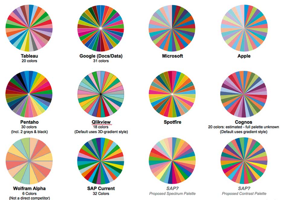
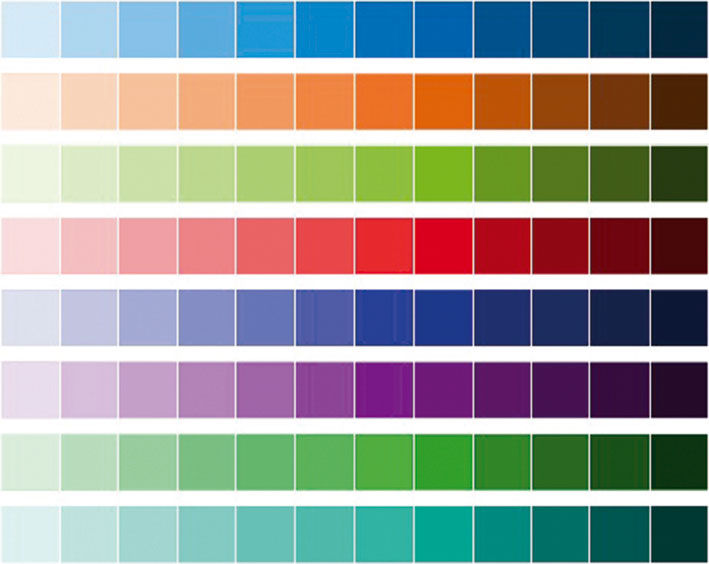
Figure 12.11: A sampling of palettes from other providers.
Author/Copyright holder: Edward Guttman and Keith Mascheroni. Copyright terms and licence: All rights reserved.
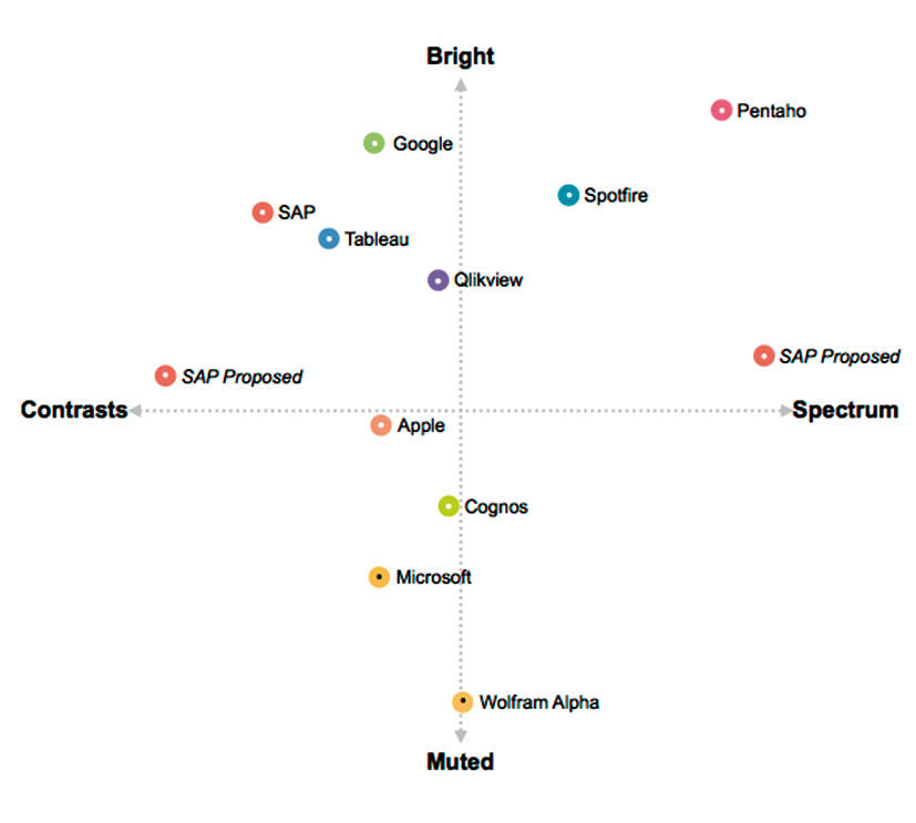
Figure 12.12: Palettes mapped according to Spectrum/ Contrast and Saturation.
 Author/Copyright holder: Edward Guttman and Keith Mascheroni. Copyright terms and licence: All rights reserved.
Figure 12.13: Palette generation process.
 Author/Copyright holder: Edward Guttman and Keith Mascheroni. Copyright terms and licence: All rights reserved.
Figure 12.14: The two palette candidates chosen for testing.
 Author/Copyright holder: Scott Kuo, SAP AG. Copyright terms and licence: All rights reserved.
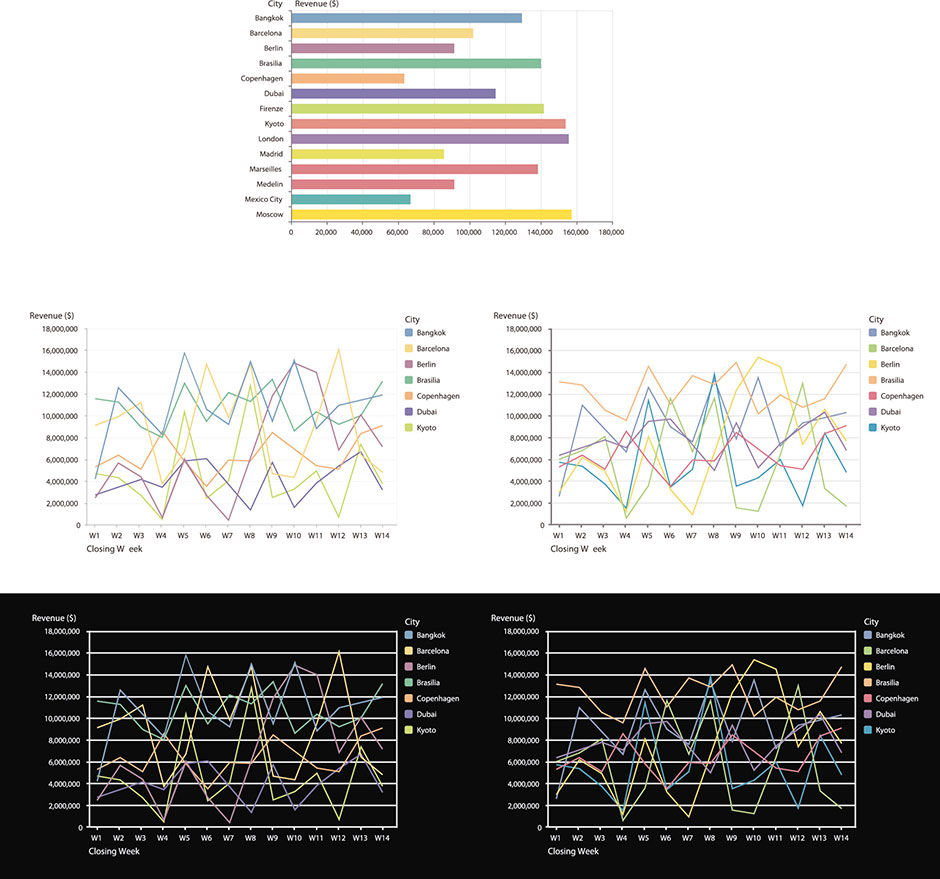
Figure 12.15: Charts from user test, by SAP program manager Scott Kuo.
 Author/Copyright holder: Edward Guttman and Keith Mascheroni. Copyright terms and licence: All rights reserved.
Author/Copyright holder: Edward Guttman and Keith Mascheroni. Copyright terms and licence: All rights reserved.
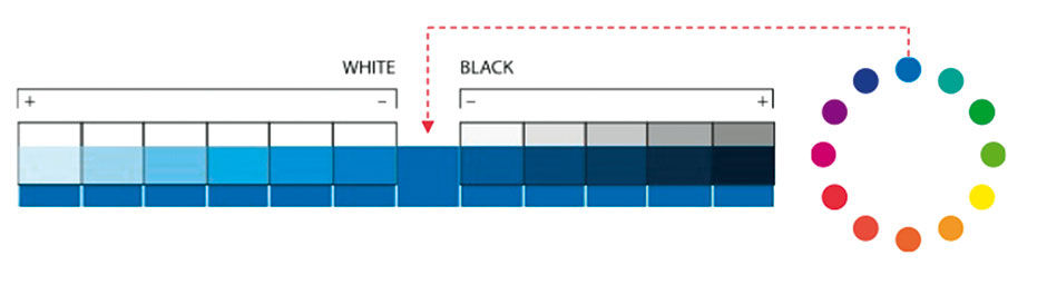
Figure 12.16 a: Monochrome palette process. Figure 12.16 b: Monochrome sequences.
Our goal was not to pass any sort of effectiveness benchmark, but rather to gauge preference between our two options and versus what was currently being used. We also worked on monochrome palettes to establish a sequence of value settings applied to full-chroma, first-generation colors from Spectrum and Contrast. We tried for 24, but found 12 to be about the limit for discernable shades (about 8-10 for bar charts). ‘Pseudo-gradients’ were explored to extend legibility out beyond 12 in extreme cases. Lighter values, with white added, offered better discernable separation. Darker values – and blue / purple hues – were more difficult to discern.
While we looked at incorporating SAP brand colors into the palette, the complexities involved were deemed not worth the effort. Given the secondary or even counter-productive nature of this requirement, we dropped it. The palettes chosen were, however, deemed to be in the spirit of SAP’s brand.
The test results showed strong preference for Spectrum and Contrast over the previous palette, with the predicted aesthetic preference for Spectrum but with no meaningful difference in cognitive performance. We chose Spectrum as the default palette, with Contrast as an alternate. Of course users could also create their own palettes with our tools, but could rely on these for most purposes.
12.0.3 References
12.1 | Color Usage Research Lab, NASA Ames Research Center (web) | http://colorusage.arc.nasa.gov
12.2 | Colorsystem: Colour order systems in art and science (web) | http://www.colorsystem.com/?page_id=551&lang=en
12.3 | Zwahlen Design Color Palettes Documentation (dvd) | Christian Zwahlen
12.4 | Expert Color Choices for Presenting Data (web) | | http://www.stonesc.com
12.5 | Practical Rules for Using Color in Charts (web) |
http://www.perceptualedge.com/articles/visual_business_intelligence/rules_for_using_color.pdf
12.6 | Designing Maps for the Colour-Vision Impaired (web) | |
http://colororacle.org/resources/2007_JennyKelso_DesigningMapsForTheColourVisionImpaired.pdf
12.7 | Munsell Color System, Lab Color Space, CIECAM02, Principals of Grouping (web) | | https://www.wikipedia.org
