Affinity diagramming is almost too good to be true. Write on some sticky notes, arrange them, and…that’s it. But don’t let its simplicity fool you. With affinity diagrams in your toolbox, you’ll have the power to bridge the gap between research and results.
Begin with Affinity Notes
Affinity diagrams start as a collection of user observations in the form of affinity notes. They are typically written on adhesive notes or their digital equivalents, though you may also use printed cards or other formats. In this video, William Hudson, User Experience Strategist and Founder of Syntagm Ltd, introduces affinity notes and the methods you can use to obtain them.
Show
Hide
video transcript
- Transcript loading…
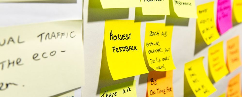
"Affinity notes" are the basic observations of what participants said or did that you write in the first person. The “voice of the customer” is the preferred term, though “the voice of the user” is equally relevant.
How to Build an Affinity Diagram Step by Step
Now that you understand how user research translates into affinity notes and how to write them, William provides a detailed explanation of the diagramming process:
Show
Hide
video transcript
- Transcript loading…
In the affinity diagramming process:
Begin with the affinity notes and organize them into related groups.
Then label the groups and repeat the process at two or more levels, depending on the number of observations. This process creates a hierarchical structure.
All levels, except the top, maintain the voice of the customer. The top level can use more abstract topic descriptions, such as "Online Shopping."
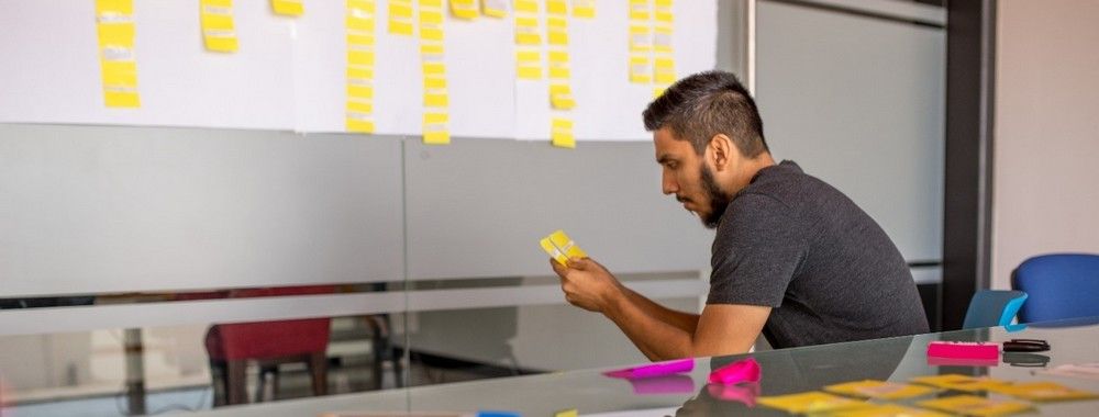
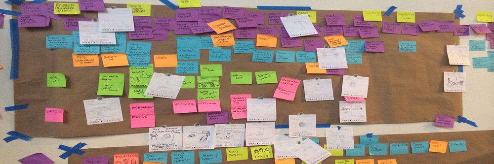
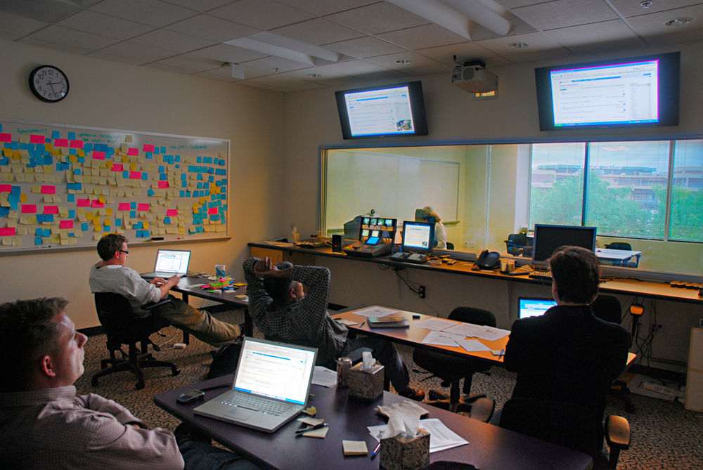
In affinity diagramming, participants traditionally arrange notes on a table or a vertical surface, such as a wall or a whiteboard, in a room large enough to comfortably accommodate all participants. At the end of the session, the group may take a photo of the diagram to capture the results.
However, digital tools now make it easier to create affinity diagrams online. The concept remains the same—you write your notes on virtual sticky notes and arrange them collaboratively via video calls or other online tools. While you lose the benefits of in-person collaboration, online sessions make it easier to revisit and amend your diagram. And if your team is scattered geographically, online sessions help overcome travel and time zone challenges.
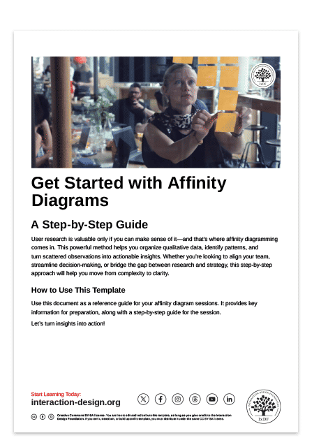
Affinity Diagram Guide
This practical guide will help you stay on track during your affinity diagramming sessions. It summarizes the colors used in the hierarchies, provides useful metrics on the number of notes at each level, and includes step-by-step instructions for running your session.
The Take Away
Affinity diagrams are highly effective for turning raw research into actionable insights, and the steps involved are simple:
You begin with affinity notes—original user observations in the first person, known as the "voice of the customer," which you typically transcribe on-site or from audio recordings of remote sessions.
Next, review the transcribed data with the original interviewees to ensure you have not changed the meaning.
To begin the diagramming process, group the yellow affinity notes according to their connections and place a blue note on top.
Next, arrange the blue notes into groups with a pink note on top, then arrange the pink notes with a green note on top. Write all notes in the voice of the customer, except the green notes, which use more abstract categories.
When you follow this process, your aim is to accurately represent user observations and group related themes using a hierarchical approach. Affinity diagramming is an engaging activity that immerses participants in user research. The effectiveness of the results lies in the decisions you make as a group.
References and Where to Learn More
Discover more about affinity diagramming and other key contextual design techniques in Karen Holtzblatt’s and Hugh Beyer’s seminal book, Contextual Design: Design for Life.
Read Nielsen Norman Group’s article to find out How Many Users You Should Visit for Contextual Inquiry.
Hero image: © Interaction Design Foundation, CC BY-SA 4.0