
Our next article is all about a scary-looking subject in that its title may look ominous. Fear not! It covers a concept that will seem familiarvery quickly. Of course, having a better understanding of it will let you work its antidote into your designs with confidence.
Horror Vacui — the fear of not filling up
Horror Vacui (a Latin-derived term) means “fear of emptiness”. At first glance, we may identify with that fear as being perfectly natural: it could be the fear of not refueling at the pump before we set out on a long drive, or not having a filling breakfast before a long, busy day. Many of us who shop on Amazon may have noticed that, when our cart is empty, the caption reads: “Your shopping cart lives to serve. Give it purpose — fill it with...” (books, games, DVDs, etc.). They are appealing to our “horror vacui”. But, as designers, we need to understand that such a fear may sound like no bad thing.
However, we want to look at horror vacui differently. For a long time, it was a driving force in design. Although we’ve moved to the opposite extreme now, for the moment, it’s important to understand how you can use (by avoiding) horror vacui to enhance your own web designs.
Modern design prefers simplicity in layout – from Apple to Google, clean, simple layouts with plenty of whitespace are the preferred way to deliver content. However, it hasn’t been always like this. If you went back in time 50-100 years ago, designs were far busier. Adverts from brands like Coca-Cola barely included an inch of whitespace. Your eyes might have strained to notice things back then!
Nowadays, we’re used to being surrounded by clean and clear interfaces. Nothing is nicer than landing on a web page, flipping to a catalog page, or walking past a good store and seeing an element stand out. The simplicity is reassuring, especially in so busy an age when information is flying quickly and furiously. In our modern, frenetically paced world, there is comfort and tranquility in seeing simple designs. The concept of horror vacui, named as such, appears to have arisen during the Victorian era. It was first used as a criticism of interior design in architecture and wasn’t considered to be any kind of compliment. However, the term has Latin roots, and the concept turned up in the time of Aristotle.
Author/Copyright holder: Fae. Copyright terms and licence: Public Domain
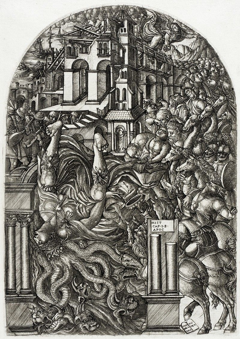
If we surf or stroll to paintings throughout history, we can see exactly what this fear involved. Painters such as Bosch, Brueghel, and Duvet showed this need to fill up the “design space” with elements — people, animals, buildings, trees, etc. They made busyness their business! If we look at Jean Duvet’s “The Fall of Babylon”, we can barely pick out any background—the engraving is almost 100% action, actors, and set, with the tiniest amount of sky in the top-left corner (and even that is full of tremulous clouds). Ironically, Leonardo da Vinci had his finger on the problem long before it became a problem: “Simplicity is the ultimate sophistication.” His peers had other ideas.
It was Mario Praz (1896 – 1982), an Italian-born cirtic of art and literature, who used “horror vacui” to assail the Victorian fetish for cluttering up designs. The people using the phrase felt that interior design was beginning to overwhelm living and working spaces and that the huge volumes of visual information applied in the field were beginning to reduce the appeal of such spaces. Rich and overloaded with detail, these filled spaces weren’t just distracting and uncomfortable to be around; they also took a lot of work to create.
Gradually, this understanding of horror vacui became the norm in many fields. Designers had found the magic key to freedom. Out went the sugary, background-saturating design tendencies of the Victorian, Georgian, and Baroque eras; in came a new sense of proportion and representation. Designers were starting to understand their users’ senses more, and they were starting to see that elements could stand out better if they had space to set them off, rather than be crushed in amid other elements. Like silence between musical notes, the gaps between elements could be made to work.
The Value of “Nothing” — Whitespace
Modern offices and homes are often minimalist to reduce visual distraction. Print adverts and web design have followed the same trend. However, not all marketing departments have tapped this vital resource.
Have you got any junk mail lying around — anything from a supermarket or a clothing store offering discounts? If you have, pick it up and have a quick look at the literature.
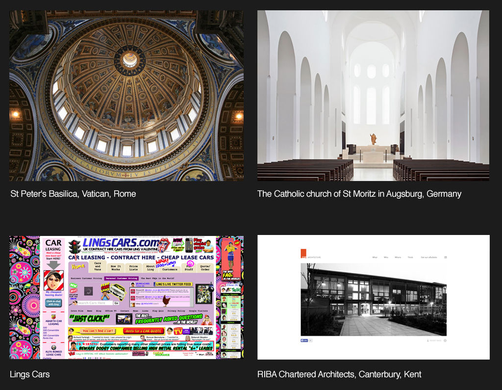
Do you notice how busy it is? Whoever designed that special offer “floodsheet” seems to have been adamant about presenting you with as many options as possible. There is nothing wrong with showing off bargains, until we approach it from a designer’s point of view. Why do they do this? Well, we currently relate “lots of choice” with cheap or bargain. While when we’re presented with fewer choices, we tend to assume that things will be more expensive. Think of a posh restaurant or the window of an expensive store.
It is the complete opposite of the era previous to when the “horror vacui” concept was born. In the Victorian, Baroque and Georgian eras, more was better because it meant affluence. Now, in a time where all that surrounds us is “more”, we perceive the opposite: less is better.
That’s mostly true for Occidental cultures. Not all cultures perceive emptiness vs. fullness in the same way. Consequently, we need to look at our users to understand if their cultural take on “less is more” matches what we find in the West.
As web designers, we’ve already learned a great deal about what works in a design. Certainly, when we surf the Internet, we can pick out the good designs from the bad. A large part of what makes those not-so-good designs ineffective and unattractive lies in the relationship our eyes draw between horror vacui and our perception of value. Basically, it works like this:
High-density, cluttered = Mass market, bargain basement, discount.
Low-density, minimalistic = Classy, sophisticated, valuable.
The secret of reducing the density in a design has to do with how much whitespace we include as we zero-in on showing those more valuable elements. Remember, whitespace does not have to be white! We can use any color to surround our main element, or make smaller “islands” of several (still important) elements. Consequently, the user’s eye goes to the elements while being calmed by the whitespace.
The cons and pros of Horror Vacui
Author/Copyright holder: Gogoro. Copyright terms and licence: Fair Use.
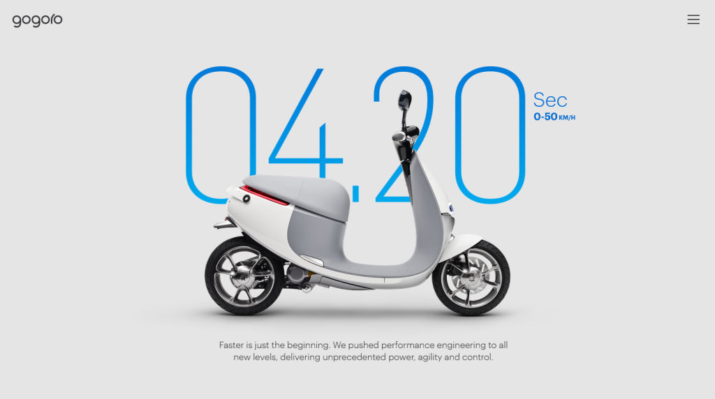
Designers may find themselves under pressure from clients to use up whitespace. The client wants the most “content for their cash” and will heap ideas onto the design in order to get that perceived value for money. To them, “the more, the merrier”, or they might see the design surface as a “lifeboat” for their messages.
As much as they might think you ruthless, it’s worth pointing out to your clients that horror vacui is, in most cases, a bad idea. Tell them the truth — that the public have come to the conclusion that there is a relationship between high levels of whitespace and product quality. Products marketed with large amounts of whitespace often command a significant market premium. The designer’s job is to create return on investment for their clients; a frank discussion about perceptions of whitespace can often help the client justify backing down on their demands for “horror vacui” in your designs.
However, it’s worth remembering that horror vacui in design is not always a bad thing. Businesses with a sales strategy based on low prices, discounts, volume shifting, etc. (such as Walmart or your local dollar store for example) may actually be better served by busy designs. If you are trying to convey affordability rather than luxury,then you may need to cut down on the whitespace that you deliver in your designs.
Using other Tools to Manage Horror Vacui
Although we have the ultimate tool for combating horror vacui in design — whitespace — we can take advantage of other considerations.
Hick’s Law — The time it takes your user to make a decision depends on the number of options you provide. Narrow down the essential options that are relevant to your design goal, accentuate them on your main page, and relegate non-essential ones to other pages via link buttons.
Control — This involves knowing your users. Ask yourself, who are they and what do they want from your design. Is your website appealing to people of a certain skill set or industry background?
Flexibility-Usability Tradeoff— Hit a good balance between flexibility and usability. Remember, the more you adapt your design to make sure that more users can access it effectively, the size of your design will increase, potentially overwhelming users with options. Making one size fit all can be counterproductive; think out ways of tailoring it to be more streamlined.
Performance Load — Don’t give your users ‘work’. This means stepping back as designers and appreciating what our users have to do to use our design. Don’t make a pleasurable user experience anything like completing a tax form.
Signal-to-Noise Ratio — Unnecessary elements in a design create noise, jarring the user’s senses while detracting from the effectiveness of the essential elements. Do you really need those jazzy stars around your design’s “star feature”?
Occam’s Razor — Choose the simple over the complex; do not multiply elements unless absolutely necessary. The eye strains at the complex.
80/20 Rule — Pareto’s Principle, which states that 80% of users only use 20% of a product’s given features. Focus on what are vital elements; leave the non-essential or nice-to-know ones out.
Progressive Disclosure — Lead your users through the actions you want them to take in gradual steps. By gently increasing the detail on subsequent screens, you will avoid drowning them in information.
Direct Manipulation — Using this means that we present our design to our user in much the same way as we might provide a steering wheel for a car. The user can interact with visible objects through visible actions in a transparent interface.
Chunking — Be direct and concise with the content you’re showing. Can you divide it up into smaller pieces of information? Users will be able to digest these far more easily than a single “chunk” made up of many parts.
The Take Away
Horror vacui is the fear of emptiness. An age-old concept, evidence of this fear is visible throughout history, in busy, element-saturated work of past masters of the brush and canvas. The compulsion to populate a design with as many elements as it could hold appeared in interior design, too. Rich, labor-intensive detail once dominated design surfaces.
Finally, one critic identified the problem in regard to Victorian interior design. Horror vacui became a term used to chide interior designers who had taken it upon themselves to drown their designs with elements. Overloaded, busy designs distract, confuse, confound, and even upset users.
“Less is more” would grow to become an anthem or catchphrase in modern design. Minimalism in the marketplace denotes classiness and style, as seen in high-quality magazines with low image density, as opposed to the high-image density flyers we receive as junk mail. Our eyes tend to tell us that the value of a lone item in an image is greater than a hundred clustered ones.
As web designers, we have a powerful weapon in our arsenal against horror vacui. We can make our designs more accessible, more user-friendly, and more valuable by using whitespace. Whitespace enables us to set off our element against a calming background, boosting the worth of the element in the process.
We can use whitespace in conjunction with a number of other concepts, ranging from Hick’s Law and Occam’s Razor, to Progressive Disclosure and Chunking. Ultimately, we need to serve our users best by knowing what they want in our design. We also need to assess whitespace (also known as negative space) as being a huge positive force. It will spotlight the standout, selling elements, helping us to reach our goal — a good user experience.
References & Where to Learn More
Lima, M. (2014). “Horror Vacui and the battle for white space”. Code Academy.
Marcantonio, B (2015). “Design Principles – Gestalt, white space and perception”. Design and UX.
Newbold, C. (2015). “Design Principle: Horror Vacui (or, a far of white space)”. The Visual Communication Guy.
Steffen, N. (2015). “Whitespace or Dead Space: Beware the Horror Vacui of Web Design”. The Blog.
Hero Image: Author/Copyright holder: Lionel Allorge. Copyright terms and licence: CC BY-SA 3.0


