Your constantly-updated definition of Horror Vacui and
collection of videos and articles. Be a conversation starter: Share this page and inspire others!
197shares
What is Horror Vacui?
Horror vacui refers to the inclination to fill every bit of space on a webpage or app with content. In user experience (UX) design, it can harm the overall user experience. Pages can be crammed with text, images, advertisements and other elements, with little or no negative space—and often results in overly complex, cluttered compositions.
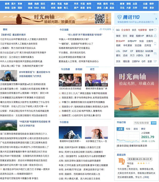
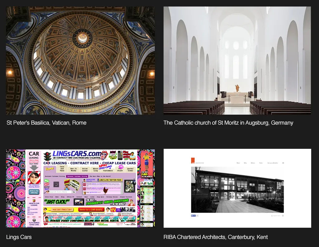
This is a popular landing page design in China—full of detail with little free space.
Horror vacui is a term that has its roots in Latin—and it means “horror of the void” or “fear of emptiness.” This fear of empty space has been a part of art and design for centuries, and the concept of horror vacui itself comes from art history. Many historic art movements—and these include the Victorian, Georgian and Baroque periods—often filled canvases with intricate details. And, because of this tendency, many artists from those eras felt more or less compelled to leave no space untouched.
Despite the potential it’s got to overwhelm, this tendency for complexity and detail was immensely popular back in those times. After all, if a client or patron could actually afford such detailed artwork, then it was a sure sign of prestige on their part. And an ornate jam-packed art work signaled both affluence and craftsmanship.
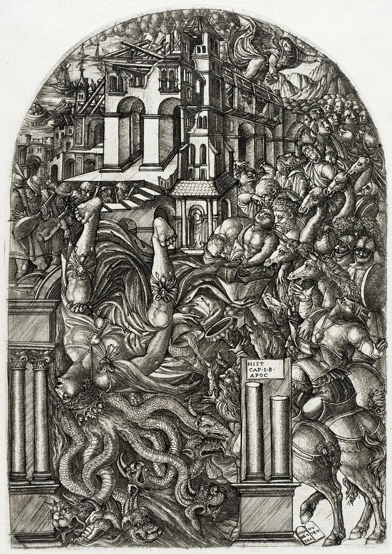
It’s all in the details; only some bits around the horses’ hooves have managed to “breathe” in The Fall of Babylon (1555).
(Public Domain)
The trend changed later. In modern art and design movements—like minimalism—artists prioritized simplicity. Many artists would pioneer a really effective use of background or negative space in art—and this shift shows the evolving perception of design aesthetics over time. Artists—and art patrons—were paying serious attention to elements in a different way.
What is Horror Vacui in UX Design?
Art is different from design. It’s a subject that sometimes causes confusion in the popular psyche of the real world. However, even for user interface (UI) design there’s a common misconception that empty space is a waste or even a sign of lazy design. The effective use of negative or white space is—in fact—crucial for good design work.
That’s particularly the case for designers of user interfaces, and when designers provide such space, they let their designs “breathe.” What’s more, they allow for better readability and comprehension. They’re key parts of improving a website’s—or an app’s—user navigation.
Designers who fall prey to horror vacui can end up with overly crowded and visually overwhelming interfaces. This can work against the user experience—and it can harm a digital product’s or service’s chances of doing well in the market due to:
1. Reduced Readability and Comprehension
Overcrowded web pages and app screens can make it really hard for users to read and understand the information that’s on show. That strain on the viewer’s eye can mean less user engagement—and potentially higher bounce rates. Users might even get so distracted that they can’t even find essential tasks or information—never mind focus on them. In an era of mobile-first design—one where many users discard apps after just a single use—it’s truly vital to design for the distracted user who’s got next to no patience.
2. Poor Navigation
If a designer does clutter a screen with information—users may find it extremely challenging to navigate and spot the information they’re after. What’s more, they might even struggle to see what the actual subject of an image is. A designer might’ve inadvertently buried calls to action in the design elements of a cluttered website, for example. This will translate to a poor conversion rate. If the users become frustrated, they will leave sooner—very soon if they’re already in a frustrated, busy or even potentially hazardous environment.
3. Reduced Aesthetics
A cluttered site can be visually unappealing. What’s more—and what’s probably even worse—that ugliness can sour a user's perception of the brand they’re encountering. Without a decent amount of or adequate space around the subject to set it off, it can’t draw attention to what’s important for the brand message to get through. Users like pretty things—and they’re very quick to distrust a product design that they can’t identify with.
In this video, Frank Spillers, Service Designer, and Founder and CEO of Experience Dynamics, shows how Google’s Material Design principles demonstrate that clean, visually balanced layouts aren’t just attractive, they also enhance usability. By reducing clutter and emphasizing clarity, contrast, and consistency, you can make interfaces feel both beautiful and trustworthy.
ShowHide
video transcript
Transcript loading…
4. Outdated or Unprofessional Look
Digital products that fall victim to horror vacui tend to seem amateur—or outdated. For example, users who can recall the early days of the internet—from back in the 1990s—may remember that “cluttered retro” feel that came across from many websites back in the day. And cluttered digital products that are stuffed with design elements can look very cheap and unprofessional. For instance, even a slightly busy web design can be a big turn-off for many users and potential customers—or would-be customers.
5. Information Overload
Users may simply get overwhelmed if they’ve got too many elements going on in front of them. Cognitive overload will make them shut off in a few seconds. And even if they do have time to spend on their desktop in a quiet environment, many will become frustrated if they’ve got to find something. Many users will leave the site or app, regardless, and likely won’t return.
These are primary reasons to manage horror vacui appropriately. Visual designers have both challenges and opportunities to make the best of a digital environment where aesthetics and clear design are things of high value. That’s why it’s important to fight the urge to fill every pixel on the screen. Users want helpful cues such as affordances and signifiers to aid them in their user journey. What they don’t want is to find an excess of information, graphics and options for the product or service they simply want to use.
How Do Designers Manage Horror Vacui?
Here are some strategies:
Understand The Target Audience
User research is vital, every time. Designers must understand the context of use, cultural context and preferences of the users they’re going to help. And what works for one group well mightn’t work for another. So, a thorough grasp of the users’ scenarios—as well as a grasp of the users themselves—is an absolute “must” for any design project.
Author and Human-Computer Interaction (HCI) Expert, Professor Alan Dix explains how important understanding users is—and more—in this video:
ShowHide
video transcript
Transcript loading…
Prioritize Content
Not all content is equally important—and that’s a big reason why designers need to prioritize their content and highlight the most important information. It’s a crucial thing for them to curb the temptation to cram too much information in in areas like the information architecture of a digital design. So, designers must make really sure that users can readily access the most pertinent details—and not feel overwhelmed at all from non-essential information.
Use a Good Visual Hierarchy
This hierarchy is something that, quite simply, guides the user's eye in user experience design. More than that, it improves the experience—since it makes for easier information processing. When designers strategically set out the right visual elements, they can boost the experience and prevent visual clutter from wrecking the experience. Use size, color, contrast and spacing to establish a strong visual hierarchy—one that will guide users to the most important elements first.
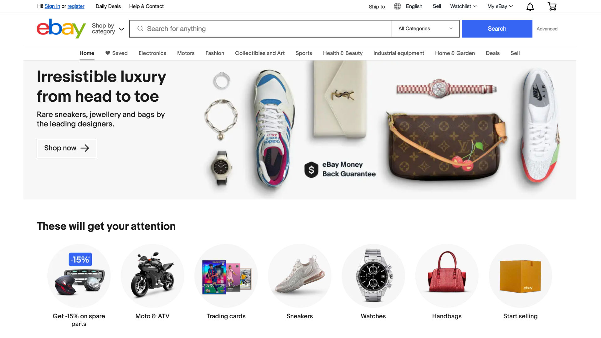
E-commerce giant Amazon—which has a wealth of information to display—manages to keep its interface relatively clean. It uses hierarchy, categorization and a clear navigation system to present information in an organized and digestible manner.
Remember the famous design principle, "Less is more." For general public releases, at least, a clean, simple design is nearly always far more effective than a complex one. It’s vital to keep interfaces simple and straightforward—to manage and minimize horror vacui. So, designers really need to aim for clarity and ease of use, and keep unnecessary elements from appearing. Be ruthlessly selective—it’s an approach that boosts the user's ability to navigate the interface and access information, without feelings of overwhelm coming in and ruining the experience.
“A designer knows he has achieved perfection not when there is nothing left to add, but when there is nothing left to take away.”
— Antoine de Saint-Exupery, Aviator and writer
Implement Progressive Disclosure
Progressive disclosure—it’s a term that means revealing information gradually as it becomes relevant. And that’s opposed to presenting all information upfront. Designers use progressive disclosure effectively this way when they prevent information overload. At the same time, it contributes to a clean and uncluttered interface throughout.
Embrace White Space
White space—or negative space—is a powerful tool in combating horror vacui. This space is that empty space in a design that surrounds different elements like text, images and buttons. It’s “nothing” that has a big purpose—and it helps to make the visual hierarchy, improve the readability on show, and guide the user's attention.
Contrary to what the term suggests, white space doesn’t necessarily have to be white. Actually, it can be any color, texture, pattern—or even a background image. The key is that a healthy balance of positive and negative space is something that gives visual breathing room for the eyes. It’s also important in UX design—and that’s because it can help guide users' eyes and attention to key elements on the page. What’s more, it can help achieve a balanced and harmonious design that’s pleasing to the eye. A generous use of white space often is a sign of luxury and sophistication—in the modern design aesthetic.
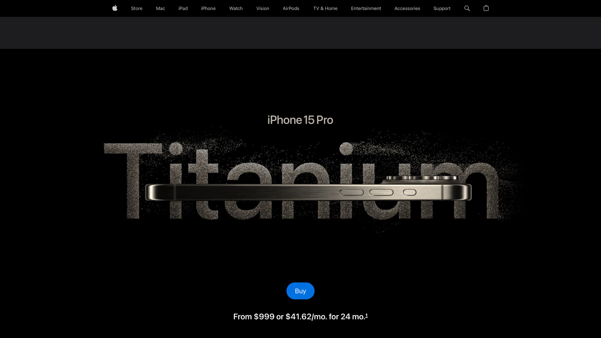
Apple’s interfaces feature plenty of white space, clean lines and a focus on core functionalities. This approach not only aids usability but also enhances the perceived value of their products.
Consider the Advantages of Gestalt Principles and Grids
Designers have an exceptionally strong ally in the form of the Gestalt principles. The law of proximity—for example—is a powerful one to work with, and it can help simplify a web page and establish hierarchy.
What’s more, designers can explore the use of typography and grid systems to organize content and optimize the use of space within their designs. Every aspect of the elements they intend to include is something to consider and—if essential to the message of the design solution and brand—optimize for the user.
Designer and educator Mia Cinelli explains how the Gestalt principles are important in design.
ShowHide
video transcript
Transcript loading…
Leverage Hick’s Law
The time it takes users to make a decision depends on how many options a designer gives them. Keep the essential choices that are relevant to the design goal and highlight them on the main page. Non-essential ones can go on other pages via link buttons.
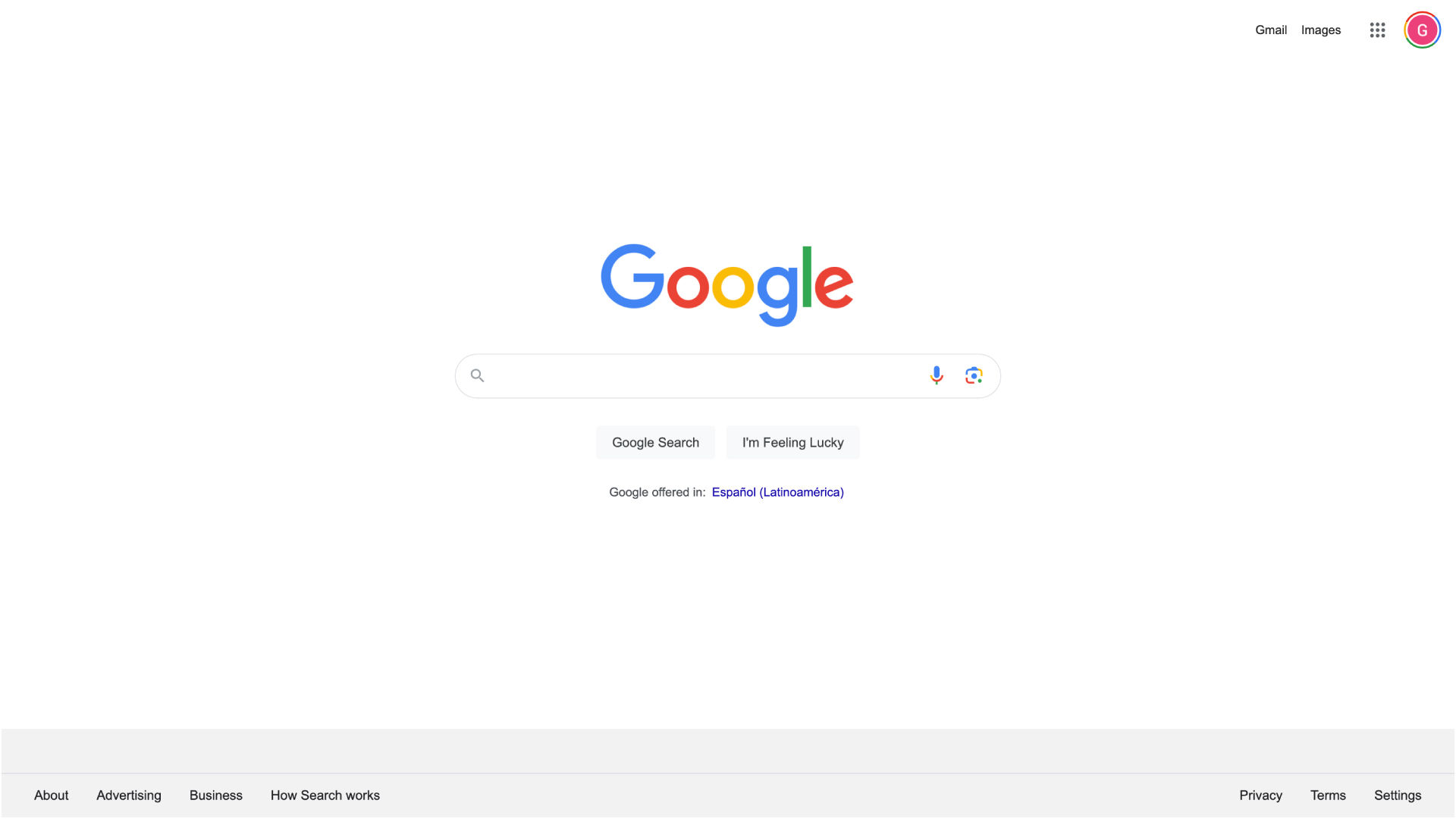
Google is another example of a brand that effectively manages horror vacui. Its search engine interface is incredibly sparse. There is a vast amount of white space. This simplicity lets users focus on their search without any distractions.
The more a designer adapts the design to make sure that more users can use it effectively—the greater are the chances that the design will swell to end up as a one-size-fits-all product. Although accessibility is indeed a vital thing—and often a mandatory consideration—it’s important to keep things streamlined, too.
Apply Occam’s Razor
Pick the simple over the complex with Occam’s razor—that’s the principle that prefers simplicity to complexity. Designers shouldn’t use more elements—unless they really have to as a vital part of the design.
Have an Easy Performance Load
Designers shouldn’t put “work” in front of users. For an intuitive design to be pleasurable and seamless, users really need to have the luxury of neither working at it nor having to pause to wonder about it.
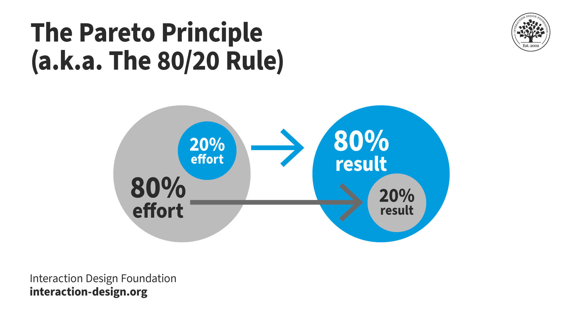
Leverage the 80/20 Rule
That’s called Pareto’s Principle—80% of users use only 20% of the features that a product’s typically got. It’s wise to focus more on the vital elements—and be wary about the nice-to-haves.
Split bigger pieces of content into smaller ones—if it’s possible. Designers who cater to their users this way really make it easier for them to digest material—and that’s especially so when it comes to written content.
Test and Iterate
It’s vital to do usability testing with users—and that’s real users. As with UX research, testing is an ultra-important part of the whole design process. It’s also the only way for designers to really understand how individual users interact with a design. Then, designers can collect that user feedback and work with the insights they’ll have gotten from it. From there, they can fine-tune and truly improve their designs to better address users' needs and preferences. And—in terms of horror vacui—they can get the optimal balance of negative and positive space per screen based on their findings.
The many aspects of detail—or lack of detail—at work.
How do Horror Vacui and Space Work in Different Cultures?
The target users’ culture is an essentially important consideration for negative space. Western cultures tend to associate clean, minimalist designs with sophistication. In some Eastern cultures—such as China—though, it’s different. A densely packed design is often a sign of wealth and abundance there. So, it’s crucial to understand the cultural context of the user base.
Designers need to appreciate their users’ culture as well as the many contexts of use for their digital products in any case. These brands will be more likely to enjoy international success. They can design effective and appealing UIs that travel exceptionally well in an international market.
Overall, perhaps the best way to approach horror vacui is to be aware of it—and manage it. One way to see it is as more a historical anomaly to consider and minimize than a warning to scare designers away from including details on a page or screen. Whatever the case, the goal is always to mirror the users’ needs—and get the brand message across without confusing anyone, and know how much detail to include. White space isn’t wasted space. “Nothing” is a handy tool here and applies to a wide range of possibilities in product design. The key to the enterprise with navigating horror vacui is good judgment and the careful application of a designer’s skill set.
Can horror vacui and minimalism coexist in a single design?
Horror vacui and minimalism can coexist in a single design—but their integration takes careful balance in the visual elements.
To combine these approaches, UX—or UI—designers can use zones or layers. For instance, one area of the screen might feature a dense, intricate pattern (horror vacui). And then another—meanwhile—keeps a good deal of simplicity and open space (minimalism). The main thing is to—while you make a unique experience—keep a harmonious balance, so one style doesn’t overpower the other.
Watch our How to Balance Complexity and Simplicity in UX DesignMaster Class with Morgane Peng, Design Director at Societe Generale to explore the principles of balancing different design elements, crucial when combining horror vacui and minimalism.
How can designers effectively use horror vacui in UI design?
First—prioritize functionality. The UI should stay intuitive and easy to navigate—even with an abundance of visual elements. So, focus on clear visual hierarchies. They can make sure that important elements like call-to-action buttons or navigation links stand out amidst the detailed interface.
Second—use horror vacui to make focal points. From concentrating detailed designs in specific areas, professionals can guide users’ attention exceptionally well. And this technique is something that can be particularly useful in areas less critical for functionality—like background patterns or decorative borders.
Third—implement responsive design principles. An interface that’s rich in details can become overwhelming—or lose its intended effect—on different screen sizes. Designers should make sure that the horror vacui elements really do adapt gracefully across devices.
Plus, think about the context and audience. Horror vacui can work well for creative, artistic or cultural websites—situations where users expect and appreciate visual richness. But, for applications that need quick information retrieval or frequent user interactions, it’s crucial to balance these detailed elements with ample negative space.
The design community—typically—views horror vacui with both fascination and caution. On one hand, designers appreciate horror vacui for its artistic richness and how it can get a sense of abundance and detail across to the viewer. It's particularly admired in fields like illustration, graphic design and certain cultural or artistic contexts where an intricate and opulent aesthetic is something that’s desired.
On the other hand, in user interface (UI) and user experience (UX) design, clarity, usability and simplicity typically really do take precedence. And a design that’s overly filled—or stuffed—with elements can be overwhelming for users and end up working against itself.
In any case, it's crucial to balance the intricate and detailed aspects of horror vacui with the needs and expectations of the target audience—including accessibility concerns. And in contexts where user interaction and functionality are key things—like web design—a more restrained approach may be necessary.
Overall, designers can rely on a strong grasp of form follows function among other allies—such as UI design patterns, to help judge what’s best in their work.
Watch our video on UI Design Patterns for more insights:
ShowHide
video transcript
Transcript loading…
Which forums or platforms discuss horror vacui in design?
Forums and platforms discussing horror vacui in design often include online communities and websites that are dedicated to design, art and architecture. And here are some recommended platforms:
Behance and Dribbble: These platforms showcase creative work—including projects that feature horror vacui. Designers often share their work and get into discussions about their design choices.
Remember—the popularity and use of these forums can vary, and active discussions on horror vacui might ebb and flow with trends and interest levels in the design community. Join our design community to stay up to date on horror vacui and other topics.
How do designers ensure accessibility in horror vacui designs?
Designers should focus on a few key principles, including:
Contrast and legibility: They're vital things for readability—and that's especially so for visually impaired users. Text and key elements must really stand out against intricate backgrounds.
Hierarchy and clarity: Despite the detail, put a clear hierarchy in to guide users to important information or elements.
Simple interaction: Keep interactive elements like buttons straightforward for ease of use.
The study, conducted by Andrew Murphy at the UNC School of Information and Library Science, examines the usability of the UNC Libraries website by first-year students. Focused on students enrolled in the first-year writing courses ENGL 105 or 105i, the research utilized a mixed methods approach, incorporating both surveys and contextual interviews. The objective was to assess how these students perceive and experience the website's usability in the context of their coursework. The findings revealed that while students could complete their course-related tasks using the website, the overall perceived usability and user experience were not rated highly. This suggests a need for improvements in the website's design to enhance user satisfaction and effectiveness. “Horror vacui” receives mention.
What are the psychological effects of "horror vacui" on users?
Users who experience horror vacui may feel overwhelmed, confused or distracted—and that’s due to a cluttered or excessively busy design. This sensation comes about because the human brain seeks order and simplicity to efficiently process visual information. And whenever they’re confronted with an overly complex or crowded design, users can find it difficult to focus on the main message or action desired by the design. This can lead to a decrease in usability and overall user satisfaction.
It's Easy to Fast-Track Your Career with the World's Best Experts
Master complex skills effortlessly with proven best practices and toolkits directly from the world's top design experts. Meet your experts for this course:
Mia Cinelli: Associate Professor of Art Studio and Digital Design at the University of Kentucky.
Joann Eckstut: Color Consultant, Founder of The Roomworks, and one of the 12 designers chosen by the Color Association of the USA to create the yearly forecast used by industries to keep up with color trends.
Arielle Eckstut: Author, Agent-at-large at the Levine Greenberg Rostan Literary Agency, and Co-Founder of The Book Doctors and LittleMissMatched.
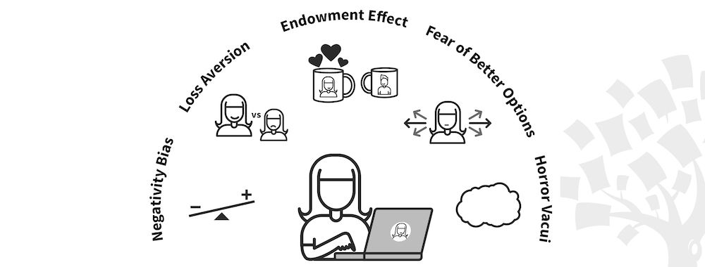
Be Afraid! The Silent Role of Fear in Decision Making
Fear plays such a dominant role in our lives that several businesses and products have succeeded on the back of this sin
709 shares
5 mths ago
Open Access—Link to us!
We believe in Open Access and the democratization of knowledge. Unfortunately, world-class educational materials such as this page are normally hidden behind paywalls or in expensive textbooks.
