
A lot of UX work is focused on letting users know when something has gone wrong. There’s a strong, and in our view - positive, movement for better error messages, better help text, etc. But there’s also a requirement for the opposite; a hearty back on the back when a user gets something right.
Showing the Love
It’s not love per se but something called positive reinforcement that users require. People like feedback on what they’re doing; in fact the current generation expects regular feedback exactly when they’re doing something – as opposed to previous generations who were more used to being given feedback only on larger tasks.
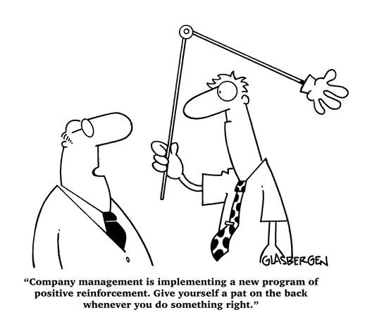
Author/Copyright holder: Randy Glasbergen. Copyright terms and licence: All rights reserved Img source
We’re all human. We all worry if we’ve done the right thing at times. Why shouldn’t products let us know when we’ve got it right?
One of the most frustrating experiences online is when you fill in a big form, usually because you want to buy something or receive information from a company or charity or similar, and then you hit the “Send Button” and you’re left hanging in the air. Yes, we know it can take time for you to process information via the net to your database but is that any excuse for leaving a potential client in limbo? A simple; “Hey! Thanks for entering your data – please be aware it can take a little time to process, so just wait a few seconds and we’ll be ready… the screen will change when we are.” message can change this experience completely.

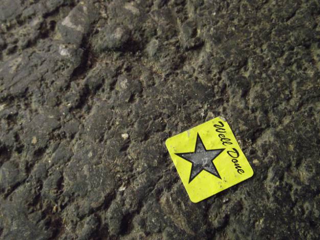
Author/Copyright holder: Jonno Witts. Copyright terms and licence: CC BY-NC 2.0
Shopping baskets online can also be frustrating. I click an item and wait for it to go the shopping cart. It doesn’t seem to go. So I click again; to find that I now have two of each item in the cart when I go to pay. You don’t have to make this complicated for me; why not just show the item change when it’s added to the cart? That’s probably easier than auto-refreshing the whole page when the cart updates.
Of course, the idea of positive reinforcement doesn’t just have to apply to data entry; have you ever been on a website and clicked a hyperlink and then waited uncertain if you’ve clicked it or not? We have. In fact it happens all the time. Yet, simple visual cues are easy to show people that they’ve clicked on a link – a colour change is shorthand for “you’ve clicked me” but there are still thousands of websites not showing such a change.
Types of Positive Reinforcement
There are dozens of ways to share the love with your users but the most common are textual feedback and visual feedback. Tell people in either words and/or images that they’ve done what they’ve set out to do and you’re going to improve their experience of your web site dramatically.
Author/Copyright holder: quietlyurban.com. Copyright terms and licence: CC BY-ND 2.0
Just one word of warning; try to ensure that you do offer positive feedback rather than patronizing feedback. “Well done, we wondered when you would work it out…” is not going to improve a user’s experience at all.
Header Image: Author/Copyright Holder: Smashing Magazine. Copyright terms and licence: All rights reserved. Img


