Writing about music is like dancing about architecture.
- Elvis Costello
Digital products share the properties of printed pages, spaces, interactive mechanical devices, and film & TV. It’s print aspects include composition of text and images within a rectangular space, and sequential organization of content. Wayfinding among often complex sections and subsections over time is architectural in nature, hence the term “information architect”. The experience of seeing a sequence of backlit moving images over time, both within discreet screens and in the sequence of screens themselves, makes the experience cinematic, as does the task- and time-based intent of using applications where there is a beginning, middle, and conclusion to the usage session. Hard-core authoring applications, like Photoshop or Word, are almost like virtual environments – workshops, where the “content” artifact being worked on is the subject of a continuous flow of session after session, and the application recedes into utility status, alongside electricity and water. Finally, digital products are increasingly seen as a service, a proxy for what used to be provided by real people in service or professional roles.
The whole computer usage experience, through the manipulation of the various hardware devices to the operation of the software user interfaces themselves, has long been modeled after our long relationship with physical machines, and the process of learning and using their wheels, levers, buttons, and status displays. At the most basic level, and as defined by the science of cybernetics, the entire “user interface” is an ongoing dialog of communication between the user and an inanimate “system” that is treated, subconsciously, as anthropomorphic – expected to behave more and more like one’s brilliant human assistant. Many who spend significant time with an omnipresent machine, such as a computer program or a ship, begin to address it as “he” or “she”. Richard Powers’ Galatea 2.2: A Novel features a scientist who falls in love with the artificial intelligence system he creates/grows/raises. How can designers get better at representing these beasts in support of associated development projects?
Designers often complain that they are not brought into a project until it’s too late to make an effective impact. When invited to the table, however, they need to respect the costs and impact of being at the front of a long production process, with an entire team awaiting an approved , buildable design. In my software experience, unfortunately, a project often truly “begins” only when the required development engineering team is assigned and becomes available. This means that these resources need to be made busy immediately and demonstrably, or else be lost in pursuit of their own ideas or, even worse, to another project. Designers assigned to teams at this time can feel fortunate. However, if DT is to be effective in it’s role of enabling developers to reference relevant product designs, such teams are in fact already behind schedule. Ideally, some DT has been done ahead of time, with the result in fact acting as the trigger to pursue the project and secure the execution resources in the first place.
In this chapter I describe several design practices that can help us to represent the elusive form and behavior of software products. Again, many of these recommendations are fairly common practice in all design, and especially for user experience design, but are particularly important process considerations for UX problems that are complex, or involve visual analytics.
22.0.1 Reconciling DT and Lean
The composer Handel claimed that parts of his ubiquitous Messiah symphony were written in a trance, dictated to him by god. The problem with writing relevant content about spontaneous inspiration is that, unlike in Poe’s essay, and as evidenced by countless anecdotal post hoc accounts, conditions for its realization are hard to prescribe and replicate. Inventor Ray Kurzweil likes to wake up slowly, thus prolonging the semi-dreaming state where the mind is freer to fantasize and combine otherwise disparate concepts. He claims to have gotten some of his most innovative product ideas while in this state. So-called method actors perform elaborate rituals to get into the mindset of their characters and deliver a more convincing performance, sometimes remaining in character throughout filming, even when off camera. Martin Sheen’s naked, violent hotel room scene from Apocolypse Now – where he guzzles vodka and punches a mirror – was entirely unscripted. The acts were merely his ritual to prepare for the scene, and Director Francis Ford Coppola decided to roll the cameras and included the footage in the film. Sheen severely cuts his hand, and the scene’s blood is his. Although crazy, successful ideas can come out of nowhere despite the best-laid plans, having a well-laid plan like DT to provide structure, while accommodating change and improvisation, is advised. Managing the relationship between DT and Lean can be optimized with the following proposal.
As a kid learning to draw, I would often indulgently render small parts of a drawing in rich detail, while paying less attention to how these parts spatially related to each other. Lacking an overall layout guideline, I often ended up with gross inaccuracies that ruined the drawing (Figure 22.1).
My instructional books recommended starting with a light sketch to plan the composition, and then to gradually commit to areas of light, shade, and detail over the entire surface to evenly develop the composition. Maintaining such a balanced overview of the drawing would reveal planning flaws sooner, and allow for their correction. Initially I resisted drawing these lines that would just need to be erased later, but the advice eventually worked. Results became more predictable, and the eraser became my friend (Figure 22.2).
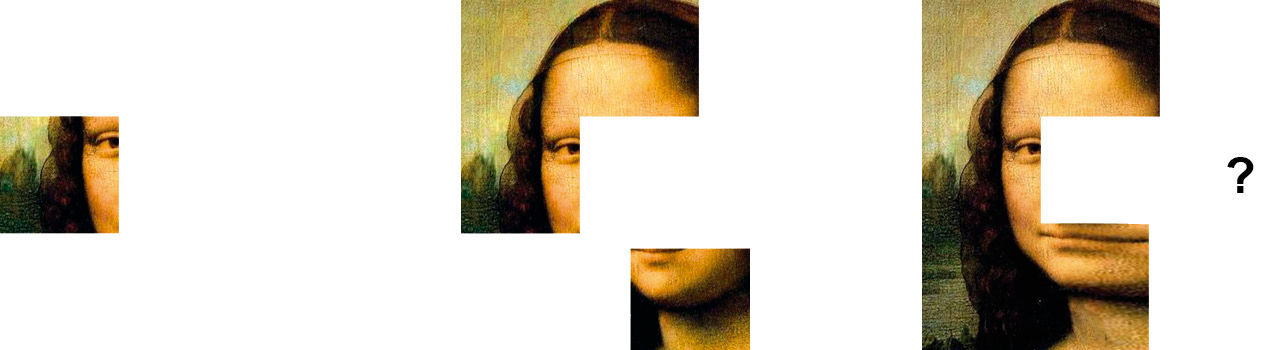
Figure 22.1: Ad Hoc Development. Large structural errors are possible.
Figure 22.2: Staged progression from low- to high-fidelity.
For digital product development, these drawing stages roughly correspond to the product’s migration through three basic forms/phases: Requirements, Specifications, and Builds resulting in a final product. Commercial development processes, however, are rarely ideal. Many approaches have been tried, and all involve representing the end product in these forms and in this order. Each form represents a “current version” of the product expressed in different media and detail.
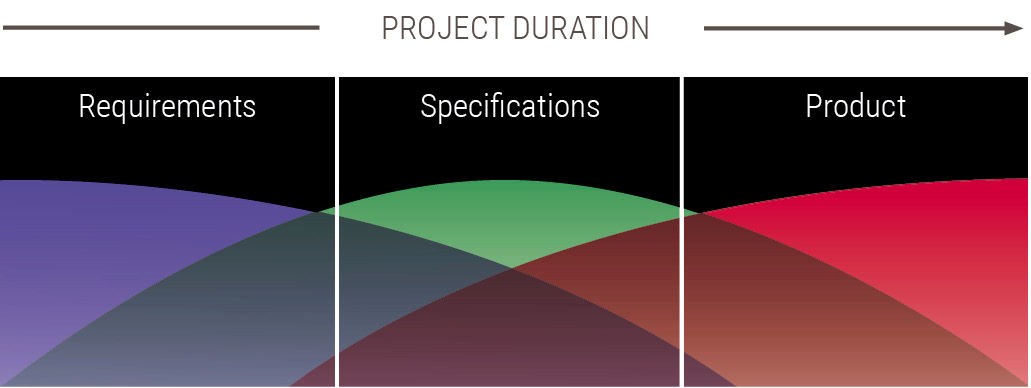
Figure 22.3: The Development Relay: Ownership of a project’s “current version”.
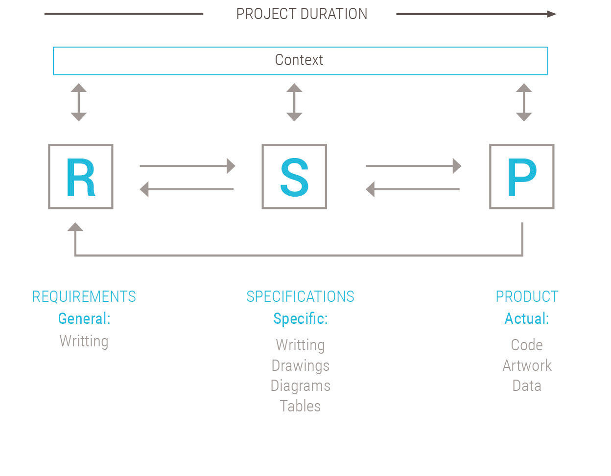
Figure 22.4: Forms of product representation.
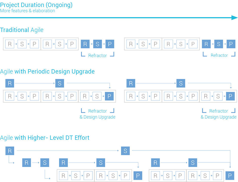
Agile methods, a foundation of Lean, are distinguished primarily by their approach to the quantity, scale, and frequency of these phases. Agile projects are implemented more or less as a series of small projects, called sprints, strung together into a larger, ongoing project, called an Epic. Each sprint has its own requirements, specification, and product phases. Acknowledging that large, long projects often change course during development, agile methods seek to produce finished, working, reliable code for what has been worked upon. These results can be more valuable to a team and its customers than an unfinished, poorly written, and unreliable shadow of an initial, overall design.
The agile movement was instigated and pioneered by software developers in reaction to a frustrating history of projects being delayed, going over budget, and eventually collapsing under their own weight, as described in Scientific American’s depiction of Software’s Chronic Crisis. Tired of working stressful jobs with long hours on doomed projects, Agile’s founders blamed the problem on volatile requirements and efforts to create sweeping, ambitious, improperly targeted product designs before any real code had been written.
Even though development models had matured from being primarily ad hoc (little or no structured process) to waterfall phases (sequenced handoffs from discipline to discipline) to more interdisciplinary blended phases (e.g., having designers advise the requirements and developers advise the design), project results were still disappointing. Ad hoc processes typically resulted in chaos. Waterfall processes, and to a lesser degree blended phases, experienced trouble and delays because disciplines made incorrect feasibility assumptions, favored purity of their own standards at the expense of the team’s, or acted in absence of a shared product vision.
The Agile founders felt that if large projects could be reduced to a series of mini-projects that are started, finished, tested, and delivered to the customer in quick succession, perhaps risk could be minimized. Customers could provide feedback on delivered work to inform the next mini-project. Iterations would be built upon one another over time, resulting in software systems that “grow” into existence while actually being used, versus having been “determined” beforehand. Iterations would be tested for reliability. In the end, the customers would be able to get more of what they wanted faster, because they would have had more flexibility with the requirements.
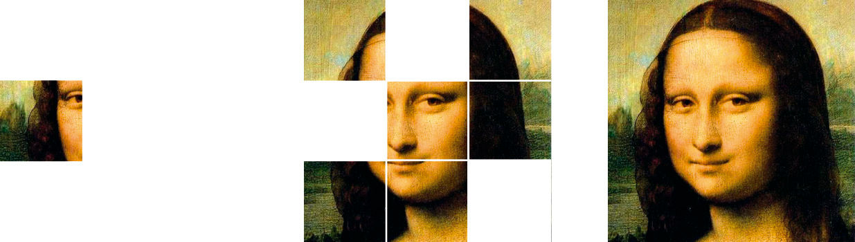
Figure 22.5: The ideal agile result: A series of finished pieces assembled serially into a cohesive whole.
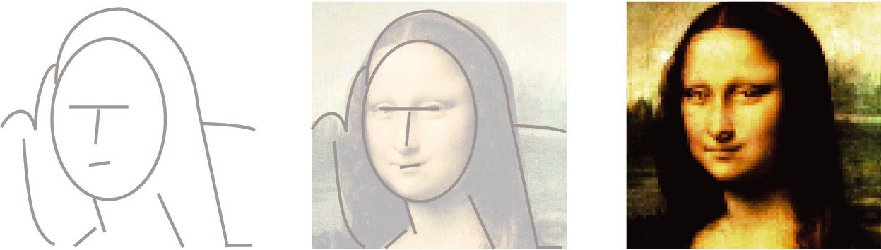
Figure 22.6: One risk of phased processes: Design is accurate but implementation is poorly crafted or unreliable.
Figure 22.7: Another risk of phased processes: Re-design never ends and implementation is never finished.
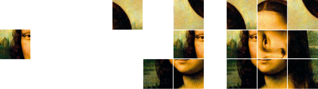
Figure 22.8: The risk of the agile approach. Individual pieces have value, but the larger system is disjointed.
The risk of this approach is the inability to model ahead of time what is to be built – in other words, to design it – and ending up with a well-crafted and reliable final product that lacks a coherent structure and vision.
Agile may appear to be merely an ad hoc process with a catchy name, particularly in its disregard for prescriptive design in favor of building what the customer says they want or need next. Many designers have experienced the ad hoc treadmill, and work hard to instill planning and discipline in the completion of complex projects. Agile literature, however, purports highly structured, disciplined methods, which are rarely applied at full strength in professional practice. XP – or Extreme Programming – seeks to break down complex features into the simplest possible forms, and then quickly build them. If the result works and the customer likes it, the feature is kept and perhaps enhanced.
Figure 22.9: Board Composite Archetype
For example, in LAVA’s archetype Board Composite, the full set of browser-based features appear, including the Digest, Gallery, Well with Lattice, filters, settings for personal and shared Boards, and an interwoven interaction between Points, Posters, and the Lattice. Due to the self-sufficiency of the main components, a much simplified rendition of this Board was able to be built in SAP Dashboards — a tool not designed to produce the full LAVA experience. The initial builds from SAP’s internal CFO dashboard project, although built in straight HTML5, were also recognizable, and served as a foundation Proof of Concept for the introductory LAVA experience. The Lattice was not yet built, nor were the personalization features. However, with the Title Bar, Filters, and navigable – but not yet manipulable or editable – Digest and Gallery, the initial LAVA consumption experience, as well as its key sustainability properties to ease future edits, proved viable.
Whether it occurs in a large, speculative, up-front effort, or in small, steady steps that grow into a coherent product, today’s demand for retail-quality user experiences mean that success calls for explicit UX design to occur somewhere, somehow, in the process. If the main benefit of having dedicated UX designers on a project is the ability to imagine, and represent, how a disordered set of functions and meanings can be synthesized into a whole that is harmonic to users, Agile can be a huge limitation to UX quality. It can limit the design role to short-term efforts to design and redesign small, isolated elements. If applied within an initial and ongoing DT effort, however, the best of both approaches can be achieved.
This hybrid approach requires design work on three levels, done in parallel. The low level effort – typical for agile – supports the short-term iterations by providing detailed component designs to drive construction. A second level presents low-fidelity redesigns of existing builds in order to inform refactoring efforts. This split duty limits the designer’s ability to optimize either effort with just “one pass”, but, because in theory an Agile project’s design and product assets are to be built in a flexible manner, it should be easy to layer on improvements as the project progresses. An additional overarching effort, a continuation of an initial DT process as detailed below, enables design on a third level to provide more overall product vision. As the new components and capabilities are rolled into future builds, the underlying structure will not need much change. In the meantime, customers and the product team benefit from having something working at an earlier date.
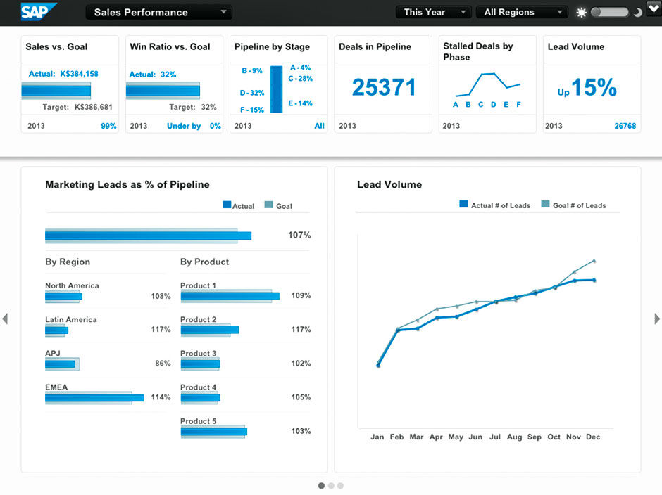
Figure 22.10: Sales Pipeline Demo built in SAP Dashboards, 2013. Copyright: SAP AG. All rights reserved.
L9.4 | LAVA Board: CFO (video)
A key piece of Agile that allows it to make the pieces fit together and adapt is called refactoring. Refactoring is Agile’s eraser, and involves taking time out from adding new features in order to re-work and integrate what has already been done. It’s a bit like cleaning up the mess after a long run of construction – or doing redesign after much has already been built and learned. Looking back to the event in early 2013 when LAVA was first shown to external customers, the Lean development team showed the current incomplete build of Lumira – the current state of the bottom RSP track – and then a UX designer showed the projected designs for the next 3-6 months of sprints – the middle RS track – and then I showed the LAVA vision – the top RS track.
 Author/Copyright holder: John Armitage. Copyright terms and licence: All rights reserved.
Figure 22.11: Agile sequences of Requirements, Specifications, and Product artifacts. Dedicated UX design efforts are in dark blue.
For many professional designers, agile methods can seem threatening. In agile proponent Martin Fowler’s essay Is Design Dead? his rhetorical answer is actually “no”. However, his use of design refers to technical design versus user experience design. In fact, initially the agile community rarely mentioned users or user interfaces at all, which means that they were either neglecting UX, or focusing on projects with less need for UX sophistication.
An example of this approach working on a very high level was described in Eli Maor’s book To Infinity and Beyond!: The Story of Pixar Animation Studios. The book describes how Pixar creative visionary John Lasseter and his small circle of writers met at the Townhouse Café in nearby Emeryville, California, for what was essentially a DT brainstorm session for the future of their new animation studio. They spent an afternoon sketching out over ten years of film concepts. With intimate knowledge of what their technology could achieve, in both the short and long term, they chose the order of production according to the subject matter to be rendered, and of course wrote content to suit what could be rendered convincingly on screen. Their plan called for beginning with Toy Story and A Bug’s Life, because rendering the simple geometry of toys and bugs would be practical to accomplish with the systems of the time. In these films, human figures like Sid have small roles, and are rendered crudely by today’s standards. Next in line would be the more ambitious films Monsters Inc., Toy Story 2, and Finding Nemo, to be produced at a later time when the rendering of more complex movements, textures, and organic elements – like hair in motion – could be done convincingly. But the main characters would still be either fantasy-based or stylized animals, with humans playing a larger role but still in the background. Only with The Incredibleswould they be able to convincingly render the movement and expressions of even simplified, highly stylized figures to the point where they could base the whole movie on human-like characters. The Renaissance Florentines took the same approach in the construction of their cathedral dome, albeit with much less certainty about the pace of technical progress.
Product usage scenarios drive the design effort, and, as with film production, take the form of linear, storyboard depictions – but rather depicting how users complete workflows versus how characters act out a drama. Storyboards show how users would use a series of components, or groups of UI functionality, e.g. a browser tree, a form, a dialog box, etc., to complete a practical task. In the storyboards, the design shows typical – not comprehensive – depictions of these components, just clearly enough to gather feedback from users and stakeholders on the design’s overall merit. Concurrently, and upon design validation, the customer and engineering team prioritize components for development, and assign them to sprints (Figure 22.12).
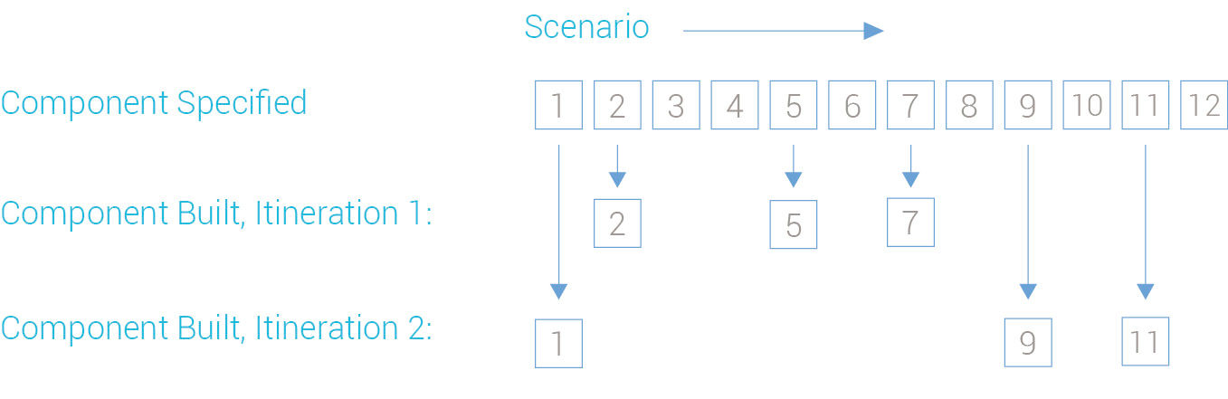
Figure 22.12: The component planning process.
Without initial and over-arching efforts, designing for agile projects can be frustrating for team members having the imagination to foresee the likely overall outcome to the effort, but lacking the influence to accelerate its realization. When small features are added and tested one-by-one, feedback can accumulate until the overall system design needs re-thinking. Designers end up fixing symptoms of problems too large to be solved within one sprint. The team can end up designing and building the project several times over, constantly editing, re-doing, and combining elements, primarily due to changing requirements . Designers trained in the perfectionist industrial revolution model are particularly vulnerable to frustration in these situations.
Although requirement changes are the bane of anyone trying to help another party get anything done, their elimination has always been a losing battle, and always will be. Requirements change because they can, and software’s FMBE nature actively encourages it. Again, the project itself is the greatest influence on the project. The more work that is done on a project, the more the project context changes. Agile methods seek to benefit from the intelligence of experiencing the real product’s existence in the real world, and the sooner the better. Traditional design, on the other hand, aims to predict and depict what the entire product will be before it exists. Heavy up-front design, as espoused by Alan Cooper in his book The Inmates are Running the Asylum, calls for adequate product intelligence to reside in a definitive specification artifact. This sounds good in theory, but in cases where technology is new or untried, requirements are volatile, the domain unfamiliar, or the complexity immense, it can be too risky to heavily invest in assumptions without adequate “reality checks”. Cooper’s intent with Inmates, however, is valid, and it’s argument is compelling. It’s the one book I sent to BOBJ’s executive-level stakeholders as an explanation of the UX challenge.
In summary, agile methods exist to mitigate product development risk. They are more empirical than other methods, using trial-and-error to reduce the risk of building the wrong thing, with the expense of having more routine code to re-work, and having to maintain all development code in a form close to release-quality. Essentially a series of very high-fidelity design experiments, they achieve low-level certainty by accepting high-level uncertainty.
Despite the identified shortcomings, agile methods can enhance the design process. Iterative releases being used by customers, even those having had little design input, can serve as ongoing usability tests. This arrangement also allows automated usage tracking and testing tools to be brought into play sooner and in a more relevant context. Lower-risk release cycles can also encourage design experiments (albeit at low levels), and gone are the ominous specification documents to write. The fast release pace gives an ongoing sense of accomplishment, and because there is closer team interaction, shared goals, and less solitary time invested in elaborate design or engineering schemes, there is less defensiveness and territoriality about individual contributions.
Components chosen for an iteration can then be designed in more detail, but not complete detail. These components are then assembled into a rough working version of the system for testing. Components can be added in later iterations, and changed as their designs change.
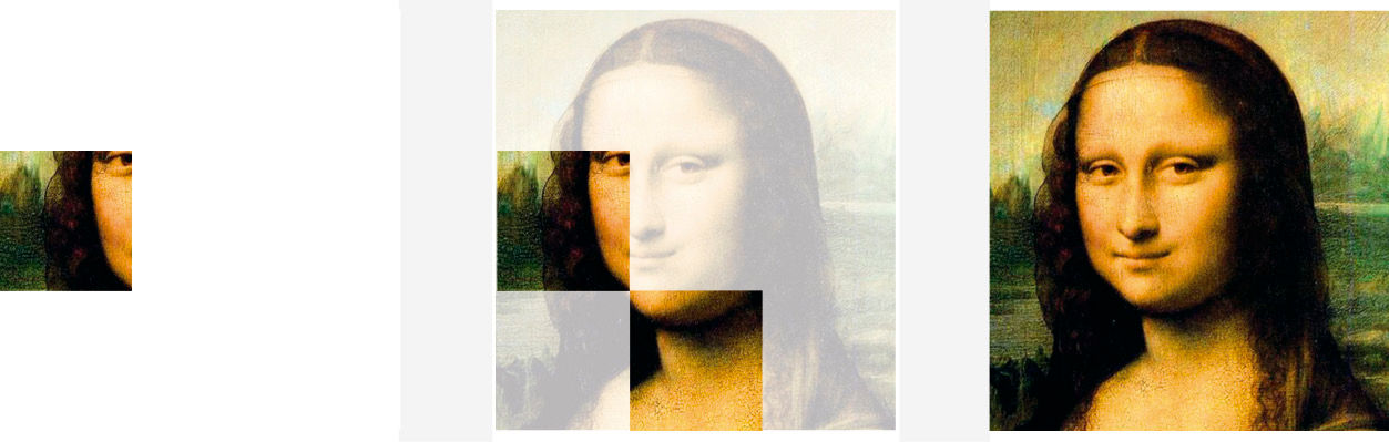
Figure 22.13: The answer: Split your time investment between overall design and detailed, iterative development
Here are some guidelines for designers working in an agile environment:
- Embrace a larger context and judge success by the success of the team/project (which is perhaps the essence of being interdisciplinary).
- Appreciate that providing partial solutions earlier can be more valuable than providing full solutions later on.
- Design solutions and work products that can easily be changed.
- Learn to design the simplest possible version of your idea, and add to it later.
- Think hard about what to design first and what to leave for later.
- Be willing to throw out what’s done if it’s not working, or was the wrong thing to do in the first place.
- Learn to quickly jump from low-level to high-level design tasks.
- Branch out from the build iterations to sketch and model an overall vision, yet still respect the learnings from early technical trials.
- Design with the product lifecycle in mind, in particular how the product will evolve over time, by completing a minimal functional scope and building upon it in future versions.
Vision-level work needs the top-level design track to succeed. DT is about doing the right things, Lean is about doing these things in the right way. With a strictly Lean-based process, it’s impossible to steer development away from incremental improvements. Lean enables evolutionary advances, DT enables revolutionary ones.
Evolution can of course give amazing results, as it has with eyes, the keystone use case in the pseudoscientific evolution theory known as Irreducible Complexity — often used to support the broader Intelligent Design theory of biological diversity. Irreducible complexity claims that eyes are such a complex yet elegant construct that there is no chance they could have evolved without a pre-ordained plan from some higher intelligence. The dominant scientific-theory for biodiversity, of course, is Darwin’s natural selection, which proclaims that eyes, along with every other feature of living things, evolved through natural selection’s sequence of tiny, beneficial, self-replicating mutations – more of an ever-present Force setting rules and handing out micro-payments than a giant spec doc from God. Alas, commerce timelines don’t allow for a strictly evolutionary approach to product development. Design Thinkers need to intervene and play the role of God in the evolutionary theory of Intelligent Design, to punch through solutions that approach irreducible complexity. But don’t expect an all-knowing designer to walk through your door, made in Alan Cooper’s image and packing a perfect, comprehensive spec doc, to save the day.
The Design Thinking process provides the sketch to guide the project, and Lean provides the structure to get it developed. LAVA was a higher-level design project conducted in loose parallel with formal product development. Although there was not an official project team, the volunteer collaborators coming in and out over time served as a virtual team representing all relevant disciplines. Knowing the DT process as well as I did, we performed most of the steps and activities, albeit in a disjointed order over an extended time period.
22.0.2 Systematic Design
As I discussed in the study of LAVA’s color palette, the design of any system involves choices about constants and variables among system element attributes. Keeping many things constant results in uniformity, while allowing them to vary results in, naturally, variety. It can be summed up as deciding, among all of your design elements of form and behavior, what are the rules that govern which stay the same and which change, and under what circumstances. Could English improve if, instead of 26 characters, it had 50? Or, as with traditional Chinese, thousands? The graphic design program at RISD had a class called, rather vaguely, Design Systems, where students manipulated such variables using the simplest of formats. By coloring patterns on graph paper, or writing simple music scores, students learned the aesthetic possibilities of composing the rhythm, repetition, and density among sets of entities. The exercises are a pure study of repetition and variation, consistency and surprise, as an underpinning for systematic design cases in the real world.
Road signage systems benefit from more uniformity. The book jackets of a publisher’s portfolio, on display like small posters and dispersed throughout a physical or online bookstore, benefit from greater variety. Most system solutions fall somewhere in between. Just as colors cannot be judged in absence of their usage in context, uniformity and variety on their own are not inherently good or bad, but are rather generic properties of anything with a perceivable multitude of parts. They are the defining poles in an aesthetic of relationships. Good uniformity is expressed as the virtue of reassuring consistency, and demands discipline. Bad uniformity is numbing banality – think Soviet-era tenements. Good variety is a stimulating store full of music albums and CD covers, and demands distinctive individual expressions. Bad variety is a wobbly painted border on a baseboard or windowsill. The good examples take skill and effort to do well, and represent a foundational aspect of good design. The bad examples represent failure and cheapness.
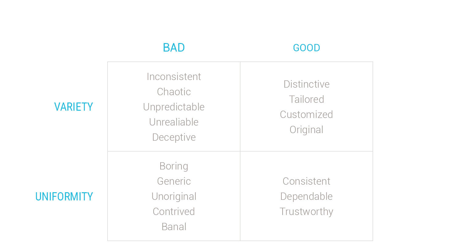
Figure 22.14: System design quality matrix in words.
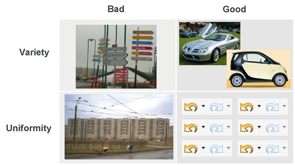
Figure 22.15: System design matrix in images.
22.0.3 Tripodal Design
Tripodal Design calls for thinking in a balanced way about the business and technology aspects of a product, as well as about its user experience. Tripodal design increases the relevance of product design proposals by ensuring they are grounded in business strategy and available technology. This principle is central to DT, but is a timeless realization first put into words around 15 BC, by the Roman architect Marcus Vitruvius, in his treatise Ten Books on Architecture. As originally translated, it states “Well building hath three conditions: Firmness, commodity, and delight”. It later evolved into “sturdy, useful, and beautiful”, and now appears in DT as “Feasible, Viable, and Desirable”, and inclusively considering “Technology, Business, and People”. Innovation tends to happen when demands and opportunities native to these three concerns overlap to create new possibilities.
LAVA represents tripodal design in that it 1) proposed a new type of consumption-oriented product form and experience – desirable – that 2) fit the business strategy of broader analytics use at a lower price point by less-experienced users via a cloud model – viable – and 3) was made possible by HTML5 rendering and performance improvements et al – feasible. LAVA’s proposals demanded elaboration on all three aspects to tell a complete, compelling story. Although all three factors and associated disciplines contributed to the process at various times, in LAVA’s case the speculative product forms and their customer validations came first, informed by high-level strategy and capability. They were then validated by various software architects and front-end developers, and finally embraced by product managers and marketers, who articulated how the opportunity could be brought to market. Each effort impacted the product design and how it was positioned.
Referring back to Poe’s Philosophy of Composition and the accusations of self-congratulatory hindsight, LAVA did not develop as a tidy pre-ordained DT case study. Empowered by the promising new landscape, the core team led with our strength, which was designing product forms, to address a problem space of unknown business potential, and then let the created forms inform and inspire us and our stakeholders and on what to do next. Once all three legs were better understood, they influenced each other and started spinning like a wheel in cycles of invention and revision.
22.0.4 T-Shaped Prototyping
Due to FMBE, digital products are particularly difficult to visualize. On a more tactical level of determining and presenting the proposed product form, the practice I call T-Shaped Prototyping is an effective way to represent the most relevant product aspects with the least effort. I borrow the “T” metaphor from its more common usage – primarily by IDEO – in referring to personal skill sets and interests. To be a T-shaped person is to have working knowledge within a variety of different topics, and to be deeply skilled in one. The former skills represent the horizontal top of the T, and the latter the base. Having wide interests helps design team members to have empathy with other domains and perspectives, as well as to be versatile in completing multiple project tasks when needed. Having deep competency in a particular skill or activity both enables expert-level performance within a team, and provides insight into advanced-level properties of other disciplines. It has been said that going deeply into one thing is to go deeply into all things, as at a certain point of topic mastery the same issues, limits, and patterns are encountered, be they personal, political, physical, etc. Having “drilled to the metal” within one’s specialty, it becomes easier to understand the principles and motivations of your peers from other fields.
In designing digital products, the point is to be T-shaped in what you choose to work on first, in how much detail, and to what level of completion to support milestone reviews. As I mentioned, the design effort is more than the straight translation of requirements into form. It’s a valuable source of intelligence about requirement validity and scope, triggering useful second-guessing and the realization of better functional ideas. The design process seeks not only to visualize and specify as much as possible as quickly as possible, but to serve as a validation step, with a feedback loop to earlier stages. The artifacts made by designers, in the form of “wireframe” sketches, static product mockups, or semi-working prototypes, are a proposed vision of the future, to be read as “is this what we really want to invest in building?” With digital products like applications, however, especially in a Lean development process, it’s not practical to design everything before commencing production. Doing so invites risk by delaying the technology development track and its valuable feedback loop into design.
As design can influence requirements, technologists working with real code on real designs can impact design and requirements as well. The art of prototyping is to show breadth by indicating the amount of sections, features, content, and use cases in a product, and depth to demonstrate the required sophistication and detailed behavior of the key product attributes. As there is often significant redundancy in the form and behavior of complex products, the deeply-designed subset of product attributes serves as an example of how the entire product should look and work, enabling better estimates of development costs and of overall product value and potential.
In simple Website design, a T-shaped mockup shows the home page and perhaps one static screen within each section, and then, within one or two critical sections, shows every screen and/or a demonstration of key user interactions or workflows within the section. Secondary sections might be rendered in wireframe outline form, like blueprints, with the featured sections fully rendered in the intended style. With more complex applications it’s trickier, as there are a variety of key workflows that make up the full value of the product, and the visual styling of the product is typically less important than how it behaves and what it can do. There are two approaches to take in these cases.
If the team is confident it can execute on key product features, and the concern is about producing a large volume of simple features to hit a time deadline, then first design all the easy stuff that is not likely to change, so that production can begin on that material while the designers and technologists work in parallel to figure out how to do the harder stuff. The risk here is that the harder stuff proves to be too hard and causes an overall delay, or needs to be done differently than planned and somehow invalidates the concurrent production work on the simpler items.
The other way is to delay production of the simpler stuff until the harder stuff is nailed down. This is the approach to take when there is a core piece of innovation or tough engineering to be done, and/or a validating demonstration is needed to secure funding or support from stakeholders. Figures 22.16 and 22.17 depict these approaches, respectively, using agile developer John Brewer’s idea to focus on Mona Lisa’s smile as the crux of her appeal. As opposed to being limited to mundane progress bar production states, milestone reviews can present complementary, compelling proof of a product’s key benefit, either in static rendered form, actual working form, or both, even if the rendered form differs in form or function from the current code line. This is the typical mode to use for innovative and ambitious projects, and the mode I will discuss in more detail.
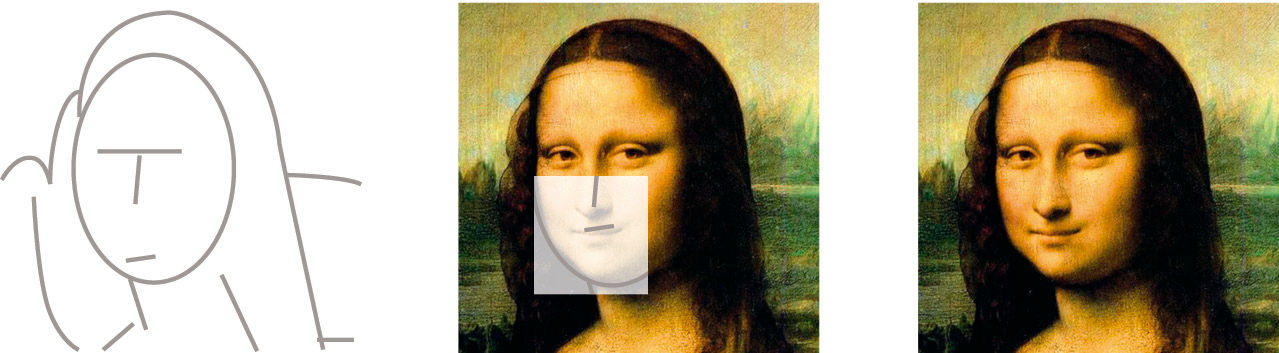
Figure 22.16: Finish the easy stuff first, leave the hard part for last (or work on in parallel).
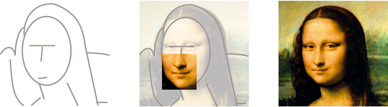
Figure 22.17: Finish the hard stuff first, leave the easy stuff for later.
22.0.5 Design Triage
Regardless of the project schedule, the overarching goal of representing as much of the most relevant attributes of the product, as early as possible, is always present. My general approach to designing, based in part on the SAP executive coach’s advice that we are all really consultants, is to assume that project team membership is up for renewal after each milestone. This drives me to create each deliverable as if it were the last, to serve as the only design guidance for the development team. Naturally, with this mindset I’m trying to deliver the most valuable ideas in a coherent and complete format first. These ideas are the ones that will 1) most influence the rest of the design, 2) typically represent the most challenging engineering efforts, 3) often trigger a re-thinking of client/sponsor expectations, and 4) because I’m a user-centered designer, represent the essence, often called the “mental model”, of the product, according to the perspective of the user persona. I call my approach Design Triage, and it’s invaluable in developing one’s sliding scale for use in projects that demand short designer engagements, including those defined in terms of days, hours, or even minutes.
Depending on the milestone pace, an initial product design presentation can consist of explanatory presentation slides, diagrams, product examples, and actual product design images. While all are relevant, I tend to invest the most effort in using low- or mid-fidelity product sketches and mockups to convey the main points. I back these up with documentation in other forms as necessary but, as prescribed by agile, as little as possible so as to focus as much effort as possible on specific product usage representations. This is unlike the heady consulting days of the dot-com boom, where it was common for teams of 5-10 design experts to design their niche aspects of huge products, working in whatever tool best supported the authoring of their unique deliverable. These projects resulted in the file format version of the Telephone Game, a medley where every design starts out on a whiteboard, then recorded in Powerpoint, then moved to Adobe Illustrator or Microsoft Vizio for wireframes and flow diagrams, alongside Word or Xcel files for use cases, and then moved to Photoshop, Flash, and HTML editors, with possible side trips into disposable interactive demos. With each file format transition, not only is effort wasted in the rote translation and replication task, but core product information is untranslatable, overlooked, or ignored, and thus lost.
Sustained success in the workflow- and interaction-heavy projects I specialize in – and have demonstrated up to this point – rarely hinges on product styling or special effects. Most of the value added in the design of such products is rational, procedural, and organizational, and is most efficiently conveyed with a wireframe shorthand, or styled in a generic or simple minimalist manner. The ability to author designs for as many purposes as possible with the fewest tools and formats saves time. I can create a specification of sufficient precision to drive most development by using only one or two document types. The key is to maintain one working file, containing the most current product representation of the product to be built, and that is understandable to the widest possible audience. For as long into the project as is practical, this representation is the single vehicle to which new feature specs are added and edits are made. The key to making this approach pay off is to present the product design information in a form that can be referenced and understood by developers (for building), by sponsors (for evaluating), and, often via facilitator, by users (for feedback and testing). Perhaps most importantly, designers need this representation to feed their own understanding and confirmation. Remember, the designer maintains a dialog with the forms they create, using the making of things as a way to think.
Following the Design Triage approach, I’ve created a hierarchy of representation levels corresponding to levels of effort and project completion. It begins with one or more Platinum Views – product screen shots that best represent what the product is and does. I’ve heard the definitive single view referred to as the product’s “money shot”. For example, in the design of a typical desktop-based text editing product like Microsoft Word, the Platinum View would be a screenshot of the product-to-be’s state while being used to edit a document. The document shown being edited might have a sentence selected and an embedded image and a chapter heading within view. One or two toolbars would appear in the product frame, with a tool palette floating off to the side. With only this image, a solitary reviewer or product interpreter can understand and describe what the proposed product is and does. It’s important to realize, however, that while this view type is of obvious value after the fact, as screen shots from a larger design mockup or product version, it is also of great value as the form in which the design is actually envisioned and advanced.
I remember a hopelessly delusional designer once declare that, as opposed having user documentation be the final artifact created in the development process, it could and should be the first. It could then serve as the spec, driven and filtered by the mature and rigorous standard of having to explain a product to users in words and images. Development – here’s where the miracle is inserted – would then be compelled to make it come true. Using Platinum Views as a design format is a much milder version of the same idea, again referencing Stephen Covey’s Habit of “begin with the end in mind”. The Platinum View I showed from the Sabre air booking application depicts a typical round-trip flight, with the search results from the return trip leg shown and a flight for the first leg already selected. For LAVA, the first version of the Platinum View is shown again in Figure 22.19, alongside a later view of the tablet version.
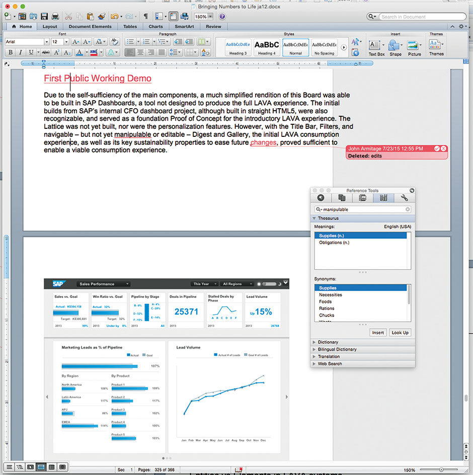
Figure 22.18: A possible Platinum View for Microsoft Word.
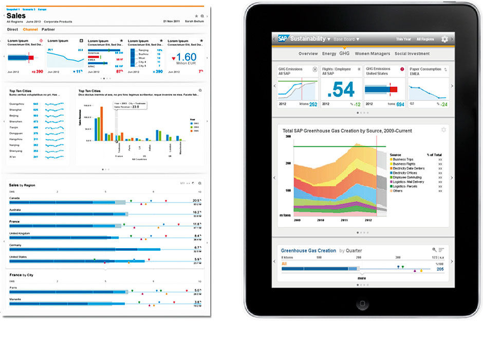
Figure 22.19: Early Platinum Views of LAVA
While you can continue to draw Platinum Views of progressively less-important screens, eventually it becomes hard to track how they relate to each other, and where/how they all “reside” within the product. For the design of Web sites and other relatively static content-based entities, at this point the next logical step is to design a site map to tie all the pages together. For products featuring sometimes long and tedious workflows, well before this stage it is better to stop designing views and start designing behaviors and complete functional paths through the application. These are more important than a collection of static screen views. It’s best to demonstrate the path as the user will see and experience it – by seeing the screens unfold in the context of the whole product. Again, you need to select the most important behaviors or paths through the product. The sequence of screens and user actions to depict this is commonly called the Golden Path. If the Platinum View is the single-screen depiction of a product, the Golden Path is about ten to fifty screens. The key to its smooth presentation and comprehension is to represent the Path as if it were a recording of the user’s screen as they would actually use the final product. The artifact representing the Golden Path, whether it’s a slide deck, PDF, or HTML click-through mockup, is the most important and valuable design vehicle to the application designer. It can serve as the design, presentation, and user testing workhorse throughout a project’s design stage.
The best examples of Golden Path mockups from LAVA are the tablet-based sustainability design, although even this contains some secondary elaborations added later, such as the multi-selecting of Lattice rows and the expanding and collapsing of Lattice Layers. My first Golden Path mockup was done in 1995 for Planet SABRE, as it was the only way I could imagine to represent the nuanced process of a travel agent, on the phone with a client, iteratively searching for, discussing, and selecting a flight itinerary.
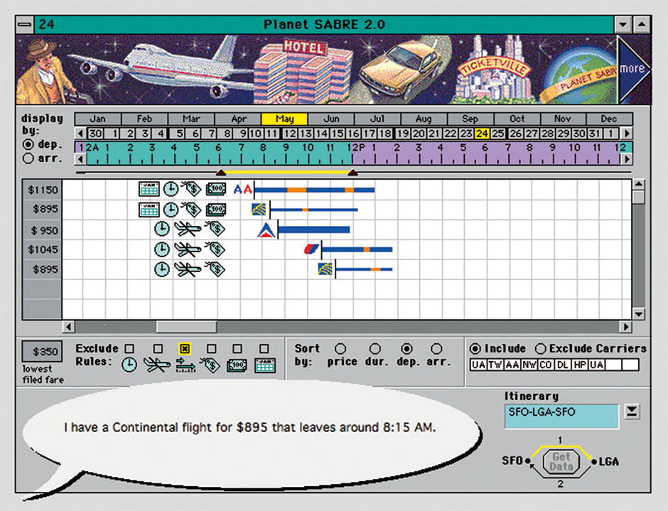
Figure 22.20: Frame from the initial Planet SABRE Golden Path mockup, 1995. L22.1: SABRE Golden Path final (pdf)
The Golden Path is ideally derived from DT research about what users and customers would find most valuable to be able to do with the hypothetical product – by definition, what makes the product unique and relevant – which means that the correlating mockup can be used to gather customer/user feedback in a focus group, or in solitary user tests with a moderator. The resulting written narrative is called a Usage Scenario, an example of a high-level use-case that combines several smaller use cases into a description of a user completing a task. The scenario adds real or hypothetical content to the golden path, such as the names of scenario participants, the subjects they are depicted to be working with, and their related data.
Although the fixed linear format prevents the user from truly interacting with and operating the mockup, a good test moderator can discover a lot by just giving the subject a task to accomplish, have them begin on the first mockup screen, and proceed to describe what they see and would try to do. The moderator can advance the mockup through the procedure, asking the same question at each screen and, when necessary, indicating to the subject when they elect to stray from the path prescribed by the mockup. While building an interactive prototype can allow multiple paths through the product, and can give more precise feedback about how users would interact with a fully interactive product, they are rarely worth their effort during early development stages. They are expensive to build, and, more importantly, to edit. The hidden values of the linear Golden Path mockup are that it is easy to change, can be built and operated without any coding skill, and can be run and presented by anyone, without instructions or training in where to click to make the desired demo event occur. Even for those audience members not engaged enough to operate a slideshow, the mockups can be screen-recorded with a voice-over and published as a video. This is how I made the LAVA videos already referenced.
Despite the urge to keep the Golden Path demo concise – ideally about a 15-20 minute walk-through – if there is not significant redesign necessary for the existing content, then the path demo can expand to include secondary use cases and demonstrations. These might show an extended set of features, or, in Design Stress Tests, describe how the design scales to cases of greater volume or complexity, a key part of the design mentality I call Critical Design. Critical design is having the attitude of always looking for what could break or go wrong with your design, as opposed to fully internalizing the also-important, but dangerous, persuasive attitude that one’s creation is appropriate and good. Working in the domain of endless use cases and system state combinations, as well as having to lead users through long and error-prone workflows, builds a discipline of skepticism that does not exist in simpler design arenas. As I discovered, it is in a way the antithesis mode to that of the confident designer trying to blow away stakeholders with slick demos that smooth over all the potential pitfalls.
Critical Design is necessary, but can backfire if it dilutes the main message of the Golden Path, provoking feedback like “jeez I thought this was supposed to be for beginners. This looks pretty complex”. Unfortunately, with LAVA we never had the luxury to maintain a slick public demo to seduce executives in parallel with the stress-test proof of concept demo I used to convince peer-level colleagues in product and engineering. We combined them, hoping that my audience, like me, would sense that if the solution could handle the extreme cases – think the Lattice with the Strip divided into quarters and containing Pace Bars and multiple Markers for Goal, Projection, etc. – then it could handle the cupcake cases as well.
With room for only one demo, we chose to show the most complex cases to prove to us and others that it would work, and as a reaction to serial feedback asking “can it do this?” or “how would you do that?”, typically from engineers who knew that eventually it would, in fact, need to do such things. We responded by inserting such cases into the Path, but they can also be put into other secondary scenarios and their associated mockups, which I call the Silver Scenarios. These can accumulate to any quantity needed, based on the complexity of the product, and it often makes sense to render them in a neutral low-fidelity form to speed up their creation, and immunize them from any ongoing project styling changes. These scenarios can often match nicely with a project’s Sprint Stories, although stories are a different entity than the usage scenarios. Sprint Stories define week- to month-long development team efforts, while usage scenarios define product usage patterns by end users.
The remainder of a product’s specification often occurs only in the form of written use cases, which I’ll call the Bronze Cases. These are not yet “edge cases” – odd tasks or occurrences made possible by the product but rarely encountered – but are not necessarily important enough to commit to a scenario-based mockup. The details of LAVA Point variations are a good example of non-scenario-based specs for this level of detail. So, based on the initial T-shaped mockup, the deep vertical Golden Path remains in place as the outward-facing product representation as it evolves with feedback and improvements, and the shallow horizontal scenarios and specs are gradually filled in, growing deeper until enough of the product is built so that the product itself becomes both the demo and the spec reference. At this point, often the original specs become obsolete and too expensive to update and maintain. Ongoing design work occurs in reaction to the product build, and is focused on relatively isolated upgrades and compromises.
22.0.6 Adobe Director
I’m often asked how I make my detailed animated usage scenario mockups. If software combines attributes of graphic design, architecture, machinery operations, and film, it is the film or cinematic aspect of events unfolding over time that is the most difficult aspect to simulate. Software is like a virtual, combination document/building/movie that you can run around in. The difference is that the movie or building you occupy is constantly moving and changing around you, and you yourself can affect these changes. Page layouts can be designed just as they are for print. Site maps, use cases, and UML diagrams can model capabilities and complex navigation landscapes and pathways. Focused usability tests can iron out the wrinkles of accurately filling out a page form. Each of these however, even when combined, fails to convey the essence or gestalt – the mental model – of a product as well as representing the experience of a person using it. The reason is that this representation of, literally, the product’s User Experience and its perception by other stakeholders, is typically what matters most to product success. A software product exists in the minds of its users as remembered experiences – a personal history of time-bound usage sessions, defined by a series of screen images and punctuated by typing, clicks, swipes, taps, and transactions.
All product usage, and life in general for that matter, is based on what has just happened and what can happen next. What makes this so critical as a design element in software is that our views of the product are never complete or definitive, and are constantly appearing and disappearing before our eyes. Representing the essence of these experiences with narrative screen mockups is the single most powerful and efficient way to represent software products during the design stage. This can be nothing more than a series of screens that, when flipped through click-by-click by the viewer, morphs into a crude animation showing how the product works and is used. They are a quick and effective way to simulate the critical aspect of context to the represented system state, be it a screen or state of a screen. While easy to perceive with a working product, seeing this early and often during a development project is crucial to understanding what is being built. Unfortunately, because they are tedious to author without the right tool, they are under-used. They can be made with slideware like Powerpoint or Keynote, in Visio, in niche sketching products like Omnigraffle, in authoring tools like Flash, or in more sophisticated prototyping tools like Balsamiq or Axure. My tool of choice, for this and almost all UX design tasks, has been Adobe Director. This has been an unending source of raised eyebrows, shaking heads, and snickers from fellow designers for over fifteen years.
The key with Director is that, although it became the dominant authoring platform of image-heavy multimedia content for non-networked playback, it is basically an animation tool, and thus ideally suited to making animated product representations. I use it in a way for which it was never really intended, and it’s the source of most of the product images in this book. Its closest relative is slideware, where you can draw or paste a software screen design into a slide, then duplicate the slide’s contents to the next screen, and proceed to edit the elements to show what the user has done and what on the screen has changed. This can continue until you have a short usage scenario mockup. One problem that develops is that every image on every slide is a unique object stored in the file. Not only do large sequences result in enormous file sizes, but editing or extending these monsters is a nightmare. If any word or image in the mockup needs to be changed, it needs to be changed manually on every slide in the deck. If an element needs to be moved on every screen, the element cannot be selected everywhere it resides in the deck; it also needs to be moved, manually, on every screen. This is a quagmire, and the reason that mockups done in this way have a short lifespan.
Adobe Photoshop and Flash can be used instead, the former being particularly good for layering images to achieve overlaps and transparency effects, and the latter for putting these images into motion. Photoshop however has no easy way to string images together into an animation. Flash has strong layering and animation capabilities, but no capability for creating or using bitmapped images, and its means of selecting items across screens is crude. Neither are good sketch tools. Adobe Illustrator offers incredibly precise drawing capability, but is overkill for the level of detail necessary in wireframes and mockups, and has no animation sequencing. Visio has drawing, sequencing, and an indexed library of single-instance elements, but is not available for OSX and does not enable elegant migration of content from wireframe to higher-fidelity forms. In the end, Photoshop is for image manipulation, Illustrator for drawing, Visio is for flowcharts, and Flash is Director’s descendent intended for design and production of small-footprint, internet-deployed vector graphic content. Director remains the ideal guerrilla tool for digital product design.
The killer capabilities of Director are its library of user-created and re-usable elements, and its pixel-perfect registration among screens. Building animated mockups in Director, with its potential for systematic re-use of items and assemblies, is akin to programming’s use of objects and classes, only in a purely visual way. Art and text are stored centrally and re-usable across screens, so that changing the source item changes its representation wherever it appears in the mockup. Sweeping changes to wording, colors, or artwork can be made once, automatically updating an item’s instance in every mockup screen. Similarly, you can select single or multiple screen elements, called Sprites, across the entire mockup for editing of their screen position. It’s equally adept at supporting quick sketches at the low fidelity level where screens are depicted as “boxes and arrows with words”, to higher-fidelity wireframes, to mid-fidelity renderings of flat design applications, all without changing tools. Because Director is at heart an animation tool, it revolves around the ability to move back and forth between screens , which simulates basic animation and transition effects. This tactic is also particularly effective for ad hoc A/B comparisons of alternate design variations during work sessions. This encourages the designer to simulate and consider product attributes that are not otherwise apparent in the absence of either working prototypes or initial working product builds.
Director’s linear organization of screens is also a convenient way to organize work in progress within a single file, as each frame in the animation serves as essentially a crude Illustrator/Photoshop file with simple layout and layering capability. This all comes together in Director’s matrixed directory called the Score, with columns representing each screen/frame and rows representing image layers. Director sequences can be output to PDF files, where they can be read anywhere and paged through just as with a slide deck.
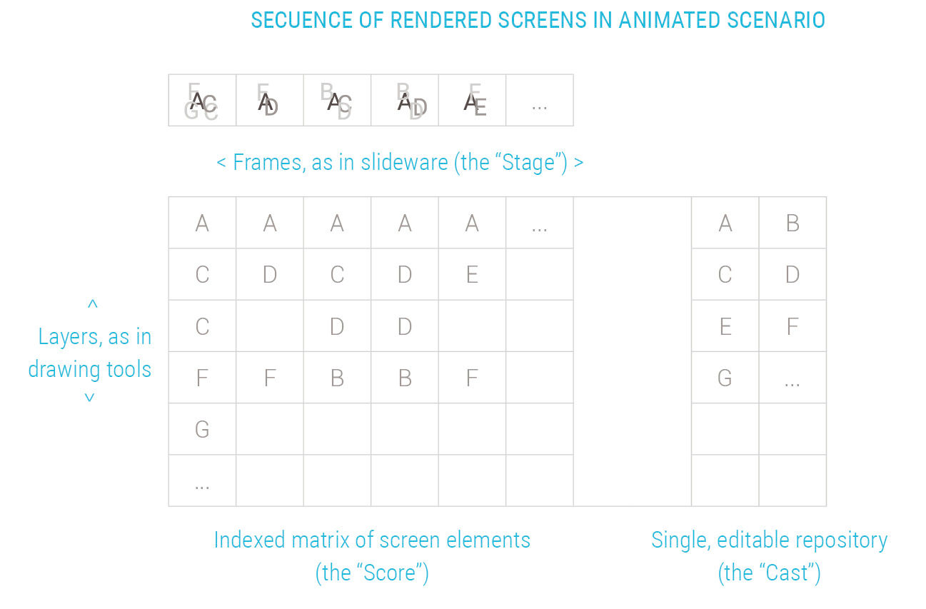
Figure 22.21: Adobe Director’s model for arranging indexed design elements like images and text onto multiple product representation screens.
Director has a unique combination of the best attributes of all the other tools, but in a simpler form that is both easier to use and perfectly adequate for low- to mid-fidelity representations of digital products. It combines the easy sketching and sequencing of slideware and sketchware, the layering of Flash and Photoshop, the drawing of Illustrator, and the indexed elements of Visio. When in need of images more sophisticated than are possible to make with Director’s simple bitmap editor, the designer can author them elsewhere and paste them in as indexed assets, just as with slideware. Director even maintains a link to the external media file, so that when selected from Director for editing, the asset opens in its native application for editing, and is saved in its native format as well as within Director.
Director has two big downsides. The first is its cost of approximately of $2000. The second is that, because almost nobody else uses it, the exchange of live working files among designers is often impossible. Whenever adopted by designers in my teams, however, they quickly see its benefits and thereafter use little else. On a deeply understaffed three-month consulting project in 2000, I needed to train an eight-person team of business analysts, graphic designers, and developers to serve as interaction designers. Facing a two-week timeframe until deliverables were needed for a client presentation, I initially suggested that they use Illustrator for their screen wireframes, but the learning curve was too steep and the teams were struggling. Once trained for several hours on Director, they became productive within several days. The speed at which Director enables early mockups, feedback, publicity, and decision-making typically more than offsets any needed re-working of file-specific design assets by others. Mockup sequences can also be compiled into a complete product spec linked to written use cases, as we did in the design of an internal tool at software consultancy EC Wise.
An entire spec can exist in a single Director file, using its convenient and single-source editing ability to minimize the chronic risk of specs being out of sync with evolving dev-stage product changes. This is not to say that Director is appropriate as a staple tool for casual, disposable composition purposes by non-designers – slideware and Omnigraffle are better suited to this for most people. My example was intended to show how easy Director is to learn as a single tool for both quick sketching and more focused and detailed design and production. There is no reason why a slimmed-down version of Director, lacking the many features irrelevant to its use for digital product prototyping, could be made available at a more affordable price and in a less-intimidating form.
The main point I want to make about creating mockups, and the one driving and enabling my use of mockup sequences, is the defining importance of the ability to draw, and to make product representations, as a design skill. A similar point has been made about graphic design practice – that designers who can draw are more valuable than those who cannot. Of course this skill is not binary, as there are degrees of drawing ability. If you are from a software engineering background, think of it as the ability to write code. While in the graphic design sense the reference is to the drawing of both finished, representational, illustrational images as well as the manual sketching of layouts and forms, for UX designers the skill is not so much about realistic life drawing as it is about the drawing of screen layouts and simple images. The skill and resourcefulness to quickly make convincing mockups, to represent and communicate a product user experience, is the most unique, and maybe the most valuable, skill to have for an interaction designer. Designers who rely too much on written use cases, free-standing screen designs, sophisticated interactive mockups, or slides full of diagrams and statements, risk having their intentions misunderstood, and/or of overlooking key issues related to product flow that are crystal clear in a mockup sequence.
22.0.7 Media Assets
L22.1: SABRE Golden Path initial (pdf)
https://www.interaction-design.org/literature/book/bringing-numbers-to-life/assets
This is the Golden Path mockup from work done for the SABRE Travel Information Network while at Aaron Marcus & Associates in 1995. It demonstrates the technique we invented to simulate the phone-based interaction of travel agent and customer in the booking process.
L22.2: SABRE Golden Path final (pdf)
https://www.interaction-design.org/literature/book/bringing-numbers-to-life/assets
This is final golden Path mockup of the SABRE Travel Information Network flight booking application.
22.0.8 References
22.1 | Software’s Chronic Crisis (web) | Scientific American | https://www.fceia.unr.edu.ar/asist/gibbs00.html
22.2 | Is Design Dead? (web) | | http://martinfowler.com/articles/designDead.html
22.3 | Are Agile Methods Good for Design? (web) | | Interactions |
http://interactions.acm.org/archive/view/january-february-2004/are-agile-methods-good-for-design1
