Nowhere is there warmth to be found
Among those afraid of losing their ground
- The Byrds, from Eight Miles High
My time spent in the role of Chief Expert was entirely different from that spent at BOBJ. Whereas with my previous team we were trying to gradually stabilize and build conformity, in the new group we were trying to provoke dramatic change in a short time, with the main effort being to create sweeping and convincing product concept demonstrations to inform and influence executive investment. As designers, we needed to steamroll doubts about minor design issues and edge cases, in favor of creating a larger narrative about strategy. Initially, especially given my boot camp in release-driven practicality at BOBJ, I was hesitant to make sweeping design proposals that I could not back up with DT confidence and evidence. The challenge was to focus on the big picture, and tell a convincing story focused on new product benefits, versus on design and implementation details.
We did however need to remain grounded in our assumptions of what was technically possible and practical in a reasonable timeframe. These were not science fiction flights of fantasy like Hugh Dubberly’s Knowledge Navigator done for Apple and later Starfire from Bruce Tognazzini while at Sun Microsystems – both of which are brilliant. We had some short-term credibility to maintain. There were no hidden, exotic “black box” technical assumptions – often referred to as “unobtainium” – unless you consider as a black box the organizational and political will of a large organization to execute on such a level, which is entirely valid. Given the example of Apple’s approach to design, revealed in higher fidelity in Ian Parker’s 2015 New Yorker story Jonathan Ive and the Future of Apple, the need to produce such visions almost serves as proof that they are unproducable by the host organization. At the very least, their existence and public display demonstrate the presence of powerful internal skepticism or outright hostility. That being said, I enjoyed a healthy and refreshing exercise of suspended disbelief, engaging in old-fashioned seduction in the effort of motivating sponsors to invest.
Joseph Conrad’s novel Heart of Darkness – where main character Philip Marlowe pilots a boat up river into the deep jungle of the 19th-century African ivory trade — is interpreted as a metaphor of the journey into the human soul. Marlowe discovers that the further he proceeds, the more primitive and brutal the surroundings become. In Francis Ford Coppola’s film adaptation Apocalypse Now, set in the Vietnam war, Marlowe’s role becomes that of Benjamin Willard (played by Martin Sheen) sent to assassinate rogue Colonel Walter E. Kurtz (Marlon Brando). Frustrated with the politics and hypocrisy of the Army’s command structure, Kurtz had abandoned his management career path to become a special forces commander, and then disappeared into the jungle with a band of fanatical volunteer fighters. Operating without orders from the army central command, using their own brutal commando tactics they quickly achieved dramatic combat results, to the dismay of the generals trying to fight a more respectable, “civilized” war. The documentary on the making of the film – Hearts of Darkness: A Filmmaker’s Apocalypse – is itself a frightening account of the obstacles overcome by Coppola to get his film made. The next time you find yourself facing adversity getting a project done, watching that will make you will feel better.
As I started my quest to reform visual analytics at SAP, I played the role of Willard, but seeking to find and terminate instances and causes of poor practice rather than a particular person. (Regardless, a few individuals reacted as if I was specifically out to get THEM). At some point I turned into Colonel Kurtz, the one being hunted. To achieve the required results, I and my band of volunteer followers and collaborators, spread throughout the company at multiple levels, locations, and functional organizations, were forced to go against our tendencies of method, protocol, attitude, and design approach. The deeper I went into the company to find where the decisions were made, the stranger it all became. It came to resemble the Peoplesoft design case at the organizational level.
In his book Making Things Happen, Scott Berkun touches on the role of politics in software projects, and how project participants typically refer to “politics” as sort of an unnecessary, evil, cancerous force. He in fact argues that political forces should be treated rationally, as real design constraints like any other, despite their being particularly unpredictable and fraught with emotion. As with any other constraint, however, this one can quickly put you into an untenable position.
The jungle changes you. You need to adapt your methods to the situation at hand. In this case, lesson 1 was that when a product presentation demo is required to gain support, it presents a much different problem than that of designing the product itself. The Demo serves many purposes, but its main one is to secure commitment from sponsors. It’s a necessary dance of well-intended seduction and magicianship to protect the stakeholders from themselves. For a demo to work to maximum effect, its designer cannot obsess about details and adherence to design best practices. These can all be dealt with at a later time, once the main point of the demo has been accurately conveyed.
This can cause stress and doubt for designers if they are forced to use designs that are inconsistent, unoptimized, or unsustainable for a long-term product design. Again, the designer needs to rely on their experience to know what parts of the demo can be forgotten, glossed over, and fixed later on in service to the overall message. For concept car designs, certain product aspects need to be featured or even exaggerated in their impact and effect, in effect intentionally over-shooting what will likely be possible to achieve if the concept is productized. The art involved in this effort is to overshoot by just the right amount so as to be inspirational without being misleading. While this is a healthy approach for design at all levels of scope, the further one moves into production phases, the more conservative and comprehensive the approach needs to be. This approach is not without risk, as it exposes your work to nitpickers who, with various reasons and intents, can derail the train. I worked for someone long ago who would, during key presentations to visiting clients, inscrutably interrupt to mention typos in our own slides.
Visionary concept car work can be criticized for wasting resources on frivolous and speculative junkets that only serve to create false expectations. If the work is never implemented in revenue-generating products, this conclusion is easy to arrive at. It can also be seen as a useless distraction, fueling doubt or even despair about initiatives already underway. However, even vision work that is not implemented exactly as shown, or that is used to define a strategy that is not adopted, still has value to the sponsoring organization as an example of something that they COULD pursue. This intellectual property, whether or not it is ever made public, provides valuable knowledge to the sponsor organization, even if just as a contrast to the status quo or other alternatives it is considering. It can also reveal potential threats in the form of what competitors or unknown disruptors might already be working on, or attempt in the future. These third parties likely employ similar designers, tools, methods, and market intelligence to that of your organization, and are likely to eventually discover these opportunities if they in fact exist. As with the results of using white-hat hackers to test your system security, it’s better to be aware of what black-hat designers might attempt.
The creation of any vision-level practice is rarely definitive or clean. The pattern I’ve seen in product development is one where a company starts out by making an innovative product, but when the product is successful and needs incremental improvements and refinements, the innovative side of development is sidelined as the team gets bogged down in more immediate matters. The visionary employees get frustrated, and convince management to let them split off into a separate, research-oriented innovation team to envision the next generation of product. Because often these employees are the most senior and/or talented contributors, management agrees out of fear that the employees will otherwise quit. These elite teams go about inventing all the innovative new stuff they were distracted from doing in the production teams, and naturally get lots of attention from management. Desperate to keep the attention of customers and investors, management publicizes this work to distract others from the inevitable delays and mundane details of building robust functioning software. Meanwhile, the production teams begin to resent the innovation team for getting all the attention and making them look slow and old-fashioned. Production is pressured to simply make the current software work, as well as try to push the newer “Not Invented Here” ideas into the product, amidst the inherent jealousies involved with the perceived lack of deadline pressure, and relaxed ivory tower work environment on the other side. Plus, at this point they are often suffering from having had the most talented resources plucked from their teams. They grow skeptical and resistant to validate the research work and thus over-estimate – or “sandbag” – the innovation proposals, and begin shadow work on innovative ideas of their own.
The innovation team begins to resent the production teams because none of their new ideas are getting implemented. The marketing team gets restless having to maintain interest from customers, and creates their own demo team, using smoke-and-mirror tactics to wrestle the current product into customized, but superficial and unsustainable, showcase examples. Concurrently, a consulting arm is created in the sales and sales support organization – referred to as “the Field” - working with large customers to customize the base product to address real but specialized needs. This often results in the creation of unsustainable hacks, which are then fed back to the production team in an endless stream of unprioritized enhancement requests. Large customers, having created these pet features, lobby and pay for their ongoing upgrades and support, further bogging down the now-bloated product.
Work in all groups proceeds, each making valid progress, but with different incentives and contributing to a confusing soup of hype, reality, and expectation. The Field thinks it knows what customers really want because they talk to them every day. Marketing is in a perception arms race against competitors. Research writes off both as profiteers and superficial attention whores. Production stops listening as they try to meet their development sprints and release milestones. Third-party consultants, partners, and software vendors orbit the mass, filling in any cracks or missing pieces with advise, toolkits, product bundles, extensions, and component plug-ins. Meanwhile, academics and industry analysts berate the entire affair from the sidelines and, for a fee, try to make sense of it all for external stakeholders at large. Eventually even corporate branding gets involved, wondering whether the product is underutilized as a customer touchpoint for brand identity and awareness. When talent availability or trust dwindles far enough, management hires mercenary design consultants that threaten and shame the horde into submission.
This is, more or less, the overall reality of enterprise software product management. I’ve given it a cynical feel here for dramatic effect. But, as with anything else, the dynamic can be managed and executed well or poorly. Although I worked with these and other organizational entities while at SAP to shape LAVA, the relationship I’ll focus on here is that between research/innovation and development/production. There is a whole other dilemma about where UX teams, or any other specialized discipline, should reside within development organizations — being centralized or distributed — which I won’t go into here, although a similar dynamic exists there as well. The entire menu of options and rationale for organizing multi-disciplinary product development teams, from flat to in full silos, is well depicted in Ulrich and Eppinger’s book Product Design and Development.
While I think the division into research and execution is valid and can work, one issue in particular needs to be given special management attention. Given that innovation is necessary for a product to evolve and remain relevant, the alternative is to keep the visionary function within the production group. This creates different problems however. The necessary independence and focus of such a group can be compromised by having them dragged into production roles in times of duress, and their ambitions can be compromised or censored to align with the interests and abilities of the production group, along the lines of the Innovator’s Dilemma.
Both models can work. The trick is to 1) coordinate and set expectations for these different roles with different scopes, timeframes, and risk factors, and 2) avoid the tendency to value and reward big-picture innovation at the expense of those working in the trenches. Design Thinking and Lean can help with these efforts.
This poem from a 13th century Zen master represents, to me, the presence in life of a fractal recursiveness – the recurring presence of similar organizational patterns in systems of any scale.
Enlightenment is like the moon reflected on the water.
The moon does not get wet, nor is the water broken.
Although its light is wide and great,
The moon is reflected even in a puddle an inch wide.
The whole moon and the entire sky
Are reflected in one dewdrop on the grass.
Dogen
I use it as an inspiration to maintain the habit of practicing DT not only for large projects but for small ones as well, yet applied at appropriate levels so as to not over-analyze things. My graduate thesis demonstrated how although DT makes obvious sense in tackling large, complex, risky problems, it’s also perfectly applicable to smaller problem-solving efforts, even solitary efforts conducted in one’s work and life. Note that at the time, DT as we know it today resided in a vague collection of content referred to as Design Methods. While at the time DT typically referenced larger-scale case studies from architecture, urban planning, and business strategy, I wanted to see what it was like to use them on a micro-level, to sort of force DT into a subconscious habit. The persistence described in the Peoplesoft Gantt chart project is an example of this approach.
My passion as a designer was to, as Pirsig wrote about, draw upon both art and science to make stuff look and work better. One inspiration was the artist Christo. His conceptual art pieces, like 1985’s wrapping of Paris’ Pont Neuf bridge in golden fabric, and 2005’s The Gates in Manhattan’s Central Park, typically begin as whimsical flights of creative fancy, but require years of rigorous planning, permitting, environmental and safety studies, and fund raising. Although contravertial, his 1976’s Running Fence was brilliant for being outrageously whimsical, seemingly wasteful, but ultimately sublime, while at the same time being a masterpiece of fundraising, lobbying, planning, and fabrication. While designers engage in the delivery of more practical utilitarian value, Running Fence answered a perceived plea for an expression of indulgent, transient, majestic beauty. One role of the artist in society is to serve as a cultural antenna, sensing these pleas and divulging them as artistic expression.

Figure 21.1: Running Fence, Marin County, CA, 1976.
Copyright: Jeanne-Claude / SAAM. All rights reserved.
In my thesis, the demonstration vehicle was a project consisting of a simple poster/brochure combination advertising a hypothetical design process conference. The conference presented a 7-step structured design process, chosen from among those I had discovered in my research. When designing the sample pieces, I myself followed the same process, and documented all of my work towards the final design solution, which included steps of Problem Acceptance, Problem Research, Problem Definition, Solution Ideation, Solution Selection, Solution Implementation, and Solution Evaluation. Put simply, my process was to pick a problem, define a number of requirements for a solution, design alternative solutions, chose one, finish it, and test it with people to measure it’s success. Although the steps appear in order as with what is known as a “waterfall” process, of course there is always looping and cycling and iteration involved, creating a number of small waterfalls within the big waterfall. My intent was not to develop a better process, but rather to demonstrate a way to improve the practice of the chosen process. I was being egged on from the grave by none other than American poet Edgar Allen Poe.
If there is doubt that a top-down, rigorous, a-priori approach cannot produce dramatic creative outputs, read Poe’s The Philosophy of Composition, a short essay about how he went about writing The Raven, perhaps the most famous poem in American literature. While he wrote the essay after the fact, and is accused of using hindsight to reverse-engineer his thought process to suit his contention, it is nonetheless an amazing description of the rational hows and whys behind a creative masterpiecee.
Poe dismissed the notion of artistic intuition and argued that writing is methodical and analytical, not spontaneous. He writes that no other author has yet admitted this because most writers would “positively shudder at letting the public take a peep behind the scenes... at the fully matured fancies discarded in despair... at the cautious selections and rejections”. He set rules and guidelines for himself that guided his options.
Wikipedia
Some of his higher-level rules for The Raven:
- Choose a single definitive intended emotional effect up front. In this case – and if you know Poe it is typical – the emotion of pain and sorrow.
- Set in verse at a maximum of one hundred lines so as to be read at one sitting for maximum effect.
- Have the subject be the death of a beloved partner, the saddest thing imaginable
- Have an agent of ominous reputation – a raven – appear almost at random and to persistently and unknowingly taunt him.
It goes on and on into more detail. The set of up-front requirements cascade hierarchically into greater detail, such as how the bird’s repeated word “nevermore” encapsulates death, has such a sinister and hollow sound, and how the emotionless and mocking rhyme and meter of its delivery contribute to the desired effect. At the very least it is a fine piece of academic self-criticism – or in this case, self-affirmation.
In my much more modest project, the requirements were based on successful communication of not only the practical content about the conference – dates, location, subject – but more importantly the subjective semantic message related to the form of this content – its style, imagery, colors, etc. What did the printed artifacts cause the observer to think and feel? Does the conference look fun? Challenging? Mysterious? Expensive? Anyone having worked in advertising or branding will recognize the exercise. I compared their responses to the initial requirements, which were conveniently specified in such terms – and then evaluated how the artifact performed. Expending such effort on a real project, involving ephemeral printed materials of such limited impact, of course makes little practical sense, and that was exactly the point. The subject matter and scope was not important. I just chose something of modest scope to keep the focus on the process.
The thesis could have ended there, but what I did was to push DT into even greater detail. I forced myself to execute this full design lifecycle within an impossibly tight timeframe, and then re-worked the project using only the later process stages in the process – the Ideation, Selection, Implementation and Evaluation steps – through two more iterations, each time refining, testing, and documenting the design. Part of the intent was as therapy for me and my process – to force me to forget about analysis and focus on making the form. Predictably, the solution for each iteration became a better match to the project requirements, and served as a vehicle for me to focus on ever-more detailed issues of semantics and craftsmanship, using the rigor of a formal process. The outcome was not to recommend that we over-analyze simple graphic design projects, or string out the process with iterative re-workings. It was rather to demonstrate what such an effort would look and feel like, and to discuss what I had learned and would recommend to others.
On the following page are some of the final poster and booklet designs. Some of the concepts that the artifacts intent to convey are those of designing, turning, growing, layering, and self-reflection, in a group setting.
DT provides a forgiving, iterative structure that engages multiple disciplines and stakeholders in defining comprehensive, relevant solutions that are adaptive to their context. A major aspect of Lean is the iterative breaking down of long projects into small, well-defined sprints with clear goals, frequent and transparent communication, and the ability to learn and adjust based on completed work and the changing context. The subject matter, language, and forms of each have unique properties and considerations, but the underlying process is similar, and each cannot survive without the other. Recognizing that, in reality, crafting a DHTML animation can be discussed in the same terms as designing a product vision, allows those of us those working at different scales to better understand and respect each other’s work, as well as to enable easier migration among roles in the different scales. Achieving such a result was in fact the goal of SAP’s Design Services Team, and their subsequent Design Thinking training and process regimen.
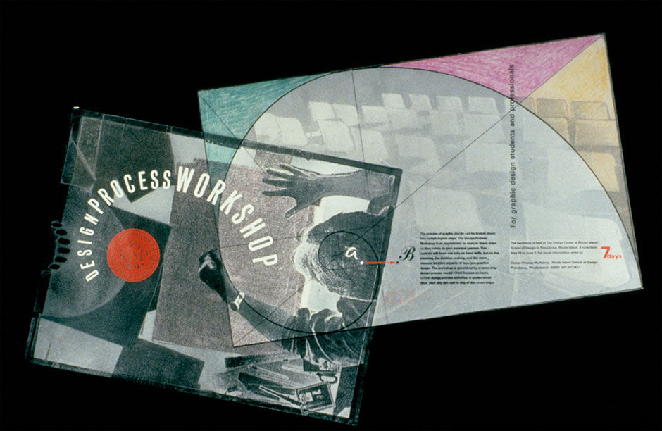
Figure 21.2: Final poster mockup from RISD thesis. Die-cut on translucent vellum paper. Photographed on a black background.
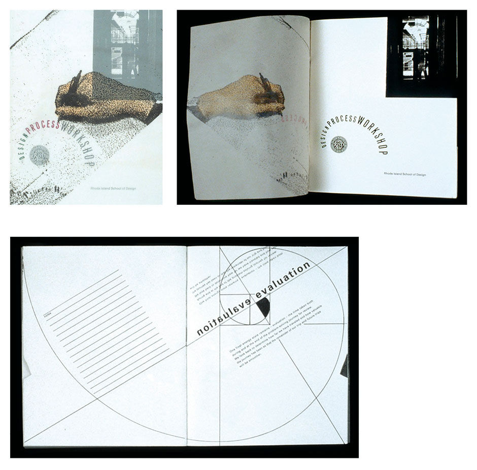
Figure 21.3: Final booklet mockup from RISD thesis.
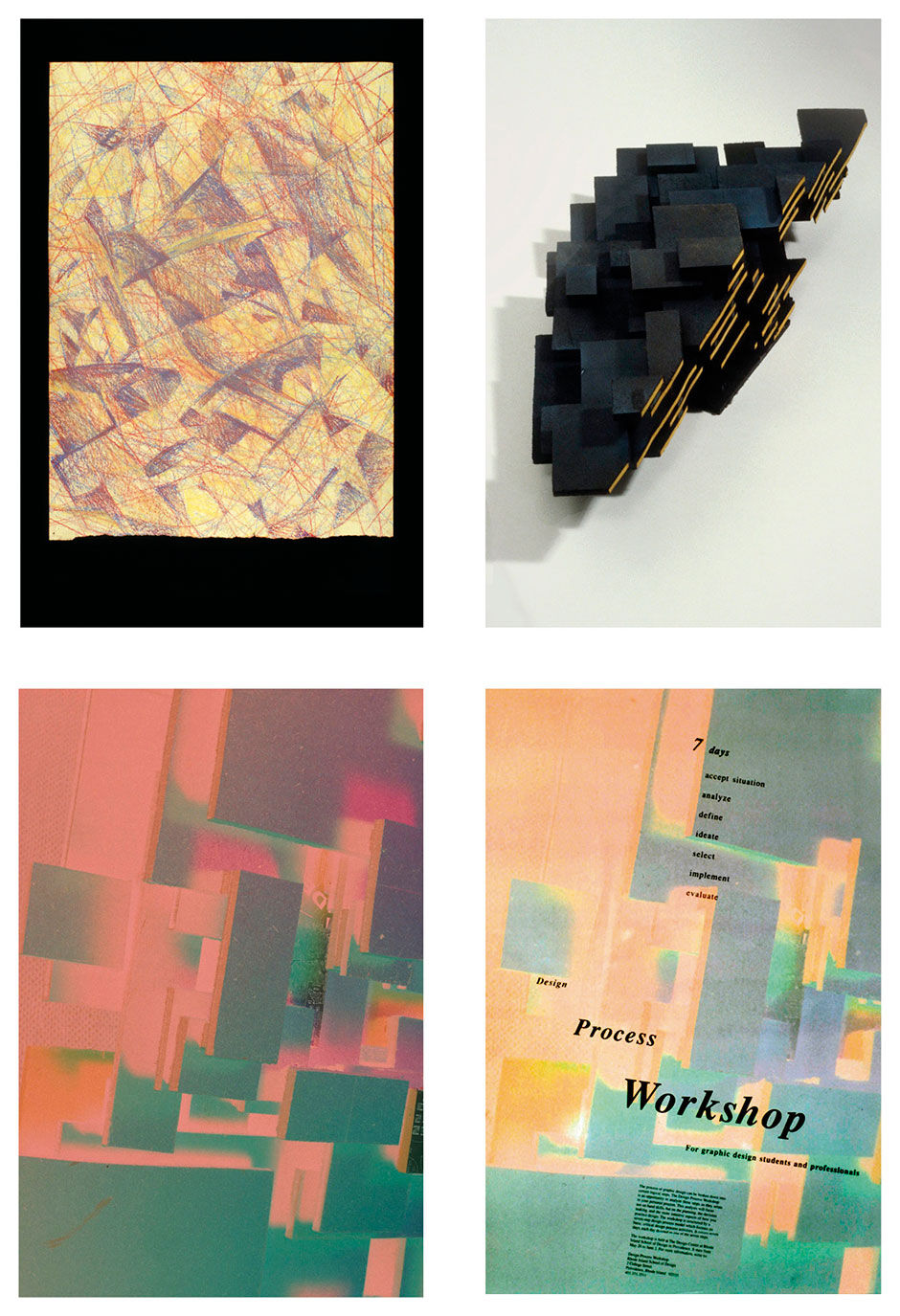
Figure 21.4: Alternative poster design drawing, sculpture, negative, and mockup from RISD thesis.
While my approach to explicit process structure — exhibited by rigorous commitment to writing explicit goals, enforcing a step-by-step process, and seeking audience validation — was proving itself out to be measurable and valid, other experiences of randomness – the Spontaneity in the thesis title – were becoming too strong to ignore. While DT and Lean seek primarily to add structure, predictability, and repeatability to development, while at the same time encouraging innovation, innovation cannot be completely managed. Unwarranted chaos and freedom has a way of surprising us. As much as DT seeks to contain lightning in a bottle, shit happens, and can be beneficial. The risk of DT is that it can lull us into complacency by turning serendipity into a checkbox. While boxing the flow of ideas into carefully orchestrated brainstorming sessions serves to cathartically divulge ideas, and thus help focus the team on their execution, the spigot of innovation should never be fully turned off.
In a class concurrent with, but independent from, the highly regimented work leading to my thesis, I had done drawing, sculpture, and photographic studies resulting in a particular abstract image that I felt, in a vague and emotional way, conveyed the requisite workshop semantics as well as or better than some of my strict process-based, and more semantically literal, solutions. My conclusion was that there is a place for spontaneity within highly structured processes, even outside of where such results are already prescribed by a process (such as in brainstorming) and that big ideas of spontaneous origin need not be carried out in spontaneous ways to be successful. Process discipline, even if it explicitly encourages periods of indiscipline, should not serve as an excuse to exclude better ideas that seem to come from nowhere.
21.0.1 References
21.1 | Heart of Darkness (book) | | Dover Publications
21.2 | Knowledge Navigator (video) |
21.3 | Starfire (video) |
21.4 | Hearts of Darkness: A Filmmaker’s Apocalypse (film) | Paramount Pictures
21.5 | Product Design and Development (book) | | McGraw-Hill Education
21.6 | The Philosophy of Composition (web) | | http://www.eapoe.org/works/essays/philcomp.htm
21.7 | From User Interface to Über-interface: A Design Discipline Model for Digital Products (web) | | Interactions
http://dl.acm.org/citation.cfm?id=769759.769770&col-l=DL&dl=GUIDE&CFID=544958762&CFTOKEN=21476886
21.8 | Planning and Spontaneity in the Design Process (document) | John Armitage | Rhode Island School of Design
