If you have an innovative idea for something, just do it. Don’t wait around for permission.
- Steve Lucas, EVP & GM, SAP Analytics
To follow up on my promise to show how visual analytics can become a greater part of everyday life, I wrap up with seven recent designs done specifically for the book. My goal here is to show the applicability of some LAVA principles to other use cases, involving recreation, scientific analysis, water usage, timekeeping, sports, vital sign monitoring, and terror.
23.0.1 Recreation
This is a redesign of the iWindsurf wind and water conditions report that I mentioned in chapter 1. Again, while you may not be interested in windsurfing, I needed to choose a subject with which to render and demonstrate this set of visual analytic best practices and ideas. Because the design features are a direct response to their context, showing the designs without their precise context would amount to product pornography. Windsurfing is a good subject because I know it so well, and it also involves such a broad spectrum of factors – environmental sensors, predictive, geo-positioning, consumer use cases, social dynamics – from the emerging visual analytic space. It’s also a topic likely to hold your interest better than some dry business use case. Regardless, I think that the ideas manifested in the redesign are relevant to other analytic cases involving similar factors of goal-driven data interaction in time and space. It’s also indicative of the trend towards personal physical metrics and recorded self-expression.
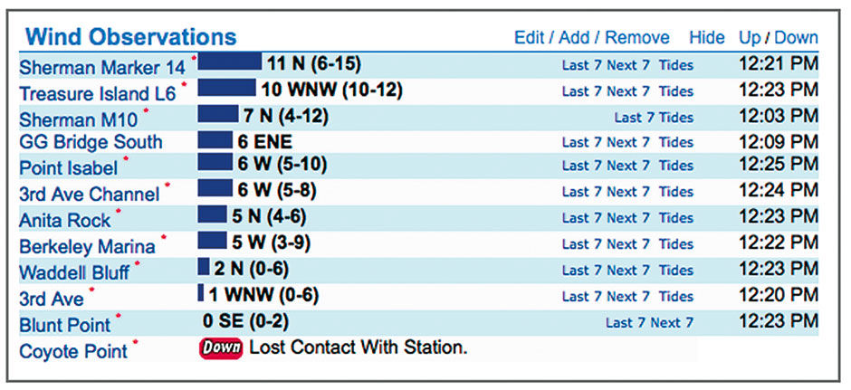
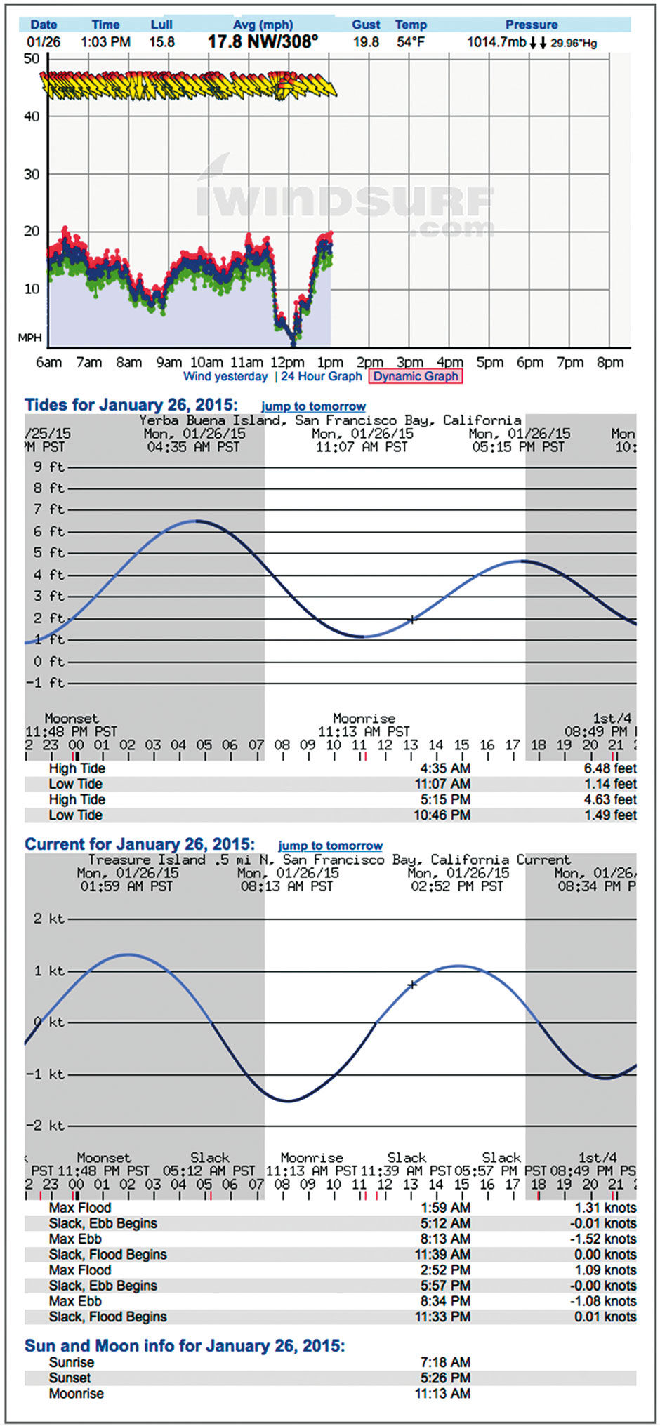
I used data from the actual day in 2014 when the Pipe Jumpers were out, and Tom shot his Ferry-chase video. I present it within a tablet-size screen space. Figures 23.1 to 23.3 show the design from the current site. It shows time left to right, with wind direction arrows at top, then Average, Gust, and Lull wind speeds below that, followed by the highly accurate tide height and current level forecasts. These are stacked within a scrolling browser window or smartphone screen. Again, the main task is to see current conditions, and to predict where and when to sail later in the day. Wind forecasts are provided in various other forms, including one that superimposes the forecast as a colored band on the wind chart.
 Author/Copyright holder: Weatherflow, Inc, www.iwindsurf.com. Copyright terms and licence: All rights reserved.
Figure 23.1: The current conditions report design, iWindsurf.com The personalized, multi-site overview.
 Author/Copyright holder: Weatherflow, Inc, www.iwindsurf.com. Copyright terms and licence: All rights reserved.
Figure 23.2: The current view of a single sensor site, in its extended, scrollable format. iWindsurf.com
 Author/Copyright holder: Weatherflow, Inc, www.iwindsurf.com. Copyright terms and licence: All rights reserved.
Figure 23.3: Iwindsurf.com wind forecast.
In the redesign, the overview presents a Lattice Layer of my favorite sailing sites. The Strip display is a time-based heatmap, sliced into hour-long segments showing the current day. The green vertical line indicates the current time, and the shaded areas at left and right indicate sunrise and sunset. Each row shows the current conditions for the site, using text and Anaji. Reading right to left, Blunt Point has wind 7-12 mph and averaging 10. It’s speed has increased over the past 15 minutes (the incline icon) and is out of the West. These readings were taken at 12:22 PM, and the current is just beginning to flood (come into the bay) as indicated by the dimmed pyramid bar chart. The Anita Rock site, where tide shifts happen first, is almost two hours into it’s flood cycle (the first bar is filled in). The current at Blunt point is flooding but at a negligible rate of 0 knots, and the tide level is three feet over baseline. Drive time to the site from my current location is 25 minutes.
The heatmap strips indicate general, or normalized, condition quality, either as a forecast or a recording. A good Bay Area sailing forecast requires, in rough order of importance: 1) daylight, 2) strong, steady wind, 3) short drive time to site, 4) ebbing tidal currents, 5) favorable wind direction, 6) friends to sail with, and 7) higher tide levels. As a user, I can rank the relative importance of these variables into a personalized performance model. This model will normalize my variables to tell me where the best conditions are likely to be, and having filled the model with historical data, will also tell me where the best conditions actually occurred on a given day. The stronger the red coloring, the better the conditions. For example, my favorite site of Treasure Island L6 is forecast to have good conditions between 5-6 pm. This result comes from my having scored wind speed and driving time as my most important factors. Waddell Bluff might have a stronger wind forecast, but not enough to negate it’s potential 2-hour drive time.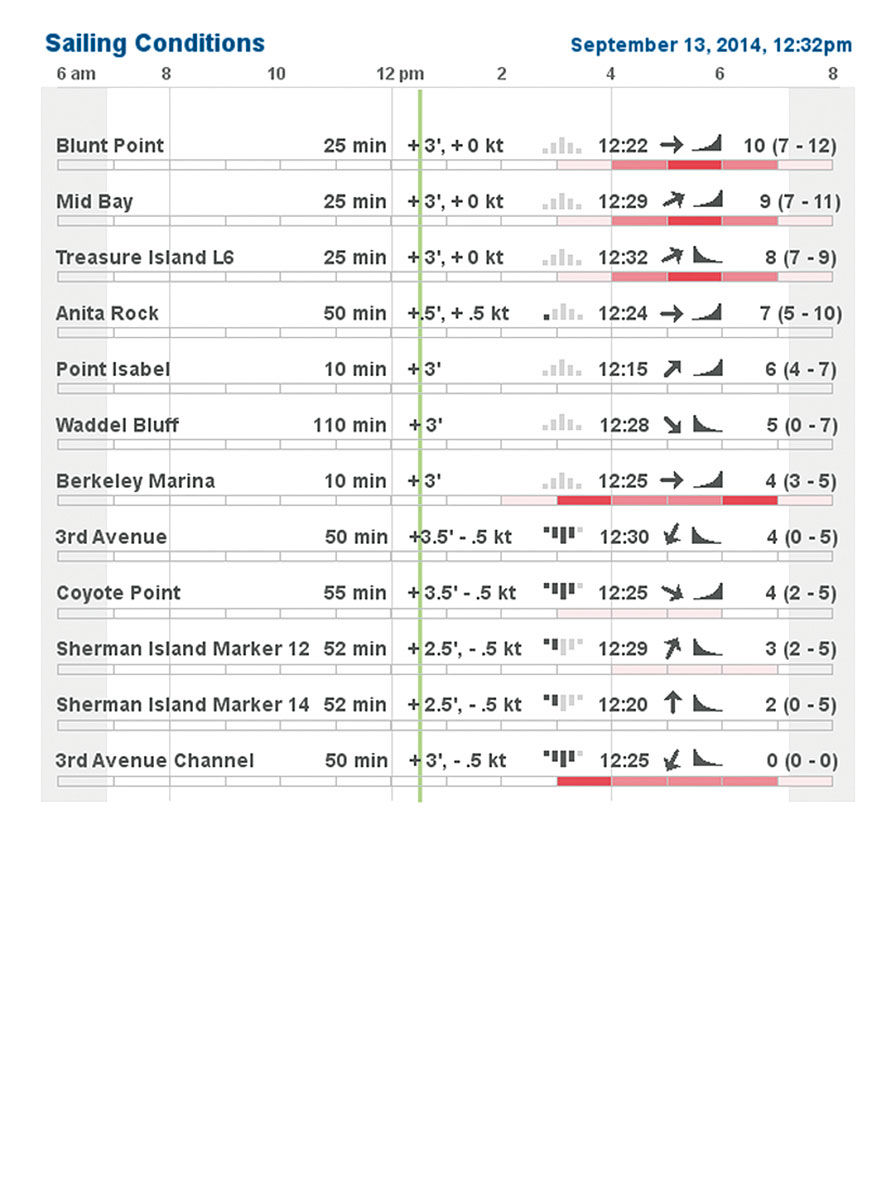 Figure Figure 23.4: The overview display of multiple sites.
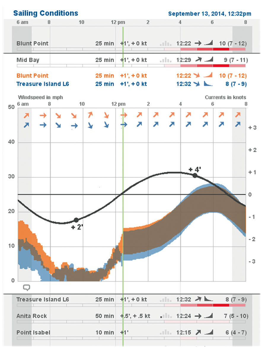
Figure 23.5: Redesign: Unfolded view of Mid-Bay conditions and forecast.
The conditions scale is a hybrid binary and continuous indicator. That is to say, it does not indicate conditions on a continuum from terrible to awesome. Rather, it has a threshold built in. For me, windsurfing is pointless at wind speeds below 18mph – I wouldn’t windsurf in my front yard in those conditions. Many windsurfers, including me, are bitterly jealous of kitesurfers who enjoy a much lower wind threshold. So, the red condition setting only kicks to life when conditions reach this threshold – otherwise, the heatmap strip remains blank so as to limit distraction. Once it depicts relevant conditions, it shifts to a continuum model, where better conditions result in redder displays. Going back to the site selection dilemma from chapter 1, this simple red display tells me where the best conditions are likely to be.
Of course, I can drill down into every row to see a 2D display of wind speed and direction. This view is similar to what you can find on local weather conditions at Wundergound.com, although modified for the micro-focus of the sailing use case, and overlaid measures for better small screen display. These simplify the original three lines showing gust/lull/average into a range – essentially filling in the space between the gust and lull lines to present a “visual average wind speed”. The average wind speed is still provided in numerical form – what is more important for sailors is to see the spread, or the difference between high and low. Here, smaller variance – a thinner colored band top to bottom – is better, as it indicates steadier wind. Wind directional arrows display at fewer intervals to improve clarity.
I also layered the forecast and tide data onto the Actuals wind chart. This shows how the actuals match up with the forecast, with the metaphor of the green time indicator sweeping across the day, erasing the forecast as it goes, and replacing it with historical fact. The tidal forecasts are so accurate that they need no distinction between forecast and actual. Because currents are more important than tide level, the Current Strength sine curve is used, with high and low tides indicate by markers and numeric indictors on the curve (high of + 4 feet, low of +2 feet). These points are always a bit offset in time from the ebb/flow current maximums. The scale for Current Strength is at the right.
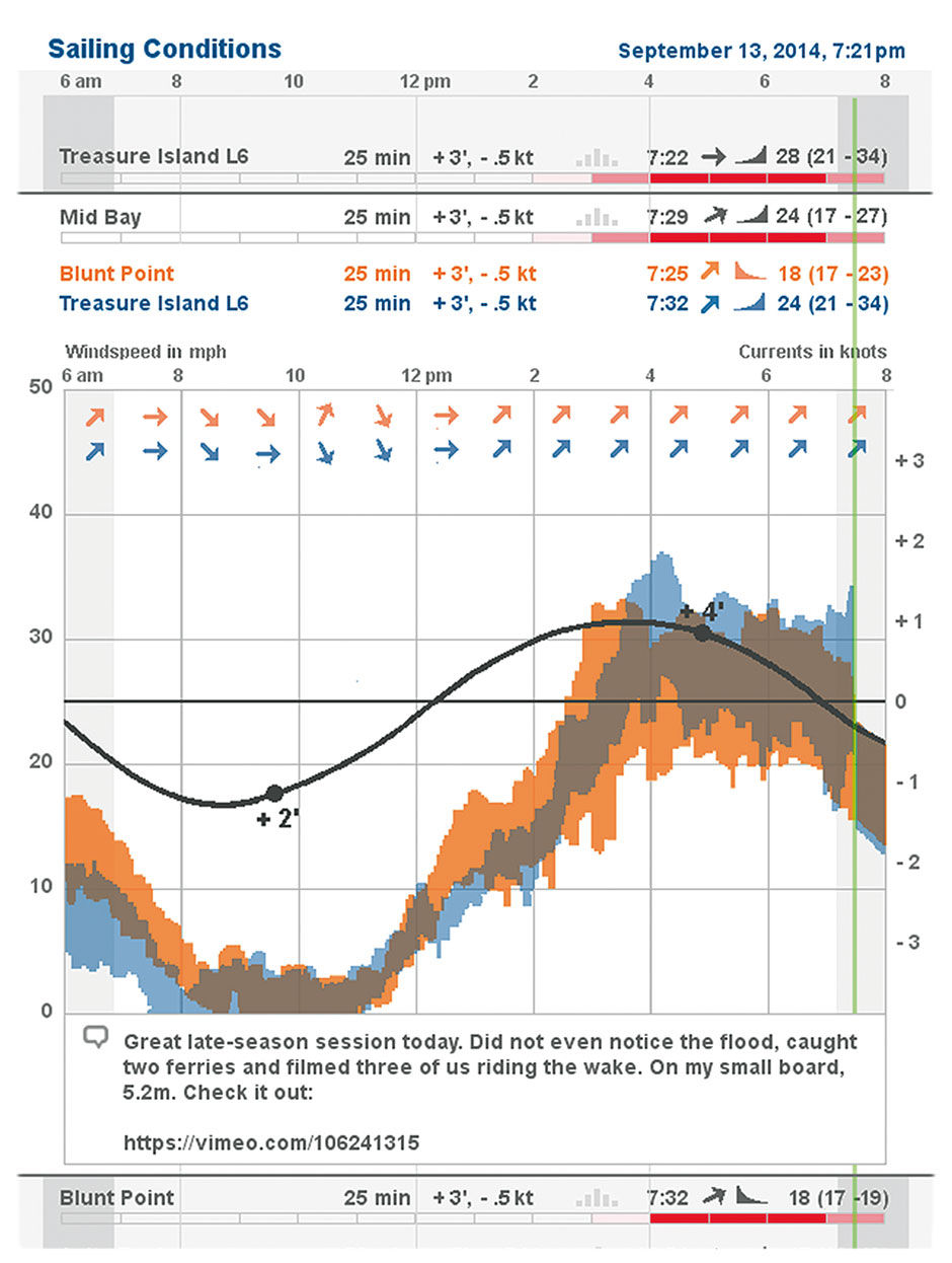
Figure 23.6: The Same Day’s data shown 7 hours later, with comments.
Finally, the design enables the creation of hybrid sites combining multiple wind sensors. When we sail the Mid Bay, we launch near a sensor at Treasure Island – nestled romantically between a wastewater treatment facility and a radioactive waste dump – and sail the waters directly to the north and west. The sensor across the Bay on Angel island tells us the wind speed there, and the combination of the two give us a sense of the wind speed in the middle. Iwindsurf, or myself via personalization, can combine these two sensor displays into one. Where the blue/orange site wind speeds overlap, forming a gray, indicates the wind speed in the Mid Bay.
After a sailing session, it’s fun to go back and see the data recordings of not only the site where you sailed, and also the other sites where you might have gone. This feedback loop enables you to make better choices in the future, as well as to recount and share your experience with the online community. In this view, we see the whole day’s data, and can post comments containing anecdotes, photos, etc. The day’s results, shown in Figure 23.6, represent many of the merits of Minard’s Napoleon Russian Campaign diagram – such as the matrixed cross-indexing of temperature and troop strength, only in a more constrained, robust and repeatable format.
In a practice that is common in skiing and other outdoor pursuits, some windsurfers wear waterproof GPS devices, or simply GPS-enabled smartphones in a sealed bag, when sailing on the water. The devise draws their path on a map.
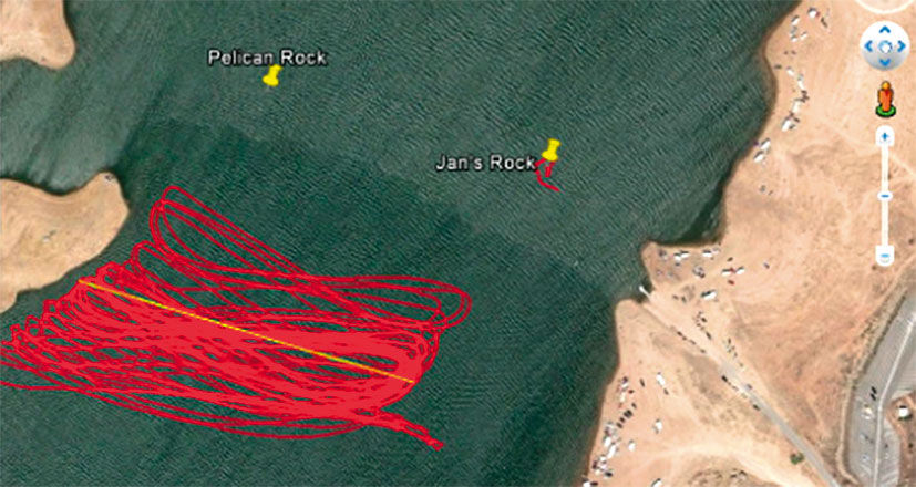
Figure 23.7: GPS tracking of a windsurfing session.
Here’s an example of the resulting patterns: It’s easy for me to imagine a near-future scenario where the Pipe Jumpers all wear Google Glass-like augmented reality goggles, with real-time condition reports shown in a heads-up display while on the water, and/or a waterproof smartwatch with a LAVA Point display. The session video would be recorded and later synchronized to the conditions display and a GPS path recording. We could concurrently replay the three synchronized displays, and snap to any point in the sequence playback by dragging the green indicator line, playback head, or arrow. While the cost and hassle of all this certainly makes it a distant reality, its use for broadcasts and training material for professional athletes in more mainstream activities is more realistic. Broadcasts of the America’s Cup races already feature similar techniques. SAP has produced similar real-time monitoring dashboards for its sponsored sailing competitions, and in a much more elaborate demo mode for tracking live Formula One car performance data during a race.
It should be easy to imagine how these solutions could be applied to other more essential decision-heavy activities that unfold across time and space and rely upon real-time data streams.
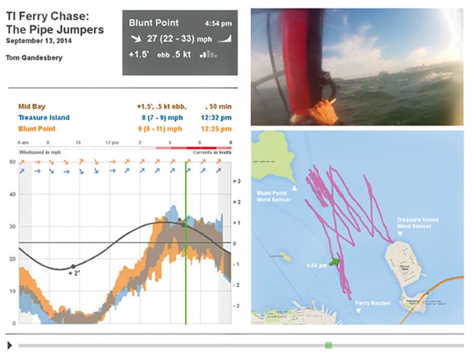
Figure 23.8: Heads-up goggle display of conditions, with head-mounted camera video recording, synchronized to conditions and GPS playback. If you look closely you can see the Bay Ferry routes depicted in the map.
23.0.2 Science
This example from a science use case converts a powerful parallel coordinates display into a Lattice form that is more accessible, powerful, and beautiful. Figure 23.9 is the original chart, showing petal and sepal measurements of a sample of three species of iris flowers, rendered in a chart form known as “parallel coordinates”. Each line represents an individual flower, and each color a species. The display is good for spotting patterns; for example, compared to the other species, Setosa samples have consistently small Petal lengths, but wide and varying Sepal Widths. If you have trouble making sense of the diagram, instructions for how to read it are available elsewhere – but of course that is my point. Is there a way to make this data more accessible to more people, without sacrificing the power that is of obvious benefit to scientists?
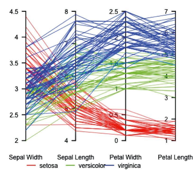
Author/Copyright holder: JontyR. Copyright terms and licence: Public Domain.
Figure 23.9: Iris flower measurements, using parallel coordinates - Wikipedia.
Figure 23.10 is the redesign, using the Lattice form. The overall intent is to compare flower size by species, so this is the first realization. Virginica samples are the largest, Setosa the smallest. Each species is represented by 20 flower samples, so the overall score of Virginica (340) is the sum of all these measurements. On the surface, this sounds dumb – we don’t care about the sum of the measurements, but rather their relationships. Sepal and Petal measurements – while of a similar scale – are in different categories, as with apples and oranges. Imagine if the Measures included things like color spectrum or moisture content of the samples. Adding spectrum color and petal length would be meaningless (although not impossible, but that’s a much more complex topic involving Measure normalization. In the worst case, the sums can irrelevant and removed or just ignored).
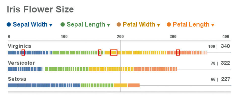
Figure 23.10: Iris data redesign.
For this data though, it works. While we are not directly seeking cumulative scores, but rather comparative ones, the sums are relevant in that they give us a direct summary indication of the data, in relative terms, as well as a bounded framework within which we can create normalized relative comparisons. Next to the actual scores are a percentile ranking. Virginica, as the largest species, establishes the benchmark at 100%, with the others’ scores normalized versus the top score on a 100-point scale. The Versicolor and Setosa flower samples, based on these measurements, are respectively 78% and 66% the size of Virginica’s. While this may not be the point of the original parallel coordinate plot, it is a fact, and can be shown at relatively low “cost”.
The absolute score of 340 will be more clear as we look at the Strip plots. The blue slices represent the sum of each species’ Sepal Widths, and themselves are sliced into segments representing each of the 20 sample measurements. These strips show distribution in measurement size, sorted from large to small. Each sample measurement can be selected, as indicated in red, so as to see its values within the other measures. Doing so with parallel coordinates requires tracing a line through the spaghetti field. While here we cannot see the absolute value of each measurement on a scale, as we can in the parallel coordinate version, we can in fact hover or drill down per the Lattice behavior. While this is a drawback, the purpose here is to provide an overview for spotting patterns, not a detailed lookup capability. The patterns, such as the relative outlier profile of Setosa, is apparent from the wide and skewed Sepal Width bar alongside the narrow and uniform Petal Length – so much so that the slices cannot be rendered at this resolution. The Lattice format brings all of its other benefits as well, such as sorting, scaling, legible numbers and titles, interactivity, etc.
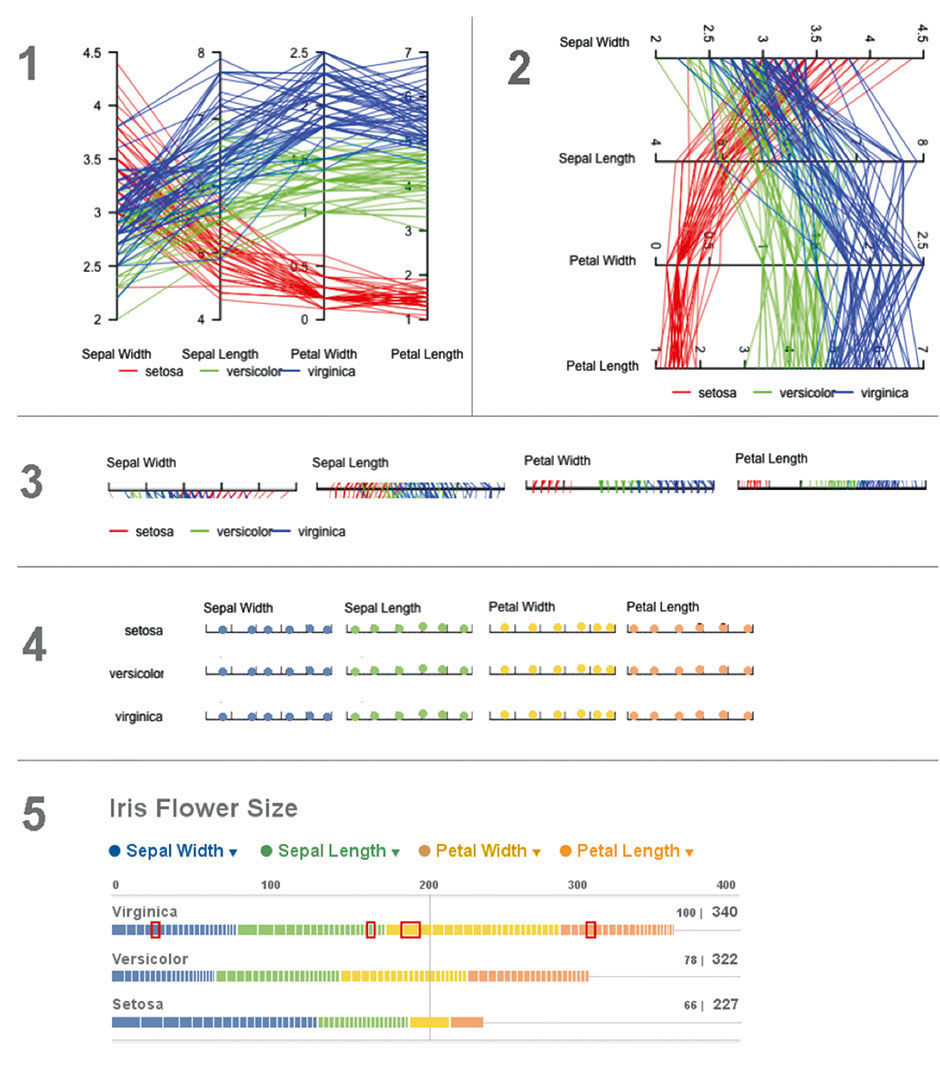
Figure 23.11: Iris data redesign process.
Figure 23.11 is a sketch of the conversion process I used for the redesign. The first step is to flip the chart axis. This enables cleaner label rendering and loses nothing in comprehension. The second is to convert the mostly arbitrary 2D layout to a 1-D stacked strip display. The third step is to distill the three species to their own 1-D row displays, broken out by measures into a stacked bar — or Strip — format. The final step is to normalize these measurements onto a common scale, where their values and distributions can be compared more easily.
23.0.3 Water
Here is another example of how rectilinear forms are more effective than radial ones. Traditional water faucets have two dials – one for hot water and one for cold – for manipulating the two Measures of Flow Rate and Temperature. Taking a shower using such dials requires careful, coordinated adjustment of each dial, with the only meaningful feedback being the perceived properties of the water stream itself. This is a classic example of an engineering model – the faucet’s two separate pipes and valves – being exposed fairly verbatim as the mental model for the user. The most primitive examples have separate faucets for each pipe, while the most advanced hide the mixing of the water streams behind a single joystick control, or pre-set temperature settings.
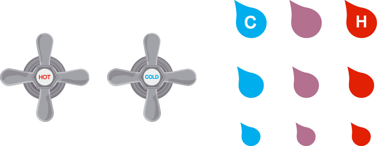
Figure 23.12: Digital faucet touch panel design.
All of these, to a certain extent even the joystick, rely on the radial model arbitrarily inherited from the screw-based valve design. A more effective way to convey the water model to the user is as a 2D input and display map, with temperature on the horizontal axis and volume on the vertical. Touching on any icon mixes the water to that temperature and volume. Touching again turns it off. There are nine distinct settings in this example, but more granular – even continuous – settings are possible. The display could be on the countertop, wall, or be embedded in a mirror above the sink. Elaborate versions could illuminate the current selection. Hot is to the right, counter to convention. Cold Low Flow is the default at lower left. Settings to the North and East progressively add volume and heat. Cold’s default placement is changed to the left – the default position in Western cultures – to encourage energy conservation in repeated, quick usage.
23.0.4 Time
Having summarily trashed most radial designs, I feel compelled to offer a linear alternative. A fundamental strength of the Lattice is its support of value comparison in context, so I designed a solution for a common use case of comparative time analysis: The visualization of multiple time zones.
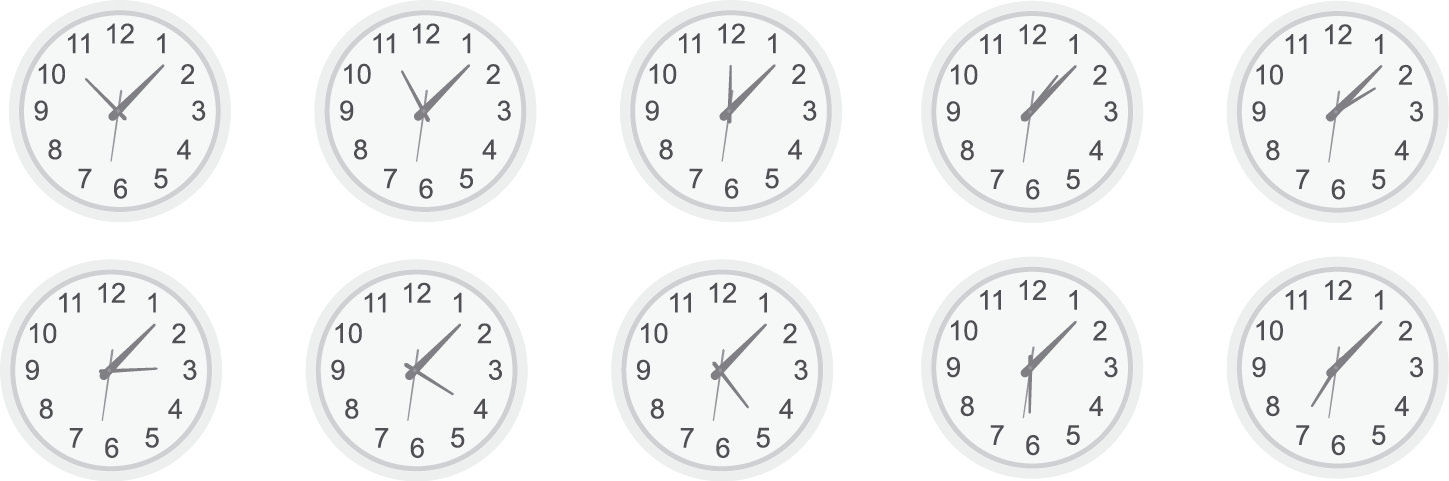
Figure 23.13: Time zone clocks.
A stereotypical view of any workplace involved in coordinated global affairs is the wall of clocks set to the time zones of major cities. This is none other than a gruesome case of a dashboard full of pie charts, and equally hard to decipher, especially with the lack of AM/PM designations.
Figure 23.14 is a redesign of world time, using the Lattice, called Circadian. The first mode uses a fixed time scale, and marks the current time in every zone. Users can scroll to any world time zone in two modes. The first aligns on a scale set to the user’s current city, in this case San Francisco. The second aligns on the current time, and varies the local condition display. Like all good visualization, this display provides the requisite facts, while at the same time provides ambient awareness to be assimilated, in this case revealing the often frustrating time zones set at 30-minute intervals, as well as the varying daylight hours of cities in different latitudes. It still actually relies upon the wheel metaphor – the difference is that here, we are looking at the edge of the wheel, versus the face. Think of the view screen as the imprint of a tire on the pavement. Scrolling rolls the tire back and forth, showing a different subsection of the time zones that wrap around the equator.
Anyone who has tried to schedule a conference call with members in multiple time zones will appreciate this feature: It provides modifiable defaults to indicate reasonable multi-national working times for meetings; depending on urgency and company culture, working hours could be anywhere from 9AM to 5PM to more extreme ranges like 5AM to 1AM. With this setting you can see which time zones can talk together synchronously within this window, along with which location must suffer the most inconvenience.
This hilarilous video parodies these often futile global conference calls:
http://blogs.technet.com/b/usefultechnology/archiv...
Individuals who work recurrently with only a few time zones can select these as favorites, which are shown at the top of the list. Figure 23.17 is a common use case for a global all-hands conference call at SAP. As you can see, someone always suffers. Anyone trying to schedule meetings around people’s crowded calendars in Outlook will recognize the pattern, rendered here at the largest scale.
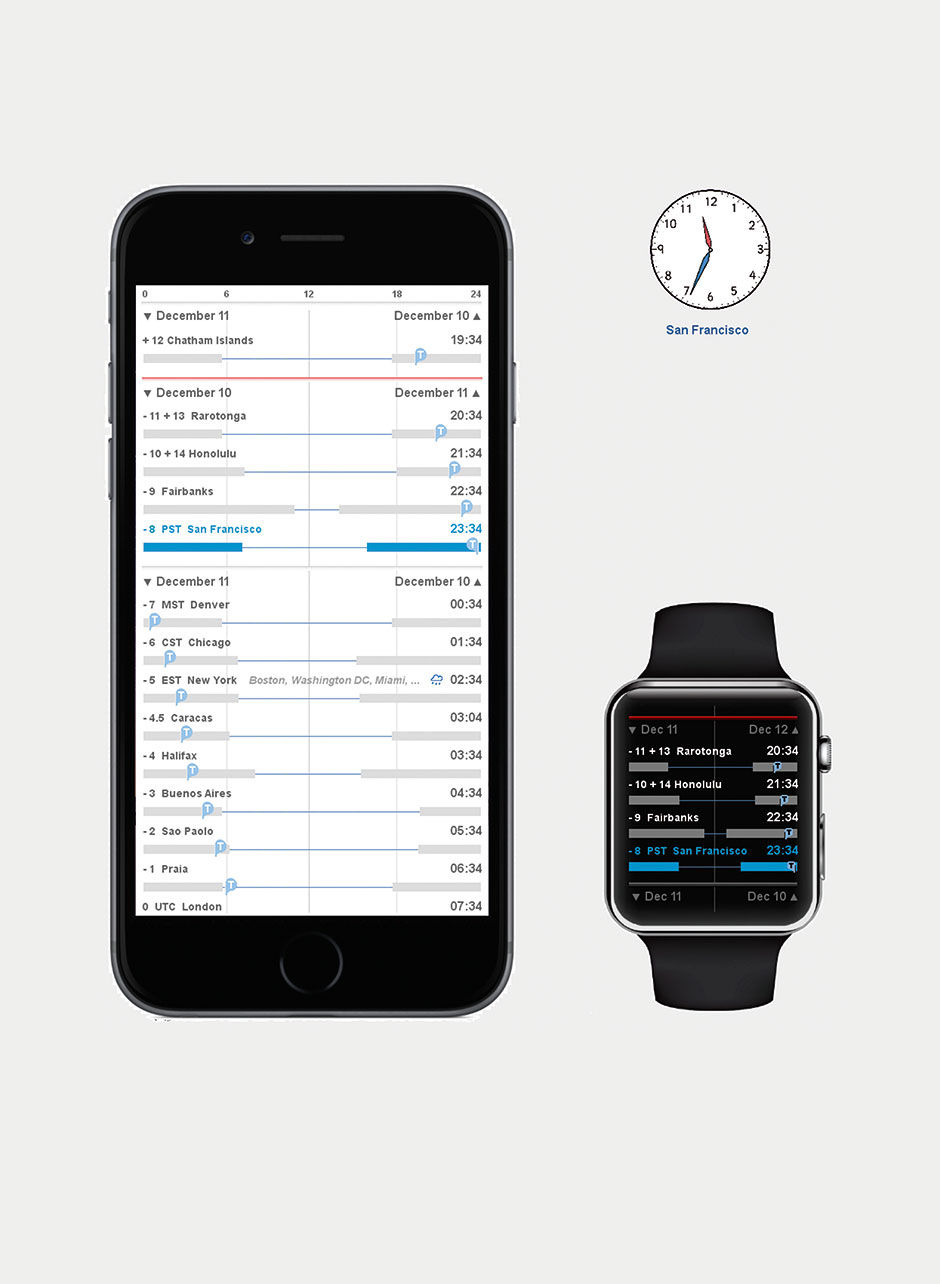
 Figure 23.14: The Circadian App. 11:34 PM in San Francisco. Scale at top, sliding values. Current time in all other zones. Bars indicate nighttime in local timezone cities. Red line is International Date Line.
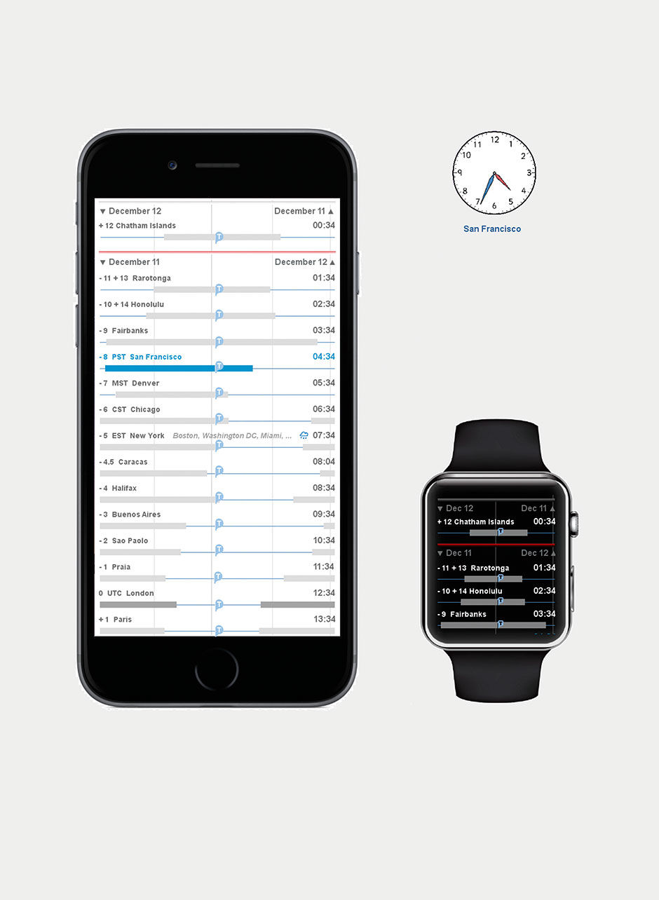
Figure 23.15: No scale. Time aligned to show relative position in day, by zone.
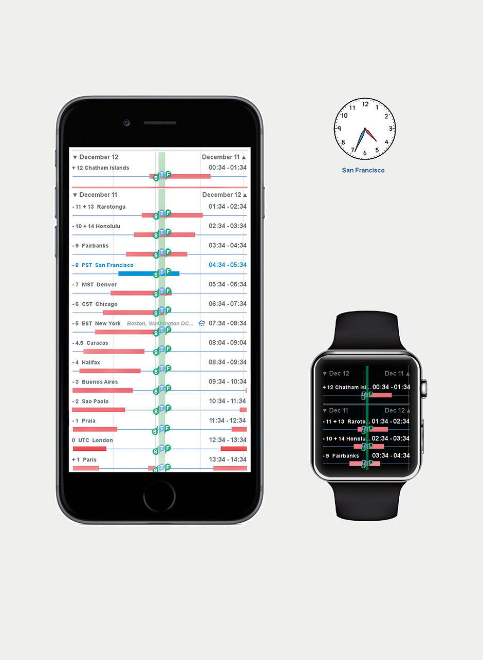
Figure 23.16: Local non-working hours in pink. Modes show current time alignment and proposed meeting time.
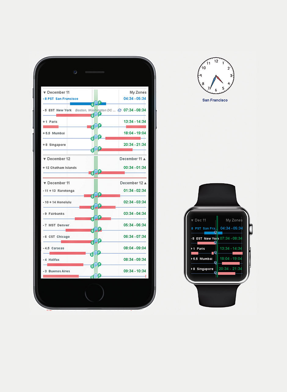
Figure 23.17: Meeting scheduler across favorite (?) time zones.
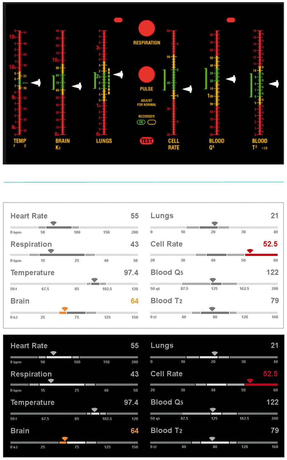
Figure 23.18: Star Trek Vital Sign Monitor, before and after (day and night views).
23.0.5 Sports
Fantasy sports allow fans to form their own competitive league, composed of players – typically friends, family, and co-workers – who each builds their own fantasy team with players picked from the active rosters of the league’s chosen sport and real-world league. America’s National Football League is the most popular fantasy league reference. Fantasy teams compete against others in their league throughout the reference league’s season by accumulating points, leading to wins and losses, based on the actual in-game performance of the teams’ chosen players. These “fantasy players” accumulate points for their fantasy teams when their actual reference players realize success in their real-world games.
If I have picked Adrian Peterson, a top NFL running back, for my fantasy team, every time he runs for positive yards or scores in his live games, my Adrian Peterson fantasy player wins points for my team. For each weekly cycle of NFL games, each fantasy team in a league – which may have about ten teams – compete head-to-head against another team in the league. The team whose fantasy players accumulate the most points in that week’s games wins the week’s fantasy matchup. These matchups rotate among the league teams so that each team “plays” each other team at least once. When the actual season ends, the fantasy team with the most head-to-head wins is declared the champion.
The details of every fantasy service vary, and are too lengthy to describe in full here. The basic model for American football, however, is that before a week’s games begin, the fantasy team owner chooses their starting team – as with real teams, there are more players on a team than play at any one time in a game – and monitors the performance of his players as the live games are played. Team parity is assured through a player “draft” that occurs before the season begins, with each team owner taking turns to choose the best players – namely, the players most likely to perform well at the point-generating measures, and thus earn the most points for the team. Although there exists a large amount of chance in winning or losing, the owners compete to pick the best players, both for their team as a whole, and for playing in each week’s game. This is essentially the placing of bets on which players will play well throughout a season and in individual games.
Figures 23.19 and 23.20 are from my fantasy service application design, which uses strip charts to track and compare the head-to-head competition of two teams throughout a week’s progress of games, as well as individual player performances. To do this in a coherent and engaging context is actually quite complex. Each team has, say, ten players in action each week, playing for up to ten different NFL teams, whose games might occur as early as Thursday night, and end as late as the Monday night, five days later. Only after all actual games involving fantasy player references are completed can the total tally of a fantasy team be counted, and then compared to that of it’s weekly opponent. Although the players of each team accumulate points serially over the days and hours of the week, one team’s players might not see action until later in the week, or might wrap up their games early on Sunday afternoon (when most of the games are played).
The first design challenge is to depict the status of a fantasy team’s week of games. In the top row is a strip chart, with one slice devoted to each game where one or more fantasy players from either team are active, ordered left to right according to the game’s start times. The number of relevant games may vary between the extremes of one (extremely unlikely as all 20 fantasy players would need to play for the two NFL teams playing each other) and 20 (each player on each fantasy team plays in a different game, with none playing each other). In this case there are 10 relevant games, and the available strip width is divided evenly among the games. As each game starts, its grey placeholder is filled with a bullet progress bar to track the game’s clock. In 23.20, we see that four of the ten games are over, three are being played, and three have not yet started. We might describe this Strip as a Stacked Bullet Chart.
The next challenge is to depict the predicted outcome, the absolute and relative progress of both teams, and whether they and their players are performing to expectations. The rows marked with the team names, John’s Jukers and Andrew’s Anglers, have strips subdivided into ten slices, one for each player active for that week, sorted by their predicted point generation. The prediction is shown numerically at the extreme right, and can be based strictly on historical averages or on expert projections by fantasy service experts. For real games, similar expectations are how professional oddsmakers decide betting lines. As the players accumulate points according to their live play, a bullet within their associated slice in the team strip advances, and their points contribute to the total at right. If the player’s performance exceeds their prediction, the bullet will “push” the player’s point prediction to the right. If a player’s actual game ends with the player underperforming the prediction, their slice collapses to the width of the bullet.
Figure 23.19: View of a fantasy duel, before the week’s action starts.
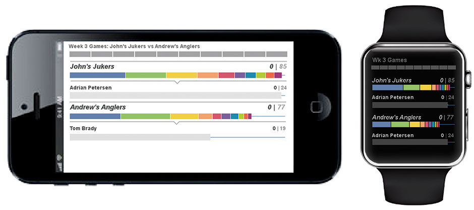
Because the players play in games spread over five days, conveying which team is actually ahead is tricky. John’s Jukers might have more points mid-week, but Andrew’s Anglers might have more remaining potential for point generation, if more of their players are active later in the week. The hybrid prediction/actual display conveys this balance.
Strips for each player can appear below the Team strips, with the top predicted performer – in blue – is shown by default. More players can be shown by tapping their slice in the team strip. 23.16 shows three of John’s players in expanded view.
In the sample games shown, the Jukers are favored to beat the Anglers 85 to 77. However, nearing the midpoint of the set of games to be played, the Jukers lead by only 59 to 56, and several Angler players have yet to appear in games, including their second-best player. The odds at this point favor an Anglers upset.
The next challenge is to depict the ten active players from each team, and their associated performance as it unfolds during their games. For this, the users can elect to show any or all of their players, scrolling to the overflow display. Each player’s prediction is shown as a gray bullet barrel, which fills with a strip bullet, sliced according to the plays recorded by the player, and with the slices sized according to the points gained on the play. A dramatic play, like a 75-yard touchdown run, will earn more points than a 5-yard run. Slices are sorted by largest point-plays to smallest. In 23.20 we see that Wes Welker exceeded his point expectation, while Michael Crabtree underperformed.
As a bonus, a team owner can tap every point-generating play to see it’s video footage. In this regard, the strip charts are an accessible aggregation of the week’s highlights, perfectly sorted to the interests of the team owner.
Some fantasy services enable negative points for bad plays. If a quarterback is sacked or throws an interception, these services remove points from the game total. To depict these plays, and their impact to the player’s total, a second strip chart is drawn beneath the original, and a marker placed to indicate the difference (Figure 23.21). This enables viewing and selection of each play affecting the point total.
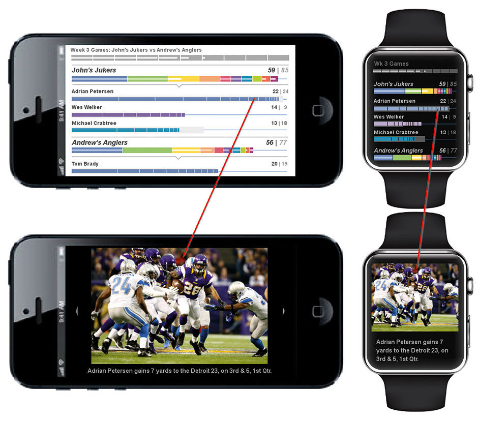
Figure 23.20: Fantasy duel in mid-week action.
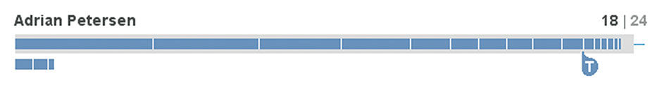
Figure 23.21: Negative Points.
23.0.6 Terror
Here is a redesign of the United States Homeland Security Terror Alert Scale. The redesign is primarily a change of wording, typography, and styling – away from the vague and imprecise terms and colors of the original, towards unambiguous wording and a clear scale. For levity, given the somewhat absurd nature of this alerting system, I used the typeface of the famous “Keep Calm and Carry On” posters from the WW2 Blitz bombing of London. Hey, it worked for them.
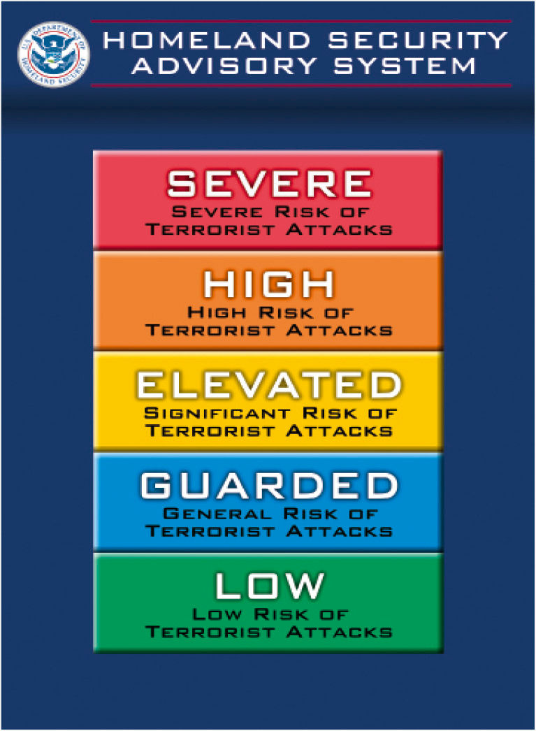
 Figure 23.22: US Terror Alert Scale, current.
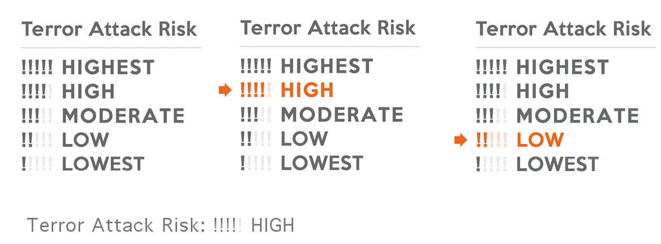
Figure 23.22: US Terror Alert Scale, redesign. Neutral, Set, and raw text states.
23.0.7 Media Assets
L23.1 | Circadian (video) |
https://www.interaction-design.org/literature/book/bringing-numbers-to-life/assets
L23.2 | Circadian (pdf) |
https://www.interaction-design.org/literature/book/bringing-numbers-to-life/assets
23.0.8 References
23.1 | Conf Call Hell (Web video) | Technet.com |
http://blogs.technet.com/b/usefultechnology/archive/2006/07/08/440787.aspx
