
When it comes to user experience design a lot of effort is put into the engineer design of products, and yet more is expended in the graphical design of products. However, all too often the user experience design stops there – the written content of the product is left to whoever is handy to write it and create it.
Sadly, this is often the end of the line for otherwise great products. The written content is part of the user experience. In many cases, it’s the greatest part of the user experience – would the BBC or The Guardian get the volumes of users they do, if their written content was hard to understand and badly written?
Given that – how do we write copy that enhances rather than detracts from the user experience? The first step is to get someone who can write readable copy. It’s amazing how many companies try to outsource writing to the lowest bidder rather than a writing professional, something that they’d never consider for graphic design or programming.
Then it’s a question of following some fairly simple guidelines:
Don’t Distract Your Users
You don’t need to tell your users where they are. There’s no need to start a sentence with; “On this screen…” They know they’re on the screen. It’s the kind of stilted sentence that jars the attention and forces someone to stop feeling an experience and start reviewing that experience instead.
Unless it’s done for a particular dramatic effect; you don’t open a magazine or a book which starts its sentences with “on this page…” for exactly the same reasons.
Obviously if you’re discussing something in house; there are times when breaking this rule can be useful or act as a short cut but when it comes to your readers – it’s best to leave it out.
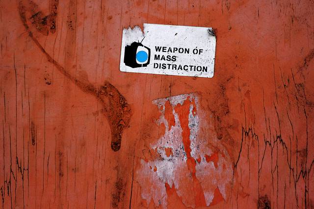
Author/Copyright holder: smlp.co.uk. Copyright terms and licence: CC BY 2.0
Keep It Simple Stupid
There is a reading scale called the Flesch-Kincaid score. In essence it’s a measure of how easy/difficult a particular passage is to read by an audience. The higher the score, the easier it is to read. Newspapers use this score to evaluate their own copy.
It doesn’t matter how academic you are in house; unless your copy is aimed squarely at high-level academics in the arts, your copy needs to be as easy to read as possible. Go through it and weed out the big words which can be replaced with small ones. Then look at the sentences themselves. Can you break them up? The shorter they are, the clearer their meaning.
Simplicity in copy can be tested in other ways too. How easy is it to read aloud? If you can’t easily read it aloud, it’s going to jar when people read it.
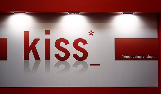
Author/Copyright holder: Lambros Rousodimos . Copyright terms and licence: All rights reserved Img source
Think About Link Text
The link for the Flesch-Kincaid score takes you to the Wikipedia page for that topic. It’s clear and simple. If you Google the words “click here” you will find that the ultimate winner for that particular phrase is Adobe’s Acrobat Reader. It has millions of incoming links marked “click here”.
Some people object to the use of “click here” because we no longer click on all our internet based devices. We touch screens and don’t click them. That’s probably an artificial and not particularly valuable distinction. In the same way that the floppy disc icon still means “save” when the floppy, for most of us, has long departed common usage. However, the phrase itself is meaningless.
Your eyes are forced to read the text around the words “click here” to get the context of where the user will be sent if they do “click here”. So try and be more descriptive in link information. If you’re not using links for SEO then they can be whole sentences if you want them to be. If you are, then you might want to concentrate on using your key phrases as links.
Break Up Data as Needed
Bullet points, numbered points and tables can often take much of the writing out of the writing. Users are, by and large, looking for information. Before you write anything, you could ask; “Can we display this information in an easier manner to access than if we wrote an explanation for it?”
You can substitute graphics for text. It’s easier on the eye and many people prefer data to be presented graphically. Of course, that doesn’t mean that you should skip text altogether – some graphics will still need a line or two to explain what’s going on.
And don’t forget to format tables of figures to make them easy to follow; cash amounts, for example, are better right justified than left justified. That way the zeros and decimal points line up (as long as you keep the decimal point for round numbers) and people can quickly get what they need.
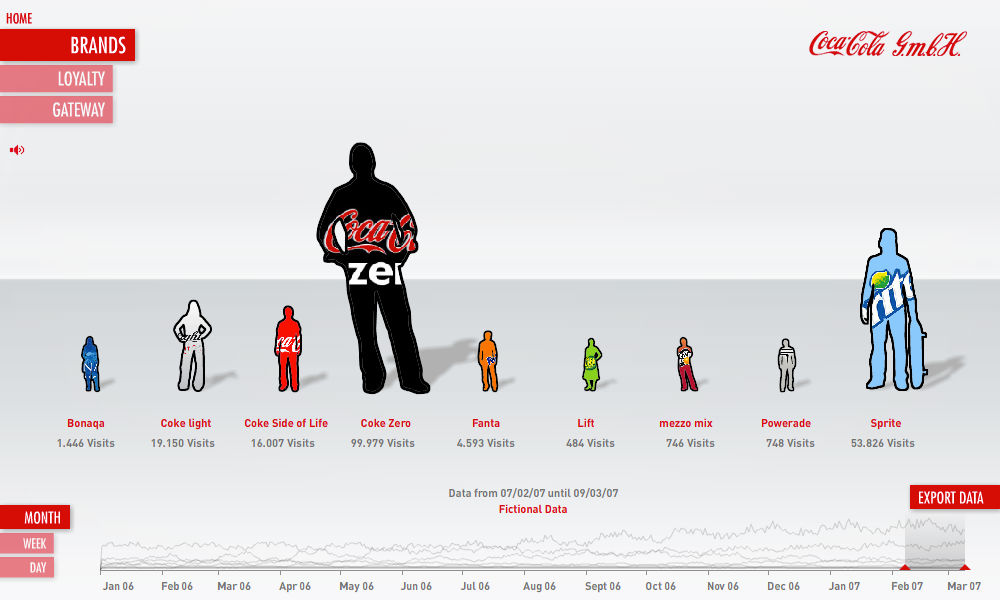
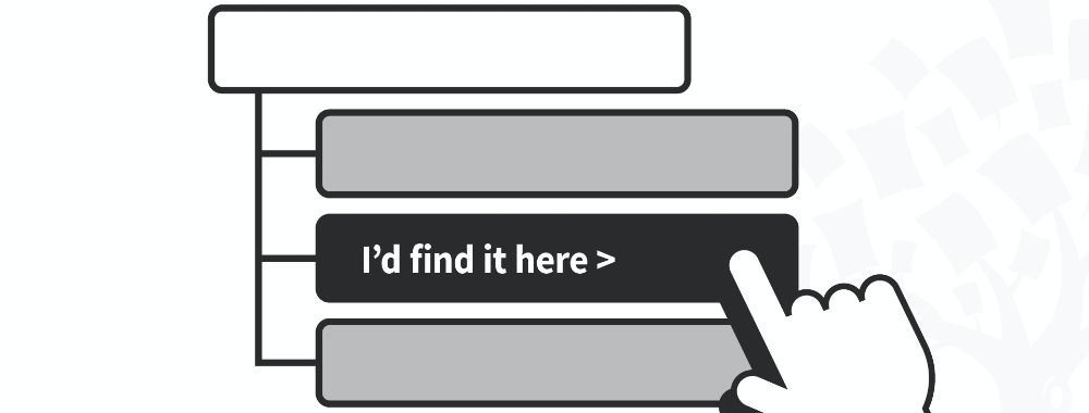
Author/Copyright holder: datalicious. Copyright terms and licence: All rights reserved Img source
Pay Attention to Tone and Brand Identity
In a perfect world, your corporate pieces will have a single tone and identity. It doesn’t matter who writes them but it does matter that they sound similar. They should also sound like a human being wrote them (again reading aloud can help you determine if this is true – bad text sounds robotic or unnatural when you speak it).
The way you say something matters and lasting brands have an identity. For some that identity will tend to be formal and for others it will be informal. Your ideal tone is the one taken by your users. A little UX research won’t go astray in determining the way your users like to be spoken too.

Author/Copyright holder: Simon Bleasdale. Copyright terms and licence: CC BY-ND 2.0
One Last Thing…
Mistakes happen. They are the way of the world. Nobody churns out perfect copy all the time. Even the best writers have a bin full of stuff that they didn’t publish or unleash on the world. They also have editors and proof readers to call on.
Spending some time reviewing your copy and checking it for mistakes can reduce (but never eliminate) the number of mistakes you unleash on your audience.
Great copy requires time and money to bring about and the rules above will only get you so far without that investment.
Hero Image: Author/Copyright holder: David Airey. Copyright terms and licence: All rights reserved. Img


