Your constantly-updated definition of Anatomy of Type and
collection of videos and articles. Be a conversation starter: Share this page and inspire others!
97shares
What is Anatomy of Type?
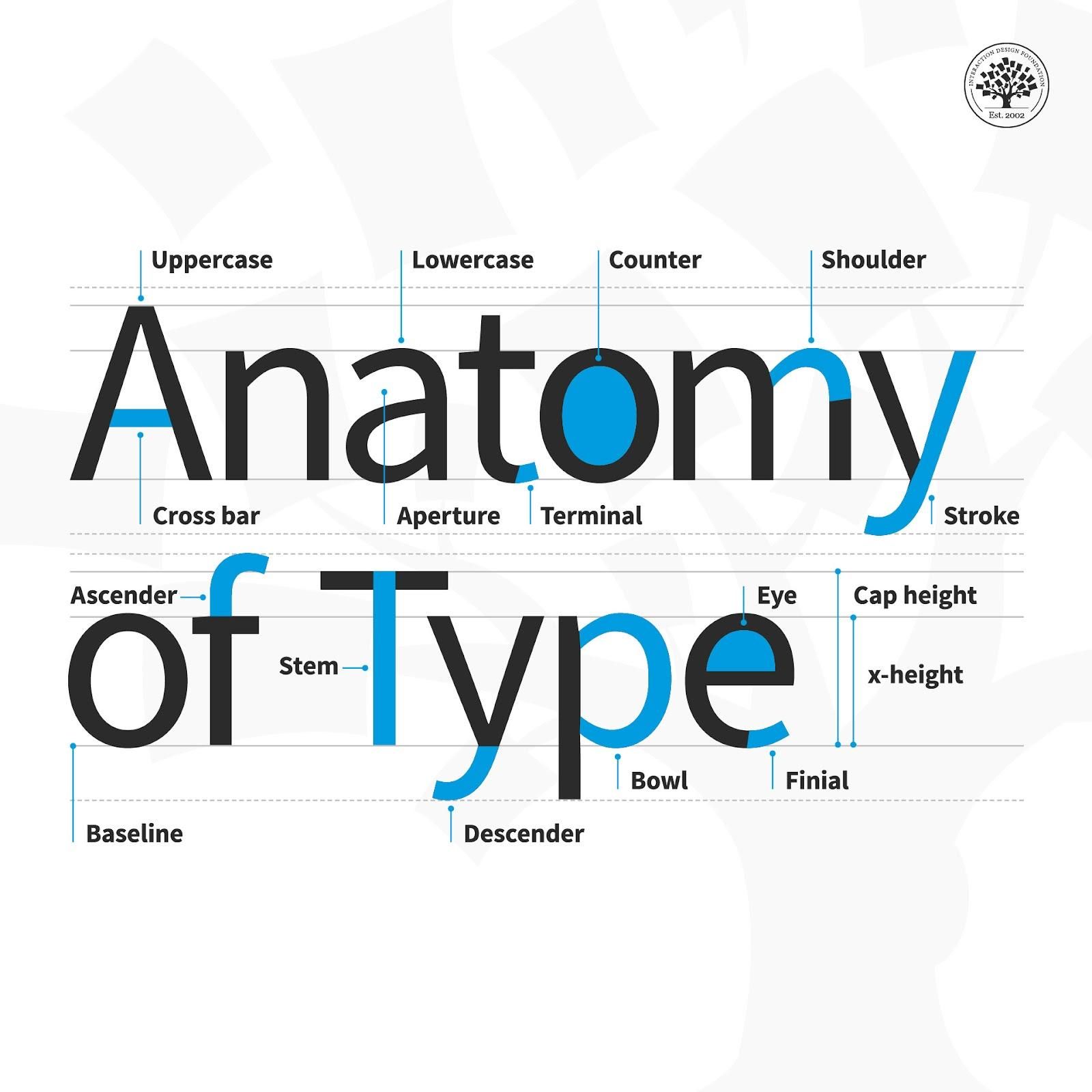
The anatomy of type describes the visual elements that make up the letterforms within a typeface. Each letterform is made up of individual components (e.g., spine, stem, stroke). Type designers create typefaces using components — crucial parts that contribute to the overall appearance and legibility of a typeface.
Your text plays a vital role in carrying the right message to your users. Not only are the words you choose important; the typographic choices you make such as font style and how you lay out your text onscreen are equally vital, too. So, it’s important to have an understanding of what goes into the type that you select. Be it for a website headline, a call-to-action button or a host of other functions, when you break type down to the anatomical level, you’ll have the building blocks to create a more legible and readable experience for your users. These are the terms to have in your “type dictionary” so you better understand how type is created and how to use it effectively in your work:
Aperture: The partially enclosed space of a letterform.
Ascender: An upward vertical stroke that extends beyond the x-height.
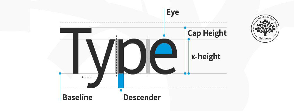
Baseline: The invisible line on which all letters rest.
Bowl: The generally round or elliptical forms which are the basic body shape of letters.
Cap height: The distance from the baseline to the top of the capital letter.
Counter: The white space enclosed by a letterform.
Cross bar: The horizontal stroke in letters.
Descender: A downward vertical stroke that extends beyond the baseline.
Dot: Also known as a tittle, is a small diacritic on a lowercase i or j.
Eye: The closed counter of a lowercase e.
Finial: A tapered or curved end on a letterform.
Ligature: Two or more letters tied into a single character.
Lowercase: A smaller form of letters in a typeface.
Shoulder: A curved stroke originating from a stem.
Spine: The main curved stroke of a lowercase or capital letter.
Stem: A main stroke that is more or less straight, not part of a bowl.
Serif: A stroke added to the beginning or end of one of the main strokes of a letter.
Small Capital: Short capital letters designed to blend with lowercase text.
Stroke: A straight or curved line that creates the principal part of a letter.
Terminal: A circular form at the end of the arm, leg or brow in letters.
Uppercase: A typecase containing capital letters.
x-height: The distance between the baseline and the height of the lowercase letter ‘x’.
Here are some helpful points to consider with the finer points of type:
Kerning – This is the adjustment of space between two individual letters. An example of bad kerning is when you use a font that has the letters so close together that (e.g.) what you typed as “kerning” shows up as “keming” (the letters get mashed together). It’s better to devote time to kerning with larger text and headlines (as opposed to smaller text and body copy). Also, if you kern one headline, be consistent and kern the others.
Tracking – This is the adjustment of space between a whole group of letters (rather than each one, as in kerning). You can fine-tune tracking by compacting or expanding this space to optimize your text.
Leading – This is the adjustment of vertical space between lines of text. While the default is typically fine, you can always fine-tune leading to make text extra-comfortable to read for your users.
Legibility – This refers to how easy it is to distinguish one letter from another in a particular typeface. This is the most fundamental consideration because you’ll know at a glance how legible your text is.
Readability – This refers to how comfortably users can read your text. Although they may be able to make out each letter, a poor choice of (e.g.) small caps use and font can slow users down or turn them off completely from proceeding with your design or product.
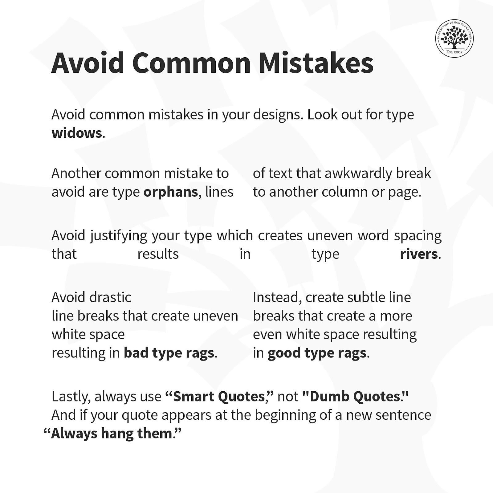
Here is a helpful list of common mistakes to avoid when designing with type.
Overall, remember that the best designs are ones where users don’t stop to think about what you’re trying to show them. That’s why your typography not only has to complement the well-thought-out wording of your messages as well as the other design elements such as your images. Text needs to present well at both the micro and macro levels, too, hence why typographic knowledge is vital to design.
The baseline in type anatomy is the invisible line upon which letters sit. It serves as the reference point for most of the characters within a typeface. Most letters rest on the baseline, ensuring a visual consistency when typeset. The descenders in letters like lowercase ‘g’ and ‘y’ are so-called because they drop below the baseline. Baselines align text to create a uniform appearance in a body of text. They anchor the design of all the letters, enabling coherent text flow and readability.
When typesetting, designers measure the height of x-height, ascenders, and descenders from the baseline to create balanced and harmonioustypography. Watch this video for a simple example of Gestalt Principles in typography.
ShowHide
video transcript
Transcript loading…
Carefully selecting and arranging type elements is important to convey the intended message and emotion of the text.
What is the tail in type anatomy?
In type anatomy, the tail is the descending, often decorative stroke on certain letterforms. They are decorative flourishes, as seen in the capital letter ‘Q.’ Note that tails are related to descenders but are not the same thing. Descenders are the parts of lowercase letters that drop below the baseline. Descenders are normally used in the letters ‘g,’ ‘j,’ 'p,’ ‘q,’ and ‘y’.
Tails vary significantly in design, length, and style across different typefaces, contributing to their unique character andaesthetic. Tails can be long and elaborate or short and straightforward, depending on the typeface’s design intention.
What are the four major font types?
The four major types of fonts are
Serif Fonts: Traditional and legible with small lines at ends (e.g., Times New Roman).
Sans-serif Fonts: Modern, clean, without small lines (e.g., Arial).
Script Fonts: Mimic handwriting, fluid, and cursive (e.g., Brush Script).
Display Fonts: Highly stylized for headings, not for body text readability.
A terminal-in-type design is the end of a stroke that does not include a serif. Terminals may take straight or curved forms and vary significantly in shape. It may influence the typeface’s overall feel. You can find them in letters with curved strokes, like ‘f’ or ‘c.’ They have a defining characteristic in serif and sans-serif typefaces. Terminals add a stylistic touch and contribute to the readability of a font by guiding the reader’s eye along the letterforms.
What are the numbers in type anatomy?
Intype anatomy, numbers, often referred to as numerals, have distinct qualities. They come in two main styles: lining and old style. Lining numerals align with the uppercase letters’ cap height and baseline, making them uniform with the rest of the type.
Old-style numerals come in different heights. Some go above the x-height, others drop below the baseline, like uppercase and lowercase letters. In typography, numerals have special terms like ascender, descender, and x-height. These terms define their shape and readability in a typeface and correspond to similar features in letters.
What are the holes in letters called?
“Counters” name the holes in letters, referring to the open spaces within them. These spaces include the fully enclosed areas inside letters like ‘o’ and ‘b,’ and the partially open spaces in letters like ‘c’ and ‘e.’ Counters critically influence type design by affecting a typeface’s legibility and overall look. The counters’ size and shape are pivotal in shaping perceptions of a typeface as open and airy or dense and solid. They are essential elements in typography that significantly enhance a font’s readability, especially in small or extensive texts.
ShowHide
video transcript
Transcript loading…
What is a curving stroke of S called in typography?
In typography, the “spine” describes the curving stroke of an “S.” This spine gives the “S” its distinctive sinuous shape and stands as the central curve defining its form. The spine’s elegance or strength adds to the typeface’s overall style and energy. Designers meticulously craft a well-designed spine to balance the “S” with the alphabet’s other characters, ensuring aesthetic appeal and readability. This feature is crucial for the dynamism and harmony of the typeface. Watch the informative video to enhance your typography skills and delve deeper into the differences between fonts and typefaces.
A spur in a typeface acts as a slight projection or pointed part that juts out from the primary stroke of a letter. Letters such as ‘G’ and ‘a’ often feature spurs, providing a unique flair and assisting in character recognition. In serif typefaces, spurs stand out, adding to the font’s style and personality. While less prominent in sans-serif typefaces, they still offer letters a distinct appearance. The design and inclusion of a spur can influence a typeface’s readability and aesthetics, making it particularly important in display fonts where you focus on details.
What is an arm in a typeface?
In typography, an arm is a horizontal or upward-sloping stroke not connected at one end. This sets it apart from a crossbar, which connects two sides of a letter. You can find arms in letters like the uppercase’ E,’ ‘F,’ and the lowercase’ t.’ The arm’s design—its thickness, length, and curvature—adds character and visual interest, influencing a typeface’s style and readability. It plays a vital role in the balance and legibility of the letterform, making it an essential element in type design.
You can take thevisual design course to understand more about the anatomy of type. This course offers insights into the anatomy of type, which is essential for anyone interested in design. It guides you in selecting typefaces and effectively using them in communication. Leading experts teach this course and provide high-quality, industry-relevant knowledge. You’ll gain practical skills and create a portfolio case study, enhancing your understanding and showcasing your expertise in typography. This course is a valuable resource for grasping the complexities and nuances of type anatomy.
Earn a Gift, Answer a Short Quiz!
Question 1
Question 2
Question 3
Get Your Gift
Try Again! IxDF Cheers For You!
0 out of 3 questions answered correctly
Remember, the more you learn about design, the more you make yourself valuable.
It's Easy to Fast-Track Your Career with the World's Best Experts
Master complex skills effortlessly with proven best practices and toolkits directly from the world's top design experts. Meet your experts for this course:
Mia Cinelli: Associate Professor of Art Studio and Digital Design at the University of Kentucky.
Joann Eckstut: Color Consultant, Founder of The Roomworks, and one of the 12 designers chosen by the Color Association of the USA to create the yearly forecast used by industries to keep up with color trends.
Arielle Eckstut: Author, Agent-at-large at the Levine Greenberg Rostan Literary Agency, and Co-Founder of The Book Doctors and LittleMissMatched.
Typography has its very own language. It’s full of typographic terms that make up its basic anatomy. Just like it’s vita
824 shares
5 mths ago
Open Access—Link to us!
We believe in Open Access and the democratization of knowledge. Unfortunately, world-class educational materials such as this page are normally hidden behind paywalls or in expensive textbooks.