Courses from the Interaction Design Foundation, IxDF, help you stay up-to-date with all the latest technological and design-related developments. But, at the same time, we help you dig much deeper: If you were only to focus on today’s latest technology and design trends, your knowledge would soon be outdated, and you’d end up following in the footsteps of other designers instead of leading the way. We know trailblazing is the better route.
Three core components underpin all our courses, both to empower you to steer your career in the best possible direction—and to “future-proof” what you learn so that this knowledge will serve you well for many years:
Technology and existing designs in all their forms
Human psychology and sociology
The interaction between the two points above
Let’s look closer at what these three cornerstones mean for us.
Technology and existing designs in all their forms. IDF courses mix the latest best practices and research when it comes to technology and design. At the same time, our courses stand on the shoulders of history’s design giants by learning from successes and failures in the history of design and technology. We thus place great importance in learning from old designs that are still relevant and highly inspiring today. Understanding the present and the past designs of technology is the foundation for designing innovative products for the future.
Human psychology and sociology. IxDF courses take a human-centered approach. Putting the human/user/customer center stage is the foundation for designing highly usable and attractive products. As human psychology and sociology comprise fundamental principles (after all, people have not changed much over the centuries), the in-depth knowledge we provide about them will not get outdated easily.
The relation between technology and human psychology/sociology. Now we come to the relation between the previous two points: Although our approach is human-centered, great design always consists of a link between a human (psychology) – or groups of humans (sociology) – on one hand, and a piece of technology (e.g., a website, an app, a physical object, etc.) on the other. This is why it’s called “interaction design”—we design interactions between humans and technological objects.
This triad will make the knowledge you gain timeless and allow you to set trends rather than follow them. Let’s take an even closer look at these three elements.
1. Technology and Existing Designs in All Their Forms
The first important component of the courses of the Interaction Design Foundation is to learn from the past and present of design and technology in an active way. Consider the following quote.
“If I have seen further it is by standing on the shoulders of Giants.”
– Isaac Newton, discovered the laws of gravity. English physicist, mathematician, astronomer, alchemist, inventor, theologian, and natural philosopher.
Isaac Newton claimed that we are like dwarves perched on the shoulders of giants, our ancestors. When we stand on the shoulders of giants, we can see much more and much farther. This is why our courses actively draw upon the successes and failures of our design predecessors—because that will put you on their shoulders, thereby enabling you to see much farther than other designers.
Show
Hide
video transcript
- Transcript loading…
Every great artist, every great designer, is influenced by what has been done before his/her time. That essentially means that if you want to be a great designer, it’s not enough to look at today’s trends and new innovations. In this video, Steve Jobs emphasizes this fact by quoting Pablo Picasso, who famously said: “Good artists copy; great artists steal.”
Copying is, as it sounds, unimaginative—in an industrial or design context. It can result in anything from ridicule (being laughed at) to legal trouble for the copier. Stealing, ironically enough, is not anywhere near as bad—at least, it’s not as bad in a design sense. That’s because “stealing”, in the sense of what Steve Jobs is talking about, requires that you modify the original item or idea by adding your fresh, unique interpretation.
IDF’s courses will expose you to – and help you learn from – the very best designs. And we’ll help you make use of that knowledge in your day-to-day design practice. At the same time, you’ll also learn how to avoid the worst—and sometimes fatal—design errors of your predecessors.
“Technologists are not noted for learning from the errors of the past. They look forward, not behind, so they repeat the same problems over and over again.”
– Don Norman, Inventor of the term “User Experience” and Chairman of the IxDF Executive Board
Learning from the past is just as important when it comes to “hard-core” technical foundations of great designs. A great design will need implementation – for example, in one or more programming languages, on technological platforms, or through manufacturing the physical aspects (such as when designing a mobile phone where physical design and digital design intersect). As a designer, you will often be working with developers and manufacturers who will awe you with the latest technologies and buzzwords. In this critical situation, you need to be prepared—particularly—to have historical knowledge of design and technology. That knowledge will give you “X-ray vision” to see through the latest technological fads and decide wisely regarding the best way ahead.

Author/Copyright holder: Stan Wiechers. Copyright terms and licence: CC BY-SA 2.0
Historical knowledge of design and technology will give you “X-ray vision” to see through the latest technological fads and decide wisely regarding the best way ahead.
Let’s take an example. The programming language Java was launched back in the 1990s with the goal of being a programming framework independent of operating systems such as Microsoft Windows and Apple Macintosh. Should we discard all the lessons learned from Java? Of course not—today, an ever-increasing number of programming frameworks pop up almost every day, and the only way you – as a designer – can navigate and make the proper decisions is to understand history. Indeed, the successes and failures of technologies like the Java framework from the 1990s may allow you to predict the future of a current technological trend. Technologies may come and go; some stay because they work, but even the most “totally new and original” technology will always have a precedent to an earlier one in some way regarding usability, often hard to see at first, but it’s there, and we will show you how to recognize these vital characteristics.
This is one of the reasons that you will have a great advantage when taking courses from the Interaction Design Foundation: You will draw upon both the present-day as well as your predecessors’ best and worst practices. Most university courses or professional design courses neglect to teach you the practices, experiences, and designs of those who have gone before. That is a shame because – as Steve Jobs and Pablo Picasso said above – “Good designers copy; great designers steal”.
2. Human Psychology and Sociology
The second, and equally important, component of courses from the Interaction Design Foundation is a focus on the user, the customer, the operator or whatever we call the human who uses – and ultimately judges – our designs. That’s why you will often hear the words “user-centered”, “human-centered”, “customer-centered”. You’ll find these terms typically used interchangeably – depending on the context.
A focus on the human means a focus on human psychology. Technology and design may change over time, but human psychology – our desires, emotions and motivations – changes very little or not at all. Thus, from a purely psychological perspective, what made a user interface successful in the 1970s are the very same elements that make a user interface successful today.
“With the passage of time, the psychology of people stays the same, but the tools and objects in the world change.”
– Donald A. Norman, The Design of Everyday Things – and Chairman of IxDF’s Executive Board
The success and failure of a design is often the result of a broader and more social interaction than merely one user/customer sitting in front of a screen. When the interaction is social, a designer must have a toolbox of concepts and methods drawn from sociology. In simplistic terms, sociology is the study of human social relationships—and sociological knowledge is thus necessary because a design is often used in a broader social context such as “doing business with someone” or “collaborating on a work document” etc.
Similar to psychology, sociology remains fairly stable because groups of humans still have roughly the same dynamics today as they did 100 years ago. Therefore, with the knowledge you gain from IxDF courses, you will have a stable foundation to stand on when it seems like the world is moving at an ever-increasing pace. That platform of stable knowledge will be a key ingredient in the success of your personal career – as well as the success of the companies for whom you work.

Our courses feature examples from different centuries. Let’s compare the two men in the two pictures. They live in different centuries with technologies that – from a technical point of view – are completely different. However, the designers of each system have had to apply the very same psychological and sociological knowledge/methods/concepts/insights in spite of the fact so many technological advances have taken place in the decades between the two. Their technology may be vastly different, but their psychological apparatus are identical, and their needs to get things done in collaboration with their colleagues and in a business context (sociology) are also identical. They use their respective technologies to fulfil their aims and objectives efficiently and effectively.
3. The Relation between Technology and Human Psychology/Sociology
The third, and equally important, component of the courses at the Interaction Design Foundation is the relation between the previous two sections. In simple terms, it is the relation between the existing body of knowledge of technology and design on one hand – and human psychology and sociology on the other. This is why it’s called “interaction design”—we design interactions between humans (or groups of humans) and technological objects.
We’ll illustrate this with some concrete examples now. The following are based on designs and designers who did not take the approach we teach. As we shall see, bad design can be fatal—or result in some very, very large losses of money.
We will focus on the design of a few simple buttons. A simple button… that should be pretty easy to design, right? Well, as you will see, that’s not exactly the case. Even a simple button can prove to be a massive design challenge.
Our challenge to you – in this introductory lesson – is to explain to yourself which knowledge the designers lacked. What knowledge could have prevented these design disasters?
Example 1: Catastrophic Design at the Three Mile Island Plant
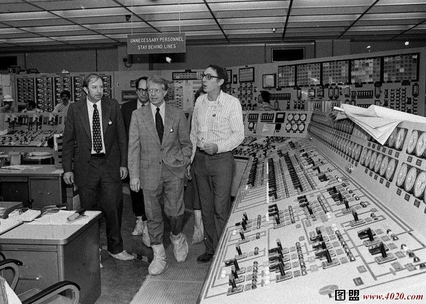
We’ll start with an example from back in 1979. The Three Mile Island accident was a partial nuclear meltdown that occurred on March 28, 1979, in Pennsylvania, the United States. It was the worst accident in U.S. commercial nuclear power plant history. The incident was rated a “5” on the 7-point “International Nuclear Event Scale”. The following image shows the control room and the wealth of buttons and confusing controls that turned out to be the cause of the catastrophe.
 Author/Copyright holder: John G. Kemeny. Copyright terms and licence: Public Domain.
The control room where badly designed buttons and labels caused nothing less than a nuclear accident. Here, President Jimmy Carter is touring the Three Mile Island 2 (TMI-2) control room on April 1, 1979.
The nuclear accident began with failures in the non-nuclear secondary system, and was worsened by a valve being stuck open, allowing large amounts of nuclear reactor coolant to escape. However, the operators of the nuclear power plant did not make any attempts to close the valve. Why? Well, a whole team of investigators spent the following months investigating just that.
During the investigation, they discovered that the user interface in the reactor control room had big usability problems. Despite the critical valve being stuck open, a status indicator on the control panel could be interpreted to indicate that the valve was closed. In fact, the status light did not even indicate whether the valve was open or closed but only whether it was powered or not. The status indicator thus gave false evidence of a closed valve, and when the control room operators were unable to interpret the meaning of the light correctly, they could not correctly diagnose the problem for several hours. By this time, major damage had occurred.
As Don Norman explains: “The control room and computer interfaces at Three Mile Island could not have been more confusing if they had tried.”
In other words, the design of a simple “on/off” button – and accompanying status indicator – can cost vast numbers of human lives and nuclear catastrophes. And when they do, we often do not blame “bad design”, which we should, but instead blame it on the “humans” and call it “human error”. In fact, did you know that over 90% of industrial accidents are blamed on “human error”? If it were 5%, we might believe it—but 90%? That means that humans are almost always to blame for accidents.
Grand Old Man of User Experience, Don Norman, sums it up elegantly:
“When major accidents occur, official courts of inquiry are set up to assess the blame. More and more often the blame is attributed to “human error.” The person involved can be fined, punished, or fired. Maybe training procedures are revised. The law rests comfortably. But in my experience, human error usually is a result of poor design: it should be called system error. Humans error continually; it is an intrinsic part of our nature. System design should take this into account. Pinning the blame on the person may be a comfortable way to proceed, but why was the system ever designed so that a single act by a single person could cause calamity? Worse, blaming the person without fixing the root, underlying cause does not fix the problem: the same error is likely to be repeated by someone else.”
― Donald A. Norman, The Design of Everyday Things
Don Norman elaborates:
“Does human error cause accidents? Yes, but we need to know what led to the error: in the majority of instances it is inappropriate design of equipment or procedures.”
Example 2: Panasonic Makes Users Fight their own Intuition and Common Sense
That was the first catastrophic design of a simple button and accompanying status indicator. Let’s move on to another button – namely an example from the middle of the 1990s when mobile phones were starting to appear. Take a look at the following picture and try to figure out: How do you turn on the phone?

Author/Copyright holder: Redfield-1982. Copyright terms and licence: All rights reserved.
How do you turn on the phone? Please take your time to figure out what you would do before you continue reading.
Okay, so just how do you turn on the phone? Well, you press the red button with the icon for “hang up”. In other words, to start calling your friends, you need to press the only red button on the display despite the fact that red is the universal colour for “stop” and despite the fact that the icon shows “hang up”/”stop the call”.
Let’s just repeat that in more clear terms: If you want to call your friends, you have to press the “hang up” button. Oh… and you have to hold down the button for several seconds although this is not indicated anywhere. So, you simply have to guess that this button behaves differently from any other button on the phone.
Alas, it’s no joke that the users of this popular phone had to fight their common sense and intuition to make a phone call. You would think that we would have been able to design something more elegant in the mid-1990s. You may also be tempted to think that the designers at Panasonic were bad designers. But we’re certain that a top-notch firm such as Panasonic hired some of the best designers available then. However, design decisions in companies like Panasonic – or at the company you work for right now – are often group decisions made by people from various professions: designers, engineers, managers, etc. If designers are not able to communicate the difference between good and bad design clearly, their insights may get muddled or distorted, or become forgotten and wasted. And that is not because managers, engineers or people from other professions are somehow against good design, but simply because you – as a designer – need crystal-clear and easily communicable examples of the “ingredients” of great design to keep driving home the point that it’s not a luxury—it’s a must-have. If you cannot explain in simple terms what constitutes great design—and why—your designs will become compromised and – consequently – risk becoming design disasters like the examples in this lesson.
The good news is that you are taking courses at the Interaction Design Foundation. And our mission is to equip you with examples and knowledge that will enable you to advocate what great design can do for your company—and, above all, how to do it in the real world.
Example 3: Press Start to Stop the Computer
Let’s move on to the design of another “simple button”, namely the “Shutdown button” in an earlier version of Microsoft Windows’ operating system.
Like Panasonic, Microsoft had hired – and continue to hire – some of the best designers in the world. Nevertheless, Microsoft created a version of their operating system where users had to press the “Start” button in order to “Stop” their computers. You may just remember this design yourself.
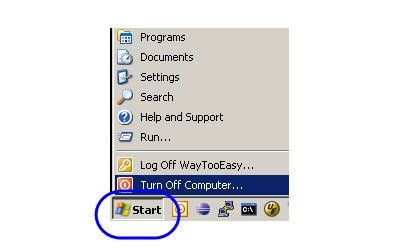
Author/Copyright holder: Microsoft Corporation. Copyright terms and licence: Fair Use.
In earlier versions of the Microsoft Window operating system, users had to press “Start” to turn off their computers. You may be laughing now. But, right now, there’ll be top designers hired by the most respectable tech companies who’ll make the same mistakes over and over again. They’ll waste their users' time. They’ll make them feel dumb. But, in reality, they could so easily learn from previous mistakes and create frustration-free technology if they had spent more time learning design history.
“Your most unhappy customers are your greatest source of learning.”
– Bill Gates, American business magnate and co-founder of Microsoft
Again, we cannot claim that the designers at Microsoft were – or are – bad designers or simply not smart enough. Multiple factors impact on design decisions, and if designers cannot clearly communicate the ingredients of great design, their designs will become compromised and may suffer.
Example 4: Who Gets to Rule Our Countries?
Another seemingly “simple button” that has drawn enormous attention—the buttons of the so-called “butterfly ballot”, which was used in 2000 in Palm Beach County, Florida, for the U.S. presidential election. George Bush needed to win in Florida to become president, and he got some unexpected help from the button design of the electronic voting system.
On the image below, the Democratic Party are listed second in the column on the left. However, if you press the second button in the yellow column of buttons, you will actually vote for the Reform Party, listed in the right column. To vote for the Democratic Party (listed second), you need to press the third button in the yellow column. Thus, George Bush’s rival, Al Gore from the Democratic Party, lost many thousands of votes, which instead went to the Reform Party.
Poor designs can lead to confusion and—potentially—chaos and major democratic problems when large numbers of voters mismark their ballots. Being a designer is an enormous responsibility. Embrace it. Design will help us get the people we trust to run our countries – or to make a simple phone call – or to turn off our computers without getting a headache or reading a manual.
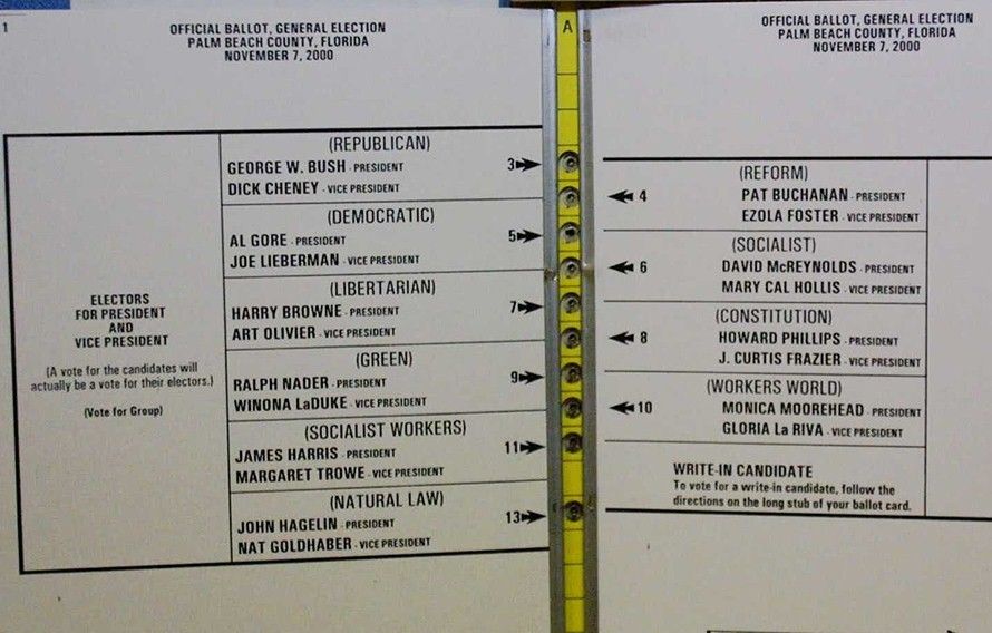 Author/Copyright holder: Anthony. Copyright terms and licence: Public Domain.
Behold the infamous butterfly ballot, which caused thousands of voters to vote for the wrong party—unintentionally. After an intense recount process and the decision of the United States Supreme Court in Bush v. Gore, Governor George W. Bush officially won Florida's electoral votes by a margin of only 537 votes out of almost 6 million cast, and, as a result, the entire presidential election. The process was extremely divisive, and led to calls for electoral reform in Florida.
Example 5: Don’t let Your Users Get Killed Because of Your Design
Let’s take a more recent example of yet another seemingly “simple button”. In 2015, precisely 13,574 cars of the American brand Lincoln were recalled because the Start/Stop button of the car had to be moved. The reason? Drivers accidentally pushed their cars’ Start/Stop button while driving at full speed. Turning off a car while it’s driving at a high speed is hardly the safest move, especially if you’re not expecting it.

The designers at Lincoln had placed the Start/Stop button right below the “S” button, which stands for “Sport”. Drivers would usually intend to press the “Sport” / “S” when driving at high speeds, and their attention would obviously be limited because they needed to keep their eyes on the road. The result was that some drivers unintentionally pressed the “Engine Stop” button instead of the “S” button right next to it. The result? Some drivers unintentionally—and abruptly—stopped their cars while they were driving at high speeds.

Lincoln had to recall the 13,574 cars and then move the button to the top of the column of buttons – as a kind of “usability patch”. By placing the “Sport” / “S” at the very opposite end of the column, they lowered the likelihood of the drivers’ accidentally pressing “Stop engine” while driving at high speeds.
The Take Away
The examples above – from different centuries – show that if you want to become a great designer, you shouldn’t just be studying the latest technology or design trends. Many principles of great design are universal and timeless as they are based on psychology, sociology, studies of our present and past technology, as well as the interaction between humans and technology. Not even the design of a single button is an easy win.
“Creativity is just connecting things. When you ask creative people how they did something, they feel a little guilty because they didn't really do it, they just saw something. It seemed obvious to them after a while. That's because they were able to connect experiences they've had and synthesize new things. And the reason they were able to do that was that they've had more experiences or they have thought more about their experiences than other people.”
– Steve Jobs, Interviewed with Wired: Gary Wolf. Steve Jobs: The Next Insanely Great Thing
References & Where to Learn More
Hero Image: Author/Copyright holder: Rikke Friis Dam. Copyright terms and licence: CC BY-NC-SA 2.0
Don Norman, The Design of Everyday Things, Introduction, page xv, 2002
Steve Jobs: Good artists copy great artists steal. Interview with Steve Jobs about the creation of the Apple Macintosh. Did Steve Jobs steal from Xerox PARC? 1994.
Don Norman: Human Error? No, Bad Design.
Background on the Three Mile Island Accident, 2014.
Per Curiam, SUPREME COURT OF THE UNITED STATES, GEORGE W. BUSH, et al., PETITIONERS v. ALBERT GORE, Jr., et al., 2000.