When you’re in the beginning stages of your design project and you have just finished some highly informative interviews and observations in the context of your users, your head is full of impressions. You have a feeling for the different types of users who exist, and you have heard some similarities in their stories that you feel should guide the design process. But how do you get these impressions out, into the minds of your co-designers and the client? Personas are very powerful tools that will help you do just that. They are commonly used by design teams around the world, and have been proven to be very effective. Let us show you the best practices in developing these design deliverables, so your user research results can work their magic.
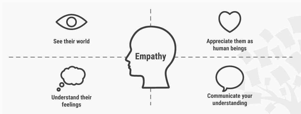
In her Interaction Design Foundation encyclopedia chapter on personas, leading specialist in personas Lene Nielsen describes four perspectives that your personas can take to ensure that they add the most value to your design project: goal-directed personas, role-based personas, engaging personas, and fictional personas. Here, we’ll explain the engaging personas in more detail, and show you how to implement them in scenarios, because this perspective is most useful when you want to establish empathy for the user in your fellow designers or clients.
“The engaging perspective is rooted in the ability of stories to produce involvement and insight. Through an understanding of characters and stories, it is possible to create a vivid and realistic description of fictitious people. The purpose of the engaging perspective is to move from designers seeing the user as a stereotype with whom they are unable to identify and whose life they cannot envision, to designers actively involving themselves in the lives of the personas.”
— Lene Nielsen
Evoking Empathy with Engaging Personas
Developing an engaging persona starts with user research. Collecting insights about the social and cultural backgrounds of the users, their psychological traits, their feelings of frustration, and their goals will help you develop a broad knowledge of the users. But that’s not enough! In the personas, the data you collect should be balanced with some fictitious information that evokes empathy. Just compare the following two user descriptions, to get an understanding of what we mean.
Description of the target group of a social media platform for seniors, based on research results only:
Single elderly inhabitants of the Timbuktu region
Living independently in the house they own
Children living at a distance with their families
Are feeling loneliest when they have to eat alone
Description of an archetypical user of a social media platform for seniors, including some fictional elements:
Mrs. Green is 68 years old, and always loved cooking for her husband. Since he passed away, she has been living alone in her house. Her children are all grown up, and are living outside the Timbuktu region with their families. They only come to visit her every other week. Mrs. Green doesn’t want to bother them more, since they have busy lives with their work, children, and friends. She often feels lonely when there’s no-one around, especially during meal times. She hates sitting at the table all by herself, so she doesn’t cook as often as she used to. Sometimes she just has a sandwich in front of the television.
Both descriptions are based on the same research data. The first is not incorrect, but is far less helpful when you want to evoke the same empathy you have developed for the target group, in your fellow designers or client. Once you start putting this data in context, the archetypical user will come alive as a person they can feel for. An image of the user in context will help you strengthen this effect even further, as will some other elements that you should include in a persona.
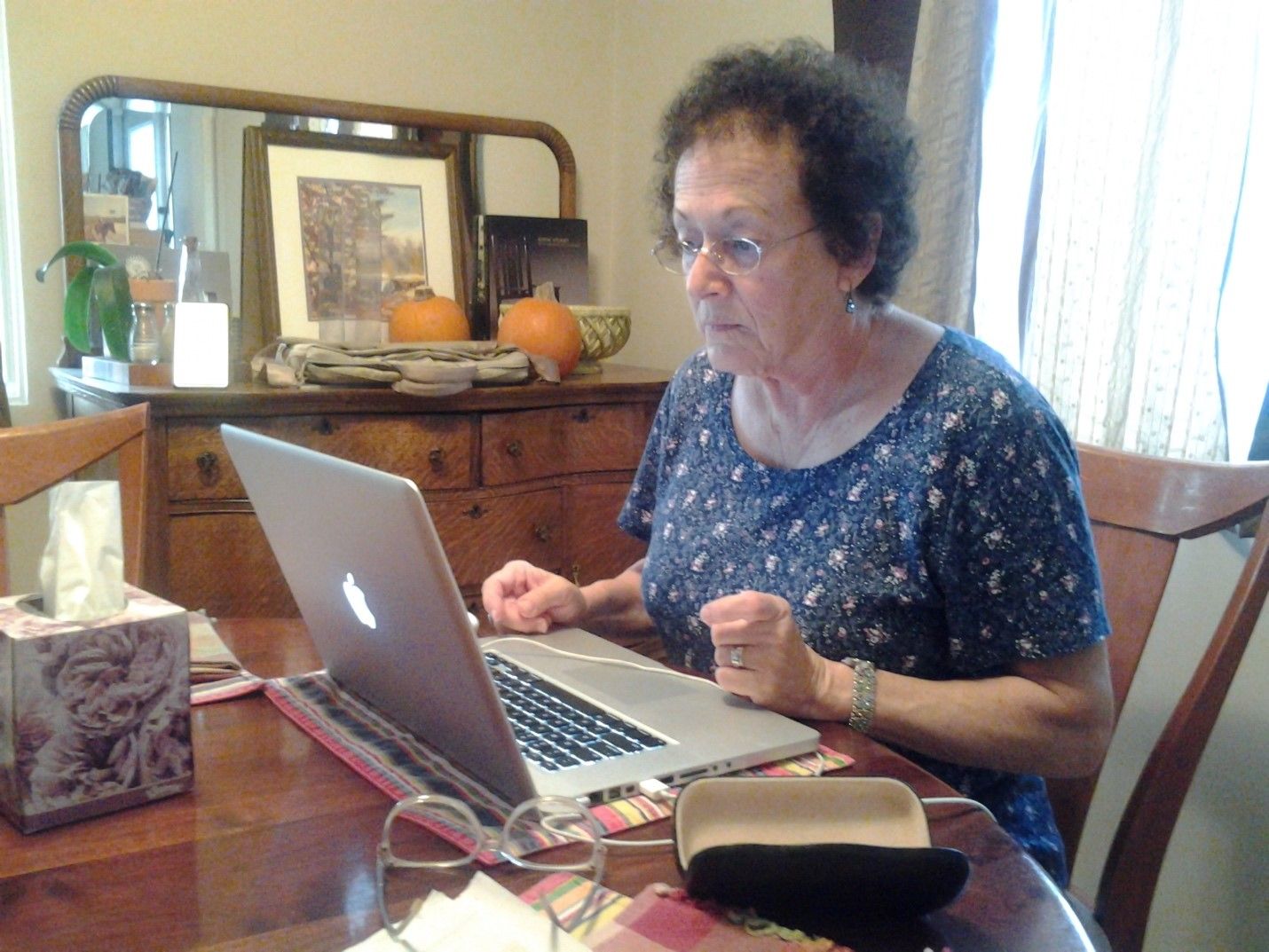
Author/Copyright holder: Kimberly B. Copyright terms and license: CC BY-ND 2.0
An image of the user in context will help make the description above come alive even further. Just imagine that this is Mrs. Green, alone in her house. As such, she is the sole occupant of a dwelling in which the environment may tend to be very quiet, dark, and likely to bring her down.
Elements to Include in a Persona
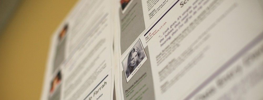
As you want to use personas throughout the whole design process, to remind all people involved of the people you’re developing your products for, you don’t want to create voluminous documents that nobody would want to read. You want to focus on creating easily accessible overviews that instantly let the most important insights stand out. Ideally, you would print them out and hang them on the wall of your workspace, to glance over every time you’re thinking about a design decision you need to make. We’ve already touched on the importance of placing the dry research results into context and using an image to make them come alive. Now, let’s have a look at some other elements that experts incorporate in their personas and see how they combine to make an inspiring representation.
Aurora Harley, User Experience specialist at the Nielsen Norman Group, explains that there are six common pieces of information that make up a persona:
Name, age, gender, and an image of the persona, preferably including some context in the background
A tag line, indicating what the persona does or considers relevant in his or her life
The experience and relevant skills the persona has in the area of the product or service you will be developing
Some context to indicate how he/she would interact with your product or service (e.g., the voluntariness of use, frequency of use, and preferred device)
Any goals, attitudes, and concerns he/she would have when using your product or service
Quotes or a brief scenario, that indicate the persona’s attitude toward the product or service you’re designing. If the persona already uses an existing product or service to meet his or her needs, you might describe the use of that here.
These elements can then be combined into a layout, one that is the same for every persona you create in a project. As you’ll most likely develop more than one persona for a design problem, to cover the whole breadth of your user group and the diversity of characteristics in it, keeping to one layout will help you communicate the variety in personas clearly. Below is an example of what such a layout could look like, when filled with the research data and fictional components.
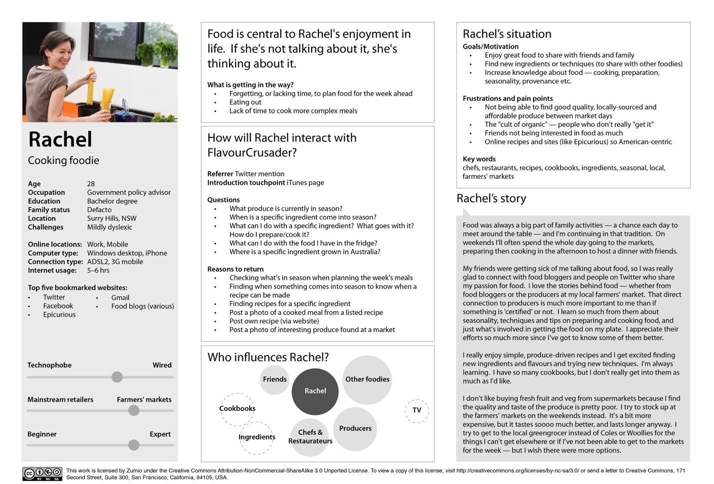
Author/Copyright holder: Zumio. Copyright terms and license: CC BY-NC-SA 3.0
Example of a persona that shows the six main elements you should include. Name, age, gender, tag line, experience, and skills are placed on the left-hand side. The middle column focuses on the context to indicate how—in this case—she would interact with a product or service. Finally, on the right-hand side, some goals and concerns are shared, as well as a short scenario to indicate the persona’s attitude.
For your convenience, we’ve created a template that you can use to create your own personas. Download a printable PDF here:

Creating the Right Balance
It might take some practice to get the balance between research data and fictional details just right. In the end, you want to enhance empathy for people who actually form your target group. Without the research data, nobody in real life will use your designs; without fictional details, nobody in your design team will remember whom you’re designing for. On the other hand, with too much research data, your design project loses its focus, and with too many fictional details, your persona loses its credibility. So, it’s important to pick precisely the right information to show in a persona. To do that, you only have to decide if a piece of information is relevant when making a design decision. It sounds so simple, but let’s explain it with an example.
“Each piece of information should have a purpose for being included: if it would not affect the final design or help make any decision easier, omit it.”
— Aurora Harley, user experience specialist at the Nielsen Norman Group
Just imagine that you’re creating this social media platform for seniors that we were discussing earlier. Knowing what media devices your persona uses is highly relevant, as it influences whether you are mainly developing it for mobile or desktop use. This information should come from research data rather than your imagination. Besides that, understanding the daily rhythm of a senior using your platform would also be relevant, as you want your design to fit into this flow seamlessly. However, while this information is also based on research, you will present it best in a mixture with some fictional details. You will then have a short story that will help others imagine what it would be like to be your persona. Given not only a face to the issue but also a narrative, your readers will be catapulted into the reality your users face, and the scale of the problem you’re addressing.
On the other hand, knowing what newspapers your persona reads might not be relevant in your design project at all, unless research shows that your target group uses the personal advertisements (those short advertisements you can place to find companionship) as a solution to their current feeling of loneliness. In that case, you can select a newspaper that would fit the overall impression you want people to have from this persona to include in your overview. Some newspapers will mainly target highly educated liberal people, whereas others will target lower-income conservative groups.

Author/Copyright holder: htraue. Copyright terms and license: CC0
In the seniors’ social media platform case, where the aim is to solve feelings of loneliness, including information on the type of newspaper the persona reads is only relevant when research shows that the target group uses personal advertisements to find companionship. Then, you can add some fictional information. You can use the type of newspaper to reflect the type of reader that this persona represents.
Going overboard with the fictional details can make your persona less credible, especially when the details are irrelevant to the design process. In the senior social media platform case (well, in most cases probably), it would, for example, not make much sense to include a description of Mrs. Green’s favorite candy. An archetypical user will not be defined by his or her candy preferences, and you are unlikely to be able to use this as a guiding principle for your design decisions. Including this detail will stand out so much that it will make your fellow designers and/or client question whether other parts of the persona are based on a solid understanding of the users. Worse than that, it may even give rise to derision—just think; would Mrs. Green’s preference for Gummy bears over, say, brandy-balls have any real bearing on the mind-crushing sense of being alone she experiences when peering through her lace curtains on a typical weekday mid-afternoon? So, think like a storyteller—make the details matter to the story. Each attribute needs to pull its weight in portraying the persona’s world, motivations, fears, hopes, etc.
Another balance to consider is the one between short and to-the-point statements and longer, more flowing scenarios. As you want to achieve an overview that communicates the persona’s characteristics clearly, you need some shorter elements such as bulleted summations, sliding scales, or tag clouds. At the same time, you will want to engage your colleagues and clients and make them empathetic to the user. For that, you will need the scenario-part of the persona to be sufficiently descriptive and sizable.
The Take Away
Creating personas is a powerful way to make the user group come alive to your design team members and clients. Developing an engaging persona starts with user research. Then, you balance the data you collected with some fictitious information that evokes empathy. When developing a persona, you should strive for a good balance between research data and fictional details to ensure credibility and applicability. Also, the balance between short and to-the-point information, and more elaborate scenarios is important for overview and engagement.
A good persona includes six main elements:
Name, age, gender, and an image
A tag line
The experience and relevant skills
Some context to indicate the interaction
Any goals, attitudes, and concerns
Quotes or a brief scenario
References & Where to Learn More
Hero Image: Author/Copyright holder: Travis Isaacs. Copyright terms and license: CC BY 2.0
Course: User Research – Methods and Best Practices
Aurora Harley, Personas Make Users Memorable for Product Team Members, 2015:
John Pruitt and Tamara Adlin, The Persona Lifecycle: Keeping People in Mind Throughout Product Design, 2006
Alan Cooper, The Origins of Personas, 2008:
