Gestalt psychology attempts to understand psychological phenomena by viewing them as organised and structured wholes rather than the sum of their constituent parts. Thus, Gestalt psychology dissociates itself from the more 'elementistic'/reductionistic/decompositional approaches to psychology like structuralism (with its tendency to analyse mental processes into elementary sensations) and it accentuates concepts like emergent properties, holism, and context.
In the 30s and 40s Gestalt psychology was applied to visual perception, most notably by Max Wertheimer, Wolfgang Köhler, and Kurt Koffka who founded the so-called gestalt approaches to form perception. Their aim was to investigate the global and holistic processes involved in perceiving structure in the environment (e.g. Sternberg 1996). More specifically, they tried to explain human perception of groups of objects and how we perceive parts of objects and form whole objects on the basis of these. The investigations in this subject crystallised into "the gestalt laws of perceptual organization." Some of these laws, which are often cited in the HCI or interaction design community, are as follows.
22.0.1 Law of proximity
Figure 1.A: A real-world example of the law of proximity from MTV Music Awards 2002
Figure 1.B.: An example of the use of the law of proximity in interface design - Kazaa Media Desktop
Figure 1.C.: A typical "text-book way" of exemplifying the law of proximity
The law of proximity posits that when we perceive a collection of objects, we will see objects close to each other as forming a group. In figure 1.A., we perceive the MTV logo and the logo for the Europe Music Awards as forming a group in the top left corner and the logos of the sponsors as forming a group in the bottom right corner. The white space separating the two groups of logos is used to indicate 'grouping', and the proximity of the logos of each groups is thus used to this end. Thus, a semantic separation of 'organisers' from 'sponsors' is achieved via structuring the graphical layout in accordance with this simple principle of perceptual organisation.
Figure 1.B is taken from Kazaa Media Desktop, where the law of proximity is used in designing the user interface of the popular peer-to-peer (P2P) software. As shown by the screen dump, the user can choose between P2P and web search. The group of radio buttons underneath are only associated with the P2P search and not the web search. To signal this association to the user, the vertical row of radio buttons are placed comparatively closer to the P2P-search radio button.
Figure 1.C is a typical textbook example, exemplifying how the law of proximity groups the items into 3 groups as opposed to 8 individual items.
22.0.2 Law of similarity
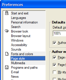
Figure 2.A.: The "preferences window" of the Opera browser
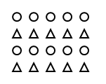
Figure 2.B.: A typical textbook example of the law of similarity
The law of similarity captures the idea that elements will be grouped perceptually if they are similar to each other. In the "preferences window" of the Opera browser (figure 2.A), colour is used to make the user group the menu items on the basis of their background colour. The grey background of the first four menu items thus "tie them together". Figure 2.B. is a typical textbook example of the principle of similarity, whereby we see the circles and triangles as forming four horizontal rows (or at least some configuration where triangles and circles are grouped depending on their shape). Objects similar to each other thus tend to be seen as a unit.
22.0.3 Law of Prägnanz (figure-ground)
Figure 3.A: The logo of visitnorway.com
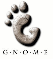
Figure 3.B: The logo of the Gnome Desktop Environment
Figure 3.C: The logo of the Macintosh
Edgar Rubin, a Danish psychologist, was the first to systematically investigate the figure-ground phenomenon. The phenomenon captures the idea that in perceiving a visual field, some objects take a prominent role (the figures) while others recede into the background (the ground). The visual field is thus divided into these two basic parts. This effect is often used by smart logo makers, as figure 3.A, B, and C suggest: The logo of visitnorway.com can be viewed as both three separate elements of blue, green and navy colour. It may, however, also be viewed as a person stretching his/her arms into the air. Similarly, the logo of the Gnome Desktop Environment (figure 3.B.) can be viewed as both a "G" and a footprint. Lastly, the Macintosh logo can be viewed as a regular happy face and a happy face in profile (looking at a computer screen).
Common to these logos is that you can focus on only one "interpretation" at a time; you cannot observe both the figure and ground at the same time, as ground will become figure when shifting the focus.
It should be noted that the figure-ground is most often exemplified using the Rubin Face/Vase Illusion, named after Edgar Rubin.
22.0.4 Law of symmetry
Figure 4.A.: CSC Finland's logo.
Figure 4.B.: A typical textbook example of the law of symmetry
The law of symmetry captures the idea that when we perceive objects we tend to perceive them as symmetrical shapes that form around their centre. Most objects can be divided in two more or less symmetrical halves and when for example we see two unconnected elements that are symmetrical, we unconsciously integrate them into one coherent object (or percept). The more alike objects are, they more they tend to be grouped.
In the above (figure 4.A), CSC Finland's logo is perceived as an integral whole although the two constituent geometrical shapes seem to be pointing in different directions and have differing colours.
A typical textbook example of the law of symmetry (figure 4.B.), consists of a configuration of a number of brackets. When perceiving the configuration, we see three pairs of symmetrical brackets as opposed to 6 individual brackets, or two pairs and two singles. This happens despite what is suggested by some of the brackets immediate proximity to each other.
22.0.5 Law of closure
Figure 5.A.: IBM's logo.
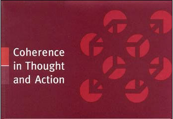
Figure 5.B.: Half of the book cover of Paul Thagard's book, "Coherence in Thought and Action"
Figure 5.C: A typical textbook example of the law of closure
The law of closure posits that we perceptually close up, or complete, objects that are not, in fact, complete. In the above, we perceive the letters 'I', 'B', and 'M' although the shapes we see, in fact, are only lines of white space of differing length hovering above each other. Similarly, we see the figure on Paul Thagard's book (figure 5.B.) as forming a three-dimensional box although all we see, in fact, is 24 dissimilar red shapes (count for yourself!) on a dark red background. Figure 5.C. is the typical textbook example of the law of closure; we perceive a circle and not 8 individual circles.
The Gestalt approach can be said to be a "bottom-up" theory as it starts from the bottom (the aspects of the stimuli that influence perception) and work its way up to higher-order cognitive processes. An example of another bottom-up theory (of perception) that is well-known in the HCI community is James Gibson's theory of "direct perception" (see affordances and perception).


