In this, the second part of our examining Gestalt principles, we’ll look at another Law – the Law of Proximity. This one is especially useful as it deals with how our eyes and brains draw connections with design images. Of course, connecting is also important to us – that’s what we want to make happen between our users and our designs!
“The eye tends to build a relationship between elements of the same design,” is a crucial saying to keep in mind. Our brains build connections between disparate design elements based on laws of visual perception. These are influenced by the way in which elements in a design are laid out. The laws that apply are those of proximity, uniform connectedness, and continuation.
This article is a follow-up to the first Gestalt principles article, in which we introduced and discussed the Law of Similarity. There will be a third article to cover the Laws of Figure/Ground, Prägnanz, Closure, and Common Fate. For now, let’s stay near proximity, which (literally!) means closeness in space, time, or relationship.
What Is the Law of Proximity?
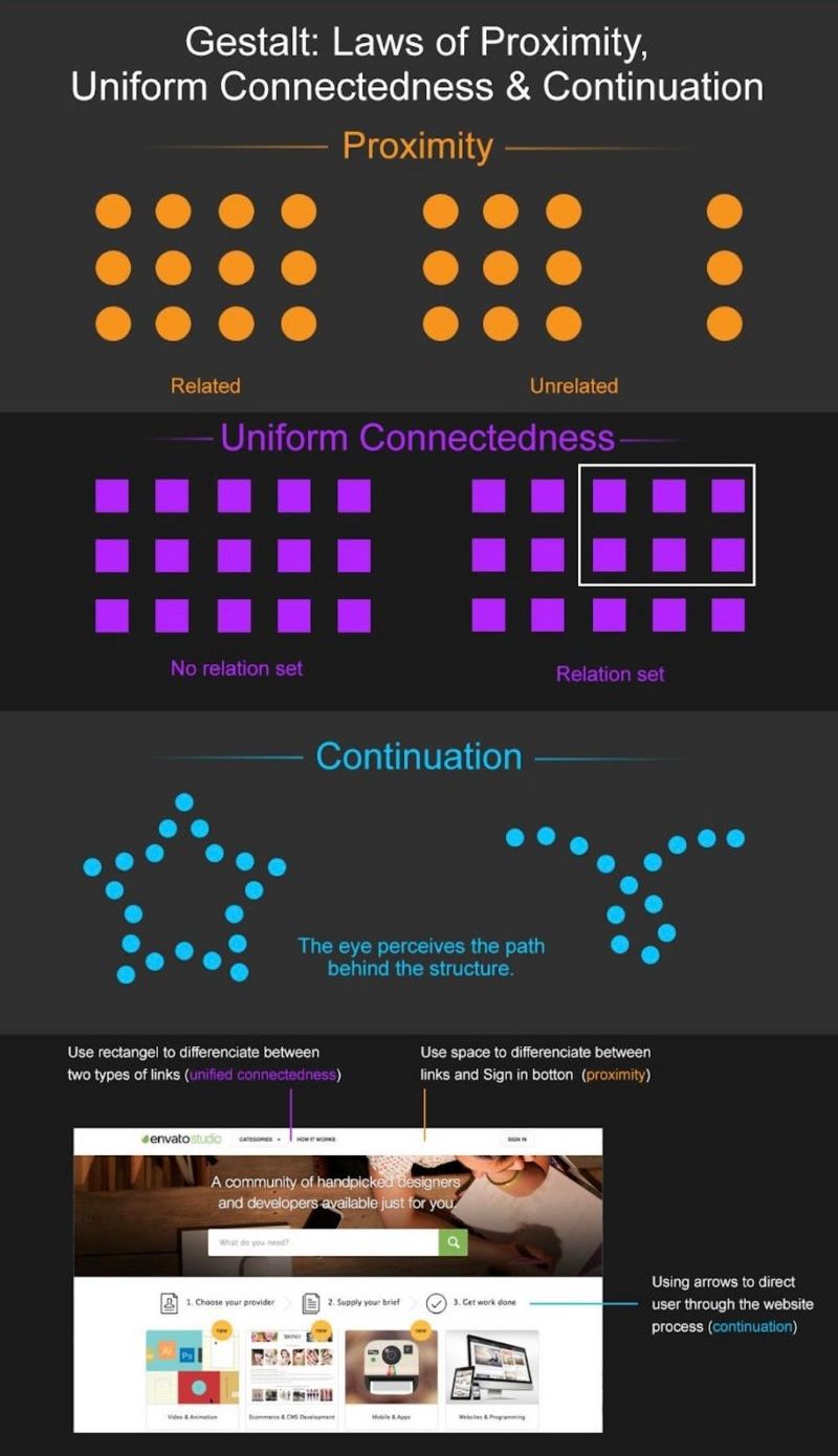
The law of proximity describes how the human eye perceives connections between visual elements. Elements that are close to each other are perceived to be related when compared with elements that are separate from each other.
The law of proximity allows us to use whitespace, for example, to build perceived relationships between different elements.
In written material, the law of proximity enables us to make sense of text as a whole. This is also true for paragraph spacing and for more disparate elements of text on a web page. The spacing between blocks of text tells us how likely they are to be related to each other. Pick up any book near you and flick through it. Unless it’s a telephone directory, you’ll notice how the author has (hopefully!) made sensible use of paragraphs to keep text about similar ideas, points, or threads of arguments together. The rule is this: if you change the subject, you’ll need to start a new paragraph.
The law of proximity is very useful for allowing people to group ideas, concepts, etc. – it’s ideal for us to be able to recognize different clusters of items at a glance. However, as designers, we need to be careful about employing the law in our designs. Why? If you group too many items too closely, you’re going to end up with a noisy, crowded layout. The proximity of each item will become so indistinct that your design will lose meaning.
Let’s try a little experiment. If you’ve got a pencil and paper handy, try this: draw 8-10 circles (at scribble speed – there’s no need to spend time on neatness and geometric perfection!), anywhere on the page, using up about a quarter of the total space, but keep them together.
Now, let’s add the same number of triangles, just a little way away from the circles (so that the distance between the two groups is about 3-4 times the distance between each circle). Again, leave room so that there’s still half a page that is blank. Okay, let’s put in some squares now – about the same number in the same amount of space, keeping them close to each other.
For our grand finale, let’s insert some rectangles, maybe 4-5, increasing the size a bit so they’re noticeably different from the squares.... All done? Good job! Now, turn away for a moment and then look back at your page.
Do you see how, although the four groups are sorted or clustered together, the design as a whole is a very busy affair? We can see that looking at this is actually something like work! Making our users work is not what we want.
What Is the Law of Unified Connectedness?
The law of unified connectedness states that elements that are connected to each other using colors, lines, frames, or other shapes are perceived as a single unit when compared with other elements that are not linked in the same manner.
This grouping effect works even when it contradicts other Gestalt principles, such as proximity and similarity. “How can it contradict laws?” you might ask. Well, remember that we’re dealing with the unique combination of the human eye and brain. Without getting into the subject of magic, illusions or tricks (because we don’t want to get off topic), we can see that the human tendency to link or group elements, or focus on like items in a sea of dissimilar objects, is a powerful trait.
Let’s try a quick experiment. If you have another blank page, please take it and try this little sketch. It will take a matter of seconds.
Draw six, rough circles, like the six dots on a pair of dice. Now, draw a line from the top-left corner dot to its comrade dots at its right and below it. For the bottom-right corner dot, connect it to the dot above it and also the bottom left dot. Look away for a moment; then, check out your sketch. You now have two groups of three, linked dots.
Implementing this connectedness in your designs is easy; there are many ways to indicate grouping within a design. Some common examples include:
Connecting related links or buttons by adding them to the same drop-down menu.
Using the same bullet shapes, colors, or numbering system (such as Roman numerals, Arabic numbers, etc.) on list items to group them with each other.
Displaying functions of a similar nature, such as login, sign up, and forgotten password, so that they are related, inside a frame or colored rectangle.
What Is the Law of Continuation?
The law of continuation asserts that the human eye follows lines, curves, or a sequence of shapes in order to determine a relationship between design elements.
The continuation can carry through both positive and negative spaces in designs. Positive space is the space in a design that is made up of the subject – the image we insert. Negative space is the rest of the space around and in between that object’s edges. When we view a design layout, our eyes tend to draw a line that connects different elements.
Have you still got your page? Good! Let’s turn it over and do another quick sketch. First, find three different colors of pencil or pen or highlighter. This will help us understand continuation, and you may probably recognize it right away as something that has struck you several times before.
Using one pen, let’s draw a vertical, broken line – as straight as you can, no ruler needed. Now, let’s take a different color of pen and put a broken wavy line horizontally across it. Then, taking our third color of pen and keeping our eye on the point where they intersect, let’s put a third line, broken (or dotted), across it.
Look away for a moment; then, look back at your sketch. Do you see how, for all three lines, you follow them as they run through the point where they meet? What you don’t see are six segments (three smaller lines of two colors) meeting in the middle. We can immediately see that the items lying on any of these lines are connected. If we were to add something else at the end of one line, we’d notice that this last item would be disconnected or perhaps even sitting outside the overall design.
You don’t have to draw such lines in your design – they may be metaphorical (visually and/or in writing). For example, you could fashion a line through the shape of the content or graphical elements. Or, you could deliver it through numbering steps in a process. Thus, a payment process might use numbered steps to show continuation, or it might use a flow chart with arrows drawn, linking each step. Alternatively, you could use a “funnel” shape to show progress towards the end of the process.
Remember that the human eye is accustomed to marking out pathways and following them. Thankfully, there are traffic laws to keep us right on the road, but our eyes and brains tend to like following lines and routes. That frees people to “go with the flow”, and frees up designers to make use of this nature. That’s also good for keeping our users on track, because we don’t want them straying from what we’d like them to see in our designs.
The Take Away
With your designs, you’re looking to deliver both the most aesthetically appealing and easy-to-use interactive product. The laws of proximity, uniform connectedness, and continuation are tools to improve the usability and interaction from the user’s perspective. While this isn’t necessarily magic, remember that optical illusions exploit some guaranteed human eye-to-brain traits, which is the beauty of understanding Gestalt principles, too.
You can organize related content for clarity using the laws of proximity and continuation. You can also use the unified connectedness law to show a stronger correlation between actions and content. Keeping these in mind, ask yourself which elements of your design you want to group for the user.
Let’s quickly summarize the Gestalt principles we have seen so far:
Similarity (also known as Invariance): The human eye tends to build a relationship between similar elements within a design. Similarity can be achieved using basic elements such as shapes, colors, and size.
Continuation: The human eye follows the paths, lines, and curves of a design, and prefers to see a continuous flow of visual elements rather than separated objects.
Proximity (also known as Emergence): Simple shapes arranged together can create a more complex image.
Uniform Connectedness: This Law deals with a “grouping effect”: we perceive elements as connected to each other thanks to colors, lines, frames, or other shapes.
Where to Learn More
Eager to learn even more from Gestalt Psychology? Take our course, “Gestalt Psychology and Web Design: The Ultimate Guide”!
This course will help you to:
Understand how the Gestalt laws influence User Experience.
Be able to adopt a Gestalt-driven approach to product and web design.
Be able to analyze existing product and web designs according to the Gestalt principles of perceptual organization.
Have the knowledge necessary to design products and websites that support the quirks, biases and defining features of visual perception.
Be equipped with the knowledge necessary to design displays that support visual perception and improve the user experience associated with your websites.
Have a deep understanding of human visual perception.
Appreciate how the human mind influences what we see and when.
Be equipped with an understanding of the Gestalt view of visual perception and the principles of perceptual organization.
References:
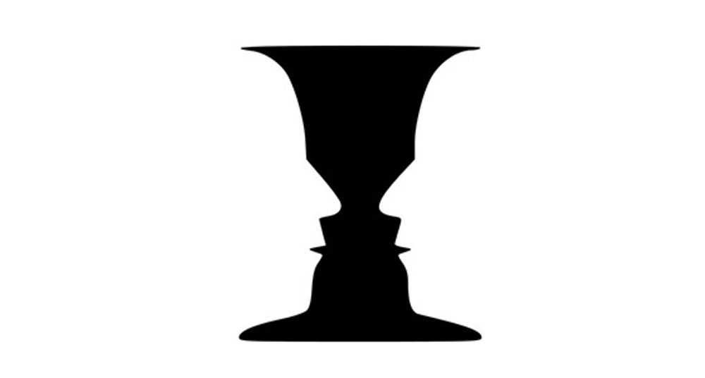
Hero Image: Author/Copyright holder: Eumedemito. Copyright terms and licence: Public Domain.