If you can just get your mind together
then come across to me
We’ll hold hands an’ then we’ll watch the sun rise
from the bottom of the sea
But first
Are You Experienced?
Ah! Have you ever been experienced?
Well, I have
I know, I know
you’ll probably scream n’ cry
That your little world won’t let go
But who in your measly little world are trying to prove that
You’re made out of gold and -a can’t be sold
So-er, Are You Experienced?
Ah! Have you ever been experienced?
Well, I have
Ah, let me prove it to you
I think they’re calling our names
Maybe now you can’t hear them, but you will
if you just take hold of my hand
Ah! But Are You Experienced?Have you ever been experienced?
Not necessarily stoned, but beautiful
- Jimi Hendrix, Are You Experienced?
Having gone through that long-winded personal history, and description of my personal design approach, let’s see how it plays out in today’s digital product development scene in general, and in the lead-up and execution of LAVA in particular.
20.0.1 Design Thinking
Renowned design firm IDEO personifies the comprehensive approach to design in search of fundamental innovation, selling its DT problem-solving process versus specializing in solutions specific to any particular style or medium. Originally championed by IDEO founder David Kelley, DT is the foundation of Stanford University’s D-School interdisciplinary product development curriculum, and under different names and variants is the process basis of the top university design programs. It is now used to describe the menu of best-practice design methods collected over the years.
The shortcut design process I described in the previous chapter can sometimes work, and here is no single recipe for all projects. Projects can of course be over-analyzed, especially by doctrinaire designers who insist on rote interpretation of DT even when it is not necessary. Sometimes this position is taken out of fear that if success occurs by cutting corners, the value of DT will be questioned in the future. Not every problem needs the full DT approach, but all design projects can benefit from selected techniques in the DT menu. Deciding how many to use, and to what extent, is determined by the stakes of the problem, its level of understanding, and the amount of risk willing to be accepted. The more thoroughly DT is used, the more confident the team can be of a solution’s validity. As Doblin pioneered in the 1970s, a broader and more thorough approach up front, which simulates the outcomes of any necessary production investment, accepts the small risk of higher design costs and time to avoid the large risk of project failure.
In reality there are many more factors in play when making such decisions. However, what we possess now, that we did not decades ago, is a proven, repeatable, documented, and more accessible process that can be called upon when necessary. Much of DT is oriented towards group inclusion in ideation, selection, and validation of options. It explains and packages design methods for quicker consumption by others in the product development business process, giving form and validity to an otherwise mysterious activity. A designer once likened design methods to a sex manual. It’s not there to be followed line by line in practice, but rather to be referred to when problems occur. What we also have are professionals willing to take ownership and responsibility for bigger, more integrated outcomes, versus blaming participants from other silos for failures. While the comprehensive methods of DT are no guarantee of success, it is the best process we have to expose problems and opportunities in the general development process, making it less possible to blame failure on unpredicted user behavior, or developers that did not know of or buy into the vision.
This does not of course mean that poorly performing, unskilled, untrained, or inexperienced people can follow a DT process and expect success. The process is only as good as those using it. In fact, one of the main values of more experienced designers is their knowing what steps might be unnecessary in a given context – when the rules can be broken to buy time or save costs. It definitely provides a boost to whatever competency level is present in the team using it, even for experienced participants who may find it tedious. In a few cases when doing hands-on work, I’ve caught myself in projects wanting to jump to conclusions, based on personal experience and best practice solutions. I find it oddly reassuring that, despite occasional doubts about its value, I am often surprised about the value of results from research and testing that, sometimes, prove my assumptions wrong. I sometimes need to second-guess my experience – to regain beginner’s mind and sacrifice predictable form-making time for unpredictable question-asking time.
20.0.2 Lean
As for Lean Development, I first encountered the related concept of agile methods in the form of the process called Extreme Programming, or XP, in my work at boutique software developer EC Wise. While the initial ideas of agile development were put forth in the agile manifesto, in the 2002 paper Are Agile Methods Good for Design?, my answer was an uncomfortable and qualified “yes”. The design profession is still heavily influenced by its historical roots in architecture, printing, and the consumer product phenomenon resulting from the industrial revolution. In mass-produced product design, as with architecture, there is pressure to get things right the first time. Buildings are expensive, intended to last a long time, and difficult to change once in place. Given a professional understanding of customer needs, historical best practices, and the physical properties of building materials, design and construction is mostly a relatively straightforward affair, as long as everything is well specified ahead of time. The same is true of mass-produced products.
As opposed to the craftsman tradition preceding the late 19th century, where the creator of an artifact was likely to be following established design patterns – and the person building it by hand — product designers perform the more specialized role of drafting specifications for the creation of the tools and dies used for the production and assembly of a multitude of identical final products. As with architecture, because a production line and its implements are expensive to build, and more so to change, there is pressure to achieve perfection at a single point in time when production commences, and then maintain it throughout production runs. Successful designers in this world need to be extremely detail-oriented and precise, because mistakes causing part misfits or aesthetic flaws can be tragic. Printing is the same way. Originally the person who did the printing was the one who set the type and, if not executing the illustrations, placed them into a layout, with a keen eye for the practical limitations of the printing equipment and the properties of paper and ink. Artisanal graphic artist David Lance Goines still works that way in his Berkeley, California print shop. Once his press is running, there is a very limited number and range of possible adjustments to alter the final product. This tradition of a more-or-less definitive point in time where the design stage transitions into production still has a huge influence in design schools, in particular RISD (despite the analytic and process orientation of its Graphic Design program) with its long tradition of focus on craftsmanship, materials, and reverence for the integrity of the created artifact. The academic tradition has relentlessly reinforced this perfectionist attitude that, in the world of software design, can actually be counterproductive.
Given that software products need precision, quality, aesthetic appeal, and attention to deadlines just as any other product does, it is distinctly unique in that it is relatively Formless, Malleable, Boundless, and Evolving, or FMBE. This is now especially true with the advent of the Web and the cloud-based distribution model. Unlike buildings and physically manufactured products – which can be perceived more or less as an iconic, distinct whole – software products are relatively formless. Their users and even creators only ever “see” them through the wormhole of the display screen, views of its source code, or via abstract models like UML diagrams or site maps. It is boundless because, as any developer will tell you, anything is possible with software given enough time and money. The ease with which it is changed, both by its authors and its users, makes it quite malleable. The relatively young age of the discipline, and the rapid change of its underlying technologies and markets, cause it to constantly evolve. These factors, being the very ones that make the field so dynamic and innovative, can make it maddeningly difficult to visualize and design. They introduce unique challenges and opportunities for designers.
There are no expensive printing plates, die molds, or 60-story steel frameworks to change if a glitch is found. Errors can be fixed with software patches, periodic updates, or by going in and changing code in the production website or application. While this capability is not cost-free or encouraged, the corresponding environment is dramatically more forgiving to minor fixes and direction changes. Often the major barrier to product evolution is that of convincing users and customers to accept and learn to use newer versions. Agile development essentially turns this malleability into a systematic development reality, whereby major errors are avoided by doing a little bit of work at a time, testing to see if it’s right, and then moving on the next batch of work. If major traditional tooling and manufacturing efforts were tied to such a process, costs would be prohibitive.
In fact, the writing of this book is an exercise in this historic tradition that I have actually been far removed from for awhile now. As I’m writing it, I’m terrified of the errors or awkward phrasings that you have undoubtedly already discovered. I’m not (yet) a professional writer, and the process of debugging something of this size is a mystery. Because the book will be in part distributed in printed form, some errors will go unfixed. (I do remember a time when books might have a small paper insert labeled “errata”, with lists of typos and fact corrections). Designing and representing digital products and their magic ink is different and in some ways more difficult than doing so for physical products like books, cars, and buildings. Complexity of mechanical design is often measured by the number of moving parts involved that can wear out, malfunction, or break. In software, almost everything is a moving part, where the tiniest edge case error – like limiting the Year database format to two characters – can cause the whole system to collapse. It’s similar for designers, where not only is there almost infinite possible variety in composing equally-priced pixels on a screen, but, unlike working with materials whose properties are well known – like stone, steel, paper, and ink – the design medium itself is under constant flux. Moore’s law of accelerating boosts in processing power, new programming languages, and new display, distribution, and payment innovations put any solution optimized to fit any state of these enablers onto a treadmill into obsolescence. Imagine the stress for architects if they had to decide whether to wait until next year to begin a project in order to use a new steel that was, according to marketing literature, twice as strong?
A colleague once shared with me a dramatic example of this gulf in expectations. When Microsoft co-founder Paul Allen was building his $500 million luxury yacht, he managed the construction like a software project — in that few design decisions were never final and could be changed at will — to the deep consternation of the diligent and perfectionist shipbuilders in Hamburg, Germany. Apparently, perhaps upon hearing that Larry Ellison had an even larger project in the works, he asked that the yacht be lengthened. This would be a dramatic requirements change even in the design stage, but in this case the boat’s keel had already been laid and the hull construction underway. Any naval architect will tell you that the first factor to be established in ship design is its length, as all subsequent decisions such as width, height, powerplant, hull shape, etc. key off of this value. While it may seem simple to merely grind the steel hull in two and add a ten-foot length of hull to its midsection, doing so distorts the hull’s hydrodynamics and impairs its handling characteristics. Surely due to the delays incurred by this and other changes, later on the twisted-pair digital wiring was asked to be ripped out in favor of fiber optic cables. The boat was taking so long to build that its digital technologies were being made obsolete before it was finished. In the end, whatever network form was decided upon is likely not even used, having since been supplanted by wifi.
The point here is not to belittle Paul Allen, an all-around good guy with enough money to get the result he wants, at whatever the cost. What is interesting is the culture clash between the world of matter and the world of electron charges. Software – instructions for collections of stored electrical charges – has properties and constraints that are quite different from those of physical products – in this case a machine that, more than any other, has represented the vanguard of technology throughout history. We can look to architecture as a shining example of careful forethought and planning, due in part to the permanence of real estate, the cost to build and destroy usable structures, and the responsibility that comes with a structure’s shared public presence. Buildings, like ships, are hard to change in mid-construction. Imagine the skyscraper builder asking to add more floors to compete with another rival (without the shortcut of installing a longer broadcast antenna to the building’s tip). Unless the foundation and structure are over-engineered to accommodate, it’s not possible. Despot Romanian dictator Nicolae Ceaușescu would not approve the redesign of his palace’s stone façade based upon its drawings and scale models. He insisted that a full-size wooden mockup be constructed directly in front of the palace for his evaluation, a steep price to pay for his lack of imagination and interpretation. Apparently he ran his country with equal aplomb. In 1989, the population revolted and had him jailed and executed. This, in fact, might not be a bad story to have handy for anyone tormented by demands from above for a fully interactive and convincing, yet unnecessary, interactive product prototype.
Apparently, although not to the extent possible in software, and not with the extreme example of a skyscraper sizing duel, architectural design and construction do not necessarily represent he well-oiled machine we would expect from a field with thousands of years to have figured it out. Karl Sabbagh’s book Skyscraper: The Making of a Building chronicles the design and construction of a large but conventional 1980s Manhattan office building. The building experienced dramatic changes of form and purpose during its construction, including the configuration and purpose of its first tier of floors, and the material and color of its exterior cladding. Stewart Brand’s book How Buildings Learn: What Happens After They are Built shows how this process continues after a building is occupied, through historical case studies of how owners modify structures to suit changing needs.
Much of the value of the more traditional design role was in designers’ ability to use their imagination and rendering ability to visualize and orchestrate the big picture of what was being done, and then execute in definitive detail the instructions for completing it with maximum efficiency. With Agile, the need for both of these skills is diminished. The product can start out small and organically “grow” over time, never being actually “done” but rather presenting its current state to its users as a service-level offering. Designers who rely primarily upon their skills in these areas are often frustrated when their detailed designs are not implemented as specified, or when a critical piece of their grand vision is changed and causes the whole creative edifice to collapse. It can also be difficult for designers trained in traditional best practices, and with very high standards, to put up with the turbulence and compromises of fast-paced digital product development. Design for software products has moved from a tradition of severe brinks (the edge of a large chasm) to one that is relatively brinkless.
I experienced the latter effect on a consulting project that was critically understaffed with design talent. I needed three interaction designers and only had one – inexperienced but with impeccable credentials, whom I had hand-picked for the job. To fill the of the other two roles, I “created” designers by forming two teams of three people who had graphic design, front-end developer, business analyst, and strategy roles. Each team had someone with rendering tool skills, a user research participant, and a German speaker (the team was multi-national and the product to be redesigned was German-language only). Although we delivered successfully, the project was precarious throughout. The expert designer, disappointed with the unconventional arrangements, shortcuts, and blunt decision-making that was required, experienced some “teachable moments” and was actually a detriment to the process until focused effort got things back on track.
On the other hand, designers who, for whatever reason, get late-breaking ideas, or who rely upon real usage feedback for inspiration, tend to like agile approaches. They can get things built and tested quickly, and learn empirically from the results. Designing in this environment favors those who can solve problems and design solutions quickly, with an eye towards practical collaboration with both other disciplines and other designers working in the same sphere, albeit perhaps at different timescales or scopes.
20.0.3 The Buildup To Lava
As the details of DT and Lean are widely available elsewhere, I’ll try to reference their relevance to the LAVA project, and as a backdrop for process variants I employed due to the demands of the subject matter and project context. When working on LAVA I was acting as a principal-level individual contributor at SAP in the role category dubiously called “Chief Expert”. My first four years with BOBJ were in a very different management-oriented role. At BOBJ, the goal was to introduce and institutionalize the UX practice, hire the UX team, and guide the suite-wide improvement of product design quality. The BOBJ work mix was approximately 90% management and 10% hands-on design.
When in 2007 I relocated from the analytics-focused Paris development center back to Silicon Valley, it was with the idea to build upon the UX foundation that had been established, and to focus more on design innovation and next-generation vision work. When SAP acquired BOBJ soon after, my team of 20 moved into SAP’s then-centralized UX organization to work in Michael Arent’s broader analytics design team. I then moved to an individual contributor role in the exploratory design team called UX Next, led by Joerg Beringer. I worked on vision-oriented concept car projects to demonstrate how topics new to SAP — such as collaboration facilitation, social media, and business networks — could be adopted within the product suite. We also worked on sweeping ERP reinvention projects, to leverage new technical capabilities and evolving user expectations for application usability and simplicity. The goal was to influence the organization through the demonstration of future possibilities – to provide a vision and a business case for innovation, and hand off the intellectual property to front-line design teams for gradual implementation according to their specific contexts and constraints.
Interestingly, in this role my work balance was inverted, flipping to being 10% management and 90% hands-on design, a ratio that continued through the LAVA work. I characterize the first work phase as trying to incrementally and predictively improve a suite of products over time, and the second as provocatively envisioning dramatic and fundamental product design changes. Although both were UX roles dealing with the same basic products and use cases, their day-to-day experience was dramatically different, and each required very different skills and tactics. After three years, I worked my way back into the visual analytics team with Michael, working in the same role of visionary design, but now focused on the more familiar visual analytics domain. This was where the LAVA project occurred.
Looking back, I was fortunate to have had the opportunity to work at both extremes of creative scope in a product organization — from managing detailed UX work contributing to a release, to creating provocative vision statements. The main thing I gained from this experience was insight into how the people working in one area perceive the people and work in the other. Large organizations like SAP need to organize their people into hierarchical teams, intended to maximize their productivity and effectiveness in reaching business goals. Of course, there are many ways to do this. A common pattern in technology and design disciplines is the division I’ve already described; that between production-oriented work and research / strategy-oriented work. In fact, this split is common to many disciplines. In Psychology 101 we were told of the gulf and rivalry between the field’s research and clinical communities. Researchers spend their lives in labs doing experiments and publishing journals, while clinicians work directly with patients to treat and manage illness and improve daily quality of life. Each side frets about how little of their work is respected or utilized by the other.
The management role, in accordance with the specific goals and limitations of BOBJ at the time, was tightly bound to general product release cycles. Our focus was to build trust and credibility with business and engineering groups through a series of small successes. As my manager Chuck Altomare put it, “short term funds long term”. To counter any negative designer stereotype of technical ignorance, impracticality, or ego-centered work, we worked in a strictly tactical way, selling our contributions not as burdens but rather as easier ways to meet growing customer demands for more usable, consistent, and compatible products. Doing so meant reassuring developers, through detailed specifications, that we had anticipated and prepared for the problems and edge cases imposed by our proposals. Much of our effort was about establishing standards and guidelines for suite product behavior and appearance, which, given the diverse product line assembled through a multitude of acquisitions and technologies, posed stiff technical, political, and interpersonal challenges.
In fact, as both I and the design team had little BI domain expertise, attempting anything more radical at the time would have been folly. Once we had proven ourselves as fundamentally sound, and learned more about our users and customers, we could earn the credibility to propose more impactful, but riskier, solutions. We did actually do some fundamental design work on the very innovative natural-language query product called Intelligent Question, discussed earlier.
On a hypothetical competence scale of 1 to 5, we took the company from “0” to “1” in one year, and made it to “2” after four years. If you are aware of Jacob Nielsen’s 8-stage Usability Maturity Model, this roughly corresponds to his level 5, called Managed Usability. The improvements were modest but noticeable. However, in the context of a rapidly evolving market, they were not happening quickly enough to be a major influence. To be a multi-billion dollar, market leading company in 2004 without any formal user experience practice was a risky position to be in. Due to the underlying and real complexity of BI products in general, some past planning missteps, and the difficulties of integrating multiple acquisitions , dev center time zones, and legacy products, BOBJ struggled to keep up with customer requests and product quality, let alone to have a solid vision and funding for product design innovation. Altomare eventually told me “even if you design new stuff, we don’t really have the people to build it”.
I’ll now present an iconic artifact from the era when we were introducing UX to the BOBJ development process. It is a verbatim email trail discussing a UX issue, and it reads like a screenplay. This is the most accurate description I’ve encountered of the UX designer’s experience in an immature, unstructured development environment.
We pick up the trail on Thursday afternoon in Paris, 2004...
CAST:
Developers (write the code).
UX Leads and Designers (design screens, workflows, icons, images).
Program Managers (write specifications and oversee requirement implementation).
Product Manager (responsible for product requirements).
Documentors (write documentation of the product for manuals, help functions).
Trigger: Developer sees inconsistent presence of icons in a soon-to-be-released product. It is two days before UI code freeze which is, as it suggests, the last chance to change how the new product appears. Developer requests that icons be created for dialogs that do not have them.
UX Design Lead (me) and Program Manager Manager meet and agree to, for the sake of simplicity and consistency, remove all the icons rather than design and add the requested new ones. The icons were merely decorative and judged to be not worth the space they occupy or the effort they require to produce and maintain.
| | WHAT IS REALLY BEING SAID, WHAT IS HEARD. | ANALYSIS |
| Act 1 | ||
| FROM: UX DESIGN LEAD Sent: Thursday, 1:23 PM To: Developer; Designer 1; Designer 2; Designer 3; Program Manager 1; Program Manager 2; Program Manager 3; Program Manage r4 Cc: Program Manager Manager Subject: large icons in dialogs Program Manager Manager and I discussed the issue of whether to have large icons in the upper left of our dialog boxes. This is currently an issue because not all of our dialogs have these icons, and we need to be consistent. We should either: 1 Have no icons 2 Have icons for all dialogs, or 3 Have a clear reason and rule for which dialogs have icons and which do not. We thought that 1 was the best choice. The icons serve little functional purpose, are costly to create and manage, and do not comply with any fundamental UI design standards that we may be trying to emulate. If you have any objections, new rationale, or questions, let me know. Otherwise we can begin to remove these icons. Thanks, UX Design Lead | Design Team managers make a decision about an issue brought up by a developer very late in the dev process. | Why is such an issue brought up so late in the process? UX needs to be better at knowing about issues like this and suggesting a change early enough to be implemented. UX should be aware of, and contribute to, all UX issues of their product. |
WHAT IS REALLY BEING SAID, WHAT IS HEARD. | ANALYSIS | |
FROM: PROGRAM MANAGER 1 Sent: Thursday, 1:23 PM To: UX Design Lead; Developer; Designer 1; Designer 2; Designer 3; Program Manager 2; Program Manager 3; Program Manager4 Cc: Program Manager Manager Subject: large icons in dialogs Is this affecting the usability? Doesn’t it make the UI nicer? You are the expert I let you decide. In project point of view and at this time, we cannot consider modifying existing UI without impacting dev and doc. Having talked to Documentor1 any change on existing UI should be avoided. So I suggest leaving the UI like it is for This Version, and plan to revisit the UI for Next Version. | Recommendation against removing icons, but no comment on adding icons. | Reasonable response re: impact of change at this point, but still no comment on option to add icon |
FROM: PROGRAM MANAGER 2 Sent: Thursday, 3:31 PM To: Design Lead Cc: Program Manager Manager; Documentor 1; Program Manager 1; Developer; Designer 1; Designer 2; Designer 3; Program Manager3 ; Program Manager 4 Subject: RE: large icons in dialogs By the way, if you go to Outlook, you see them all over but not on every dialog box. Makes it easier to read… | There is precedent for the current design, we should follow the precedent | Relevant suggestion added to discussion |
FROM: UX DESIGN LEAD Sent: Thursday, 4:23 PM To: Program Manager2 Cc: Program Manager Manager; Documentor1; ProgramManager1; Developer; Designer1; Designer2; Designer3; ProgramManager3; ProgramManager4 Subject: RE: large icons in dialogs Hmmm...I just went through all the “...” command dialogs in Outlook for three minutes and saw only one dialog with icons like these; the Junk email dialog, and this dialog had tabs with unique icons for each tab. Wizards are an exception but they devote a large panel to an image as part of their design pattern. Do you find any others? I agree that our UI should look nice, but not in a gratuitous way. Putting in nice pictures that add little to the usability is not worthwhile for our users or for us. The factor of legacy conformity with full client is a minor issue. We cannot remain unnecessarily bound by old products that we are not actively updating. If unanticipated changes at this point are costly or disruptive, that is definitely a factor in our decision. Documentor 1, what are the implications of removing the icons? As I understand the policy from Documentor Manager, changes to UI elements that are strictly to the appearance do not necessarily require new screen shots. UE DesignLead | Suggestion is incorrect or irrelevant | Program Manager 2 is under-informed contributor to discussion, surface-level analysis |
WHAT IS REALLY BEING SAID, WHAT IS HEARD. | ANALYSIS | |
FROM: PROGRAM MANAGER 2 Sent: jeudi, 16:40 To: UX Design Lead Subject: RE: large icons in dialogs Tools => Options | ||
FROM: UX DESIGN LEAD Sent: Thursday, 4:45 PM To: Program Manager 2 Subject: RE: large icons in dialogs I missed these, but they are different. They serve a purpose by differentiating blocks of functions within a dialog, versus being placed alone at the top of the dialog. | Suggestion is still incorrect or irrelevant | Program Manager 2 is under-informed contributor to discussion, surface-level analysis, and still not addressing the root issue |
FROM: PROGRAM MANAGER 2 Sent: jeudi, 16:47 To: UX Design Lead Subject: RE: large icons in dialogs Even the delegates tab? Besides, all the large icons work like Program Manager Manager said, to remind the user on the first window. | If there is this much thought behind the issue, why is it being done this late in the process? | |
FROM: UX DESIGN LEAD Sent: Thursday, 4:50 PM To: Program Manager 2 Subject: RE: large icons in dialogs That’s just to make the whole dialog consistent. “Delegates” just has one category so it has only one icon. In Outlook I have not seen a large dialog icon used that matches a toolbar icon that brought up the dialog. | Relevant suggestion is again incorrect or irrelevant | This is now a waste of UX Design Lead’s time |
ASIDE: DISCUSSION BETWEEN UX DESIGN LEAD AND PRODUCT MANAGER: UX Design Lead: “The presence of the large icons in your product’s dialog boxes is inconsistent. We do not have the resources to design icons for all dialog boxes and they serve no real purpose, so I recommend removing them.” Product Manager: “I agree with you but not if it takes too much time. There are other more important things to fix before freeze. If this effort takes hours, do it. If it takes days, do not” | Getting reality check from who is really responsible for the business case. |
WHAT IS REALLY BEING SAID, WHAT IS HEARD. | ANALYSIS | |
FROM: PROGRAM MANAGER 1 Sent: Thursday, 5:13 PM To: UX Design Lead; Developer; Designer1; Designer2; Designer3; ProgramManager2; ProgramManager3; ProgramManager4 Cc: Program Manager Manager Subject: large icons in dialogs UX Design Lead, This Version is in a critical phase that does not allow any changes: so it is too late to change anything in the UI. For this reason, we won’t remove anything in existing UI and let the UI as it is. (I can organize a meeting for more explanation if required?) | This whole discussion is a waste of time because nothing can be changed anyway | Presumably this message comes from Developer 1. If this is true, why is Developer 1 asking for new icons to add to the product? |
FROM: PROGRAM MANAGER 2 From: Program Manager 2 Sent: Friday, 9:56 AM To: UX Design Lead Subject: RE: large icons in dialogs Actually since it is too late for This Version, no reason to argue because the way things are going, there will probably no longer be a product for Next Version ;)… | Why care anyway? | Cynicism/defeatism, lack of passion |
FROM: PROGRAM MANAGER 2 Sent: Friday, 10:04 AM To: UX Design Lead Subject: RE: large icons in dialogs I was just kidding about NextVersion on that last email… | We’re all in this together | Friendly rapport-building, ass-covering for possible leak of confidential info. |
Act 2 | ||
FROM: DOCUMENTOR 1 Sent: Friday, 10:30 AM To: UE Design Lead Cc: Documentor Manager Subject: FW: large icons in dialogs Hi UX Design Lead, You need to discuss this with Documentor Manager. Regards, Documentor 1 | ||
WHAT IS REALLY BEING SAID, WHAT IS HEARD. | ANALYSIS | |
FROM: UX DESIGN LEAD Sent: Friday, 11:03 AM To: Documentor Manager Cc: Documentor1 Subject: RE: large icons in dialogs OK. Documentor Manager, the prospects of removing the large icons from the dialogs in This Version? Product Managersupports it but not if it costs too much. Thanks, UX Design Lead | Ask the manager | |
FROM: DEVELOPER Sent: Friday, 11:05 AM To: UX Design Lead; ProgramManager1; Designer1; Designer2; Designer3; ProgramManager2; ProgramManager3; ProgramManager4 Cc: Program Manager Manager Subject: large icons in dialogs No, the icons look great!! Designer1 did a great job on them and they make the UI look good! Plus OtherOlderProduct has them too. Which window is missing an icon anyway? If it is the Feature1, we were planning one (at least when I was here back in the day ;). Are there others? Besides, documentation usually does not allow changes to the UI this late in the game. There are other more important things that we need to work on like the arrows on the bottom right that can confuse users as page navigation (+ close) when in reality they are report navigation (+ a delete)… - I think they should not appear at all until there are too many reports and we should remove the delete x. My thoughts | I know what good UX is, what looks good, etc., as well as what is wrong with the product. Why aren’t you working on what I think is important? | OK to provide opinions, but it appears that Developer is too attached to the product and uses their position to unduly influence what is done. Why are other frustrations & suggestions brought up only at this late point? Why try to change the point? Is this their chance to complain about a battle lost in the past? Why are all the other Designers brought into the discussion? |
FROM: UX DESIGN LEAD Sent: Friday, 11:06 AM To: Developer Subject: Large icons in Dialogs Developer, Thanks for bringing this up with Designer1, and for your patience as we thrash about with it. How much time, and at what risk, is it for you to remove these icons? We would not be designing any more icons to go into the product, so the choices are to keep the product as it is, or remove all the icons. Thanks, UX Design Lead | Product Manager wants to know how much time this takes to fix…hours or days? | Trying to get a sense of whether this is worth it or not |
WHAT IS REALLY BEING SAID, WHAT IS HEARD. | ANALYSIS | |
FROM: DOCUMENTOR MANAGER Sent: Friday, 11:12 AM To: UX Design Lead Subject: RE: Large icons in Product Hi ,UX Design Lead, The policy of not re-doing screenshots for OtherOlderProduct was something we did as a one-time compromise. We did something similar for CurrentProduct icons in the past because in screenshots, there was no detectable difference. It’s not something we like to do because it reflects badly on the quality of the documentation. Our schedule for This Release is already so tight that we cannot afford to take on any additional work no matter how little or much it costs. If you think this is a good idea, you should submit it as a CRF. However, given the problems we’re currently having just trying to have a stable build in time for our proposed Beta date, it’s highly unlikely that a CRF to remove large icons would get as far as a vote by the full board. Documentor Manager | Any change at this point cannot be reflected in documentation if it is decided that it needs to be. But if you are serious about this you can escalate. | Must documentation match the product for these non-functional icons? Again, adding icons would introduce a mismatch just like removing them would. |
FROM: UX DESIGN LEAD Sent: Friday, 11:17 AM To: Developer Subject: RE: Large icons in Product > So, if you decided to not design any new icons, we must removed this one from spec and UI, which is already “code freeze”. Regarding the “harmony”, to remove all of them, I’m not sure it’s the good period to do it, more… a lot of dialogs are “ugly” without icons, and there are also “code impact”… Thanks for your input Developer. What I’m interested in now is more detail on the code impact and the cost. Can you elaborate? > So I guess we just choose to not include new icons, right ? And we’ll see further for NextRelease ? Yes, it is not worth the team spending more time on this when occupied with more worthwhile efforts. We will remove them for NextRelease. Thanks. | Your role is not to decide whether the icons should be there or not, it is to insert them or remove them based on direction from the design team, and to provide effort estimates and risk assessments. | Trying to get the relevant information to report to Product Manager. Developer not answering questions. |
FROM: DEVELOPER Sent: vendredi 11:26 To: UX Design Lead Subject: RE: Large icons in Product > Thanks for your input Developer. What I’m interested in now is more detail on the code impact and the cost. Can you elaborate? A lot of legacy code have “relative” positioning… If we remove an object (icon) we should change the code also, in order to rearrange other components. It’s not a big deal, but should be done everywhere… Developer. | here are risks involved in removing things, but not great risks. | Still no time estimate |
WHAT IS REALLY BEING SAID, WHAT IS HEARD. | ANALYSIS | |
FROM: UX DESIGN LEAD Sent: Friday, 11:32 AM To: Developer Subject: RE: Large icons in Product This makes sense. How much time would it take? | Please answer my question | |
FROM: DEVELOPER Sent: vendredi 11:33 To: Design Lead Subject: RE: Large icons in Product Too much for ThisRelease…I’m code freeze in 28min! ;-) | Too late…time is out. I am in control here and do not care about my relationship with you. I have “real” responsibilities that are more important. | Still no answer. This is a passive-aggressive response that shows disrespect for the UX and PGM roles. Nobody wins…Even if the icon issue is not resolved well, one benefit could have been that UX/PgM learns more about the effort required for certain UI changes. But even this was not shared. Did the developer expect UX to design what probably amounts to 3-4 sophisticated, custom icons in 24 hours before code freeze? |
This scenario displays the worst-case, where development drives the debate and PgM is not informed or motivated enough to ensure the right solution. UX was not engaged enough in the product to know of this issue, PgM was also not aware, did not care enough, nor had the expertise to solve the problem, and development had the attitude that the issue was their responsibility, and only engaged other roles because they did not have the expertise to solve their preferred solution (drawing new icons).
Note from the time stamps that this all took place within one 24-hour period. A genuine waste of time, but this is the situation often encountered when first introducing UX and how it needs to be integrated into product development. Needless to say, it’s a long way from this to developing something on the scale of LAVA.
In Tim Burton’s 1994 movie Ed Wood, Johnny Depp plays the title role, a character that has since been tabbed as the worst film director of all time. Wood, however, is innocent and likable. He starts his quest for movie-making fame in the role of a delivery boy moonlighting as a playwright, and he’s extremely ambitious to follow in the footsteps of Orson Welles, his idol. However his creative standards are almost nonexistent, and he has few skills, connections, or sources of funding.
Early on, he tries to stitch together a plot based upon free, surplus studio stock footage, highlighted by Bikini Atoll hydrogen bomb tests and stampeding buffalo. “Opening scene: There’s a mysterious explosion out in the ocean and it’s upsetting the buffalo. Could it be aliens?”
He accepts a job directing a B movie about an alien transgender character (in the late 1940s nonetheless) with the special qualification of being himself a cross-dresser. In the job interview, the producer claims to already have theater dates booked in Alabama and Mississipi, and a movie poster printed, but there is as of yet no movie produced, or even a script. Wood’s movie-making constraints include a subject (transgender alien, female), due date (opening night several weeks away), and a poster design. While an interesting and entertaining creative exercise, it of course ends in disaster. His later “masterpiece”, Plan 9 from Outer Space, is a cult classic about alien graverobbers, somehow funded by the Baptist Church of Beverly Hills. While an admirable optimist and believer in his vision, Wood is a comical cautionary tale of trying to achieve success with untenable constraints.
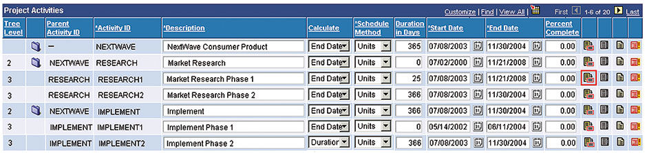
While a UX designer at ERP software provider Peoplesoft, since acquired by Oracle, I worked on a suite project management application that, due to the limitations of Peoplesoft’s software development tool set, called PeopleTools, could not render vector-graphic Gantt bars to depict multi-task project timelines. Despite Gantt bar displays being the top customer request, project durations in the product were limited to being shown in table format with written dates for task start and end points.
This was clearly ridiculous, as Gantt bars are the overwhelming choice for showing nested, overlapping, and dependent project tasks, and are effective for many of the same reasons as is the Lattice. Seeing these two images side by side is as strong an example as you can imagine about the superiority of using geometric data plots versus tabular, alphanumeric visuals to convey patterns in data. Incidentally (and reassuringly), customers never actually used this product, even if they owned it. It really only existed as a “check-box” item – a product or component included as part of a larger product suite, to demonstrate that the suite satisfies all possible use cases demanded by the customer. In other words, Peoplesoft sales reps could say that they offered a project management app, which could somehow be summarily demonstrated in person, as part of a much larger package deal. But nobody from the customer would ever spend the time to examine in detail what the product was actually like to use until well after the purchase.
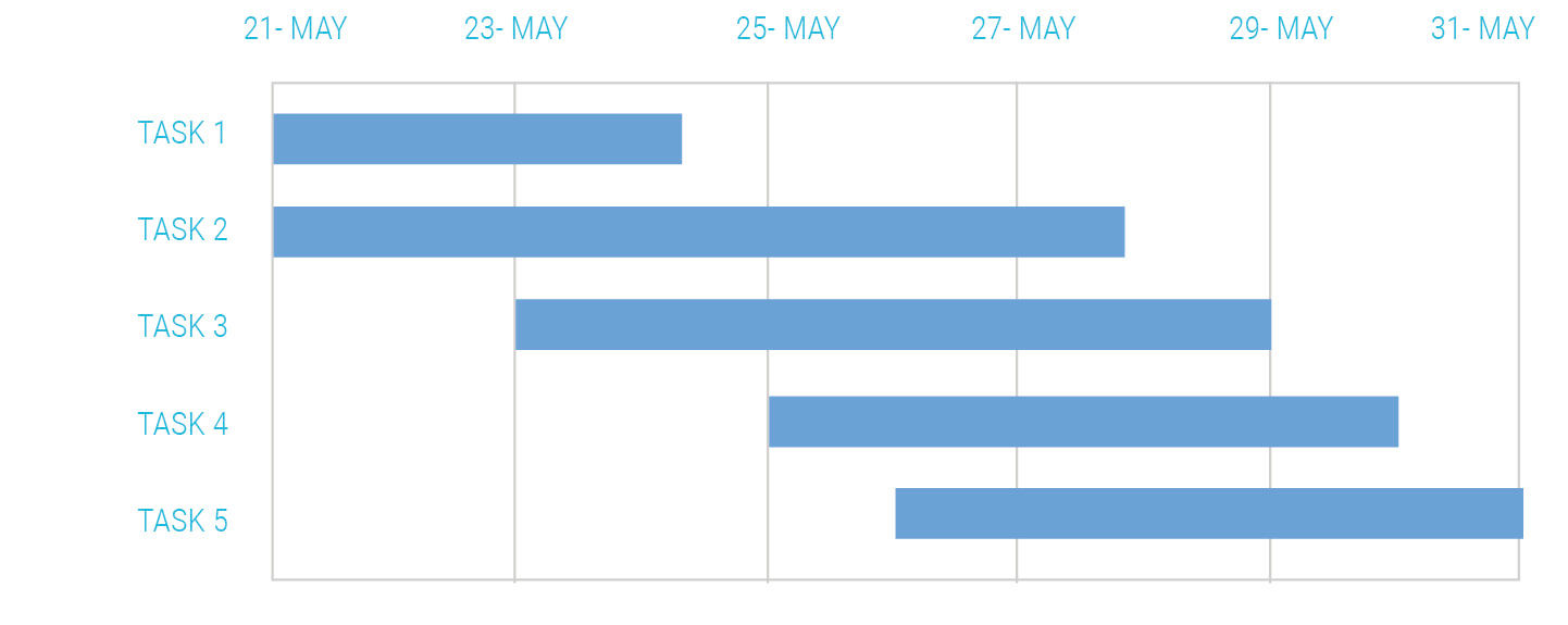
Figure 20.1: Gantt Chart.
 Author/Copyright holder: Oracle Corporation, www.oracle.com. Copyright terms and licence: All rights reserved.
Figure 20.2: Peoplesoft’s Project Activities view.
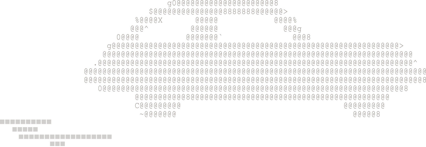
With the developers having run out of viable options to draw the bars in the way God intended, I proposed that we “fake” the Gantt bars by drawing them with text characters, as with Ascii Art – essentially “tricking” PeopleTools into enabling a result that, although of crude fidelity, was far better than the alternative. Of course, in a larger perspective, there is no fakery in software UI, in that what appears on the screen and what it does is all that matters, regardless of how it is done technically. This however was a solution so crude and desperate that any competent engineer could only consider it as a last resort, if it was considered at all. It was a classic, and very visible, hack.
In the proposal, every bar row consisted of a long text field, with spaces placed where a bar was not to appear and square characters from a symbol font , such as Zapf Dingbats, placed where the bar was to appear. Because the fonts used were mono-spaced, it was possible to draw a field of crude, indexed bars depicting overlapping tasks. While initially laughed at by the engineering team, in desperation they tried it, and it worked.
This seemed promising until we discovered that, at runtime, PeopleTools automatically stripped out any repeating double-spaces from each text field, and that this routine could not be over-ridden. We then tried using just the square characters, and then coloring the non-drawing squares white to match the background. When this failed for some other reason, in what was beginning to seem like a secret conspiracy by PeopleTools against good project management, we even tried using underscore characters for the blanks spaces, like this: ____ ■ ■ ■ ■ ■ __, but I left Peoplesoft before a final solution was reached. Despite the absurdity of a Peoplesoft-caliber software vendor in 2003 being reduced to seriously considering a Tamagotchi-like UI solution, in retrospect I see this as a legitimate design exercise and resolution. We accepted the constraints and sought a way to make it work. The problem, of course, is that the need for this isolated design hack was a sign of Peoplesoft’s deeper strategic problem, which was the design straightjacket imposed by PeopleTools. Despite the valid design-school ethos and persistence, we were arranging deck chairs on the Titanic.
 Author/Copyright holder: Bob Wilson. Copyright terms and licence: All rights reserved.
Figure 20.3 : Ascii art car, ascii Gantt chart.
My final example of getting from Zero to One comes from my initial efforts to introduce and evangelize UX through courses and presentations to the BOBJ development organization. I co-presented along with Microsoft veteran and author Scott Berkun, whom I hired for his foundation UX training content, candid advise, and captivating facilitation skills. We conducted two-day training sessions at the major development centers. My key presentation asset was the now-famous ABC News Nightline TV segment, The Deep Dive, which depicts design firm IDEO using DT to redesign the traditional shopping cart, in an impossibly short time frame. I still think this is the best depiction of DT ever produced, primarily for its focus on the repeatable process of design, versus merely on its outcomes. At the start, IDEO acknowledges the folly of attempting such a fundamental challenge in such a short time frame, but proceeds for the sake of demonstrating the underlying process. Their worst-case outcome would be some sort of obvious failure or missed deadline. Even under reasonable working conditions, the subjectivity of most people’s reaction to design guaranteed a public fusillade of nit-picking and sweeping opinions. Committing to a frighteningly short timeframe in the execution of an almost impossible task was a stunt for the ages. Interestingly, this was exactly what I had done in the first design round of my graduate thesis, which is probably why I treasure the fact that they did it. The point in both cases was to keep the focus on the process – the final product was never intended to be definitive, but rather a vehicle for learning – and this point is driven home in the dialog.
I showed this video following my introductory UX presentation, given to an assembly of about 125 mostly engineering-oriented employees at our development center in Vancouver, British Columbia. At the end, I turned to the audience and asked “well, what do you think?”. One guy immediately shot up his hand, and responded with “But I don’t like the shopping cart they designed”. At first I thought he was joking, but he just stared back at me with a smirk on his face. I looked around the room and I detected little discomfort or eye-rolling. After a somewhat awkward reminder that the point of the video was the process and not the final product, and that IDEO and others have used the same process to solve dramatically different problems with wild success, I asked for more comments. The next question – one common to every similar showing to co-workers – was “How hard is it to get a job at IDEO?” This was when it started to hit me: “Wow, this is going to be harder than I thought.”
Not all enterprise software design experiences are as tedious as these examples. I recount them to provide a view into the day-to-day sausage-making that is enterprise software development, where it is rare to be handed a mandated, budgeted, and clearly defined design project. You typically need to 1) Fight like hell to make them happen, or 2) Pretend to be doing something else while you secretly solve the real problems that, for whatever reason, go unfunded, and then 3) Try to get credit for the resulting success from those who matter and finally 4) Give public credit when necessary to those who most need it and can help you in the future. The same situation has been described consistently by colleagues from other disciplines – this reality is not limited to design, software, SAP, or business in general. It just gets worse in large organizations.
Restrictions of time, budget, material availability, political environment, etc. may seem arbitrary and irrelevant, but are real, legitimate, and often necessary design constraints. Design legend Charles Eames, apparently not one to be accused of griping, said that “the best you can do by Friday is still a form of the best you can do”. However, all of our efforts, whether as consultants or employees, are parts of larger efforts that we may or may not choose to identify with and be accountable for (Eames’ statement referred to a rushed consulting effort for a product that failed in the market). Consultants – unless working under a license or equity model as IDEO is known to do – are not investors. SAP executive coach Roz Usheroff of The Usheroff Institute, in fact, told us that all employees should see themselves, and behave, as consultants on a yearly renewable contract.
To help us visualize the limits of our influence, many prescriptions for focus and happiness feature a target-shaped diagram containing what are variously called the circles of influence. (Some call them Spheres of Influence but of course that merely adds a superfluous third dimension that is irrelevant to the point of….oh nevermind ;-) The labeling is – approximately worded – a bulls eye of “Things I Can Control”, the next ring out being “Things I Can Influence”, followed by an outer ring of “Things That Impact me”, floating in a field of “Things that are Irrelevant”. Imagine a game of Jeopardy with these topics. And there… if you visualize the game board, can you imagine how the traditional radial organization of these sequential topics could support the Jeopardy game dynamic? Me neither. Anyway, What Eames does in his statement is to help define for us his Circle of Control. While diets and health clubs validly claim to be able to contribute to weight loss, none I know of will guarantee it.
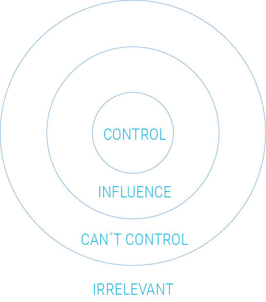
Figure 20.4: Spheres of Influence.
However, although they need not believe in the prospects of their customer’s initiative in order to accept a design fee, consultants who repeatedly contribute to failed causes will see their reputations tainted. One’s personal accountability has an aspect of scale. Part of being a leader is to swell your Circles of Control and Influence – to not take no for an answer, to address the root cause, to take the bull by the horns... the analogies go on forever. Choosing to engage in the larger picture is the essence of becoming a strategic, system-level designer – to have the courage to acknowledge concerns that may be above your current “pay grade”. Higher pay grades, however, are not achievable without taking the risks associated with accountability.
20.0.4 References
20.1 | The Agile Manifesto (web) | http://agilemanifesto.org
20.2 | How Buildings Learn: What Happens After They’re Built (book) | | Penguin Books
20.3 | Skyscraper: The Making of a Building (book) | | Penguin Books
20.4 | “And Another Thing…The Original Site is in German”: The Final Project in an International Business Consultancy (paper) | | DUX ‘03 Proceedings of the 2003 conference on Designing for user experiences, Pages 1-15, ACM | http://dl.acm.org/citation.cfm?id=997107
20.5 | Corporate UX Maturity: Stages 1-4 (web) | | http://www.nngroup.com/articles/usability-maturity...
20.6 | Ed Wood (film) | Touchstone Pictures
20.7 | The Deep Dive (video) | ABC News Nightline |
