I can resist everything except temptation.
- Oscar Wilde
The colophon is a brief passage within a book that describes its publishing and design properties, such as its typeface, binding and printing method, location of its production, etc. In the spirit of Edgar Allen Poe’s essay The Philosophy of Composition, and my RISD design thesis, this final section is sort of a massive colophon about the book’s cover design and how I created it. Designing the cover was refreshing and nostalgic. It harkened to my days as a graphic designer, where technology was relatively stable and the task was more about wrangling with form and meaning than with functionality and behavior.
You will have to trust me that I did not, as Poe is accused of doing, 1) reverse-engineer my requirements to fit the solution and process, or 2) begin the design process knowing that I would later write about it, as I had done with my graduate thesis. It was not until after reaching the cover design solution that I saw how a post-mortem of the effort could contribute to the book’s message. If the cover’s steady and logical progression of ideas seems contrived, it might be due to my serving as both designer and client, which, although fraught with other perils, eliminates the expectation gap and communication barriers common to working for other people.
If Poe’s main goal with The Raven was to convey horror and sadness, mine was to convey simplicity and focus. Layout is a good vehicle for this. I was inspired by popular book covers from the 2000s, which often featured a simple, centered, evocative image on a white ground. What I like about the examples in Figure A.1 – besides the presence of the word “bestseller” – is that the designs feature a single, small, enigmatic image. The image’s obscure relation to the book’s premise is revealed as the book is read. The match refers to how a small flame can start a large fire. The black swan is an analogy to a phenomena previously thought nonexistent or impossible (at one point in history all swans were believed to be white, until black ones were discovered). Such simple graphical content also shifts focus back to the semantics of the title, which mixes with the imagery in the viewer’s mind to create a dialog between the two, mediated by the individual’s unique interpretation and thus creating a personal meaning. My book’s primary title is similarly metaphorical, with the double meaning of both giving life to numbers and involving numbers in everyday life. In the spirit of LAVA’s simple typography in service of legibility, along with it’s focus on visuals for quantitative content, I envisioned the cover typography to feature a fairly neutral font, color, and layout.
The secondary concepts for the cover to convey include numbers, visualization, measurement, movement, transition from print to digital, change, freedom, innovation, and LAVA itself. The image I initially imagined to convey numbers coming to life was inspired by the logo of the 1980s pop band Duran Duran. I always liked how its two “D”s looked playful and animated.
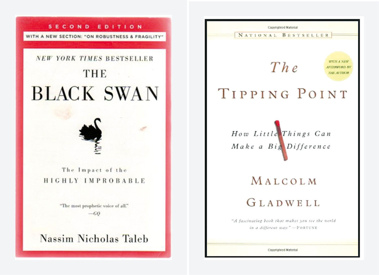
Figure A.1: Reference book covers.
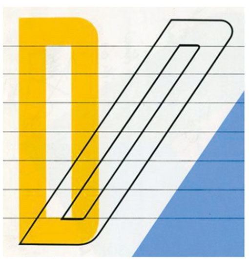
Figure A.2: Duran Duran band logo.
My idea was to achieve the same effect with a number. This concludes what I had in mind when I sat down to begin designing, and I began with the digit 1.
In Figure A.3, the transparent italic makes the number look like it’s standing up, in motion… a lighter, more agile number breaking away from the flat confines of the picture frame.

Figure A.3: The digit 1, coming to life.
I tried a variety of typefaces for the “1”, and settled on this one for its heavy slab serifs and unmistakable reading as a digit. The more minimal variants of the character do not necessarily read as a “1” in the absence of other adjacent digits.
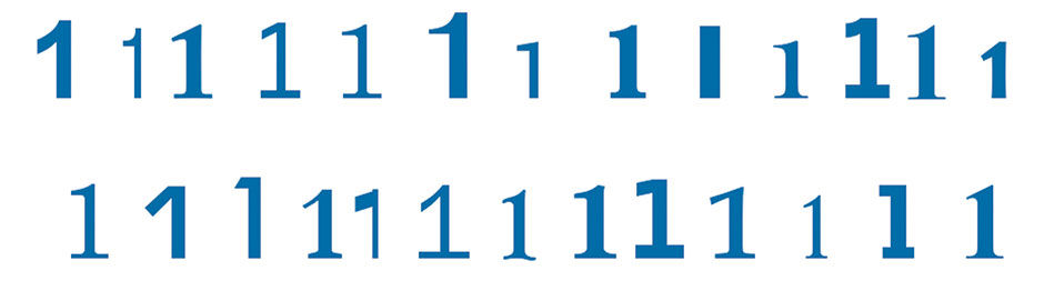
Figure A.4: Alternate typefaces.
I then experimented with different digits and angles. Composition has three basic actions: Adding things, removing things, and changing things. I tried adding multiple digits, trying different digits, and spinning their orientation. “Numbers” being plural, I tried adding other digits and symbols to evoke quantitative concepts. I noticed how the double “1”, when tilted, looked like a bird in flight. This metaphor fit both the idea of bringing things to life, or setting them free, and the idea of sensors in the outdoor environment. I tried for the same with other digits, to limited effect. All work was done in Adobe Director.
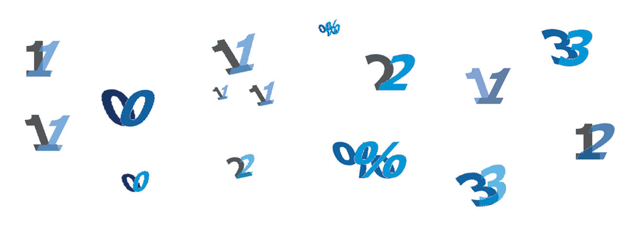
Figure A.5: Additional characters.
With this set of symbols to work with, I drew a portrait-format book cover, added the title typography, and began composing the layout of the elements. I added a subtle grid at the bottom to suggest measurement, and perhaps appear as a horizon to follow the flight metaphor. I composed using three symbols. This is the smallest quantity to suggest the concept of “many” versus a mere duality, and when their size is varied they give an illusion of depth in space. Making the forward-leaning digit the darker color enhances the wing metaphor by simulating a shadow from an upper light source.
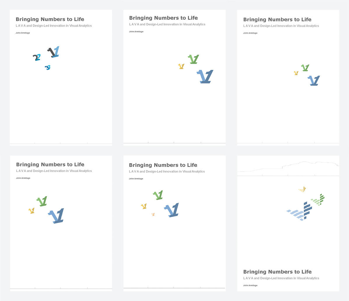
Figure A.6: Initial layouts.
I experimented with symbol size and positioning to achieve a harmonious spatial relationship between the image, type, and ground. Because we are not asking the cover to serve as a sales-inducing advertisement in crowded bookstores, it did not need to be bold, loud, or dramatic. It was free to serve more as a poetic reference, and complement, to the book’s content and purpose, which if anything is about focus and tranquility.
Such trial and error layout experimentation is the subject of most foundation design instruction. Putting the symbols to the right of the page enhances the effect of movement from left to right. The version with three colors and three digits is too busy. Increasing the number to four symbols brought more color and depth but was not worth the clutter. Also in this case, the viewer’s eye follows gestalt perception principles and tries to either draw a perimeter around the group, or see them as dots to be connected by a line and thus forming a single large “blob”. In moving from 3 elements to 4, the mind grows curious as to the significance of this quantity, as well as to the significance of the individual elements. The elements become more of a group, versus three independent symbols distributed in space.
I settled on three “1”s, varying in size and color (the first three hues from the LAVA palette) and left lots of white space to suggest open sky, with the idea of focusing on something relevant within an enormous field of content. Tilting them increased this effect, suggesting greater depth, as well as the notions of rising and improvement. I added a subtle line graph plot at the bottom, to evoke this chart form and also to suggest clouds or even a mountainous terrain. I then removed it for simplicity and to become less literal, and settled on the design in A.7. The hands-on work for this took about two hours. Satisfied I had an answer, I set it aside for a few weeks. This was in effect the first “sprint”. Had it been the only effort allotted – meaning that if an interruption had prevented further work – I felt I had a viable option.
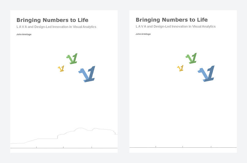
Figure A.7: Initial solution, at right.
Returning to the design later, I felt that using the “1” digit contradicted my message of relying upon geometric visuals to convey numbers and their relative size. Using the same layout, I then drew a new symbol, consisting of a simple horizontal bar graph with a crude bell curve distribution. The aha moment was when I saw that this looked even more like a bird in flight, and the AHA! moment was when I saw its resemblance to a windsurfing sail on the water, complete with a reflection/shadow. This is due to both the silhouette of the graph and to the horizontal stripes, which mimic the thin, flexible sticks – called battens – that are sewn into the sails for increased stability.
Because I previously had no intention of conveying the windsurfing topic or any specific LAVA forms on the cover, this event was a case where visual exploration caused me to alter my initial requirements, just as had happened with my exploratory thesis poster image 25 years earlier. The image still reads alternately as a bird – associated with the outdoors, freedom, and movement – but with the added reference to visual analytics and the windsurfing scenario. More meaning is delivered via the same elements, all of it relevant.

Figure A.8: Bar chart / wings / sail.
I started using this in the existing layout. I moved the grid / fever line (horizon / cloud / land mass) to the top, which maintained the depth metaphor but changed the viewpoint to be looking down from above onto windsurf sails on the water, with the horizon and a land mass in the distance. In fact, from where we actually launch our sailboards onto the bay from Treasure Island, the shape of Angel Island — silhouetted against the sky to the north — looks much like this fever line. Now, the line signifies a fever line in the shape of the rising and falling wind speed during the day, as well as the appearance of this particular land mass.
To enhance the sense of depth in perspective, I moved the title to the bottom, where in the picture plane it appears to reside “in front” of the other elements, thus creating a foreground to go with the middle ground of the sails and the background of the baseline and fever line. RISD’s Professor Malcolm Grear, the founder of its graphic design program, described graphic composition as more about manipulating graphical elements in the Z, or depth, dimension versus in the X and Y, or flat, dimensions. This is achieved by using the depth perspective properties of element size, sharpness, color intensity, and relative vertical position in the picture plane. The fever line’s dim grey color, for example, enhances the perception of its distant location.
I added a bar to the chart/sail symbol to make it more resemble a sail. I made the standing half of the symbol more prominent by making it the darker of the two. This also enhances the illusion of three birds in flight, coming towards the viewer, as the dark bars appear to be the underside of a wing in shadow.
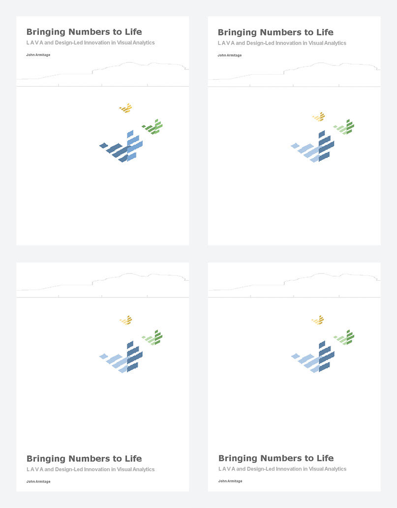
Figure A.9: Revised layouts.
The straight grid line at top became too strong of a horizontal division, so I removed it. To retain a symbol of measurement, and to provide a subtle echo of the striped vertical meter of the bar charts, I added a scale of tick marks in the upper left corner, as if acting as a vertical axis to the fever line to its right.
At Treasure Island, we sail in the afternoon. If looking north as we do from our launch site, our sails throw a shadow to the right, not the left as in this image, so I flipped the shadow/reflection half of the image over to the right side. I again experimented with a fourth sail to enhance depth and add color, and alternated the sailing direction of each sail. For the sails coming towards the viewer, however, the wings appear to be diving versus climbing, and the birds appear to be aimlessly flying back and forth. Each of these exercises results in a greater understanding of the form at hand, how it can be manipulated, and the effects.
Happy with this overall layout, I began to tweak the size, positioning, and detail of the sails. I changed their direction, which turned the shadow on the water into a reflection. I tried aligning the type to the right and flipping the position and shape of the fever line, all in pursuit of the complex and intuitive harmony of figure/ground dynamics, intending to “activate” the white space as it flows around the objects into shapes of its own. Like the silence between musical notes, cultivating this contrast creates movement on the page while juggling the logical and semantic considerations already discussed. Learning this dynamic is the main subject of Malcolm Grear’s notorious Graphic Form course at RISD, and is central to all 2-D composition.
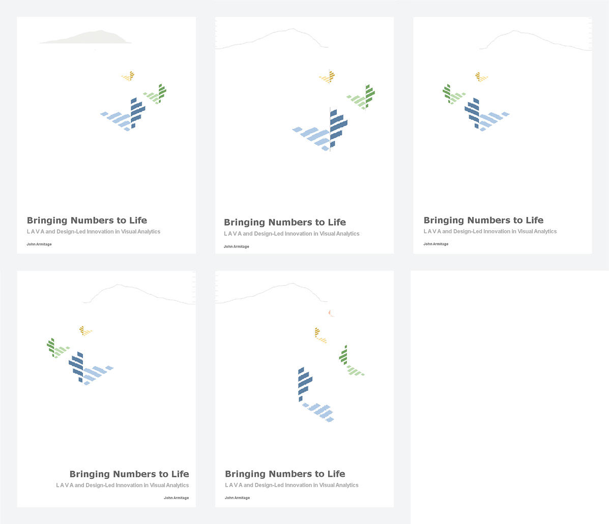
Figure A.10: Layout exploration .
While the fourth sail added depth, scale, and color, and represented the four members of our Pipe Jumpers windsurfing circle, it was not worth the added complexity. To bring more colors in, I gave each bar in the sail its own hue according to the LAVA palette sequence. The sail and reflection still looked like wings, however now more like those of a butterfly, which is even better. This way I get five colors with only three sails. More with less. Because having the sail reflection consist of the dimmed hues of those in the sail itself would be too fussy, so I turned the reflections to grey, which also now related to the color used in the typographic and linear elements.
At this point, I felt that the composition premise I had been wrestling with had become a bit too literal, and had moved away from my initial inspiration of having a singular image. I removed two sails and worked on details within the sail, such as adding a mast/axis hairline, and once again tried a few different image orientations. The axis/mast added some fine detail, but became too intricate and literal. When the sail is oriented to move toward the viewer, it’s winged interpetation appears to be diving, which is not appropriate. When the sail appears to travel to the right – the same direction the eye is led by the reading direction and shape thrust of the typography, the composition’s energy is sent running off the right side of the page.
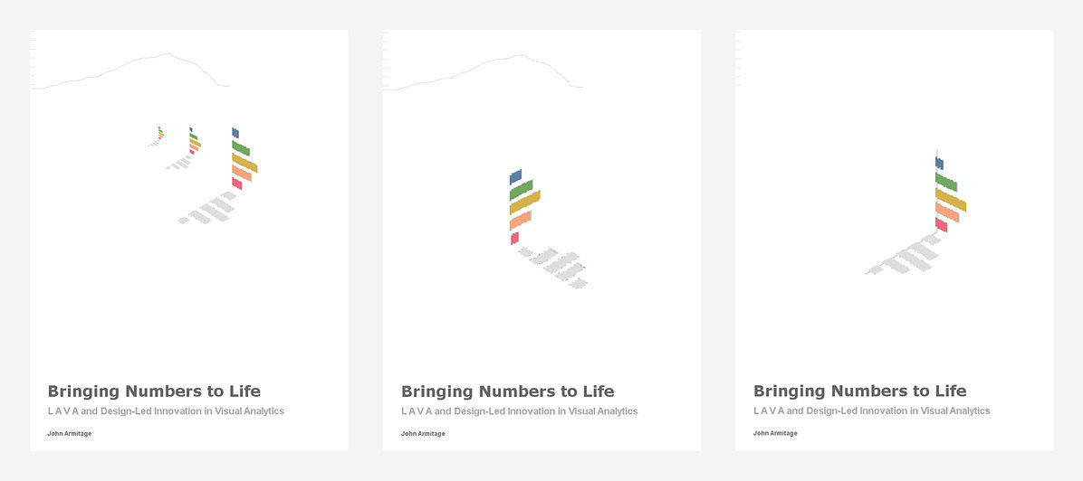
Figure A.11: Layout optimization.
Figure A.12 is the final design. Initial viewers will likely interpret the colored image as a chart, bird, butterfly, sail, flag, or merely an enigmatic abstraction, all of which are relevant. This second sprint took me about a day to complete. Remaining tasks are to convert the bitmapped images into precise vector graphic format for high-resolution publishing. The precise form of the fever line became the wind range plotline of the average windspeed from the Blunt Point sensor, located on Angel Island, on the day of the ferry video and that I used in the Iwindsurf redesign. It evokes Angel Island, and also the fog looming behind it, and reinforces the inherent variation and fuzziness of the metric. Elsa Paricio, the book’s graphic designer, brightened the sail colors from the muted originals.
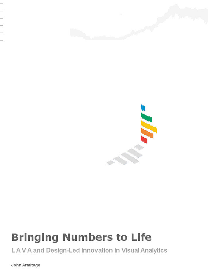
Figure A.12: Final design.
If we analyze the cover design, we see that it is organized by depth according to a landscape perspective metaphor, with four levels including foreground (typography), middleground (sail image), background (scale and fever line), and frame/overlay (the scale alone). While the position of the scale at the top/rear joins it to the fever line, its being anchored to the left border causes it to alternately leap forward to the level of the picture plane itself, formed by the border of the book. It wraps around the binding to appear on the rear cover as well, forming a decorative binding element while representing the notion of measurement. Its attachment to the “frame” causes it to “jump” back and forth from the background to the overlay. This is reminiscent of the role played by measures in analytics: They are an artificial structure that we overlay onto the world for measurement purposes, even though we may perceive them to be a part of the environment itself. The scale is not prominent here, but rather sitting off to the side as a reference.
The viewer’s eye is intended to first land at the title. Although its position in the bottom left corner is not prominent, viewers pay attention to large words first. If they can read these words, viewers do so instantly and precognitively – in fact they find it impossible not to. The organization of the page by depth perspective, versus the conventional flat, top-left-to-bottom-right page hierarchy, helps to overcome the natural Western tendency to start in the upper left.
The southwest angle of the sail shadow points to the title beginning, and along with a right edge aligned with the title’s ending, creates a triangle that accentuates the depth. The straight edge of the vertical sail parallels the book edge, creating a resting point until the angle of the sail stripes, matching the movement direction of the sail/wings, sends the eye up and left to the scale. The scale, after bouncing back and forth in depth, sends the eye right to the fever line which gently leads the eye off the right edge, completing the journey. Of course, all of this happens subconsciously and in few seconds, but over and over again every time the image is viewed.
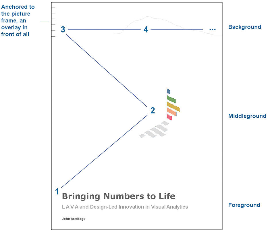
Figure A.13: Layout analysis.
Note that little of this layout dynamic was preconceived, but rather recognized and documented by me after having reached an intuitively harmonious design. Upon reflection, the reasons for the layout’s appear begin to take shape. At one time I would try to concoct such models before starting to compose, which would result in analytic overload, serving as an unnecessary constraint versus as a generative tool. The ability to understand how goals can be influenced by form, in harmony with form being driven by goals, is the powerful flipside of design that was revealed to me at RISD.
Although Adobe Director was never intended to be used for this type of design, it is my tool of choice for creating mockups of any sort, as my skill and familiarity with it allow me to work quickly and laterally. Director’s roots as an animation tool skew its mental model in favor of frame-to-frame comparisons. This was initially intended for the inspection of transitions in linear animations, but I use it to compare singular design alternatives, as if my design process is in fact immersion within an overall animation of process.
To create the alternatives shown above, I merely copy the current design and paste it into a new, adjacent frame. Toggling back and forth highlights the differences in a more dramatic way than by concurrent side-by-side viewing. As the design evolves, the working file maintains a historical string of every past design state. The decision to complete, or abandon, a frame and move to another is an intuitive one, based on the perceived scale and risk of the likely upcoming edits. Although this is a common design tactic, it usually involves saving past iterations as separate files. Here, all is kept together within one. It encourages lateral thinking, generating alternatives and comparing them. This is reflected literally in the horizontal frame layout of Director’s Score window (and in LAVA’s assignment of peer status to horizontally arranged Board elements).
If the model imposed by one’s authoring tool enhances process and outcomes, as in my case with Director, does in also serve to constrain or even impair them? Certainly. Director is not the tool to use for richly layered photomontages, precise illustrations, for use in large or disparate design teams regularly exchanging and merging files and assets, for production-quality assets, and certainly not for precise typography or text-intensive publications. Its output formats need to be re-created in production tools and formats such as Adobe InDesign or html5. Had this project called for a solution with any of these demands, I might have sketched briefly in Director and then switched to another tool, or handed it off via a written brief to another designer more skilled in the required type of work.
I chose to pursue this type of design role at the close of my undergraduate education. In my final review at Miami University, professor Cory Croyle told me “you are in the envious position to be able to become either a designer or an illustrator”. I chose the former because of its wider potential applications, its systematic and collaborative approach, and my perception that it could have more impact and offer more career directions later in life. Illustrators, photographers, and other media specialists are like actors, or soloists in an orchestra. They need to be virtuosos of their craft, and can develop star appeal and have a big influence, but play a relatively subservient role within the larger vision of the production and its composer/conductor or writer/director. My interests were always too diverse, and my attention span too brief, to pursue such a deep and narrow specialty.
Medical illustrators, among the most specialized workers in the industry, can paint absolutely anything. Working with them always left me in awe. For a project about anatomy, one colleague brought a trout into the office, serially dissected it, and digitally painted each step. She finished before it started to smell. The reason art students study by drawing objects from life is that these are the most sophisticated visual forms we encounter. In my Freshman year at college, frustrated after two grueling early morning hours spent drawing onions, I asked my Drawing 101 professor what this all had to do with future employment. She asked me what I wanted to do, and I said I wanted to design cars. She said “Then you should design cars. But you will still need to know how to draw.” Nude human models are used because this is this form we are most familiar with and sensitive to. While rendering nudes convincingly is really hard, medical illustrators need to go on to learn how to draw their insides as well, and attend medical school to do so. The drawings in Figure A.14, three poses of 10-15 minute duration, are part of a series made in a 2-hour voluntary evening session as a senior at Miami University. They are the best I’ve ever done, the cream of four years and piles and piles of failures, meaningless pages of rote exercise reps. I’ve not drawn a live figure since that night.
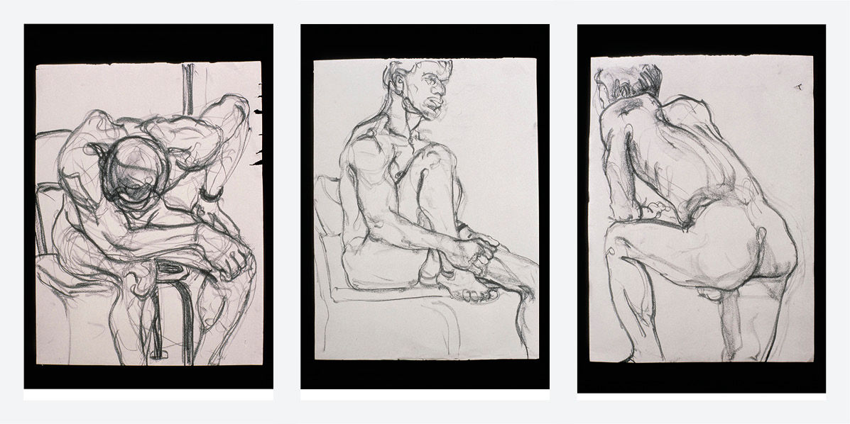
Figure A.14: Life drawing series.
Of the body, the face is the hardest of all, as we are wired in real life to rely so intensely on interpreting its state, for clues to the health, mood, and intentions of others. Rembrandt painted mostly portraits, but because of his unique ability to convey the rich personality of his subjects, his paintings don’t need action or drama to deliver a transcendent experience. As for my role in design efforts, I’m more interested in composing when and where the faces appear, while relying on colleagues with more specialized skills to paint them. The film industry is even more specialized. A recent RISD animation grad once recounted being burnt out from a week spent at a computer, trying to make an alien’s tongue look wet.
This completes the intentional process and reflection behind the cover design. Having gone through it, I’m inclined to believe Poe’s post hoc account of writing The Raven. However, in the time since completing the design, and in the time spent writing this post-mortem, I’ve imbued the design with even deeper meaning than was originally intended. This is a long-cycle reflection, where I project my own experience and perception onto the image to create meaning.
The sail is literally heading towards the symbol of measurement, as if on a journey. It is multi-colored, referencing its relevance to all of us. It is sailing on an angle into the wind – an upwind reach, or “pointing” (the prevailing winds in this bay view are west-to-east, or left-to-right in the picture frame). This is a difficult direction to sail, and requires multiple, tedious, back-and-forth iterations, or tacks, to make progress into, or against, the wind. As I indicated in my description of compass-based navigation, this maneuver is the basis of the sailor’s ability to travel towards any chosen direction of the compass. Ironically, the stronger the wind being sailed against, within reason, the easier it is to make progress upwind, and the greater control the windsurfer has over his position on the water. Wind is our friend, our power. If it drops off during a session, being “upwind” of the launching spot is a relatively safe position. It’s easier to sail with the wind, or “downwind”, to return home if the windspeed drops.
As is done for designs of greater investment and risk, I could run tests to determine if viewers interpret the book cover as I had intended. The tough part is that much of the design’s meaning is only apparent upon reflection after having read the book, which makes such testing too disruptive and costly for this production. It is after all intended to convey a bit of mystery initially, to invite interest. Plus, as serial self-publisher Scott Berkun claims, cover designs seem to do little to influence book sales. Maybe I will try later on, but the truth is that I will never really know what most people think of when they see this cover. It’s all very subjective, and hard to know as a designer if you got it right. I suppose this is part of the fun. But getting back to measurement, this is a big reason why, for better or worse, I got into the design of more rational, deterministic things to begin with. I always wanted to know if the solution worked, and why. Instead of using rhetoric or seduction to convince a client of the work’s quality, I’d rather spend the effort to be able to prove it.
Yes, this is reading a lot into a simple design, and it might appear that I’m spending way too much time designing and talking about a simple book cover. Mental masturbation? Too much time on my hands? Self congratulation? Maybe. That’s why its an Appendix. But I believe it’s relevant, and a similar level of calculated, quantitative nuance is needed for good artisanal dashboard design, but to a greater extent, and to a greater and longer-lasting effect on its users. This is why we need a more robust quantitative vernacular for these artisans to stand upon.
There is a small story played out in the viewing every static composition. The art is to create a virtual animation within a single static frame, and comes with a long legacy of techniques for achieving the desired effects. Malcom Grear’s flipbook project in his Graphic Form course accentuated the fact that all graphic design, particularly highly sequential forms like books and magazines, but also singular compositions and environments such as airport signage systems, are essentially cinematic. They are not consumed in an instant, but rather over a period of time, by the viewer. Grear taught us to think of page sequences as animations, as with the familiar novelty flipbook animations, but unfolding more slowly and with less literal, more abstract connections between pages. There is a similar discipline to designing environmental experiences, as with immersive games or in a retail store, where a shopper’s experience is not unlike a film. It is under the shopper’s control, but bound and influenced by the sensory offerings of space, image, sound, and smell, composed into the environment and encountered in a linear sequence.
Just as with the discipline of BtF, the design of static compositions will always be needed. But the advent of low-cost image animation will make the artisinal methods of static image design less essential. Think of the living ghost portraits at Harry Potter’s Hogwarts, the constantly drifting, looming, spinning images in TV graphics, and now the emerging electronic paper displays. Using little or no power, Electronic Paper Technologies – or EPTs – can turn previously utilitarian and inert surfaces into an always-on stream of custom images, animations, and product interfaces. As photography did to painted image-making, and affordable color did to the ascetic efficiency of Swiss modernist graphic design, the aesthetic of permanence is being eclipsed by the aesthetic of movement and change.
I decided long ago to live by design, to not separate business from pleasure, in the model of deep-design lifestyle icons Charles and Ray Eames. Perhaps this reflects the influence of Pirsig and his quest to reconcile art and science under the unified concept of Quality, or perhaps this personal quandary was already present in me, leading inevitably to him for confirmation and elaboration. Although freeing me from maintaining different personas for the office and home, this model has drawbacks. It cannot be turned off, and can lead to dilettantism, naive idealism at the office, and boorishness with friends. Simultaneous engagement in the worlds of science and art dilutes proficiency in both, leaving you vulnerable to challenge from experts. For some reason I’ve always suppressed the fact that the obsessions and struggles of Phaedrus, the protagonist in Zen and the Art of Motorcycle Maintenance, drive him to mental illness.
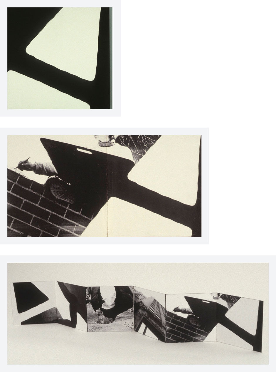
Figure A.15: Graphic Form booklet sequence.
After an extended silence while at a restaurant with a management-trained colleague, I asked him what he was thinking about. He had been counting the customers and the table turnover rate, estimating the average dinner bill, and calculating how much money was being made. I, on the other hand, had been trying to understand the motive behind the choice of light fixtures, including their cost, effect, and styling. Viewing the world from a designer’s perspective means that everywhere are interdependent problems and opportunities, with inseparable functional and aesthetic factors. Although likely the case for non-designers as well, the designer’s mindset delivers a particularly wide variety of distractions from all directions.
Designer Paul Rand was said to have been torn by the conflicting demands of art and commerce, to the point of being chronically insufferable and grumpy. Designer Edward Guttman seems to live in an exhausting state of disappointment in the quality of most things around him, and always seems to have a plan for how they should be improved. Steve Jobs, perhaps the greatest designer and industrialist ever, is portrayed as being both brilliant and a world-class asshole. He lived in a house without furnishings because none met his standards. Life is simpler when beauty is ignored. But it’s much less fun.
Maybe the sail is me, working upwind towards a measurement, seeking to know where I stand and how to control it. But why? Compared to what? And by what measure? We risk confusing the measurement of the subject for the subject itself. Measurements describe the subject, but are not the subject. They are merely an overlay to reality, an artificial framework we impose on ourselves for comparing actual versus expectation. In the manner described by E.O. Wilson in biology, and Steven Pinker in brain science, as measurement increases, the vague, personal, unmeasured, and unmeasurable aspects of life retreat, but remain the frontier of awareness and inquiry. Actually growing in importance, their continued engagement is needed for competitive advantage and happiness.
There are three responses to bad situations: Live with them, leave them, or accept responsibility for changing them. Complaining is not an option. Respect numbers, but look beyond them. Accuracy is more important than precision. Don’t blindly accept prevailing expectations. As design writer Ralph Caplan said in his book By Design: Why There Are No Locks on the Bathroom Doors in the Hotel Louis XIV and Other Object Lessons, perhaps designers can’t save the world, but they can keep the world worth saving.
25.0.1 References
A.1 | YotaPhone 2 Review (video) | Clove Technology |
A.2 | By Design: Why There Are No Locks on the Bathroom Doors in the Hotel Louis XIV and Other Object Lessons (book) | | Fairchild Books
