A UX designer doesn’t live in isolation from the rest of the world. Every day, you encounter and use products and services designed by others. Prior to starting a new UX design project, it makes sense to gain a sense of its scope by looking at what others have done and critically analyzing the designs of others. Here, we will outline the key ingredients of the comparative mindset and how they can lead you to success.
Analyzing the “competition” is one of the standard tools in UX practice. In fact, a UX competitive analysis report is one of the common UX deliverables in the industry. Of course, when called upon to design a new solution to a problem, you would want to see what others have done about it, identify any weaknesses or strong points, and see how your own design can improve on top of what’s already been done. Here, we will explore the analysis of competition as a strategy and a mindset, rather than just a tool to be employed on occasion. The adoption of a critical, comparative mindset is essential to a UX designer’s career. Let’s explore the how and why.
What Types of Competitors Does a UX Project Encounter?
Before you begin your competition analysis, it’s important to know that any UX design project faces two types of competition. While it’s true that sometimes you might be called upon to design a product or service that directly competes with another (e.g., Uber is a direct competitor to Lyft), many times the competition is indirect. Another product might serve a totally different purpose from yours, but your users might use it to accomplish similar goals. For example, Amazon (an online store) and Google (search engine) have different value propositions, but are indirect competitors in product search: in fact, customers prefer Amazon over Google when it comes to product searches and reviews.
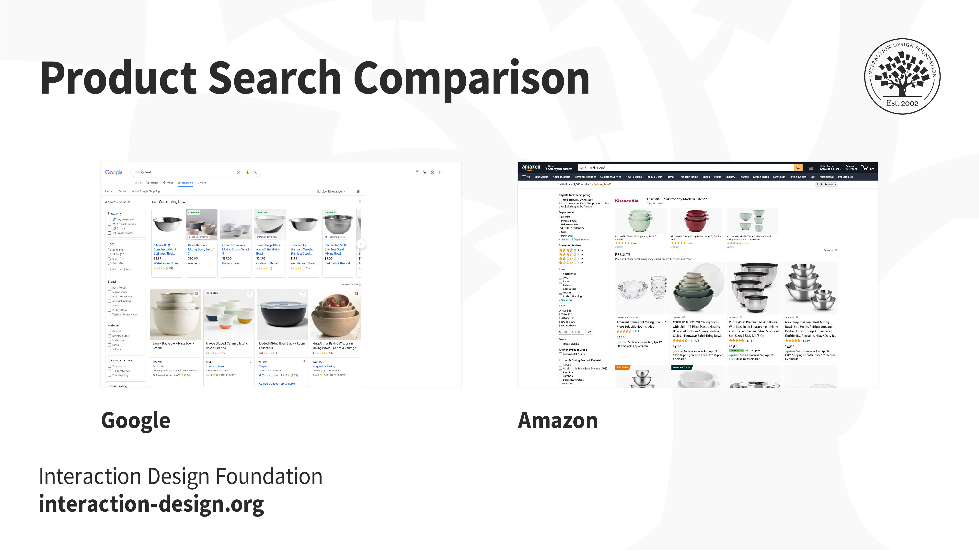
A product search comparison for “mixing bowls” between Google and Amazon.
When and Why Should You Compare Your Designs to Others?
The short answer to the question of “when?” is “at every opportunity.” Whether you are embarking on a new project, working on something unrelated or simply not doing much at the time, every encounter with another product is an opportunity to learn through comparison.
“Fortune favors the prepared mind.”
— Louis Pasteur
As far as the “why” question is concerned, there are two main answers. Firstly, looking at what others are doing allows you to identify what they are not doing (or not doing very well), which opens up opportunities for you to offer a better service. You might also assume that whatever solution is out there was designed in such a way for a good reason. Examining how other designers tackled particular problems can be a good source of inspiration and learning to develop your own skills. To really learn you will need to break down the interaction and visual elements to understand why they work well, and then apply the knowledge to your own designs. Let’s explore these points further.
Undertaking Competition Analysis as Part of Your UX Design Workflow
More formally, competition analysis is often undertaken in the early stages of a design project. In these cases, you might look at the existing market, see if there are any direct competitors, and then try to identify weaknesses in their user experience designs, to scope out what you might be able to do better. If there aren’t any direct competitors, you might want to look at common aspects of the experience and how others are accomplishing those sub-goals. Often, a client might have already done that before you, having seen an indirectly comparable product and stating a requirement like “I want the app to look like so and so.”
Sometimes, a formal competition analysis might also take place after a product has launched and has run for some time. A new direct competitor might emerge, and you might want to see what they are doing and how your product stacks up against theirs. Perhaps new ways of interacting might be emerging (e.g., voice interfaces) and you might want to see if you should consider an update to your product. UX designers might be tasked with updating a product with the latest trends (for example, a new design language offered by device manufacturers).
Nevertheless, more often than not, competition analysis is an informal activity that UX designers undertake for their own benefit. They can be an excellent way of keeping up to speed with the latest industry trends and developments, getting inspiration for future designs or updates to current ones, and learning through breaking down the reasons that designs by others work well (or not so well).
How to Take Advantage of Ad Hoc Encounters with Indirect Competitors
As a designer, you can learn a lot from your competitors. As you encounter products and services on a daily basis, from the perspective of the user, keeping an eye out for elegant and creative design solutions will serve as a great source of inspiration for your own designs. However, it’s not enough to imitate. Just because a particular design works well in a given context, it doesn’t necessarily mean that the same design will work equally well elsewhere. Also, you should always be aware of the dangers of blindly following trends and fads. Apart from the possibility of violating trademarks and intellectual property rights, such copying might not even be of much value in the long run. There is a big difference between a new design that’s good and a new design that’s simply a fad — good design has lasting value and is a combination of aesthetics and inspiration, backed by scientific knowledge and research. Such designs are in step with the particular demands of their audiences, and they address very real dimensions of the human condition effectively. Fads just come and go, because they are supported by nothing but the designer’s view on aesthetics. Like hairstyle crazes, they vanish in the long run as dated, spent curiosities.
“Superficial app designs that follow the latest fads and blatantly ignore basic usability conventions, UX best practices and fundamental principles of interaction design, would most likely fail in the real world!”
— Miklos Philips, UX Principal Lead, Prototypr.io
When assessing other designs, it’s important that you don’t just stick to the “wow” element but also get to grips with the question of “why” — namely, what is it that makes that particular design work so well? Would it work just as nicely if the context of use was somewhat different? In short, break down the factors that make or break a certain design.
Five Rules to Help You Form and Maintain a Comparative Mindset
To help you build and maintain this comparative mindset that is most crucial for your success as a UX designer, here are five rules that you should keep in mind when assessing a new design that you come across.
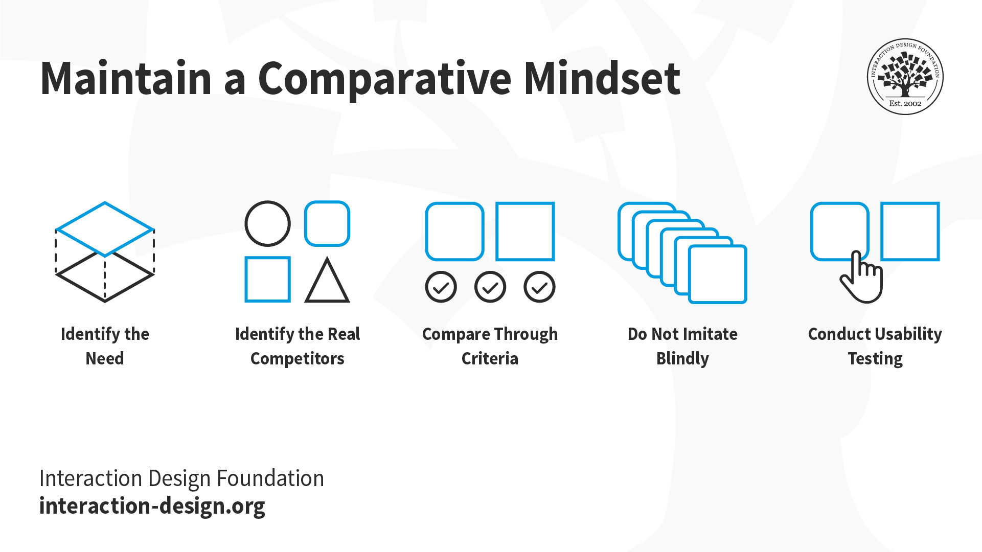
Five rules for maintaining a comparative mindset.
1. Identify the Need
Every design is a solution to a particular need. To the extent that is possible, try to identify what the need behind the design was. For example, a carefully designed UX of the search process in Amazon makes sense, because their users are faced with millions of products. Would it make sense on the website of a specialist store selling only 20 products? Consider also the focus of your product. Adding new functionality just because it’s cool isn’t the right strategy. Ask yourself how a particular bit of design helps your users achieve a goal better. If it doesn’t, leave it out.
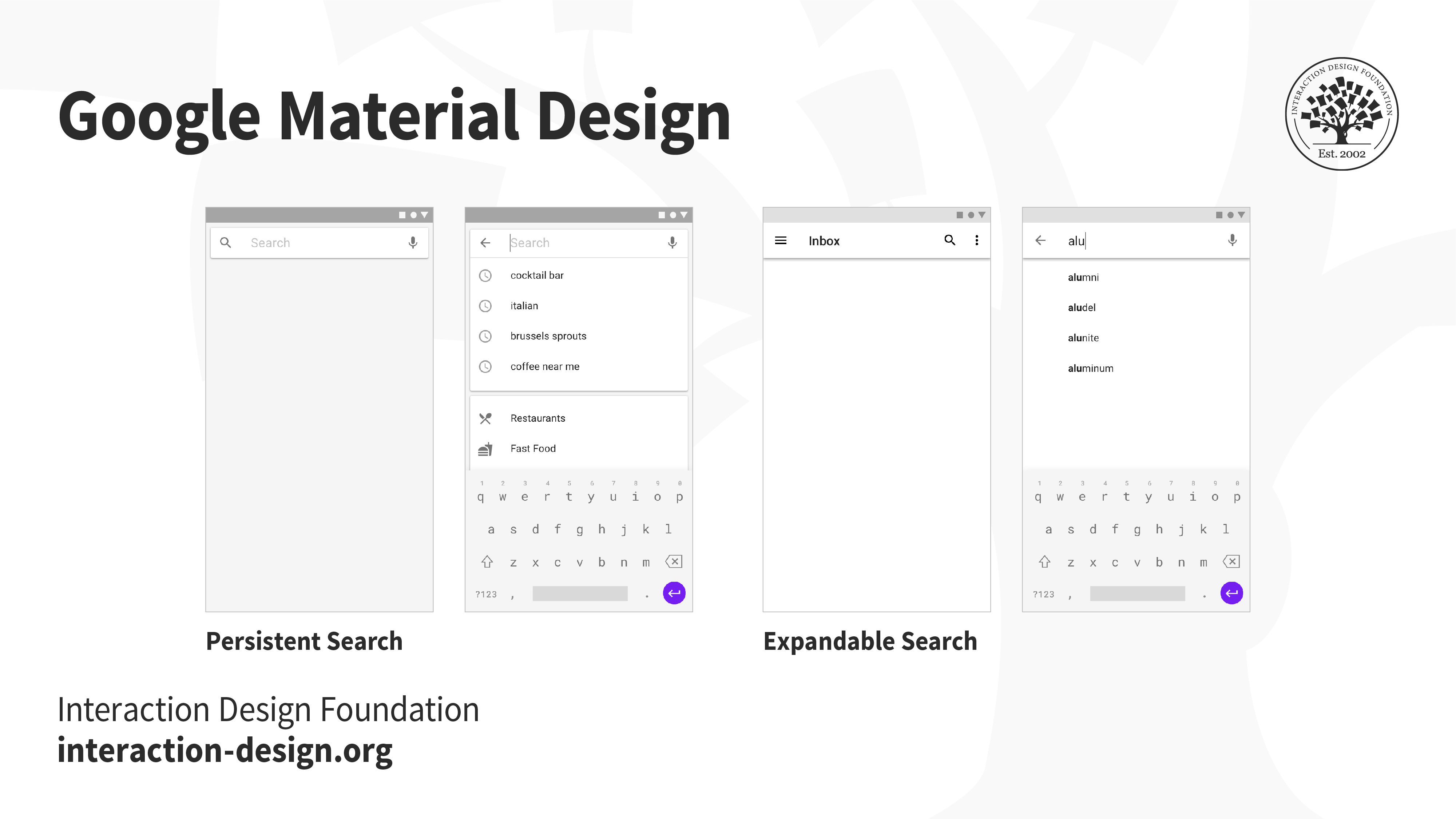
Google’s Material Design guidelines about search boxes state clearly that how you implement these should strongly depend on the focus of your application. Use persistent search boxes (left) when your application’s primary focus is search — here, the search box is persistently displayed at the top of the application. Otherwise, use expandable search boxes (right) — in this case, a user clicks the magnifying glass icon to convert the top bar into a search box.
2. Identify the Real Competitors
Whether it’s a direct or indirect competitor, ask yourself exactly what you are making a comparison with. Users have goals they want to meet, and technology is a means for achieving these goals. For technology to succeed, it must do something better, or offer some other type of value that a low-tech solution can’t.
For example, 3M Post-it notes — small pieces of adhesive paper — are still a hot selling product that are used for note taking, to-do lists and brainstorming. However, this physical paper product has an indirect competitor, Miro. Miro Sticky Notes are digital and allow you to share with your team, customize the color, resize and edit in real time. Often, your biggest competitor might be outside your industry.
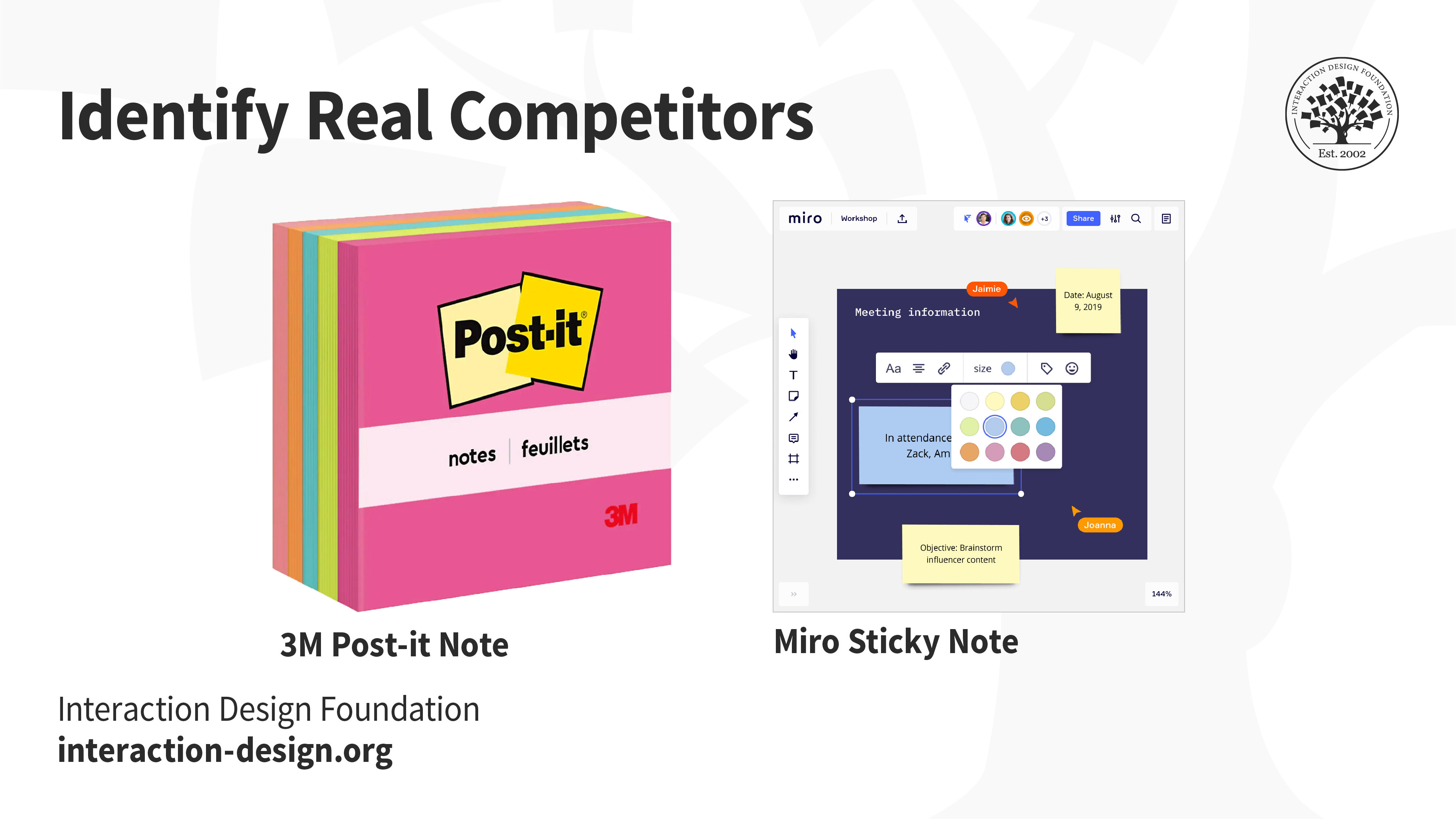
A product comparison between 3M Post-it Notes and Miro Sticky Notes. 3M, who produces paper products, and Miro, who creates collaborative software, are not direct competitors. Although, they do indirectly offer competitive products that allow users to accomplish the same task.
3. Compare Through Criteria, Not Personal Preference
Every comparison implies judgment against a set of criteria or values. In order to be objective and not biased by personal preferences, your comparisons can be made on the basis of heuristics (rules) that are scientifically and empirically derived through research and practice. Here, usability heuristics, such as those specified by Jakob Nielsen, are good to remember and put to use. You might also set and use other criteria yourself, which might be more specific to the problem at hand. Whatever you do, ensure these are specific and assessable.
Parallax scrolling websites were a trend in the early 2010s. They were typically aesthetically pleasing, but often less functional due to slow load times with too much content on the website. User tests have shown that this type of website sacrifices many of Nielsen’s usability heuristics for good looks.
4. Blind Imitation Is the Most Certain Path to Failure
What works well in a particular context may not work at all in another. Every design solution is unique not just to the problem at hand but also because of the target audience. Remember that good design is the result of a thorough process, with considerable effort in empathizing with users, framing problems, and ideating, prototyping and evaluating solutions under context. You might be tempted to think that you can skip all this work because someone else already did it, but they did it for their problem, not yours. So, before you imitate, think very, very carefully about how well your problem truly matches that of the original designer. Pay particular attention to how your situations differ in terms of the needs of the users, as well as the realities that designers faced at the time (remember — a lot can change in the market even in just a year!).
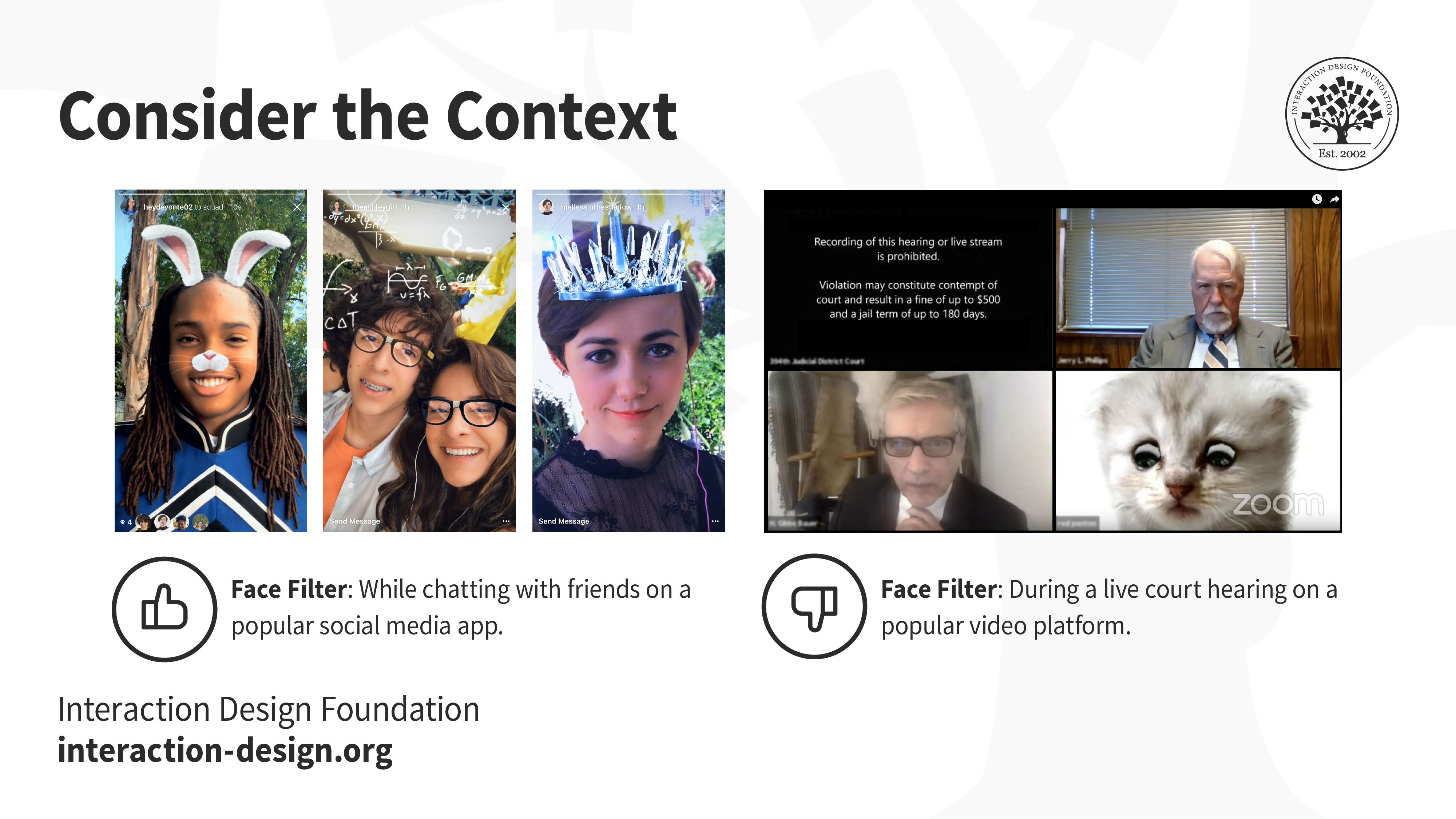
In 2017, Instagram introduced a new feature called face filters — an easy way to turn an ordinary selfie into something fun and entertaining. Face filters help you express yourself and have playful conversations with friends. This design feature may be a perfect fit to chat with friends on a social media app; however, it may not be an appropriate feature to use on a Zoom video call during a live court hearing. So, before you consider imitating this design, ask whether it truly makes sense for your intended audience.
5. There Is No Substitute for Usability Testing
In the previous rule, we explained why you should be a skeptic — i.e., distrustful of design that was made by others, before adopting it for your own project. So as to assess whether a particular design truly satisfies your project’s requirements, it can be evaluated with or without users. An objective assessment of a design by experts — through usability heuristics, for example — might reveal good reasons for adopting or discarding a design, and that’s a great first step to take towards selecting between design alternatives. Even so, ultimately, if you plan to include any design in your own project, remember that the proof is in the pudding — only user-based evaluation in the context of your project scope and target audience can prove whether a design really works. In short, whether you are assessing a new design you came up with yourself or designs created by others, the only way you can truly know whether they are successful is to test them with real users and in realistic settings.
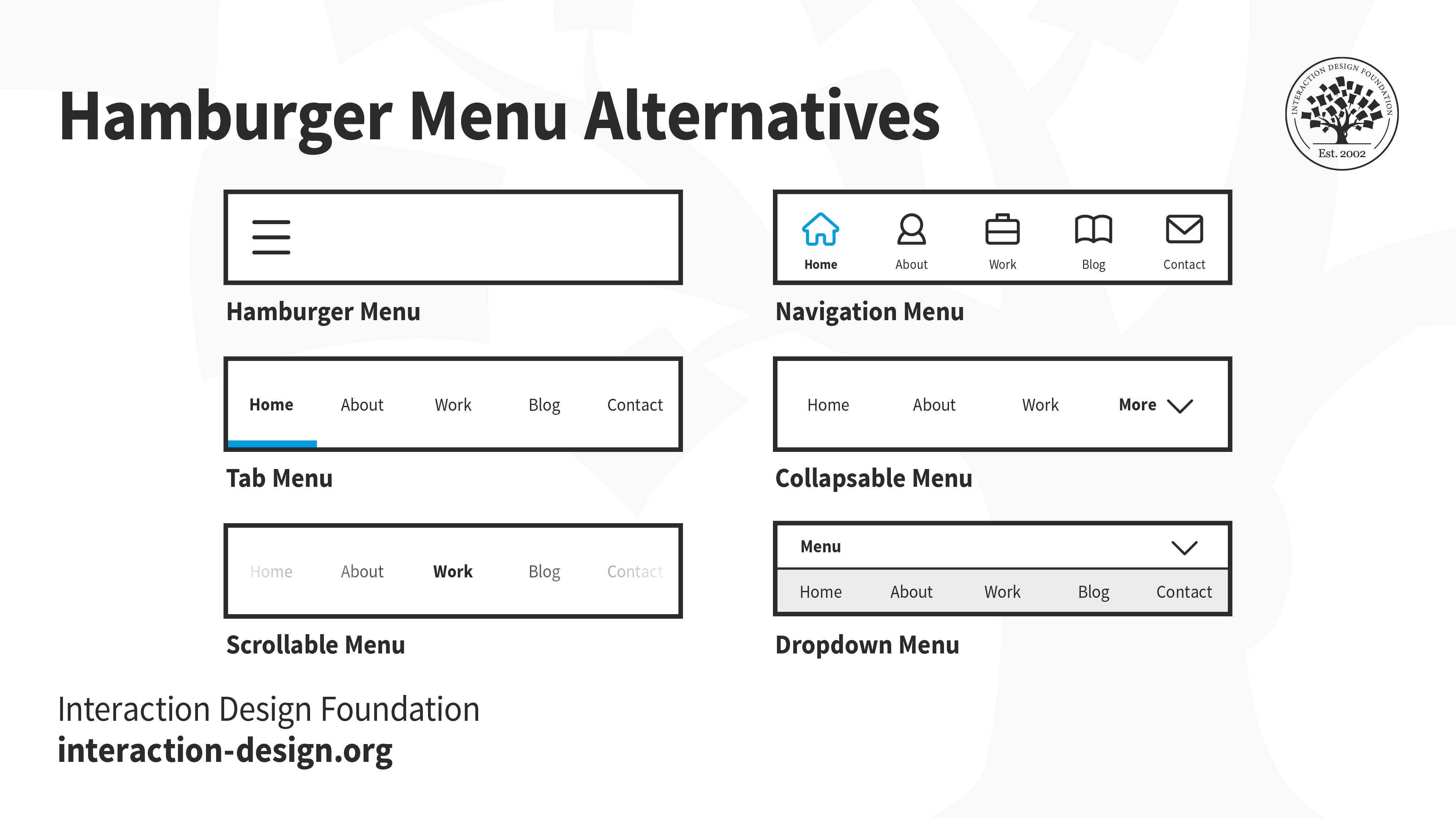
The ubiquitous “hamburger menu” button (three horizontal bars). Initially an idea pioneered by Facebook with great success, there is now considerable evidence that this design entails considerable usability problems. These problems were uncovered by A/B tests that compared the icon against alternative menu options (e.g., navigation, tab, collapsable, scrollable, dropdown).
The Take Away
A comparative mindset is essential to your success as a UX designer. Whether you undertake a formal process of competition analysis or it’s something that you do instinctively for yourself every time you come across a new design, comparing will only be useful if you look for the “why” behind the aesthetic value of a design.
While keeping an eye out for what your direct or indirect competitors do can keep you updated and give you an edge in your own designs, remember that a competitive analysis can only help you understand how to get to the same level as your competitors. It will not show you how to break new ground or solve problems that others haven’t solved before. Additionally, the insights you get from it depend exclusively on your experience, knowledge and evaluation abilities. So, be sure to keep honing those critical appraisal skills, by questioning everything you see and by breaking down the context and reasons that make particular designs successful (or not!).
References and Where to Learn More
Read the article User Interface Design Guidelines: 10 Rules of Thumb.
Images
© Interaction Design Foundation, CC BY-SA 4.0