Type is everywhere. In the books you read, the products you use, and even in this very website you're on right now. But what is type? In the context of design, type is the style or appearance of text. It can also refer to the process of working with text. Typography can often be an intimidating topic, but it doesn’t have to be. You only need to understand the basics to make an impact in your designs.
So, let’s begin. Designer and educator Mia Cinelli will discuss type classifications, type families, and help us understand the difference between a font and a typeface.
Show
Hide
video transcript
- Transcript loading…
Video copyright info
Copyright holder: Mia Cinelli
Mackinac 1895, Bags to Riches, The Landscape of Love, What's Past is Prologue, Pandemic Parade Banners
Hide Content
What Are Type Classifications?
According to Ellen Lupton, author of “Thinking with Type,” type classifications are a basic system for classifying typefaces devised in the nineteenth century, when printers sought to identify a heritage for their own craft analogous to that of art history. Humanist letterforms are closely connected to calligraphy and the movement of the hand. Transitional and modern typefaces are more abstract and less organic. These three main groups correspond roughly to the Renaissance, Baroque and Enlightenment periods in art and literature.
Historians and critics of typography have since proposed more finely grained schemes that attempt to better capture the diversity of letterforms. Designers in the twentieth- and twenty-first centuries have continued to create new typefaces based on historic characteristics. Let’s take a look at the common classifications for Serif, Sans Serif, Monospace, Script and Display typefaces.
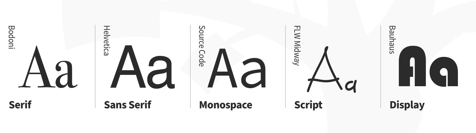
Type classifications for Serif, Sans Serif, Monospace, Script, and Display typefaces.
© Daniel Skrok and Interaction Design Foundation, CC BY-SA 3.0
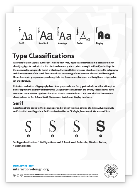
Serif
A serif is a stroke added to the beginning or end of one of the main strokes of a letter. A typeface with serifs is called a serif typeface. Serifs can be classified as Old-Style, Transitional, Modern and Slab.
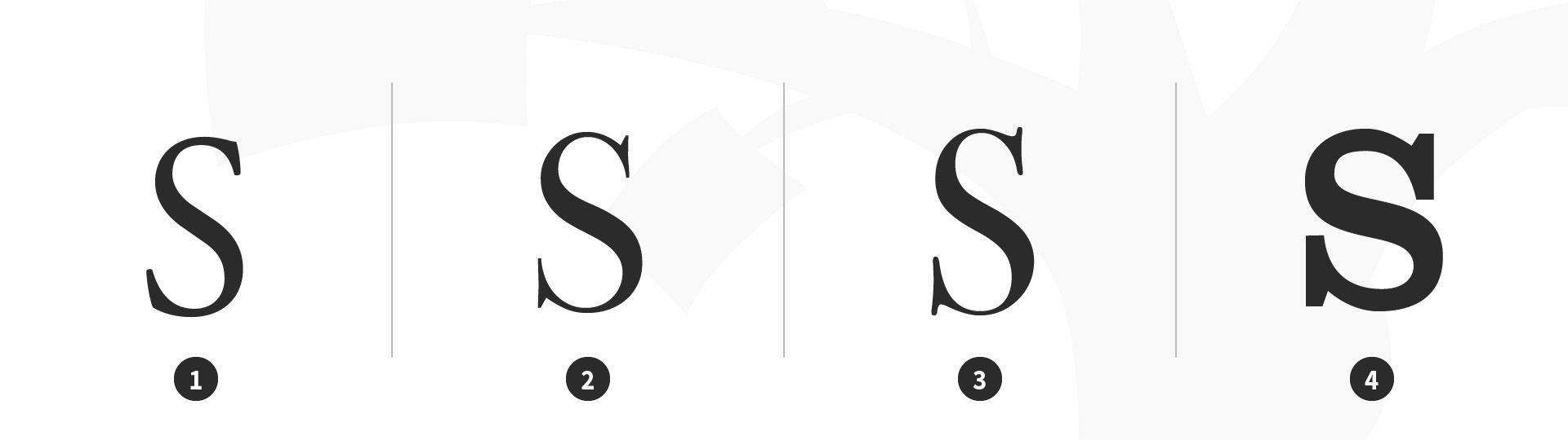
Serif type classifications. 1 Old-Style: Garamond, 2 Transitional: Baskerville, 3 Modern: Bodoni, 4 Slab: Clarendon.
© Daniel Skrok and Interaction Design Foundation, CC BY-SA 3.0
Characteristics of Serif Typefaces:
Old-Style
Have a low contrast between thick and thin strokes
Have a diagonal stress in the strokes
Have slanted serifs on lower-case ascenders
Transitional
Have a high contrast between thick and thin strokes
Have a medium-high x-height
Have vertical stress in the strokes
Have bracketed serifs
Modern (Didone, Neoclassical)
Have a high contrast between thick and thin strokes
Have a medium-high x-height
Have vertical stress in the strokes
Have bracketed serifs
Slab
Are heavy serifs with subtle differences between the stroke weight
Usually have minimal or no bracketing
Sans Serif
A typeface without serifs is called a sans serif typeface, from the French word “sans” that means "without." Sans serifs can be classified as Transitional, Humanist and Geometric.
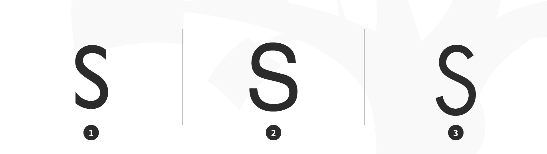
Sans serif type classifications. 1 Transitional: Gill Sans, 2 Humanist: Helvetica, 3 Geometric: Futura.
© Daniel Skrok and Interaction Design Foundation, CC BY-SA 3.0
Characteristics of Sans Serif Typefaces:
Transitional
Have a low contrast between thick and thin strokes
Have vertical or no observable stress
Humanist
Have a medium contrast between thick and thin strokes
Have a slanted stress
Geometric
Have a low contrast between thick and thin strokes
Have vertical stress and circular round forms
Monospace
A typeface that displays all characters with the same width is known as Monospace.
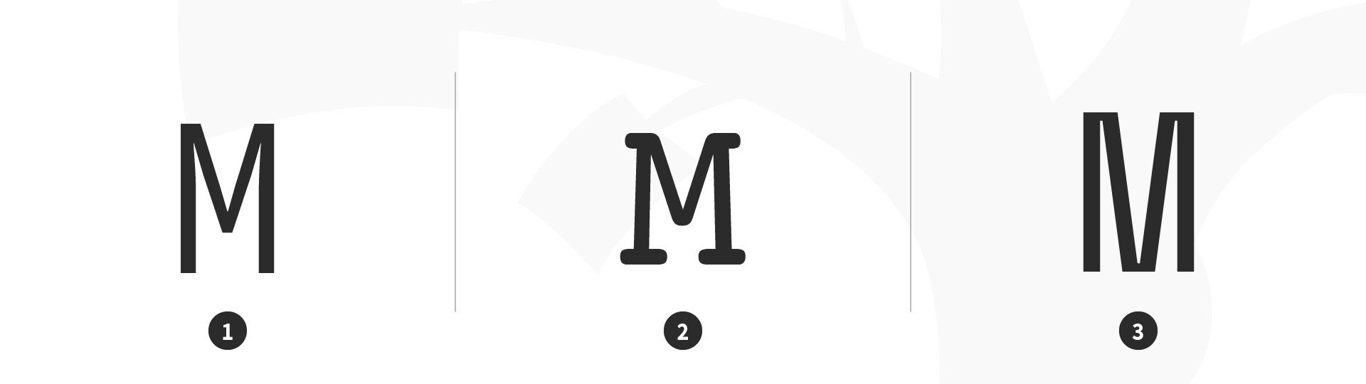
Monospace type classification. 1 Monospace: Source Code Mono, 2 Monospace: Courier, 3 Monospace: Space Mono.
© Daniel Skrok and Interaction Design Foundation, CC BY-SA 3.0
Script
Script typefaces have a natural, handwritten feel. Scripts can be classified as Black Letter, Calligraphic and Handwriting.
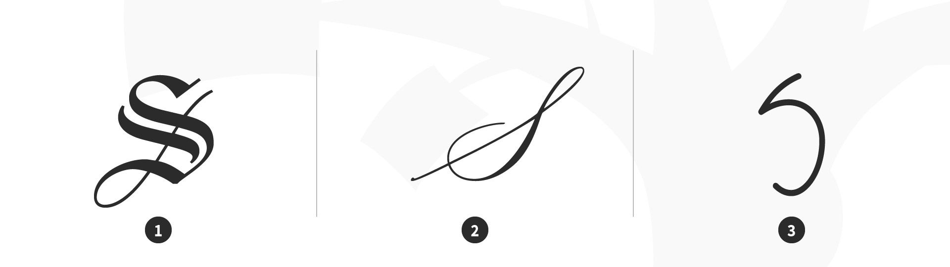
Script type classification. 1 Black Letter: Linotext, 2 Calligraphic: Mackinac 1895, 3 Handwriting: P22 FLW Midway.
© Daniel Skrok and Interaction Design Foundation, CC BY-SA 3.0
Characteristics of Script Typefaces:
Black Letter
Have a high contrast between thick and thin strokes
Are narrow with straight lines and angular curves
Calligraphic
Are replications of calligraphic styles of writing (formal)
Handwriting
Are replications of handwriting (casual)
Display (Decorative)
Display typefaces, also known as decorative, are a broad category of typefaces that do not fit into the preceding classifications. They are typically suited for large point sizes and primarily used for display.
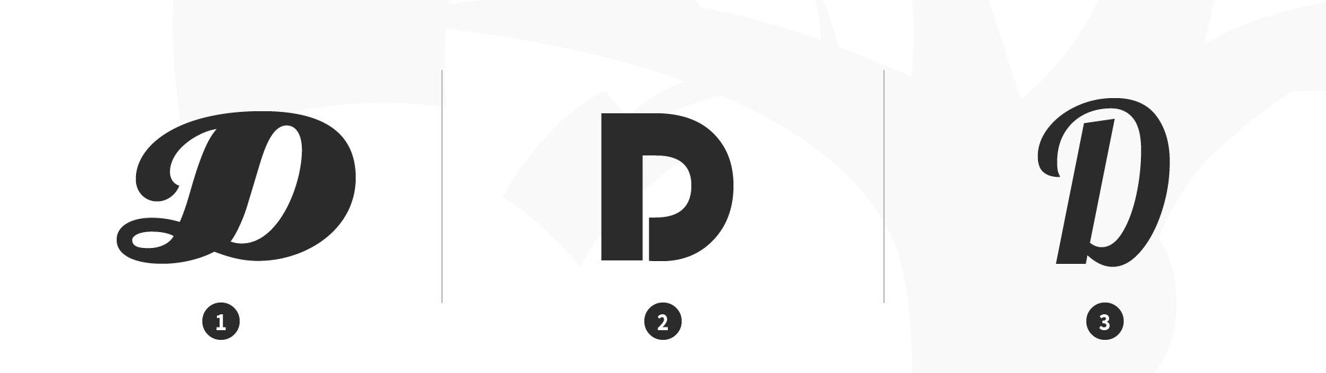
Display (decorative) type classification. 1 Display: Eclat, 2 Display: Bauhaus, 3 Display: Lobster.
© Daniel Skrok and Interaction Design Foundation, CC BY-SA 3.0
Characteristics of Display Typefaces:
Decorative
Are distinctive, eye-catching and original
Example in Use: Helvetica
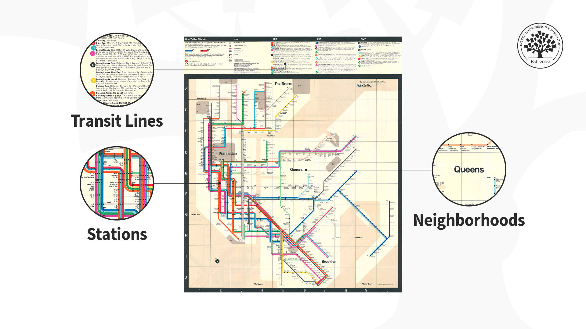
Illustration of the Vignelli NYC Subway Map depicting the effective use of the sans serif typeface Helvetica.
© Massimo Vignelli and RIT Cary Graphic Archives, Fair-Use (
This NYC Subway Map designed by Massimo Vignelli uses a sans serif typeface, Helvetica, to clearly indicate neighborhoods, stations and transit lines.
What are Type Families?
In the sixteenth century, printers began organizing roman and italic typefaces into matched families. The concept was formalized in the early twentieth century to include styles such as bold, semibold and small caps.
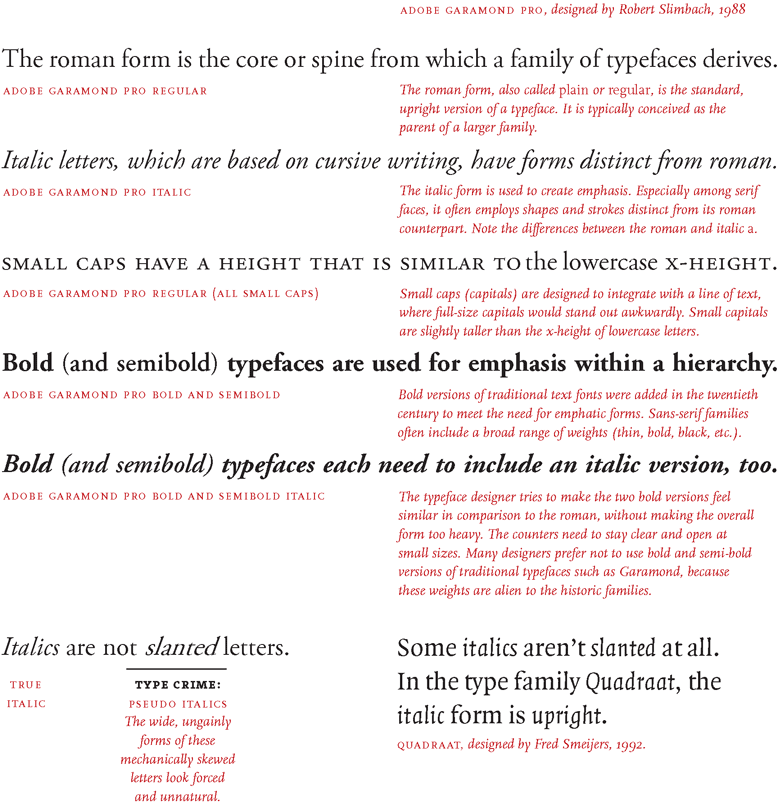
Illustration depicting the type family Adobe Garamond.
© Ellen Lupton and Princeton Architectural Press, Fair-Use (
Example in Use: Garamond 3
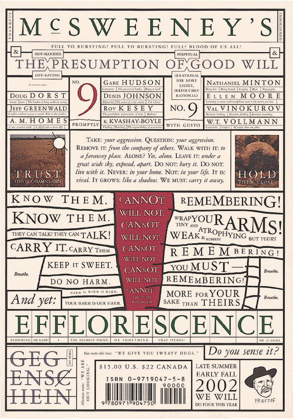
McSweeney’s Magazine cover designed by Dave Eggers in 2002.
© Dave Eggers and McSweeney’s Magazine, Fair-Use
This magazine cover uses the Garamond 3 typeface family in various sizes. Although the typeface is classical and conservative, the obsessive, slightly deranged layout is distinctly contemporary.
What are Type Superfamilies?
A traditional roman book face typically has a small family — an intimate group that consists of roman, italic, small caps, and possibly bold and semibold (each with an italic variant) styles. Sans-serif families often come in many more weights and sizes, such as thin, light, black, compressed and condensed. A superfamily consists of dozens of related fonts in multiple weights and/or widths, often with both sans-serif and serif versions. Small capitals and non-lining numerals (once found only in serif fonts) are included in the sans-serif versions of Thesis, Scala Pro and many other contemporary superfamilies.
Example in Use: Univers
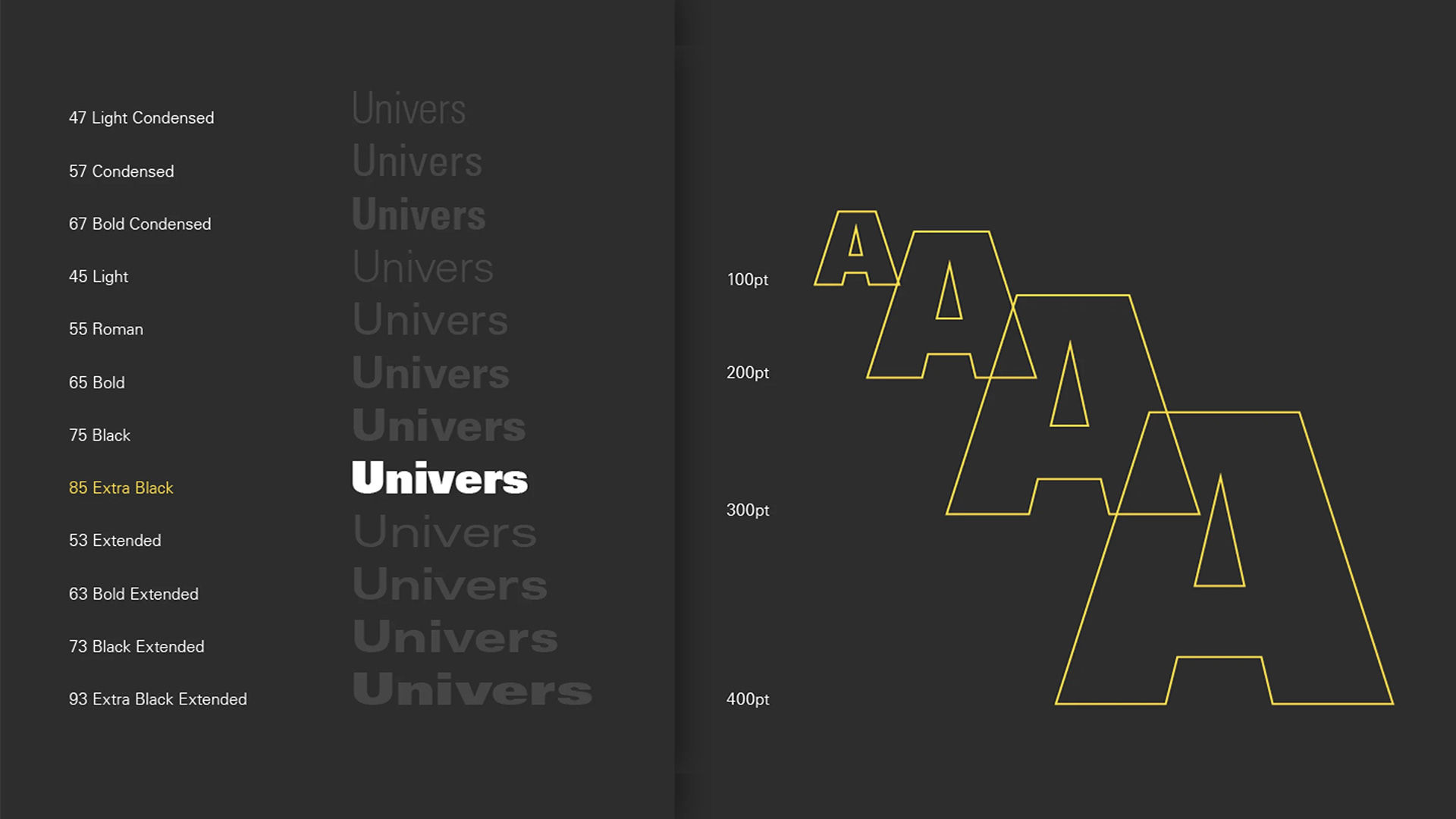
Univers designed by Adrian Frutiger in 1957.
© Adrian Frutiger, Fair-Use
Univers was designed by the Swiss typographer Adrian Frutiger in 1957. He designed twenty-one versions of Univers, in five weights and five widths. Whereas some type families grow over time, Univers was conceived as a total system from its inception.
The Take Away
Type is everywhere. In the books you read, the products you use, and even in this very website you're on right now. In the context of design, type is the style or appearance of text. In this lesson, you learned about type classifications, type families and the difference between a font and a typeface.
Type classifications were a basic system for classifying typefaces devised in the nineteenth century, in an effort to organize and understand type. Common classifications include Serif, Sans Serif, Monospace, Script and Display typefaces.
You also learned about type families, a concept formalized in the early twentieth century to include styles such as roman, italic, small caps and bold — and type superfamilies, that consisted of dozens of related fonts in multiple weights and sizes to include thin, light, black, compressed and condensed.
Remember, you only need to understand the basics to type to make an impact in your designs.
References and Where to Learn More
Learn more about the Typography by reading this thoughtful book by Ellen Lupton: Ellen Lupton. Thinking with Type. 2010. (Link)
Learn more about Type Classifications.
Visit Google Material Design to understand Typography:
Image
© Daniel Skrok and Interaction Design Foundation, CC BY-SA 3.0