
Users of all ages will still remember the tabbed file folders people used to bring order into a vast amount of information and make it super simple to find what they were looking for. If you’re trying to design a good way to prevent your users from having to search for a needle in a haystack every time, the tabbed user interface is just what you need. Here, we will bring you up to speed with the differences between different types of tabs and when to use them. Soon, you’ll be a step closer to designing ultra-efficient systems while benefiting your users’ mental health as they find what they want that much faster.
The Design Problem
You are dealing with a multi-level site, system, application, dialogue box, panel, or window, and you want to allow users to navigate to these various levels from one point on the user interface. Each level contains different sets of contents that need to be grouped together for the following purposes:
So the users know these are connected;
So as to prevent the potential confusion from users’ facing unconnected options arranged together;
So they can compare their options before making a selection, and
So users can go straight to a specific set of options according to their current aims and objectives.
Let’s consider the wealth of material we might need to include in the piece we’re working on. For instance, imagine you’re working on an official website for a famous actor. You have his biography, filmography, news, famous or funny lines, and perhaps a section for images from his pre-star life. Within ‘filmography’, however, you’ll want to divide his movies between a few genres—say, action, science fiction, and rom-coms—and then there’s the two TV series he was in before he made it ‘big’ (and each of these will need to appear within its own subsection). That’s a great deal of information to organize—or, more precisely, stratify—into dedicated sections. Fans and casual browsers will expect to have an easy time of navigating through to relevant sections. The only surprises they’ll want will be in what they learn about him, as opposed to wondering where information is or why it appears in an unexpected way.
“I don’t know about you, but I practice a disorganized religion. I belong to an Unholy Disorder. We call ourselves ‘Our Lady of Perpetual Astonishment.’”
—Kurt Vonnegut, American author and playwright
The Design Solution
A common solution to this design problem is to use a tabbed document interface, also referred to as a 'card stack pattern'. In this pattern, labeled 'cards' or tabs help to structure content into separate sets of links, such as the Reuters market data section shown below, where links to subsections are arranged into four categories: stocks, bonds, currencies, and commodities.
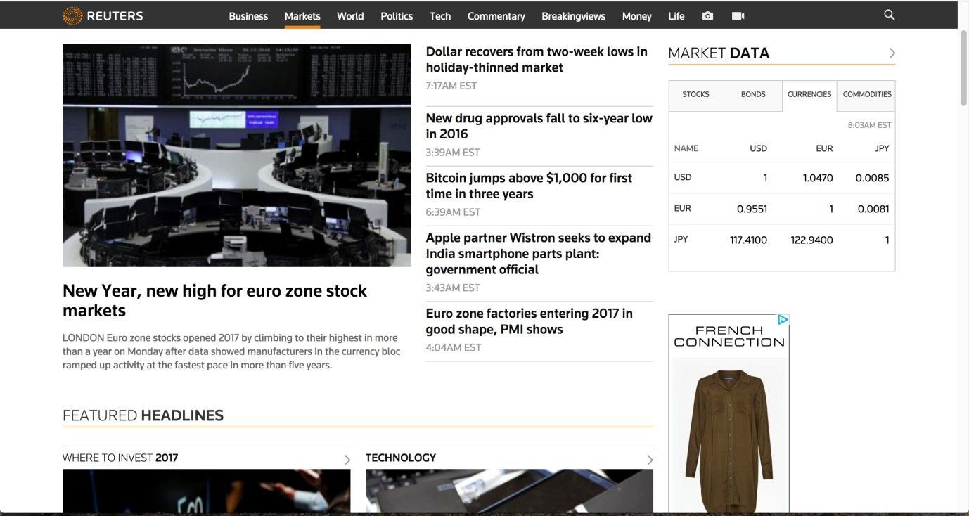
Author/Copyright holder: Reuters. Copyright terms and license: Fair Use.
This example of the tabs design pattern shows how it can help create structure in content. The four categories of stocks, bonds, currencies, and commodities each make a separate tab, but content is shown within the same page, making it an example of a module tab pattern.
Tabs take their inspiration from file folders and indexed address books, which enable the users to jump quickly to their target section by holding a particular label and opening the book on that page. Although address books are usually indexed alphabetically, interface tabs generally include one or two descriptive words that help the user identify the contents of a particular page. Tabs act as the highest-order sections or categories; they are purposefully broad so the user can gradually channel into the user interface to access more specific content without having to scan all of the available contents a site has to offer at once.
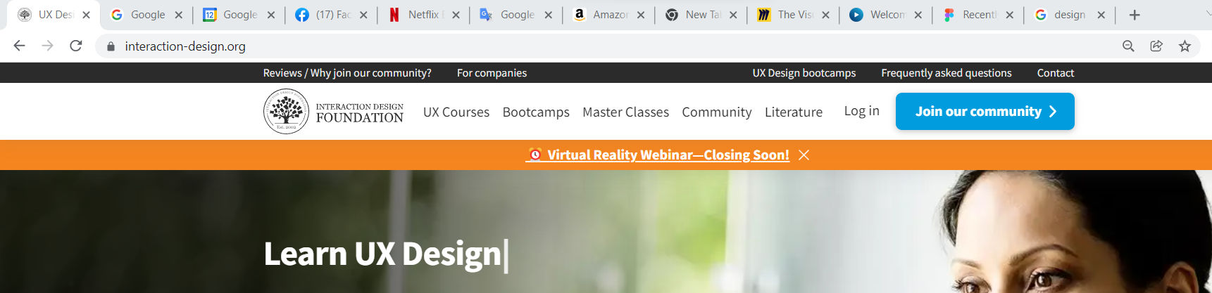
There are two distinct types of tabs you can use. Navigation tabs are almost exclusively placed along the top-level navigation bar of websites, offering small, clickable labels that open content in a new webpage. We can see navigation tabs in the example of the Firefox interface below. This is in contrast to module tabs, which present information on the same page, usually within a fixed panel, allowing the user to operate without having to navigate to other separate sections of the user interface. The Reuters example, shown previously, is a good example of module tab implementation.
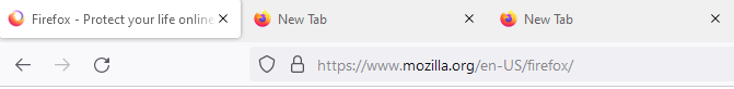
Author/Copyright holder: Firefox. Copyright terms and license: Fair Use.
The Firefox web browser uses a tabbed user interface. Here, it is clear that it involves a navigation tab pattern, as each tab leads the user to a different webpage.
Why Choose a Tabbed Document Interface Design Pattern?
Perhaps the most compelling argument for using tabs is simply that they are so common in user interface design and, specifically, web design. This means even novice users will likely have come across the pattern and know how to use them. Moreover, due to their resemblance to physical, ‘old-fashioned’ file folders and address books, tabs fit the mental model of the organization of sections of content perfectly.
A further benefit to using tabs is they help keep the user interface free of clutter. Each tab navigates the user to a separate webpage (navigation tabs) or section (module tabs), which can contain an enormous amount of information; they may also contain links or other user interface design patterns that take the user to further content. Therefore, if all the contents from these distinct sections were combined on one page, the user interface would be flooded. Users would then face the undesirable task of scanning the massive display to try and identify specific items or elements of interest to them. As we know, that’s not going to happen—unless a user’s life depended on it, but even then, our producing material like that would contravene our code as designers. Happily, we have tabs, which not only provide a satisfying means of hopping to, from, and between different sections but also help establish order within the user interface.
As we can organize tabs together within the same region of space, the user can skip from one section to another with the click of a button. Affording movement through the different pages or sections like this means users do not have to perform multiple interactions when they have finished on a particular page, or if they simply want to investigate the contents of another tab. Reducing the amount of effort the users must expend so as to complete their tasks saves time, improves usability, and can promote exploration – an important element to e-commerce web designs. When users have to carry out a number of different steps in order to reach content, it contributes to a poor 'Return on Click Investment' (ROCI), which refers to the amount of effort expended versus the pay-off when they arrive at their intended location. The ideal ROCI is achieved where the user has to carry out the fewest number of interactions possible, while the new location provides that user with all of the sought information in an easy-to-digest fashion.
Implemented appropriately, tabs provide an ever-present means of changing location. No matter where users are, they can navigate to another broad category by simply clicking on another tab. Moreover, module tabs have the advantage over navigation tabs of saving users from moving between different pages of a website. The maintenance of tabs in the top level of the user interface can also help orient users and provide them with important contextual information. If the selected tab is highlighted/distinguished from unselected options, users will know where they are, where they can go, and how they can get there.
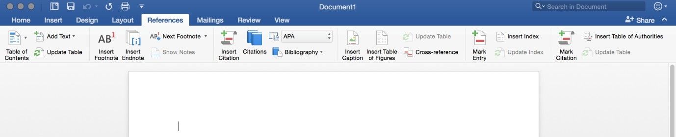
Author/Copyright holder: Microsoft. Copyright terms and license: Fair Use.
When implemented appropriately, tabs allow users to navigate to another broad category simply and quickly, both in websites and in applications such as the Microsoft Word application shown here. The maintenance of tabs in the top level of the user interface helps orient the users and lets them know where they are, where they can go, and how they can get there.
Best Practice: How to Implement Navigation and Module Tabs
First of all, you must establish how the site contents will be divided, which involves clubbing related information, images, and other items together under the same umbrella term. As a general rule, you should only use tabs when you are dealing with at least three and no more than nine or ten distinct sections. After you have established which groups all the available contents fit into, you must assign a logical and unambiguous tab label to each category and sort them in a logical order.
You must then arrange all of these labels horizontally, bordering one another so as to reduce the amount of space the user must traverse when skipping from tab to tab, and to ensure there is enough room to fit all of the necessary information onto each tab. The usual convention for navigation tabs is to make sure the tab bar spans the top width of the screen, as this helps establish the first level in the visual framework – with the navigation tabs serving as the top tier and providing the broadest channels to explore.
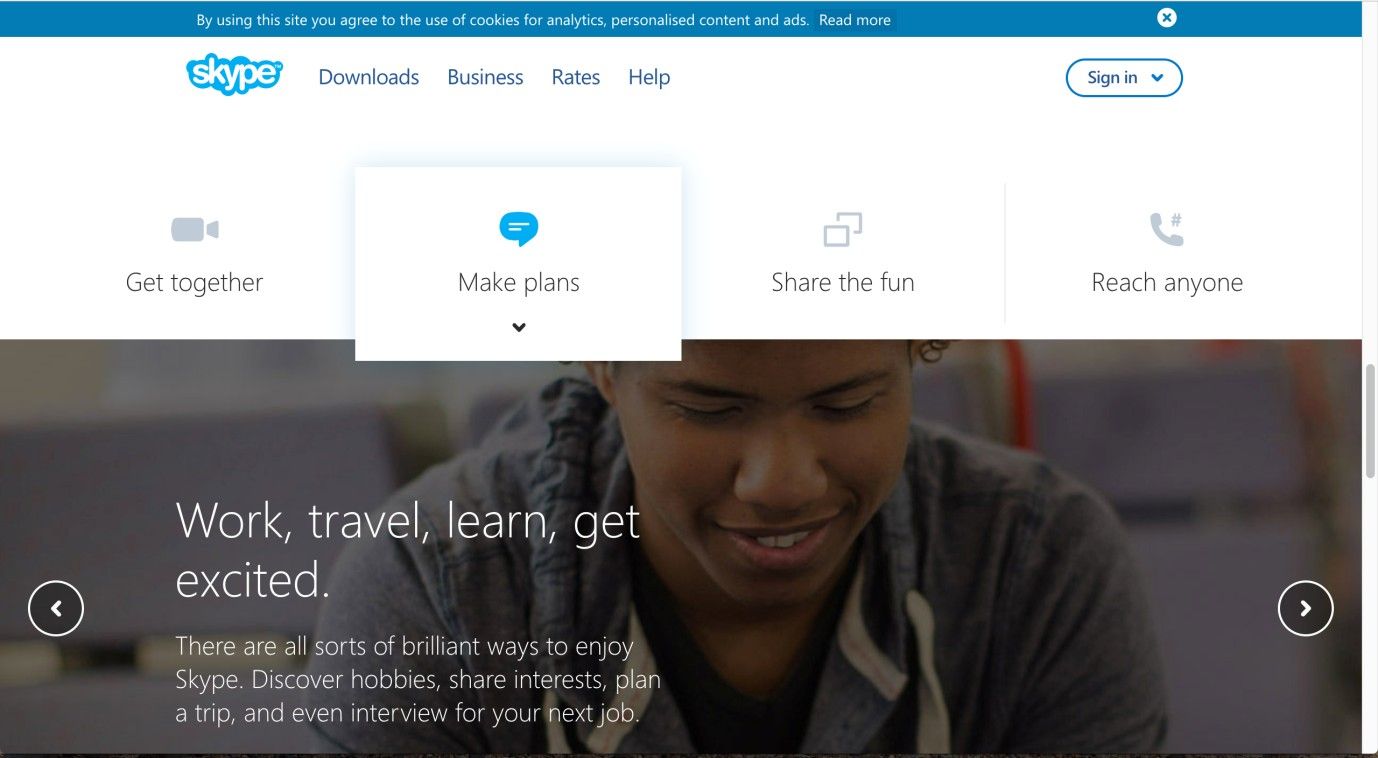
In order to help users identify where they are within the website, you should distinguish the currently selected tab from the rest. You can achieve this by using a different color for the selected tab, but any visual indicator will work. Providing context is an important element of user interface design as, otherwise, the users might not remember where they are, where they have already been, or where they can go (in general or from their current position). Next, place some form of boundary around the tab and its corresponding contents, to increase the sense of connectedness between the means of selection and resulting information, options, etc. To enhance this effect, ensure the color of the selected tab is the same as the background color of the corresponding content panel or menu.
![]()
Author/Copyright holder: Skype. Copyright terms and license: Fair Use.
The Skype webpage clearly indicates which tab is selected, by using shading and position to let the selected tab stand out from the others.
Finally, ensure the same design is maintained across all the different pages, to allow free and easy movement around the contents of the site and to prevent errors. Users are more likely to make selection mistakes if the tabs are constantly changing place. Furthermore, inconsistent design forces users to engage with the visual display consciously rather than rely on experience to help guide their interactions.
Consistent design helps to reduce the amount of cognitive effort required in order to decode the visual representations in a user interface. As cognitive resources, such as short-term memory and attention, are limited, consistent design enables users to apply knowledge from one page to all others without even realizing it, thereby conserving these precious resources for their core aims and objectives. Users do not want to spend time working out how they can achieve their goals according to the constraints of the system; the user interface design must take this pressure off them, freeing their attention up so they can move and interact (largely) unconsciously to complete their system-based tasks.
To help you get started implementing navigation and module tabs, you can download and print our “Tabs” template:
Potential Problems with Navigation Tabs
When a user has to deal with more than ten tabs, the visibility and clarity of tab labels starts to suffer. While experienced users will learn where their favored tabs are located, the time new or novice users take to identify their desired tab will increase proportionally as the number of alternatives increases. This phenomenon is referred to as Hick's Law and although it has faced criticism, there is strong evidence to suggest that selection speed is heavily influenced by the number of alternative choices.
Author/Copyright holder: Interaction Design Foundation. Copyright terms and license: Fair Use.
Google Chrome allows users to open more than ten tabs at a time. Although this flexibility is nice to have, it restricts users from viewing the entire label of each tab. This means that users will lose sight of what they have opened.
Tab labels should be short and sweet; ideally, they should not exceed two words, and they must convey to the users exactly where they will be taken when they click these. A long or wordy tab takes time to decode and digest, while ambiguous labels might force the user into a process of trial and error – clicking a tab and navigating to the page to check exactly what the label means. Most importantly, you must never abbreviate tab labels, as users would then have to rely on what they can deduct from the visible portion. We insert tab labels purely to help users see exactly where they will go and where they are. By cutting part of the label out, you are reducing the amount of information available to the users, which restricts the decision-making process (i.e., which tab to choose for their current aims) in turn.
A common complaint with tabs when people are using the automatic display method is their sensitivity to cursor movements. Although users can move from one tab to another faster than they would if they had to click the tabs, using the cursor location to open and close tabs can be a nuisance. If users want to see content in one tab, they must make sure they haven’t placed the cursor over another tab; otherwise, undesired content will be displayed. Therefore, even though users don’t have to click on a tab to view its contents, automatic content display can be frustrating—as users must ensure the cursor is not flicked over or left on another tab. Furthermore, if the tab contents are revealed in a dropdown menu, they can obscure the users’ view of content on the rest of the page, so they must be mindful not to move the cursor over the module tabs when attending to content on the rest of the display.
One way around this problem is to introduce a slight delay between moving the cursor away from a tab and removal of the dropdown menu or content panel. This means if the user moves the cursor around the screen it is unlikely to cause the contents of a tab to close unintentionally, unless it is left outside the region of space occupied by the menu or panel for a prescribed length of time (typically 200–300 milliseconds). An alternative method of preventing the unintentional closure of a tab is to make the menu or panel wider than the contents require. This increases the user's margin for error when moving the cursor over the dropdown menu or panel. The final method is to alter the image of the cursor when positioned over a tab (e.g., switching from an arrow to a pointing hand); this helps to inform the users that they are within an interactive area of the user interface and moving away from this region will cause the removal of associated content.
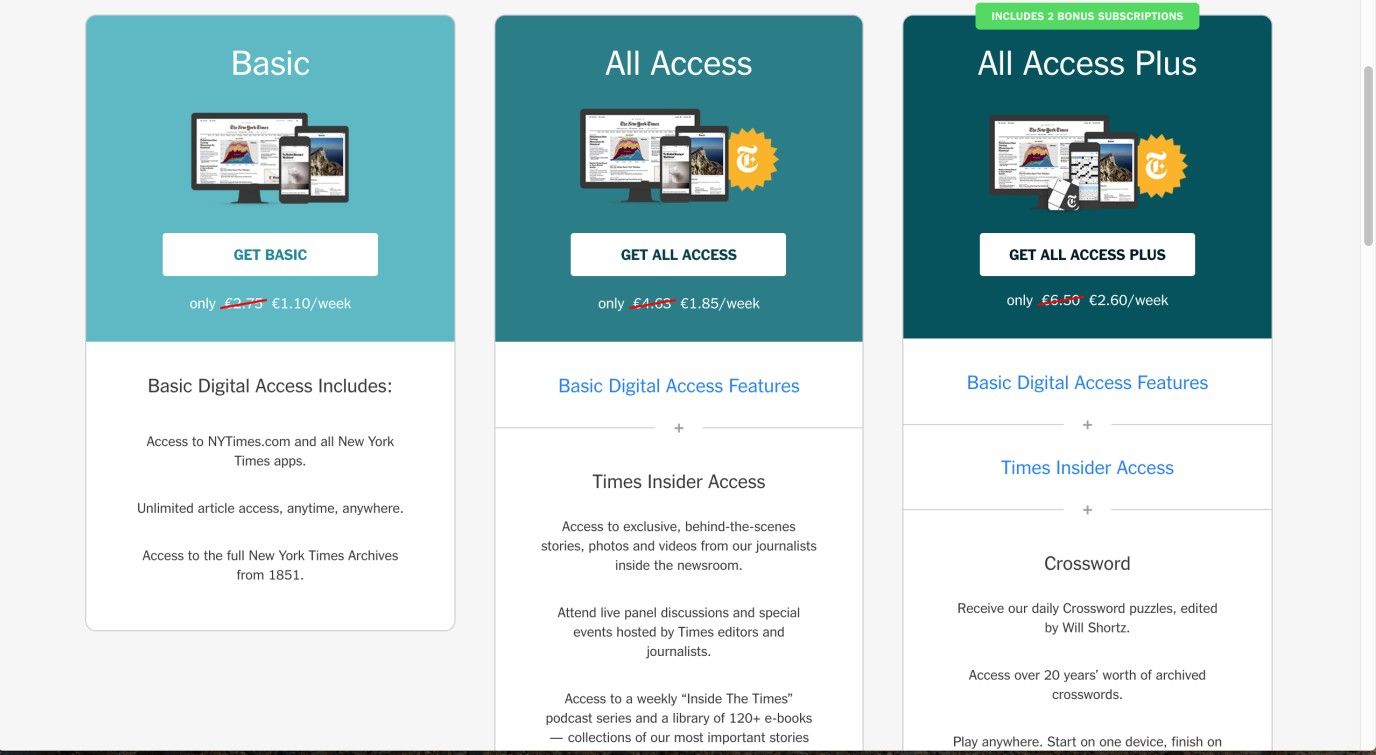
Author/Copyright holder: New York Times. Copyright terms and license: Fair Use.
You should not use tabs in your designs when the user will need to compare several sections of content with each other, like in this example from The New York Times. Here, tabs would dramatically increase the number of clicks needed to perform the task of comparing subscription options, as well as the cognitive effort required to remember all the information that needs to be compared.
There are a number of occasions where you should not use tabs:
One such occasion is when the user would benefit from seeing the contents of multiple sections on the same page. For example, a user might need to compare different data sets so as to derive an understanding of the overall thrust of a topic, or a user may want to compare the prices offered by different sellers on an e-commerce site. Placing such information in separate views means the user has to switch back and forth, increasing the amount of time and effort involved in making comparisons. Additionally, this forces users to remember information from at least one of the sections as they will never be able to have the two groups of content side by side.
Navigation tabs are used as broad categories, so they should not be employed when dealing with data that is content-specific, such as newsfeeds or dated articles. On these occasions, archive lists are probably more likely to satisfy your needs and the users'.
If there is only a small amount of information in a number of tabs, there might be a user interface design pattern better suited to the content of your site. Tabs should be used to consolidate distinct groups of information; still, if each one is only a few lines of text long or contains one or two images, the user might benefit from having them available all on one page and in some logical order.
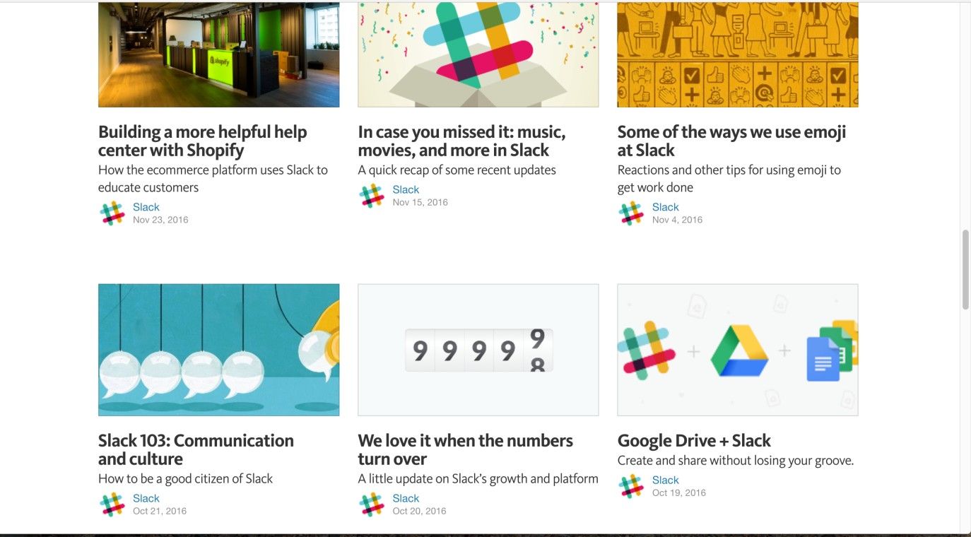
Author/Copyright holder: Slack. Copyright terms and license: Fair Use.
Blogs, such as this one from Slack, contain dated content. Although blog posts can sometimes be divided into categories, this is not always the case. Then, using a different design pattern makes more sense; archive lists are more likely to fit your users’ needs than tabs.
The Take Away
The tabs design pattern is very well known among users of all types. It helps you to provide a large amount of content to users, while maintaining a high degree of user-friendliness. With tabs, it’s easy for users to know where they are, what they can do there, and where they can go at all times. In order to implement tabs, the main step is to determine which categories of content you need. Keep in mind not to use too many categories, as that may lead to confusion and lower efficiency. When you ensure that selected tabs stand out visually, and all tabs are presented consistently, you’ll create interfaces people will love to use over and over again.
References & Where to Learn More
Jenifer Tidwell, Designing Interfaces: Patterns for Effective Interaction Design, 2010
Martijn van Welie, Pattern Library, 2008
Jakob Nielsen, Mental Models, 2010
Christian Holst, ROCI: Return On Click Investment, 2013
Hero Image: Author/Copyright holder: Tom Woodward. Copyright terms and license: CC BY-SA 2.0.


