First impressions count. So how do you make a good impression on the first time user of a mobile application? Through a mobile splash screen. Unfortunately, there are often conflicts between a client’s wants for the splash screen and best practices. If you can learn to manage these conflicts – you can create better mobile user experiences for end users.
It can be tough being a user experience designer at times. Your role is to represent the user and deliver the best possible end product but there are times when the stakeholders (and particularly clients) want you to do something entirely different. One key area of conflict in the current mobile environment is the mobile splash screen.
What is a Mobile Splash Screen?

Author/Copyright holder: Roland Tanglao. Copyright terms and licence: CC BY 2.0
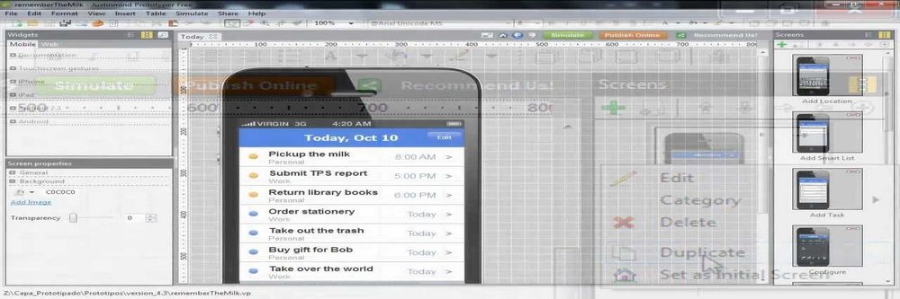
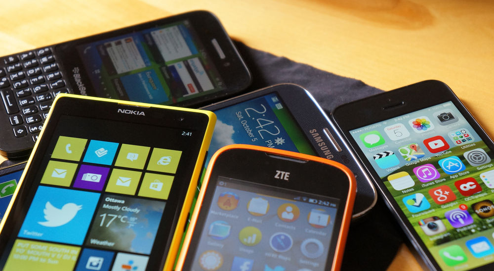
The splash screen is the very first screen that a user sees when they open up your app on their smartphone or tablet. It’s your chance to make a good impression on your user and set the tone for what’s coming with your application.
The splash screen dates back to the days when Flash first became common on the web. It takes time for actual content to load and execute – so to reassure the user that something was going on –the splash screen was used to catch their attention and show them that they weren’t just waiting for nothing.
What’s Controversial About That?
You’d think something so simple would be an easy task to agree the way forward on wouldn’t you? Unfortunately, it’s not quite that easy in many instances.
What the App Stores Recommend
Both Google and Apple have developed guidelines for mobile apps and both of them say that there’s a specific use for splash screens in mobile apps. That is to give the user the impression that their app has loaded faster than it actually has.
Author/Copyright holder: Amir. Copyright terms and licence: Fair Use.
The idea is to design a launch image that appears identical to the first screen of the app when it is loaded. Text on the image is static and thus can’t be localized (except for Windows 8.1 or above). It’s also important to try and be consistent with the UI so that nothing changes between the splash screen and the first real screen of the app. In addition, you ought to indicate that this is a loading screen to ensure the user doesn’t become frustrated pushing buttons on the splash screen.
What Clients Want
Clients, on the other hand, often don’t want this. They’ve become used to seeing splash screens in games and major desktop applications. Those splash screens are all about branding and marketing. They reflect the heavier workload of apps and games, etc. that aren’t optimized for mobile.

Author/Copyright holder: Angry Coop. Copyright terms and licence: CC BY-SA
The trouble is that a designer who applies the same technique to the mobile splash screen is, in essence, telling the user that they’re going to be waiting a long time for the app to load. That’s a bad idea as many app users are about as patient as website users i.e. if it takes too long to load, they’re leaving and not coming back.
How Do You Handle This Conflict?
The only way to handle this conflict between best practice and client demands is to draw your client’s attention to the best practice guidelines. You need to make the case for the user experience and explain how using branding and marketing approaches to the splash screen could damage the success of the client’s app.
UX designers have to be consultants for their clients (even when the client is an employer, not an external agency) and their role is to provide options and recommendations to the stakeholders in the project.
If the client chooses to pursue a marketing and branding approach after you’ve given your recommendation – they’re free to do so. It’s their money when it comes down to it. As long as you’ve provided the right information to the client and made the right recommendation – you’ve fulfilled your responsibilities.
The Take Away
The mobile splash screen is the first screen a user will see when they access a mobile app. Best practice says that it should be a screen which introduces the user to the first screen of the app and indicates that progress is being made while the app is loading. Clients may wish to pursue a branding and marketing strategy for the splash screen but this can be damaging to the UX of the mobile app. As a designer you should be aware of this conflict and be prepared to educate your clients as to the right way to approach the problem.
References
iOS Launch Files (Splash Screen) Guidance can be Found here.
Android Splash Screen Guidance can be found here.
A great collection of mobile splash screens can seen here if you’re looking for inspiration.
Hero Image: Author/Copyright holder: Aniol. Copyright terms and licence: CC BY-SA 3.0