
With the move away from websites to applications on mobile devices; there’s a need for many apps to create, maintain and manage user profiles so that users can effectively interact with the app and so that the app’s creators can collect and analyse data useful to their businesses. There is no “one size fits all” method of building user profile interfaces on mobile but there are some best practices that may be worth considering as you design your user profiles.
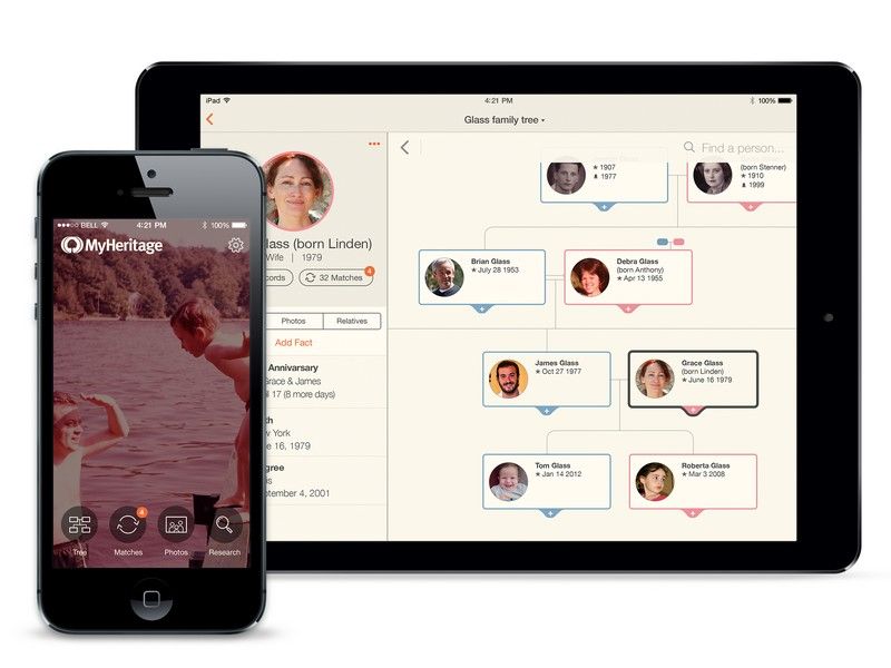
Author/Copyright holder: MyHeritage. Copyright terms and licence: CC BY-SA 4.0
Mobile apps usually require user logins and for users to offer up a certain amount of information to get the full experience from the app. This requires designers to pay some attention to the design of the user profile interface – how can the profile be made to work in a way that is pleasing to the user?
Jake Rocheleau a UX designer, writing for Team Treehouse, offers some pointers to consider when designing profile interfaces for the mobile web:
Keep Things Clear and Keep Them Concise
A user profile page, like any other mobile page, is constrained in terms of screen real estate on a smartphone. That means that you don’t want to try and cram too much information on to a profile page or you can make the page too complex for the user to want to interact with.
You need to pay careful consideration to the information that you actually need in order to accomplish this. The basic rule of thumb is to only collect data on mobile if it is essential to the business or to the use of the application. You simply can’t expect users to fill in 10 page forms with joy when they only have a thumb dedicated to the task of form filling.
This principle will then ensure that your user profile is streamlined. If profiles are viewable by other users – you also need to consider what data will be shared and what will remain private to the individual.
However, that doesn’t mean your designs need to be bland. You can employ all the visual design tricks associated with the mobile operating system to make the profile aesthetically pleasing.
For example, flat design (such as that used on the emoticons below) can be employed to improve your user profiles.
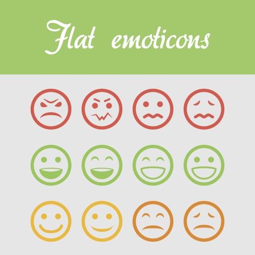
Author/Copyright holder: crassuscz. Copyright terms and licence: CC BY 3.0
At a Glance User Statistics
Not every user profile is going to take advantage of delivering user stats – a lot depends on the mobile application itself but if it does deliver stats. These should be easy to see at a glance, stats can motivate users to become more involved with an app but only if they’re readily understood and there’s a basis for comparison (either with previous stats generated by the user or with other users’ stats).
You may also want to consider privacy concerns when designing stats for user profiles; in particular is there a way that the user can opt out of sharing stats with other users? Or can the user determine which stats are shared and which are not?
Navigation Should be Intuitive
Profile pages should be easy to get to and easy to get around. Menu options should be simple to access and deliver exactly the right options when they are opened. Sliding menu systems are, perhaps, the easiest way to achieve this. If there is a “social” element to the mobile app then it can be a good idea to offer two menus – one relating to functionality that pertains solely to the user and one that pertains to the social aspects of the application.
As with all mobile navigation, you should present the most commonly used items in a menu first and ideally you want to keep options to fewer than 7 choices. If you need more choices, it’s better to break the menu down into sections with sub-menus that allow further choices.
Google’s material design, pictured below, makes designing navigation much easier for Android apps:
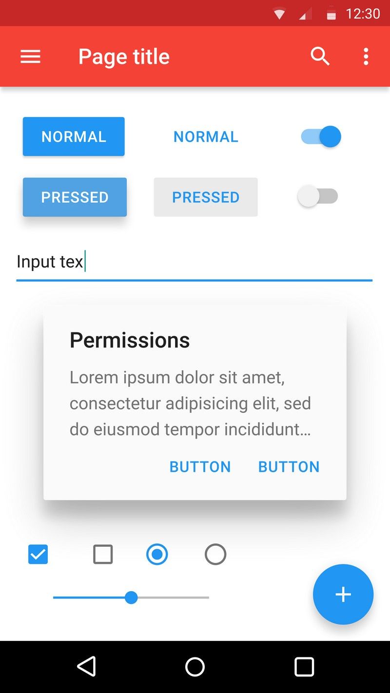
Author/Copyright holder: Google Inc. Copyright terms and licence: Public Domain.
Aesthetics Matter
A functional design is a wonderful thing but in order for profile pages to appeal to users in the long-term they also need to be desirable. That means focusing some of your design efforts on making the menu systems and the profile page aesthetically pleasing.
You want to experiment with animations, textures, etc. to deliver a visual treat once you’ve ascertained the “usability” of your profile pages.
The Take Away
User profile design falls between art and science. User research and testing will allow you to make the best choices for your users. The four tips above should help stimulate ideas and discussion around creating the best user experience for your profile page. There’s no doubt that this area of knowledge will grow over the coming years as mobile apps continue to gain market share and more investment and research is spent on them.
References & Where to Learn More:
Jake Rochelau’s original article with some examples of real-life applications of these principles can be found here.
An interesting debate on the merits of user profile design can be found over at Stack Exchange.
Hero Image: Author/Copyright holder: Pixabay. Copyright terms and licence: Public Domain.


