
In mobile user experience (UX) design, it’s important that we respect a user’s task and mindset, as well as the device’s limitations. Here you’ll learn about the general principles that can help you get started with your design.
Josh Clark, the author of Tapworthy: Designing Great iPhone Apps, describes three types of mobile mindsets:
“I’m Microtasking”: When the user interacts with their device for brief but frenzied periods of activity. Think about how you can accommodate users who are in a hurry. Make frequent, recurring tasks as efficient as possible.
“I’m Local”: When the user wants to know what’s going on around them. Take advantage of mobile devices’ sensors such as location, device orientation, and ambient light to personalize the experience where appropriate (and with permission, of course!).
“I’m Bored”: When the user is looking to be entertained, think beyond the task-focused features. What can you offer users when they leisurely browse?
We might add a few more categories that have emerged since Josh wrote that book early on in the smartphone era:
Extended engagement: When the user fully engages with the content for a long time, scrolling, tapping or swiping endlessly.
Interrupted attention: When notifications pull users back to check up on activity, status updates, or anything else. Note this is not always good, as notifications notoriously pull users back for no urgent reason other than for the company’s app engagement monetization needs.
In that last category, Microsoft offers a set of guidelines called “Respecting Focus.” They fall into five main areas:
Understand urgency and medium: Technology communicates in many ways: pop-ups, blinking lights, sounds, and vibrations. Are they all needed? Match the urgency of a notification with the urgency of the communication.
Adapt to the customer’s behavior: How a customer interacts with each feature or part of your experience will change over time.
Adapt to context: We all focus, filter, and consume information in unique ways. We filter out different information. These preferences and capabilities can rapidly change based on the contexts of use. context. Because of that, how a person interacts with each feature or part of an experience will change. Can your system learn from how people interact to modify the way it communicates?
Enable the customer to adapt: Personal experiences should suit each individual. Customizable features help customers feel empowered and in control of their devices. Many alerts on computers today are difficult to tune out or turn off. It can get overwhelming if multiple applications all send alerts simultaneously. Better systems have ways for users to control the type and timing of notifications.
Reduce mental cost: Experiences move beyond screens to engage and immerse human senses. Each of these new interactions presents new potential points of friction.
Basic Design Considerations for the Mobile Web
Small Screens
You don’t have as much screen real estate for mobile devices as you do for PCs and laptops. That means, normally, you’ll design for multiple screen sizes. Remember, you want to focus on a “mobile first” approach, which means you’ll design for the smallest mobile platforms and increase complexity from there.
A good process to follow would be:
Group device types based on similar screen sizes and try to keep these groups to a manageable size.
Define content and design adaption rules that enable you to make a clean layout on each group of devices.
Adhere as closely to web standards (W3, Material Design, etc.) as possible.
Prioritize the Primary Task
If we use a task-first approach, we can guarantee that you've got the main task upfront. Think of it as a measure of urgency for the task.
The app Shazam is an excellent example of how you prioritize the main task. Shazam identifies the music playing around you. It helps solve a problem that we can all relate to: how many times have you heard a great song on the radio, at a shop or bar but couldn't identify it? Often, you don't have much time to Shazam a song, and the app caters to this issue. The interface is pared back, with just one large button on the screen. The button is animated to show the user that it needs to be pressed, with a line of text saying, "Tap to Shazam." The app's main task is immediately apparent to anyone who uses it.
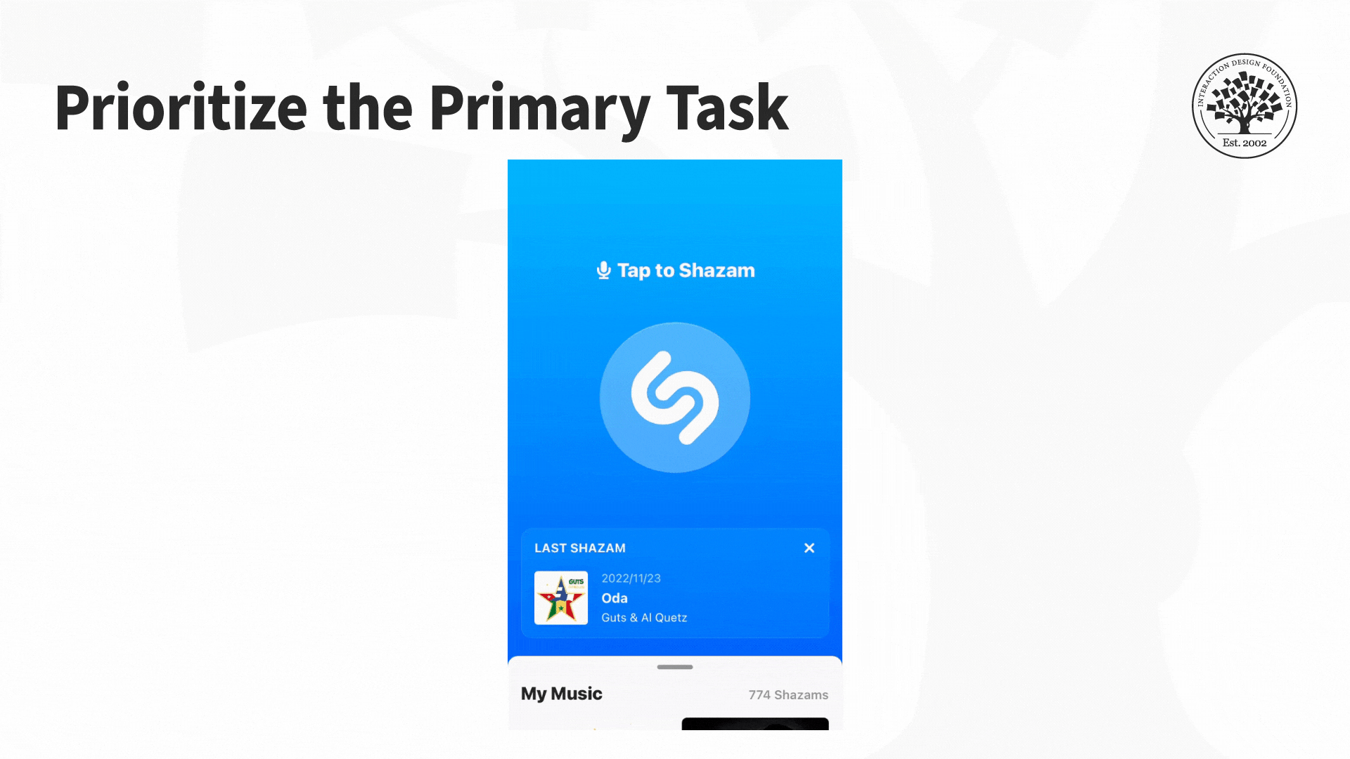
So, what’s your Shazam button in terms of task urgency and priority?
© Shazam, Fair-Use (Link)
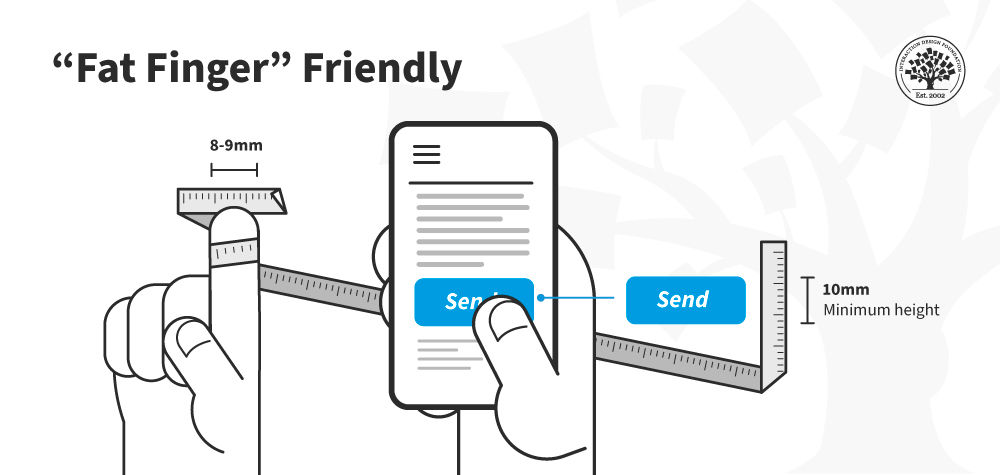
Keep Navigation Simple
Keypads and touch screens don’t make for precise navigation like mice do, so try to:
Prioritize navigation with the most common tasks at the top.
Minimize the levels of navigation involved.
Ensure the labels are clear and concise for navigation.
Offer short-key access to different features.
Remember to offer a minimum 10mm size for all buttons.
![10 mm touch targets are]()
© Interaction Design Foundation, CC BY-SA 4.0
Ensure that links are visually distinct and make it clear when users have activated them.
Make it easy to “hand off” or swap between the mobile and desktop sites and keep task continuity between devices if possible.
Offer navigation links in the footer of a page (if a mobile website) as well as a “back-to-top” function. This feature helps reduce scrolling fatigue, so users don’t have to scroll all the way back to the top. Also, screen readers (for blind users) need repeat footer links, so they have a forward motion path.
Make sure “hamburger menus” (a menu icon with three horizontal lines) are visually distinct (don’t assume users know what they are). Use appropriate ARIA attributes to identify the hamburger menu for accessibility.
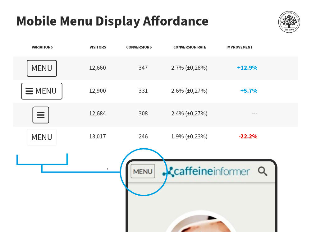
Various studies have been done on the mobile Menu (hamburger) display affordance. This study by developer James Foster found a word menu with a border had a much higher conversion rate than a menu without a border—and no hamburger was involved!
© James Foster, Fair Use
This isn't to say that you should never use a hamburger menu. Mobile gaming especially finds good uses for hamburger menus, but be aware of their strengths and weaknesses.
As always, test with your users to make sure your mobile menu is accessible.
Keep Content to a Minimum
Don’t overwhelm your users—respect the small screen space. Keep content to a minimum.
Ensure content is universally supported on all devices, or avoid it.
Make page descriptions and microcopy short, verb-oriented and concise.
Reduce the Inputs Required from Users
The less the user has to fiddle with their phone, the more they’ll enjoy your mobile web or app. Consider how to:
Offer alternative input mechanisms (video, voice, etc.).
Minimize inputs in forms (you can always ask for more data when the user logs on to the desktop).
Allow permanent sign-in (most smartphones are password- or fingerprint-protected, so this poses less risk than on the desktop).
Keep scrolling to a minimum and ensure users only have to scroll in one direction.
Remember That Mobile Connections Are Not Stable
Mobile connections can be a colossal pain in areas with patchy service. Don’t make things difficult for your users. Try to:
Retain data, so you don’t lose it in a connection break.
Minimize page size for rapid loading.
Kill off ad networks and pop-ups on mobile sites which consume huge amounts of bandwidth and data.
Keep images to a minimum and reduce the size of those images.
Reduce the number of embedded images to a minimum (speeding up load times).
Continuous Integrated Experiences
As users move between mobile and desktop, they will expect similar experiences. Remember to:
Maintain continuity. If they log into your web store on mobile, they should be able to track orders and make purchases just like they would on the desktop.
Maintain consistency. Offer the option to switch between mobile and desktop at will.
Maintain brand. The look and feel of each version should be similar.
The Take Away
Mobile is different from the traditional desktop environment. While standard UX and usability considerations apply to a mobile context, the mobile environment brings new design considerations. We must respect a user’s attention and minimize interruptions. Overall, we must pay attention to the particular details of mobile experiences to deliver the best possible UX.
References and Where to Learn More
Creative Bloq suggests focusing on these 10 principles of interactive design for mobile.
Read Microsoft’s guide on Respecting Focus.
Learn more about designing interruptions in this Medium article.
Familiarize yourself with Toptal’s Guide to notification design.
Learn about how to make a hamburger menu accessible.


