Now we’re going to look at two powerful design principles that may, at first glance, seem too simple and second nature to us to warrant too much thought. However, we would be wise not to underestimate their capabilities and the benefits of their effects. Always keeping a firm appreciation for symmetry and asymmetry close to mind can equip you to make better judgments in your design planning and executions.
Whenever we distribute compositional elements evenly around a central point or axis, we’ll make a symmetrical design. A good example of symmetry in nature is the butterfly; its right and left sides are highly similar to each other (although not identical).
We find perfect symmetry when two mirrored sides are exactly the same. Poke a finger of your right hand up against the surface of your bathroom mirror, and look at it and its reflection from an angle (note - you don’t have to twist yourself too far to the side for this). Assuming that our mirrors are clean, we’ll always notice that the real right hand and its mirror image (which flips to look like a left hand) are perfectly symmetrical.
Fortunately, symmetrical design does not depend on identical mirroring. It’s only important to get close to the effect; exactitude is not necessary. Remember, you can manipulate the user’s eye easily without worrying about geometric perfection as a consideration in your design.
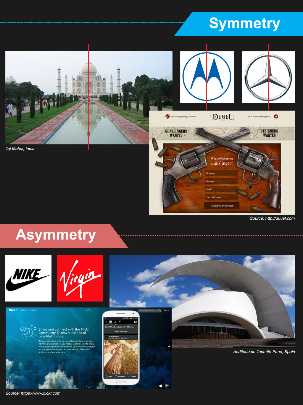
Conversely, asymmetry is the absence of symmetry of any kind. Whenever we make a design that consists of elements that we’ve distributed unevenly around a central point or axis, we’ll consequently have an asymmetrical design. We can exploit asymmetry, using it to draw attention to areas in the design or to convey dynamism or movement.
As in biology, elements are like cells or parts of an ecosystem. Ultimately, we need to keep in mind that building balance, which we can do through the use of symmetry, makes for a “healthy”, more effective design.
Types of Symmetry
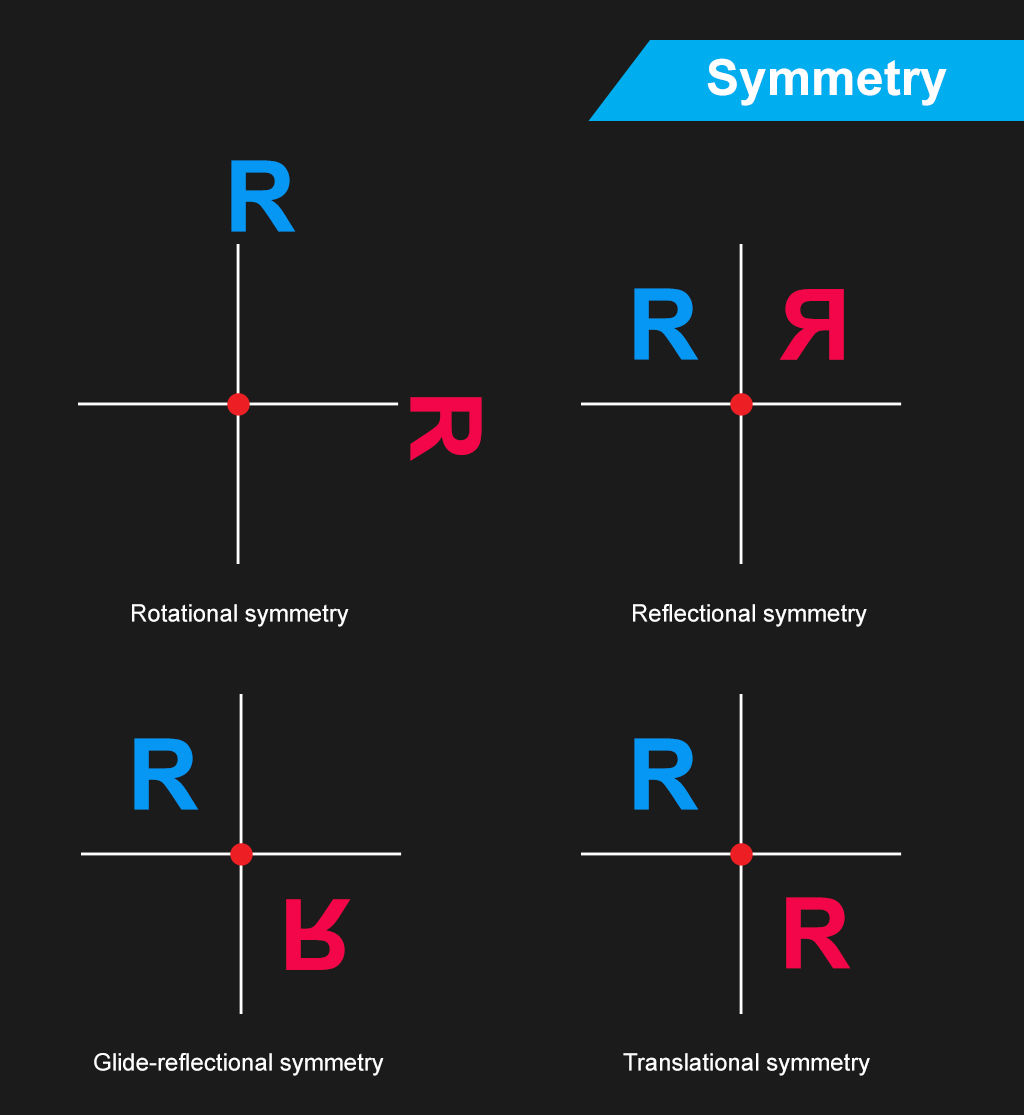
Based on how symmetry occurs and how we can compare each side of a design to the other, we can categorize symmetry into the following types:
Rotational Symmetry – Symmetry does not require that the design elements are perpendicular (at right angles) to each other. If there is a central point (the center of rotation) about which you can rotate the design while keeping its symmetry, then you’ll have an example of rotational symmetry. Therefore, don’t restrict your imagination to picturing only four parts of the screen or page (i.e., the top left, top right, bottom right, and bottom left quadrants). Think of it more like a circle, with degrees and coordinates that you can use more freely.
Translational Symmetry - Translational symmetry occurs whenever we can move (translate) an element in a design without causing it to lose its symmetric properties. As designers, we are unlikely to use translational symmetry for the whole page. Instead, we may occasionally use the principle for individual symmetric elements on the page.
Reflectional Symmetry - If one half of the image is a mirror image of the other, you’ll be looking at a case of reflectional symmetry. Now, we’re back to our finger in the mirror illustration. This is the strictest kind of symmetry.
Glide Reflectional Symmetry - If you’ve ever seen footprints in the sand or snow, you’ve seen glide reflectional symmetry in action. The idea is simple; you reflect the image but then move the copy so that it is no longer opposite the original image. Instead, you’ve made the copy seem like it’s changed in a specific way. You may have inverted it or made it look like it’s drifting away, conveying the impression of movement in a direction.
Symmetry and Balance
Symmetry offers an ordered approach to a design. As it makes for a neat and tidy design environment, users can find elements more readily. The human eye finds the balance brought about by symmetry (or pseudo-symmetry, where two items are not perfectly symmetric but are “close enough” for us to see as symmetric) pleasing.
We sometimes call symmetric balance “formal balance”. It is difficult to achieve in web and app design. The nature of symmetry is such that it binds the designer to very simple, very specific layouts, such as the Google homepage, which is, in fact, pseudo-symmetric. Remember that Google’s main page looks the way it does for no small reason. Because we use Google for one main purpose (looking up keywords or subjects), we find it more comfortable to have a tool that can take us to where we want to go, without distracting us along the way. How many times have you entered search terms because you’ve realized or remembered an important topic? If Google were to have a busy-looking main page, there would be a good chance that you might stop to look at a feature there, perhaps forgetting what it was that you’d wanted to research!
As more complexity is required in more sophisticated designs, we find that symmetric balance becomes increasingly difficult to attain. If we try to make it happen in a less simplistic design, we’ll notice how much force we have to use to keep that symmetry. Of course, that effort will turn up in the overall look, creating a strained impression in the user’s eye.
Happily, there’s an alternative. Most web and app designs rely on “informal balance”. That means accepting a certain asymmetry in the design itself but trying to achieve a balance of content on either side of a vertical or horizontal axis. Instead of going for a strict symmetry, which will constrain us, we make the best of the situation and work to insert an even distribution of elements. This situation is just like life itself! Nothing’s perfect, even if we know what, say, an equilateral triangle looks like and how perfect it is in form. Remember, too, that although our bodies seem symmetrical, they are not truly mirrored sides. If you’ve got moles, freckles, a cut or scar, a slightly different color in one eye, or have one arm that’s stronger or longer than the other, you’ll see this right away.
The Take Away
Designers often employ symmetry and asymmetry in web and app design to organize content and to provide a user-friendly interface. We can use symmetry and asymmetry as tools to achieve balance and harmony in the layout, creating more pleasing (to the eye and, consequently, the brain) effects than would be available if we didn’t design with symmetry and asymmetry in mind.
However, we need to approach symmetry with caution. Symmetrical layouts require simplicity to be effective. There are several types of symmetry:
Translational symmetry
Rotational symmetry
Reflectional symmetry
Glide-reflectional symmetry
As a page becomes more complex, keeping a tight grip on symmetry can lead you to make sterile layouts that lack visual appeal. One school of thought attributes dynamism to asymmetrical designs. In other words, asymmetrical designs can appear to be more alive and active, a far cry from the colder “flatness” of symmetrical designs.
However, simple pages with high degrees of symmetry can feel clean and are often very easy to use. This is particularly true when a page has a single point of interaction in the center. You will often find this on log-in pages, search engine home pages, etc.
Symmetry might also be used to develop familiarity with layout. Using symmetry in a design is a feature that might particularly benefit someone with learning disabilities, for example.
However, when complexity increases, you will often find that you can manage asymmetry more easily. With careful application, you can use an asymmetrical design to call attention to particularly important parts of a page, such as a call to action, which might otherwise have been lost in the greater part or parts of the content.
So, take the time to consider which one might benefit your design better. Stand back and take a look at the big picture before you go in and try to sort out the finer details. Who are your users? What is your product, service, or message? What are your most important points, and which parts can you afford to keep more subdued as “nice to know” portions? Which web pages do you want to convey what kind of information?
Only when you’ve answered these questions will you be able to have a better idea of whether a symmetrical design or an asymmetrical design will be the one to work better for that page. Remember, too, that your user’s eye will work in concert with your choice, so make sure that you consider all your elements and aspects of your design with care.
Where To Learn More
Kole, S. Symmetry vs. Asymmetry. Web Design Nerd Depot. [2014,,Aug 1]
Palomar Collage. Balance - Symmetry. [2014, Aug 1]
References:
Hero Image: Author/Copyright holder: Unknown. Copyright terms and licence: Uknown.