
Breadcrumbs act as navigation aids—ones that simplify user journeys on websites. They highlight the path taken within a site to boost user experience, especially on mobile devices with limited screen space. Explore more about mobile breadcrumbs and understand the common design mistakes and best practices in UX. Learn how to craft effective, user-friendly breadcrumb trails for mobile interfaces. Refine mobile breadcrumb design to make websites more accessible and navigable.
Consider a scenario where you search a website on your phone for the perfect pair of sneakers. You click through categories, but then...confusion sets in. How do you find your way back to the main shoe section without a ton of taps on the "back" button? This is where breadcrumbs come in.
Breadcrumbs act as simple navigation aids—ones that show your path within a website. They provide a major UX boost on mobile devices where you’ll have limited space to work with. What’s more, they play a crucial role when users arrive at a page via search results or external links. For instance, whenever you land directly on a page about sneakers through the site's search feature or a web search, breadcrumbs enable navigation to broader categories like the sneaker collection or the main shoe section.
But here lies the problem—some designers don’t use breadcrumbs (or a breadcrumb trail) correctly, and that’s especially the case on mobile websites and apps. Some use the breadcrumbs when there’s no need, while some use them in a way that’s got a negative impact on the user experience itself.
To understand the best way to use breadcrumbs, you’ve got to learn about their best practices. So, let’s explore the best ways to design mobile breadcrumbs and how to use them effectively for that all-important seamless user experience.
Why Do We Need Breadcrumbs?
Breadcrumbs serve as vital navigation tools—and they guide users through a website's structure. This clarity becomes crucial on mobile devices; that’s because they provide limited screen space. Breadcrumbs offer a compact way to display locations within a site; plus, they also let users navigate back to previous pages easily.
In desktop environments, you’ve got the luxury of more space, and it’s something that allows for more detailed breadcrumbs. Users can see the structure of a website there. On desktops, breadcrumbs can include more text and additional details—there’s more screen real estate to play with.
Mobile breadcrumbs need a far different approach—there, you’ve got to condense information. They should save space while the focus remains on that vital usability factor. This often means that you may use icons instead of text—but, alternatively, it might involve the point that you’ve got to simplify the breadcrumbs to essential levels only.
The key difference between the two lies in the display and complexity of them. Desktop breadcrumbs can afford complexity—given the extra room to spare. Mobile breadcrumbs, though, prioritize conciseness and simplicity—given the sheer need to handle things amid such limited space. Both types, in any case, aim to enhance user experience. But especially with so many users on mobile devices now, breadcrumbs there should make navigation in mobile intuitive and efficient.
Types of Mobile Breadcrumbs
Mobile breadcrumbs adapt to limited screen spaces while they live up to their primary function: to guide users efficiently. Here, we’ll explore different breadcrumb types—each one has its unique benefits.
1. Location-Based Breadcrumbs
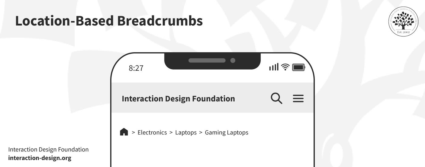
© Interaction Design Foundation, CC BY-SA 4.0
These breadcrumbs trace the user's path within the website hierarchy—and they offer a straightforward map back to the homepage. Location-based breadcrumbs work well on mobile devices. That’s because they provide a clear sense of direction without overcrowding the screen and confusing the user.
2. Attribute-Based Breadcrumbs
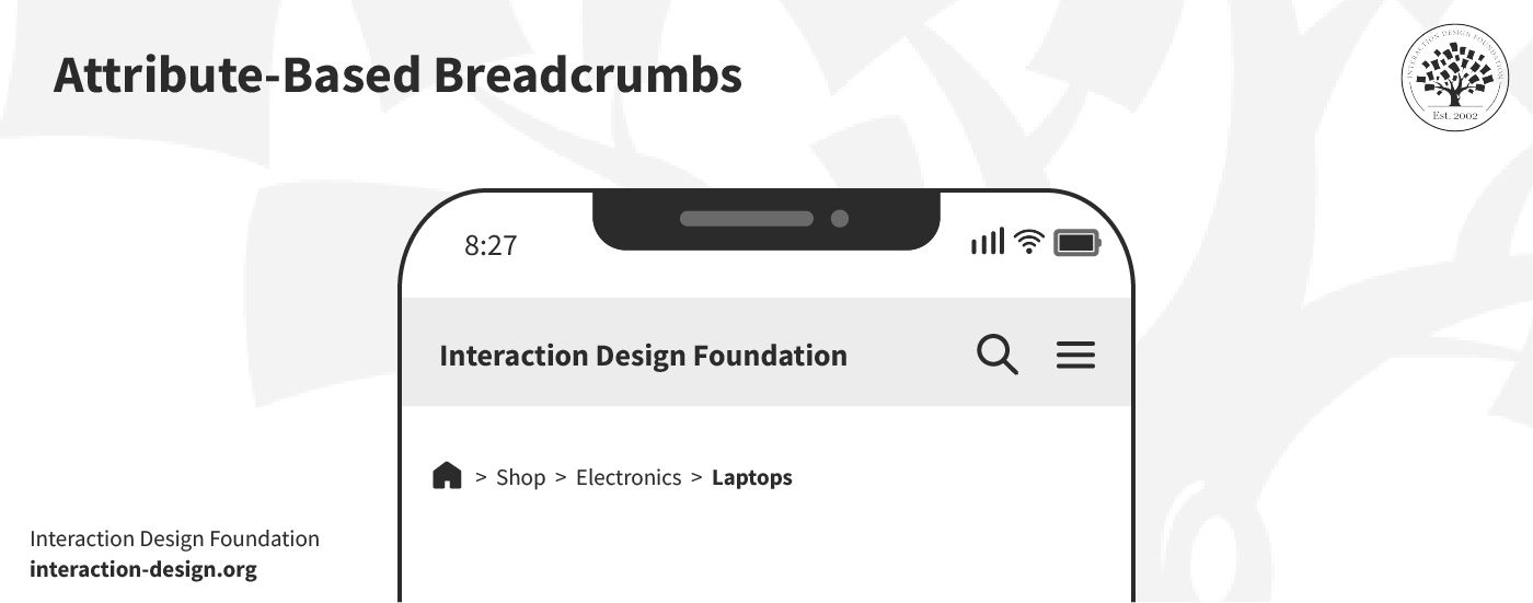
© Interaction Design Foundation, CC BY-SA 4.0
Attribute-based breadcrumbs create a dynamic path that’s based on various filters that a user may apply on a page. They’re often seen at work in e-commerce sites; what they do is they help users track their steps, like "Men > Shoes > Sneakers." This type of breadcrumbs allows for flexible navigation within categories and filters—a handy aid for e-shoppers.
3. Path-Based Breadcrumbs
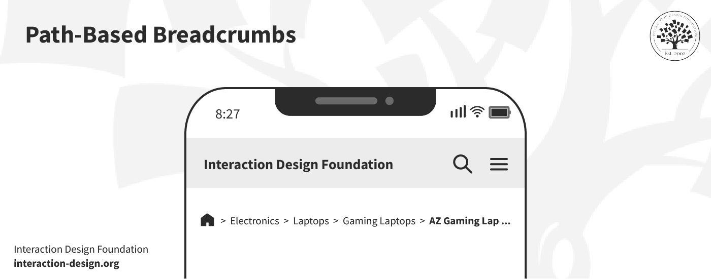
© Interaction Design Foundation, CC BY-SA 4.0
Path-based breadcrumbs show the unique journey that a user's taken on a site. They're less common on mobile—due to the space constraints; still, they can offer personalized navigation histories in apps where user paths vary widely.
But beware—this type of breadcrumb doesn’t help users much. In fact, it’s better for you to rely on the browser’s ‘back’ button. A history trail doesn’t really serve visitors who arrive directly on a page deep within the site.
Common Mobile Breadcrumbs Design Mistakes
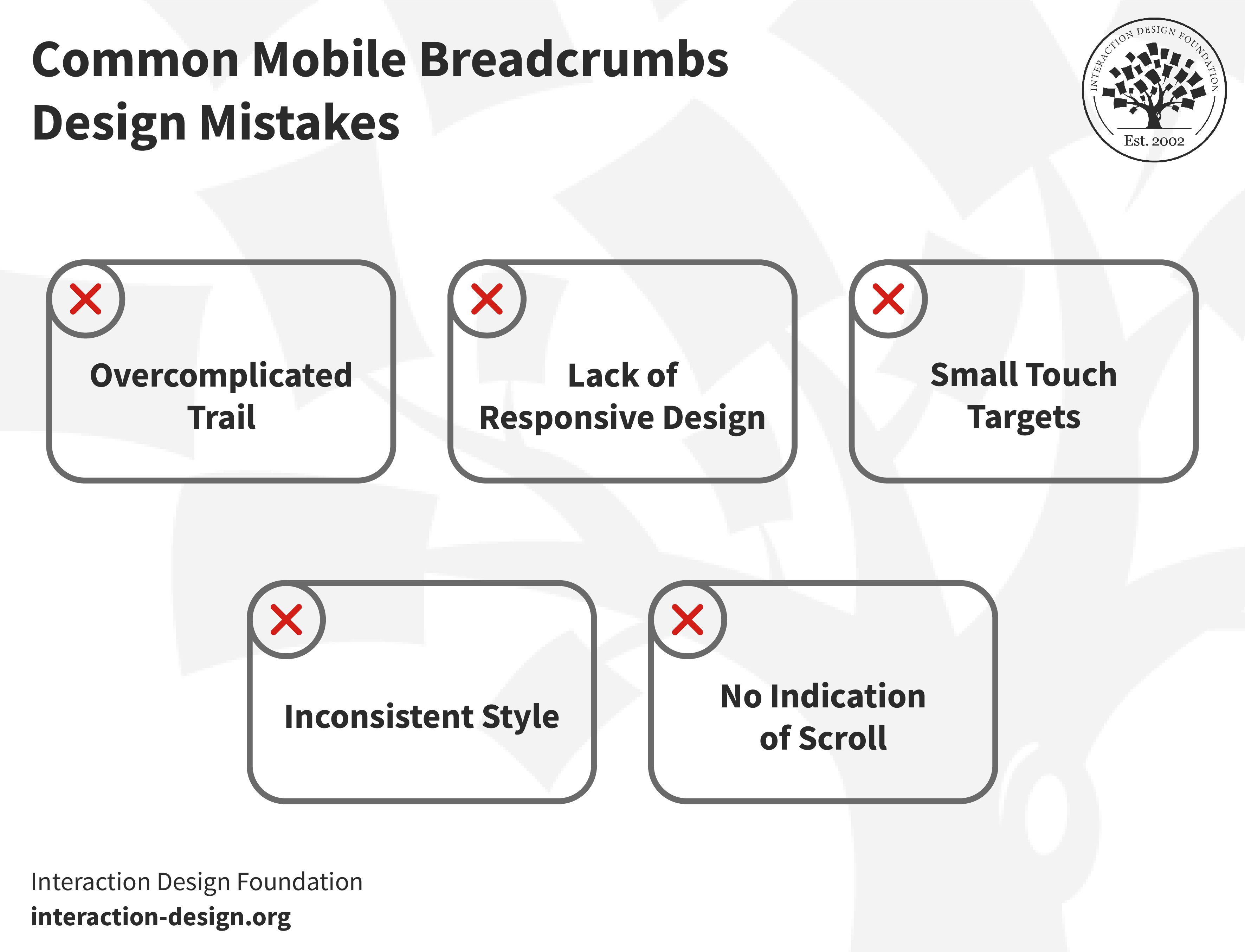
© Interaction Design Foundation, CC BY-SA 4.0
Before we get into the best practices, it's crucial to address the cautionary side of things: namely, the common mistakes which designers make while they design breadcrumbs for mobile. It calls for a unique approach to design for mobile—thanks to the limited screen space and the different ways users interact with their devices in their wide range of scenarios.
1. Overcomplicated Trail
Designers sometimes just pack too many levels into the breadcrumb trail—and it’s an overcomplication that confuses users instead of guiding them. A simple, straightforward path enhances user experience—that’s what users are after.
2. Lack of Responsive Design
Not all breadcrumb designs adapt well to different screen sizes. A design that works on a desktop might well clutter things or even break on mobile. Responsive design is an approach that makes sure that breadcrumbs look good and function well across all devices.
3. Small Touch Targets
On mobile, touch targets have got to be large enough for users to tap easily. Small links frustrate users—especially older users (or others with motor-related disabilities)—and they may lead to navigation errors. You’ve got to make sure that you design accessible and easy-to-select breadcrumb elements.
It’s vital, too, to make it easier for people with disabilities to access information, services and products without barriers—and in many jurisdictions on the planet, it’s the law. Watch this video to understand the concept of accessibility and its role in today’s design—and appreciate how it helps everyone.
Show
Hide
video transcript
- Transcript loading…
4. No Indication of Scroll
When designers pick horizontally scrollable breadcrumbs, they sometimes forget to signal this feature to their users. Users may not realize that they can scroll for more options without clear indicators—and, given that, designers miss out on useful navigation paths.
5. Inconsistent Style
Consistency in breadcrumb design is a vital thing as it helps users understand how they can navigate a site. Any inconsistent style across pages can confuse users about their current location and how to navigate back. This inconsistency can disrupt the user's journey; it makes navigation more challenging than it needs to be and—worse—can ruin what should be a seamless UX.
8 Best Practices: How to Design Breadcrumbs for Mobile
Now, let’s get into the more positive-facing stuff. You’ve got to take a different approach to create mobile breadcrumbs than you would desktop ones. Space constraints and user interaction patterns on mobile devices demand that designers prioritize simplicity and efficiency. So, without further ado, let's explore the best practices to help you design mobile breadcrumbs effectively.
1. Make Sure Users Need the Breadcrumbs
Before you add breadcrumbs, confirm that you actually need to. Remember, users—in their wide range of contexts—seek quick, easy navigation on mobile devices. Breadcrumbs can guide them through your website efficiently, and painlessly (at least, with less chance that they’ll feel frustrated). So, consider these examples to understand the scenarios where you may add breadcrumbs.
Add breadcrumbs: Let’s picture an e-commerce site that’s got multiple categories and subcategories. A user who browses through "Electronics > Laptops > Gaming Laptops" benefits from the breadcrumb trail. These breadcrumbs allow users to track their path and navigate back to "Laptops" or "Electronics" effortlessly.
No need for breadcrumbs: For a simple blog with a linear navigation structure, breadcrumbs might add clutter—with no substantial benefit to show for it. If users typically access content directly via search or the homepage, then if you add a breadcrumb trail, it could distract rather than aid navigation for them.
Users might actually struggle to grasp the options quickly when a website grows and introduces more navigation levels—things can become tricky for them. Suppose a user reaches the fourth level of navigation without clear labels to guide them; they might find it hard to explore similar items.
So, it’s best to analyze user behavior and site structure and ask yourself this question: “Does my site benefit from a hierarchical navigation scheme?” If yes, breadcrumbs can help users understand their location within your site. They’ll provide a swift way to return to previous sections, too. For complex sites with multiple layers, breadcrumbs become indeed essential. They really do offer users a clear, straightforward path to take.
User research is what can help you understand the need for a particular feature like breadcrumbs. Discover why performing user research early in the design process is crucial—and which methods suit you best.
Show
Hide
video transcript
- Transcript loading…
2. Simplify Breadcrumb Trails for Mobile Use
You’ve got to shorten the breadcrumb trail on mobile devices to improve the user experience. Sometimes, it’s sufficient to include only the last level(s) to support user navigation—and it’s an approach that’s particularly useful in contexts where users mightn’t need the full history of their navigation path but rather a quick way to step back or explore related categories.
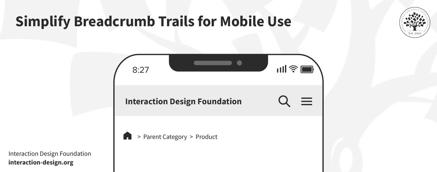
© Interaction Design Foundation, CC BY-SA 4.0
Consider the example of an e-commerce site:
A shopper arrives at a product-detail page from doing an external search.
They might want to view other items within the same category.
In these sorts of cases, a single breadcrumb that links to the parent category facilitates comparison shopping without clutter.
This method offers a direct link back without there being a need for a lengthy breadcrumb trail. What’s more, it conserves valuable space on mobile screens.
It's important to tailor this strategy to mobile users. Mobile screens make it essential to prioritize simplicity and directness in navigation aids—that’s due to the limited space they’ve got. You’ve got to display the full breadcrumb trail on desktop platforms—which have so much more screen space. The full trail helps desktop users understand their exact position within the site hierarchy more comprehensively—and it’s a helpful aid for them.
3. Focus on Visibility
It’s important to make sure the users can spot the breadcrumbs easily without any need to search for them. That means they’ve got to stand out on the page. High visibility is what makes sure that breadcrumbs serve their purpose as effective navigation aids. So, follow these four tips to make the breadcrumbs more visible:
Use Contrasting Colors: Select colors for breadcrumbs that have adequate contrast against the background—this makes them immediately obvious to users; plus, it meets accessibility requirements.
Strategic Placement: Position breadcrumbs at the top of the page, close to the global navigation—it’s this spot where users typically look at for navigational cues.
Pick Clear Fonts: Choose a font size and style that is distinct from the page's content. It should be readable on small screens without any need for the user to zoom in.
Incorporate Icons Sparingly: Use icons like arrows or chevrons to indicate the navigation path. These icons should complement the text and—as a vital point—easily guide the user's eye from one breadcrumb to the next.
Remember, a well-designed breadcrumb trail acts as a silent guide. It leads users without any interruption in their journey or break in what should be their seamless experience. That’s why you’ve got to make breadcrumbs visible and distinct to enhance user experience on mobile devices.
4. Don’t Use More than One Line
Make effective use of screen space on mobile devices—remember how small the screen real estate is. Breadcrumbs can consume valuable space if you don’t design them carefully. A cluttered display confuses users more than it helps; so, be sure to follow these guidelines to make effective use of space:
A single-line breadcrumb trail works best—and it clearly shows the site's structure without overwhelming the display. Don’t have a trail of items that spill over into multiple lines—that approach muddles the navigation path.
You can highlight the current page's title separately—and this action makes the user's location prominent to them. With that said, though, it’s optional to include the current page in the breadcrumb trail.
Styling choices affect this decision, and it’s a point that every website may approach this differently based on design preferences. The key is to balance visibility and compactness—to make sure that breadcrumbs aid navigation and don’t eat up valuable space on the screen.
5. Create a Concise Breadcrumb Trail
A concise breadcrumb trail is a vital thing for clear navigation. It helps users understand their location within a website without clutter on the screen getting in the way. The goal is to balance detail and simplicity while users navigate back to the upper pages without getting confused at all. Let’s take a look at the examples below:
Good Example: Home > Electronics > Laptops > Gaming Laptops
.jpg)
© Interaction Design Foundation, CC BY-SA 4.0
Bad Example: Home > Products > Electronics > Computers & Accessories > Laptops > Gaming Laptops

© Interaction Design Foundation, CC BY-SA 4.0
The good example offers a nice, direct and straightforward path. For one thing, it guides users from the home page through to a specific category. What’s more, it keeps the trail short and relevant—and users can quickly backtrack if they need to.
The bad example, though, includes unnecessary layers. It makes the trail longer and more complex than it needs to—and this example dilutes the user's focus as it uses too many steps.
Here’s what you can do to make a concise breadcrumb trail:
Limit Steps: Include only essential categories. This keeps the trail both readable and direct.
Be Descriptive: Use clear, descriptive labels for each category. This will make sure that users understand each step of the path.
Avoid Repetition: Eliminate redundant categories that add length without value.
Use Delimiters Wisely: Choose symbols like '>' to separate categories. It maintains clarity and doesn’t take up too much space.
6. Truncate Labels
You’ve got to shorten the labels to fit within a given space, and you've got to do this for mobile design due to limited screen space. The label of the last link—which is often the most specific—might be lengthy. The issue of lengthy labels can come up at any stage of the breadcrumb trail. While this poses no issue on desktop, it mightn’t fit entirely on mobile.
Good Example: Home > Electronics > Laptops > Gaming…

© Interaction Design Foundation, CC BY-SA 4.0
Bad Example: Home > Electronics > Laptops > Best Gaming Laptops for Under $1000
.jpg)
© Interaction Design Foundation, CC BY-SA 4.0
In the above example, truncation keeps the breadcrumb concise and the path clear—even if the last category is long. The bad example shows the full label. It’s something that can overwhelm the user and clutter the limited space on a mobile screen, where each pixel needs to count so much more in that sense.
So, apply these practices to make sure that your mobile sites stays navigable and user-friendly, no matter how complex your site structure is.
Prioritize Clarity: Make sure the truncated part still conveys the essence of the page.
Use Ellipses Wisely: An ellipsis (...) indicates that more text exists—and it guides users without confusing them.
Maintain Touch Targets: Even with truncated labels, it’s vital to make sure that links remain easily clickable.
Test on Devices: Check—as in, thoroughly verify—that your breadcrumbs work well across different screen sizes; it’s especially important on smaller screens.
7. Implement Horizontal Scroll
© Interaction Design Foundation, CC BY-SA 4.0
If you want an alternative to truncation or overflow menus, horizontal scroll offers a viable solution for breadcrumb trails on mobile devices—a handy plus. This approach leverages the natural swipe gesture that’s familiar to mobile users, and it lets them navigate through the breadcrumb path effortlessly.
Even so, it's critical to recognize that horizontal scrolls mightn’t suit every user. Some may find it difficult due to limited dexterity—and it’s a point that may make this design less accessible. To address this, you’ve got to incorporate clear visual cues in the design.
Indicators such as arrows at both ends of the breadcrumb trail can signal that the user’s able to scroll through it. Without these cues to help them, users might overlook the ability to scroll. From that, it may lead to not just confusion but possibly frustration as well.
Here’s how you can enhance Usability with Horizontal Scrolling:
Visual Indicators: Add arrows or fading edges to hint that there’s additional content beyond the screen. It encourages users to explore further.
Optimize for Touch: Make the scroll area responsive to touch gestures. It'll allow for smooth navigation without users needing to make precise movements.
Consider Accessibility: While you optimize for mobile, remember the diversity of user abilities—and how accessible designs can be a legal requirement, too. So, offer alternative navigation options for those who might struggle with swiping.
The Take Away
Mobile breadcrumbs show the path which users take within a website to enhance user navigation. They’ve got a crucial role—given the limited space on mobile devices. Make sure you use breadcrumbs correctly, so you don’t hurt the user experience. Keep these three things in mind while you design breadcrumbs for mobile:
Simplify the breadcrumb trail to improve navigation and conserve screen space.
Keep breadcrumbs visible and intuitive to help with user orientation and interaction.
Adopt a responsive design approach so that breadcrumbs function well across all devices.
From here, you can take several steps to refine your approach to mobile breadcrumb design and make first-rate examples of great breadcrumb use. Incorporate these insights to evaluate your current designs and find areas for simplification and improvement in visibility.
You can—and should—test with real users to get valuable feedback on the intuitiveness and functionality of the breadcrumb navigation. What’s more, continually iterate based on user data and best practices to create more effective, user-friendly mobile experiences—ones where the ‘magic’ of a seamless experience stays unbroken for users in their many contexts.
References and Where to Learn More
Take our course on Mobile UX Design: The Beginner's Guide to understand how to design effectively for mobile devices.
Read about Designing Effective Breadcrumbs Navigation in Smashing magazine.
Take inspiration for breadcrumb designs from Dribbble.


