In today's world, mobile apps are an essential aspect of our daily routines, so the demand for user-friendly and intuitive mobile applications has skyrocketed. In response to this need, Google has released a set of best practices for mobile app usability to increase user satisfaction and retention rates. These guidelines help you create visually attractive and easy-to-use apps, which in turn makes a more seamless experience for the user. Here, you will explore these best practices in detail and see how they guide you through implementation effectively.
Material Design provides various tools and resources to help you create an accessible app, including support for assistive technology like screen readers and magnifiers. This means that users with disabilities can navigate your app with ease and have an enjoyable user experience.
In addition to accessibility, Material Design offers some of the latest patterns and practices in mobile UX, from intuitive navigation and responsive layouts to bold typography and vibrant colors.
Mobile App Usability: A Field Guide
Google has been at the forefront of mobile app design for years, constantly pushing the boundaries and setting new standards for what a great mobile app should look like. To help designers create better apps, Google has released a set of Mobile App UX Principles.
Take a closer look at these principles and explore how you can apply them to your own app design process:
Text and Content
Use font sizes above 11 points, maintain consistency in your use of fonts, and ensure sufficient contrast between elements. These considerations improve readability and enhance the UX, regardless of where or when users access the app.
Make sure that key content is accessible even when the user is offline. This includes critical information such as account details, payment history, and other vital features for the user to access at all times.
Make sure tap targets are big enough so users can easily see and tap them. On Android devices, the suggested size is 48dp, which is about 9mm wide. For iOS, it's recommended to have a size of at least 44 points.
Ensure that controls are both discoverable and user-friendly: Place buttons, tabs, and other interactive elements in intuitive locations and have enough space between them to prevent accidental taps or touches.
Deliver on-screen content and transitions quickly, so your users don't get impatient with loading times.
Modals are ideal for multi-step processes that involve simple and self-contained tasks, which do not belong in the main user interface of the app. For example, in an e-commerce app, users may need to confirm their shipping address or payment method during checkout. Instead of navigating away from the checkout screen, implement a modal view that allows them to complete these tasks without losing their progress.
To further enhance usability, place call-to-action buttons above the fold whenever possible; however, for pages with rich content, that may not be feasible. In those cases, you can implement a sticky button at the bottom of the screen to give users a convenient way to take action at any moment.
Forms
Design extra security measures when forms require sensitive information such as passwords or credit card details. Use encryption and secure storage for the data, and implement two-factor authentication to prevent unauthorized access.
Provide clear form labels and instructions, and offer helpful error messages that help users to correct mistakes. To reduce frustration and improve usability, display these messages as the user fills out the form rather than at the end of the process.
Group related fields together, use contrast or shades to distinguish different sections and ensure that important elements like CTAs are visible and accessible.
Add animations or micro-interactions to engage the user. Use them to provide feedback when a user interacts with a field or completes a step in the process. These small touches help create a sense of progress and accomplishment for users, which can improve their overall experience with your app.
Four Key Pitfalls to Avoid
Google has also identified four major don'ts in mobile app design that can negatively impact user experience.
Do not copy UI elements between platforms. While it may seem like a good idea to make your iOS and Android apps look the same, each platform has its own unique look and feel. Users have developed clear expectations about how each platform works, so changing the UI to resemble a different platform can confuse and leave users unsure about how to proceed.
Avoid using underlined URL links in your mobile app. This convention belongs to website design and doesn't translate well into mobile apps. Instead of linking users to a different page, rely on buttons or other visual cues to signify a screen change.
Don't disrupt user experience by sending users out to a browser. If you must call their attention to some content online, use an in-app browser instead of redirecting them elsewhere.
Don't demand an instant rating from users immediately following the download. Give users time to get used to your app and appreciate the experience before you ask them for feedback or ratings. Regular repeat users are more likely to provide better reviews with higher content levels than those who have just installed the app.
The Take Away
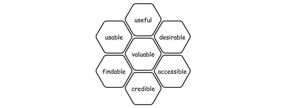
Mobile app usability is a crucial component of any mobile app design process. While following Google's best practices for mobile app usability can undoubtedly help improve the overall user experience, it's important to remember that every set of users is unique, so to optimize your app's usability truly, you should conduct thorough user research and usability testing to confirm that your design caters to your specific user group's preferences and needs.
Google's Mobile App UX Principles provide practical advice to design apps that are easy to use, accessible, and engaging; however, these best practices are not a replacement for proper user research but a great starting point. Ultimately, this approach will lead to higher user satisfaction and retention rates, which are critical metrics for any successful mobile app.
References and Where to Learn More
Read Google’s paper on Mobile App UX.
Keep handy these tools and guidelines from Google:
Hero image: © Interaction Design Foundation, CC BY-SA 4.0