Static representations of data have been with us for millennia; a single image of a data set can be incredibly useful but with the increasing complexity of data sets a static representation can also be inadequate to the task of delivering value to the user of the information visualization.
Ed Dunbill, the VP of Strategy at Silicon Valley Data Science, said; “The art and practice of visualizing data is becoming ever more important in bridging the human-computer gap to mediate analytical insight in a meaningful way.” Making information visualizations interactive helps bridge that gap.
Thanks to the advent of computing and the easy and relatively low cost availability of computing power and software packages to develop information visualizations there are now two additional options available to the information visualization designer to improve on the usability and usefulness of information visualizations: manipulable and transformable representations.
This article is concerned with manipulable representations of data sets.
About Manipulable Representations of Data
A manipulable representation is an interactive model that allows the user to manipulate the view that has been generated for the information visualization. Generally, this is achieved by applying simple transformations on the data’s geometry.
In his book, Introduction to Information Visualization, Riccardo Mazza offers three standard techniques for achieving manipulable representations:
Scrolling
Overview to Details
Focus and Context
Let’s take a look at each of those in turn:
Scrolling
The simplest and easiest technique is scrolling; it allows the user to scroll around the image using scrollbars on one (or more) axis. This technique recognizes that data sets can be too large to handle and allows the user to find particular points within the representation that are of interest or value to them – however it does have a drawback; namely that the user cannot see the global image. This can prevent a user from being able to put the smaller sample of data in context with the big picture.
Overview to Details
This technique provides a global picture of the data and then allows the user to select a more detailed local representation of data. This technique was employed in Microsoft Word to enable easier selection of special characters for insertion into a document.
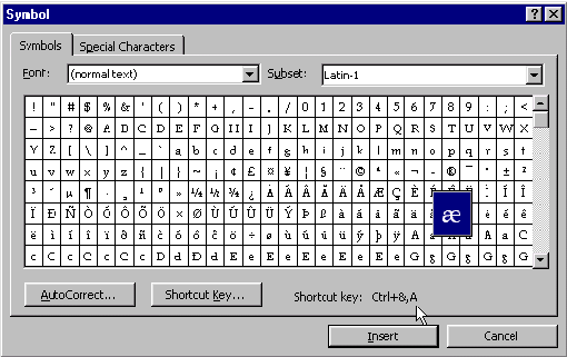
Author/Copyright holder: Web Designer Depot. Copyright terms and licence: CC BY 2.0
As you can see in the image above when you mouse over the particular character in the special characters list – it is highlighted and then made larger to ensure that you have selected the right character for use.
Another example of this technique is in Google Maps where the user can call up a high-level map of an area and immediately zoom in on the map to find more low level detail. If you haven’t used Google Maps before, you can try it with a map of Chiang Mai here: https://www.google.co.th/maps/place/Chiang+Mai,+Mueang+Chiang+Mai+District,+Chiang+Mai/@18.7716998,98.816391,11z/data=!3m1!4b1!4m2!3m1!1s0x30da3a7e90bb6f5d:0x98d46270a59b4367
Focus and Context
This type of view enables the user to view detail (focus) and context at the same time – without employing two separate views to deliver it in. This ensures that the user’s visual attention is kept on a single image and thus works better with their short-term memory for data interpretation.
The idea is to deliver the focus (the area that the user is interested in in the data set) and at the same time provide enough context to make that data meaningful. It is typically achieved by either distorting the view to some extent or by eliminating detail in peripheral zones.
The most common techniques are bifocal views, perspective walls, and fisheye views which tend to distort the view and the hyperbolic browser and SpaceTree techniques which eliminate detail in peripheral zones.
Bifocal Views
While there have been dramatic increases in resolution and screen size on modern monitors – there still isn’t always enough space available to show the most complex data visualizations.
In 1982, Robert Spence the interaction designer and professor at Imperial College London, proposed a solution to this space problem using a distorted view technique.
The solution was simple; if you cannot display the whole of a visualization on screen – you should display the focus and somehow compress (distort) the rest of the visualization in the remaining screen area. The bifocal display is one application of such distortion.

Author/Copyright holder: Robert Spence and Prentice Hall. Copyright terms and licence: All Rights Reserved
Here we see the London Underground as transposed by a bifocal display – the user zooms in on the area of interest and the rest of the data is suggested around it.
Perspective Walls
The perspective wall is similar to the bifocal display and simply uses a third dimension for context. With the wall, facing the user, providing the focus and the walls moving away from the user providing the context. You can see this in action below.
Author/Copyright holder: Inxight Software, Inc. Copyright terms and licence: Fair Use.
Fisheye Views
This technique distorts the data provided with a fisheye lens effect over the most important data e.g. the focus (making it larger in comparison to the context).
It is worth noting that this kind of representation is actually very difficult to pull off successfully as it uses controls to make fisheyes either too sensitive (a small move of the cursor can massively alter the fisheye perspective) or too difficult to set in the first place.
Hyperbolic Browser
This representation is generated using the StarTree software from Business Objects. It is a complex representation that allows the user to change the node of interest by clicking on it (and the software rearranges the other nodes around it and changes their scaling).
Author/Copyright holder: Mazzar. Copyright terms and licence: Public Domain.
SpaceTree
This is another technique, this time developed by the University of Maryland, which allows the user to view complex information within a tree style layout. The user clicks on the parts of the tree that they wish to explore and software then reorganizes the tree (via an animation) to deliver the most useful data.
The Take Away
The purpose of manipulable information representations is to enable a user to get useful information from large data set visualizations. The user can manipulate the view of the data in order to better interpret that data. It requires computer software to build a manipulable information visualization.
References & Where to Learn More:
Find out more about bifocal displays here.
Robert Spence’s original work on bifocal displays - R. Spence and M. D. Apperley. Data base navigation: An office environment for the professional. Behaviour and Information Technology, 1(1):43–54, 1982.
Find out more about Robert Spence here.
Riccardo Mazza, Introduction to Information Visualization, Springer, ISBN 878-1-84800-219-7
Hero Image: Author/Copyright holder: Jer Thorp. Copyright terms and licence: CC BY 2.0