Have you ever thought about how much data flows past each of us in an ordinary day? From the newspaper you read at breakfast, to the e-mails you receive throughout the day, to the bank statements generated whenever you withdraw money or spend it, to the conversations we have, and so on?
There is a tidal wave of data associated with each aspect of our lives, and in addition to that personal data, there is data available on nearly every aspect of life.
Over the last few decades computing and the internet have revolutionized our ability to create, store and retrieve information on a whim. A global economy and instant communication have created an explosion in the volumes of data to which we are exposed. Yet, the amount of data leads to a large amount of possible confusion and decision paralysis. There’s more data available than we can comfortably process.
Information visualization, the art of representing data in a way that it is easy to understand and to manipulate, can help us make sense of information and thus make it useful in our lives. From business decision making to simple route navigation – there’s a huge (and growing) need for data to be presented so that it delivers value.
An Example of Everyday Information Visualization
This map, generated in Google maps, offers two simple ways of representing the route from Chiang Mai in Northern Thailand to the capital of Thailand, Bangkok, in the center of the country.
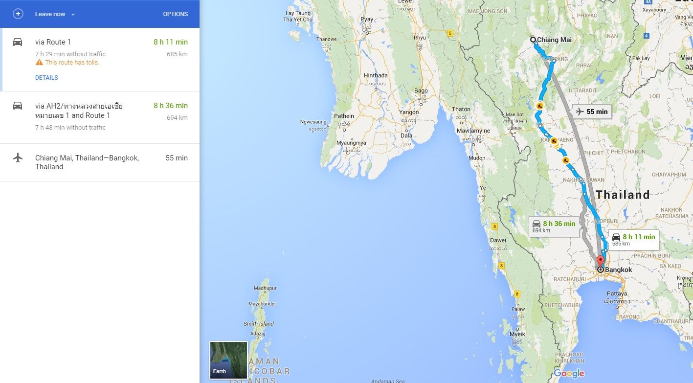
Author/Copyright holder: Google, Inc. Copyright terms and licence: Fair Use.
The first representation consists of written instructions on how to go from Chiang Mai to Bangkok (as you can see it’s a pretty simple drive – though it’s worth noting that it would be more complex if we were to be moving between specific points within each city). The second representation is an image of the route itself imposed on a map.
Both representations represent value to different people. The first, the instructions, is highly useful to people who need to get from Chiang Mai to Bangkok directly. For example, a businessman going to a meeting.
The second, the map data on the other hand, could be really useful to a tourist who intends not to drive straight from A to B but rather wants to know “what’s on the way?” This lets the tourist look for potential break points in the journey and start to research what their options are in those places.
Both of these representations are examples of information visualization. The first relies on clear simple instructions and the minimum of graphical content – it conveys a simple set of useful instructions. The second conveys rather more data and in a visual form that allows for rapid cognitive processing to enable us to quickly digest the information we see.
Common Uses for Information Visualization
There are some very common uses for information visualization and these include:
Presentation (for Understanding or Persuasion)
“Use a picture. It’s worth a thousand words.” Arthur Brisbane, Syracuse Post Standard, 1911.
Journalists have known for a very long time that some ideas are simply too awkward to communicate in words and that a visual representation can help someone understand concepts that might otherwise be impossible to explain.
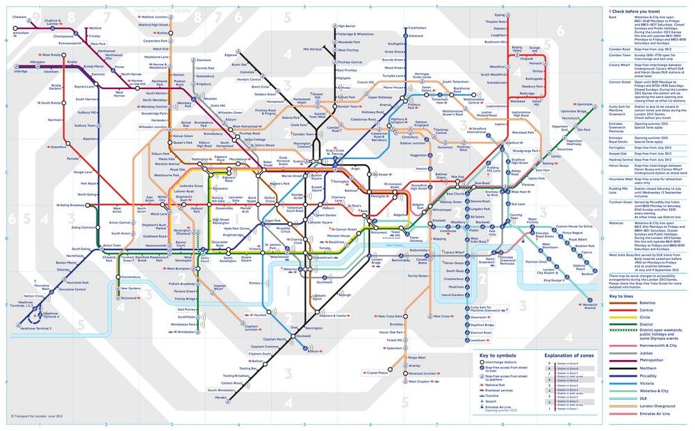
Author/Copyright holder: Lablascovegmenu. Copyright terms and licence: CC BY 2.0
One of the most famous information visualizations in the world is the map of the London Underground. It is only a “map” in the loosest sense of the word; in that the geography above ground is very different to the way it is shown on the underground map. However, it enables pretty much anyone to quickly understand how to get from one point in London to any other using the underground system.
In simple terms, the underground map presents complex data for the purposes of understanding that data to make it useful.
There is a “dark side” to the presentation of information for understanding and it’s the presentation of information to persuade. There are “lies, damned lies and statistics” as the saying (usually attributed to Mark Twain but he attributed it to the British Prime Minister Benjamin Disraeli and there is no trace of Disraeli having said it – the saying has also been attributed to others) goes. By choosing what information to represent and what information to leave out – there are now “lies, damned lies and information visualizations”.
It is up to the presenter to decide where the ethical boundaries are in persuading people through information visualization. For example, you could show a graph that states “70% of people who use homeopathy feel better than those who don’t” but omit the fact that “70% of people who take a placebo feel better than those who don’t”.
Explorative Analysis
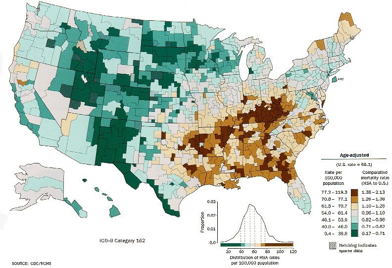
Author/Copyright holder: Centers for Disease Control and Prevention. Copyright terms and licence: Public Domain.
The image above portrays the frequency of lung cancer within the United States by geographic region. Mapping disease data like this enables researchers to explore the relationship between a disease and geography. It’s important to note that this data doesn’t explain why there is a spike in cancer rates in the South East of the United States but it does indicate that there is a spike which is worthy of further investigation.
Explorative analysis through information visualization allows you to see where relationships in data may exist.
Confirmation Analysis
Information visualization can also be used to help confirm our understanding and analysis of data. For example, if you perceive a relationship between two stock prices, you can plot the data and see if the two are related.
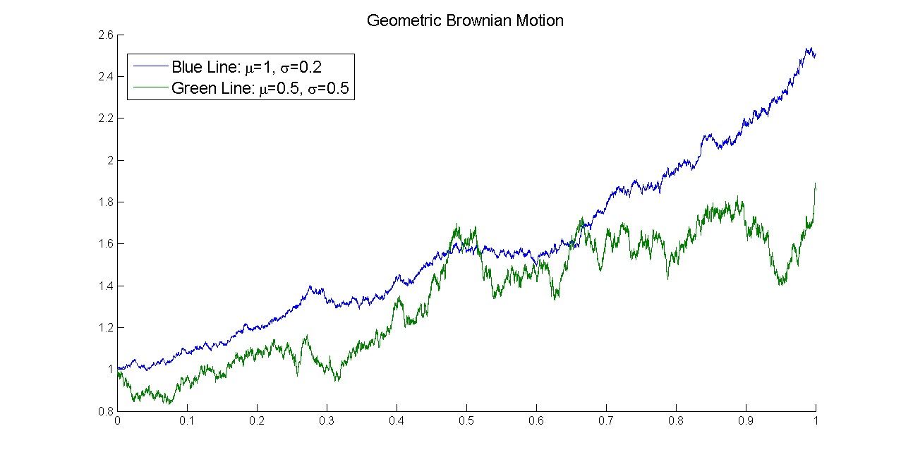
Author/Copyright holder: Arthena. Copyright terms and licence: CC BY-SA 3.0
This graph (above) might be used to show the similarities in Brownian motion between sets of particles or it might be used to question the break in the relationship towards the end of the graph, for example.
The Take Away
Information visualization is designed to help us make sense out of data. It can be used to explore relationships between data, to confirm ideas we hold about data or to explain data in easy to digest manner. It may also be used, rightly or wrongly, to help persuade someone with data.
As the volume of data available to us increases exponentially in every field of endeavor – information visualization is becoming increasingly important as a skill in the workplace and in academia.
References and Resources
Course: “Information Visualization”
Tess Flanders’s original quote was printed in "Speakers Give Sound Advice", Syracuse Post Standard (page 18). March 28, 1911.
You can find some beautiful examples of information visualization here .
Hero Image: Author/Copyright holder: david. Copyright terms and licence: CC BY-NC 2.0