
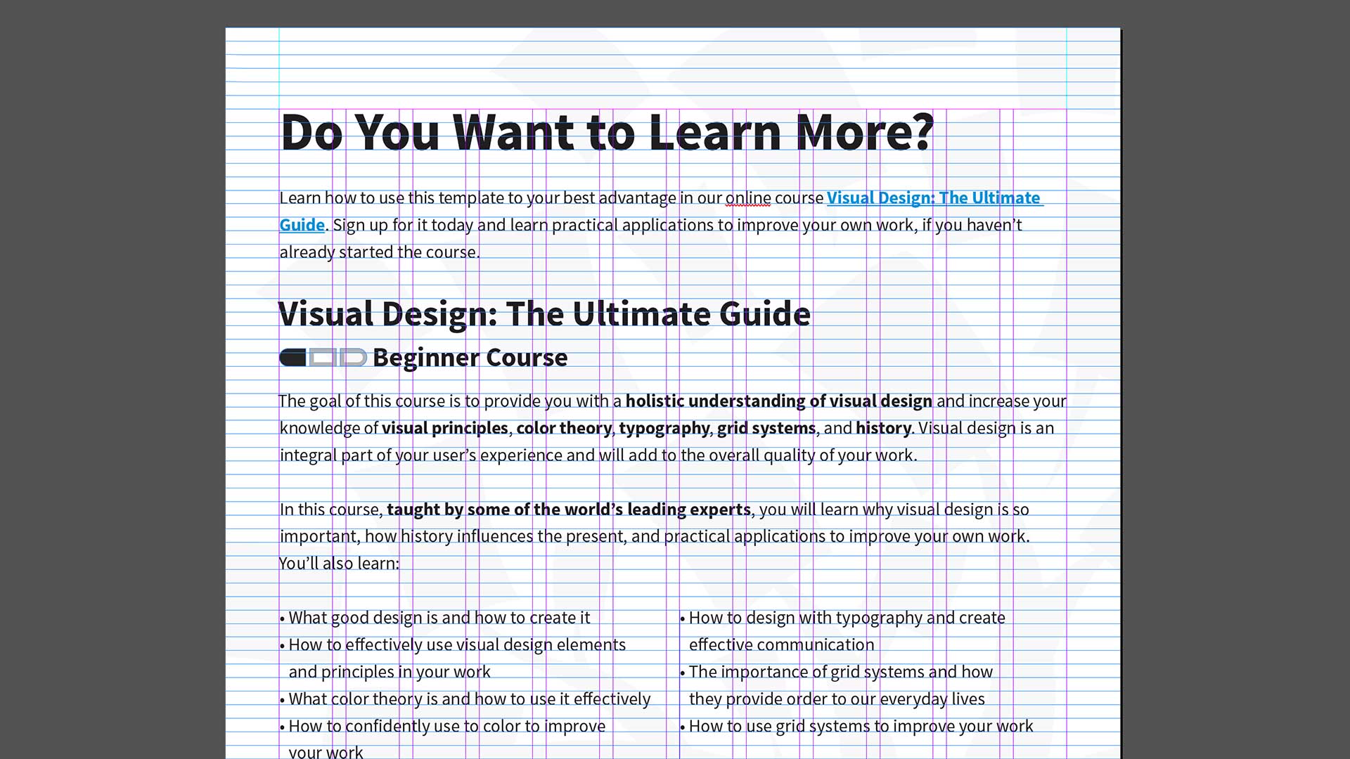
Grids systems can help you add structure to your design, organize information and create a consistent user experience. When designing with grids, the best thing you can do is to choose the right grid for the right project. However, with so many grids to choose from, it can be hard to know where to start. So, let’s discuss the common types of grid systems and how to effectively use them in your work.
In this lesson, you’ll learn how to use grid systems. You’ll also learn how to make a book from Italian designer Massimo Vignelli. We’ll explore seven common types of grid systems including rule of thirds, golden section, single-column, multi-column, modular, baseline and responsive.
It’s important to understand the common types of grid systems so you can integrate them into your work and help design the best possible user experience. Before we start, let’s first watch Italian designer Massimo Vignelli make a book.
Massimo Vignelli Makes Books
Massimo Vignelli’s approach to book design is the subject of a video created by Pentagram, a design firm, for the “What Will You Make Today?” campaign from paper company Mohawk. In the video, Vignelli discusses his use of the grid as the basis for the layout of a book’s pages, using one of his classic book designs for the architect Richard Meier as an example.
“The grid is an integral part of book design, it’s not something that you see. It’s just like underwear: you wear it, but it’s not to be exposed. The grid is the underwear of the book.”
— Massimo Vignelli
The interior pages of the book feature the grid of 24 rectangular blocks that Vignelli used as the basis of his layout for the Meier monograph, as you’ll see in the video. Let’s watch.
© Pentagram and Mohawk, Fair-Use (Link)
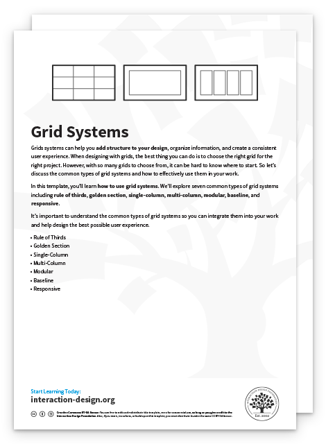
Rule of Thirds Grid
The rule of thirds is a grid system that divides a composition evenly into thirds, both horizontally and vertically. The design elements are placed at the intersection of those dividing lines, or along one of the lines itself.

The rule of thirds grid system.
© Daniel Skrok and Interaction Design Foundation, CC BY-SA 3.0
Here, we see how the rule of thirds is used as an effective way to elicit emotion and define the relationship between the two characters in Disney Pixar’s Wall-E.
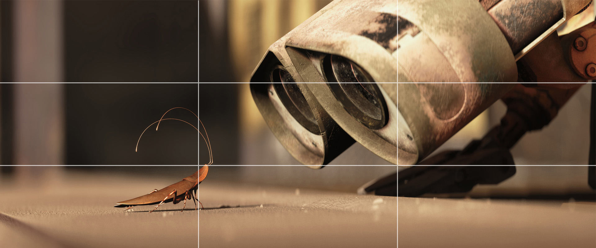
An example of the rule of thirds in effective cinematic action.
© Pixar, Fair-Use
Golden Section Grid
The golden section (also known as the golden ratio) is a mathematical ratio that has been used in art and architecture for more than two thousand years. The formula for the golden section is a : b = b : (a+b). This means that the smaller of two elements (such as the shorter sides of a rectangle) relates to the larger element (i.e., the longer sides) in the same way that the larger element relates to the two parts combined. In other words, side a is to side b as side b is to the sum of both sides. Expressed numerically, the ratio for the golden section is 1 : 1.618.
The golden section is commonly found in nature, and when used in a design, it fosters organic and natural-looking compositions that are aesthetically pleasing to the eye.

The golden section grid system.
© Daniel Skrok and Interaction Design Foundation, CC BY-SA 3.0
The use of the golden rule is evident in the Brno Chair designed by Ludwig Mies van der Rohe. The chair was named after the town of Brno (in the Czech Republic) where the Tugendhat family, who commissioned the chair, lived. The Tugendhat house had a large dining room and table that could seat 24. The family needed a set of compact chairs that could fit neatly under the dining table. The Brno chair was designed for this purpose with a low sweep of the arms and compact form to fit neatly under the table.
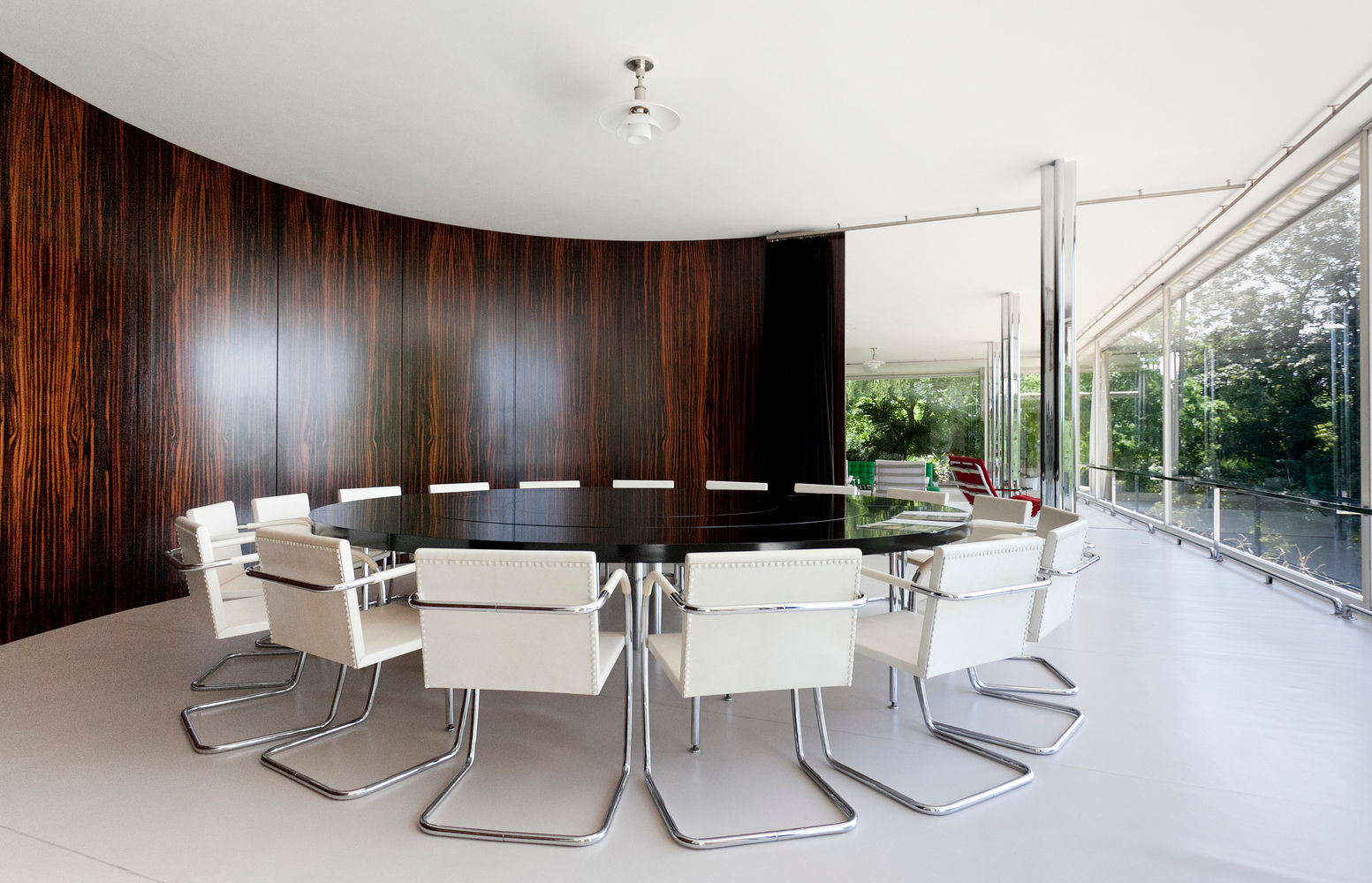
A set of Brno Chairs, designed by Ludwig Mies van der Rohe in 1930. The chairs are neatly positioned around a table in the Villa Tugendhat.
© Alexandra Timpau, Fair-Use
The front view of the chair and side view fit neatly into the golden section rectangle. The angle of the front legs and chair back are symmetrical, and the radii of the curves are in 1:3 proportion.
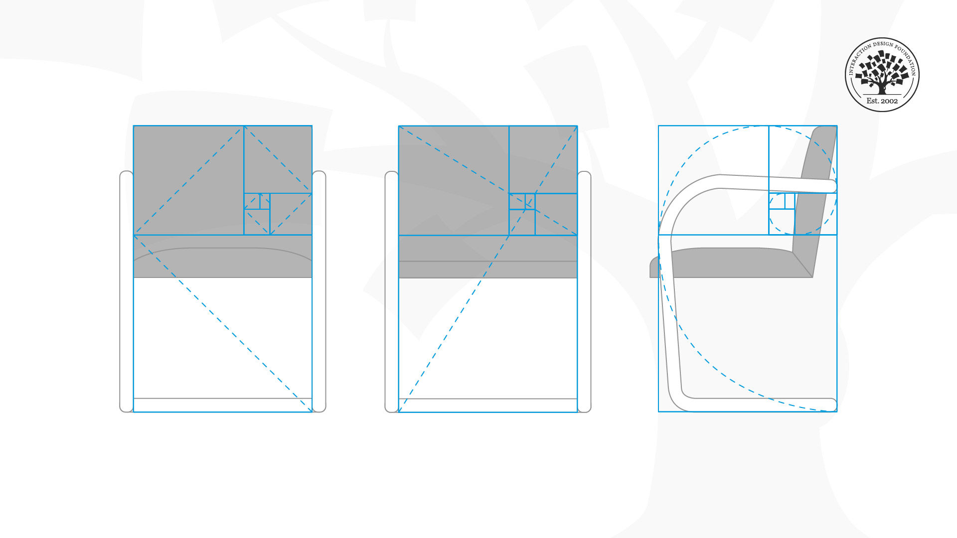
A practical, comfortable and neat example of the golden section.
© Daniel Skrok and Interaction Design Foundation, CC BY-SA 3.0
Single-Column Grid
The simplest grid consists of a single column of text surrounded by margins. Essentially, every time you open a new document in a page layout program, you are prompted to create a single column grid.

The single-column grid system.
© Daniel Skrok and Interaction Design Foundation, CC BY-SA 3.0
Here, we see the use of a single-column grid in a traditional book design by Ellen Lupton. Often, books and magazines are designed in spreads (facing pages) with a single column of text.
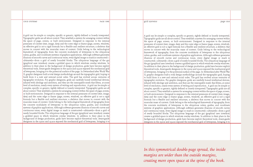
An example of a single-column grid — when a book is bound, the inside margins naturally get “pulled” into the spine a little.
© Ellen Lupton and Princeton Architectural Press, Fair-Use (
Multi-Column Grid
While single-column grids work well for simple documents, multi-column grids provide flexible formats for publications that have a complex hierarchy or that integrate text and illustrations. The more columns you create, the more flexible your grid becomes. You can use the grid to articulate the hierarchy of the publication by creating zones for different kinds of content. A text or image can occupy a single column, or it can span several. Not all of the space has to be filled.

The multi-column grid system.
© Daniel Skrok and Interaction Design Foundation, CC BY-SA 3.0
Here, we see the use of a multi-column grid designed by Daniel Skrok for COMMON, a creative accelerator and community for social businesses. Often, books and magazines are designed in spreads (facing pages) with a single column of text.
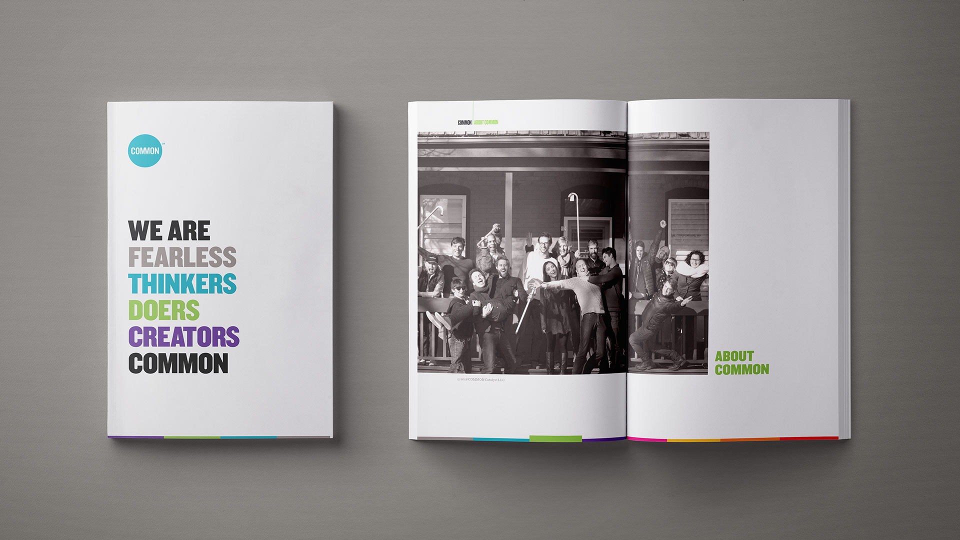
An example of the multi-column grid.
© Daniel Skrok and Common, Fair-Use (
Modular Grid
A modular grid has consistent horizontal divisions from top to bottom in addition to vertical divisions from left to right. These modules govern the placement and cropping of pictures as well as text. In the 1950s and 1960s, Swiss graphic designers including Gerstner, Ruder and Müller-Brockmann devised modular grid systems like the one shown here.

The modular grid system.
© Daniel Skrok and Interaction Design Foundation, CC BY-SA 3.0
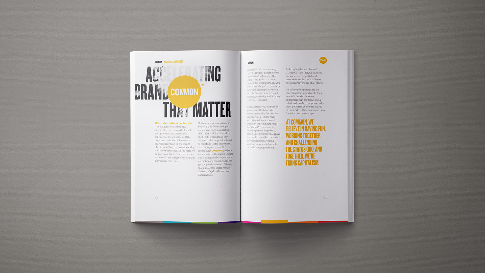
Below, we see an example of a modular grid in The Vignelli Canon by Massimo Vignelli. Massimo creates a grid by dividing the page into a certain number of columns according to the content (two, three, four, five, six, etc.). Then he divides the page from top to bottom into a certain number of rows (four, six, eight, or more) according to the size and need. The combination of vertical columns and horizontal rows assures a level continuity throughout the publication.
An example of a modular grid at work in The Vignelli Canon.
© Massimo Vignelli and Lars Müller Publishers, Fair-Use (
Once you have structured the page, you can begin to structure the information and place it in the grid in such a way that the clarity of the message will be enhanced by the placement of the text on the grid. There are infinite ways of doing this, and that is why the grid is a useful tool, rather than a constricting device. However, one should learn to use it so as to retrieve the most advantageous results.
Baseline Grid
A baseline grid consists of horizontal guidelines that govern the whole document. Baseline grids serve to anchor all (or nearly all) layout elements to a common rhythm.
Practical Tip: To create a baseline grid, simply choose the type size and leading of your text, such as 10-pt Scala Pro with 12 pts leading (10/12). Avoid auto leading so that you can work with whole numbers that multiply and divide cleanly. Use this line space increment to set the baseline grid in your document preferences.

The baseline grid system.
© Daniel Skrok and Interaction Design Foundation, CC BY-SA 3.0
Below, we see the use of a baseline grid in a downloadable template design by the IxDF. The horizontal baseline creates a common rhythm and a consistent alignment between multiple columns of text.
An example of a baseline grid in an IxDF downloadable template.
© Daniel Skrok and Interaction Design Foundation, CC BY-SA 3.0
Responsive Grid
A responsive grid adapts to screen size and orientation, ensuring consistency across layouts. These grids are typically made up of three elements — columns, gutters and margins.
Columns are the areas that content occupies. The gaps in between columns are gutters, which add breathing spaces between the content to avoid visual overload. Finally, margins are spaces that add padding between the page’s contents and the edges of the viewport. The configuration of columns, gutters and margins change depending on the screen’s width.
A breakpoint is the range of predetermined screen sizes that have specific layout requirements. At a given breakpoint range, the layout adjusts to suit the screen size and orientation. Each breakpoint range determines the number of columns, and recommended margins and gutters, for each screen size.

The responsive grid system.
© Daniel Skrok and Interaction Design Foundation, CC BY-SA 3.0
For example, the IxDF Design System provides a structure for consistent page layouts, as well as for optimizing how content is displayed on different screen sizes. The responsive grid system is fluid on mobile and tablet sizes and fixed on desktop.

The responsive grid system here helps the page adjust cleanly to the screens of users’ various devices.
© Daniel Skrok and Interaction Design Foundation, CC BY-SA 3.0
The Take Away
Grid systems can help you add structure to your design, organize information and create a consistent user experience. When designing with grids, the best thing you can do is to choose the right grid for the right project.
In this lesson, you learned how to use grid systems. You also learned how to make a book from Italian designer Massimo Vignelli. We explored seven common types of grid systems including rule of thirds, golden section, single-column, multi-column, modular, baseline and responsive.
Let’s recap the seven common grid systems:
The rule of thirds is a grid system that divides a composition evenly into thirds, both horizontally and vertically.
The golden section has been used in art and architecture for more than two thousand years. Expressed numerically, the ratio for the golden section is 1 : 1.618.
Single-column grids are the simplest, consisting of a single column of text surrounded by margins.
Multi-column grids provide flexible formats for publications that have a complex hierarchy or that integrate text and illustrations.
Modular grids have consistent horizontal divisions from top to bottom in addition to vertical divisions from left to right.
Baseline grids consist of horizontal guidelines that govern the whole document. Baseline grids serve to anchor all (or nearly all) layout elements to a common rhythm.
Responsive grids adapt to screen size and orientation, ensuring consistency across layouts. They are typically made up of three elements — columns, gutters and margins.
Now that you understand the importance of the grid systems and how to integrate them into your work, take what you learned and add a little structure to your designs.
References and Where to Learn More
Learn more about the Grid Systems by reading this insightful book by Kimberly Elam:
Kimberly Elam. Grid Systems: Principles of Organizing Type. 2004. (Link)
Learn more about Geometry of Design by reading this intriguing book by Kimberly Elam:
Kimberly Elam. Geometry of Design: Studies in Proportion and Composition. 2011. (Link)
Learn more about the Typographic Grids by reading this fascinating book by Ellen Lupton:
Ellen Lupton. Thinking with Type. 2010. (Link)
Visit Pentagram to learn more about Massimo Vignelli Makes Books:
https://www.pentagram.com/work/massimo-vignelli-makes-books
Image
© Daniel Skrok and Interaction Design Foundation, CC BY-SA 3.0


