Information visualization is not as easy as it might first appear, particularly when you are examining complex data sets. How do you deliver a “good” representation of the information that you bring out of the data that you are working with?
While this may be a subjective area of information visualization and, of course, there are exceptions to the guidelines (as with all areas of design – rules are for breaking if by breaking them you achieve your purpose) it’s best to begin with the four guidelines outlined by Edward Tufte.
About Edward Tufte
Edward Tufte is, perhaps, the world’s leading authority on information design and data visualization. He is an American statistician and a Professor Emeritus at Yale University (for political sciences, computer sciences and statistics).
He has authored several books and papers on analytic design and is a strong proponent for the power of visualizing data. In particular his books, Visual Display of Quantitative Information, Envisioning Information, Visual Explanations and Beautiful Evidence are considered to be definitive works in the field of information visualization. The New York Times called him; “The Leonardo da Vinci of data.”
Within his works you can find four essential guidelines for visual information representation:
Graphical Excellence
Visual Integrity
Maximizing the Data-Ink Ratio
Aesthetic Elegance
Tufte’s Criteria for Good Visual Information Representation
The purpose of “good’ representations is to deliver a visual representation of data to the user of that representation which is “most fit for purpose”. This will enable the user of the information to make the most out of the representation. There is no single hard and fast rule for creating good representations because the nature of the data, the users of that data, etc. are enormously varied.
Thus we find ourselves with a set of criteria which can be applied to most visual representations, as suggested by Tufte, to judge their fitness for purpose. It must be acknowledged, however, that these criteria can be bent or even broken if doing so serves a purpose for the user of the information representation.
Graphical Excellence
There could be hours of debate as to what constitutes graphical excellence but Tufte offers that in data representations at least it should provide the user with; “the greatest number of ideas, in the shortest time, using the least amount of ink, in the smallest space.”
In short as with many other areas of user experience – the focus here is on usability; it is completely possible to create beautiful graphical representations of data which fail to deliver on these premises. In fact, it might be said that this occurs so often that the power of data visualization is muted because people have come to expect such visualizations to be decorative rather than valuable.
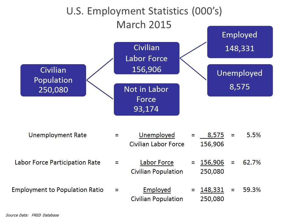
Author/Copyright holder: Farcaster. Copyright terms and licence: CC BY-SA 3.0
The graphic above, relating to US employment statistics in March 2015, offers many ideas in a very small space and is easy to digest. We’d suggest it meets the criteria of “graphical excellence”.
Visual Integrity
This is a confusing term. When Tufte refers to “visual integrity” he is invoking an almost moral position in that the representation should neither distort the underlying data nor create a false impression or interpretation of that data.
In practice this means that numerical scales should be properly proportionate (and not fudged to exaggerate the fall or rise of a curve at a particular point, for example). That variations, when they occur, should relate to the data rather than to the artistic interpretation of that data. The dimensions used within an image should be limited to the dimensions within the data and should never exceed them and finally that the keys (or legends) should be undistorted and unambiguous.
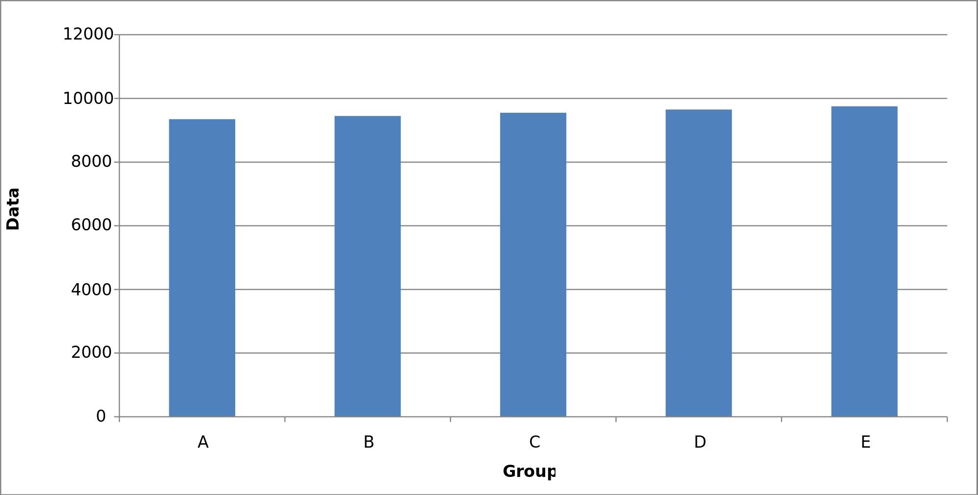
Author/Copyright holder: Smallman12q. Copyright terms and licence: CC0 1.0
This bar graph fails to give us enough information to be useful and thus fails in delivering “visual integrity”.
Maximizing the Data-Ink Ratio
Tufte recommends that we pay attention to the way that a visualization is compiled; in that all superfluous elements (to the user) should be removed. He offers the idea that borders, backgrounds, use of 3D, etc. may do nothing but serve to distract the user from the information itself. He promotes that you give priority to the data and how it will be used and not to the visual appearance of that representation.
He also provides a mathematical formula for a data-ink ratio:
Data-Ink/Total Ink Used
This is simply a comparison of the ink needed to clearly and unambiguously present the data to the ink actually used (including aesthetic considerations). The closer the ratio is to 1 – the less distracting your representation is likely to be and thus the more useful it is likely to be for your user.
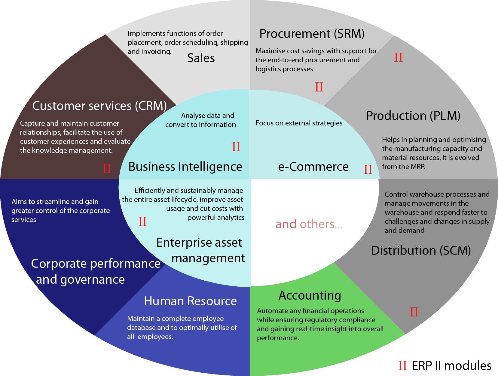
Author/Copyright holder: Shing Hin Yeung. Copyright terms and licence: CC BY-SA 3.0
This image of business processes with an ERP environment is quite good at conveying which business functions are affected by the ERP processes but what purpose does the color scheme serve?
Aesthetic Elegance
Tufte’s interpretation of aesthetic elegance is not based on the “physical beauty” of an information visualization but rather the simplicity of the design evoking the complexity of the data clearly.
He holds up Minard’s visualization (pictured below) of Napoleon’s March in the Russian Campaign as an example of aesthetic elegance.
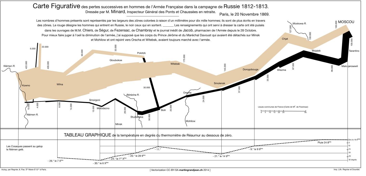
Author/Copyright holder: MartinGrandjean. Copyright terms and licence: CC BY-SA 3.0
The Take Away
Tufte’s guidelines are not prescriptive but rather designed to assist the information visualization professional in creating usable and useful information representations. At their core his rules can be boiled down to keeping things as simple and as honest as possible. The rest simply ensure that you adapt to complexity in the most creative and basic way possible.
UX designers will see clear links between their own design work on products and the design of information representations.
References and Resources
You can find all of Edward Tufte’s work via his website.
Find out more about Charles Joseph Minard and his map of Napoleon’s Russian Campaign.
You can also find an interesting analysis of Minard’s map here.
Hero Image: Author/Copyright holder: Kitware Inc. Copyright terms and licence: CC BY-ND 2.0