There are many ways to provide an excellent user experience but there are some tried and tested methods to do the opposite as well. It’s important not to fall into the trap of doing things because; “that’s the way they’ve always been done around here”. It’s a seductive position because it involves making no waves but sadly, it’s the kind of position that eventually puts UX designers out of a job.
You have to champion your users even when no-one else is. Ideally, you’ve put some time and effort into building strong enough relationships to make that easy but if you haven’t; you may find some of these tips helpful when putting your case forward to a hostile audience.
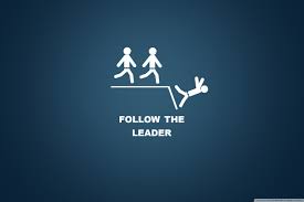
Don’t Follow Your Competition
It’s so tempting to follow the competition. It’s a “play it safe” strategy. If your competitor is doing better than you are and they have a couple of cool design elements – it almost makes sense just to copy (without actually copying – imitation as they say is the sincerest form of flattery) what they’re doing. If people like it there – why not in your website?
The trouble is that this idea sucks. It leaves you playing permanent catch up. It deliberately positions your website as second best. Do it for long enough and people may even start laughing at your obvious attempts to be number one without putting in the effort that the market leader does.
Your job as a UX professional isn’t to follow your competitor’s lead. It’s to work out what your users need and then follow their lead.
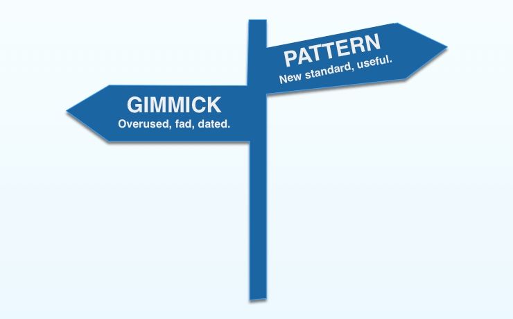
Gimmicks and Novelty Don’t Last
Creating new things is what designers are all about surely? That’s the “secret sauce” of user experience. Yet, all too often creating new things is done for creating new things’ sake and not for the users.
Littering your website or application with gimmicks can be appealing at first but if there’s no substance to the innovations – the joy of them will quickly wear off. Take gamification, for example, it’s a great strategy when it has depth and it complements the overall user experience. But a few shiny badges on their own won’t make your customers like your product any more – in fact, it’s likely to turn them off.
The truth is that the majority of user experience design is about refining and improving what’s already there and not about breaking new ground. The most successful companies in the world are rarely those who had the idea in the first place. Facebook was not the first social network. Samsung didn’t invent the smartphone. And so on…
It’s also worth noting that in many cases companies aren’t geared to break from their mould anyway. Kodak did invent the first digital camera… look where that got them.
Usability is Useful Only When Combined With Utility
Usability has almost become a mantra in many organizations. Their whole focus is on simplifying for simplification’s sake. The more usable a product is – the bigger the market for it, right?
Oh so wrong.
The Digital SLR camera market is growing not shrinking and that’s despite its products being more complex to use than the excellent cameras found in many smartphones. The trouble with the smartphone camera is that while it may be more usable, it doesn’t offer the same utility as a digital SLR. Zoom functions are less capable on smartphones when compared to top end telephoto lenses. Taking a shot requires rather more patience with a light flimsy smartphone (which has a tendency to waggle about) than it does with a DSLR and so on…
Usability is important. However, it has to be backed with utility or it’s a waste of time.

Clients Don’t Care About the Technologies You Use
This should be obvious but from standing around in development meetings you wouldn’t think so. The latest, greatest programming language, development technique, operating system, etc. don’t matter unless you use them to produce the products your customers want.
If you spend your time designing to technologies and not to your user’s needs; you’re going to lose ground to someone who does the opposite. In many cases, users are completely ignorant of the technologies their websites and products use – they don’t care at all. They want to know; what does this do for me? Not, what clever tricks did they use to make it?
Websites and applications are for people to use and not for developers to congratulate themselves on being clever for. That doesn’t mean you can’t use new technology – of course you can but it does mean you need a good user-driven reason for doing so.
The Next Big Thing is Almost Always Elusive
Very few ideas or implementations of ideas change the world. When they do, it’s often not the people who had them that get to take advantage of their success. You can’t chase the next big thing and expect to make it happen. Most real user experiences coalesce over time. If you do hit the next big thing – it’s as likely to be by accident as by design.
Most of all it’s important to remember that you have zero control over what will catch the public’s imagination next. It’s better to focus on finding concrete improvements in what you have now than to spend your time ripping up the game plan and chasing success from “the next big thing”. It’s not that it’s not out there – it’s just very unlikely that it’s something you’re going to find.
Summary
These mistakes are common throughout web development and they’re easily avoided. There’s a better game plan too. Try to stand out by being unique and by inspiring your users. The good news is that with just a little UX research, you can find out what these things are and deliver them rather than spending your time on the failed strategies above.
Header Image: Author/Copyright holder: IBM. Copyright terms and licence: All rights reserved. Img
Image Sources: Mountain Web Media (link to image), Wallpapers Wide (link to image), Intercom (link to image), Mashable (link to image), The Tech Journal (link to image)
