What we need is just one chart type that can do anything. Can you design that?
- Andrew Murray, Mobile Analytics Product Management VP, SAP
The Lattice component is LAVA’s most innovative aspect, providing perhaps the most value and serving as the engine that ties the rest of the language together. It is essentially a hierarchical, navigable, manipulable horizontal bar chart, able to render multi-dimensional data sets of any size, configuration, or subject. It’s an accessible, intuitive, and forgiving view into data sets, providing a missing link between fixed summary dashboards and powerful but complex OLAP analysis tools and spreadsheets, and between geometrically visualized numbers and common text-based lists and tables. The Lattice is an entirely new invention, and to be understood needs to be seen in motion and being used. In designing it, we needed to spend a lot of time making animated sequences to show how it works, and it was only after nine months that I found a development team in SAP’s Shanghai office interested in building a working version running on real customer data. I’ll describe it here with words and images, but it will likely only come together for you by watching the video of its use, or by playing with the interactive prototype.
In the sequence of explanations to come, I use examples taken from multiple mockups at different stages of LAVA’s development. Each mockup had unique requirements, and as a set they represent the evolution of LAVA’s look and feel. Some design elements and behaviors from earlier mockups are obsolete, but all represent the same basic functions and intents. Instead of updating these older designs into the latest forms, I leave them as they were originally made, for the added benefit of showing how the designs developed over time, and to demonstrate the compromises and shortcuts of working in an agile, rapid prototyping environment. Keep in mind that the Lattice is a design pattern, and based on its principles can take a number of forms to suit the device, data, or workflow required.
The Lattice is a big part of LAVA’s promise to automatically render a multi-dimensional data cube set and make it accessible to casual consumers. It starts by providing a way to show the most relevant view of the cube in a simple way. Doing so requires either an automated or artisinal – meaning manually authored – choice of what is the most relevant content in a data set. While this ability is still in its infancy, I’ve already described ways to make it perform better than random to start out, and how with use, the cube can be “taught” what is most relevant, through individual and group usage data and preferences. Cubes have multiple Dimensions and Measures, so the first step is to choose the most relevant of these and begin by showing some sort of default view. Let’s start with a data set providing current-year financial performance measurements for a multinational enterprise, and assume that the Lattice has been authored. The width used is appropriate for display on an original iPad screen in portrait view.
I mention again that this is a tedious way to describe the Lattice’s dynamic content. The corresponding animated sequences, as with the design and presentation of work like this, are better at conveying the essence of the design. The Lattice, like much of LAVA, relies upon dynamic animated state transitions for its full effect. Our cursory demo and development efforts only achieved fairly crude examples to suggest these effects, which with today’s technology and skills can be made quite elegant and dramatic. I believe that these transitions are where today’s visual design artisans can and will apply their skills to bring the “wow” factor to visual analytics. It is in these transitions that the enabling effects of metaphor can be a productive force to enhance comprehension and productivity, in comparison to its heavy-handed use with trivial decorative and skeuo effects.
We default to show the Measure Revenue, which serves as the title as well as a picklist menu for switching to other Measures in the Data set. We see from the scale that it is measured in billions of Euros, and from the Row Label can see that we are looking at the total aggregation of all revenue for the context, and that the value is 18.2 billion Euros. in this case we assume that this Lattice is within a financial Board with clear titling and time filter set to the current year.
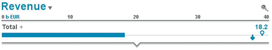
Figure 15.1: Total Revenue Aggregate Row.
A Row Plot, or Strip, appears in bar form along the scale, seeming to end at about 18 on the scale. At the right of the plot, we see two symbols, or Markers. The circle indicates the Revenue Target for the current year, and the diamond represents the Revenue Projection, or how much revenue the enterprise expects by year end. Hovering the mouse or tap/holding these plots displays a popup title via HTP with a corresponding value display. The user can also elect elsewhere to show a full legend via a “flyout” menu from the key icon. The blue circle and diamond are standard symbols from Rolf Hichert’s IBCS financial notation standard, used here and recognizable by this Lattice’s user base of financial controllers.
Professor Rolf Hichert is a pioneer of applying such standardization to visual analytics. During a career focused on information design, he evolved a universal visual analytics notation language for financial content. It includes color and styling codes, text content abbreviations, and chart formats for the common – and in many cases standardized and regulated – financial reporting concepts. As a part of his International Business Communication Standards, or IBCS, this language provides a lingua franca for financial report consumers within and between companies. It has been adopted by SAP and many other organizations, and even has a certification program to ensure correct and effective usage. Like the BtF legacy, Hichert’s work is print-oriented and not yet optimized for today’s digital consumption opportunities. But it´s quite effective, and a major step in reducing unnecessary visual analytic variety for this staple content type. What IBCS has done for financial visual analytic content, LAVA is trying to do for all visual analytic content – to enhance the impact of numbers on everyday people by providing a universal, baseline visual language for numbers in interactive digital displays.
The IBCS standard calls for black bar plots as well, but for visual appeal, and to subtly connect the bar color to its corresponding title (Revenue) and value (18.2) we used blue. Three Measures for the current year are shown in this row: Total Revenue (the Primary Measure), Target Revenue, and Projected Revenue. The scale is set automatically according to the largest Metric value, in this case Target Revenue.
Note the BtF-compliant lean appearance features. There are no extraneous lines or boxes. Numbers are rounded to three digits and modified with decimal points and magnitude suffixes (k,m,b) to save space with large numbers. When appended by these suffixes, three digits are sufficient to discern numerical values for monitoring and analysis, and this practice speeds relative comparisons and cognition. Full decimal displays appear via HTP. Horizontal bars are the default view, as they are the single most efficient, effective, and – thanks to its use in progress bars throughout most software – the most prevalent visual analytic chart type. The bar label is stacked and left-aligned with the bar, as are the Measure values. If you are a Star Trek TV series fan, you may remember the patient monitor used by Bones (Dr. McCoy) in the Sick Bay. It’s a vertical equivalent of the same basic form, albeit showing values delineated according to optimum range states versus aggregations.
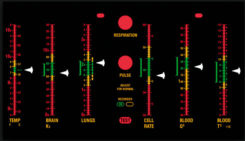
Figure 15.2: The Enterprise’s Sick Bay patient monitor from the Star Trek TV show.
If we change Revenue to Margin, the scale and Values change to suit. In Figure 15.3, the actual margin is 28.3%, with the Target slightly below and the year-end projection a bit higher.
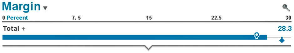
Figure 15.3: Row showing Margin.
If needed to be shown in a narrower format, such as on a smartphone or a narrow column, the Lattice can shrink elegantly, with the degradation limited to scale fidelity. It can also stretch extensively, again unchanged but for the addition of scale fidelity, and perhaps more metrics appearing with their ability to fit within the scale. This view also shows the facility of stacked labels to accommodate long labels and even badges and comments within the generous space to the right of the title, or Chase. These would degrade upon shrinking with truncation, consolidation, or removal. See Figures 15.4, 15.5.
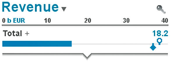
Figure 15.4: Condensed Row
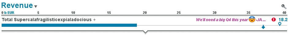
Figure 15.5 Extreme Row.
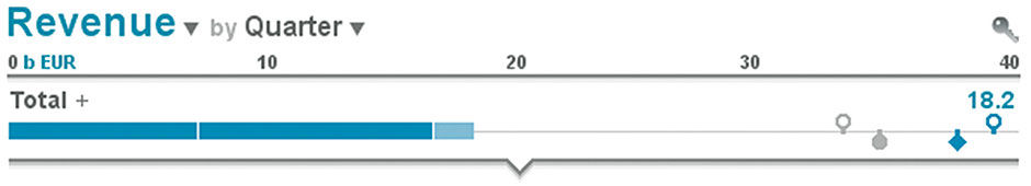
Figure 15.6 Row with four Markers.
In Figure 15.6 we add a Dimension, called a Cross Dimension, to break down the horizontal bar into sub-sections. In this case, we will use the common financial time Dimension of Quarter. This allows us to see total revenue in a stacked bar chart – I prefer the name Strip Chart – format, according to the order in which it accumulated through Q1 and Q2 – the first and second segments – and current status of incomplete and thus lighter-blue Q3. Labels and values for each Segment of the Strip appear via HTP. We can also add two more metrics; Target Revenue LY (last year) and Actual Revenue LY. Per IBCS these appear in gray as the target circle and filled circle for Actual.
We can see that last year we exceeded our target. If we select anywhere in the scale, it toggles to a percentage breakdown of the Main Measure according to the Cross Dimension. This provides the value of a pie chart without its drawbacks. We can see the total with units shown, and that Q1 contributed about 40% of revenue for the year so far...
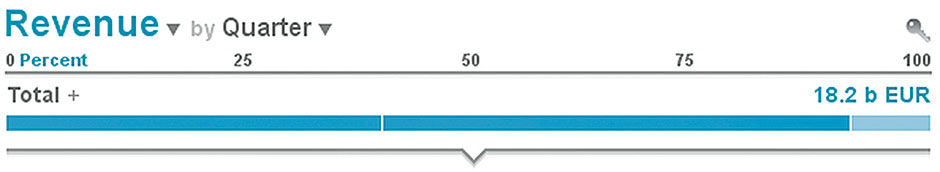
Figure 15.7: Row with Strip Slices.
Or on HTP we can see precisely:
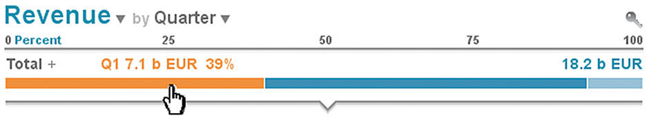
Figure 15.8: Row HTP display.
We can also Unfold the Row by selecting the Row Title. In Figure 15.9, the Unfolded Row converts the one-dimensional Row format into a two-dimensional format. This enables all labels to be shown adjacent to their slices, in a “waterfall chart” format. Note that for showing aggregated values of a subdivided whole, the row-based text display always enables a combined actual and percentage-of-whole values. This is carried across all LAVA displays, and is a critical fundamental practice to convey context. Stock price changes are typically shown this way – with actual price change in currency as well as the percentage change in the stock price that this represents. This quickly conveys that a $5 price change in a $10 stock is a much more significant event than it is for a $100 stock.
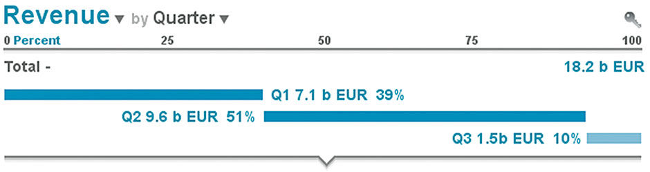
 Figure 15.9: Expanded Row.
Switching back to actuals versus the percent scale, in Figure 15.10 we can see the other Metrics as well. This also serves as a de facto legend. While a relatively space-inefficient display type, it is accessed on demand and thus not a burden.
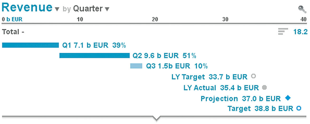
Figure 15.10: Expanded Row with Markers.
Note how, even if we assume the formal name for LY Target is LY Revenue Target, spelling this out for this and the other measures in the row would be redundant. A key part of LAVA’s Lean Appearance principle is Inherited Semantics – which is to say that if content has been labeled already by virtue of its inclusion in a larger category, there is no need to repeat the name of the larger category in the subsections, as these titles inherit the context of their parent. As the secondary Measures in the Row would be members of the Measure class called Revenue, the display knows this and can truncate “LY Revenue” to “LY”. If LY Revenue appears elsewhere on its own, it will appear with its full name. While this reflects basic graphic design practice, for it to be automated like this it needs to have simple rules. The Lattice can do this reliably because of its singular, top-down Categoric Dimension. Such simple inheritance is difficult to maintain with multiple Dimensions in a display, as is the case with multi-column layouts.
Let’s add the ability to change the one-dimensional Row display from a bar chart to a time series or table, by selecting the small bar icon in the top right next to the Value.
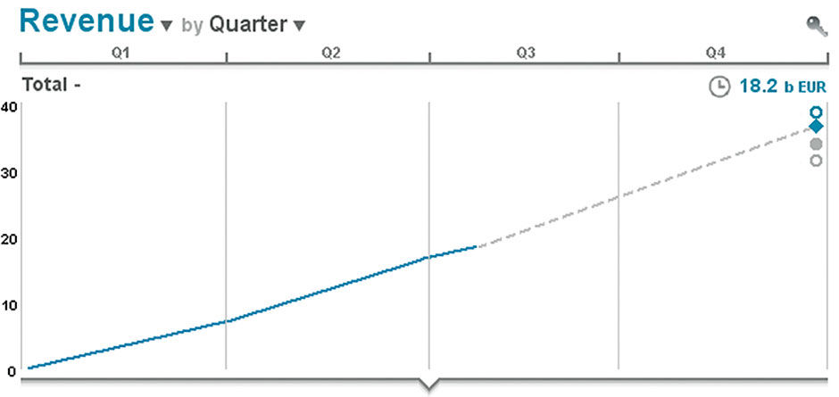
Figure 15.11: Expanded Row with line graph display.
If we then collapse the Row back to a one-dimensional display, it resorts to a table view by quarter, with projections shown in gray.
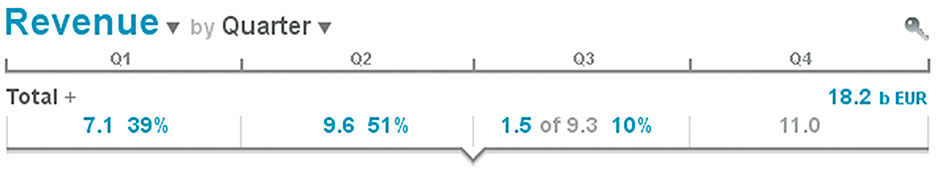
Figure 15.12: Row with table display.
If there are goal values in place for each quarter, as is typical for large enterprises, each cell can become a heatmap indicating over(green) or under-performance (red) of actual versus goal.
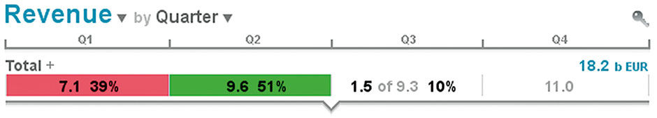
Figure 15.13: Row with narrow Keyline display.
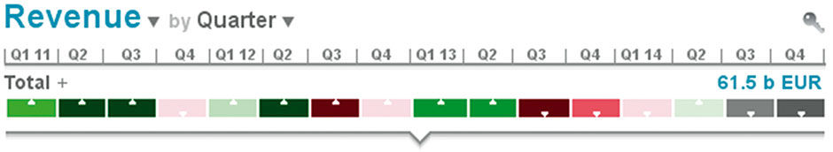
Figure 15.15: Row components.
The value of this view is more apparent when a greater time range is used. If we change the governing time filter to show performance over four years, patterns can emerge. In this case, we see that historically Q1 and Q2 tended to exceed goals, where Q3 and Q4 have not. Darker colors indicate variance of greater degree. The white arrows are semantic supplements for color-blindness. 30% of males have some level of trouble with red/green distinction – including a previous boss of mine who had almost no distinction at all, which often made our design reviews an interesting affair. If no goal or other benchmark measures are available, the heatmap can indicate the increase or decrease of the cell values, as is easy to imagine with a stock price history.
This completes an overview of Row behavior, in this case the for the Aggregate Row of the Lattice. The key aspects are 1) the one-dimensional Row visual that unfolds into a two-dimensional visual, 2) the embedding of control inputs within titles and labels, 3) the systematic provision of actual and percent values, 4) elastic sizing with smart degradation, 5) stacked bar titles, 6) inherited semantics, and 7) rounded values to reduce clutter. While it’s an interesting design unto itself, the Row is but a unit within the overall Lattice structure, which amplifies these behaviors into a multi-dimensional interactive environment.
The true power of the Lattice lies with its multi-dimensional manipulation and exploration properties. Building upon the aggregate Revenue Row we have discussed, let’s now see what lies within the underlying data set. It shows financial data for a global retail apparel organization. It breaks down Total Revenue with the two orthogonal Dimensions of Product and Geography – essentially, what is sold, and where. Geography is a Hierarchical Dimension, meaning that it is a straight parent/child breakdown of larger categories like Region to smaller ones like Country or City. Product is actually a set of smaller orthogonal Dimensions like apparel type, apparel gender, and fashion season.
To explain this difference simply, New York City is in New York State, Northeastern USA, USA, and Americas. Its Revenue is exclusive from other cities and countries. The product category of Women’s Wear, in contrast, generates Revenue worldwide and can be aggregated at any store, city, district, country, or region, and cross-indexed and filtered with any other product Entity to further filter the Revenue results. I could ask to see all Revenue coming from both the USA and UK, but the result would always be zero because Revenue comes from one place or another, not both. Note however that I can ask to see all Revenue from the USA plus the UK, which would combine the sums versus trying to find an overlapping amount. I can also ask to see Revenue from Women’s Wear that is also from the Spring Collection, because the Women’s Wear includes Spring Collection items and vice versa. This is the basic and/or distinction of Boolean logic at work, and it has proved to be a perennially difficult concept to convey to casual quantitative information consumers. The main power of multidimensional analysis is this ability to overlay dimensions to achieve precisely triangulated, filtered numerical values. Figure 15.16 shows the top-level breakdown.
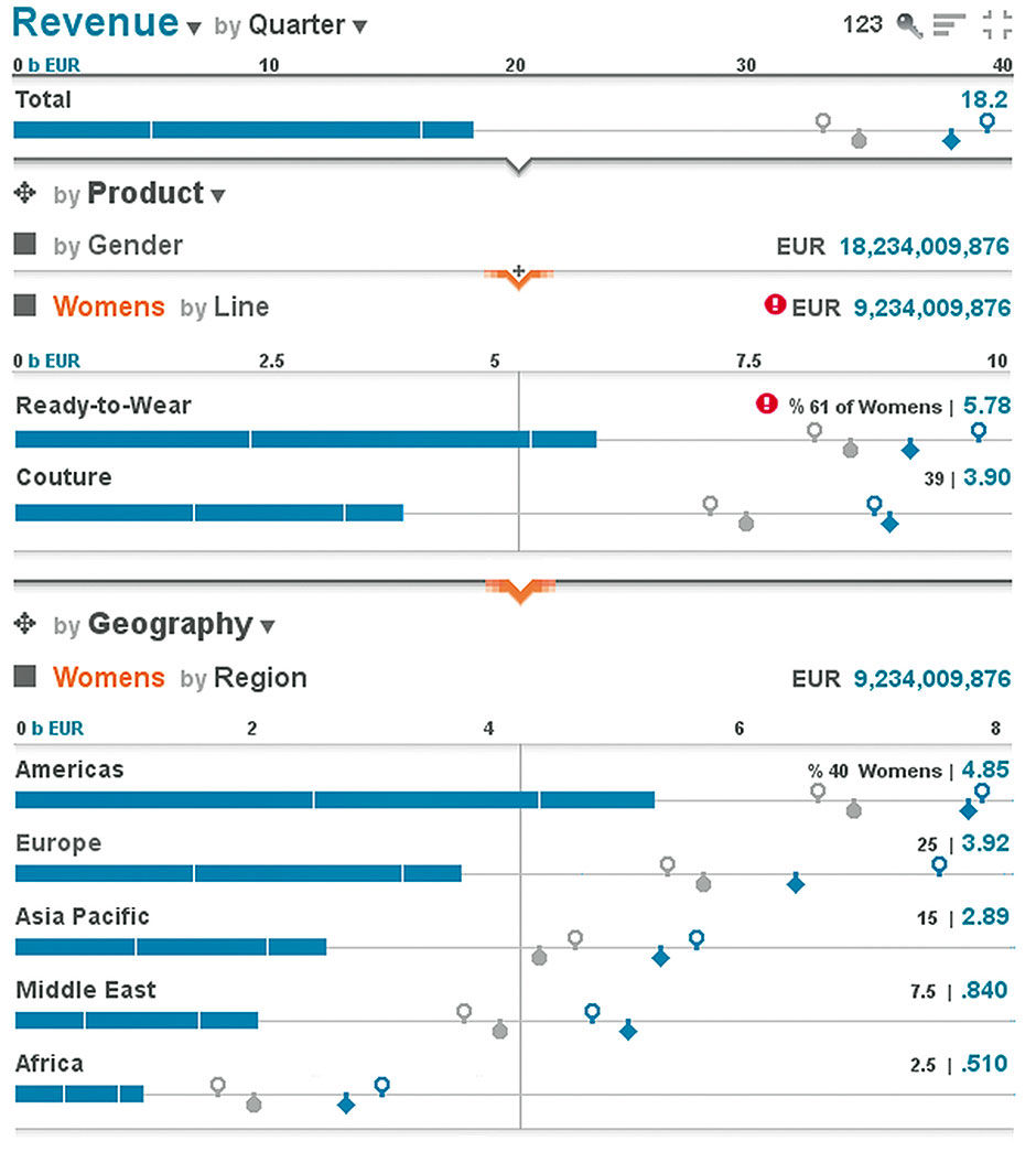
Figure 15 .16: Initial full Lattice view of global apparel sales data
We can see the Product Revenue broken down by Women’s and Men’s wear, as well as the Geography breakdown by Region, with the same set of Goal, Target, and LY Measures as appears in the Total Row. In addition, because each Row in the breakdown adds up to the total above, we see a percentage contribution of the sub-category’s Main Measure to the parent. Women’s is 11.4 billion in Revenue, which is 60% of the total. Notice how the totals under Product and Geography are identical. This looks a lot like the metacharts within Few’s sales dashboard, but because it is dynamic it can provide much more detailed information. We see that the user has selected the Goal for Women’s Wear and that there is an alert badge associated with this category.
A key attribute of the Lattice is the Sliding Scale. Notice how, in order to maximize horizontal space for every Row, the top of each successive Layer has its own scale calibrated to the size of its Metric Values. If we retained the scale from the Aggregate Row at the top, bar lengths would become miniscule and bunched along the left edge, rendering them useless. While such a solution would immediately convey the order-of-magnitude size reductions being shown, it would sacrifice the value of what is essentially an automatic zoom effect for maximum display fidelity at each level in the Stack. This sacrifice is well worth it, for the important reason that it provides the best balance of context and fidelity for the task of comparing relative size of Entities within a Layer – e.g. Women’s vs. Men’s – and comparing size distribution – e.g. the curve formed by the varying bar lengths – and performance – e.g. the distance between actual & goal values – between Layers.
The user proceeds to investigate the alert badge by further drilling into the content. Selecting the Women’s Attribute collapses it into a title-only row summarizing Revenue for Women’s and revealing the next Dimension, Line, and its breakdown of Ready-to-Wear and Couture Attributes. We see that the alert is for Ready-to-Wear. Also note that the Attributes in the Geography Dimension are being filtered also, and labeled as such according to the lowest-level Attribute selected in Product. Because the Lattice inherits semantics from top-down, all Product selections do not need to be repeated in the Geography Stack, rather only the lowest-level label as an indicator of filtering done above.
We can fast-forward to Figure 15.17, where the user has made selections from several Product Dimensions, with each selection shown in its own collapsed Row. This behavior is like the familiar breadcrumb selection display method, only with each selection being given its own Row to maintain visual context and enable the display of the potentially long full title and numerical value for the Main Measure. The user has isolated the source of the alert that, for whatever reason, offers a dire prediction for the Adult Women’s Ready-to-Wear Spring Collection.
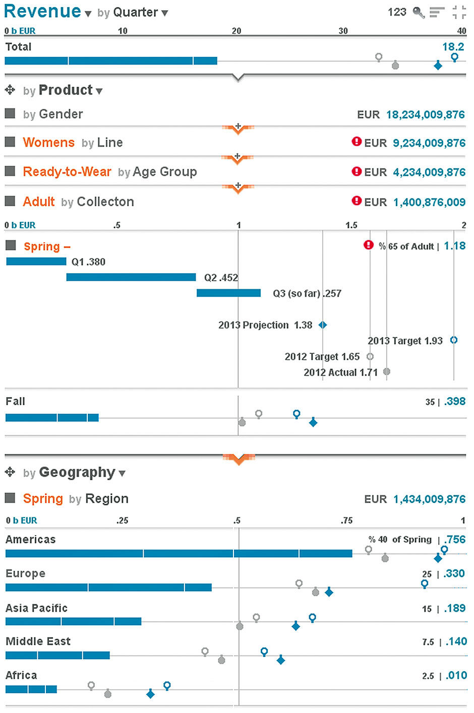
Figure 15.17: Lattice after drill-down and Row expansion.
We can also see if any geographical divisions are to blame for the forecast, and although three Regions are forecast to fall short of their goals, Europe seems to be in the worst shape. It has no alert badge, just to demonstrate that alert thresholds might not be specified for all dimensional combinations. We can see performance at any geographical level, and in Figure 15.18 we see the Lattice drilled to its highest level of detail.
We can drill down one more level, into the Cross-Dimension of Quarter, by selecting the Q3 Strip Slice. We can now see the selected slice in orange, not only for Greece but for the entire Lattice Stack. This enables us to make contextual comparisons such as while Q3 represents 15% of total revenue so far in the year, it is only 5% of Revenue in Greece.
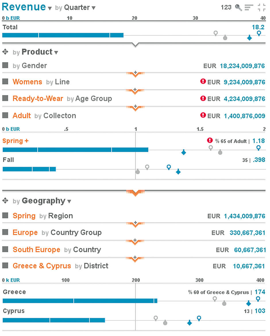
Figure 15.18: Lattice drilled to maximum level of detail.
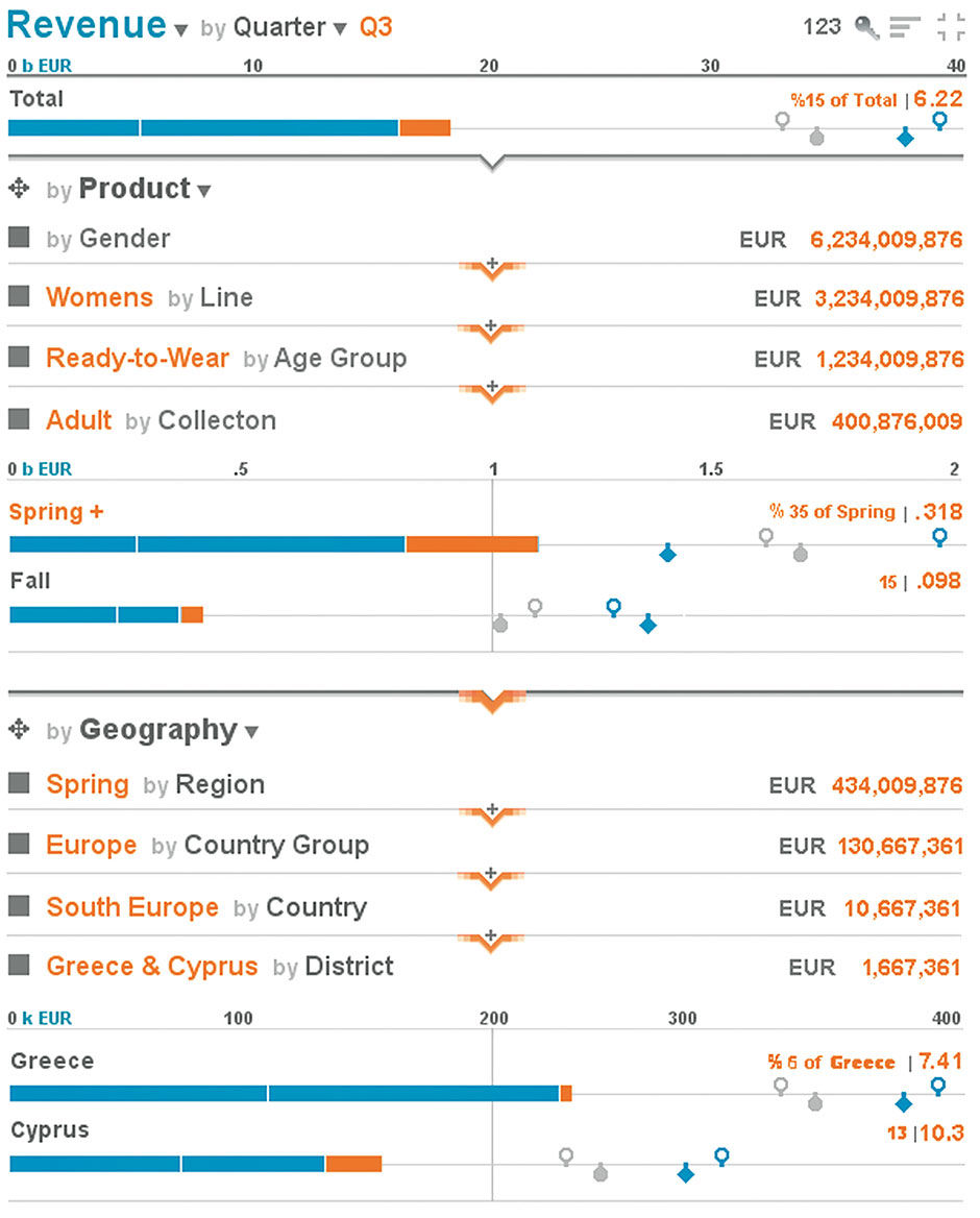
Figure 15.19: Lattice drilled to maximum level of detail, with Q3 slice selected and shown throughout the Stack.
At the Lattice base we can see, in context of this year’s Goals & Projections, plus LY’s Goal and Actual, the Revenue value resulting from a nine-dimensional filter: Adult Women’s Ready-to-Wear Spring Collection so far in Q3, in the context of Europe / South Europe / Greece & Cyprus / Greece. Using the same techniques we can see any other combination of Dimension filters as well. At this point we might want to look at the entire data set from a different perspective.
While so far we have seen the Geography values from the perspective of Product Dimensions, let’s now look at the data set from the geographical perspective by “flipping” the drilldown order. Via menus or by drag-and-drop, the Geography Dimension can be moved to the top spot in the Lattice, while retaining all current selections. The result is that we now can see values for any combination of Product selections filtered for Greece & Cyprus, as opposed to before where we could see values at any level of geography for a particular combination of Product selections. The rule is that the filters are applied from the top down.
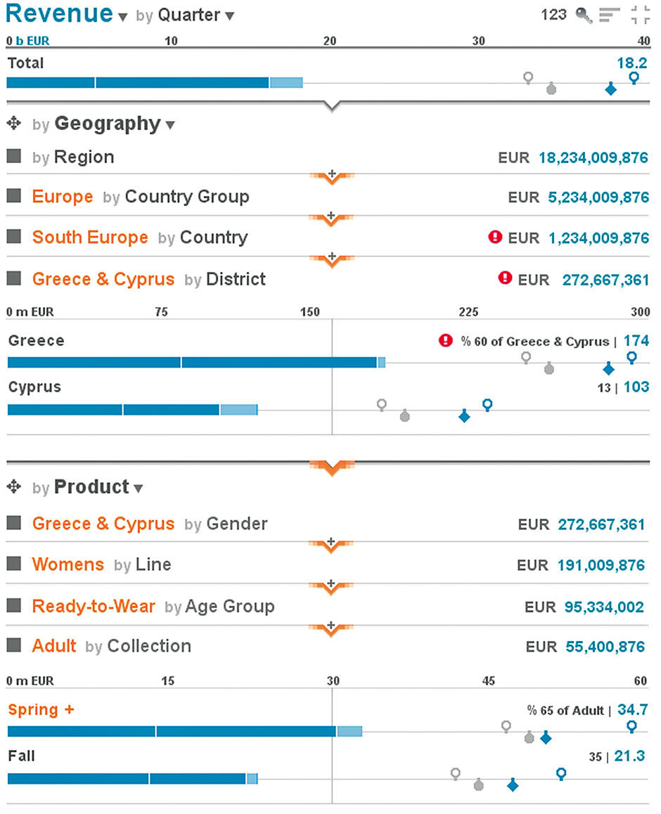
Figure 15.20: Lattice drilled according to Geography and then Product.
This high-level drill-order swap can also be done among any orthogonal Dimension set – as with the Product Dimensions – through the same means. If I prefer to filter Product by Collection first and then Gender, I can move the Collection Dimension to the top of the Stack. It is precisely settings like these that an author or algorithm must choose for default display, and the settings that a user might want the Lattice to remember and retain for them upon re-use. They also represent what collective use by a community would begin to influence over time, through the application of activity logs to help determine popular and useful defaults. If over time, everyone prefers to see the data set filtered by Geography first, eventually the data set could adapt to be initially configured in this way.
If you are wondering how such an instrumented Lattice could appear automatically from a raw data set as I have described, remember that this example represents a precisely authored Lattice, and a sophisticated one for a relatively simple Data Set. Its sophistication comes from the Measures applied, in that there are goals and projections in place for every combination of Product and Geography selections, which may not be the case in reality. If the organization for example does not specifically make projections and goals for Kids Fall Couture in Libya, then its values will simply not appear in the Row. The simplicity comes from the limited number of Entities within each Dimension. For example the Product Dimensions each have only two Entities... what if a Dimension had 5000 Entities, as might be the case with a Dimension for Product ID – essentially a list of all products in the company? While the Lattice is designed to accommodate these use cases, they are not the best examples for this initial explanation. At this point I’ll describe the details of Layer behavior to show these scaling properties as well as other features.
A Lattice Layer is roughly equivalent to a Dimension, and by default shows the Entities within that Dimension as a stacked-title bar chart showing the associated quantitative values for each Entity, and the sum total of all Entities at the top in the Aggregate Row. As the Layer must accommodate Entity lists of any quantity, a solution for scalability was among the first things needed. There are several options for how to do this, and each contributes to the final solution.
The first aspect is to sort the Entities by size from large to small value according to the Main Measure, as is the general best practice for bar charts showing aggregations. As a rule of thumb, the largest categories in a set are likely the most relevant to show. The alternative is to sort them alphabetically, which unless the user is looking for an Entity by name, is essentially semantically random. In such size-ordered displays, the conventional solution is to display as many Entity Rows as screen space allows, and combine all those off-screen into a category called “Other”. By definition, the Attributes towards the end of the list have smaller Values. Depending on the distribution shape of the Values, combining the off-screen Entity Values into a single bar can nicely result in a form where this sum is of similar size to the largest Entity – the first in the list – so that the Others bar does not dwarf the size of the larger Entities, as is the case in Figure 15.21.
 Author/Copyright holder: SAS Institute Inc. Copyright terms and licence: All rights reserved.
Figure 15.21: The Problem with “Others".
However given the dynamic and automated nature of the Lattice, such results cannot be guaranteed without another solution. If we wish to accommodate all use cases with an accessible and relevant chart, we need a solution that adjusts itself to the content with more sophistication, and draws the most useful rendering possible. Because a horizontal bar chart is essentially a list, putting a scrollbar on the chart is the first thing that comes to mind, while showing some indication of how many Entities reside off-screen. This was the approach we used for earlier Lattice versions. For really long lists we can add pagination, which would make the bar chart behave like many Web pages having too much linear content to show in one page. Another solution is to use “lazy” or “endless scrolling”, which adds batches of content continuously as you scroll down a page. As there can be multiple Layers open within a Lattice, we needed to choose how many Rows to display by default, and settled on three. Layers can also be sized manually via a “windowshade” effect by dragging the downward arrow in the Layer divider line.
For our first browser-based working prototype for China Telecom, we used a layer-level toolbar containing all Layer-specific view management controls, including, from left to right , as shown in Figure 15.22.
- Toggle for ascend/descend sorting by size and also by alphabet.
- Toggle for horizontal sorting of Strip Slices by alphabet or custom.
- Scroll up/down one frame of Rows.
- Scroll to last/first row.
- Expand Layer to show all Rows.
- Collapse Layer to three Rows.
- Hide Layer.
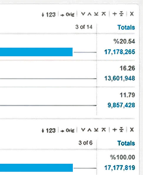
Figure 15.22: Iconic toolbars with Layer-specific view management controls
You can see all of these demonstrated in the China Telecom video demo. For the iPad design, we used a fly-out menu accessed by touching the Layer title, as shown in Figure 15.22. This had the additional commands for shuffling the Layer up or down in the stack, pinning it in place, or “Snapping” it into a Point or Chart format for display elsewhere within or outside the parent Board.
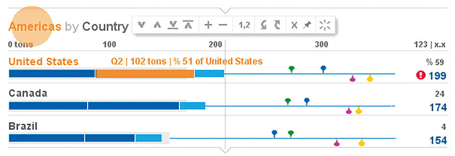
Figure 15.23: Fly-out Layer toolbar. The orange disk only indicates touchscreen finger contact, it is not part of the product display.
Our simplest and most advanced solution was to use the Bar Chart Scroll Preview, or BCSP. Although the BCSP is a new invention, it is actually quite simple. It consists of a traditional Others category, but modified with extra dynamic content and behavior. First, we added a count indicator to the title, i.e. “15 Others” versus just “Others”, and divided the Others bar plot into Strips according to the size of each Entity in the category. This tells us how many Others there are, and their relative size distribution. Entity Labels are displayed in the Chase to the extent that hey can fit, and we can also HTP each Strip within the bar to see titles and values for individual Entities. Also, by enabling the user to scroll down through the bar chart as with a block of text, the top Entities of the chart scroll off the top and the Entities from the Others category dynamically “peel off” into rows of their own, shrinking the Others category with each peeled row, until the last Entity is shown. Entities at the top of the chart scroll away under the top of the Layer. When scrolling the chart back up, the same process works in reverse, with Entities jumping back into Others when scrolled down. Figure 15.24 is an example using personal spending data.
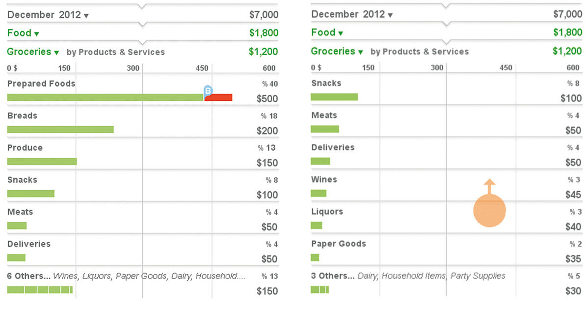
Figure 15.24: Bar Chart Scroll Preview initially and after the peeling off of three Entities through scrolling.
L15.1 | Bar Chart Scroll Preview.
While an improvement, this innovation still doesn’t solve the “giant Others” problem. For this we created a separate Others display mode, based on a simple rule: If in the vertical space provided, the value / bar length of Others is less than the value of the largest Entity in the chart – for charts sorted by size this is the first Entity – then the system just described is used, and referred to as Actual Mode. If the value is larger, and thus instigating a giant Others case, the bar display changes from showing the sum value of Entity values in the Others category to showing their average value, which will always be of a smaller length than the last individual Entity fitting into the chart. This is called Average Mode. The bar changes color to indicate the state change, and is appended with the value and “average” modifier. We elected to use average versus mean despite the latter often giving a marginally better approximation of set values. Our reason was that mean is less commonly used and understood, and for our simple approximation use in this case, the difference is negligible. While in this mode we lose the visual representation of the Others sum, we have it provided numerically to the right, as well as the percentage contribution to the whole ( Figure 15.25)
Upon scrolling down, Entities peel off from Others as in Actual Mode, gradually decreasing the bar length. As soon as the sum of Entity values in Others becomes less than the largest Entity, Average Mode switches to Actual Mode.
The final option is to have an Average Mode Row appear at the top of the Layer to indicate the presence and size of Entities scrolled off the top. This mode would engage automatically for Layers exceeding a certain number of Rows. As the examples shown here are for use on a smartphone, having a second Others Row would cost too much screen space. As the user initiates the scroll, the animation effect of Rows disappearing from the top of the display conveys the presence and location of the hidden upper Rows.
Within a Layer, as well as for the entire Lattice Stack, it’s possible to allow the horizontal bar display to be changed to other chart types. While the horizontal bar format is the default, any chart type can be rendered within a Layer as long as it’s compliant with the Layer’s combination of Measures and Dimensions. (Figure 15.26)
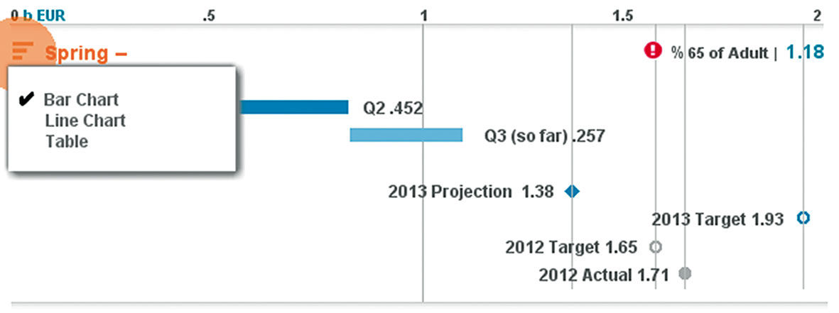
Figure 15.26: Switching Layer chart type.
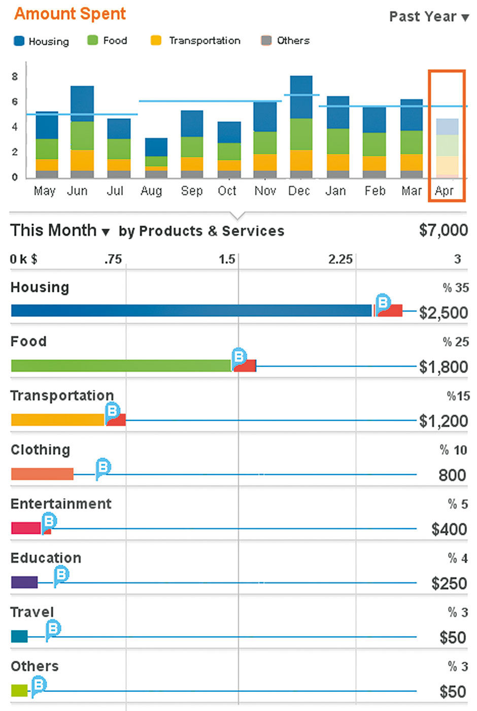
Figure 15.27: Vertical bar chart used in a fixed Layer.
In Figure 15.27, a vertical bar chart is used to good effect – due to having a time dimension and its easily-abbreviated labels on the X-axis – to show monthly spending history within a fixed top layer in the stack.
If we imagine the Lattice having layer upon layer of different chart types, each one a filter based upon selections made above, we actually start to approach a story-telling format of higher-level aggregations moving down to lower-level, highly filtered results. Certain layers might lend themselves to different chart types, such as a geo map for a location-based Layer, or a line chart for a historical time-based display limited to a few Entities. Because this capability might be unnecessary or confusing for many casual users, it may not be appropriate to enable for all Lattice applications. Layer formats could be fixed ahead of time by an author, or even chosen automatically according to data type or usage logs. However, each of these alternate chart types introduce scaling difficulties that might disturb LAVA’s baseline plug-and-play promise. While LAVA is intended to be ultra-simple to the point of being automatically generated, it is also a platform for use as a template and language for Authors, designed to be built upon without creating awkward media breaks or fundamental redesigns. I will further discuss this point later.
As with the Board, the Lattice can be simple or complex depending on the underlying data. The simplest Lattice is merely a horizontal bar chart with an Aggregate Row at the top, with actual/percent Values for each sub-category and sortable by size or by alphabet, as shown at the left of Figure 15.28. Optional content & features are architecturally non-disruptive, and can be activated by authors or consumers, according to the Data Set richness and individual needs & skills. The maximum display, to the right, includes:
- Multiple Dimensions and drilldown
- Shuffling Dimensions
- Multiple Measures
- Sorting
- Actual/Percent Toggle
- Alerts
- Pace Indicator
- Rate Indicator
- Goal Indicator
- LY Actual Indicator
- LY Goal Indicator
- Annotations
As shown with the Row, the entire Lattice can be stretched and squeezed without breaking. It can easily execute a semantic zoom scenario by shedding or adding detail as necessary.
The final point about the Lattice that you may have noticed already is that the Scale and Totals are placed at the top of each Layer, and of the Lattice itself. While it’s common to have vertical scales on the right margin of a chart, this is almost always done when employing two scales within a chart, where a primary scale already occupies the left margin. I’ve never seen a second scale at the top of a chart.
Sums, as we know from basic math notation, appear at the bottom of a stack of numbers to be added. Accounting spreadsheets keep an ongoing row-based tally of deposits and withdrawals, and in traditional handwritten bookkeeping “books”, the accountant “sums up” the page in a total in the bottom row, and carries this number over to the top of the next page. In this model, the sum is a running result, a conclusion to a mathematical story that the medium and process demand be placed at the end – the proverbial “bottom line”.
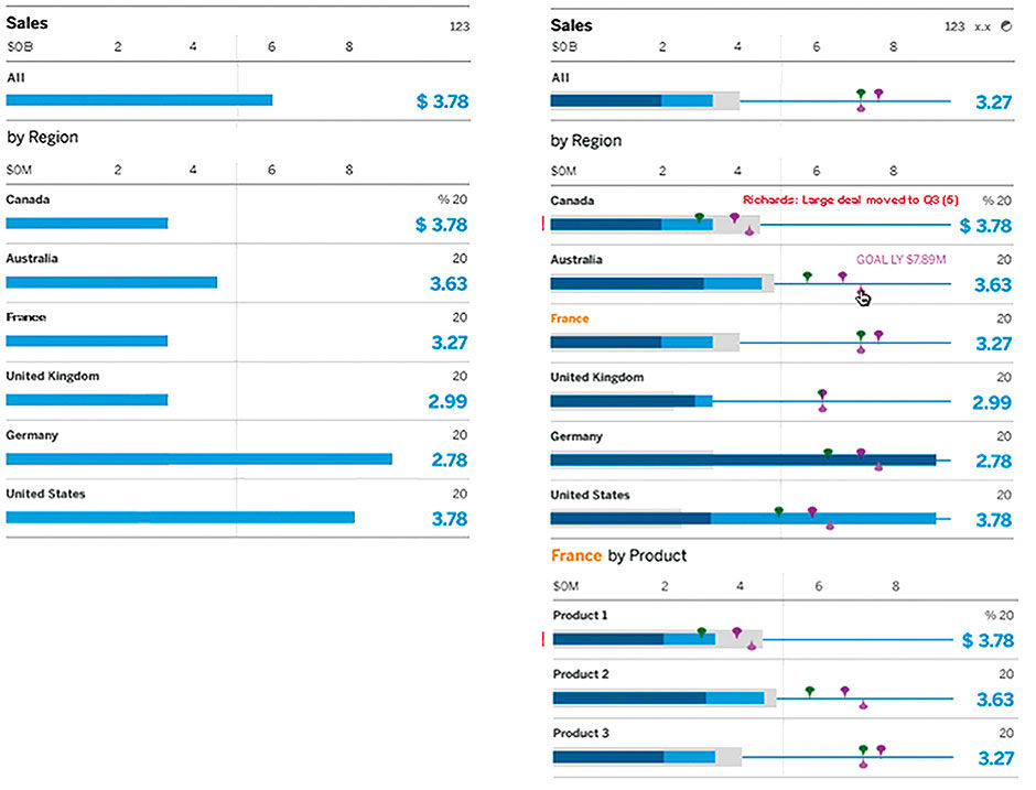
Figure 15.28: Minimal and maximal Lattice implementations
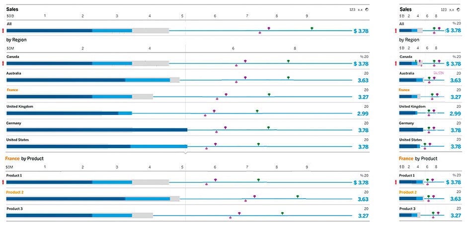
Figure 15.29: Elastic property of the Lattice.
If we deem the current sum to be the most important piece of information in the book, isn’t it counter-intuitive to place it at the end? It’s like the account balance is the conclusion to a mystery novel. Banking systems I worked on as a consultant in the late 1990s did just this, placing account balances at the page bottom, scrolled off the screen, because that was how it was always done. In fact, the entire parent/child drilldown of transactions being nested into sub-accounts and into full accounts, etc., was essentially upside-down to what most of us would expect from using the file systems of Windows or the Mac. SAP’s current reporting convention for revenue reporting does the same thing (figure 15.36).
This setup is also based on the legacy analog practice of “closing the books” at key reporting intervals, such as quarter-end and year-end. Large organizations are divided and subdivided into accounting centers, who, in a bottom-up order, periodically close their books and submit them to higher echelons, where they are collected, reconciled, and submitted upwards yet again until closed. Again, we have a top-down process of accumulating and tallying numbers over time that results in a pile of numbers at the bottom. As we can see, SAP’s software mimics this metaphor in its hierarchy, even though it contradicts the dominant hierarchy pattern. I’m not sure, but I’ll bet the view of this hierarchy opens, by default, scrolled to the bottom.
Figure 15.30: SAP financial reporting categories and their bottom-up UI depiction. Parent aggregations are at the bottom.
Of course, because software can now perform our math for free, we can place the sum anywhere on the screen, and there is no need for a bizarro-world backwards hierarchy tree to understand parent/child relationships in accounting applications. In fact, as an exercise when I designed a LAVA Board for this system, I designed both options. The first had the hierarchy as a traditional top-down Lattice breakdown, and the other was literally an upside-down Lattice. It actually still worked with very little modification, to the point where it could actually be set as a user preference for old-school accountants. But the project sponsors immediately saw that there was no longer a need to propagate such an outmoded pattern. Sums belong at the top where we can more readily see them.
As for the chart scale position, while it’s interesting to think about why scales ended up on the bottom of charts versus the top, it was immediately clear that the scale belonged above the chart. The main reason is that Lattice Rows are designed to scroll off the screen, and of course if the scale were below the chart, it would be off the screen and invisible. Freezing a scale in a footer below the Lattice could alleviate this, but the Lattice can have multiple Layers and scales in view at once, so this would not work. The Scale is also the input device toggle to switch between Actual and Percentage Value display, and all other Layer-based controls are located in the Layer Header. As the scale is also where the measurement units and k,m,b magnitude modifiers are located, this content is too important to relegate to the bottom of the chart as it calibrates the row values. With LAVA’s top-down context model and semantic inheritance – everything below is based on what is above – it was clear that scales belonged at the top, and doing so has created no usability problems. The BCSP would work with a bottom scale, but by the time we invented it, we were too attached to the top scale.
This is an interesting example of how legacy conventions can stick around long after new technical capabilities make them obsolete. I think the lesson is one where accounting was historically a labor-intensive process of entering and adding figures, and the working model and recording/reporting media reflected the constraints of the recording process. Now that the reporting media is separate from the recording media, its format can leap ahead and adopt modern best practices for content consumption. This is, in fact, an example of the same trend I’ve argued is happening with visual analytics in general.
15.0.1 Media Assets
L15.1 | Bar Chart Scroll Preview (video) |
https://www.interaction-design.org/literature/book/bringing-numbers-to-life/assets
This demonstrates the behavior of the Bar Chart Scroll Preview innovation, which allows horizontal bar charts to appear coherently, and be navigated, on screens of any size.
L15.2 | Bar Chart Scroll Preview (pdf) |
https://www.interaction-design.org/literature/book/bringing-numbers-to-life/assets
This is the content from L15.1, presented in paginated pdf form.
REFERENCES
15.1 | Rolf Hichert (web) | http://www.hichert.com/en
15.2 | International Business Communication Standard (web) | http://www.ibcs-a.org
