Our internal dashboards are often obsolete by the time they are deployed.
- Helen Poitevin, SAP product analyst
14.0.1 Boards
Pre-configured dashboards had long included filters and simple navigation within and between dashboards, but these systems were still relatively fixed and isolated. Despite feeble attempts to add annotation and other collaboration features, the rigid “dashboard metaphor” drove users to collaborate outside of the dashboards themselves, primarily with email.
Because such capabilities are assumed to be available within any modern application, LAVA has personalization and collaboration capabilities built into its components, display format, and membership model. Having the constraints associated with these features in play from the start had a big impact on the final solution. While many of LAVA’s design patterns are commonplace on the Web, they are not yet commonplace in visual analytic products, and there are a few analytic-specific nuances that are quite unique.
At the top, or membership, level, LAVA Boards can have three membership states. The first is like a traditional dashboard or report where an expert author publishes, via URL, a Board for consumption by a worker consumer base. Qualified consumption users are called Board Members. In an enterprise, there may be security limitations imposed as to who can see what data, based on a worker’s credentials in the Enterprise Resource Planning system. In this model, the Author creates and deploys the Board, containing a Well for Lattice-based data set exploration, a Gallery with Charts, and a Digest with Points. Over time the author can edit the Board content and design, and it is interactive in that the consumer can set filters, sort, and navigate around the content. However, if the consumer signs out of the Board and returns later, the Board will return to its default state, with no lingering evidence of the Member’s previous use session. Although such Boards refresh with new data, and can be edited by their author, they are relatively static. This mode is appropriate for working with simpler, more formal KPIs that are relevant to an entire Board membership. This state is called the Base Board and operates much like a traditional website.
The Author can also enable Members to personalize a published Base Board, and save these settings for increased convenience and relevance. For example, an enterprise can publish a single Board with global sales figures, and enable the sales organization members to see figures from groups other than their own. These Members might be uninterested in figures from outside their own group, and prefer to exclude their display so as to prevent having to click through multiple screens and filters every time they log in. If the personal Board state – called My Board – is enabled by the Board Author, each individual member can refine and retain their personal Board state over time. Using LAVA’s Point and Digest components, Members can create and track personal KPIs, or any other content of interest, derived from a Board’s data set without altering the original Base Board design seen by others. This Member behavior, along with all personalization and usage data, can of course be logged and monitored by the Board Author as an indication of Board utility, and as a source for ongoing content and usability refinements. The originally-published Base Board will always be available as a link within the Board as well. Also, it’s important to realize that at least for the near term, the content interactivity and personalization referred to here do not extend to editing the underlying data itself, either for isolated use within a My Board or for writeback to the shared data set. Such capabilities, while powerful, represent a different level of issues that LAVA does not yet explicitly address.
For enterprises with business rules preventing access to sales figures in other groups, for example, the same Base Board design could automatically filter out any content for which a Member does not have access rights – in the case of row-based ERP security capability, even to the detailed level of individual entities and measures. The art of designing for such dynamic and tailored content delivery is to do so seamlessly, without breaking the overall design, so componentized modularity is key.
Although providing this capability is a more challenging engineering problem than with Base Boards, in particular for how to manage changes to a Board’s data set or architecture and the effect of this on Members’ My Boards, the value it adds is immense. Having this ability allows fewer distinct Base Boards to be relevant to more potential Members, thus lowering overall provisioning costs. Again, this product behavior pattern is common in Web applications, and thus is a general expectation for any such product aimed at a mass audience.
The third and most sophisticated Board state is the Shared Board, which operates under the wiki model of shared content authorship and curation. With wiki online collaborative applications, and in fact with any shared content or file-sharing space, Members can be granted rights to read, read/write, or read/write/delete, or these plus full administrative access rights. For the case where a group membership maintains a Shared LAVA Board, the effect is one where any edit by any Member of the group changes the shared state for all Members.
The benefit of such a system is the agile and fluid sharing of updates, activities, and ideas within a workgroup. Shared Boards allow less-active or -fluent Members to observe the actions of experts in order to see and respond to what they find relevant. Not only can discrete edits like Point and Poster creation be visible in the Board content structure, but usage statistics such as what is popular among known and respected Lead Members can be shared. This can be a powerful mentoring force for newcomers, or less persistent Members, to discover who and what is most relevant in the quantitative aspects of a workplace activity. Along with the basic simplicity of Boards and the increased relevance and convenience of Board personalization, making a Board into a shared collaborative membership removes another barrier to making quantitative thought a more appealing prospect to reluctant adopters.
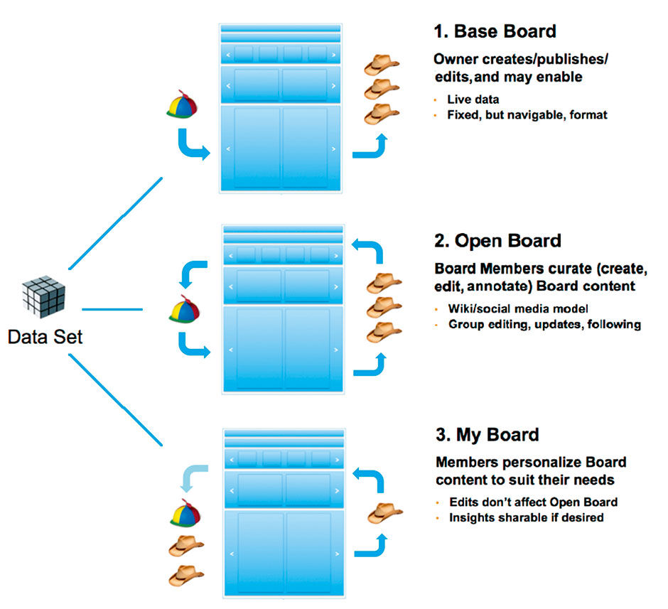
Figure 14.1: Capabilities of different Board states.
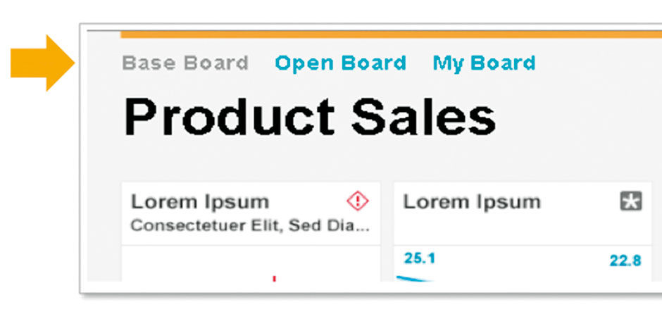 Figure 14.2: Board state selectors, prominently displayed.
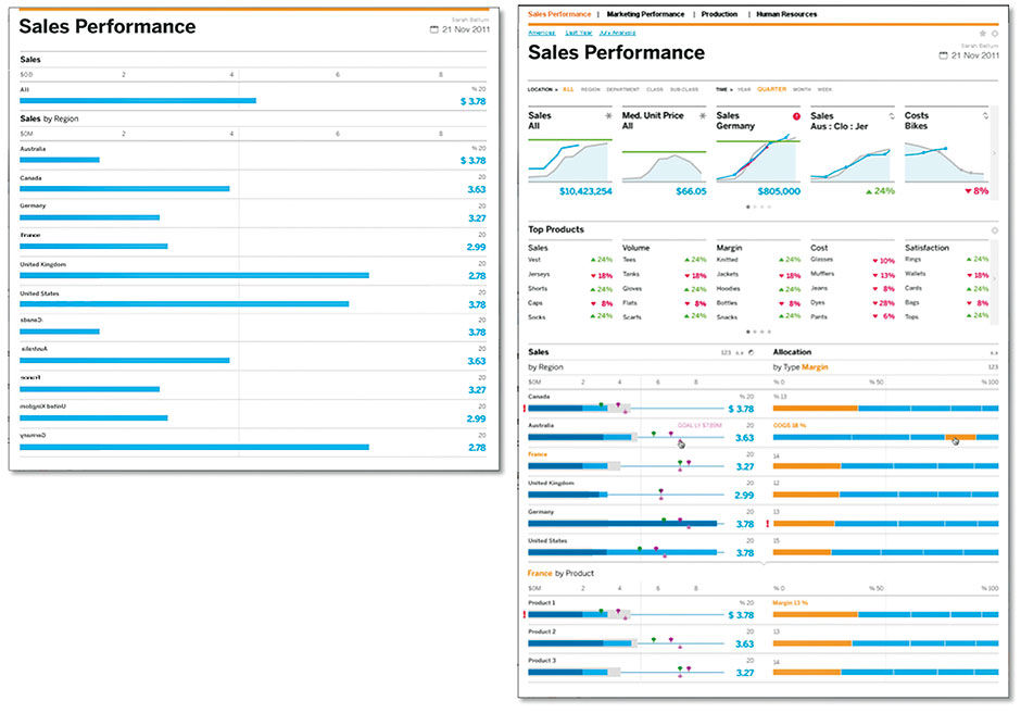
Figure 14.3: Simple and complex Boards.
As with My Board, a Shared Board can co-exist with a Base Board, thus providing the three most useful states for a given underlying data set. The originally published Base Boards provide their Author’s vision of what is relevant, or at least an initial seed of a data set for others to explore and curate. My Board is a personal quantitative sandbox, but with usage logged and shared for the Board author’s benefit. Shared Boards enable collaboration and a crowd-source dynamic. While these states are somewhat obvious to many of us engaged in digital work, using them with numerical content involves some unique considerations.
Boards can be simple or complex, depending on the underlying data and the author’s intent, skill level, and — when applied to a freemium business model, — payment level. A simple Board, as below at left, need only a title and one Block of content, such as a Lattice. The more elaborate Board in figure 14.3 includes:
- Multiple Categories.
- Bookmarking.
- Filters.
- Scrolling Digest .
- Scrolling Gallery.
- Multiple Lattice Columns.
The Board component enables individual and group interaction at the Membership level. It is however at LAVA’s content level that individuals can interact directly with data. Let’s begin with Board Filters, the simplest and most conventional way to manipulate structured content. Filters are interaction controls used to reduce a set of content into a subset by excluding from the display set content that does not comply with the filter value selected. If, on Amazon.com, you elect to view only movies, other items like Books will be removed from the content display. If I elect to see only sales figures from the United States, sales figures from other global locations will be excluded, and the resulting sales numbers in the display will by definition grow smaller. Filter controls can take many forms in a UI. In the Amazon case we might perceive ourselves to be selecting a “section” or “category” named “Movies”, and in the sales case we might select one of many values from a picklist control. In essence, however, we are logically asking these systems to limit, or filter, the superset of content down to only that which is of interest to us.
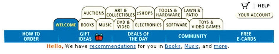
Filters can be combined to further reduce result sets, such as selecting only adventure movies or sales from last month. Many ecommerce sites can in fact be seen as elaborate filtering mechanisms, where users iteratively narrow down the available products to the one they seek. Known generally as a “funnel” metaphor, a great amount of effort has been expended refining these funnels to improve sales conversion rates and user satisfaction and loyalty. Doing this well is key for a brand like Amazon to accommodate selling such a staggeringly broad range of products from a single touchpoint. Although we take the relative elegance of such systems for granted now, in the late 1990s Amazon’s product expansion was much less graceful, resulting in product categories accessible via row upon row of beige tabs, leading to them being referred to as “tombstones” in a product graveyard.
 Author/Copyright holder: Amazon.com, Inc. www.amazon.com. Copyright terms and licence: All rights reserved.
Figure 14.4: Here lie Amazon’s dead products, circa 2000.
Over time, inside the brutally competitive e-commerce tornado, where product UIs have immediate and direct impact on sales, the systems adapted away from these crude, standardized ways of showing a content hierarchy to become a precisely orchestrated shopping experience, where customers feel in control even while they are being seduced, tracked, and manipulated to buy more at every turn.

Figure 14.5: Board Filters (This Year, All Regions). Tapping reveals the menu
As already mentioned, most quantitative content consumption systems do not have Amazon’s deep pockets, or the luxury to focus on a single use case like shopping. However, LAVA’s goal to condense visual analytic interaction into a practical and repeatable system led to a simple solution for reducing a large data set into something more manageable and relevant. Although they are not always needed, by placing a row of simple picklist menus – also called pull-down menus, fly-out menus, and other names – in the Title Block, a Board Author enables users to filter the entire Board content at any time. The Picklist is a good choice for this purpose for two reasons. The first is that it always shows its current state because the state is displayed in the control, with the effect that the current state also serves the dual role of content titling. It also provides access to a large number of options from a very small screen footprint. It’s for these reasons the Board Filters are limited to picklists.
The picklist however works well only within certain boundaries. It relies strictly upon the written names of the Dimension entities being selected. Because the picklist lacks any context other than word meaning, if the word meanings are obscure to the user, it is hard for them to know what they are selecting. It also does not scale well to long lists of entities, which make for a cumbersome, long menu that may even need to scroll. However, for the purpose of high-level data set filtering, if the picklists include major Dimensions that are more easily recognized, such as geographical location and time frame, they work well. What is important is to limit the number of such filters to a handful so as to not overwhelm or intimidate the user. Their purpose is to provide gross reductions in the data displayed in the Board below by using relatively obvious parameters, so as to enable the more fine-grained filter mechanisms lower on the Board to be more effective. If each Board Filter provides, on average, an order of magnitude reduction in content, this becomes quite powerful. Some data sets will contain too many Entities to fit well into these menus. In such cases, the onus moves to the design of the data sets themselves to anticipate the consumption model’s constraints. Once these constraints become consistent and known, data sets will be adapted to comply.
For enterprise reporting solutions, the overwhelming favorite Dimensions to use in Board Filters are, in order, time frame, geographical location, and organizational unit. The odds are that Board users will recognize these Dimensions and Entities by name, and that their available options, at least for one level of a hierarchy of Entities if that is the case, will be accessible from the picklist control. Again, LAVA tries to pick one simple template that provides the most benefit for the least variety.
Figure 14.6: Category Block. The Overview Panel combines these Measures into an expanded Lattice.
The Category Block provides another filter in a tab-like form. Like the Board Filters, it narrows down the content shown according to what is selected from the control. The difference with the Category Block is that, because it uses the tab metaphor, all or most of the options are visible at all times, and thus this element is best suited for dividing content that is rarely or never viewed together or in aggregation. The example shown assumes that Board users will want to isolate content according to the major measures of Margin, Revenue, Expenses, Headcount, and Customers. So, beyond the Summary Category Panel, this Block divides the Board into individual Panels containing content related to these Measures. Categories need not be Measures, however. The Board Author may elect to present these five Measures in a Board Filter and use the Region Dimensions and its entities as Categories. The main factor in this decision is screen real estate, because as the Amazon examples shows, the tab navigation pattern does not scale well to many options. Although the Category panel has a Channel-like horizontal overflow capability, to access off-screen Categories, it should be used sparingly.
When combined with three Board Filters, Categories provide a potential fourth order of magnitude filtering capability that can be applied to all content shown in the Panel Channels of Digest, Gallery, and Well. While reports and dashboards have long offered interactive filtering, the purpose behind LAVA’s design is to provide a simple, standard, templatized way to consume any quantitative data, thus eliminating the cost, effort, and risks of having to design a consumption experience from scratch.
While the Digest and Gallery Channels are relatively straightforward content presentation containers, when used with My Board and Shared Boards, they become living spaces for users to curate content. The creation of content, however, occurs in the Well using the Lattice, or via an external authoring tool connected to the same data set.
14.0.2 Board Sets
Although most workers occupying the visual analytics long tail will likely track a handful of Metrics, there is a need for easy worker access to multiple Boards, and a way for enterprise providers to enable group publishing and end-user browsing of all available visual analytic content, filtered for security of course through user credential login. LAVA’s answer to this requirement is the concept of the Board Set. The idea of a single location for all visual analytic content is not terribly compelling given the value of having embedded analytics adjacent to workflow actions. It does make sense however to have such a repository in a form that is accessible but not requiring a great burden of centralized editorial or publishing expertise. Board Sets apply the scalable, systematic automation principles from the lower-level LAVA components for distribution, curation, and monitoring of multiple data sets. The system for doing so we called Sn@p Navigation, referencing the effect of components fitting together like parts, and the ease of creating and managing Board access.
An Enterprise would have a superset of Data Sets / Boards called a Catalog. Remember that Data Sets and Boards are roughly equivalent, as the Board is merely an accessible view of a Data Set in a default or customized state. While of course multiple Data Sets can be merged together to provision a visual analytics display, for our purposes we treat this merged artifact as a new Data Set. Workers choose Boards from this catalog for display on their Boards Panel, and we can imagine that for workers new to their role, they would see role-relevant Boards already placed here waiting for them. The Sn@p view also has panels for an activity feed in text format showing alerts, updates, and colleague activity in a social media model, with accompanying management controls for “following”, etc. The Collection Panel is a clipboard for individual charts, Points, and Lattices where Workers could construct their own hodgepodge of whatever they wanted to follow in a single scrolling page.
Here we’ll focus on the Boards view, from where each Board that a worker follows is accessed. The “button” used to access each Board is actually a Point, with the Board title displayed below. The Point used to depict the Board in this menu is an actual Point from the represented Board itself – the designated Main Point that is either user-elected or set automatically by default. This Main Point is a live feed from the data set of the represented Board, so that even in this menu view the user can monitor what are in effect the “main points” from every board they follow, turning the Board Panel into a meta-Board.
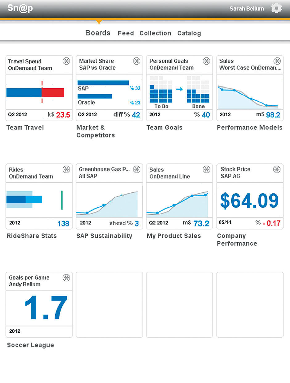 Figure 14.7: Board Set.
The persona for the designs shown in Figures 14.7 and 14.8 is a product manager at SAP, and also the local sustainability champion for the Palo Alto office. She follows a number of Boards related to her work, including role-specific management topics like travel budget, goal performance, sales, etc. She also follows local and company-level sustainability metrics, including rideshare stats for her team. She even follows a personal Board provisioned by her son’s soccer team. She has chosen a Main Point for each Board, and can see the latest status on each from the Boards view on her iPad.
If she elects to view her Board on Rideshare Stats, she is taken there from tapping its Main Point from this view. Just as with navigating within Channels, in the Board Title Bar are left/right arrows that allow her to tap/swipe left and right to go directly to her other Boards. The Main Point in the Rideshare Stats Board is “Rides, OnDemand Team”.
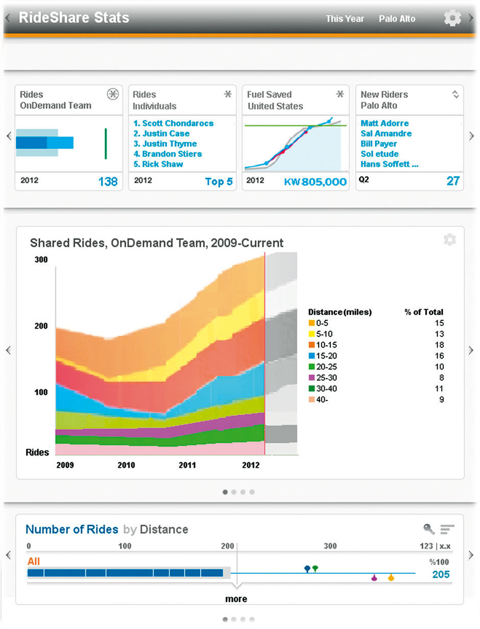
Figure 14.8: Board with access to other Boards from the gray Title Bar. Main Point is in upper left slot in Digest
